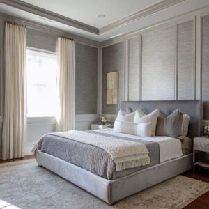
In refined interior concepts, purple carries softness and volume while silver reads as behavior—how light skims an edge, how a ribbed panel glints, how a mirrored bevel sends a thin thread of brightness along a seam. This pairing avoids noisy contrast and instead relies on pacing: lilac, mauve, and plum move through measured value steps against greys that behave like calm architecture.
The most convincing purple and silver bedroom decorating ideas treat purple as the mass (headboards, quilts, pillow stacks, velvet planes) and let silver be the reaction (mirror borders, brushed edges, pendant tips, ribbed glass). The result is a room that glows rather than flashes, with light orchestrated into slim lines, soft halos, and micro-sparkles that never overwhelm the textiles carrying the color story.
Purple as Volume, Silver as Behavior
Purple often appears as the “big shapes”—a channel-quilted headboard, a velvet bench, a folded quilt in heathered tones, a canopy that turns air into a gentle arch. Silver, by contrast, shows up in slivers and controls: the chrome toe that makes a bed float, the bevel that frames a mirror like a bright stitch, the antiqued panel that diffuses lamp glow into a pearly ring, the ribbed vase that converts daylight into tiny, even stripes.
Because the palette assigns roles so clearly, the eye reads order: cloth holds depth and warmth; slim edges and reflections keep the scene crisp. Rooms that respect this division feel composed, cloudlike, and precise—soft at their center, sharply drawn at their boundaries.

Tonal Ladders: How Value Steps Build Calm
The spectrum moves in thoughtful increments rather than leaps. Floors and large planes settle into fog, oyster, and pebble; bedding climbs through pearl, smoke, heather, and a single confident note of violet or plum; the palest silvers are saved for edges, trims, and lamp stems.
This laddering keeps the composition legible: a pale coverlet becomes a metallic field that lets deeper pillows glow; a mid-tone headboard keeps mirrored strips from feeling harsh; a single saturated cushion finds its place because everything around it has prepared a soft landing. The atmosphere stays quiet not due to minimalism but due to careful spacing of shades, where each step is close enough to the last to feel inevitable.

Sheen Hierarchy: Spending Gloss Where It Matters
A consistent sheen strategy elevates the palette without loud shine. Large surfaces remain matte or low-sheen—limewashed planes, suede-like panels, bouclé throws, jute or loop-pile rugs—so the space absorbs light softly.
Medium fields add controlled reflection—satin bedding, brushed metal, smoked or antiqued mirror—to carry a gentle glow. Only tiny accents deliver crisp sparkle—crystal finials, polished bevels, a pendant cap, a razor-thin pull.
Because gloss is “spent” sparingly, silver reads as the behavior of light rather than a coating, and purple keeps its depth instead of turning sugary. The room ends up luminous yet restful, with bright points functioning like punctuation rather than exclamation.

Drawing with Lines: Ribs, Battens, Grids, and Reveals
Architecture in such designs often arrives as linear rhythm rather than bulky construction. Vertical battens climb a wall and continue across beams so every rib top catches a pale cap of light; panel seams align with headboard channels to create a calm cadence; metallic inlays trace a square grid across velvet, flashing hairline silver whenever someone moves; mirror strips rise like reeds, adding height without thickness.
These lines make purple feel structural—more “field” than “accent”—and allow silver to appear as outline and measure. The geometry is quiet but insistent: a discipline of repeats that turns fabric into columns, grooves into instruments, and pendants into bright commas set exactly where the rhythm asks for a pause.

Mirrors as Regulators, Not Spectacles
Mirrors regulate light flow the way a good dimmer regulates brightness. Tall beveled grids turn an entire wall into a silver tapestry of narrow highlights; antiqued borders around a headboard produce a soft halo instead of glare; slim vertical mirror reeds stretch height while remaining visually weightless; mosaic squares distribute reflection into a thousand small ripples so sparkle becomes a texture rather than a shout.
These surfaces are tuned—aged, smoked, segmented, or framed—to control intensity. Because reflection is managed, purple textiles stay the star, and silver remains a precise tool: widening a room with a horizontal strip, lifting a bed zone with a luminous perimeter, or doubling pendant glow without adding fixtures.

Textile Architecture: Softness Doing Spatial Work
Fabric isn’t decoration here; it’s structure. Channel headboards read like a row of narrow columns, turning lavender into height.
A canopy crown releases gauze in a gentle arc that softens hard rectangles. Quilts and throws placed diagonally break orthogonal patterns so a formal grid never feels rigid.
Velvet panels operate as planes, not just upholstery, with pile direction catching light in ways that sketch depth. Because textiles do the architectural lifting, purple can stay restrained yet powerful, acting as a field that absorbs and returns light with a slow shimmer; silver can remain an accent language—thin, bright, and articulate—around the edges of this soft-built geometry.

Natural Warmth as a Counterweight
Drift-toned timber, pale oak, or walnut frames bring a soft counter-temperature that prevents the scheme from slipping into chilly. A jute rug grounds the coolness; a wicker basket or a rough-weave lumbar adds touchable grain; a stone tray introduces mineral calm; candlelight or a warm filament tucked near mirror edges produces a pearly ring that tamps down any clinical note.
The intent isn’t to turn warm; it’s to keep the cool palette human. Those small touches of wood and fiber make the purple read fresh rather than sweet and the silver glow feel like light, not gadgetry.

Light as Composition: Slim Glows, Frosted Tubes, and Quiet Halos
Illumination acts like a drawing tool laid over the room. Perimeter washes behind headboards transform grey planes into soft metallic fields; frosted glass tubes hung at staggered heights turn light into clouded verticals; ribbed pendants double against mirrors, becoming bright lines that lift the bed; concealed channels slip between velvet panels, slicing violet with molten columns of warmth.
Because fixtures remain slender, transparent, or diffused, the light they cast is the visible element—not the hardware. Silver emerges where the glow meets an edge, and purple deepens where the beam fades, creating a slow, confident gradient from brightness to hush.

Light Behaviors Often Used
- Thin lines that graze ribs and grooves to draw silver stripes.
- Diffused cylinders that create vertical bands without hard hotspots.
- Perimeter halos that frame the sleep zone like a luminous border.
- Reflections multiplied by mirror grids for sparkle that reads textured, not glossy.

Five Archetypes Within One Palette
The same colors produce distinct characters by shifting placement and behavior.

Soft Architectural Suite
Ribbed headboards, panel reveals, brushed accents; lilac as field, silver as outline; an even, hotel-level calm.

Cottage Airy
Bleached timber, limewash, linens, small mirrored tables; lavender as a wash, silver through grain and glass; sunlit and slow.

Urban Velvet + Mirror Drama
Deep eggplant planes flanked by mirror slabs, warm light channels slicing the purple; silver as blade-like lines and crisp edges.

Romantic Soft Focus
Canopies, gauzy folds, pearl greys, acrylic tables that read as silver lines without mass; cocooned and serene.

Hybrid Structural Warmth
Steel or brushed frames, violet channel headboards, pale oak, and honed stone; composed brightness with grounded textures.
This is the terrain implied by many purple and silver bedroom ideas, where the shift from a velvet wall to a ribbed panel or from antiqued mirror to beveled grid changes mood while the palette stays constant.

Where Silver Sits to Shape Focus
Silver is placed with intent to steer attention rather than to announce itself. Around the bed, antiqued frames and mirror borders concentrate glow; at mattress height, a horizontal datum shelf reads as a cool underline; vertically, pendant stems and beveled seams become guideposts for the gaze; at touchpoints, lamp bases, handles, and small trays offer quick flashes that feel tactile.

Typical Placements
- Framelines: Headboard perimeters, thin reveals, beveled seams.
- Light Paths: Pendant drops, ribbed glass, perimeter channels.
- Touch Zones: Pulls, toes, lamp stems, mirror edges.
- Amplifiers: Grids or mosaics that multiply small glows into a textured field.
The bed becomes the visual center not by size alone, but because every silver line and reflection quietly points toward it.

Spatial Tricks Without Construction
Linear systems continue over ceilings so walls and overhead read as one instrument; diagonal throws loosen strict panel geometry; floating nightstands and slim chrome toes cut shadow lines so heavy volumes feel buoyant; mirror seams align with pendant drops to make height feel taller than the actual dimension.

These are optical games played with fabric, reflection, light, and shadow rather than with framing. Grey contributes clarity by sitting matte where depth is needed and pearly where lift is wanted; purple responds by looking richer at the core and cooler at the edge, as if the room is breathing in and out.

Accessory Language: Small Objects, Big Discipline
Objects stay simple in form but exact in finish: ribbed vases that turn daylight into neat silver ticks; crystal fins that echo pleated drapery at a smaller scale; brushed trays that act as horizontal glints to catch a lamp’s pool; muted florals—mauve stems, baby’s-breath, dusky leaves—that land right between silver and purple in value.

Books become height adjusters for bouquets so symmetry holds; framed art often shows foggy horizons in greys and lilacs so the palette repeats in image. Within this restraint lives character: the pebble-knit lumbar that sparkles softly; the antiqued mirror face on a drawer that warms the sconce glow; the tweed-like violet pillow that adds grain so a velvet stack doesn’t read flat.
In many purple silver bedroom ideas, it’s these micro-decisions that turn a color pairing into a language.

Drapery and Rugs: The Edges That Quiet the Room
Curtains frequently sit in warm ivory or off-white with just enough sheen to borrow a breath of violet from a nearby headboard; pleats are even and deep so they register as vertical light rather than fabric bulk. Rugs choose loop pile, broken striations, or pale gradients to read like silver shadows under the bed, setting the metallic “field” that allows purple to sit calm at the center.

Binding edges might carry a faint lavender line that ties floor to bedding without adding extra color mass. These elements hold the perimeter and keep the composition tidy, especially in lavender and silver bedroom ideas, where the transition from wall to floor wants to feel fog-smooth rather than graphic.

Closing Synthesis: A Palette That Thinks in Light
Taken together, such designs show a palette that thinks in behaviors. Purple supplies mass and touch—velvet, knit, chenille, suede-like panels—while silver provides measure and motion—bevels, ribs, inlays, glows, reflections.
Greys hold the stage so subtle sheens can speak; mirrors are tuned to distribute sparkle; warm inserts keep the scheme human.
The effect is quiet radiance: brightness that arrives through craft, not volume; depth that comes from value steps and pile direction; order drawn with seams, grooves, and slender stems. It’s an approach that treats color as material and light as design—soft on the senses, exact in its structure, memorable without noise.