A blue sofa can feel instantly stylish, but it can also read cold, heavy, or slightly unfinished if the cushions are chosen without a plan. This guide turns cushions into a simple styling system: warm the edges so the sofa feels inviting, add light or misty layers so the blue looks lifted, and use calm pattern and texture so the whole setup reads intentional instead of piled.
Inside, you’ll find quick pillow formulas with counts and placement, a palette menu, and clear fixes for common room situations such as bright white walls, pale blue sofas that fade, large sectionals that look like one long block, denim-blue sofas that feel too casual, and blue leather that feels shiny or strict. The goal is a clean, finished look that still feels relaxed and livable.

Quick pillow formulas (counts + placement)
Formula A — End-Framing Warm Buffers + Soft Stripe Front (4 pillows)
Best for: saturated cobalt / jewel blue sofas in bright rooms
Back row
- 2 × large warm sand/camel cushions, tight to the arms (these are the “corner buffers”)
Front row
- 2 × smaller blue-and-white low-contrast stripe cushions, pulled slightly forward (these create the clean pattern layer)
Placement notes
- Keep the center seat area mostly open so the blue upholstery still reads as the main surface.
- Choose stripes that look slightly irregular or woven so they read calm, not loud.
Formula B — Minimal 3-Piece Diagonal (3 pillows)
Best for: muted denim / chambray blues where you want polish without “too many pillows”
Left-to-right diagonal
- 1 × rust-caramel textured square, slightly forward (warm mood switch)
- 1 × large creamy looped/“cloud” square, slightly behind (light + softness)
- 1 × small cool grey lumbar, front layer (tailored line that makes it look styled)
Placement notes
- The lumbar is the “organizer bar.” Keep it lower and slimmer than the squares.
- Don’t center everything; let the diagonal feel intentional.

Formula C — Bookended Contrast for Pale Blue (4 pillows)
Best for: powdery / light blue sofas that risk looking washed out
Back row
- 2 × deep navy cushions on the ends (bookends for outline clarity)
Front row
- 2 × creamy highly textured cushions in front of the navy (texture becomes the pattern)
Placement notes
- Leave breathing room in the middle so the sofa doesn’t disappear under pillows.
- Use warm off-white/cream (not icy white) so contrast feels calm.
Formula D — Sectional Rhythm: Anchors + Bridges + Relief (6–8 pillows)
Best for: large blue sectionals that can feel like a “big blue block”
Structure
- 2 × deep navy “anchor” cushions (place one near each major end/curve)
- 2 × blue-and-white small-scale woven motif cushions (bridge pieces beside anchors)
- 1 × darker textured stripe cushion (adds tailored structure without adding new colors)
- 1 × pale neutral cushion (relief piece near the center)
- Optional: 1–2 extra tonal blues to extend the rhythm along the long side
Placement notes
- Avoid perfect mirroring; keep it balanced but not identical.
- Put the light relief near the seat you want to feel most inviting.

Formula E — Lumbar Belt Formula (5–6 pillows)
Best for: anyone who wants an easy “designer” look quickly
Back row
- 2 × deep navy anchors (not necessarily at the far ends; slightly inward is fine)
- 1 × blue-and-white thin irregular stripe (pattern that behaves like texture)
- 1 × smaller tight-woven pattern in blue/neutral (second bridge)
Front row
- 1 × long camel-to-caramel lumbar placed across the center like a belt
Placement notes
- The lumbar is the visual “plan.” It makes everything look organized fast.
- Add a cream throw near the navy to keep the dark from feeling heavy.

Palette menu with color names
- Sand Bookends + Mist Stripe
Camel/sand ends + pale blue-white irregular stripes + clean white backdrop. - Rust-Cream-Grey Diagonal
Toasted rust texture + creamy looped texture + cool grey lumbar. - Navy Frame + Cream Cloud
Deep navy bookends + plush creamy texture in front + open middle. - Fog Ends + Tonal Rib Accents
Pale blue-grey ends + two smaller tonal textured/ribbed accents toward center. - Gallery Blue + Beige Edge Buffers
Sandy-beige ends + two slightly deeper blues in the middle (layered, grown-up). - Navy Anchors + Warm Stripe Bridge
Deep navy anchors + tan/caramel striped bridge pillow + one big fluffy off-white. - Blue-White Motif Bridge Set
Navy anchors + small-scale blue-white woven motifs + one pale neutral relief. - Watercolor Blend Gradient
Deeper blues at outer zones + softer blended blue-sand brushstroke patterns inward + small pale lumbar in front. - Texture-Only Neutrals on Deep Blue
Cream + oatmeal (heavy texture) with one muted tan placed back as a quiet warm note. - Traditional Stripe Discipline
Deep blue anchors with micro-striping + warm off-white vertical stripe cushions + smaller matching center cushion. - Warm Energy Blocks (Controlled Heat)
Red-brown end + warm orange end + tan bridge center + smaller blue accents to tie back to sofa. - Leather Softening Stack
Warm off-white + medium grey bridge + long blue striped lumbar + small dark blue “pin.” - Ink-Mark Cream + Camel Glow
Bold cream pillow with dark stripe detail + camel pillow + small lighter foreground piece. - Blue + Ivory + Rust Hero (with a Bridge)
Two ivory buffers + rust hero cushion + small striped lumbar that carries both blue and warm tones. - Family-Room Quiet Linears
Off-white textures + soft stripes + small checks + a few quiet navy notes for depth.

Common design scenarios (what to do based on the interior design)
If the walls are bright white and the blue sofa feels cold
- Add warm sand/camel at the ends (buffers at the arms)
- Keep pattern inside the blue family: soft blue-white stripes or small woven motifs
- Repeat warmth elsewhere with wood/metal or a small warm accessory
If the room is airy and the sofa is pale blue and “fades”
- Use deep navy bookends to outline the sofa
- Put cream texture in front so contrast feels soft, not harsh
- Keep the middle more open so the sofa color still reads
If there is a large blue sectional and it reads like one long block
- Use the anchors + bridges + relief plan:
- navy anchors
- blue-white motifs as bridge pieces
- one pale neutral relief near the center
If there is a denim-blue sofa and it looks too casual
- Add one warm hero (rust/caramel) in textured weave
- Add one big cream texture to lift the seat zone
- Add one slim grey lumbar to impose order
If the sofa is blue leather and feels shiny/strict
- Prioritize soft-looking off-white/cream to soften glare
- Add a grey bridge so contrast becomes gradual
- Use one striped blue lumbar to make the layout look intentional and calm

The hidden job: temperature tuning without turning the room into a color show
The quiet move that keeps blue from feeling cold
Warmth can be introduced at the sofa’s edges first, not in the center. That looks like a simple styling choice, but it is actually mood engineering.
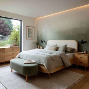
- Warm end cushions (sand, camel, beige) act like corner buffers. They soften the arm zones visually and emotionally. A saturated blue sofa, especially a boxy silhouette, can read strict. Warm ends make the blue look less sharp, even if the sofa itself does not change.
- Warmth placed at the ends makes the sofa feel wider and calmer. It is a silhouette trick: the eye reads the outermost cushions as the sofa’s boundary, so the sofa looks more generous, less tight, less severe.
- Warmth placed closer to the middle makes the seat feel social. Notice how the warm brown or rust pillows sit nearer the center in some scenes. That creates a visual hearth zone, pulling attention into the seat rather than letting the sofa feel like a long bench.
Warmth that does not look forced
Key pattern ideas: warm color is rarely used as a neon accent. It is toasted, earthy, or sun-baked.
- Rust-caramel with nubby weave warms the blue without shouting.
- Camel lumbar acting like a belt puts warmth exactly at eye level, where the room’s emotional temperature is judged.
- Warmth sometimes appears off the sofa so the sofa stays disciplined while the room still feels warm.
Non-obvious insight: Warmth looks more expensive when it shows up as a material feeling, not a loud hue. A toasted rust in a dimensional weave reads calmer than a bright orange in a flat surface, even if both are technically warm.

Visual weight control: making a strong blue feel finished, not heavy
Blue can feel dense in a bright room. The cushions solve this with a value ladder: a step-by-step change in lightness rather than one harsh jump.

The value ladder method
- Deep blue sofa (dark base)
- Slightly lighter or misty blues (lifting layer)
- Creams or oat tones (light buffer)
This is used repeatedly:.
- Pale blue-grey end cushions that are close in hue but brighter create a soft gradient. The sofa is still blue, but it stops reading as a single block.
- Cream looped cushions placed in front of navy ends make the contrast feel cushioned, not graphic.
- One oversized off-white texture cushion next to daylight creates a highlight point that makes the whole sofa feel lighter.
Non-obvious insight: The lightest cushion works best when it sits where daylight naturally hits. It behaves like a built-in highlight, so the sofa feels lifted without needing more items.

Edge versus center: where the weight should be managed
- If the sofa looks too heavy, lighten the ends or soften them.
- If the sofa looks too flat, darken the ends. Dark ends make the sofa’s outline instantly readable against pale walls.
Non-obvious insight: Dark bookends on a pale blue sofa are not about drama; they are about legibility. They give the sofa a crisp boundary so it does not fade into the wall color.

Readability: making the sofa’s comfort and shape obvious at a glance
The sofa should look inviting and clear from a distance. Cushions achieve this with three subtle devices: silhouette buffering, front-layer signaling, and breathing space.
A) Silhouette buffering
Warm or light cushions tight to the arms soften the sofa’s outline and make the seating feel friendly. This matters most for boxy shapes and for glossy surfaces that can feel strict.

B) Front-layer signaling
A consistent high-end cue: at least one cushion is pulled forward and is smaller or slimmer, creating a deliberate foreground.
- Slim grey lumbar creates a tailored front line.
- Tonal ribbed accents placed slightly forward produce a clear layer order.
- Long camel lumbar across the front acts like an organizer bar, instantly making the arrangement look intentional.
Non-obvious insight: A front-layer piece acts like punctuation. Even with only four cushions, a forward accent tells the eye there is a plan.

C) Breathing space as a luxury cue
Some cushion arrangement ideas leave the middle of the sofa more open. That empty zone is not laziness; it is restraint.
- It lets the upholstery read as the main character.
- It prevents the sofa from disappearing under pillows.
- It makes the room feel calmer and more premium.
Non-obvious insight: The sofa looks more expensive when it still looks like a sofa. If pillows erase the upholstery, the room starts to feel cluttered even if the colors are nice.

Pattern mixing without chaos: pattern treated as atmosphere, not decoration
A repeated theme: patterns are selected so they behave like texture at a distance.
Pattern as texture
- Pale blue and white stripes that are slightly irregular read like a mist of contrast rather than a loud print.
- Small-scale woven motifs in blue and white behave like a refined surface, bridging dark navy and lighter blues.
- Fine striping inside a dark blue cushion adds micro-depth, breaking up a heavy dark slab effect.
Non-obvious insight: The safest pattern is one that looks like a fabric effect first and a graphic print second. That is why these designs feel clean even with multiple patterns.

The scale rule hiding in plain sight
- Large solids to set the calm base
- Medium patterns to add interest
- Small patterned pieces to add polish
Non-obvious insight: Scale tells the eye what belongs in back and what belongs in front. Many pillow arrangements look random because everything is the same visual size.

Linear patterns are chosen on purpose
In large sectional designs, patterns tend to be linear, checked, or stripe-based rather than big florals. That choice is deeply practical visually: a big sofa already has a lot of surface area.
Bold prints add noise too quickly. Linear patterns add structure without shouting.

Sectionals and long sofas: rhythm is the real luxury
A long blue sectional can become one continuous blue mass. The advanced designs solve it with rhythm: anchors, bridges, relief, and skyline height variation.
A) Anchors: where the eye should stop
Deep navy velvet-like cushions function as visual anchors. They give the eye a stopping point so the sofa does not read washed out in daylight.
B) Bridges: how transitions are made
Patterned blue-and-white cushions bridge dark and light without introducing new colors. They repeat wall whites and window light while staying in the blue family.
C) Relief: the light resting point
A pale neutral cushion acts as relief in the middle of large arrangements. It keeps the whole lineup from reading heavy.
D) Skyline: height variation to avoid stiffness
Staggered heights can be used so the top line of pillows forms a soft skyline rather than a straight row. That tiny irregularity is a major realism cue.
It looks styled, not staged.

Non-obvious insight: A sectional looks designer-like when your eye travels along it in a controlled rhythm instead of landing on one dense cluster. Rhythm is the cure for the big blue block problem.

Connecting the sofa to the room: cushions as translators between materials and tones
The most convincing cushion setups are never isolated. They echo something already present so they look inevitable.
Art-to-sofa translation
Many design ideas pull tones directly from artwork:.
- Artwork with layered blues and greys supports multi-blue cushion ladders.
- Pale beige and soft blue blocks in art validate navy + cream + pale blue palettes.
- Triple artworks with watery blues and sandy strokes are mirrored in cushion surfaces, so the sofa feels like part of a room story, not a standalone color object.
Non-obvious insight: When the art carries both the cool blue and the warm sand note, warm cushions stop feeling like rescue accents. They feel curated.

Floor-to-sofa grounding
Rugs and wood floors quietly justify cushion choices:.
- Wood floors echo rust, camel, and sand notes.
- Pale rugs echo cream cushions so light tones feel structural, not decorative.
Off-sofa repetition as the “designer glue”
Warmth often repeats away from the sofa:.
- Orange-brown florals or small warm accessories on a table warm the room without turning the pillow palette into a warm overload.
- Warm metal notes in sconces or lamps repeat camel tones.
- A warm chair echoing rust pillows helps the palette look planned.

Coziness without clutter: texture used as the luxury engine
A strong blue sofa can feel showroom-cold if everything around it is smooth. It can be solved with tactile contrast.
Texture layering that reads expensive
- Looped, cloud-like cream cushions against muted blue create soft high contrast without harshness.
- Chunky poufs, woven ottomans, and nubby rugs reinforce the cushion textures so the seat zone feels intentionally comfort-driven.
- Texture becomes pattern in minimal setups, allowing the palette to stay simple while still feeling rich.
Non-obvious insight: Texture produces shadow depth. The tiny highlights and lowlights in a nubby cream pillow create visual layering even from far away.
That is why a simple palette can still feel complete.

Dark blue leather and very dark sofas: how softness and contrast must change
Sometimes it needs to deal with glossy or heavy-feeling seating (deep navy leather). The cushion strategy shifts in three key ways that also apply to black sofas.

A) Softness must be visible, not implied
Leather can read sleek and a bit hard. The solution is not more color; it is soft-looking surfaces.
- Large creamy buffers soften glare and make the seat feel touchable.
- Bolsters echo rolled arms and convert formal silhouettes into lounge-friendly shapes.
B) Contrast must be gradual
Pure white on very dark seating can feel sharp. Such design concepts use warm off-white, oat, and cream to keep contrast expensive and calm.

C) Warm accents look best when they have a bridge
Rust or cognac accents become believable when a bridging piece carries both the cool and warm tones.
- A striped or banded lumbar that relates to both blue and rust is the design math that prevents the warm accent from looking random.
Non-obvious insight: On very dark sofas, the bridge piece is often more important than the hero pillow. The hero gives personality, but the bridge makes it look intentional.

Micro-moves that change everything
These are small styling decisions that quietly create a high-end result:.
- Put warmth where the sofa meets the room
Warm end cushions are emotional corner buffers. - Use one slim piece to impose order
A lumbar acts like a visual organizer bar. - Let one light cushion sit in the brightest daylight zone
It becomes a highlight that lifts the whole sofa. - Treat pattern like a fabric effect
Low-contrast stripes and woven motifs read calm and refined. - Avoid perfect mirroring on large setups
Balanced but not identical placement feels real and styled. - Create a resting point in the center
A pale small lumbar or open middle zone stops many pillows from looking messy. - Repeat the warm note elsewhere in the room
A lamp, sconce, wood beam, chair, or table decor makes the warm cushion feel planned.

A simple diagnostic method to choose the right cushion direction
Squint test for value
If the sofa becomes a single dark blob when you squint, you need:.
- lighter buffers or misty blues to break the mass
If the sofa disappears when you squint (pale blue in pale room), you need:.
- dark bookends for outline clarity
Temperature test at eye level
Stand where you first see the room. If the seating feels chilly:.
- add one warm note in a toasted tone, ideally with texture
If the seating feels heavy:.
- place the lightest textures forward and near natural light
Order test
If the pillows feel random:.
- introduce a foreground piece (lumbar or smaller accent) and leave some breathing space
Closing synthesis: what makes blue sofa cushion ideas feel truly refined
The common thread is disciplined contrast with emotional warmth. The cushions do not compete with the blue; they edit it.
They control edges, build a value ladder, use texture to create shadow depth, and borrow validation from art, flooring, wood tones, and small decor. The most advanced scenes treat a long sofa like a composition with rhythm: anchors to stop the eye, bridges to transition, and relief to keep the whole story airy.