A calm luxury primary bathroom does not usually come together because of one premium stone slab, one sculptural tub, or one striking light fixture. The deeper pattern is much simpler and far more useful: the room feels high-end when it lowers visual noise, keeps its main surfaces easy to read, and adds warmth in a steady, well-edited way.
That point matters because many people chase this look by adding luxury items one by one. The result can end up polished but still tiring to look at.
A modern calm luxury design follows another path. It reduces friction.
It asks the eye to process fewer abrupt shifts. It lets large surfaces carry most of the work.
It gives the bathing area a special role. It softens hard finishes with natural materials, textiles, and filtered light.

This style is built through reduction with purpose. The primary bathroom should not feel empty, but it should feel settled.
It should not look plain, but it should not ask every detail to compete.

The foundation of calm luxury: less visual noise
The clearest lesson is that calm luxury is a perceptual strategy before it is a decorating style. Primary bathroom designs reduce what could be called visual event density.
That means fewer harsh transitions, fewer isolated objects, fewer loud highlights, and fewer moments that pull the eye away from the main composition.

In practical terms, that usually means:
- long uninterrupted vanity runs instead of many broken cabinet pieces
- broad wall surfaces instead of several competing finishes
- one close family of neutrals instead of strong color jumps
- grouped accessories instead of many small scattered items
- one main path or one centered layout instead of several competing focal points
- a tub area that feels like a destination, not a leftover fixture placement
That is why primary bathrooms can feel expensive in a restrained way. The room is easy to process.
Your eye moves with less effort. The space feels more settled because it is not forcing constant visual decisions.

Start with a few large masses
One of the most useful ideas for this style is that a handful of big, clear forms creates a richer result than a room full of small refined details. Long vanities, thick counters, broad mirror planes, integrated tub surrounds, and full wall fields repeatedly create the strongest impression.
This is what gives a primary bathroom a custom-built character. The interior design begins to feel composed from architecture rather than decorated from purchases.

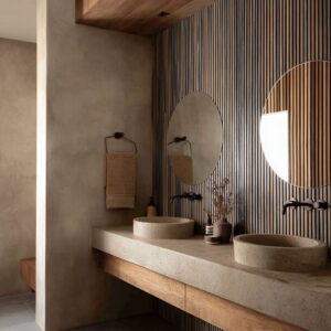
A long vanity, for example, does more than add storage. It creates a stable horizontal base.
A thick stone counter adds substance. A tub built into a broad surround feels absorbed into the room rather than dropped into it.
A large mirror panel reduces visual interruption and helps the whole wall work as one surface. The main idea is simple: let a few major forms carry the room.
Then let the smaller items stay secondary.

Keep the palette tight, then build depth inside it
Another design pattern is the narrow color range. Calm luxury primary bathrooms tend to stay inside soft cream, warm white, pale sand, beige-gray, taupe, bleached wood, and gentle stone tones.
The interior design gains richness through small tonal shifts rather than bold contrast. This is one of the biggest reasons the style feels refined instead of busy.
When the wall, counter, cabinetry, floor, and tub sit near one another in tone, the eye stops jumping from feature to feature. That alone makes the room feel more settled.

Depth still matters, of course, but it should come from quieter sources:
- undertone changes
- matte versus soft polish
- wood grain
- stone veining
- plaster-like clouding
- woven texture
- diffused shadow
- warm light grazing one surface more than another
This approach is far more durable than building the interior design around sharp contrast. Strong contrast can create drama, but it rarely creates the same slow, settled atmosphere.

Warmth in small repeated doses
A primary bathroom is usually full of hard materials: stone, tile, mirror, glass, plaster, metal. Without warmth, those surfaces can turn crisp, distant, and a little sterile.
A useful lesson here is that warmth does not need to arrive as one dramatic move. It works better as a distributed system.

That warmth may come from:
- wood underfoot
- a wood vanity base
- a wood mirror frame
- a woven tray or basket
- a soft runner
- folded towels
- pale flowers or greenery
- an amber niche glow
- warm sconces
- filtered daylight through sheers
This repeated warmth makes the room feel easier to live with. Instead of one warm statement piece trying to fix an otherwise cold scheme, the room develops a gentle, steady softness at several points.
That is one reason wood appears so often in successful calm luxury bathrooms. It acts as the main regulator that keeps stone-heavy rooms from becoming too hard.

One clear spatial order in the room
A good calm luxury bathroom rarely feels visually scattered. It usually follows one organizing logic and stays loyal to it.
That logic might be a centered composition with a tub as the focal point. It might be a long front-to-back axis that leads toward a window.
It might be a layered plan where one threshold leads to another and the bath zone sits farther back in a protected pocket.

Whatever the strategy, the room should be easy to read. This matters even more in a large primary bath.
A large room can still feel restless if vanity, tub, shower, storage, lighting, and decor all ask for equal attention. A better result appears when one major idea guides the layout.
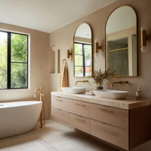
Some rooms work through centered balance: mirror pairs, a tub centered on the back wall, matching sconces, and symmetrical storage. These feel stable and composed.

Others work through procession: a long sightline, a floating vanity on one side, a built-in tub or shower destination at the far end, and a bright focal point that gently draws the eye forward. These feel more directional and softly cinematic.
Both approaches work. The key is choosing one and keeping the room legible.

Treat the bath zone like the emotional center
One more design pattern in calm luxury primary bathrooms is the special role given to the bathing area. The tub is often handled as the emotional center of the room, even when the vanity is larger or more complex.

This does not mean the tub must always be dramatic. It means it should feel intentional.
That can happen through:
- end-of-axis placement
- a centered window behind the tub
- a framed alcove
- a niche with warm light
- a low platform
- an arch threshold
- a screen that partly veils the tub
- a stone surround that makes the bath area feel carved into the room
This move changes the whole mood. The bath zone becomes a destination rather than an object.
It feels protected, more private, and more connected to daily ritual. That is a major part of why these bathrooms feel restorative.
A blank wall at the end of a long room often leaves the composition unresolved. A settled bath destination gives the eye somewhere to arrive and rest.

Choose your atmosphere: airy and bright or warm and cocooned
Additional takeaway is that calm luxury does not depend on one mood only. It can follow two very different emotional routes.
The airy route
This version relies on:
- bigger windows
- open spacing
- visible floor area
- lighter mass
- pale tones with more daylight
- floating vanities or visually lifted cabinetry
The interior design feels fresh, open, and breathable. The main risk is washout.
To keep it grounded, it needs one or two anchoring details: a darker vase, dark trim, a medium wood note, grouped decor, or a clear focal end.

The cocoon route
This version leans on:
- stone wrapping
- close tonal editing
- alcoves and framed zones
- filtered openings
- deeper beige and taupe families
- warm, lower-intensity light
The room feels sheltered, intimate, and enveloping. The main risk is heaviness.
It stays balanced when wood floors, pale flowers, a brighter tub interior, a mirror field, or one clear light source introduces relief. Both routes can look upscale and restful.
The difference is emotional, not hierarchical. One offers visual breath.
The other offers shelter.

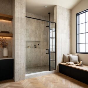
Architectural features can do the work
A calm luxury bathroom improves dramatically when architecture carries part of the design load. This is far better than trying to create interest with many decorative items on the counter.
Useful architectural moves include:
- recessed niches
- framed mirror walls
- stone piers or wall returns
- deep-set shelving
- arched openings
- alcoves around the tub
- partial screens
- step-up bath platforms
- built benches at the end of the room
These features create depth, order, and a sense that the room was fully composed rather than filled in later. They also help define zones without clutter.

A shelf recessed into the wall behaves very differently from a standard open shelf. A niche feels contained, integrated, and quieter.
A framed tub alcove gives the bath area a stronger identity without adding another finish. An arch softens transition and makes the room less abrupt.
Even a simple wall return can turn a standard vanity into a more intentional composition. The larger lesson is that calm luxury improves when storage, lighting, and zoning look like part of the room’s structure.

Light should gather, fade, and graze
Lighting is one of the main reasons a bathroom looks soothing instead of flat. Calm primary bathrooms avoid loud, even brightness on every plane.
They rely on gradients, washes, and pockets of glow. That may look like:
- daylight filtered through sheers
- side light washing a stone wall
- warm backlighting at the mirror
- under-vanity glow
- a softly lit niche
- vertical light bars that stretch the wall upward
- a brighter end point near the tub and slightly softer light in the foreground
This type of lighting creates atmosphere because it gives the room a center of gravity. It lets one surface carry a warm edge, another remain slightly dimmer, and another catch a gentle wash.
The room feels layered. Flat total brightness can be practical, but it often strips the room of depth.
A calmer result comes from light that moves softly through the space rather than flooding every corner at the same intensity.

Using dark accents sparingly and with purpose
A very pale bathroom design can become washed out if every surface sits at the same value. That is why a small, carefully placed darker note is often so important.
This darker note may be:
- one dark vase
- a pair of darker vessel sinks
- dark mirror trim
- darker wood at the vanity base
- a few grouped bottles
- darker hardware
- slatted screen details
The point is not to start a contrast-heavy scheme. The point is to prevent the pale composition from drifting.
One deeper note gives the room weight, edge, and structure. It helps the main surfaces hold their shape.
Think of this as a contrast budget. The budget is small.
Spend it carefully.

Soft elements are not filler. They stabilize the room.
Plants, flowers, woven pieces, towels, rugs, stools, sheers, and baskets can appear for good reason. They are not there merely to fill empty corners.
They do real visual work.
- They soften hard surfaces.
- They interrupt long straight lines.
- They bring the room back to a human scale.
- They reduce the distant, hotel-like quality that all-stone bathrooms can develop.

A single medium floral arrangement near the sinks can soften a wall of mirrors and stone. A woven tray can make a sleek counter feel less severe.
A runner can help a long plan feel warmer and easier. A bench with folded towels can turn the end of a narrow room into a softer pause point.
The key is restraint. One arrangement, one soft silhouette, one woven note, one textile layer.
Let these items soften the architecture, not compete with it.

Built-in tub or freestanding tub?
This choice becomes much easier once you think about visual complexity rather than style labels. A built-in tub usually works better when:
- the room is narrow
- the plan is compact
- the design leans architectural
- the goal is lower visual complexity
- the bath zone should merge into surrounding stone or plaster
A built-in tub reduces object count. It becomes part of the room’s mass, which often makes the plan look calmer and more resolved.

A freestanding tub usually works better when:
- it has a dedicated end zone
- it is centered below a window
- it belongs to a symmetrical composition
- it is framed by an alcove, wall return, or screen
- the design benefits from one sculptural object
In other words, the tub choice should follow the room’s spatial logic. It is not purely about taste.

Open shelving works only when it behaves like a contained pocket
Open shelving can either help this style or weaken it. It works well only when it is clearly part of the wall composition.
That means:
- recessed into the wall or framed by surrounding surfaces
- lightly filled
- tightly grouped
- used for a few soft or simple items
- aligned with the architecture of the vanity or tub wall
Open shelves fail in this style when they become general display space. Too many items quickly raise visual noise and undo the whole point of a low-stimulus room.
A better approach is a controlled shelf pocket: a few towels, one basket, one vessel, one small plant. Let the shelf add depth, not clutter.

Common mistakes that weaken the look
A calm luxury bathroom usually starts to lose its strength when the room includes too many interruptions. The most common problems are:
- several focal points fighting one another
- strong color jumps between major surfaces
- bold pattern on multiple surfaces at once
- counters covered with many small objects
- lighting that is bright but flat
- no wood, textile, or soft organic layer
- a long plan with no visual stopping point
- heavy dark surfaces without relief
- open shelving used like general storage
Most of these issues come from adding instead of editing. This style becomes richer through selection, not accumulation.

A practical formula for getting the look right
A calm luxury primary bathroom becomes much easier to shape when you make sure the room includes most of these core ingredients:
- A tight neutral palette
- One clear organizing layout
- One warm material backbone, usually wood
- One or two softening layers such as flowers, towels, baskets, or a runner
- A bath zone that feels protected or specially framed
- One small deeper note for visual grounding
- Lighting that glows, grazes, or fades instead of flattening everything
That mix creates rooms that look polished, warm, and steady without depending on excess.

Final thought
The most beautiful calm luxury primary bathrooms do not try to impress with constant detail. They create relief.
They slow the eye. They let a few large surfaces hold the room together.
They bring warmth into stone and glass in small, repeated ways. They give the bath area a sense of purpose and privacy.
They rely on light as atmosphere, not exposure. That is why the style feels so lasting.
It is not built on spectacle. It is built on order, softness, and careful reduction.