Spanish Revival kitchens often get reduced to a short list of familiar ingredients: arches, beams, plaster, terracotta, dark iron, maybe a dramatic hood. The designs that feel attractive today are not the ones piling on period detail.
They are the ones that treat the kitchen as an architectural shell first and a fitted room second. That shift changes everything.
So, the style does not depend on decorative performance. It comes from wall thickness, vaults, carved openings, controlled contrast, and a few materials with real tactile weight.
The cabinetry supports that shell instead of trying to carry the whole identity on its own. The result feels rooted, current, and much less forced.
For anyone looking for Spanish Revival kitchen design ideas that feel rich without becoming busy, this is the core lesson: keep the architecture in charge, then edit the rest.

What makes a Spanish Revival kitchen feel current now
Elegant kitchens keep a few old-world moves at full strength, then reduce the number of competing parts around them. That usually means:
- broad plaster surfaces instead of many decorative layers
- one major hood, not three feature moments fighting each other
- deep reveals and carved niches instead of loud backsplash treatment
- a tight palette where texture does the heavy lifting
- an island or table that supports present-day gathering habits
- dark framed openings used with precision to sharpen pale rooms
So the updated version of Spanish Revival does not erase history. It edits it.
It keeps the mass, the thickness, the atmosphere, and the sense of shelter, then removes the extra noise.

1. Let the shell carry the style
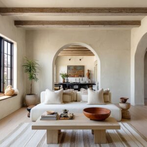
Spanish Revival starts with the shell. That shell may be a barrel vault, a row of timber beams, a curved plaster tunnel, a heavy arch sequence, or a nested arch around a window or door.
In every case, the design gets its identity from the architecture before any cabinet finish or hardware choice enters the story.

This matters because it keeps the style from feeling pasted on. A kitchen starts to feel convincing when the arches look built into the house, not added later as decorative symbols.
Thick plaster edges, deep openings, and shaped ceilings do far more for Spanish Revival character than themed cabinet fronts ever will. This also explains why some kitchens feel memorable even with very plain cabinetry.
The shell already carries enough weight. The fitted parts do not need to shout.

2. Use arches in different ways, not one way over and over
Arches should not necessarily repeat the same for the sake of repetition. Each curve can have a different role.
One arch frames the foreground. Another spans the ceiling.
Another holds the sink wall. Another marks a rear door.
Another forms a service niche. Another links the kitchen to a dining room or terrace.

That variation gives the room hierarchy. The space feels layered because each opening does a different job.
If every arch has the same scale, same thickness, and same purpose, the room starts to flatten into a motif instead of a spatial idea. A Spanish Revival kitchen feels richer when the arches create sequence, depth, and pause points.
The room then carries real architectural rhythm, not a theme.

3. Simplify the hood, but keep its mass
The hood remains one of the clearest Spanish Revival signals, but it has changed. It is rarely the ornate showpiece that older interpretations often favored.
Instead, there are a few simpler families: plain plaster mass, faceted plaster volume, stone-clad hearth wall, or a hood merged into a larger corner of the shell. That change is a major reason the style feels more current.

A broad plaster hood with softened edges can still hold the historical memory of a thick masonry house, but it does not crowd the room with trim, tile borders, or decorative linework. A faceted hood works especially well in rooms with more fluid ceiling curves because it introduces a firmer geometry.
A stone hearth-like hood wall gives the kitchen a deeper center of gravity, especially in more earthy or moody versions of the style. The important point is not to make the hood small.
It is to make it clear. Large, calm, and well-proportioned usually works better here than highly dressed.

4. Replace surface decoration with carved depth
Wall thickness feels more persuasive than decorative pattern. The kitchen designs that feel most rooted often use carved service niches, recessed shelf moments, arched sink alcoves, nested openings, or secondary prep zones tucked into wall depth.
These moves do much of the work that a busy backsplash or ornamental range wall might have done in another kitchen, but in a far more architectural way.

A carved recess immediately changes how the room is read. It makes the wall feel substantial.
It gives shadow somewhere to gather. It creates a sense that the kitchen belongs to a thick-walled house rather than a flat room with applied styling.
The Spanish Revival kitchen idea is to turn at least one flat wall into a deeper spatial moment. That one move can shift the whole room.

5. Give pale kitchens a dark stopping point
Bright kitchen ideas usually use creamy plaster, pale wood, muted stone, and a narrow warm-neutral palette. That can look beautiful, but it also creates a risk.
Without enough contrast, the whole room can blur into one soft field. A successful answer is a dark stopping point.
Often that can come in the form of a black or dark bronze framed door at the far end of a galley, a dark arched window, a darker island base, dark pendants, or a deeper timber element overhead. These darker notes should not scatter all over the room.
They can be placed where the eye needs structure.

This is a very effective modern device. In a pale Spanish Revival kitchen, one dark opening can do the work of many smaller accents.
It sharpens the arches around it, strengthens the axis of the room, and keeps the palette from drifting into something generic.

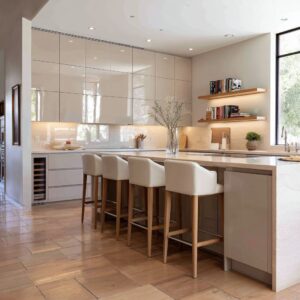
6. Decide which kind of island the room wants
The islands in modern Spanish Revival style mostly fall into three design ideas, and that distinction is useful because each one changes the tone of the kitchen.

The social slab
This is a long island that acts as a prep area, serving edge, seating zone, and gathering surface all at once. It suits larger hall-like kitchens where daily life is meant to unfold in the center of the room.

The built mass
This is the more monolithic island, the one that feels architectural rather than furniture-like. It works well in rooms with strong plaster shells, rough material weight, or deeply reduced detailing.
It gives the kitchen gravity.

The hybrid furniture-table
This sits somewhere between island and communal table. It often works well in kitchens that want to feel softer, more domestic, or more connected to dining life.
It keeps the room warm and usable without losing architectural presence.

The island should not be chosen by habit. It should match the shell and the social life of the room.
A heavy monolithic island in a gentle family kitchen may feel too stern. A casual furniture-like island in a monumental vaulted room may not hold enough weight.

7. Let texture do more work than color
One of the most striking patterns is how narrow the palettes usually are. Spanish Revival designs do not depend on big jumps in color to feel layered.
Their richness comes from texture, relief, and material contrast. That richness often comes from combinations such as:
- smooth plaster against ribbed or fluted wood
- rough stone against disciplined cabinetry
- terracotta or brick flooring against pale plaster walls
- dark timber overhead with lighter stone below
- woven stools or pendants against solid counters and walls
- matte surfaces catching daylight at different intensities
This is one reason the designs feel calm without feeling blank. They are not flat monochrome interiors.
They are tactile interiors with tight color control. For Spanish Revival kitchens, this is a powerful direction.
Instead of trying to make the room lively through many finishes, keep the palette close and let the materials separate themselves through touch, grain, shadow, and weight.

8. Concentrate rustic weight instead of spreading it everywhere
Spanish Revival kitchen ideas with heavier old-world character all follow one useful discipline: they concentrate rustic or age-like weight in one or two areas instead of coating the whole room with it. That might mean:
- a rough stone wall paired with smoother cabinetry
- a terracotta floor under a calmer plaster hood
- a dark timber ceiling above a restrained lower half
- one monumental hood with very little decorative styling around it
- one coarse plaster or stone moment surrounded by quieter surfaces
This concentration keeps the room controlled. If roughness spreads across every plane, the kitchen can easily tip into costume-like rusticity.
When it is focused, it becomes much more effective. The room gets tension between heavy and light, old and edited, coarse and refined.
That tension is a major part of what makes the stronger kitchens feel believable.

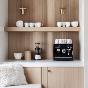
9. Push the cabinetry into a supporting role
The cabinetry should support the interior design rather than dominating it. That does not mean the cabinets are unimportant.
It means they are usually quieter than the shell. Pale integrated wood, flatter faces, lightly framed doors, limited hardware, and visually lighter uppers all appear again and again.
Even in darker kitchens, the cabinetry should stay disciplined enough not to compete with the arches, hood, or ceiling geometry.

This is a major shift from more theme-driven versions of the style, where cabinet detailing, decorative trim, and historic references can become too insistent. Here, the cabinets are often there to anchor, warm, and organize the room, not to narrate the style on their own.
A Spanish Revival kitchen gets much stronger when the viewer notices the wall mass, vaults, thresholds, and light first, then discovers the cabinetry as part of that whole.

10. Let the kitchen belong to the house
Kitchens are often not isolated. They connect to dining areas, terraces, sitting rooms, pantry-like secondary zones, or a chain of other shaped spaces.
This connection is one of the reasons kitchen designs feel rooted. Spanish Revival style works better when the kitchen feels embedded in the architecture of the house.
A rear arch leading to a dining room, open arched doors to a garden table, a service niche tucked behind the main island zone, shallow steps up to an adjacent room, or even just a visible continuation of arches into the next space can all deepen the effect.

This also makes the kitchen feel more current because modern use patterns are social. People want rooms that support gathering, overlap, and movement between cooking and living.
The style becomes stronger, not weaker, when it joins that kind of life.

11. Keep decorative styling on a short leash
Modern Spanish Revival kitchen ideas do not rely heavily on patterned tile as the main event. They do not fill every surface with ironwork, ornate corbels, carved trim, or heavily dressed countertops.
They do not need loud backsplash stories or many competing object layers. Instead, a few boards, bowls, branches, vessels, or woven pieces are usually enough.

That restraint is critical because it leaves room for plaster mass, wall thickness, and natural light to stay visible. Spanish Revival kitchens lose something important when every counter and wall becomes another display surface.
The style starts to feel much stronger when the room is allowed to breathe.

12. Choose the version of Spanish Revival that matches the life of the home
There are 6 design families, and each one answers a different desire.
Bright shell-first kitchens
These are the right fit for people who want a clean, airy, architectural look with pale plaster, long sightlines, and a dark framed endpoint.
Carved thickness kitchens
These work well for anyone drawn to old-house feeling, depth, and a quieter kind of richness built through niches, reveals, and wall mass.
Moody grounded kitchens
These suit people who want a darker, more intimate, more gallery-like version of the style, where shadow and contrast play a larger role.
Material-heavy kitchens
These are for homeowners who want stone, terracotta, heavy timber, and hearth-like gravity, but in a more edited, controlled way.
Social hall kitchens
These speak to homes where the kitchen is the center of gathering, whether through a long island, a communal table, or a sequence that links cooking with dining.
Soft everyday kitchens
These are the most approachable, especially for open-plan living or family-focused homes. They use lighter beams, woven textures, moderate-scale islands, and gentler Spanish Revival cues without losing the style entirely.
This matters because there is not one correct Spanish Revival kitchen. There are several strong versions.
The best choice depends on whether the room needs brightness, intimacy, material gravity, family ease, or a more social center.

Common mistakes to avoid
One common mistake is asking the cabinetry to carry too much of the identity. Another is repeating arches without giving them different roles.
A third is overloading the room with rustic notes so that every surface tries to feel historical at once. Another is using a pale palette without any dark punctuation, which can flatten the room.
And perhaps the most frequent misstep is forgetting thickness. Without deep reveals, a substantial hood, a carved niche, a layered threshold, or a real vault, the room can drift toward generic warm transitional design.

Beautiful Spanish Revival kitchen designs avoid all of that by staying focused. They choose one major heavy move, one clear social center, one controlled palette, and one or two strong contrast notes.
Then they let the architecture stay visible.

The takeaway
One conclusion stands above the rest: the strongest Spanish Revival kitchens today are not built from many scattered style signals. They are built from a few concentrated ones.
Plaster mass. Deep arches.
Thick openings. A hood with real presence.
A framed threshold. Tactile but limited materials.
An island or table that supports how people live now. A palette tight enough for texture and shadow to matter.
That combination is what keeps the style alive.
The kitchen still carries the memory of age, but it does not feel stuck there. It feels shaped, grounded, and current at the same time.
And that is exactly why this direction works well now.