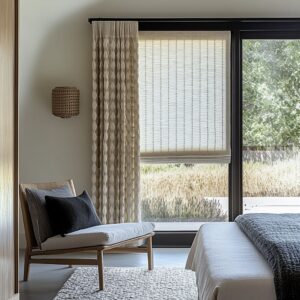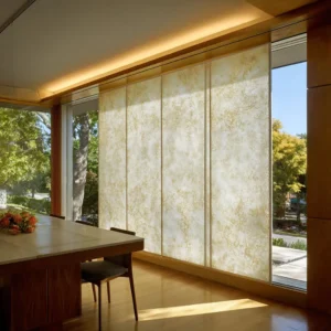
A shoreline mood enters a room at the opening, not on the nightstand. That idea changes almost everything about coastal decorating.
It shifts attention away from shells, ropes, coral motifs, striped pillows, and other objects that try to announce a setting. It turns the window into the main place where coastal atmosphere can be built with restraint.
The room begins to feel informed by glare, air, woven shade, sun-faded cloth, dry fiber, and softened edges. The coast arrives as a condition rather than a theme.
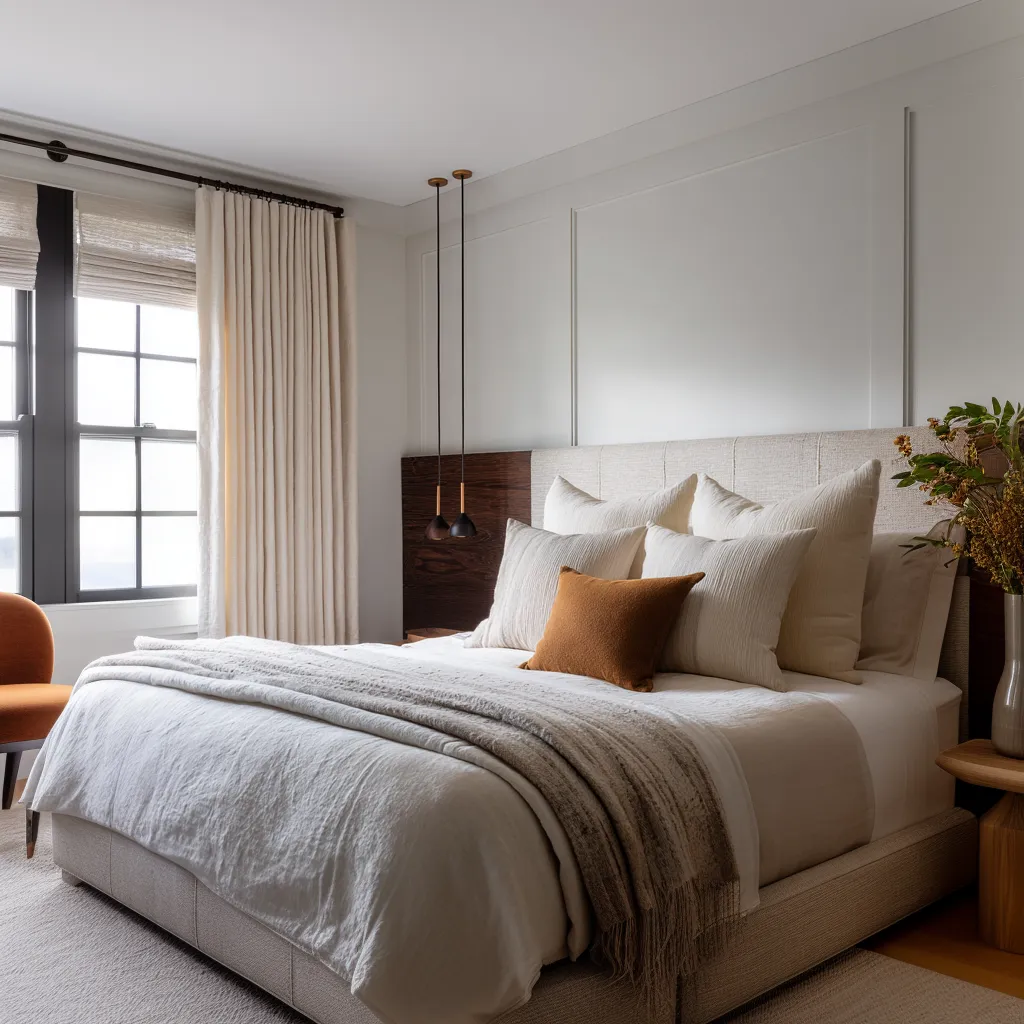
Bedrooms can feel touched by shoreline life even though they contain nothing obviously marine. Their identity is carried by pale linen, filtered brightness, fibrous layers, and the way the opening mediates between shelter and exposure.
Instead of performing a beach story, the window treatment handles light the way a shore house might need to handle light. It reduces glare without shutting the room down.
It gives fabric a role that is both atmospheric and practical. It lets the opening feel less like a framed rectangle and more like a zone where daylight is received, softened, thinned, and slowed.
That shift from object language to environmental language is the real foundation of a grown-up coastal interior.
The opening matters because the shore is first experienced as climate
A room near water is rarely defined only by what it contains. It is shaped by what reaches it.
Brightness ricochets off pale ground and sky. Air carries moisture or dryness.
Surfaces bleach, warm, fade, and soften. Boundaries become visually active because they are constantly negotiating sun, reflection, shadow, and exposure.
Window treatments are a direct way to translate that condition indoors. Once this becomes the central idea, coastal design gets far more precise.
The task is no longer to make the room look seaside. The task is to make the window behave as though it belongs to a bright edge condition where cloth, wood, and filtered light are in continuous exchange.
Linen becomes valuable because it receives light with a powdery, breathable softness. Woven fiber becomes valuable because it introduces the dry tactile note that warm sand colors alone cannot provide.
Roman shades become useful because they carry the logic of sun control and textile structure in one move. Sheers gain importance because they turn harsh brightness into atmosphere.
A strong coastal interior design is often less interested in what the fabric depicts than in what the fabric does.
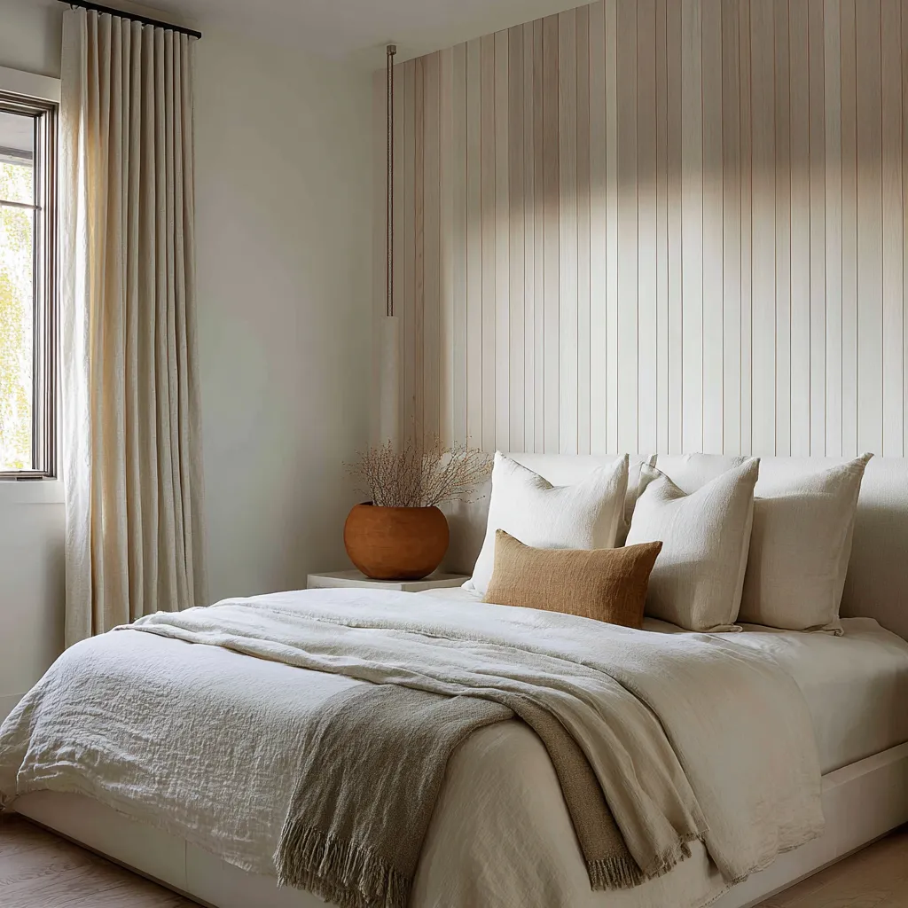
Linen is the field, not the full story
Pale linen or linen-like cloth appears again and again in successful shoreline-minded rooms for a reason. It gives the opening a washed, breathable quality that relates easily to shell tones, chalky plaster, oat upholstery, driftwood browns, pale timber, and soft daylight.
It lengthens the wall when hung high and taken to the floor. It can soften a dark frame, cool a warm wood surround, and pull bright glazing into the rest of the room without fuss.
But linen on its own does not always produce a specific coastal identity. It often creates freshness, height, and restraint, yet remains within the wider category of refined neutral interiors.
This is an important distinction. Many rooms stop at ivory drapery, a dark rod, and a few sandy accents, then wonder why the result feels pleasant but generic.
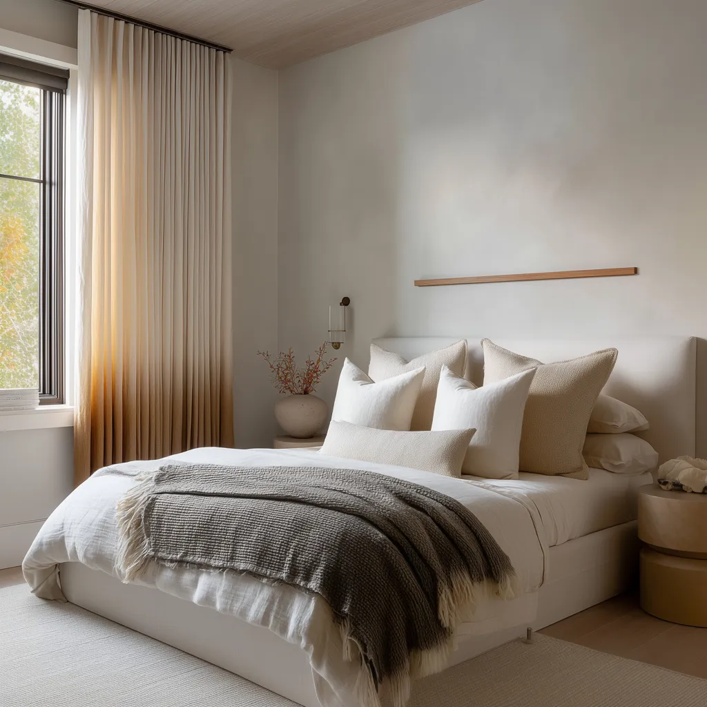
Plain linen is the base medium. It makes the room eligible for shoreline feeling.
It does not automatically create it. That is why the treatments often ask the linen to work with another condition: translucent filtering, a woven underlayer, a deeper lower tone, a Roman shade, a stitched-looking border, a top band that hints at awning cloth, or a stronger relationship to wood and structure around the opening.
Linen is the field on which these other signals become legible. Without it, the room can lose that pale air-filled quality.
With it alone, the room can remain unresolved. With it plus one deeper move, the opening begins to carry memory.
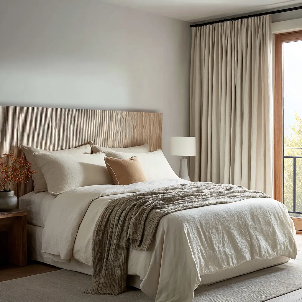
Color can suggest sand. Fiber can suggest place.
Warm neutrals are frequently used in coastal interiors, but color by itself is a weak carrier of shoreline identity. Sand, oat, straw, clay, and pale ochre can help a room move away from urban coolness or gallery whiteness, yet they do not necessarily make it feel tied to the shore.
These tones often remain merely warm unless they are attached to texture, light behavior, or material grain. Natural fiber changes that.
A woven shade introduces dry tactility in a way flat color cannot. Its irregular surface recalls reed screens, basketry, cane, raffia, rush mats, beach grass, rolled porch shades, and the hand-made practical culture that often surrounds bright coastal living.
That is where the treatment becomes more specific. The room starts referring to the material world near the shoreline rather than borrowing obvious marine symbols.
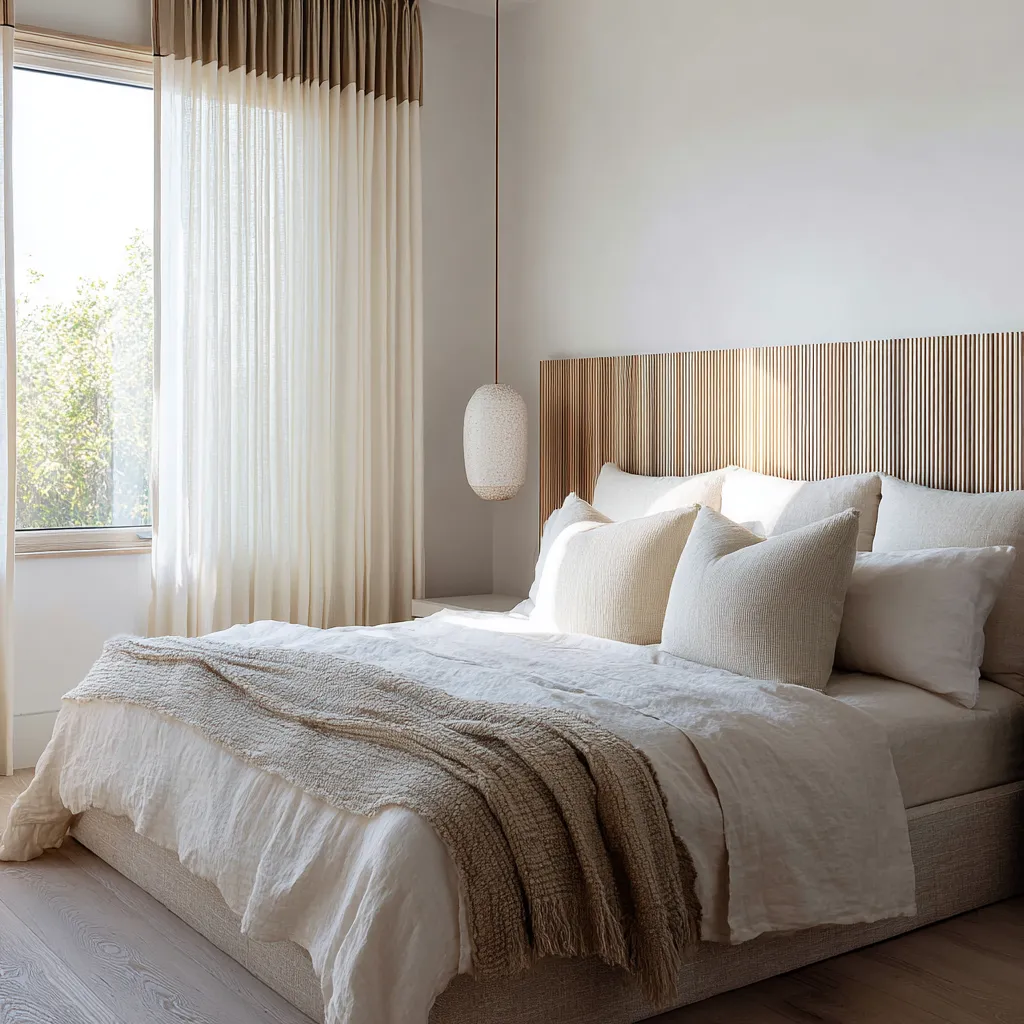
This difference is subtle but crucial. A sand-colored pillow can nod toward the beach.
A woven shade can suggest glare management, natural screening, and plant-fiber craft at the same time. One is an accent.
The other is a whole material proposition. That is why layered windows often feel richer than single-layer windows.
The woven element contributes dryness and tactility. The linen contributes softness and pale atmosphere.
Together they create a tension between structure and air, screen and veil, density and glow. That tension is deeply related to shoreline experience, where interiors often need both exposure and protection, openness and moderation.
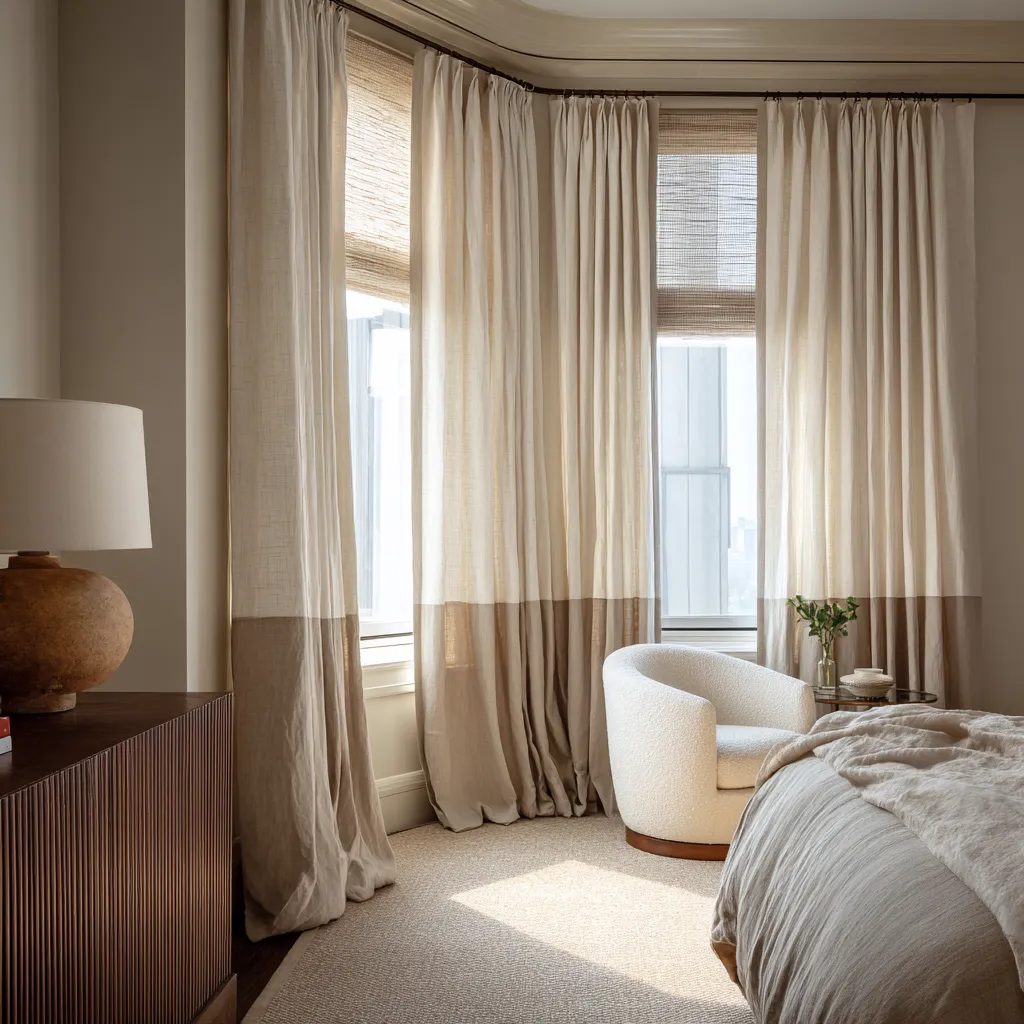
Layered Window Treatments
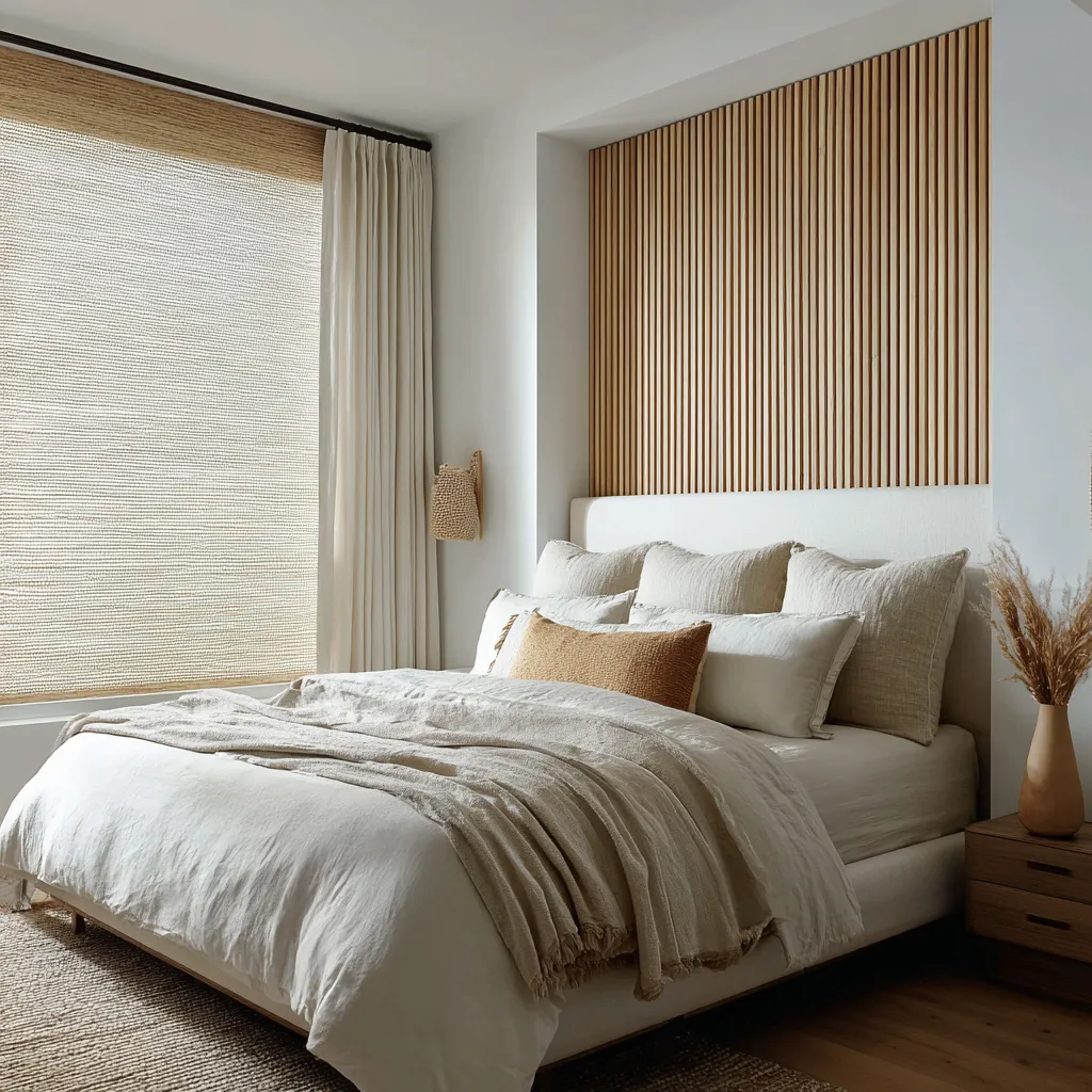
One of the moves in coastal window design is the layered treatment: woven shade plus drapery, Roman shade plus side panels, sheer curtain in front of a more tactile underlayer, or pale drapery paired with a second textile condition that changes how the light lands. Layering succeeds for two reasons.
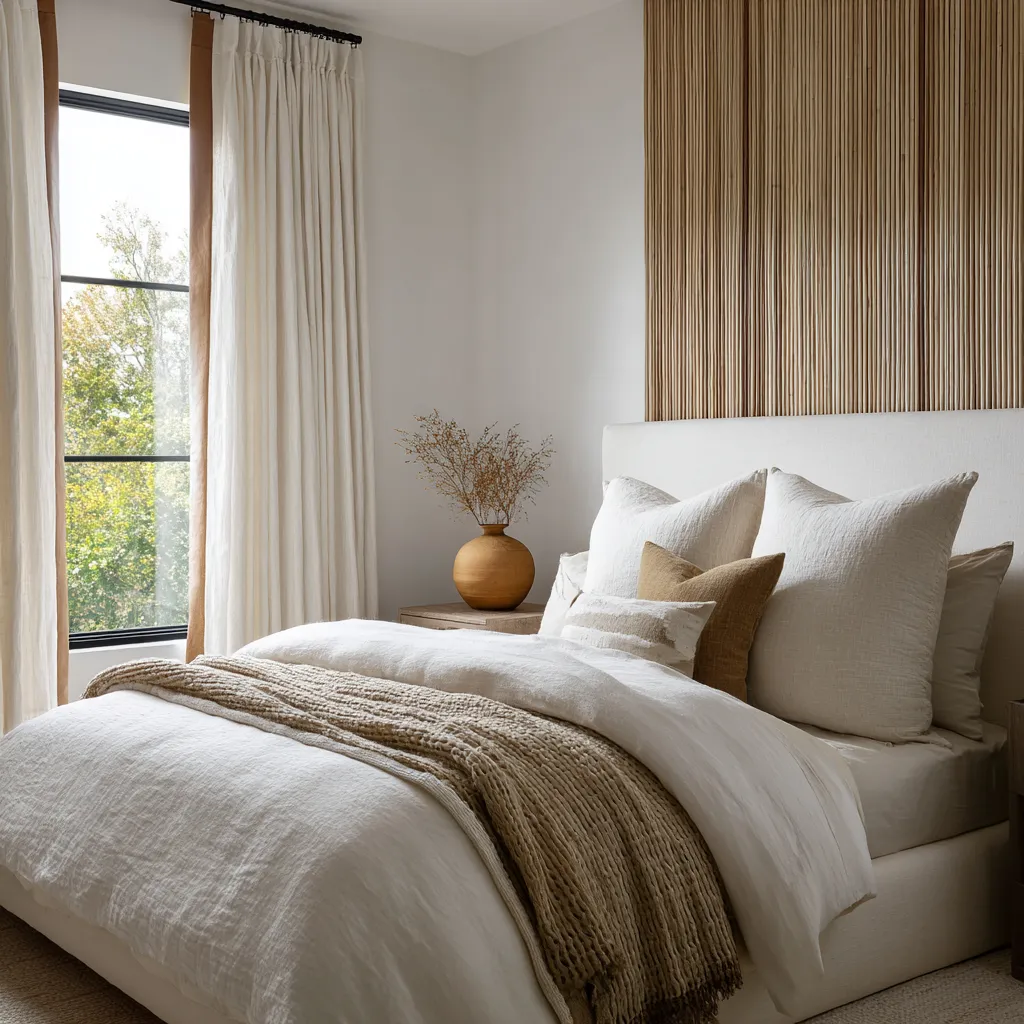
First, it divides labor. One part filters glare.
One part widens the opening visually. One part introduces a fibrous note.
One part keeps the room from going too rustic, too dry, or too heavy. This distribution of jobs makes the composition feel grounded in use.
The window no longer feels dressed for effect alone. It appears equipped for living with bright shifting light.
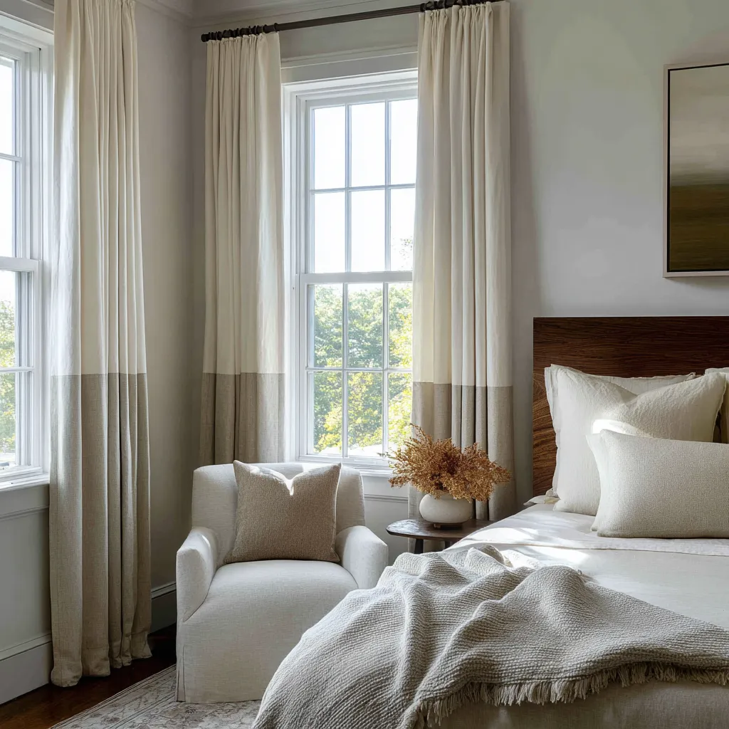
Second, layering creates material depth. Coastal rooms often become convincing when they contain a mix of values and textures that resemble the environmental layering of the shore: haze in front of stronger outlines, dry fiber against pale cloth, timber beside filtered brightness, muted warmth near the floor and lighter air above.
A single drape can offer softness. A layered treatment can offer an atmosphere with internal structure.
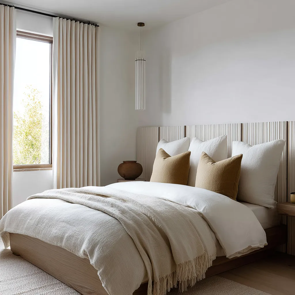
This is especially true when the layers are not equal in visual weight. A woven Roman shade set inside the opening can do the central work of controlling daylight while side panels remain lighter and less dominant.
Or a sheer outer layer can soften the room while a denser shade behind it holds the glare. This imbalance is often what makes the treatment feel sophisticated.
Each layer has a role, and the roles are not redundant.
Sheerness does something deeper than adding softness
Sheer and semi-sheer fabrics are often discussed as if their purpose were simply romantic softness. In shoreline-minded interiors, their function runs deeper.
They transform luminous density. That transformation matters because light near water is rarely neutral.
It widens. It bounces.
It diffuses. It can feel chalky, misted, reflective, or thinly veiled even on bright days.
A dense blackout drape blocks that condition. A sheer receives it and reworks it.
The opening becomes less of a hard bright cutout and more of a permeable membrane. Daylight glows through cloth rather than striking the eye directly.
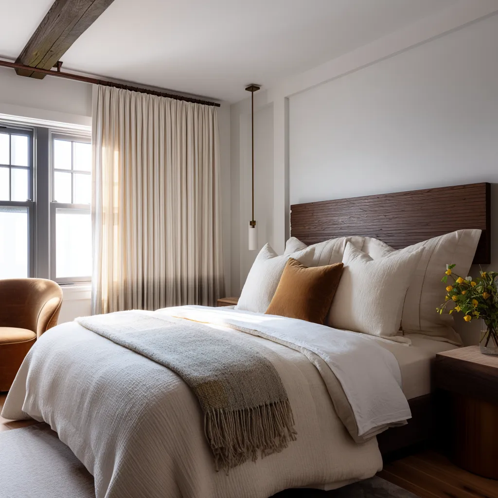
This is a persuasive way to introduce a shoreline mood without any overt reference to the coast. The room begins to hold marine brightness as atmosphere.
The window treatment turns light into a material presence. That is why sheer linen panels, semi-transparent weaves, or lightly filtered inner curtains often feel so effective in bedrooms with coastal leanings.
They do not merely soften a room’s appearance. They change how the room experiences its own daylight.
The shift is environmental, not decorative. Used well, sheerness also broadens the perceived zone of the opening.
The glass may be relatively narrow, but the light field feels larger because the drapery extends its presence outward. This is highly valuable in bedrooms, where one often wants the sense of air and glow to exceed the exact size of the window.
The lower portion of the drape can carry land, weight, and shore structure
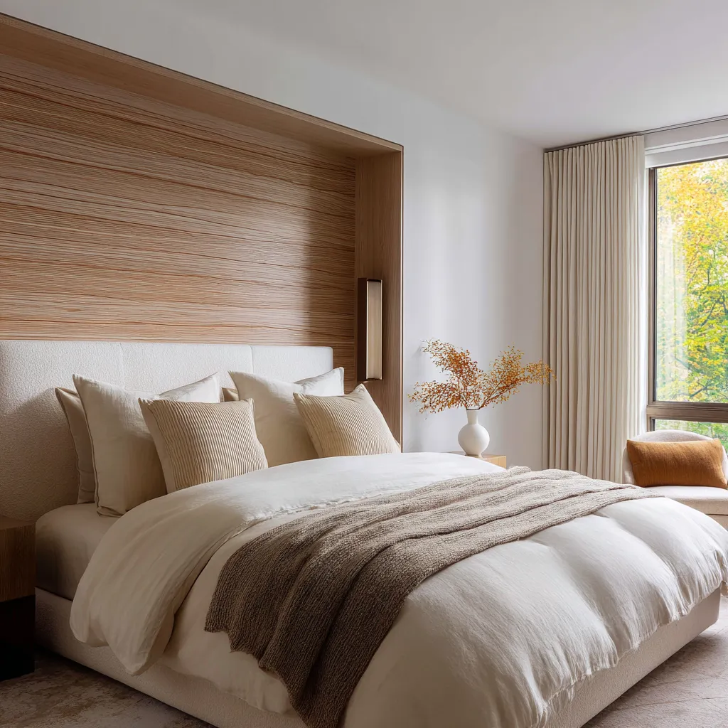
A particularly intelligent coastal move is tonal darkening near the bottom of the curtain. This can take the form of a lower band, a soft value shift, a smoky descent toward the hem, or another low-placed change in density.
The effect is much stronger than simple contrast for its own sake. It works because shoreline environments are organized by value changes.
Air and brightness tend to dominate the upper field. Near the ground, matter gathers.
Dry sand becomes compacted sand. Light openness becomes denser texture.
Haze gives way to residue, shadow, and weight. A drape that darkens near the floor borrows that logic.
It lets fabric hold both openness and gravity.
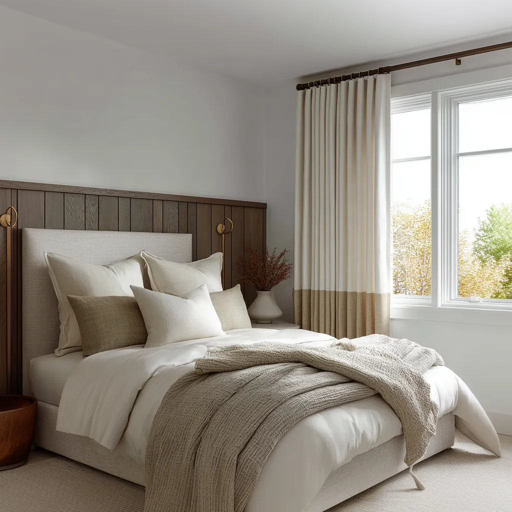
This is why bottom-darkened curtains often feel more coastal than plain ivory ones, even when their palette stays very restrained. The drape stops being a single neutral plane and starts carrying a mild landscape memory.
The lower zone grounds the room. The upper zone remains light-filled.
The treatment hints at a threshold between air and material without turning into overt scenery. The key is subtlety.
When the contrast becomes too graphic, the effect can harden into decoration. Softer tonal shifts tend to work better than sharp high-contrast blocking.
A gradient is often especially persuasive because it feels less designed as a motif and more like a natural transition. It can suggest wet sand, shadow accumulation, or the way atmospheric brightness slowly thickens near the earth without announcing itself.
In a room that already contains pale bedding, ribbed wood, or warm mineral notes, this move can be enough to push the whole composition from refined neutral into shoreline-aware.
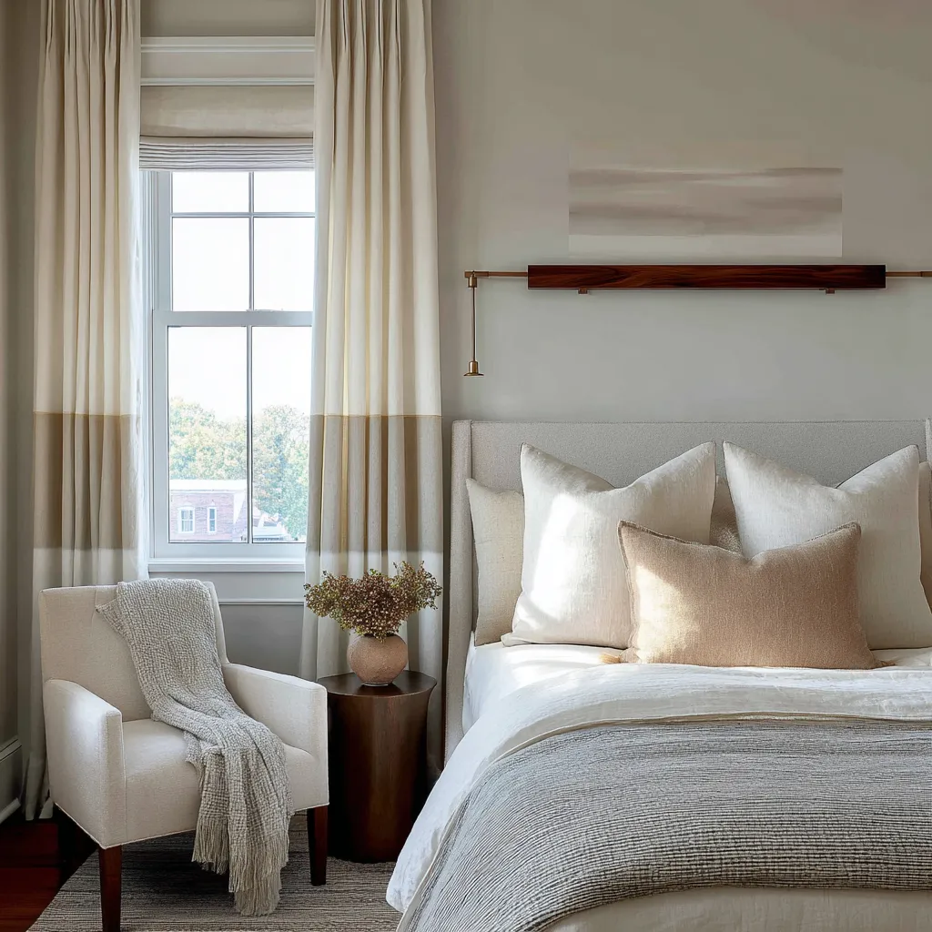
Roman shades bring structure, climate logic, and material memory together
Roman shades are unusually useful in modern coastal rooms because they bridge architecture and cloth. Their stacked folds hold a more deliberate line than loose drapery, which gives them an immediate sense of order and purpose.
They also belong directly to the opening, so they feel tied to light control rather than added afterward. That directness matters.
A Roman shade suggests a room that understands bright exposure and has a thoughtful way of responding to it. In natural fibers or pale woven materials, it can also recall awning cloth, porch shade logic, or the simple mechanics of screening and shelter near strong daylight.
It connects to the practical side of coastal living without becoming rugged or literal.
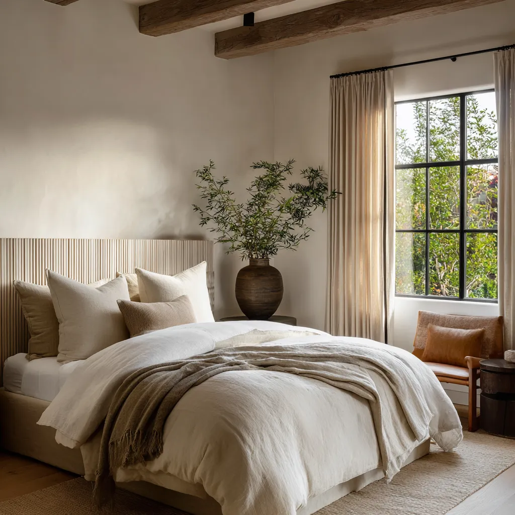
Roman shades are particularly effective when paired with side drapes. The shade manages the brightest zone in the center.
The drapery softens the edge condition and extends the vertical calm of the room. This combination produces an appealing duality: horizontal compression at the opening, vertical fall at the perimeter.
The meeting of these two rhythms often feels more resolved than drapery alone. In rooms with slatted walls, ribbed headboards, paneled timber, or finely lined architectural surfaces, the Roman shade can join the language of structure while the drapery preserves softness.
That makes the whole installation feel integrated rather than merely decorative.
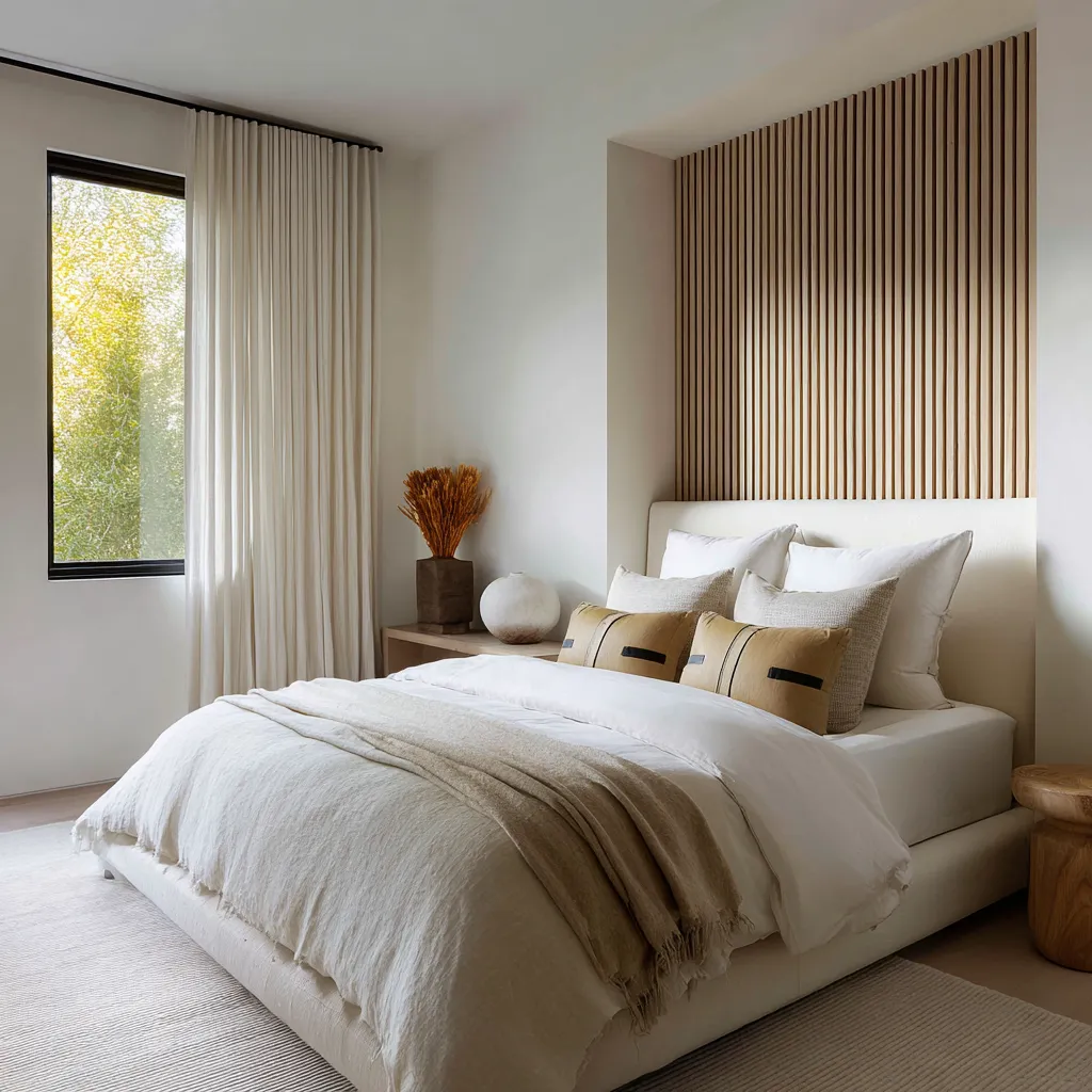
A dark rod helps. It does not carry the coast.
Dark rods and dark window frames often appear in strong shoreline-minded bedrooms, but their function needs to be understood correctly. They sharpen the composition.
They contain pale cloth. They add discipline.
They stop the room from washing out into vagueness. They create a punctuation mark against bright fabric and white walls.
What they do not do is generate coastal identity on their own. This distinction saves many rooms from overestimating the power of black accents.
A dark rod with pale linen can look crisp and current. It can anchor the treatment.
Yet without another stronger carrier—woven texture, sheerness, a layered system, tonal stratification, Roman filtering, or a strong threshold relation—it often remains simply modern. Dark framing works as support.
It outlines the field so subtler material effects can register. It acts like a graphic edge against which haze, fiber, pale cloth, or warm timber can become more legible.
In some rooms a wood rod can perform a related role with a different emotional temperature. Black gives sharper containment.
Dark wood adds age, tactility, and a closer relation to joinery and natural material wear. The key point is that the rod is punctuation, not the sentence.
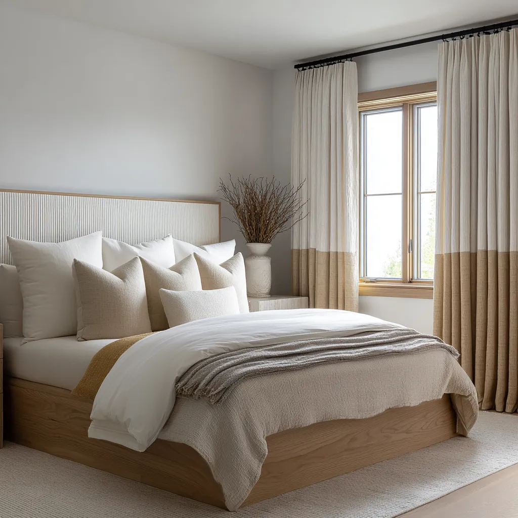
The design around the window has to agree with the treatment
Window treatments do not establish shoreline atmosphere in isolation. Their meaning is strengthened or weakened by the surfaces beside them.
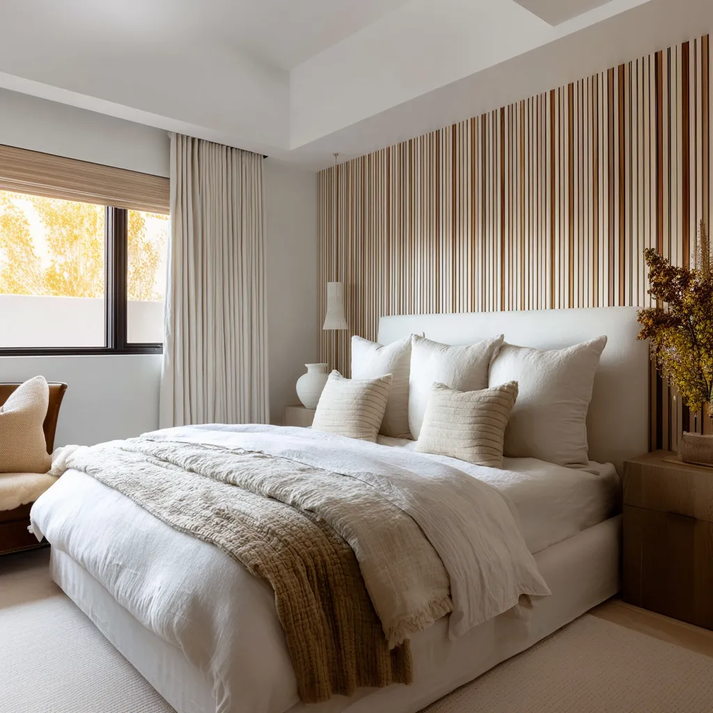
A pale drape near a slatted wall can evoke the meeting of cloth and vertical timber. Beside a ribbed panel, it can echo reed-like repetition in a softer register.
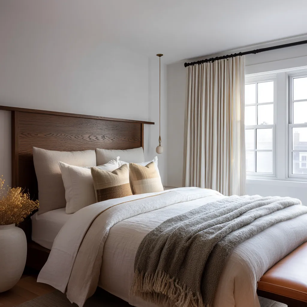
Next to a warm wood frame, it can suggest sun on joinery and cloth at the edge of shelter. Against white trim and dark muntins, it can expand the sense of a bright opening while preserving architectural clarity.
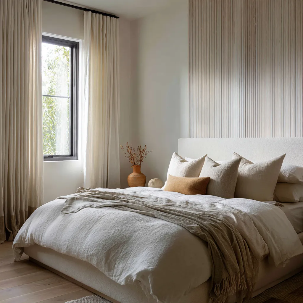
This is why so many successful coastal interiors rely on the relationship between the treatment and nearby vertical rhythms. Slat walls, narrow ribbing, boards, cane textures, grasses in vases, and even certain stitched or banded textile details all reinforce the idea that the room is borrowing from the structural and fibrous world around the shore.
The references do not need to be explicit. They only need to build a family resemblance among cloth, wood, and light.
Warm earth accents can help at this stage, though they are rarely sufficient by themselves. A clay vessel, ochre pillow, dune-toned throw, flax bench cushion, or weathered brown wood base can make the drapery feel less abstract and more connected to dry matter.
These notes tie the airy field of the window back to ground, grain, and touch. Their role is modest but useful.
They stabilize. They do not lead.
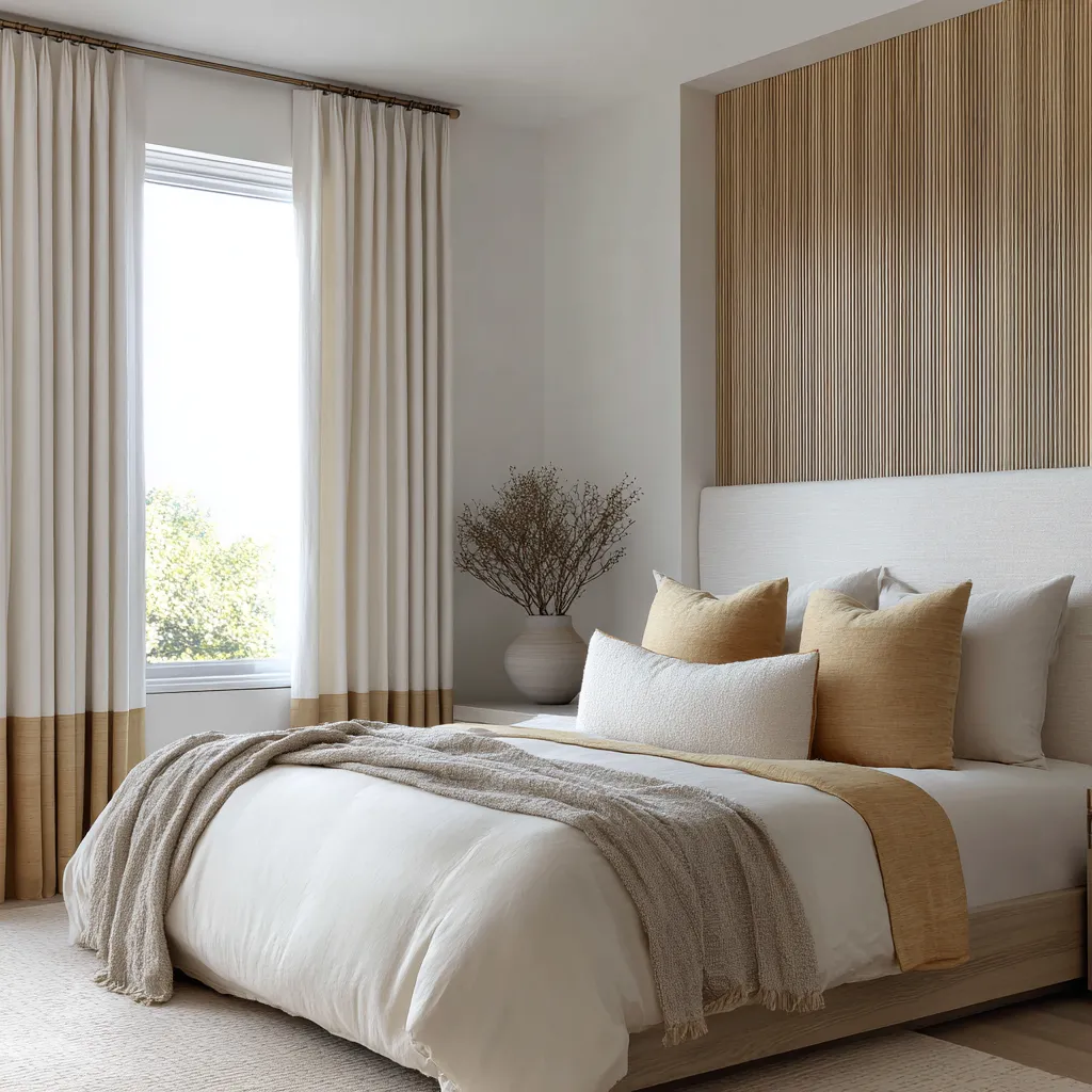
Coastal windows can behave like shelter devices
Some shoreline-minded treatments hint at awnings, shade cloth, protected porches, or overhead cover without literally imitating them. This can happen through a top band, a Roman shade, a beam relation above the opening, reinforced side edges, or other details that make the window feel prepared for sun rather than merely decorated.
This is an especially mature direction for coastal design because it treats the treatment as equipment as well as atmosphere. The cloth seems there because the room needs a way to mediate bright exterior conditions.
That gives the composition credibility. Every cue feels environmentally justified.
Once that happens, the room stops looking arranged around a style label. It starts feeling shaped by a believable life near brightness, air, and exposure.
The treatment might refer softly to cabana cloth, stitched canvas, screen logic, or porch shade, yet the result stays refined because the reference remains abstract and use-based. This is a powerful alternative to theme-heavy styling.
It keeps the shoreline mood connected to how people live with sun and boundary rather than to how they decorate for a seaside fantasy.
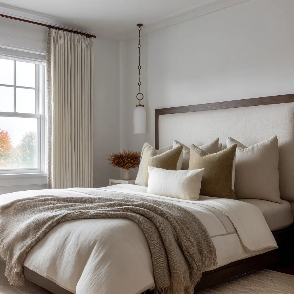
A useful order of decisions
Coastal interior designs lose force because decisions are made in the wrong order. The visual stabilizers come first: black rod, pale curtain, sandy pillow, wood bedside table.
The composition becomes clean and acceptable, but never moves into a distinct shoreline atmosphere. A stronger sequence begins differently.
Start with the baseline field: pale full-height cloth, edited palette, and some relationship to wood or warm natural matter. Then choose one move that actually carries identity.
That might be a woven shade behind the drape, a Roman shade at the opening, a semi-sheer inner layer, a soft gradient near the floor, or a subtle border that suggests reinforcement and practical cloth construction. Only after that should the stabilizers step in: dark rod, wood support, muted ochre accent, ribbed architectural echo.
This order matters because coastal feeling enters through the identity-bearing move. The stabilizers make it legible and polished.
They cannot substitute for it.
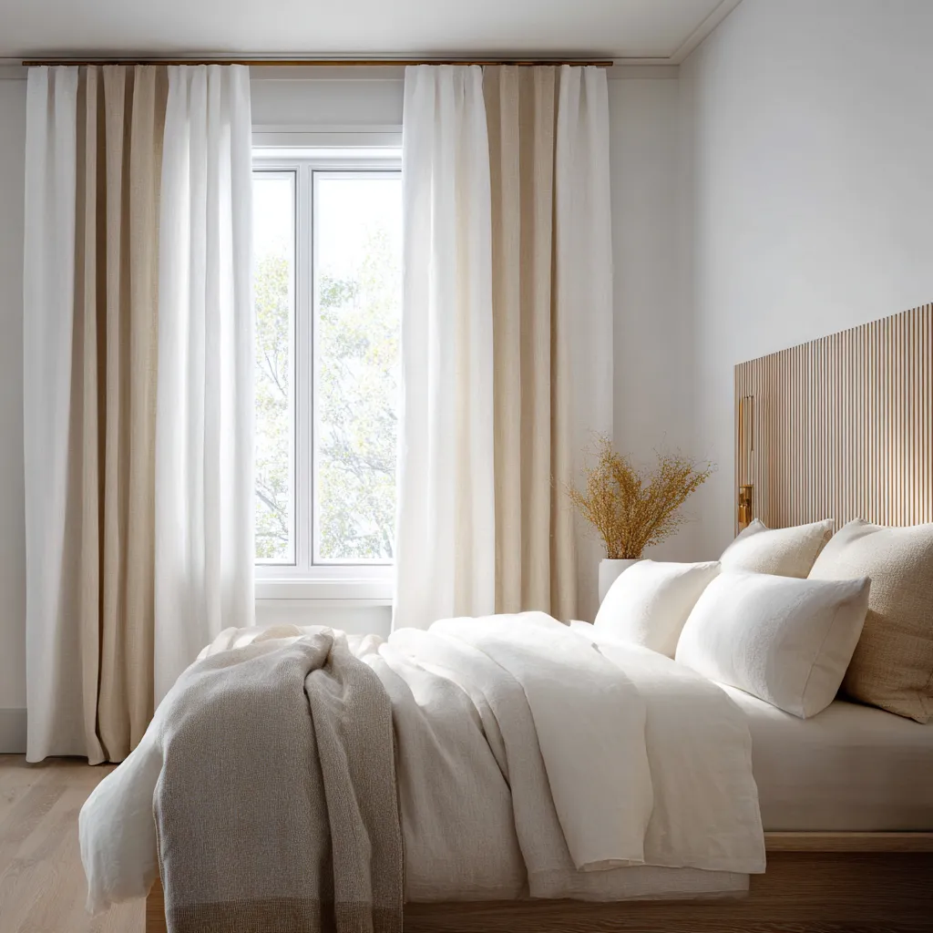
What to avoid if the goal is shoreline feeling without cliche
A mistake is to overestimate direct reference. Literal marine iconography tends to collapse the atmosphere into message.
The room becomes about what it can point to instead of what it can evoke. Another mistake is assuming that warmth alone can do the work.
Straw and dune tones help, but without fiber hierarchy or light modulation they often remain a pleasant neutral scheme. Too much rustic material can also disturb the balance.
Dry fiber is valuable, yet if every surface leans rough and warm, the room can become dense and provincial. Pale cloth is what keeps the composition breathable.
Likewise, hard contrast banding or overt nautical stripes can push the treatment toward costume. More restrained value shifts usually carry the shoreline memory with greater depth.
The target is not a room that announces the shore. It is a room that seems to have absorbed lessons from glare, washed cloth, dry vegetation, timber, and protected openings.
The coast enters through behavior
This may be the clearest way to understand the whole subject: shoreline feeling arrives through the behavior of the treatment. Linen falls in long pale fields and receives daylight with a chalky softness.
Woven shades break brightness into warmer filtered intervals. Sheers turn glare into haze.
Roman shades compress and regulate the opening. Bottom-darkened drapes let the cloth hold both air above and density below.
Dark rods or frames sharpen the whole arrangement so these softer effects do not disappear. None of these gestures need to mention the beach.
None require blue palettes or marine accessories. Yet together they can make a bedroom feel very close to shoreline life because they borrow from the actual sensory structure of coastal living: bright edges, moderated exposure, pale fabric, fibrous screens, timber nearby, and the constant work of translating exterior brilliance into interior ease.
That is what gives these rooms depth. They are not themed.
They are informed. A coastal window treatment becomes far more interesting once it stops trying to resemble the shore and starts acting as though it belongs to a room shaped by shore conditions.
At that point, linen becomes atmosphere, natural fiber becomes place memory, and softened light becomes the true decorator.