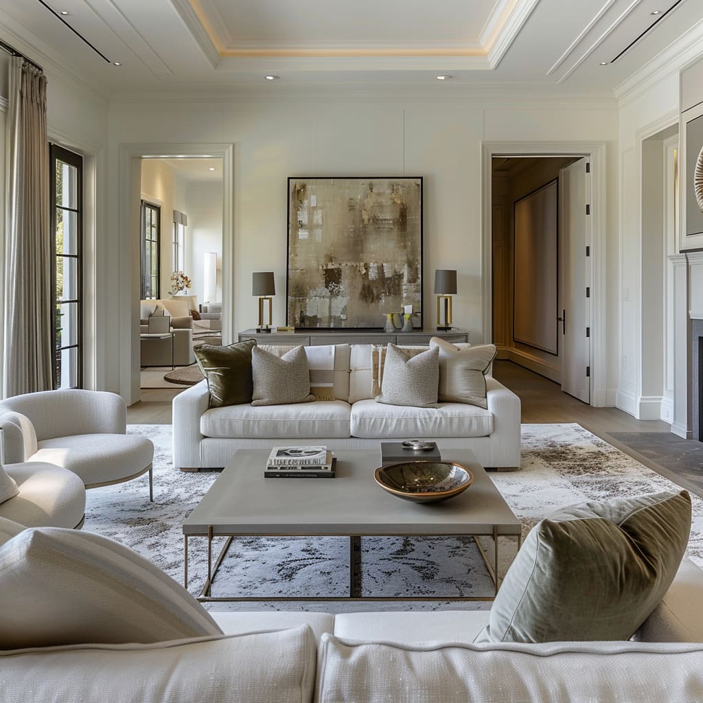
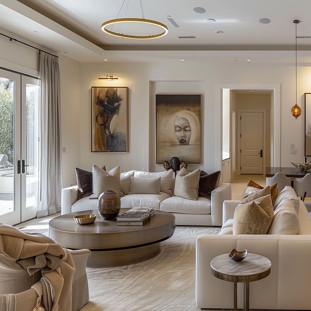
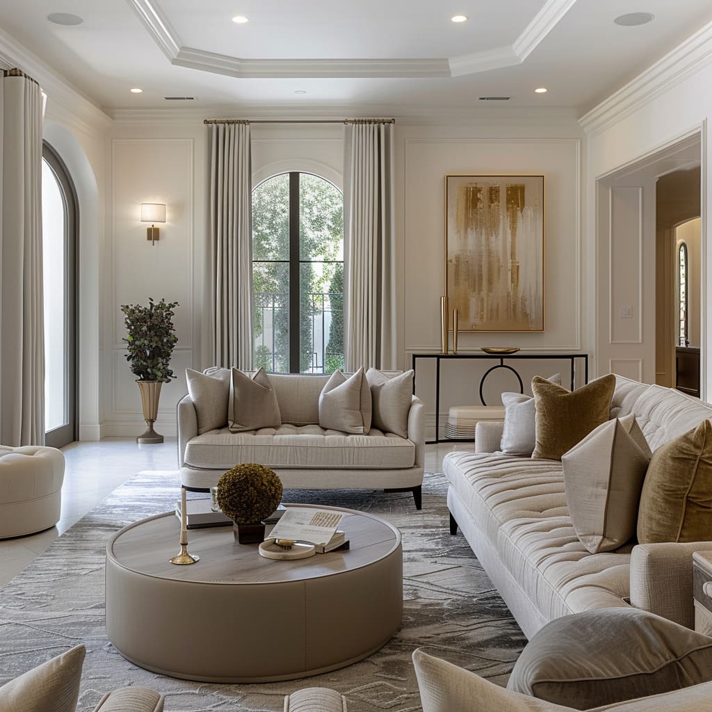
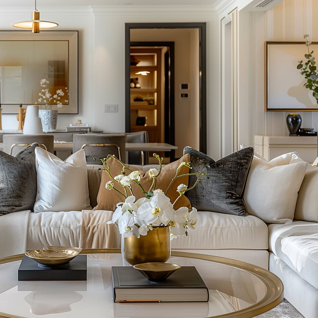
The creation of space is an art that extends beyond the mere placement of furniture and choice of color. It is a symphony of form, function, and feeling that transforms a house into a home, a room into a refuge.
This article invites you on a journey through the nuances of contemporary design, where each aspect of a room’s character is crafted with precision and intent.
Here, we peel back the layers of aesthetic allure to reveal the core principles that make modern interiors resonate with those who dwell within them. From the tangible textures that beg to be touched to the deliberate arrangements that define space, these are the elements that distinguish a thoughtfully designed environment.
The Dynamic and Sensory Experience
This section delves into how contemporary design transcends visual aesthetics to engage multiple senses, creating spaces that are as dynamic and interesting as they are pleasurable to inhabit. The characteristics in this group not only manipulate visual interest but also appeal to tactile sensations, ensuring a holistic experience.
Purposeful Asymmetry
Purposeful asymmetry serves as the heartbeat of contemporary interiors, where the eye is treated to a symphony of unconventional arrangements. It is an environment where precision is gently set aside in favor of a relaxed elegance, and irregularities become focal points that are organically woven into the fabric of the space.
This approach to design challenges the observer to look beyond the ordinary, inviting a narrative where each element contributes to a story that is both varied and harmonious.
Tactile Sensation
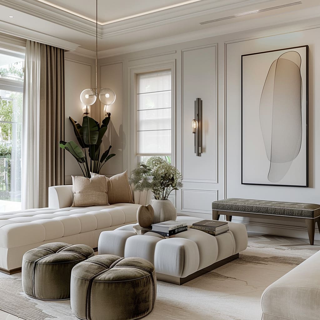
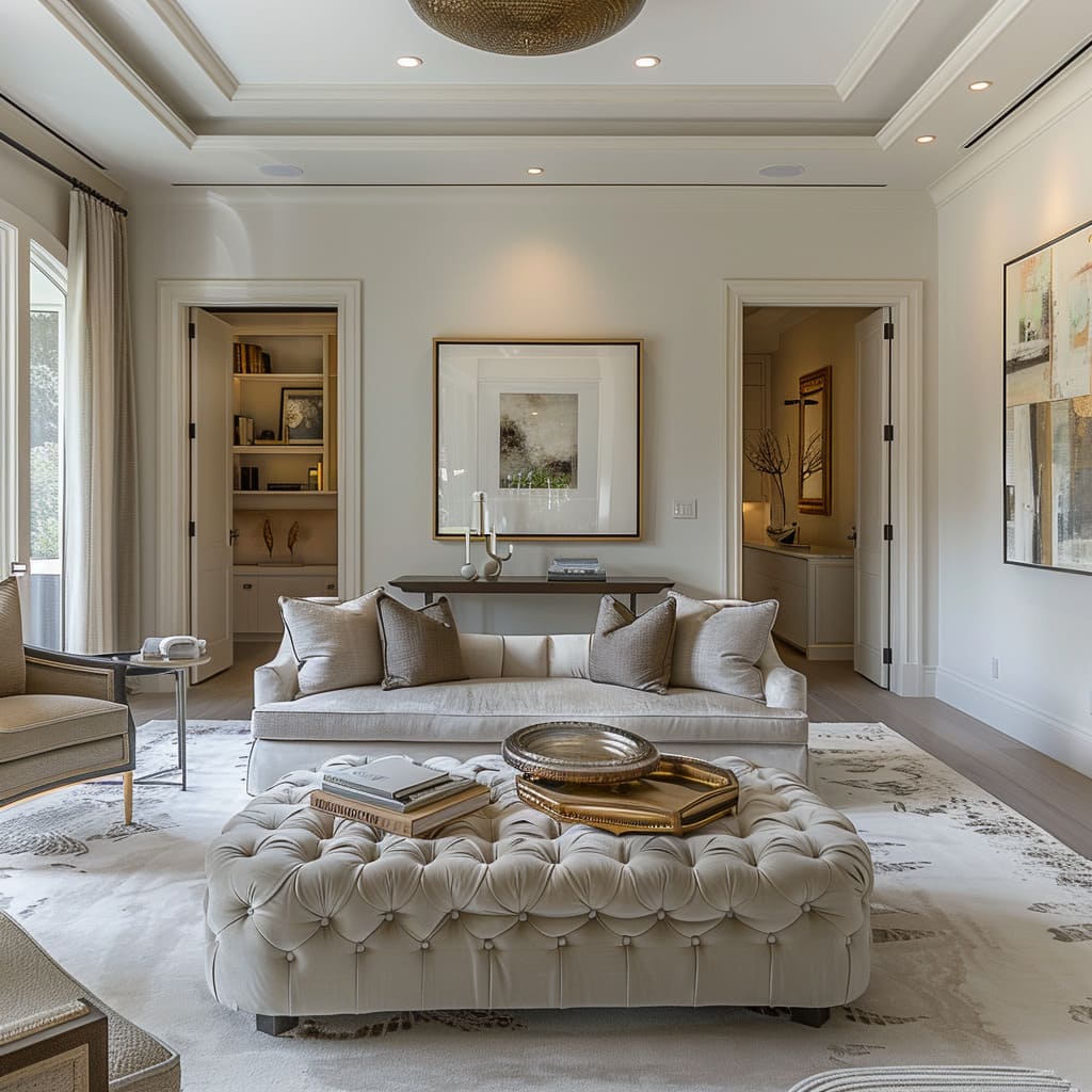
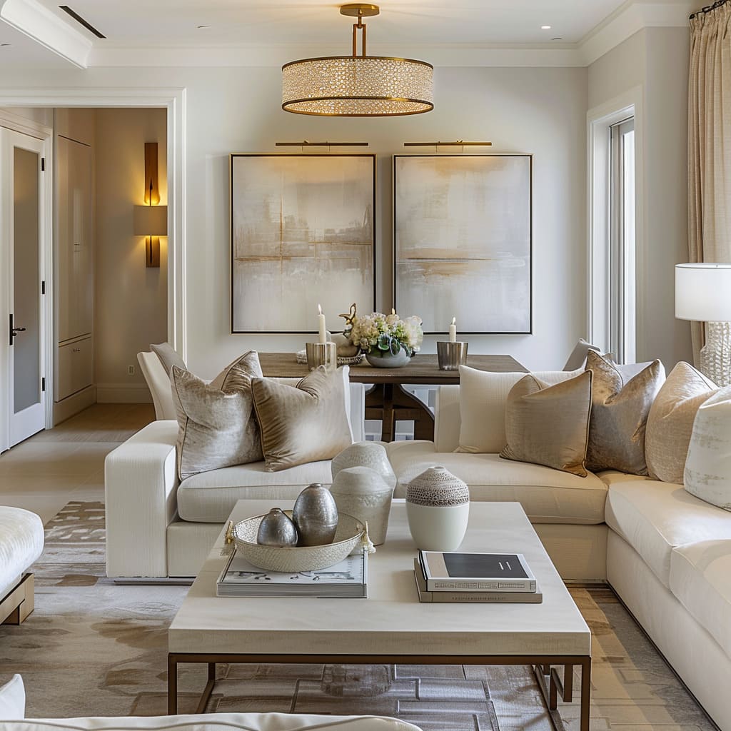
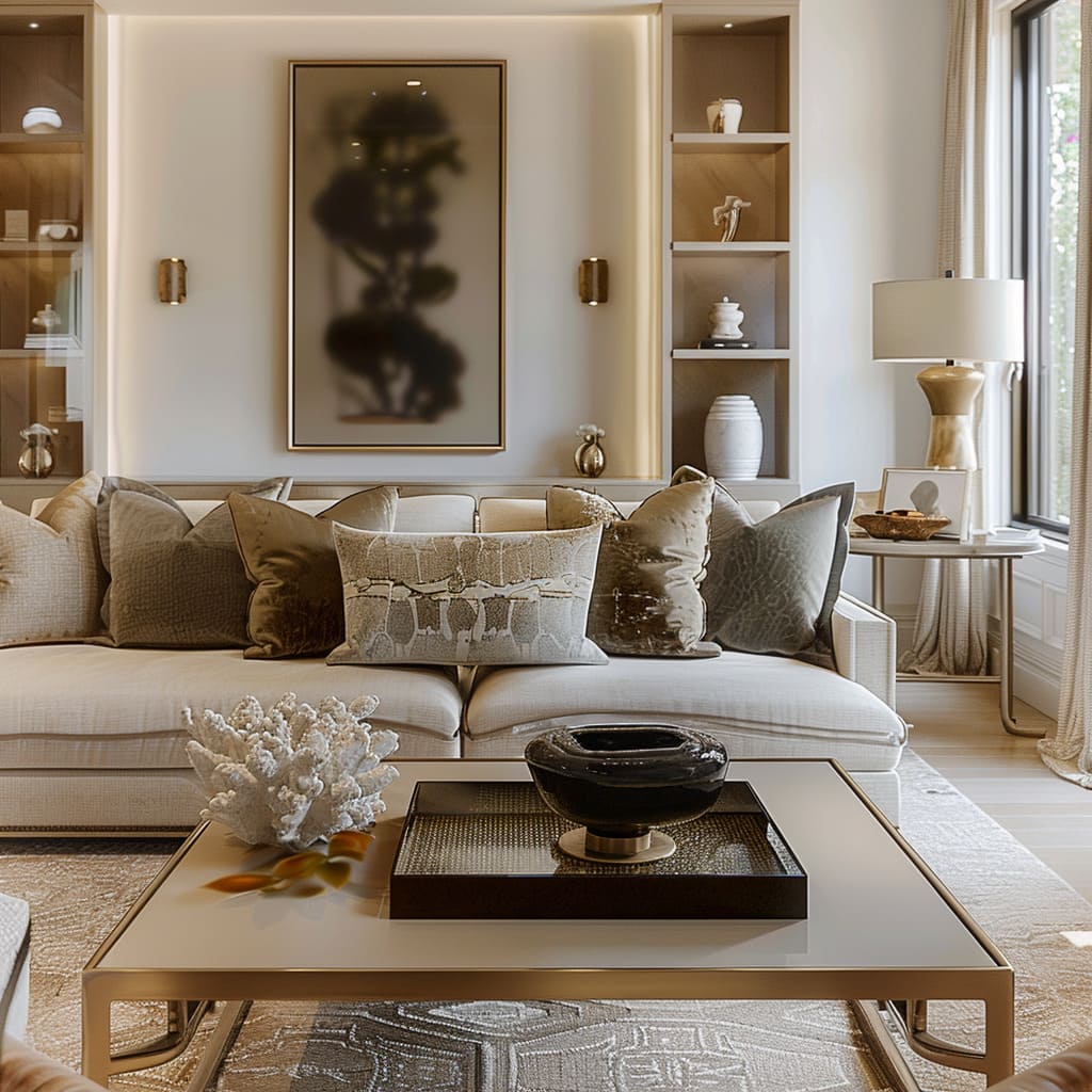
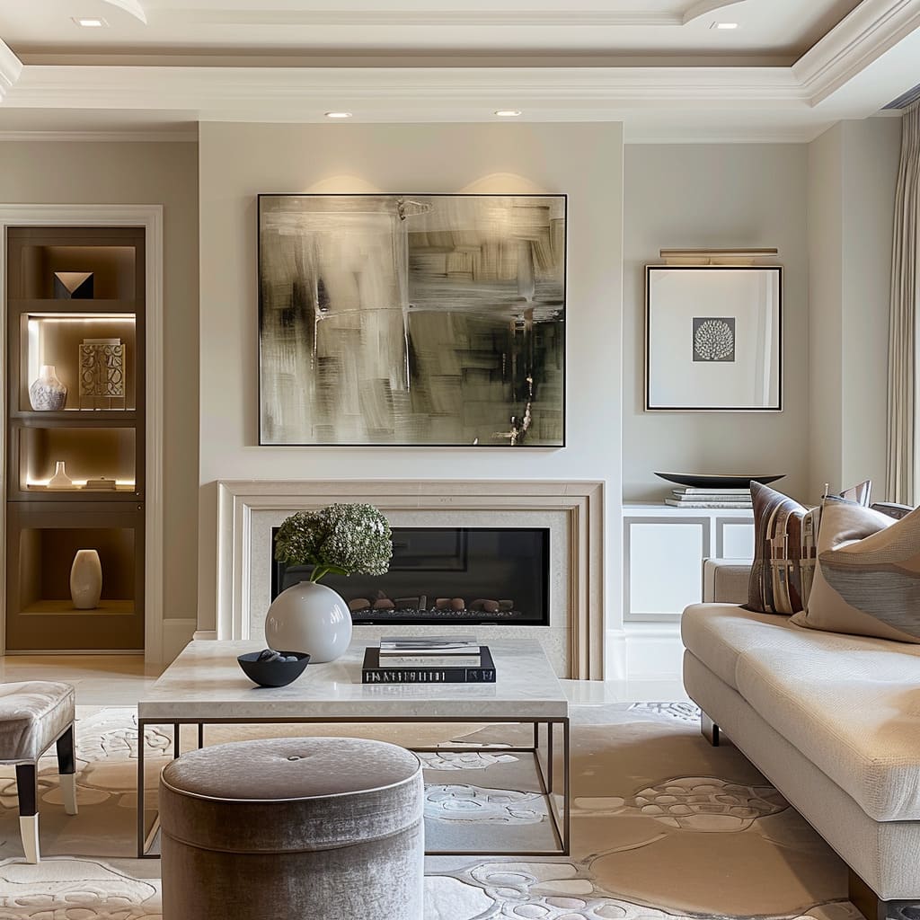
Tactile sensation in modern interiors transcends the visual to kindle a romance with touch. Textures call out for interaction, from the plushness of a brushed velvet sofa to the cool smoothness of a marble countertop, offering a repertoire of experiences within arm’s reach.
It is about creating depth and warmth, enhancing everyday interactions with surfaces that are not just to be seen but to be felt, building a profound connection between the inhabitant and their surroundings.
Fluid Spatial Transitions
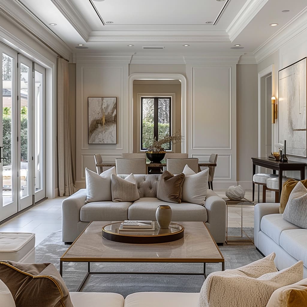
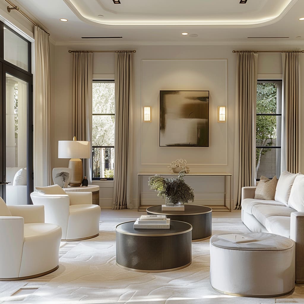
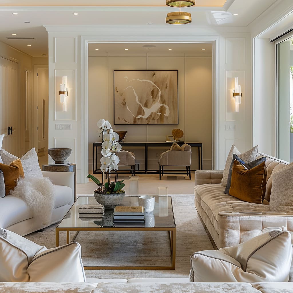
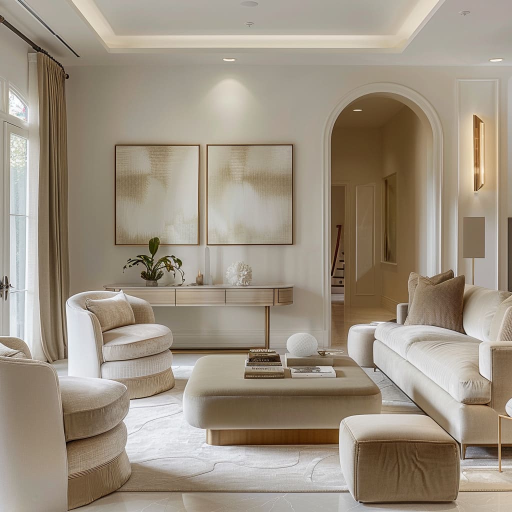
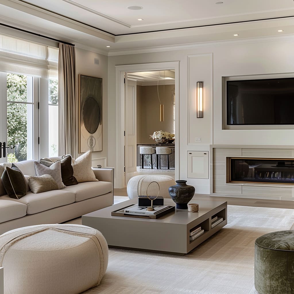
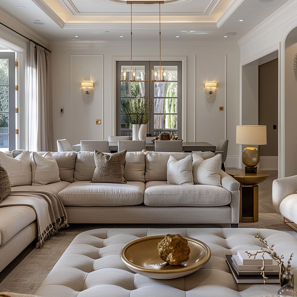
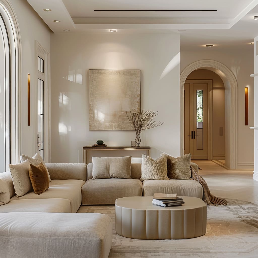
Fluid spatial transitions craft a journey through spaces with a grace that makes walls and doors seem like artifacts of the past. A consistent theme in flooring draws a gentle line from room to room, while architectural elements and furniture arrangements create invisible paths, encouraging exploration without the need for direction.
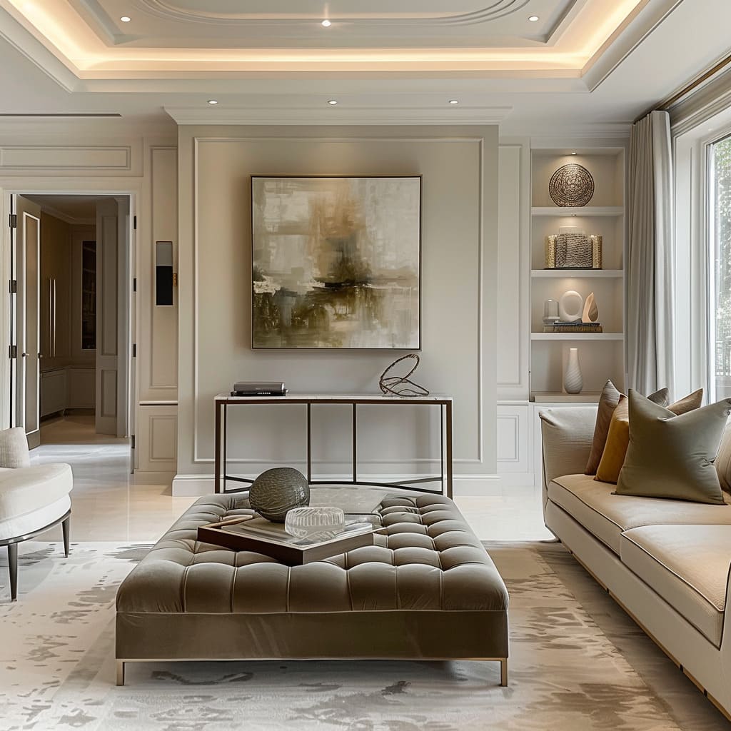
In these spaces, ceilings rise and fall with subtlety, creating invisible boundaries that whisper rather than shout.
Calm Movement in Patterns
Patterns in these spaces move with a calmness that mirrors the ebb and flow of the natural world. Textiles and wall treatments boast patterns that emerge gently, providing a serene backdrop to the hum of daily life.
Here, high-contrast designs give way to blended, cohesive motifs that promote tranquility. Patterns are scaled with intention, ensuring they add interest without overwhelming, allowing for a rhythm that lulls the senses into a state of peaceful contemplation.
The Art of Visual Composition
This section explores the subtleties of visual composition within interior spaces, highlighting the meticulous considerations designers make in achieving a balanced, curated look. Each characteristic contributes to a meticulously crafted visual narrative.
Visual Weight Balance
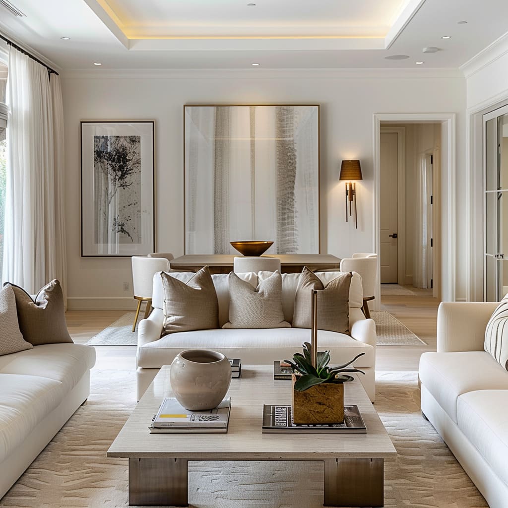
The balance of visual weight is an artful act of equilibrium, achieved through thoughtful placement and proportion of objects. It’s an intuitive alignment that gives a room its posture and poise.
Designers play with the scale and density of furnishings, so the space feels anchored yet fluid, full but not crowded. The choice of materials contributes to this balance, with heavier textures and darker colors lending weight where needed, and lighter tones offering breathability.
The result is a room that hugs its inhabitants with an air of quiet confidence.
Subliminal Symmetry
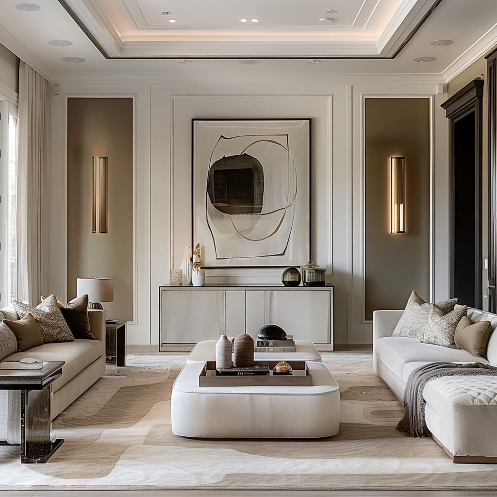
Subliminal symmetry is the secret whisper of order within the apparent randomness. It’s found in the echoes of shapes and lines that converse across the room in a subtle dialect.
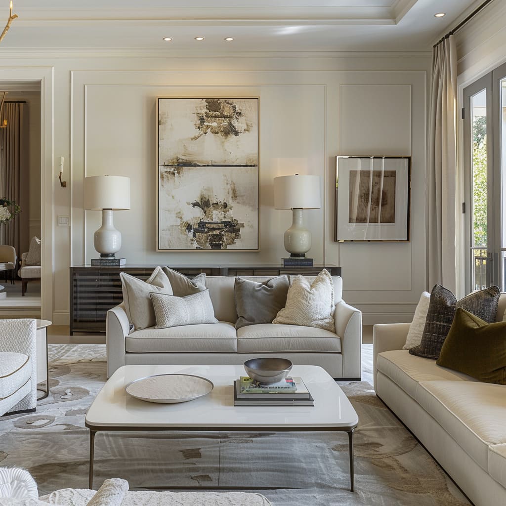
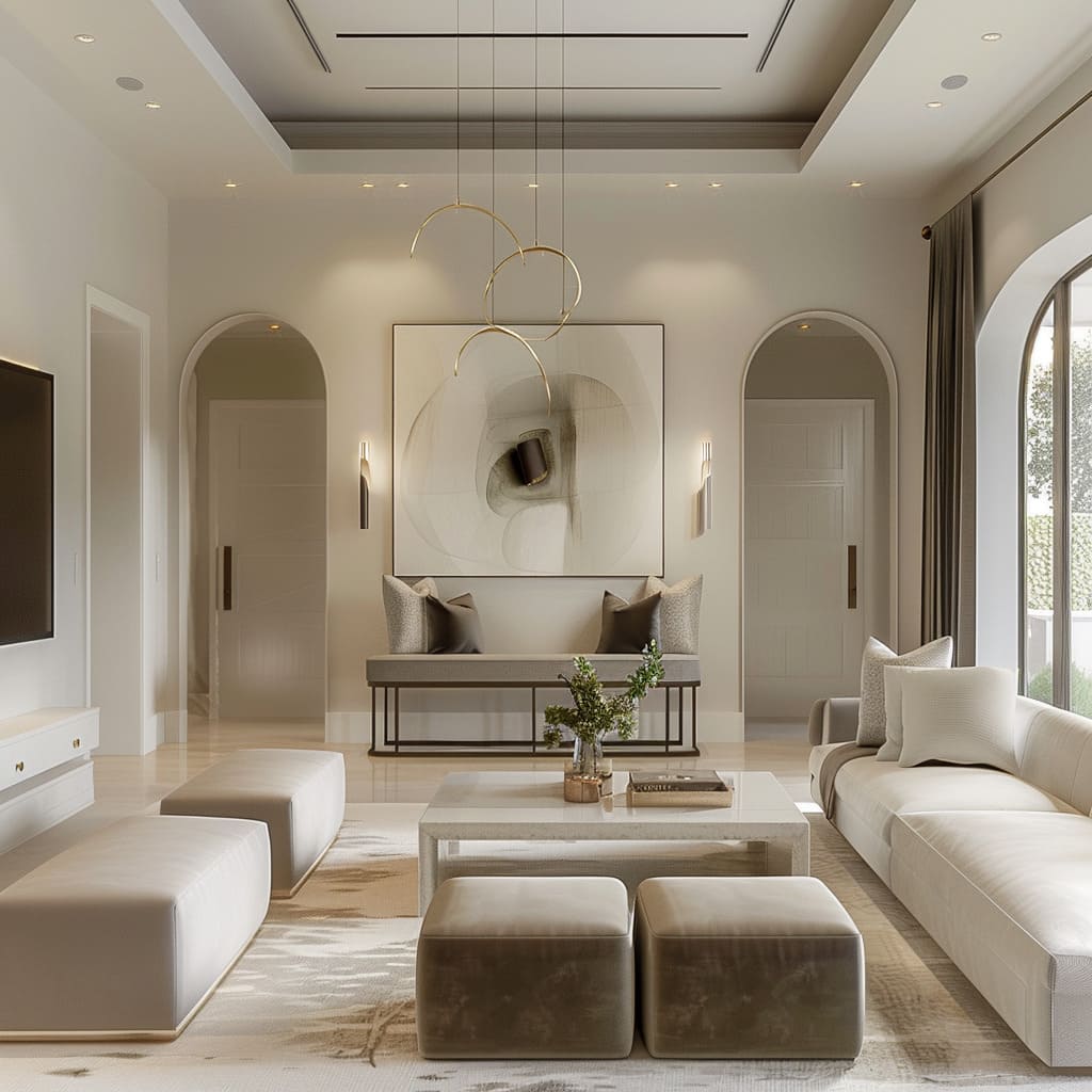
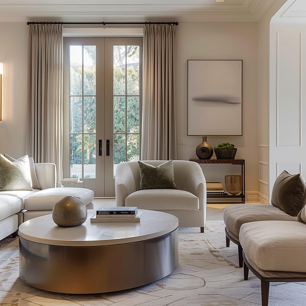
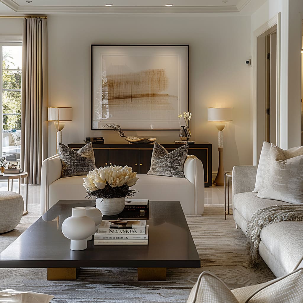
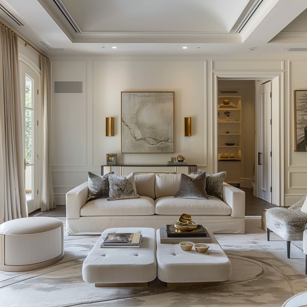
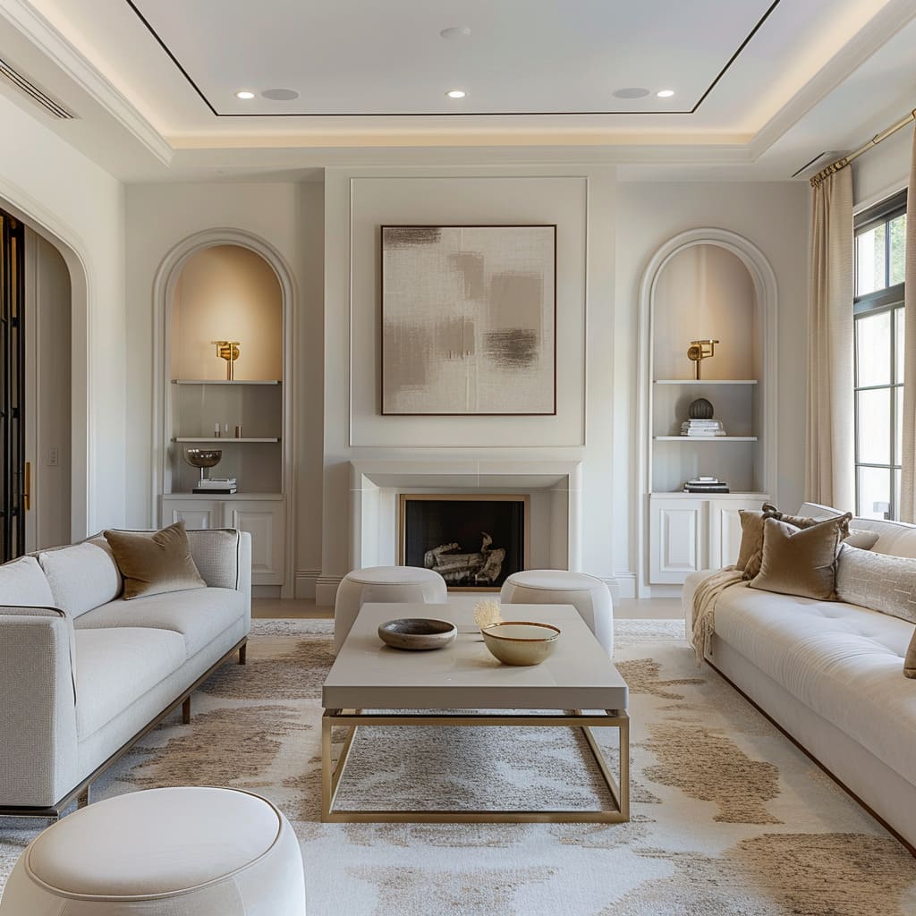
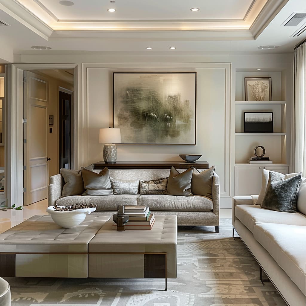
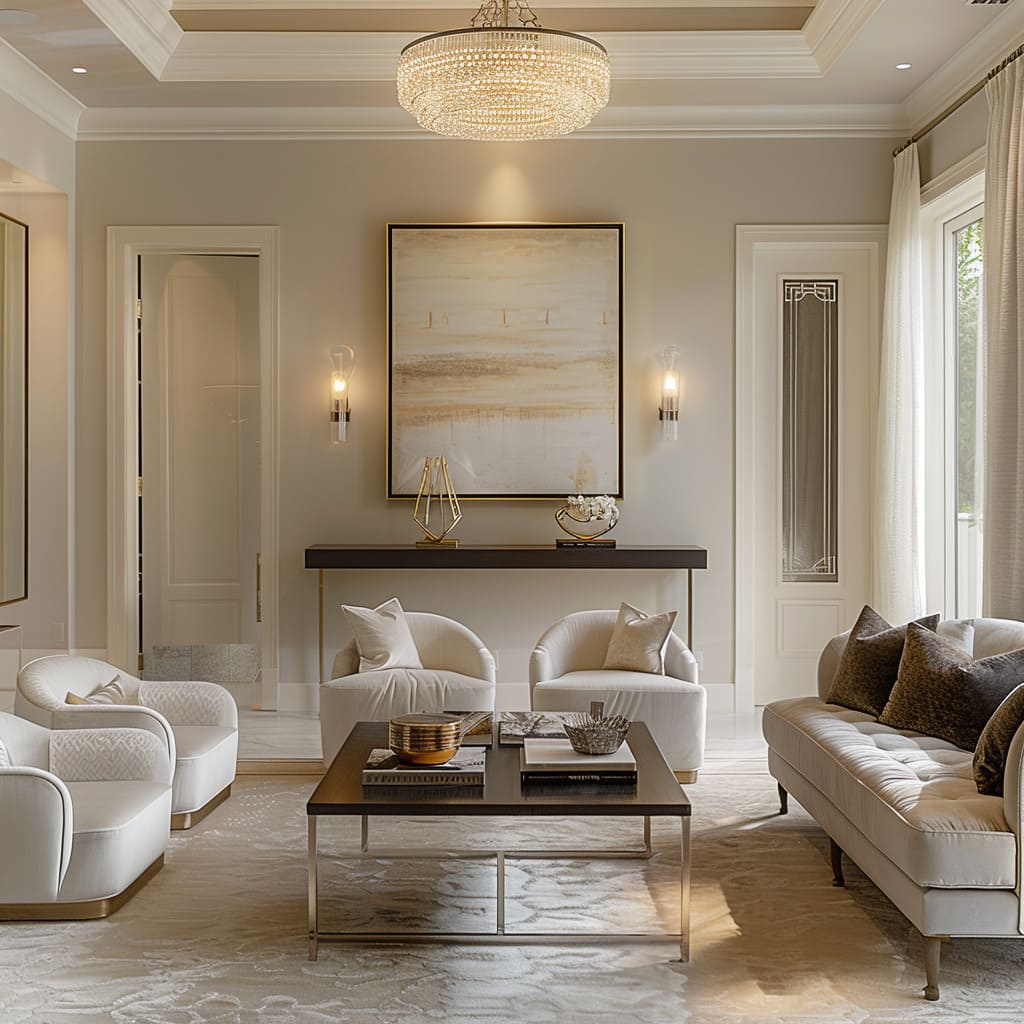
There’s a rhythmic repetition that doesn’t shout but rather hums softly, bringing an underlying unity to the space. The soft mirroring might be in the gentle arc of a lamp matching the curve of an ottoman, or in the recurring theme of brushed metal that binds disparate elements.
It’s symmetry felt in the soul of the design, rather than seen.
Curated Visual Paths
Curated visual paths are the invisible lines drawn by a designer’s hand, guiding the gaze gracefully from one object to another. These paths are the narratives of the space, leading one through a series of vignettes composed within the larger scene.
Lighting plays a crucial role, with fixtures placed to illuminate the journey subtly, creating highlights and shadows that invite the eye to follow. Decorations aren’t placed; they are plotted, each with a role in the story of the room.
Subtle Divergence in Form
Subtle divergence in form introduces a dialogue between consistency and surprise. While the overall design speaks a common language, each piece has its dialect—similar enough to communicate but distinct enough to intrigue.
This divergence might manifest in a chair’s unexpected silhouette or a series of artworks that vary slightly in shape but share a chromatic thread. It is these touches of the unexpected that ensure the design never slips into the mundane but instead remains a living, breathing entity.
Subtle Integration of Design Elements
The characteristics in this section underscore the importance of integrating design elements in a manner that complements the space without overwhelming it. From the use of historical references to the incorporation of functional components, these attributes signify a design ethos that values subtlety and finesse.
Understated Artistry
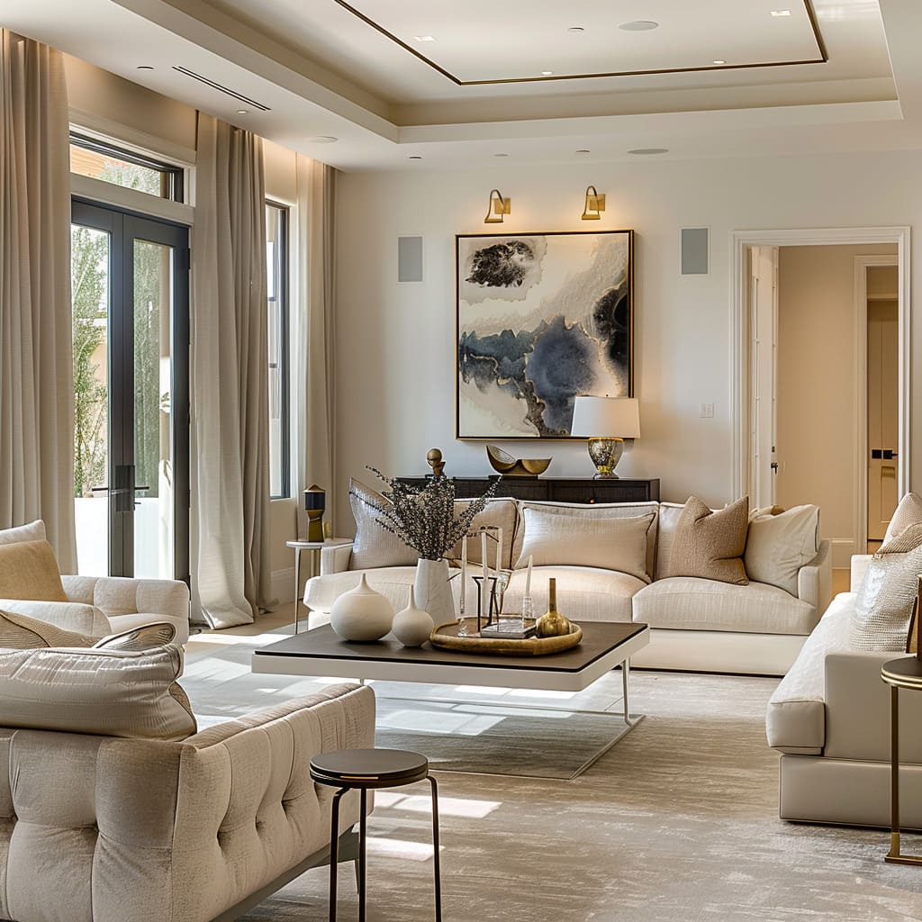
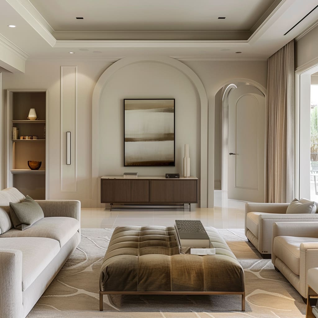
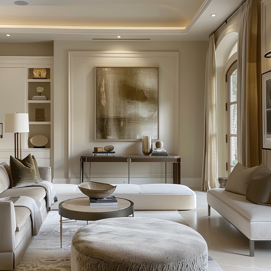
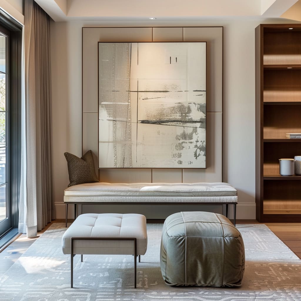
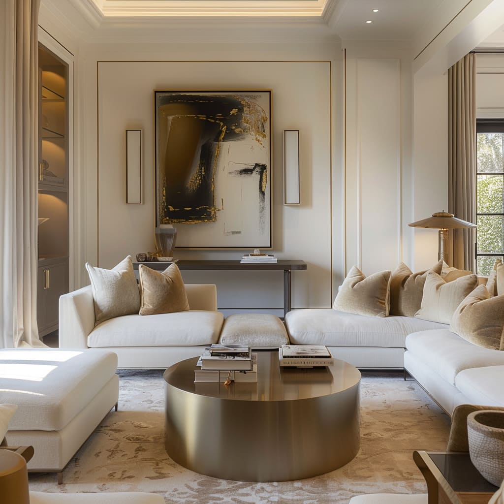
Understated artistry is the gentle hand that weaves beauty into the everyday, ensuring that the presence of art feels intrinsic to the space. It’s the soft blending of artwork with the wall it adorns, the canvas and the texture of the paint carefully chosen to complement the material palette of the room.
The art becomes a part of the architecture itself, an extension of the home’s very soul. It doesn’t scream for attention but instead offers a steady, abiding presence that enriches the environment with a layer of depth and culture.
Whispered Historical References
The whispered historical references are like echoes from the past, subtly embedded into the modern fabric of the space. It’s a nod to tradition in the curve of a banister, a homage to heritage in the pattern of a rug, and an ode to the bygone in the selection of a time-honored textile.
These references don’t recreate history but instead honor its essence, allowing the space to resonate with the wisdom of the ages, bringing a sense of continuity and timelessness that grounds the present in the richness of the past.
Recessed and Built-in Functionality
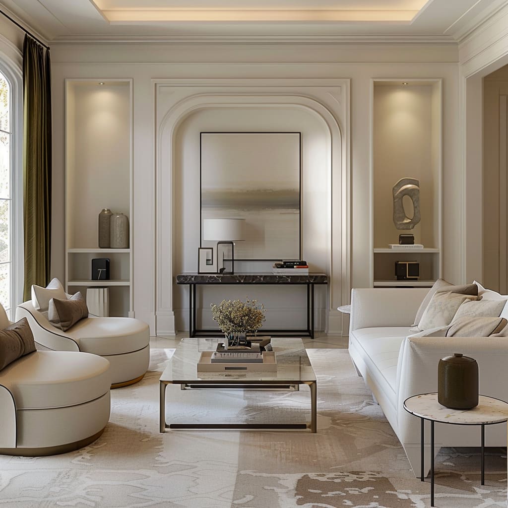
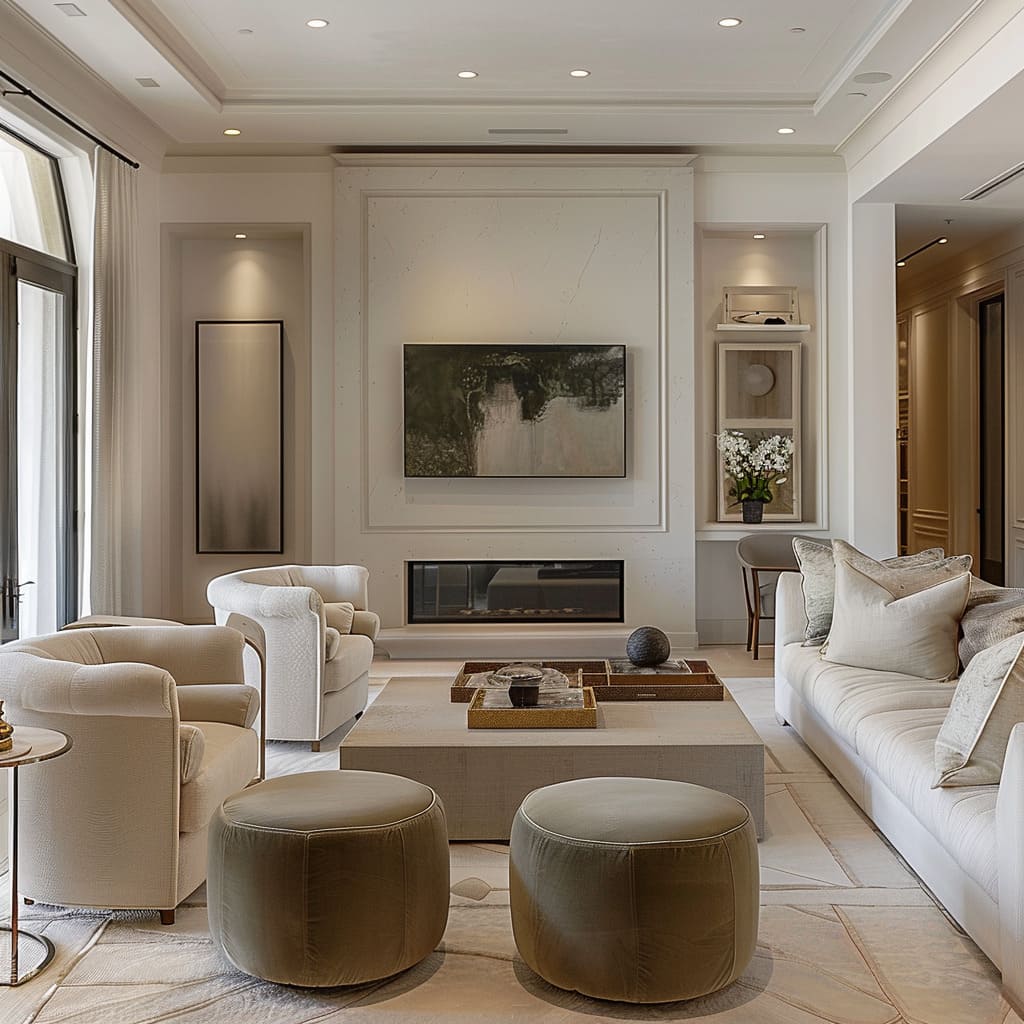
Recessed and built-in functionality is the secret agent of design, performing its duties unseen but making its presence known through the smooth operation of the space. It’s the cleverly hidden compartments, the subtly integrated appliances, and the lighting that seems to emanate from nowhere.
This approach to design values the uncluttered aesthetic, ensuring that every functional need is met without interruption to the visual or physical flow of the room. It’s the elimination of the unnecessary, the celebration of the streamlined, and the elevation of utility into an art form in itself.
Harmonious Cohesion and Tranquil Transitions
The focus of this section is on creating an environment where every element is in conversation with others, resulting in a tranquil and cohesive atmosphere. It speaks to the use of color, spacing, and the interplay between occupied and unoccupied areas.
Ambient Cohesion
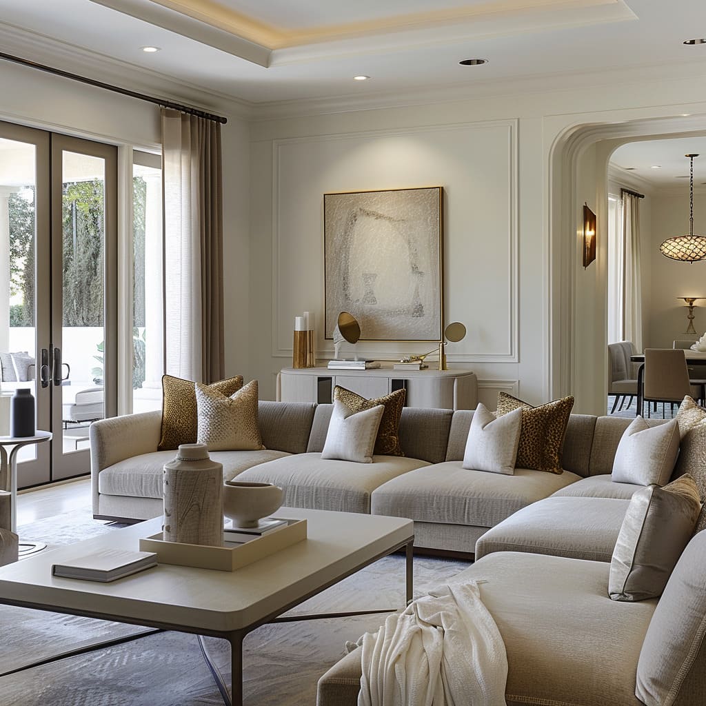
Ambient cohesion is the invisible thread that ties the disparate elements of a home together. It is present in the consistent use of a color palette that speaks in soft whispers from room to room, creating a narrative that feels both diverse and united.
The materials selected serve this cohesion, with their textures and finishes reflecting a shared design ethos, whether it’s the matte finish of a stone countertop or the subtle sheen of fine woodwork. This unity is not confined to flat surfaces alone; it extends to the volumetric harmony of the space, where furnishings resonate with the architectural language of the interior.
Evocative Negative Space
Evocative negative space is the art of the unseen, the beauty in the void that cradles and highlights the occupied areas. It is the deliberate pause between objects, the open areas that allow the design to breathe and speak.
In these spaces, the absence of clutter is as intentional as the placement of decor, providing a visual rest that amplifies the significance of each piece within the space. The strategic use of negative space invites imagination, allowing the observer to fill these pauses with their thoughts, melding the designer’s intent with the personal narrative of the dweller.
Ephemeral Color Transitions
Ephemeral color transitions are the gentle gradations that wash over the interior, shifting with such subtlety that they are more felt than observed. These transitions are like the soft blending of dawn into day, where the interplay of light and shadow gently alters the perception of color.
The mastery of this technique lies in the ability to use color to shape not just the space but the mood within it, enveloping inhabitants in an atmosphere that is fluid and alive. It’s in the way a neutral base blooms into warmth or cools into serenity, the boundaries between hues blurring into a dance of light and color that comforts and welcomes.
Intimacy and Proximity
This section reveals how spatial relationships between furniture and design elements can create a sense of intimacy and purpose within a space. It emphasizes the strategic placement and proximity of objects to foster both aesthetic appeal and functional utility.
Delicate Proximity
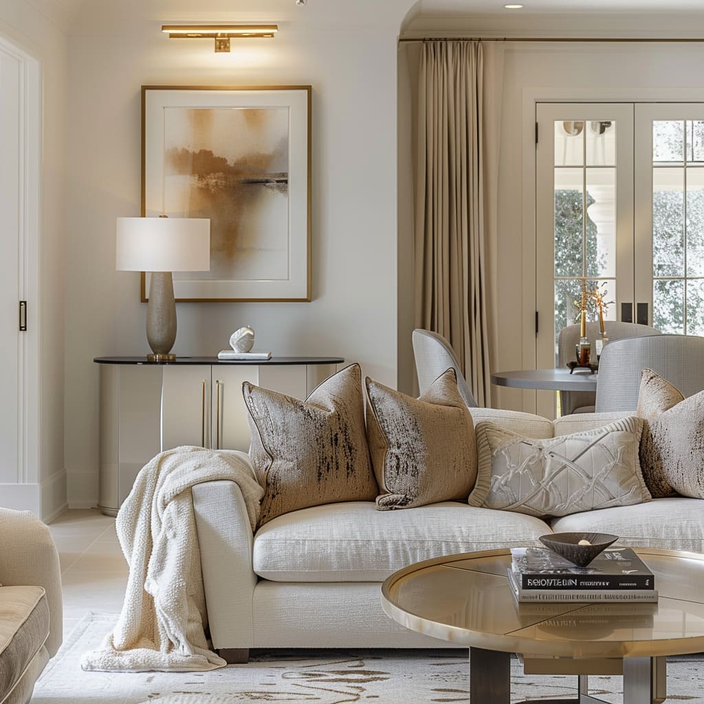
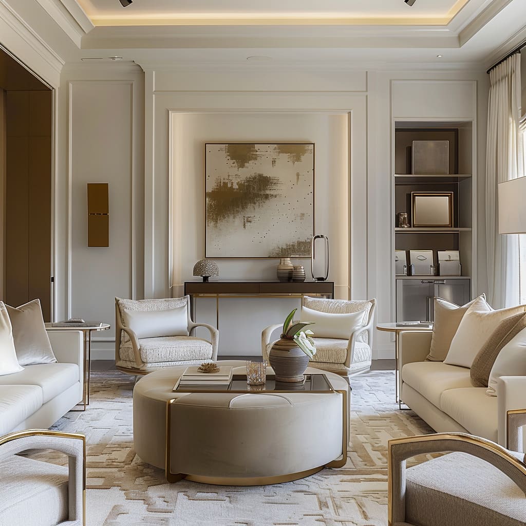
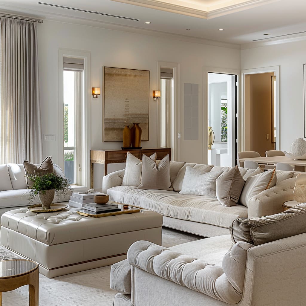
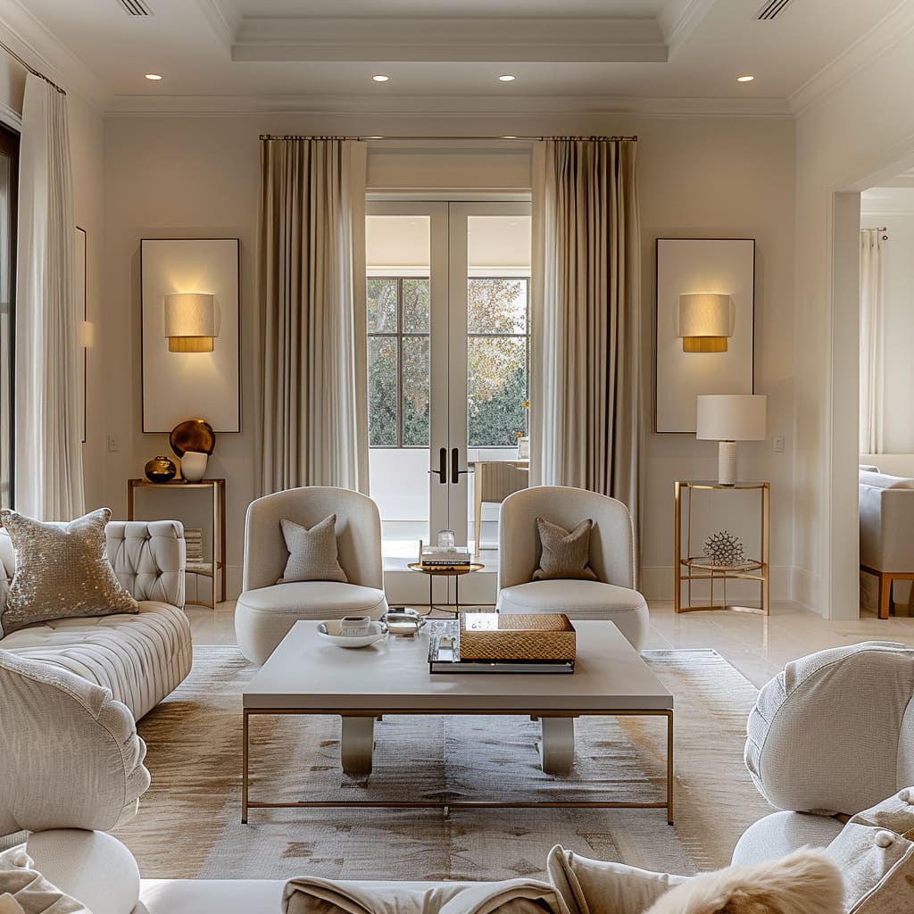
Delicate proximity within a space is about creating relationships—between furnishings, decor, and the human touch. It is the nearness of a chair to a side table, suggesting a quiet afternoon of reading, or the communal gathering of seating that intimates conversation and connection.
This closeness is not about crowding but about creating pockets of purpose, zones of interaction that feel both private and part of the whole. It is about arranging elements so that they speak to each other, their dialogue inviting one to linger, to touch, to engage with the space on a more profound level.
The placement of objects at varied heights and depths adds to this dance, crafting a landscape that is both visually interesting and inherently social.
Evocative Negative Space
Evocative negative space in the context of intimacy and proximity is the breath between words, the silence between notes. It is as integral to the design as the objects that fill the room.
This space is the canvas upon which shadows play, light dances, and the mind is allowed to wander and wonder.
It is the distance that lets the eye rest before moving on to the next point of interest, the pause that makes the conversation of design elements all the richer. By considering what is not there as much as what is, a designer crafts an environment that feels complete without being overwhelmed.
The space between becomes a stage for light to sculpt, for textures to be appreciated, and for the subtle gradients of color to be truly seen. It’s this unspoken poetry that gives the room its soul, its breath, its intimate voice.
As we step back to admire the canvas we’ve traversed, it’s evident that the strength of contemporary interior design lies in its ability to tell a story—a narrative woven from the threads of sensory experience, visual poetry, subtle functionality, and harmonious transitions.
This journey through the heart of modern design illustrates a delicate balance between the bold and the understated, the innovative and the timeless. It is a testament to the philosophy that a well-designed space does not simply house the objects of our lives, but cradles the human experience in all its complexity.
In the culmination of delicate proximity and evocative negative space, we find a design ethos that celebrates not just the space itself, but the life that fills it. In the end, the ultimate measure of these design principles is the quiet contentment they instill in those who inhabit the spaces crafted by their guide.


