Mid-century modern architecture is celebrated for its timeless appeal, combining simplicity, function, and a deep connection to the surrounding environment. This design movement, which emerged in the mid-20th century, is known for its clean lines, open floor plans, and the seamless integration of indoor and outdoor spaces.
By focusing on these core principles, mid-century modern architecture homes offer a balance of form and function that remains relevant today
One of the main attractions of mid-century design is how it blends modern materials with natural elements, creating homes that feel grounded and sophisticated. This article will explore how you can apply the defining elements of mid-century design to craft a visually stunning house exterior.
Through real-life examples, we will examine how key design choices—from flat rooflines to bold geometric forms—can help create a home that is both functional and visually compelling. Whether you are building a new house or updating an existing property, the goal is to help you embrace the essence of mid-century design while adapting it to a modern context
The allure of a 2-story mid-century modern house lies in its balance between striking visual features and practical design elements. It offers a perfect canvas for exploring these design principles, merging the best of both worlds: contemporary aesthetics and the timeless qualities of mid-century architecture.
This combination not only ensures the home remains modern but also connects it to the surrounding environment, enhancing the experience of both the occupants and those who admire it from the outside
Architectural Foundations of a Striking Mid-Century Modern Exterior
The Flat Roofline and Overhangs
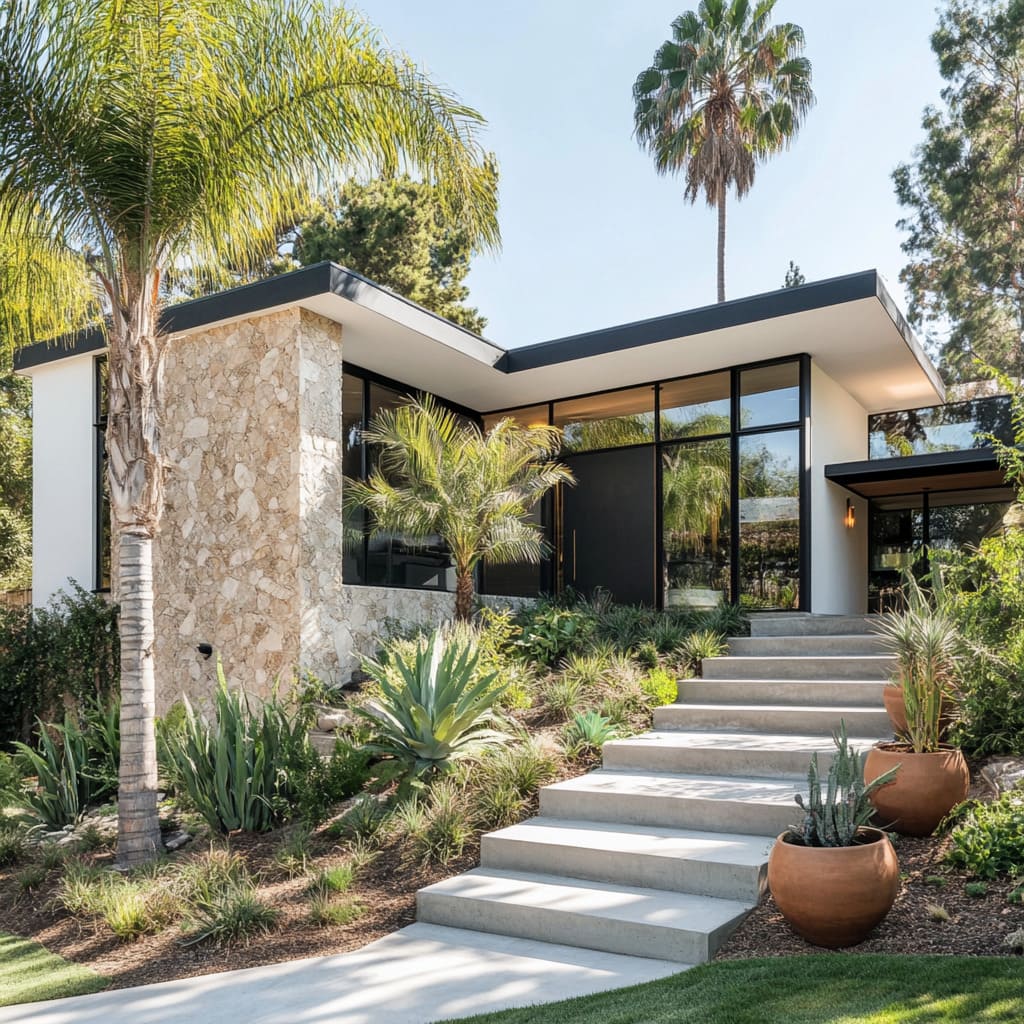
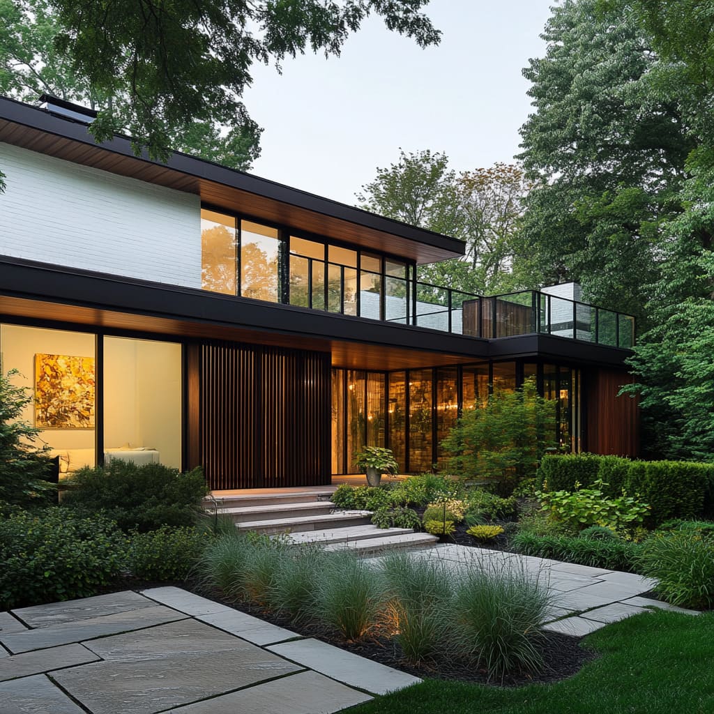
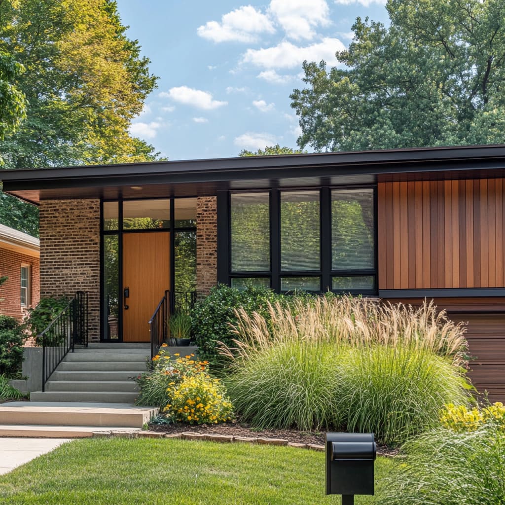
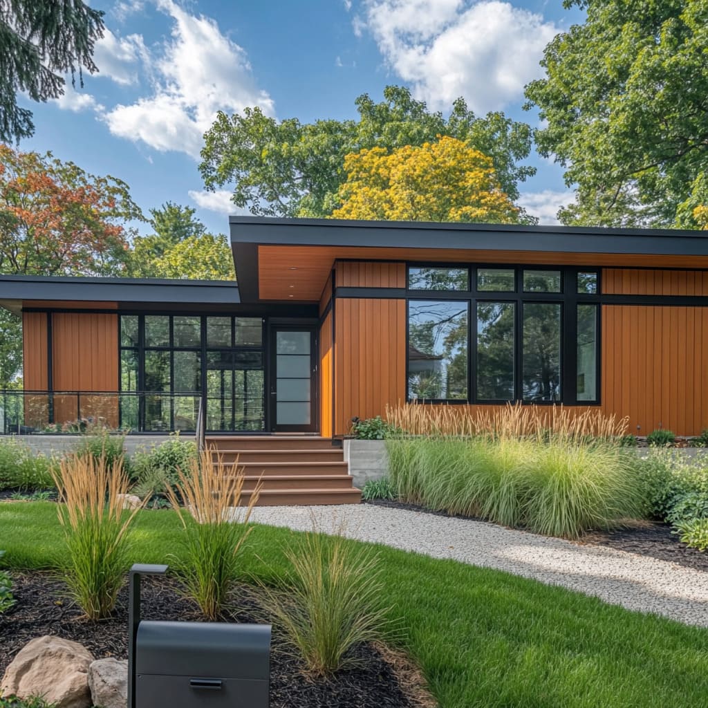
One of the most recognizable features of mid-century modern homes is the flat roofline. This element contributes significantly to the home’s clean, horizontal lines, which are a key feature of this architectural style.
The flat roof creates a low-profile silhouette, allowing the home to blend seamlessly into its surroundings rather than dominating the landscape. In contrast to the steep, angular roofs seen in more traditional homes, the flat roof is minimalist and streamlined, which gives the home a distinctly modern look
But the flat roof isn’t just about aesthetics—it plays a practical role as well. The extended roofline often includes deep overhangs, which serve a functional purpose by providing shade to the large windows commonly found in mid-century modern homes.
These overhangs help regulate the temperature inside by reducing direct sunlight, creating a comfortable living environment without the need for excessive air conditioning. In wetter climates, the overhangs also offer protection from rain, keeping entrances and outdoor seating areas dry.
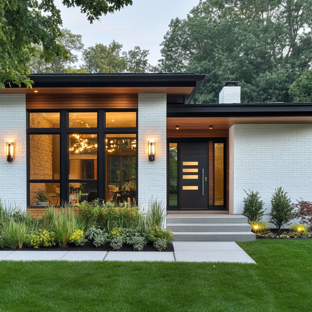
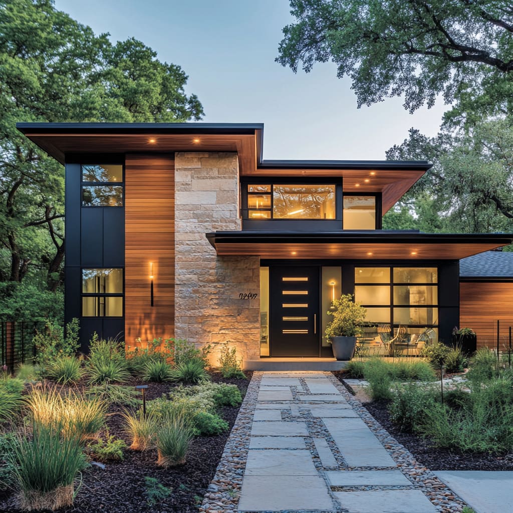
Overhangs are typically finished in wood, adding a touch of warmth to the otherwise sleek and modern design. The contrast between the natural wood and the clean lines of the roof adds depth to the exterior and ensures that the home doesn’t feel too stark.
This combination of modern materials with natural accents is central to mid-century modern design, which strives to harmonize the home with its surroundings
Bold Geometric Forms
Another defining characteristic of mid-century modern architecture is the use of bold geometric forms. The clean, angular lines of these homes are created through the use of simple rectangular and boxy structures.
This geometric precision gives mid-century homes a distinctive, modern silhouette that stands out without overwhelming the senses. The key is in the balance—strong, simple shapes that create a dynamic presence without relying on excessive ornamentation
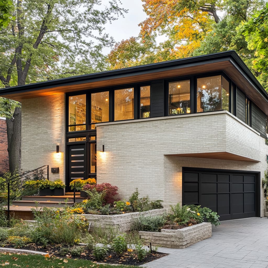
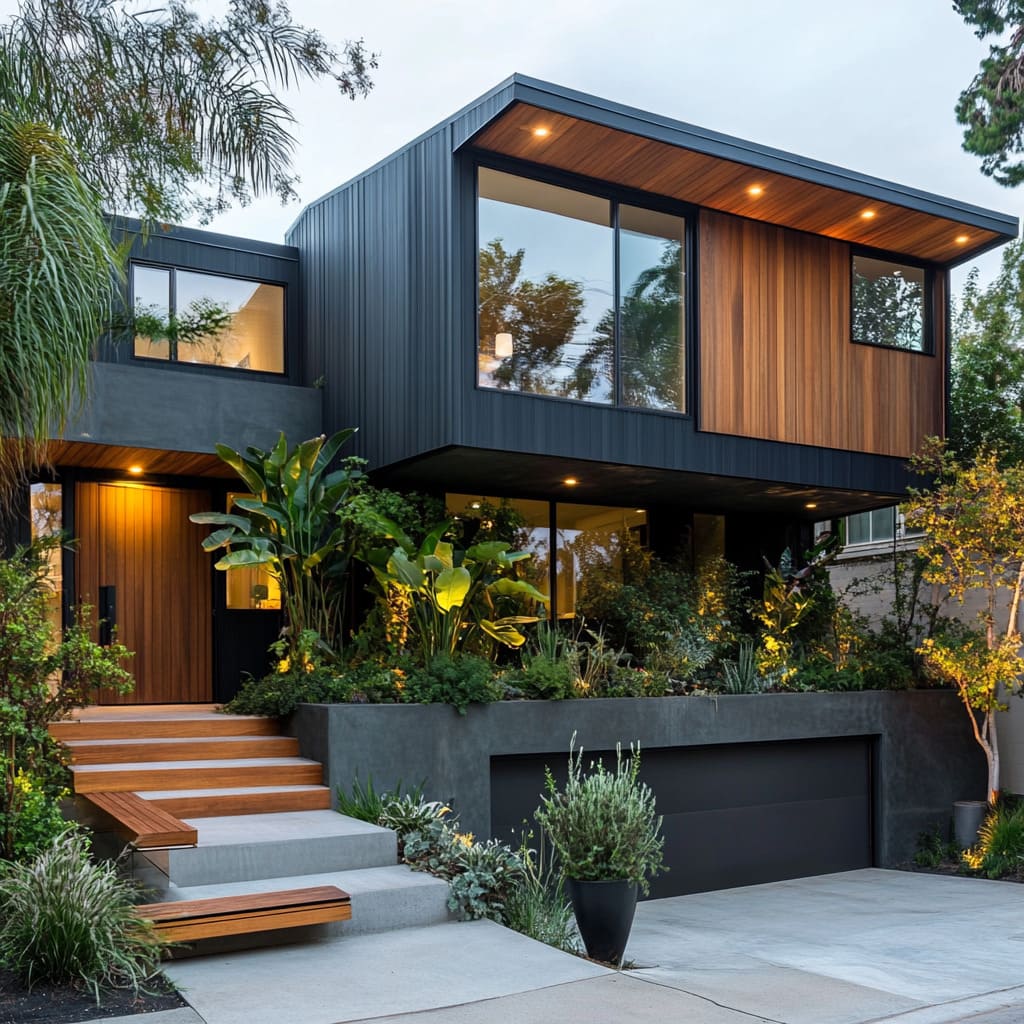
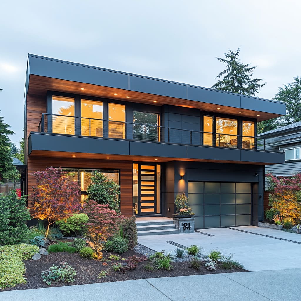
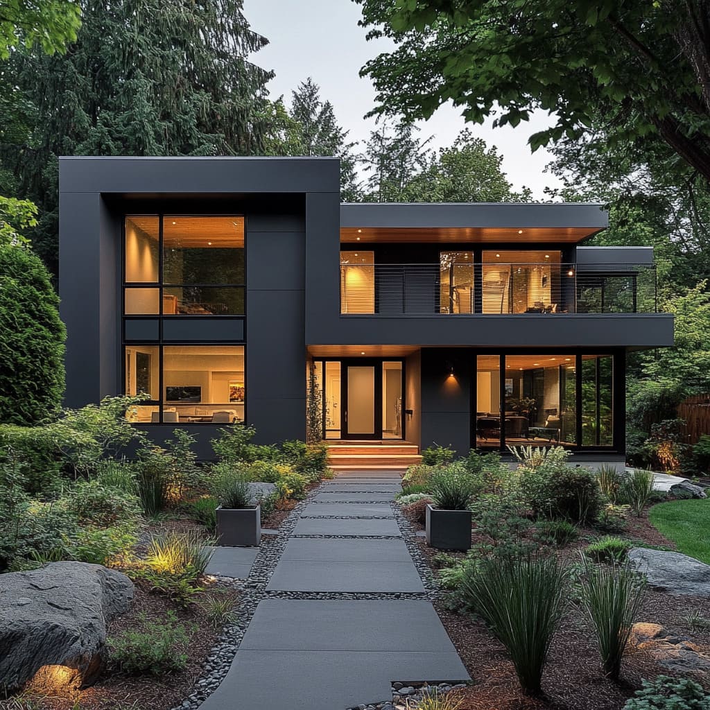
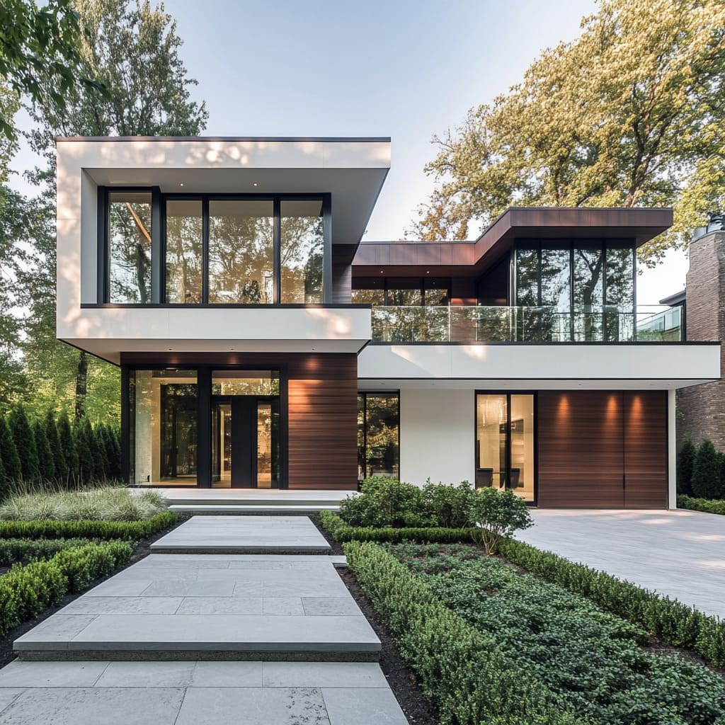
Many mid-century homes incorporate asymmetrical design elements, which further enhance the visual interest of the exterior. This is particularly noticeable in homes with cantilevered upper levels, where portions of the house extend outward, creating a sense of movement and depth.
Cantilevers are not only aesthetically pleasing, but they also provide functional benefits, such as creating covered outdoor areas below or adding space to the upper levels without expanding the footprint of the home
These bold shapes are accentuated by the careful use of materials like glass, stone, and wood, which interact to create a visually striking yet harmonious exterior. The geometric precision of the home is softened by the natural textures of stone and wood, while large expanses of glass allow light to play across the surfaces, further emphasizing the clean lines.
Whether it’s a single-story home or a 2-story mid-century modern house, these geometric forms are essential to creating a striking exterior that captures the essence of this architectural style. The combination of flat rooflines, overhangs, and geometric forms is what gives mid-century modern homes their unique charm.
Together, these architectural elements create a home that feels modern, functional, and intimately connected to its surroundings
Material Palette: Balancing Sleek and Organic Elements
Dark Facades and Warm Wood Accents
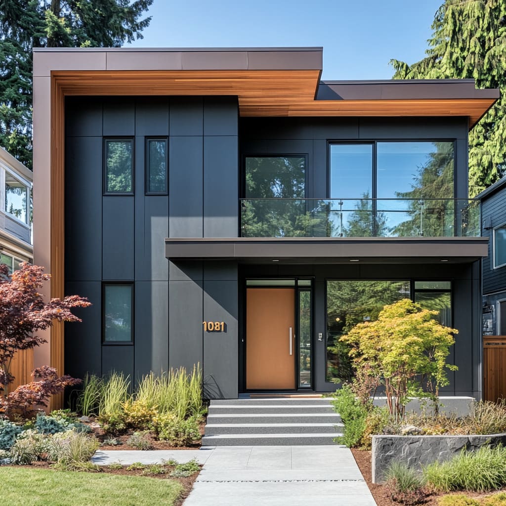
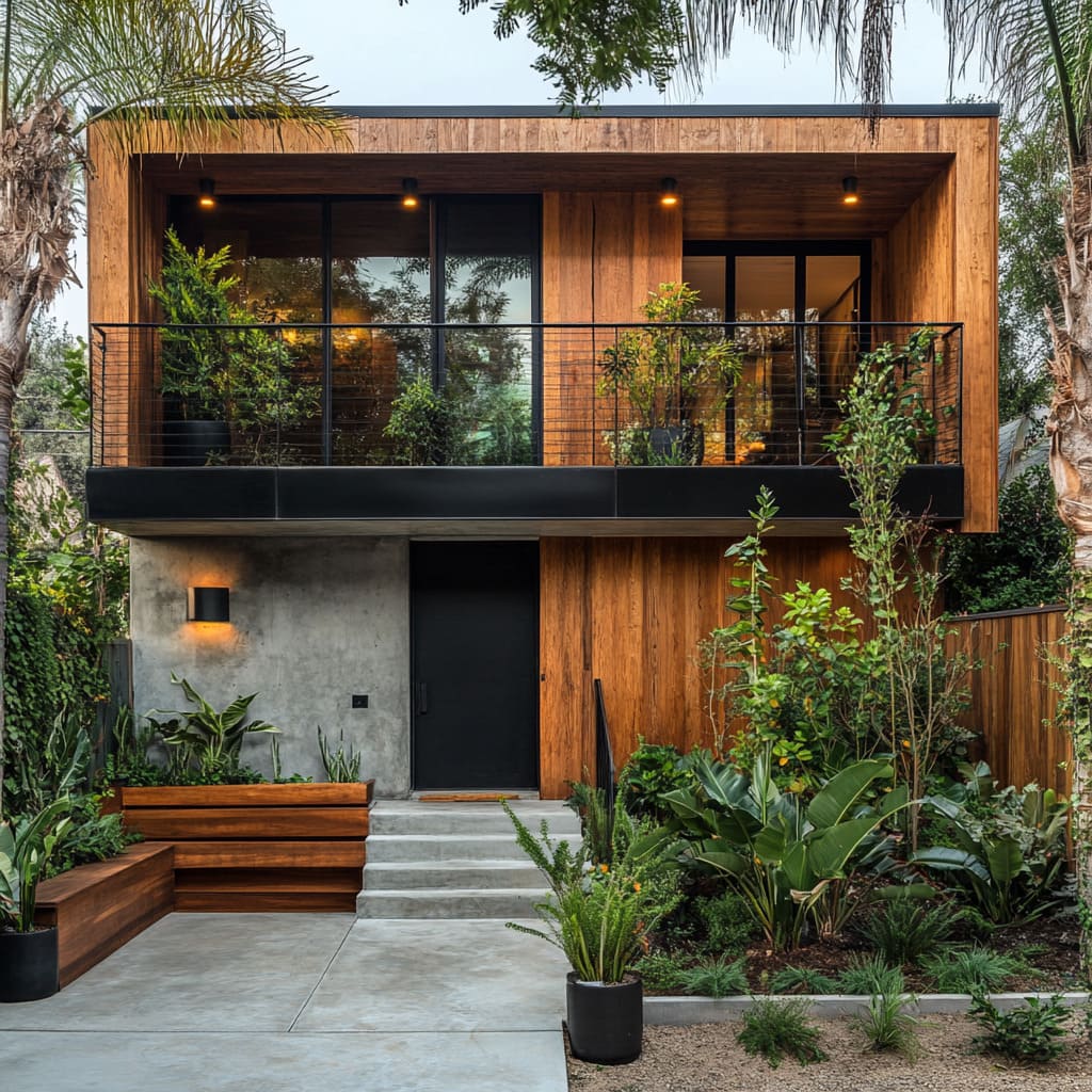
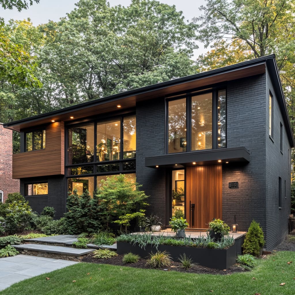
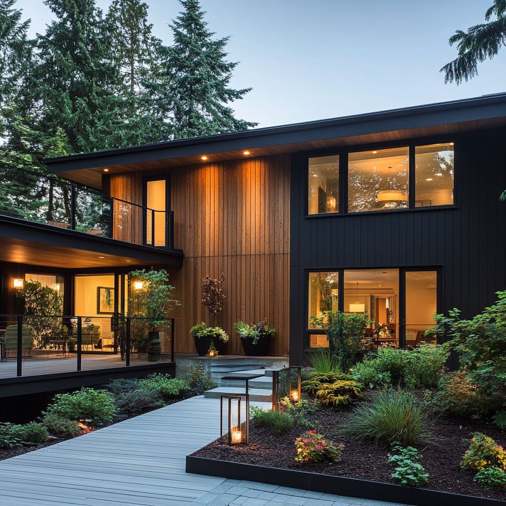
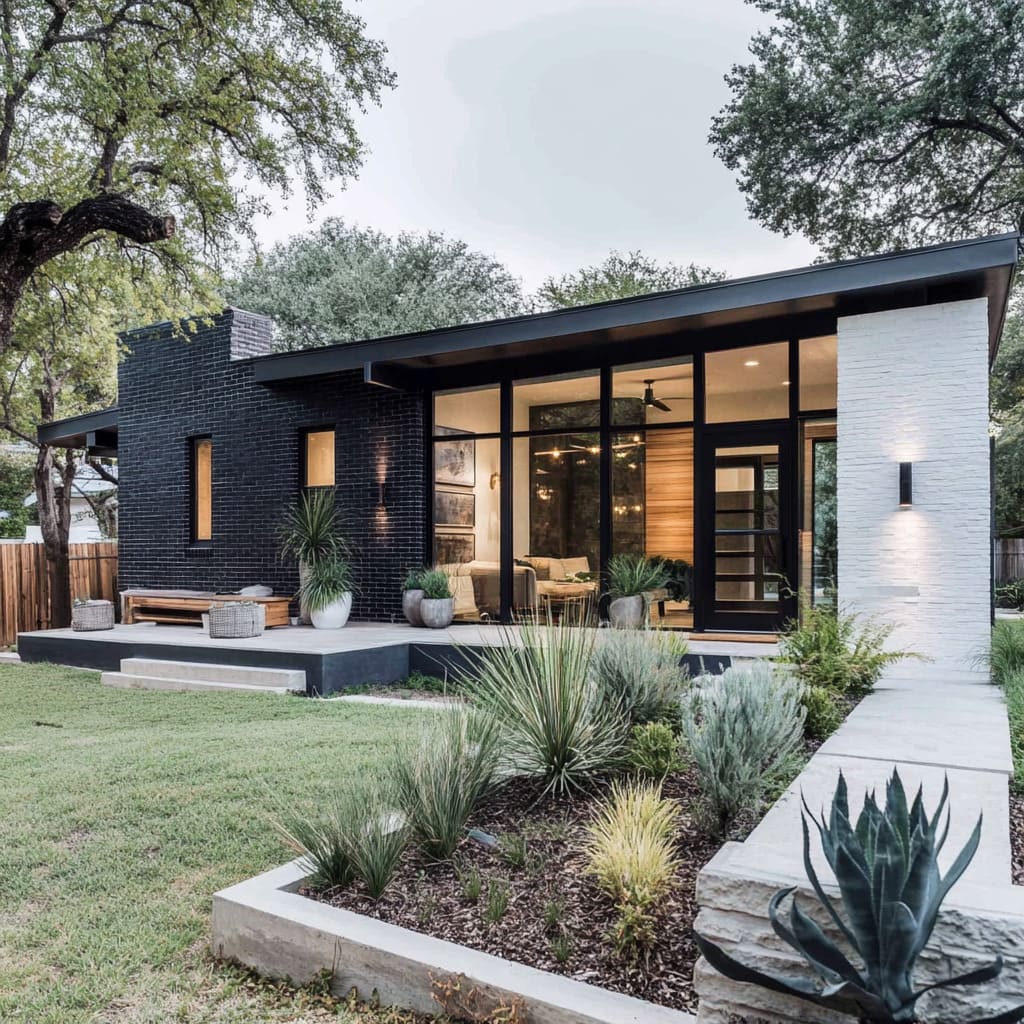
One of the most striking trends in mid-century modern exteriors is the use of bold, dark facades. Matte black, deep charcoal, and muted grays have gained popularity for their sleek, contemporary appearance.
These dark tones offer a modern edge, giving homes a sophisticated look that feels both powerful and understated. Dark exteriors create a sharp, modern profile that complements the minimalist, clean lines typical of mid-century modern design.
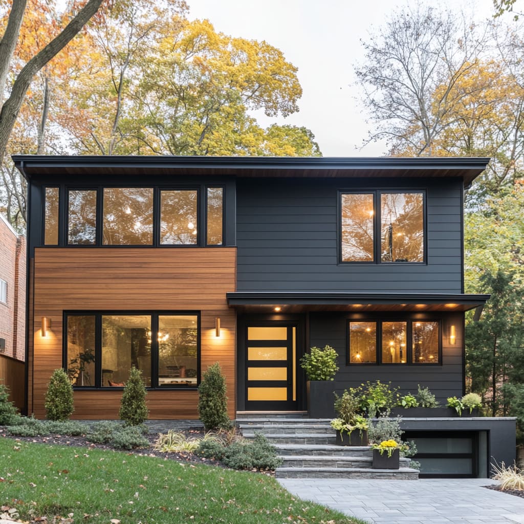
The smooth surfaces of these facades allow the home to blend into its surroundings, especially in wooded or suburban areas, where the darker tones harmonize with the natural environment. However, dark facades alone could risk feeling too austere, which is why warm wood accents are often used to soften the effect.
Wood introduces a natural warmth that counterbalances the sleekness of the dark tones. It creates a welcoming contrast while maintaining the home’s modern appeal.
This interplay between bold colors and organic textures helps create depth and interest in the design, making the home feel more inviting rather than cold
Wood cladding is frequently used as a highlight on exterior walls, sometimes framing sections of windows or acting as a feature on certain parts of the facade. A common technique is to use wood around the entry door, providing a touch of warmth to the main point of access.
Door frames and undersides of roof overhangs also offer perfect spots to integrate wood, emphasizing areas that naturally draw the eye. In the best mid-century modern homes, this balance between smooth, dark surfaces and the organic texture of wood is a key design element.
It not only adds character but also ensures that the home feels cohesive and connected to its environment, merging modern design with a timeless, natural aesthetic
Natural Stone for Timeless Elegance
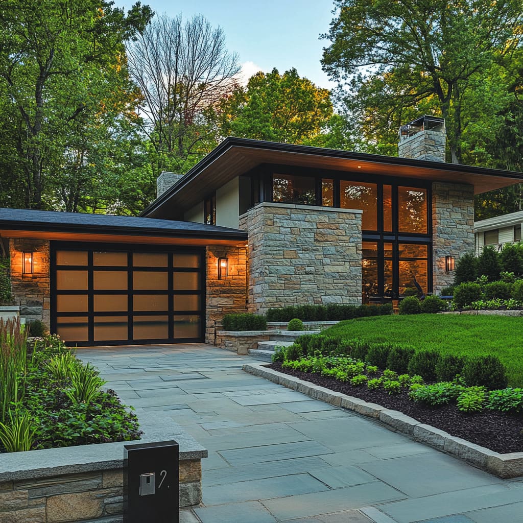
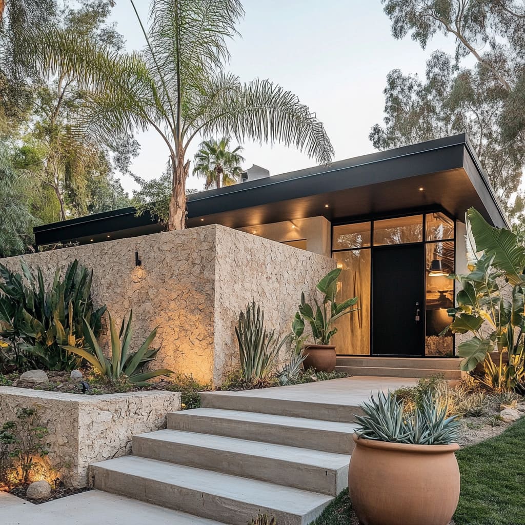
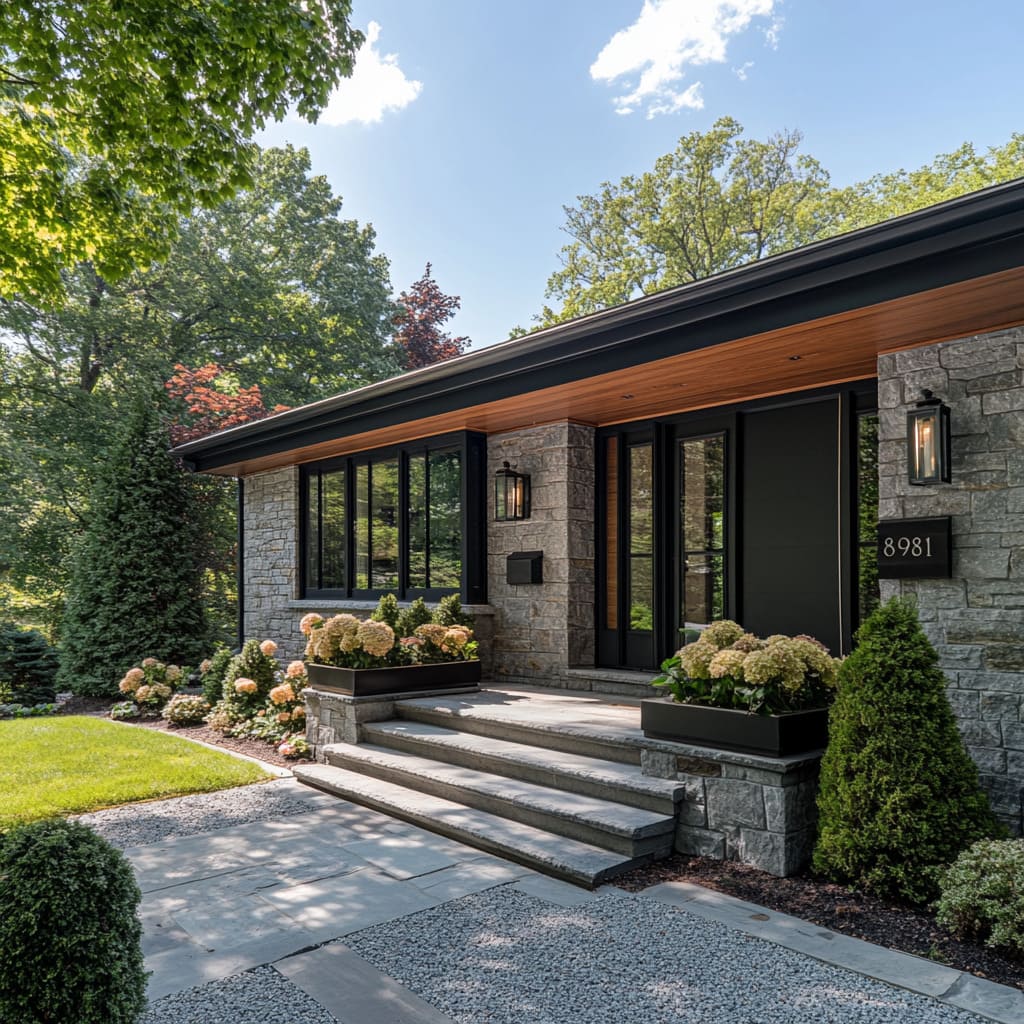
While wood softens and balances the modern feel of dark exteriors, natural stone serves as an anchor, grounding the home in its surroundings. Stone is an essential material in mid-century modern architecture, known for its ability to add texture, durability, and a sense of permanence to the design.
Layered stone facades evoke an earthy, timeless quality that is both tactile and visually rich. The rough texture of the stone contrasts beautifully with the smoother surfaces of wood and glass, creating a dynamic and multi-faceted exterior
Stone is often used around the base of the home or as accent walls, providing both structural and aesthetic support. It creates a visual connection between the house and the natural landscape, giving the home an organic feel.
The timeless nature of stone is a perfect complement to the otherwise modern features of mid-century homes. Whether used in large, imposing blocks or smaller, more intricate patterns, stone adds depth to the facade and gives it a lasting, grounded presence.
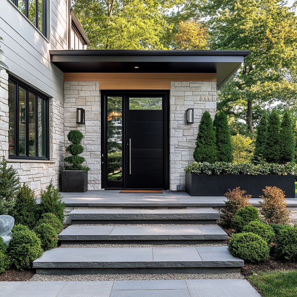
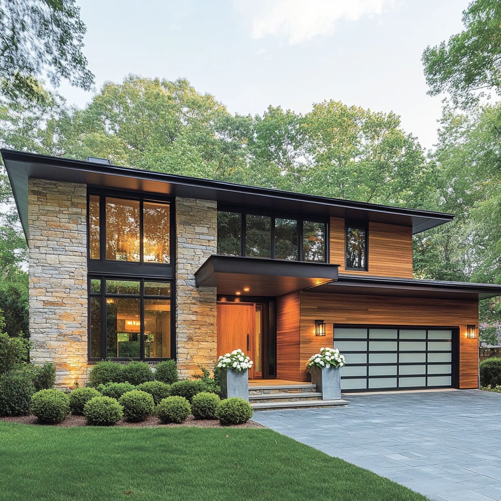
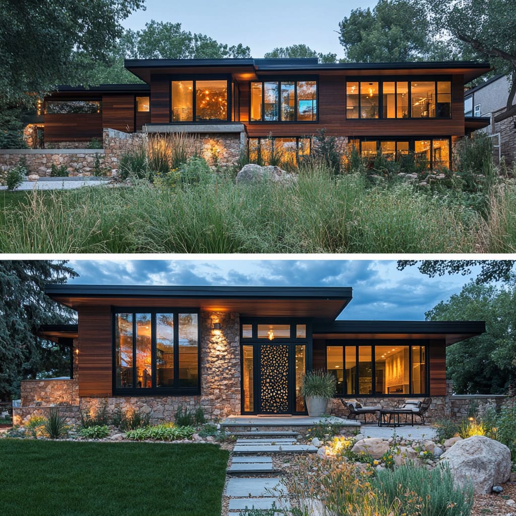
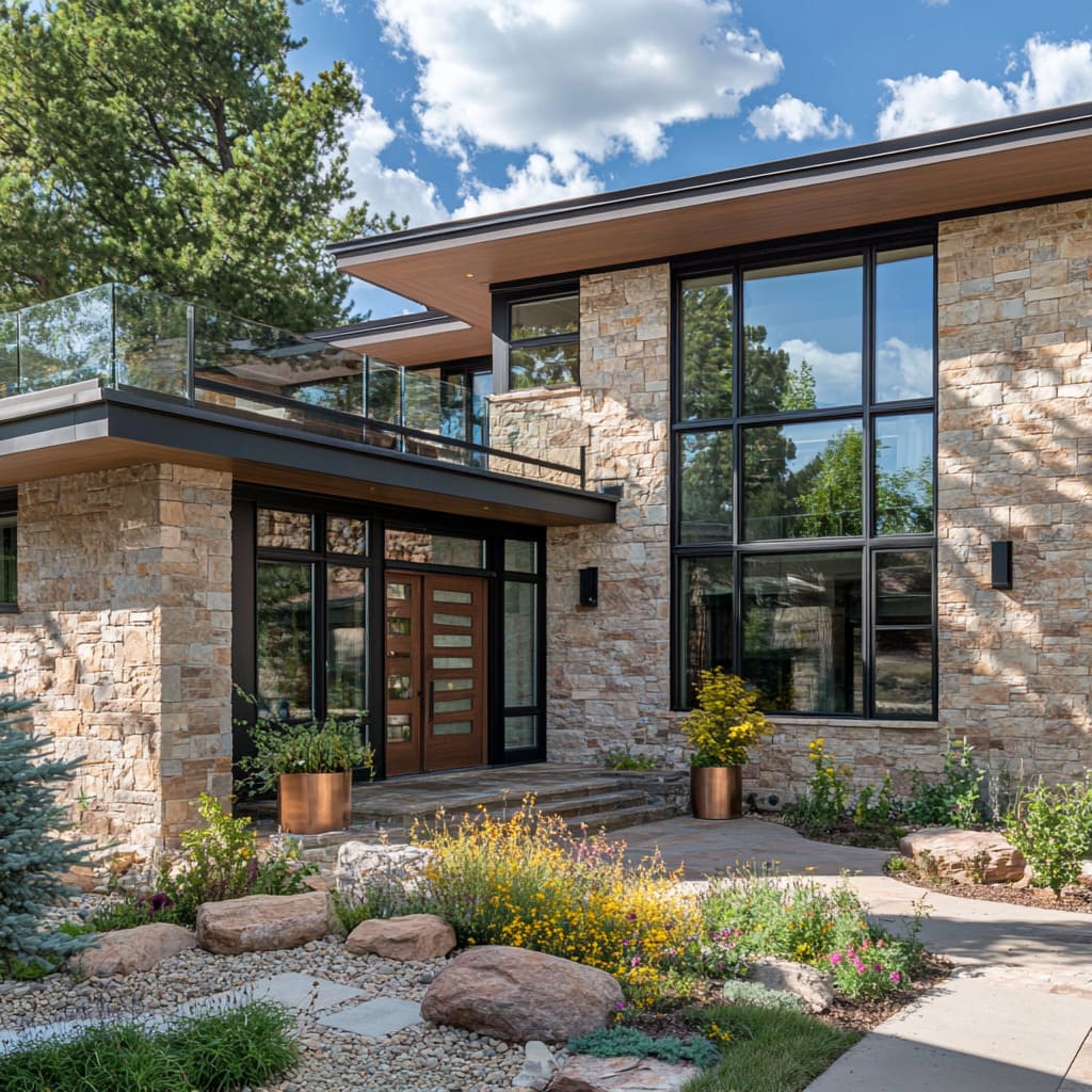
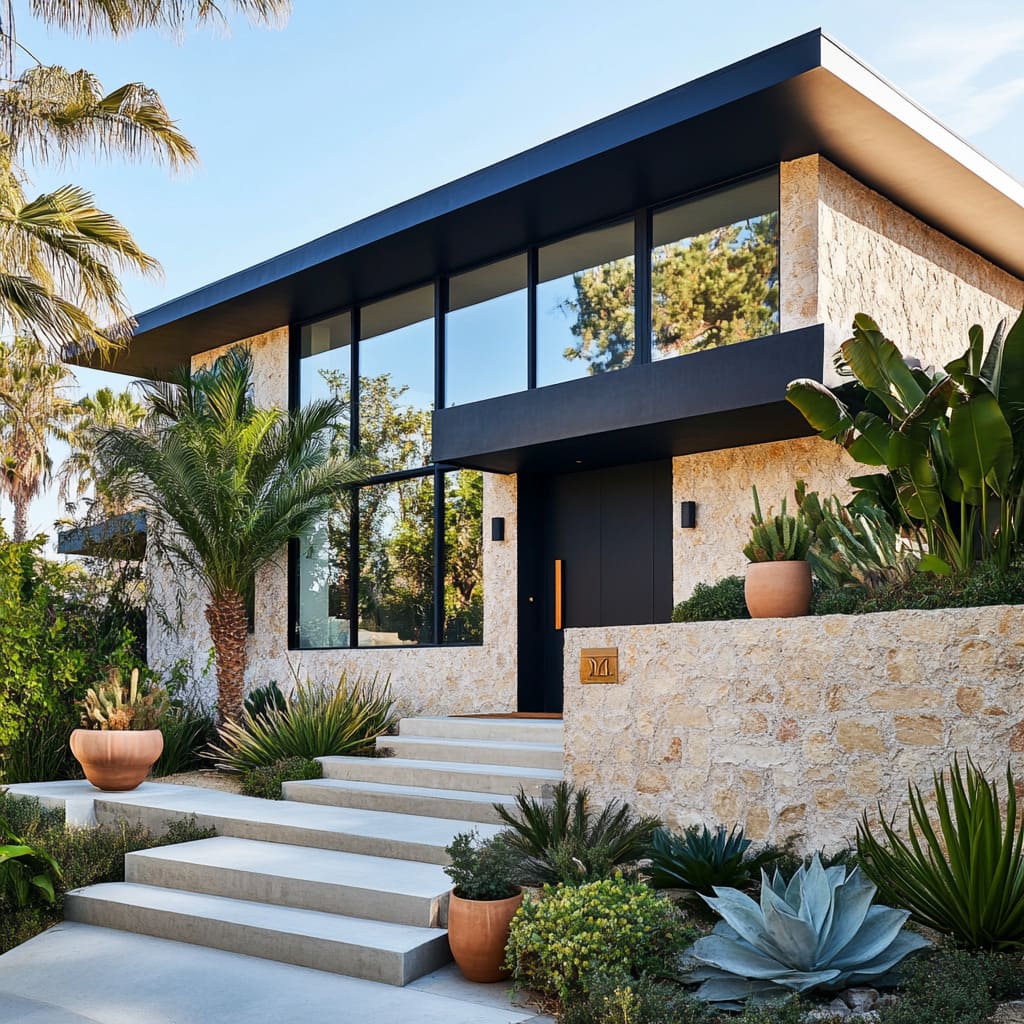
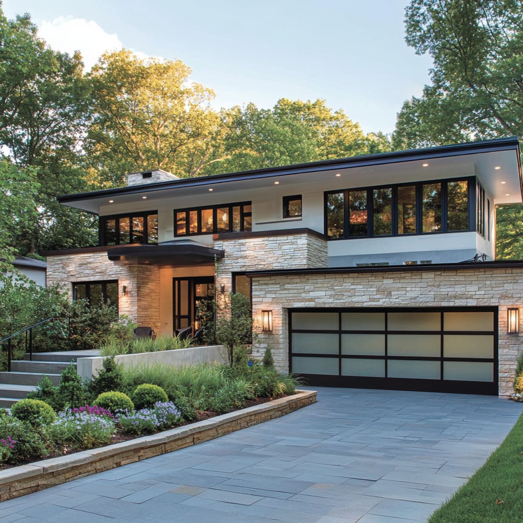
A great case study in the use of natural stone comes from 2-story mid-century modern houses, where stone is often paired with expansive glass windows and sleek metal accents. In these homes, stone plays a crucial role in maintaining balance—offering solidity to the otherwise airy, transparent elements.
The contrast between stone and glass strikes a harmonious chord, marrying the home’s modernity with its natural setting. This blend of materials ensures that the home feels rooted in its surroundings while maintaining a forward-thinking design
Maximizing Light and Transparency with Expansive Glass Elements
Floor-to-Ceiling Windows and Glass Walls
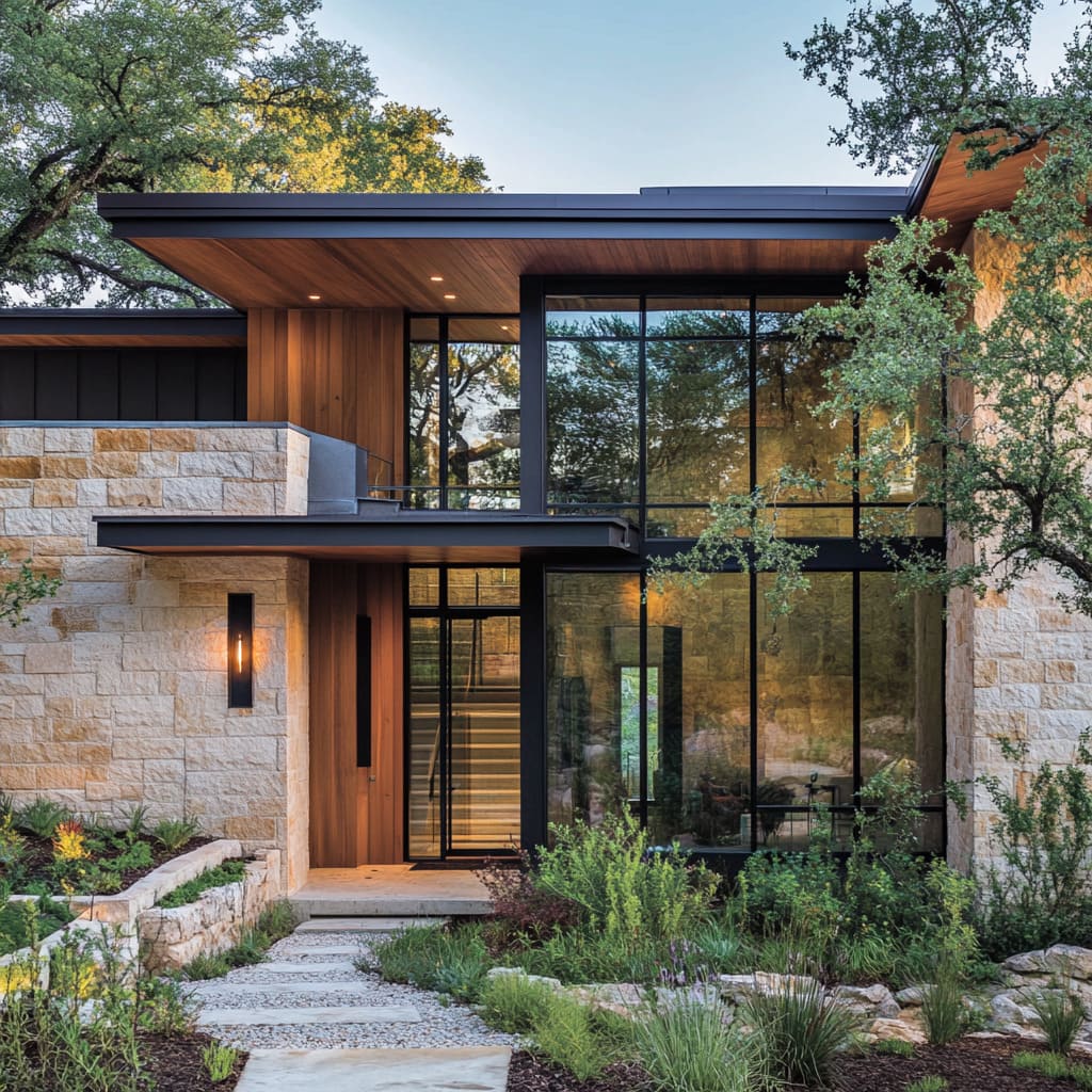
One of the most recognizable features of mid-century modern homes is their use of expansive glass windows. These large panes of glass blur the boundary between indoors and outdoors, allowing natural light to flood the home and making it feel more open and connected to its surroundings.
Floor-to-ceiling windows, in particular, have become a signature element, creating a sense of openness that defines mid-century modern living
These windows offer more than just light—they frame the surrounding landscape, turning nature into a living part of the interior design. Whether it’s a view of a lush garden, a forest, or even a modern urban setting, the windows create a connection to the outside world.
This design feature also enhances the home’s sense of space, making it feel larger and more expansive. The windows are typically framed with black metal, adding structure and contrast to the glass.
The slim metal frames offer a clean, industrial look, reinforcing the geometric precision that is key to mid-century modern architecture. In many modern home exterior ideas, the grid-like patterns of the window frames help break up the expanses of glass, adding a subtle visual rhythm that complements the home’s overall design
Glass Balconies and Railings
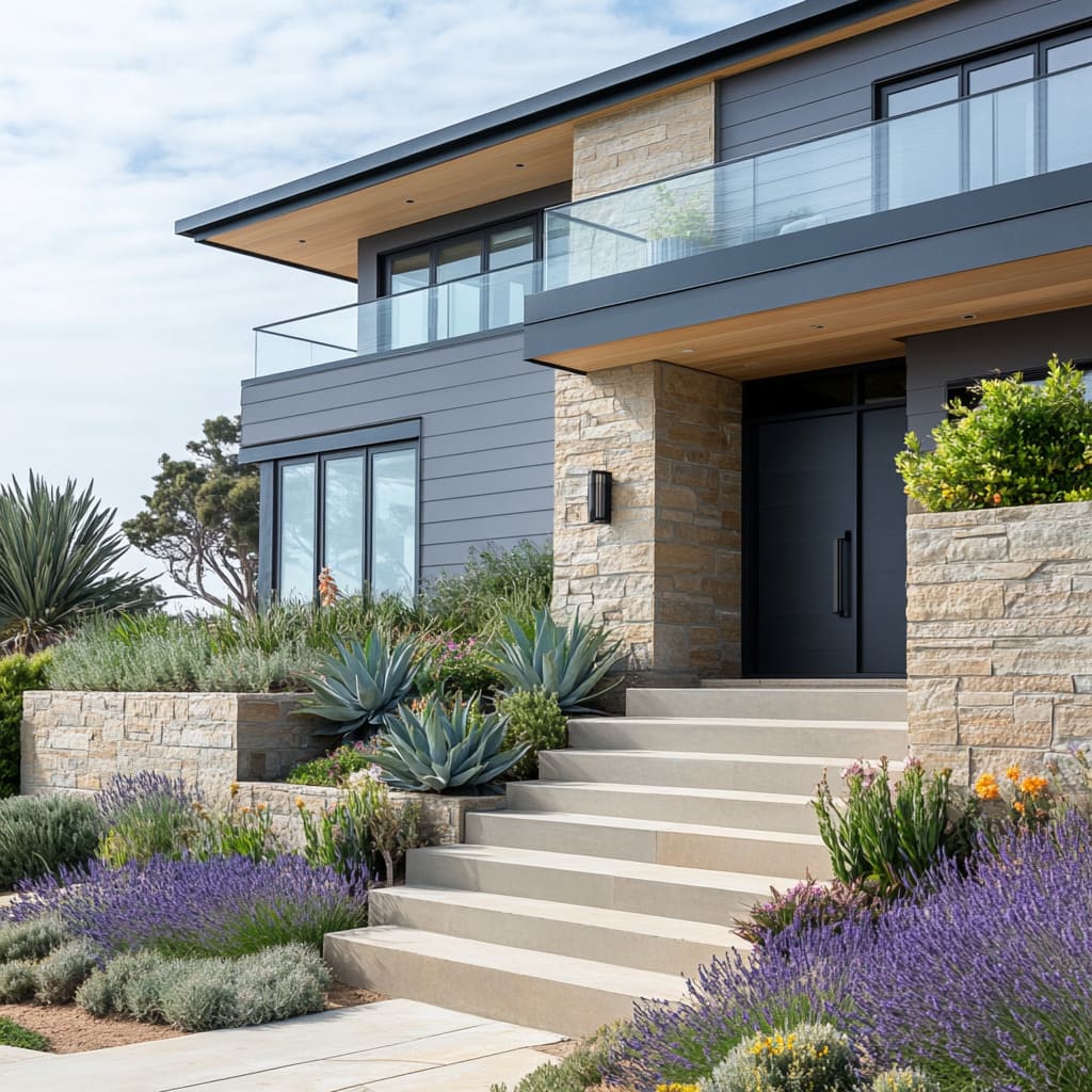
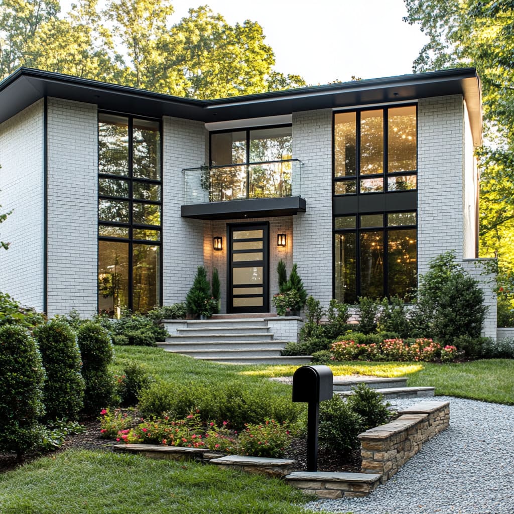
Glass railings on balconies are another way that modern mid-century homes maintain transparency without disrupting the architectural lines. Unlike traditional railings, glass maintains the minimalist aesthetic of the house while offering safety and functionality.
The use of glass in balconies allows homeowners to enjoy unobstructed views of their surroundings, whether they’re overlooking a backyard or a scenic landscape. By integrating glass into balcony designs, the exterior remains light and airy.
It’s a seamless extension of the home’s interior, allowing outdoor spaces to blend effortlessly with the rest of the house. Glass railings ensure that the home’s clean lines and modern design are maintained, without compromising the sense of openness and light that mid-century design strives for
In all of these examples, glass serves as a critical material, enhancing both the look and functionality of the home. It allows for transparency, light, and a closer connection to the outdoors, which is a key element in modern home exterior ideas that seek to blend the built environment with nature.
By using expansive windows, glass walls, and sleek glass railings, the best mid-century modern homes masterfully balance openness with privacy, creating spaces that feel bright, modern, and thoughtfully designed
Crafting a Welcoming Entryway
Minimalist Front Door Design
The front door is more than just a functional element of a home—it serves as a visual introduction to the design philosophy of the entire house. In mid-century modern homes, the entryway is often a lesson in simplicity and elegance.
A well-designed front door can be both minimalist and impactful, setting the tone for the rest of the exterior. The key to creating a standout front door in a mid-century modern exterior lies in the materials and placement.
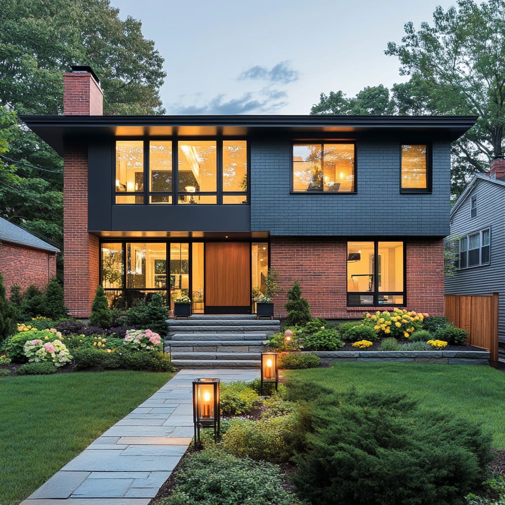
Natural wood doors are a popular choice, as they introduce warmth and texture to the clean, geometric lines typical of the style. The grain of the wood contrasts beautifully with the smoother finishes of the home’s facade, making the entryway feel inviting.
Alternatively, sleek metal doors in matte finishes—such as black or steel—can enhance the modern feel, adding a sense of sophistication and durability. These materials create a harmonious balance with the home’s overall design, ensuring the entry feels both welcoming and contemporary
Often, these doors are framed by large glass panels or windows, allowing natural light to spill into the entryway. This not only enhances the visual appeal of the front door but also creates a seamless connection between the indoor and outdoor spaces.
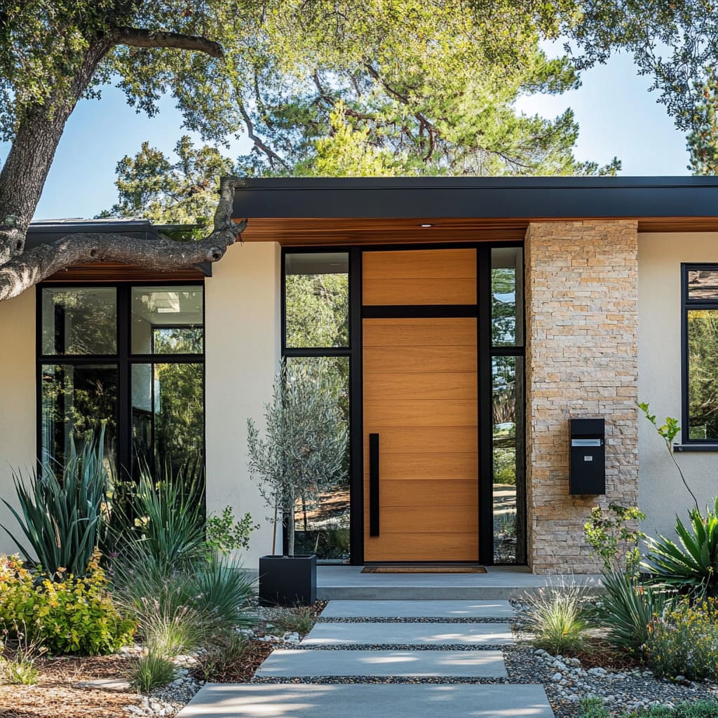
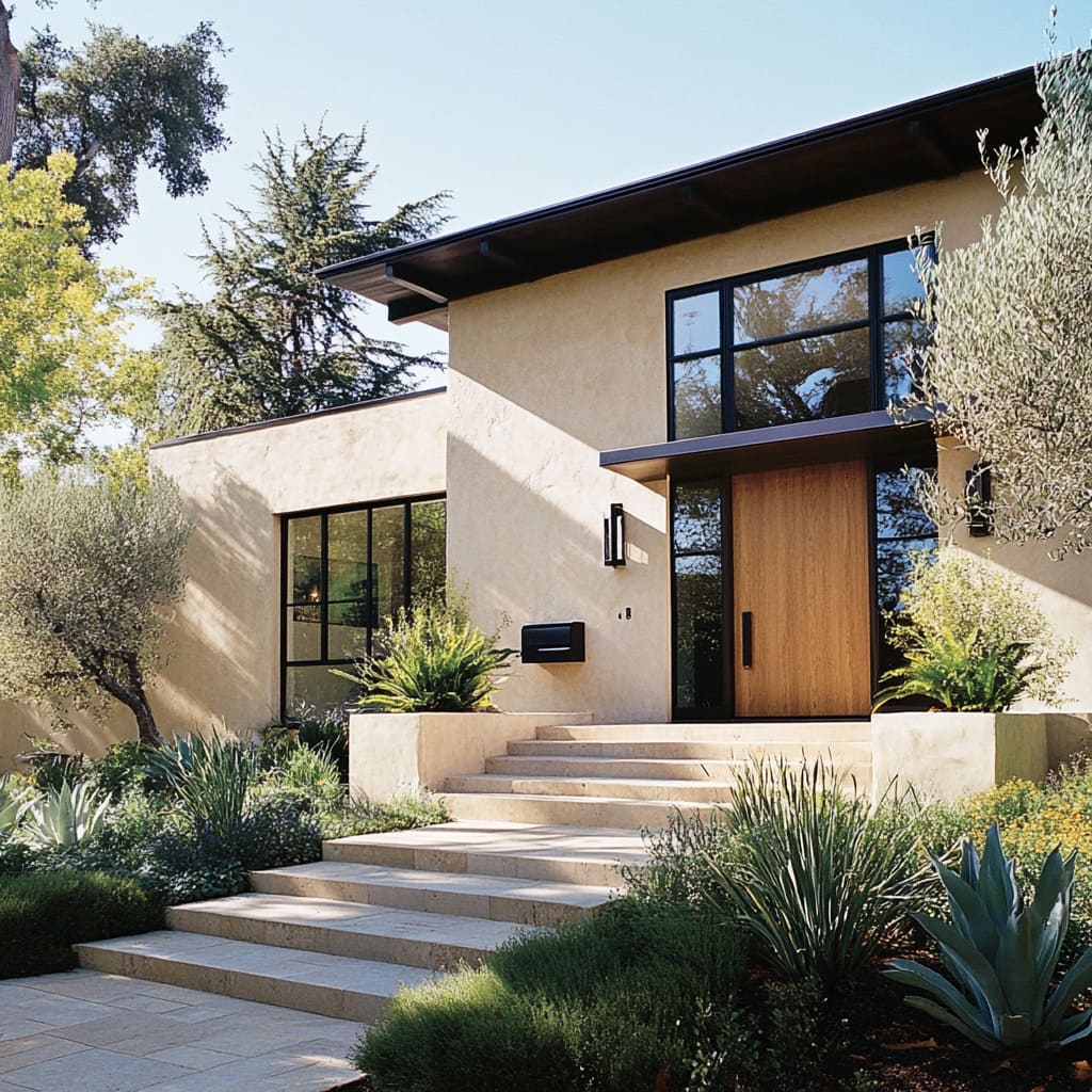
Glass framing works to amplify the minimalist aesthetic, keeping the lines clean while maximizing the use of natural light. Take, for example, cool mid-century modern homes where the front door is a simple wooden slab, framed by floor-to-ceiling glass.
The warm wood immediately softens the otherwise sleek lines of the house, while the glass creates an inviting glow from within. In these homes, the entry is understated yet impactful, perfectly aligned with the mid-century modern ethos of blending simplicity with bold materials
Pathways and Terraced Entry
The pathway leading up to a mid-century modern home is equally as important as the front door itself. A well-structured path not only guides visitors to the entrance but also contributes to the overall aesthetic of the home.
The path must complement the clean lines of the house, using materials that resonate with the modern design
Concrete slabs are often the material of choice for mid-century pathways due to their sleek, modern look. Large rectangular or square slabs, spaced evenly, can create a geometric rhythm that echoes the house’s architecture.
Alternatively, natural stone can be used to achieve a slightly more organic feel without compromising the minimalist look. Both materials offer durability and ease of maintenance while aligning with the home’s aesthetic
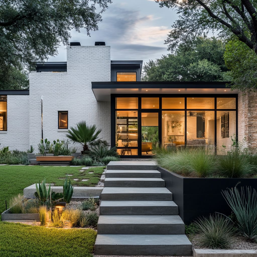
For homes with a slightly elevated entry, terraced pathways are a common feature. Multiple levels add dimension and structure, leading the eye upward toward the front door.
The combination of terraces and simple, straight lines adds depth to the facade and ensures that the entry feels thoughtfully designed
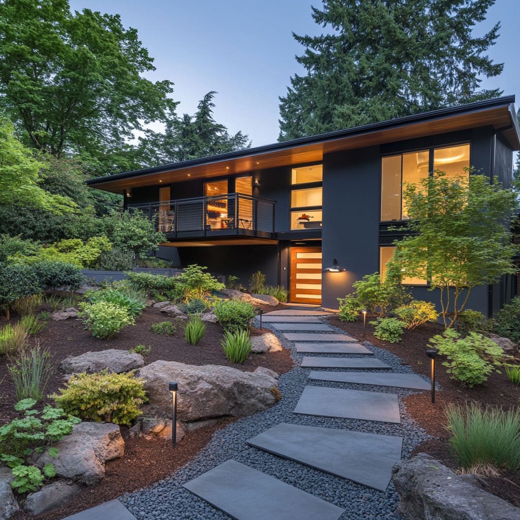
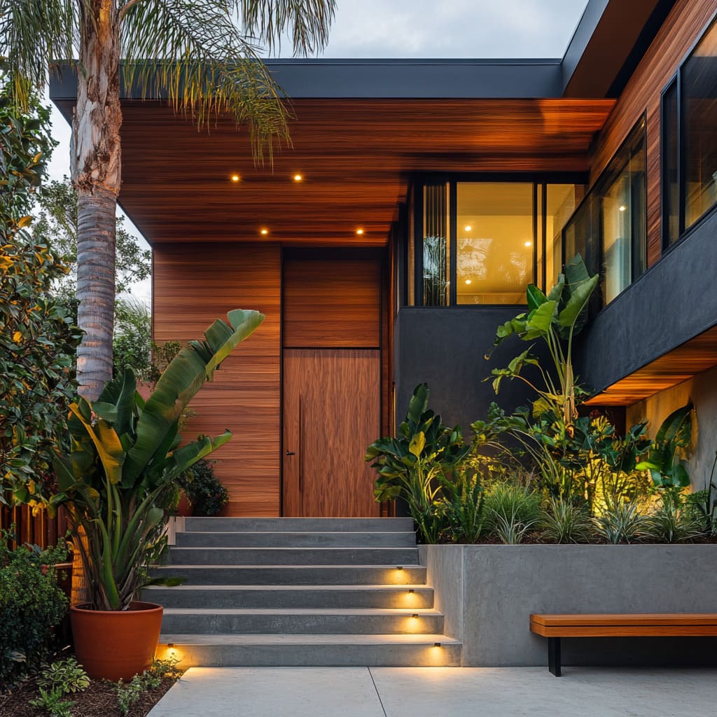
Subtle lighting integrated along the pathway is another way to enhance the appeal of the entry. Recessed lights placed strategically along the path can illuminate each step or slab, creating a soft, welcoming glow in the evening.
This lighting not only serves a practical purpose but also adds an element of visual warmth, making the home appear more inviting after dark
Incorporating minimalist lighting along pathways is one of the best mid-century modern house ideas to consider. For example, a pathway with wide concrete slabs and recessed lights creates a seamless flow from the street to the front door, guiding visitors while maintaining the sleek, minimalist aesthetic that defines mid-century modern design.
This approach to entryway design, with minimalist doors, structured pathways, and subtle lighting, ensures that the entry feels like an extension of the home’s overall style. Each element is carefully chosen to complement the modern lines and natural materials, creating a balanced and welcoming entry that serves as a perfect introduction to the home’s architecture
Landscaping: Integrating Nature with Architecture
Structured, Low-Maintenance Landscaping
Landscaping in mid-century modern design isn’t merely an afterthought—it’s an integral part of the home’s overall aesthetic. The goal is to create a natural flow between the house and its surroundings, with structured, low-maintenance landscaping that reflects the simplicity and clean lines of the architecture.
The choice of plants and their arrangement plays a critical role in achieving this balance. One of the key principles when selecting plants for a mid-century modern home is to choose native species that thrive in the local climate.
This ensures that the landscaping requires minimal upkeep while maintaining a lush, green look. Native plants are typically well-adapted to the environment, requiring less water and care, which aligns with the low-maintenance philosophy that is essential in these homes.
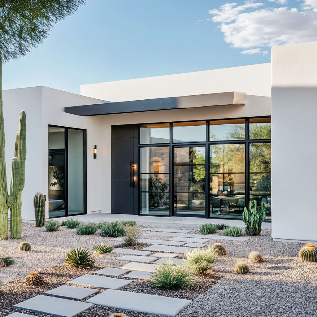
In drier climates, for example, succulents, agave, and cacti can be excellent choices, while in more temperate zones, ornamental grasses and evergreens may be more appropriate
Geometric plant arrangements are a hallmark of mid-century modern landscaping. Rather than opting for a wild, unstructured look, the focus is on clean, organized patterns that mirror the home’s design.
For instance, rows of boxwood shrubs can line a concrete path, or a series of tall, spiky grasses can create vertical lines that echo the home’s windows or roofline. The use of symmetrical, repetitive planting arrangements adds structure to the landscape while complementing the home’s architecture
Ornamental grasses are a great choice for softening the hard lines of a mid-century home. Their delicate, flowing texture contrasts with the clean, crisp edges of the house, creating a balance between organic and geometric elements.
Shrubs and trees can also be used strategically to soften the hardscape while maintaining the minimalist aesthetic. Placing trees at key points around the home adds vertical interest without overwhelming the simplicity of the design.
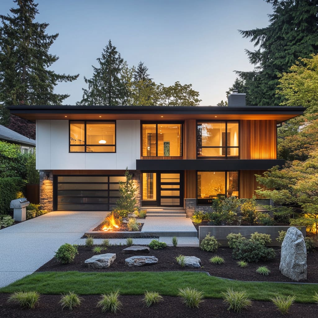
This approach is especially effective in modern flat roof house designs, where the clean horizontal roofline is complemented by structured planting below. The flatness of the roof is reflected in the low-growing plants, while taller grasses or shrubs are used to create gentle contrasts, ensuring the landscaping and the house work together as a unified whole
Terraced Planters and Retaining Walls
In many mid-century homes, the natural terrain plays a significant role in shaping the landscape design. This is where terraced planters and stone retaining walls come into play.
These elements allow for a layered approach to planting, adding depth and dimension to the yard while maintaining the clean, modern aesthetic. Terraced planters are especially useful in homes with slight elevation changes.
Rather than fighting against the natural slope of the land, these planters embrace it, creating structured tiers that can be filled with a variety of plants. The terracing itself can be designed using materials that echo those used in the house—concrete, stone, or wood.
This approach ensures that the planters feel like an extension of the home, rather than separate elements. The layering of the plants in these terraces adds visual interest, allowing for a dynamic mix of textures and colors without disrupting the minimalist design
Stone retaining walls serve both a functional and aesthetic purpose. They provide support in areas where the land slopes, but they can also act as design elements, introducing a natural, rugged texture that contrasts with the smoother surfaces of the home.
The use of natural stone grounds the home in its surroundings, giving it a sense of permanence and connection to the earth
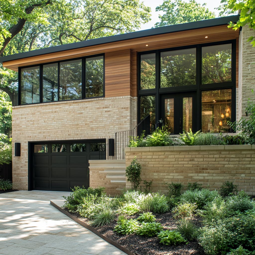
In a case study of a mid-century home with a sloped front yard, terraced planters were used to create a series of levels leading up to the front entrance. Each tier was planted with a mix of low-maintenance grasses and succulents, ensuring the design was both visually appealing and easy to maintain.
Stone retaining walls framed each planter, seamlessly integrating with the stone facade of the house. The result was a landscape that added depth and texture to the yard while perfectly complementing the clean lines of the home’s architecture.
This method of layering planting through terraces and using stone retaining walls offers a way to add interest and functionality to the landscape without overwhelming the design. By keeping the planting structured and low-maintenance, the landscape remains in harmony with the minimalist, modern aesthetic of the home, reinforcing the connection between the house and its natural surroundings
The Importance of Lighting in Highlighting Architectural Features
Subtle Exterior Lighting
In mid-century modern house design, lighting plays a crucial role in emphasizing the home’s architectural features while maintaining the clean lines and minimalism that define the style. The goal with exterior lighting is to enhance, not overshadow, the home’s structure.
Subtle lighting can be used to bring out the textures and details of materials like wood, stone, and glass, creating an inviting glow that works in harmony with the overall design. Recessed lighting is an ideal choice for mid-century modern homes, as it can be placed under roof overhangs or tucked into architectural niches.
These fixtures remain out of sight during the day, maintaining the home’s sleek look, while at night they softly illuminate the exterior without drawing too much attention to the fixtures themselves. This kind of lighting works particularly well for showcasing the natural texture of stone walls or the rich grain of wood accents, making these materials stand out in a way that feels organic
Wall-mounted lighting also fits well with mid-century modern aesthetics, especially when paired with natural materials. These lights can highlight the geometric forms of the home without interrupting its lines, ensuring that the architectural features remain the focus.
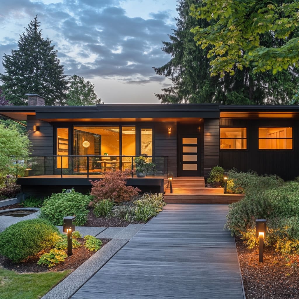
By using soft, warm lighting, the home takes on a welcoming tone in the evening, making the exterior feel both modern and inviting. For example, in mid-century ranch style homes, the combination of recessed lighting and carefully placed wall fixtures can bring out the warmth of a stone facade, while also emphasizing the flat planes and horizontal lines that define the architecture.
The lighting adds a layer of depth and interest, particularly in the evening when the interplay of light and shadow brings the exterior to life
Integrating Lighting Along Pathways and Driveways
Lighting pathways and driveways isn’t just about safety—it’s about enhancing the overall design of the home in a way that’s both practical and visually appealing. In mid-century modern homes, the use of minimalist lighting along these areas is key.
The fixtures themselves should remain understated, blending seamlessly with the landscape while providing functional illumination
Pathways can be lit using in-ground lights that line the edges, creating a soft glow that guides visitors to the entrance without overwhelming the design. The lighting should complement the materials used in the path, whether it’s concrete, stone, or wood.
This approach keeps the focus on the architecture and the surrounding landscape, enhancing the overall aesthetic of the home. Driveways can benefit from low-profile lighting that mirrors the simplicity of the home’s design.
These fixtures should be placed strategically along the edges, ensuring enough light for safety while maintaining the home’s clean lines. The goal is to keep the lighting functional yet subtle, so it doesn’t disrupt the minimalist aesthetic
A case study that highlights the power of subtle lighting can be seen in many modern house design ideas, where the integration of pathway and driveway lighting enhances the overall appeal of the home. In these homes, soft lighting along the edges of the path and driveway serves both as a guide and as a design feature, elevating the modern look while ensuring the safety and comfort of residents and guests
Garage Integration in Mid-Century Modern Exteriors
Sleek Garage Door Design
In mid-century modern homes, the garage isn’t just a functional necessity—it’s part of the overall aesthetic. The garage door should seamlessly integrate with the rest of the facade, ensuring the home’s sleek, modern look remains uninterrupted.
One of the most effective ways to achieve this is by using materials like glass, metal, or smooth panels, which match the exterior’s overall palette and geometric precision
Horizontal lines in garage doors are particularly popular in mid-century modern homes, as they echo the clean, linear forms that define the architecture. Whether the door is made from metal or wood, maintaining horizontal slats or panels ensures that the design remains cohesive with the rest of the home.
Glass panels can also be incorporated to add transparency and light, making the garage door feel less like a barrier and more like an extension of the home’s design
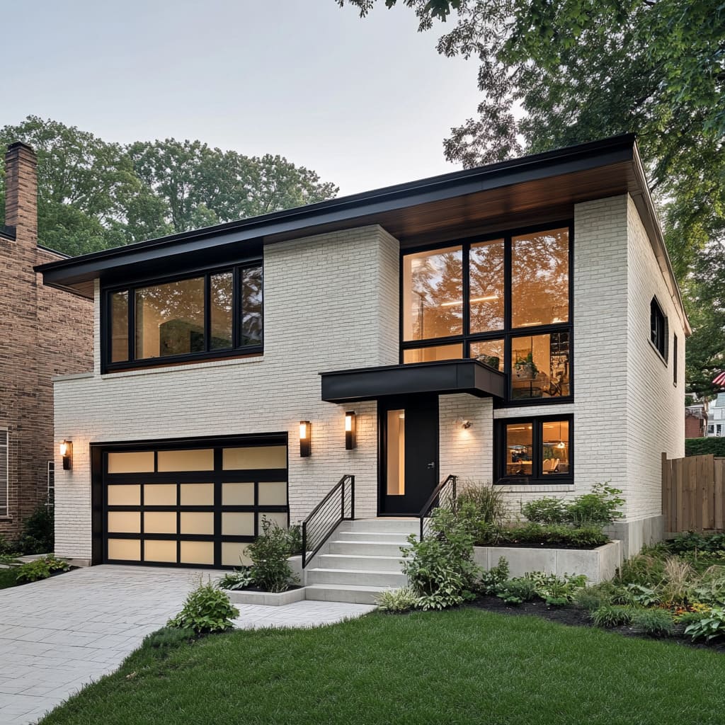
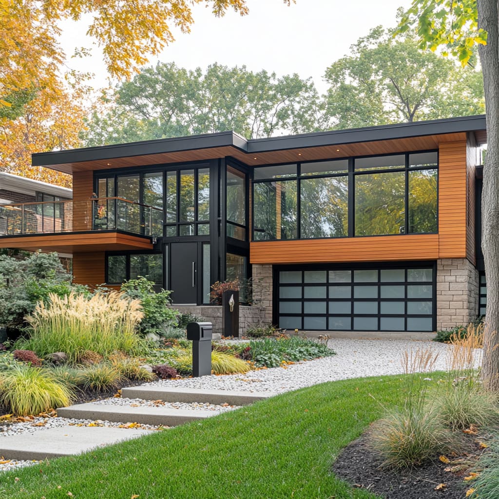
For example, in mid-century modern house design, garage doors often feature frosted glass or smooth metal panels with horizontal lines, enhancing the home’s geometric structure. These doors not only provide functionality but also contribute to the overall design, ensuring that the home’s aesthetic remains intact from every angle
A great example of effective garage integration can be seen in mid-century ranch style homes, where the garage is often positioned in such a way that it blends effortlessly into the facade. By using materials that match the exterior and maintaining clean lines, the garage door doesn’t feel like an interruption but rather a continuation of the home’s sleek, modern design.
This approach ensures that the home’s form and function work in harmony, providing both visual appeal and practical use. Incorporating these lighting and garage design strategies into mid-century modern homes helps maintain the integrity of the design while ensuring the home remains both practical and visually stunning
Conclusion
Designing a striking modern mid-century house exterior relies on a few essential principles that work together to create a home that feels both contemporary and timeless. At the heart of mid-century modern architecture homes lies the commitment to simplicity, where clean lines and minimalist forms take center stage.
This simplicity is not just about the absence of excess but about making purposeful choices that highlight the beauty of the home’s structure and its surroundings
A harmonious material palette plays a critical role in achieving this balance. The combination of sleek, modern materials—such as glass, metal, and concrete—with organic elements like wood and stone creates a contrast that feels natural, yet sophisticated.
The key is to allow these materials to work together, blending the sharpness of modern design with the warmth of nature. This interplay makes mid-century homes feel grounded, even as they embrace a modern aesthetic
Incorporating nature is another vital aspect of mid-century design. Whether through expansive glass windows that bring the outside in or carefully selected landscaping that complements the architecture, the goal is to create a seamless transition between the home and its environment.
Thoughtfully integrated plantings and natural stone can soften the geometric lines of the house, ensuring the design feels inviting rather than stark
The balance between modern materials and natural elements results in a design that doesn’t just follow trends but stands the test of time. Flat roof house design ideas, for example, offer a perfect canvas to explore these mid-century principles.
A flat roof not only enhances the home’s minimalist appeal but also provides a horizontal element that mirrors the landscape, creating a stronger connection with the surroundings
Ultimately, mid-century modern design offers a framework that can be adapted to any personal style or environment. The beauty of this architectural approach lies in its versatility—it encourages simplicity while allowing room for individual expression.
Whether you’re inspired by the sleek lines of classic mid-century homes or drawn to the use of organic textures, these design principles offer endless possibilities for creating a home that feels both modern and timeless

