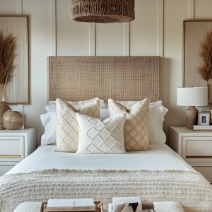
Burnt orange has a warmth that instantly makes a bedroom feel inviting, but getting the balance right takes more than just adding a few throw pillows. In the right hands, this color can create depth, highlight architectural features, and bring a sense of richness without feeling heavy.
The trick? Designers use thoughtful placement, a mix of textures, and strategic lighting to keep the space feeling layered rather than overwhelming.
This article takes a close look at burnt orange bedroom ideas that go beyond the usual advice. Instead of simply pairing it with neutrals or adding pops of color, designers use smart techniques to shape the atmosphere of the room.
From the way light interacts with different finishes to the role of wood, metal, and textiles in balancing the warmth, each decision influences how burnt orange is perceived. Whether in modern city apartments or cozy rustic retreats, these design methods ensure the color enhances the space rather than dominating it.
Strategic Use of Proportion and Placement
Using burnt orange effectively in a bedroom is all about knowing where to introduce it and how much to use. Designers carefully balance this bold shade, making sure it enhances the space rather than taking over.
Instead of covering entire walls or overwhelming the room with too much of the same tone, they rely on selective placement and repetition to keep the color controlled and visually interesting.
Modulation of Color Blocks
One of the smartest ways to work with burnt orange is through carefully defined areas rather than full-room saturation. A single accent wall can create warmth and depth, but covering all four walls can feel overwhelming, especially in smaller spaces.
That’s why many designers opt for strategic placement—like a textured burnt orange headboard, an upholstered bench at the foot of the bed, or a painted panel that stops short of the ceiling. This approach keeps the color intentional while allowing room for contrast with neutrals or natural materials.
Another effective way to introduce burnt orange without making it feel too strong is through architectural elements. Vertical paneling, wainscoting, or fluted wall treatments add texture while softening the impact of the color.
These techniques prevent a burnt orange feature from feeling flat, as the shadows and variations in tone create movement and dimension.

Repeating Tones in Pockets of the Room
Instead of making burnt orange the centerpiece of everything, designers spread it across different areas in small, well-placed doses. This method helps the color feel woven into the space rather than concentrated in one overwhelming spot.
A burnt orange themed bedroom might feature a velvet armchair in one corner, a textured throw across the bed, and a piece of abstract artwork that picks up similar hues. These accents work together to create a sense of flow, guiding the eye through the room naturally.
Pillows are another subtle way to echo burnt orange without committing too much. Layering different textures—such as a ribbed pillow next to a woven one—adds depth and variety.
Similarly, small décor pieces like vases, ceramic bowls, or even a patterned rug with hints of burnt orange help distribute the color in a way that feels effortless. By breaking up large areas of color and repeating it in different places, designers ensure that burnt orange remains a striking yet balanced part of the bedroom’s overall aesthetic.
The key is knowing when to go bold and when to let the color settle into the background, creating a space that feels cohesive rather than overpowering.

Textural Variations and Layering
Burnt orange naturally draws attention, but its impact depends just as much on texture as on color. The right mix of materials keeps the space feeling rich and layered rather than one-dimensional.
Instead of relying on a single finish, designers play with contrasting surfaces—soft against rough, matte beside glossy, and structured elements paired with organic shapes. This interplay prevents the space from feeling heavy while allowing burnt orange to remain a strong, inviting feature.

Mixing Multiple Textures in the Same Hue
One of the best ways to bring warmth into a room without making it feel repetitive is to use different materials within the same color family. A burnt orange bouclé chair, a ribbed knit throw, and smooth velvet pillows might all share the same tone, but their textures create a visual rhythm.
The depth in these materials makes the space feel layered, avoiding the flatness that comes from using just one kind of fabric. Layering also helps control how much impact the color has.
A bedroom with a burnt orange linen duvet paired with a few nubby wool cushions will feel far different from one where everything is in sleek satin. The combination of matte and plush finishes allows the color to appear dynamic rather than overpowering.
This technique works well in both modern and rustic spaces. In a contemporary setting, a smooth leather accent chair can contrast against a woven jute rug, while in a farmhouse-inspired design, a soft, quilted bedspread might be paired with a chunky knit throw.
These choices ensure the color never looks flat or overly staged.

Balancing Smooth and Rough Finishes
A burnt orange headboard wrapped in velvet feels completely different when placed against a reclaimed wood nightstand versus a glossy, lacquered bedside table. This is where the tension between textures becomes a crucial design tool.
By placing structured, sleek surfaces next to soft, organic materials, the color is given new life. For example, a burnt orange quilt with a crinkled finish draped over a crisp, white bed adds casual comfort, while placing terra cotta ceramics on a polished wooden dresser enhances the warmth of the room.
The idea is to let each element play off the other—one adding softness, the other providing structure.

Another trick often used in orange bedroom decorating ideas is incorporating metals like brass or matte black hardware into the design. A tufted, velvet bench in burnt orange feels grounded when placed alongside industrial-style light fixtures or dark metal shelving.
This kind of contrast prevents the space from feeling overly themed, ensuring that burnt orange remains a sophisticated accent rather than an overwhelming presence. By layering textures and balancing finishes, designers keep burnt orange feeling inviting, dynamic, and effortlessly stylish—never heavy or overpowering.
This careful curation makes the difference between a bedroom that simply uses color and one that feels thoughtfully designed.

Neutral and Warm-Toned Anchors
Burnt orange has a way of drawing attention, but without the right supporting colors, it can easily feel too bold or disconnected. This is where neutrals and warm earth tones come in.
Instead of competing with burnt orange, they soften its impact, creating a natural balance that keeps the space feeling comfortable and refined. Whether through walls, furniture, or subtle décor, these grounding elements play a key role in making burnt orange work effortlessly in a bedroom.
Earthy Palettes as a Buffer
A bold color always needs something to hold it in place. In bedrooms that feature burnt orange, off-white, beige, and warm taupe often serve as the foundation.
These colors act as a visual cushion, preventing the space from feeling too intense while keeping everything light and breathable. The most effective way to use neutrals is through large, continuous surfaces.
A bedroom with warm beige walls, off-white bedding, and a soft cream area rug immediately sets the tone for burnt orange to take center stage without overwhelming the room. The color still makes an impact, but in a way that feels intentional rather than overpowering.
Textiles also play a role in maintaining balance. A linen duvet cover in soft ivory or sheer curtains in a sandy tone introduce warmth while allowing burnt orange accents—like pillows or a throw—to stand out naturally.
This layering of neutral tones helps integrate the color without making it feel abrupt. For those who prefer a slightly richer contrast, taupe or greige walls create a deeper, cozier effect.
These shades still lean neutral but offer a touch more depth, helping burnt orange blend seamlessly while adding a refined warmth to the space.

Bridging Colors Through Wood and Brass
Beyond neutrals, natural wood is another tool designers use to anchor burnt orange. Wood tones that have a golden or reddish undertone—such as walnut, teak, or light oak—work particularly well because they mirror the earthy quality of the color without creating too much contrast.
A walnut-paneled accent wall, for example, creates an inviting backdrop that makes burnt orange elements feel like a natural extension of the room. Even something as simple as a wooden nightstand or a rattan bench can add a sense of warmth that prevents the color from feeling out of place.
enhances the richness of burnt orange. A brass wall sconce, a metallic lamp base, or small decorative objects like candle holders or picture frames introduce a subtle glow that deepens the warmth of the room.
Unlike cooler metals like chrome or silver, brass has an understated warmth that pairs beautifully with earthy colors. This combination of neutral foundations, warm wood, and metallic touches is what makes bedroom ideas with burnt orange feel polished rather than overpowering.
The key is balance—allowing burnt orange to stand out while ensuring it has the right elements around it to keep everything feeling harmonious.

Depth Through Architectural Details
Burnt orange is a bold color, but how it interacts with the surfaces it’s placed on makes all the difference. Flat applications can sometimes feel too heavy, but by adding texture and structure, designers create depth that softens the intensity while making the space feel more refined.
The key lies in architectural elements that shape how the color is perceived—whether through vertical paneling, built-ins, or integrated upholstery.
Vertical Slats, Fluting, and Paneling
Instead of simply painting a wall in burnt orange, many designers turn to textured treatments like fluted panels, vertical slats, or upholstered sections. These elements introduce shadows and highlights, subtly changing the way the color interacts with light.
Rather than reading as a solid block, burnt orange appears more layered, shifting in tone depending on the time of day and the room’s natural lighting. Fluted paneling is especially effective in modern or Scandinavian-inspired bedrooms, adding architectural detail without overwhelming the space.
A slatted burnt orange accent wall behind the bed, for example, creates dimension while keeping the overall look balanced. Similarly, upholstered wall panels can soften the intensity of the color, especially when paired with neutral bedding and light wood finishes.
For those who prefer a structured yet warm atmosphere, designers often use half-wall paneling in burnt orange, leaving the upper section in a neutral tone. This approach keeps the color grounded while maintaining a sense of openness.
Paired with off-white or beige walls, it provides contrast without feeling too strong.

Multifunctional Built-Ins
Another way to introduce burnt orange without making it the dominant feature is by incorporating it into functional elements within the bedroom. Instead of relying on large color blocks, designers use small but consistent applications across built-in shelving, seating, and workspaces.
A desk chair in burnt orange velvet, tucked into a built-in workspace, introduces warmth without overpowering the area. Similarly, a bench upholstered in the same shade at the foot of the bed connects the space without making it feel overly coordinated.
This method distributes the color strategically, making it feel integrated rather than added as an afterthought. Built-in shelving with burnt orange backing is another clever approach.
When paired with wooden or brass-trimmed shelves, the color serves as a subtle highlight, allowing neutral books, ceramics, and décor to stand out. This technique works well in both contemporary and traditional bedrooms, offering a way to bring warmth into the space without resorting to full-wall coverage.
By using structured surfaces and multifunctional elements, designers keep burnt orange feeling intentional and layered, ensuring that the space remains inviting rather than overwhelming. These architectural choices allow for creativity while maintaining a sense of balance, proving that a strong color can be both refined and practical when applied thoughtfully.

Contrast and Relief through Lighter Elements
Burnt orange brings warmth and depth to a bedroom, but without balance, it can feel too heavy. The most effective way to make the color stand out while keeping the space comfortable is by introducing lighter tones for contrast.
White, cream, and soft neutrals prevent visual fatigue and help create a fresh, airy atmosphere. At the same time, carefully placed darker accents provide structure, keeping the color from overwhelming the space.

White or Soft Cream Bedding
When the bed itself is a strong visual element—whether through a burnt orange upholstered headboard or deep-toned accent pillows—keeping the bedding light and neutral creates the perfect counterbalance. Crisp white sheets or a soft cream duvet act as a visual break, allowing the color to shine without dominating the entire composition.
This contrast is particularly effective in bedrooms with bold, burnt orange walls or accent furniture. Without a lighter element to ground the design, the color can start to feel too intense.
That’s why designers frequently opt for a mix of white, beige, or pale taupe in bedding, curtains, and rugs. This approach ensures the space feels inviting rather than visually overwhelming.
For a softer look, some designs incorporate layered neutrals instead of stark white. A textured ivory throw, a beige linen duvet, or off-white woven cushions can add warmth while still offering relief from the intensity of burnt orange.
This technique works well in both modern and rustic-inspired interiors, making the color feel versatile and balanced.

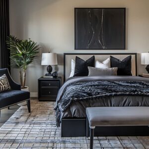
Selective Use of Dark Tones
While lighter hues soften burnt orange, darker accents bring definition. Without structure, warm tones can sometimes feel too relaxed or diffuse.
That’s where elements like black metal details, deep wood furniture, or dark-framed artwork help contain and refine the color. For example, a sleek black nightstand beside a burnt orange bed adds a sophisticated contrast, keeping the color grounded.
Dark wooden furniture, whether in walnut, espresso, or deep mahogany, creates a rich backdrop that enhances the warmth of burnt orange without letting it take over. Even small touches—like black wall sconces, dark-framed mirrors, or deep charcoal throw pillows—can provide just enough contrast to sharpen the look.
This approach is particularly effective in modern interiors, where a mix of warm and cool tones creates a more dynamic space. Instead of letting burnt orange blend too softly into a monochromatic scheme, designers use structured, darker elements to define its presence.
The result is a well-balanced composition that feels curated rather than overpowering. By pairing lighter neutrals with controlled dark accents, burnt orange stays bold but refined, ensuring it enhances the space rather than overwhelming it.
This balance is key to creating a timeless and inviting aesthetic—one that works beautifully across different design styles, from contemporary lofts to cozy, nature-inspired retreats. If you’re looking for bedroom ideas with burnt orange, this thoughtful mix of light and dark elements will make sure the color feels striking without ever being too much.

Layered Lighting Approaches
Lighting plays a major role in how burnt orange is perceived in a bedroom. The right illumination enhances its warmth, while harsh or unbalanced lighting can make it feel overpowering.
Designers use layered lighting techniques to shape the mood, ensuring the color reads as inviting and sophisticated rather than too intense. By blending soft-glow fixtures with natural daylight, they create a space where burnt orange feels rich and dynamic throughout the day.

Soft-Glow Sconces and Recessed Lights
Burnt orange reacts differently depending on the type of lighting used. Soft, diffused light enhances its cozy appeal, while direct, cool-toned lighting can sometimes make it feel overly bold.
To keep the space comfortable, designers lean on warm-toned fixtures like wall sconces, LED strips, and recessed lights that cast a subtle glow rather than a harsh glare. Sconces with fabric or frosted glass shades are a popular choice, as they soften the light and prevent sharp contrasts.
Positioned beside the bed or along built-in shelving, they highlight the depth of burnt orange without making it overwhelming. LED strips placed under floating shelves or behind headboards add another dimension, bringing out the richness of the color in a way that feels natural and layered.
The warmth of the light source matters just as much as placement. Soft white or warm amber-toned bulbs (2700K-3000K) complement burnt orange beautifully, keeping it from looking too stark.
In contrast, cooler daylight bulbs (5000K and above) can make the color appear too intense or overly saturated, disrupting the inviting feel of the room.

Pairing with Natural Daylight
Natural light shifts throughout the day, which means burnt orange never looks exactly the same from morning to night. This variation is one of the best ways to keep the color feeling nuanced rather than static.
Large windows, framed with sheer or light-filtering curtains, allow the room to breathe while preventing the shade from feeling too heavy. During the morning and midday, natural daylight brightens burnt orange, making it feel vibrant and full of energy.
In the evening, the color takes on a richer, more intimate feel under softer lighting. This dynamic quality keeps the room visually interesting and ensures that burnt orange adapts beautifully to different moods and times of day.
Designers also use window placement to their advantage. A burnt orange accent wall positioned opposite a south- or west-facing window will catch warm afternoon light, making the color glow.
On the other hand, if the bedroom gets cooler northern light, adding warmer artificial lighting helps prevent burnt orange from looking muted or dull. By combining layered artificial lighting with thoughtfully managed daylight, designers create a space where burnt orange feels balanced, inviting, and effortlessly stylish.
Whether the goal is a bold statement or a subtle warmth, the right lighting makes all the difference in how the color shapes the bedroom’s atmosphere.

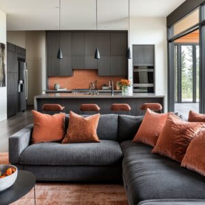
Combining Rustic and Contemporary Notes
Burnt orange has a natural warmth that works beautifully in both modern and rustic spaces, but the key to making it feel sophisticated rather than themed is in the contrast between textures and materials. By pairing organic, rough-hewn elements with smooth, refined finishes, designers create a layered look that feels rich and intentional.
This mix of raw and polished surfaces makes burnt orange stand out in a way that feels natural rather than overpowering.

Raw Wood and Refined Upholstery
One of the most effective ways to bring depth to a burnt orange bedroom is by combining weathered wood with soft, luxurious fabrics. A reclaimed wood bed frame paired with a burnt orange velvet headboard balances rugged and plush textures, giving the space a curated feel rather than one that leans too heavily in a single direction.
This contrast works particularly well in modern farmhouse or industrial-style interiors, where unfinished wood beams or distressed furniture create a grounded base, while burnt orange upholstery or leather seating adds a refined touch. The natural imperfections of raw wood bring a sense of authenticity, keeping the room from feeling overly polished.
Even small details—like a rough wooden nightstand next to a sleek metal lamp, or a burnt orange leather bench at the foot of a linen-dressed bed—help create a layered, high-end look. The goal is to let opposites enhance each other rather than compete, making burnt orange feel like a considered choice rather than an afterthought.

Stone or Plaster Paired with Orange Hues
Incorporating stone, plaster, or concrete into a burnt orange bedroom creates a timeless, earthy contrast that makes the space feel grounded. These materials act as a subtle backdrop, allowing burnt orange to take center stage without feeling overwhelming.
For instance, a plaster accent wall in soft beige or taupe provides a textural canvas that softens burnt orange bedding or decor. In a similar way, a stone fireplace or exposed brick wall introduces an organic element that enhances the richness of the color.
These materials absorb and reflect light differently throughout the day, making burnt orange appear more dynamic rather than flat. Designers often use concrete finishes in contemporary spaces to contrast against the warmth of burnt orange.
A polished concrete floor paired with a burnt orange area rug creates an inviting mix of industrial and cozy elements. Likewise, a simple stucco or limewash wall behind a burnt orange headboard brings in old-world texture while keeping the overall look refined.
The magic of combining rustic and contemporary elements lies in how they play off each other. Burnt orange feels more luxurious when set against raw materials, and those raw materials feel more sophisticated when paired with warm, inviting hues.
This balance ensures the color feels thoughtfully integrated rather than overpowering, making the bedroom feel stylish, comfortable, and effortlessly inviting.

Methodical Control of Larger Surfaces
Burnt orange can bring a bedroom to life, but when applied to large areas, it needs careful handling to prevent it from feeling overpowering. Designers often take a structured approach to ensure the color feels intentional and balanced.
By framing accent walls with architectural elements and breaking up solid blocks of color, they create visual interest while keeping the room from feeling heavy.

Accent Wall Boundaries
A full burnt orange wall can be a striking design choice, but without definition, it can overwhelm the space. That’s why designers often use built-in shelving, wood paneling, or geometric framing techniques to give the color a contained and structured appearance.
For example, instead of painting an entire wall from edge to edge, some designs introduce a wooden frame, arched molding, or recessed paneling to create a visual stopping point for the color. This technique keeps burnt orange from feeling like it’s spreading too far while also giving the wall more depth.
Another effective strategy is interrupting the orange with architectural elements. Built-in bookshelves or a floating console in a contrasting finish can break up a solid burnt orange wall while still allowing the color to act as a bold backdrop.
This keeps the space feeling polished rather than overwhelming. Even partial coverage, where burnt orange stops just short of the ceiling or doesn’t extend to the full width of the wall, can create a zoned effect that makes the space feel more layered.
Pairing it with textured neutrals, such as warm taupe or soft cream, helps keep the color from feeling too dominant.

Partial Paneling or Slatted Zones
Instead of using burnt orange as a flat, uninterrupted surface, many designs incorporate textured panels, slats, or geometric sections to break up the intensity. This technique softens the color’s presence while still making a bold statement.
Vertical slats in burnt orange, for example, create a subtle play of shadows and light, making the color appear more dynamic rather than static. This approach works especially well behind the bed, where a fluted or grooved headboard wall can add depth without the need for additional artwork or decoration.

Another option is dividing the wall into sections, using a combination of painted surfaces and textured panels like linen, wood, or plaster. This technique reduces the visual weight of burnt orange while making the room feel more refined.
A lower portion of the wall in burnt orange, topped with neutral paneling or an off-white upper section, creates a grounded yet airy effect. By framing and breaking up larger surfaces, designers ensure that burnt orange remains bold yet balanced, giving the bedroom character without overwhelming the senses.
These structural choices make the color feel like an integrated part of the design rather than a standalone feature, resulting in a space that feels both dynamic and thoughtfully curated.

Thinking Beyond Standard Combinations
Burnt orange is often associated with predictable pairings like beige or deep brown, but the most striking designs push beyond expected color schemes to create depth and character. Instead of treating burnt orange as a single note in the room, designers introduce subtle variations in tone and complementary organic motifs that make the space feel richer and more intentional.
Variation in Shade Within the Same Space
A closer look at some of the most visually compelling burnt orange bedrooms reveals that what appears to be a single color is actually a deliberate mix of related hues. Rather than relying on one saturated shade, designers incorporate rust, copper, terracotta, and even peachy undertones to create a layered, multidimensional effect.
For example, a burnt orange headboard may sit against a deep rust accent wall, while throw pillows in muted copper and a terracotta rug introduce soft shifts in color. These subtle variations prevent the space from feeling flat or overly matched, making the design feel more custom rather than off-the-shelf.
This approach also applies to different materials and finishes. A smooth leather chair in burnt orange can sit alongside a woven rust-colored throw blanket, while glazed ceramic vases in warm clay tones add another textural layer.
The interplay of sheen and matte surfaces enhances the depth of the color palette, keeping the room visually engaging.

Organic Motifs Tied to Orange
Rather than using burnt orange as an isolated accent, many designs connect it to natural themes, reinforcing its warmth with conceptual depth. This is often done through subtle, nature-inspired elements, like abstract desert landscapes in artwork, woven rugs with earthy patterns, or sculptural decor in sunbaked hues.
A large area rug in sandy, rust-toned motifs might subtly hint at the colors of rock formations or sun-faded textiles, making burnt orange feel like an organic part of the space rather than an arbitrary color choice. Similarly, curved wooden furniture, arched mirrors, or raw-edge stone tables echo the natural warmth of the color, further embedding it into the design language.
The key is in creating a connection between burnt orange and the broader theme of the room. Instead of letting it stand alone, designers weave it into a story of texture, color, and form, making the space feel thoughtful and curated rather than just bold for the sake of being bold.
By experimenting with tonal variations and drawing inspiration from natural elements, burnt orange bedrooms take on a depth and richness that go beyond simple color coordination. This method ensures the space feels inviting, warm, and visually dynamic—rather than a one-note interpretation of a single shade.

Overarching Lessons in Avoiding Overkill
Burnt orange brings warmth and personality to a bedroom, but keeping it refined requires a thoughtful approach. The most visually successful designs don’t rely on sheer saturation—instead, they balance color intensity, texture, lighting, and functionality to make burnt orange feel natural rather than overpowering.
Balance Through Neutral Grounding
The key to letting burnt orange shine without overwhelming the space is giving it a foundation of neutral tones. Many designers use off-white walls, beige bedding, or light wood furniture to create a calm, grounding effect.
This allows burnt orange accents—whether in a headboard, throw blanket, or upholstered chair—to stand out without dominating the room. Rather than layering multiple bold elements, designers often concentrate burnt orange in specific areas, making it feel intentional rather than excessive.
A single statement wall, for example, works best when framed by muted surroundings like soft cream curtains or an earthy-toned rug.

Textural Complexity
Burnt orange takes on a completely different personality depending on texture. A plush velvet headboard softens the color and gives it a refined glow, while a woven linen pillow or a ribbed knit throw adds depth and dimension.
Using a variety of textures prevents the color from feeling static or overwhelming, keeping the design visually layered rather than one-note. The trick is in mixing finishes thoughtfully—for example, a matte terracotta accent wall next to a polished wood nightstand or a leather ottoman with a woven area rug.
These variations break up the intensity and help burnt orange blend seamlessly with the rest of the space.

Controlled Repetition
Repeating burnt orange throughout a bedroom ties the space together, but designers avoid making it too predictable. Instead of using the same exact shade everywhere, they shift tones and textures to keep the palette from feeling overly matched.
For instance, if the bed has burnt orange pillows, the desk chair might feature a softer rust shade, and the artwork above the bed could introduce a mix of copper, terracotta, and deep clay tones. These variations maintain harmony without making the space look like it’s built around a single color swatch.

Strategic Lighting
Lighting plays a huge role in how burnt orange is perceived. Warm-toned lighting, such as brass sconces or table lamps with soft white bulbs (2700K-3000K), enhances its cozy side, while cooler lighting can make it feel too sharp or artificial.
Recessed LED strips behind headboards or floating shelves add a soft glow, making burnt orange elements feel more inviting rather than stark. Meanwhile, natural light from a large window framed with sheer curtains keeps the shade feeling airy and dynamic throughout the day.

Incorporation into Functional Areas
Burnt orange works best when it’s woven into both the aesthetic and functionality of the room. Rather than treating it as just an accent, designers often use it in practical furniture pieces like a desk chair, built-in bench, or upholstered ottoman.
These elements serve a purpose while reinforcing the color scheme in a way that feels natural rather than decorative for the sake of decoration. A burnt orange reading nook with a lounge chair or a built-in seating bench near a window helps anchor the color in a meaningful way, ensuring it feels like an integral part of the design rather than an add-on.

Why It Works So Well
- Warmth and Comfort: Burnt orange has an innate sense of coziness, making it a perfect fit for bedrooms where relaxation is key.
- Versatility with Earth Tones: The color pairs beautifully with wood, stone, brass, and bronze, ensuring it blends seamlessly with organic materials.
- Potential for Variation: Designers can explore different depths within the burnt orange spectrum—from muted rust to deep terracotta—keeping the color interesting and layered rather than repetitive.
By balancing neutral foundations, varied textures, controlled repetition, strategic lighting, and functional placement, burnt orange feels stylish and sophisticated, never overwhelming. The best designs let the color breathe, ensuring it enhances the space rather than taking over.

Conclusion
These bedrooms prove that burnt orange, when used with intention, enhances rather than overwhelms a space. The key lies in balance, layering, and strategic placement, ensuring the color feels inviting rather than overpowering.
Whether introduced through accent walls, furniture, or textiles, burnt orange thrives when paired with neutral backdrops, warm wood tones, and carefully curated lighting. The secret to making it work is subtle repetition—echoing the hue in different textures and finishes without making the palette feel predictable.
A velvet chair, a ribbed ceramic vase, or a woven throw in slightly varied tones keeps the color from feeling flat while adding dimension to the room. Meanwhile, structured contrasts like deep wood paneling, brass accents, or light-colored bedding help define and contain the warmth, preventing it from dominating the entire space.
By thinking beyond simple color choices and focusing on how burnt orange interacts with materials, light, and texture, designers craft spaces that feel intentional and timeless. The result is a bedroom that radiates warmth and character—bold enough to make a statement yet refined enough to remain endlessly inviting.