Blue and yellow living rooms have a way of standing out, bringing warmth and depth to a space while creating a balanced contrast. This article takes a close look at how these two colors work together, not just in terms of aesthetics but also in the finer details that make a space feel intentional and well put together.
Instead of stopping at the obvious—like pairing navy with mustard—this guide will break down the layers of design that often go unnoticed but make all the difference. From the way textures interact to the role of natural light, every detail plays a part in shaping a room’s overall look.
Whether you’re drawn to a coastal-inspired retreat with soft sky blues and sandy yellows or a dramatic setup with deep navy and rich gold, there are plenty of ways to bring this color combination to life. More importantly, it’s about using these colors in a way that feels natural to the space, creating a living room that is both stylish and inviting.
By the end of this guide, you’ll have a better understanding of how to mix and match these shades, what materials complement them best, and how to use furniture, accessories, and layout choices to create a home that feels both personal and polished.
The Impact of Layered Color and Texture
A blue-yellow living room works best when color is applied in layers rather than bold, singular statements. Instead of relying on a single shade of blue or yellow, the most dynamic spaces mix different tones within each color family, creating a more natural and visually engaging composition.
The Power of Layered Hues
Using both deep and light tones in the same space makes a room feel more refined. A navy sofa might be paired with cushions in mustard, goldenrod, or soft butter yellow.
Meanwhile, a sky-blue sectional can take on a richer look when paired with deeper gold accents. This layering of shades prevents the design from looking too predictable or flat.
The same principle applies to walls and accessories—light blue walls with navy trim or a deep blue feature wall with hints of yellow in framed artwork can subtly tie everything together.
Mixing Textures for Depth
Color is only one part of the equation. A mix of textures brings warmth and dimension, ensuring the space doesn’t feel static.
A plush velvet sofa feels more inviting when paired with woven rattan armchairs or a chunky wool throw. Wooden coffee tables, linen drapes, or metal-framed shelving introduce variety, preventing any single element from dominating the room.
The contrast between sleek and soft surfaces, rough and smooth materials, adds richness without overwhelming the design.

How to Apply These Ideas in Your Home
- If your sofa is a single shade, bring in depth with throw pillows in different fabrics—think linen, boucle, or a subtly patterned weave.
- A neutral or wooden coffee table can be softened with a fabric runner or a decorative tray in a contrasting finish.Try layering blues on a feature wall by painting built-ins in a darker shade while keeping the surrounding walls lighter.
- Bring warmth with accessories—candles in golden holders, woven baskets, or even a ceramic vase in a mustard glaze can reinforce the color balance without making the space feel too matched.
By carefully choosing a mix of tones and textures, a living room in these colors can feel stylish, inviting, and effortlessly put together.

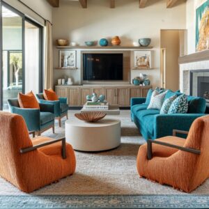
Accent Pieces
A well-balanced mix of accent pieces can bring a blue and yellow living room decorating ideas to life without making the space feel overdone. Small, carefully placed details can reinforce the color scheme in a way that feels effortless, adding warmth, contrast, and character.
Instead of relying on large furniture pieces to establish the theme, decorative touches can make just as much of an impact—sometimes even more so.
Thoughtful Use of Color
One of the easiest ways to make a room feel cohesive is by repeating accent colors in unexpected ways. A bowl of lemons on the coffee table, a golden-hued vase on a bookshelf, or fresh yellow flowers on a side table can introduce color naturally.
These details add vibrancy without making the design feel overly structured. Similarly, navy blue ceramic pieces, patterned throws, or books with rich blue covers create subtle connections throughout the space.
This method works particularly well for those who like seasonal updates. A simple swap of accent pieces—switching from sunflowers in the summer to dried mustard-hued foliage in the fall—can refresh the space without changing the core design.

Pieces That Do More Than Look Good
Accent furniture doesn’t have to be purely decorative. A mustard yellow ottoman, for example, can double as a footrest, an extra seat, or even a small side table with a tray placed on top.
The same applies to statement chairs in bold hues. A navy or gold accent chair positioned near a neutral sofa can add personality while still being a practical part of the room’s seating arrangement.
Layering textiles is another way to incorporate accents in a way that feels organic. A soft woven blanket draped over an armchair, patterned cushions on a neutral sofa, or a deep blue area rug with subtle gold undertones can pull everything together.

How to Use These Ideas in Your Home
- Introduce fresh color with small decorative pieces—lemons in a bowl, yellow candles, or blue glassware can reinforce the theme without feeling forced.
- Use functional accent furniture to make a statement while adding practicality. A bold-colored ottoman or side table can serve multiple purposes.
- Swap out accessories seasonally. Lightweight, bright yellow linen cushions in the warmer months can be replaced with rich velvet in colder seasons.
- Mix in a few unexpected items. A framed print with navy and gold accents, a ceramic lamp in a deep hue, or a textured mustard throw can add depth without overwhelming the room.
By using accent pieces strategically, you can create a dynamic space that feels inviting, stylish, and refreshingly adaptable.

Blending Multiple Styles Within One Space
A blue and yellow lounge can take on a completely different personality depending on the design influences brought into the space. Some interiors lean into rustic elements, while others embrace sleek, modern touches.
The most visually engaging rooms are often a mix of two or more styles, thoughtfully combined to create contrast without clashing.
Finding the Right Balance
A successful mix of styles comes down to balance. If the space leans heavily toward farmhouse design, with exposed beams and vintage-inspired furniture, adding woven textures or navy cabinetry can introduce a subtle coastal touch without disrupting the overall feel.
On the other hand, a mid-century modern foundation—marked by a clean-lined navy sofa and tapered wooden legs—can be made more inviting with contemporary chandeliers, bold artwork, or textured rugs that add warmth. The trick is to find a dominant style and let the secondary influence complement it rather than compete for attention.

Making Mixed Styles Feel Cohesive
The easiest way to merge different aesthetics is through color. A room that blends farmhouse and coastal elements will feel unified if navy appears in both furniture and cabinetry, while mustard accents pop up in artwork, throw pillows, or decorative vases.
Similarly, if a space incorporates mid-century and modern influences, repeating key shades in both furniture and accessories creates a seamless transition. Furniture also plays a major role.
A tufted navy sofa in a modern setting feels more inviting when paired with a classic wooden coffee table, while a coastal-inspired room with rattan textures gains depth with contemporary lighting choices. Even small details—like mixing industrial metal hardware with soft linen upholstery—can subtly bridge different styles.

How to Apply These Ideas at Home
- Pick a primary style as your foundation, then introduce complementary elements through accents and textures.
- Use color to tie everything together—whether it’s navy walls and blue seating, or mustard throw pillows and warm wooden furniture.
- Keep furniture choices intentional. If your room has strong modern influences, add warmth with vintage wood pieces or woven textures.
- Layer textures and materials to make the blend feel natural. A mix of smooth, structured shapes with softer fabrics prevents any one style from dominating.
Blending styles doesn’t mean filling a room with unrelated pieces. It’s about making thoughtful choices that create contrast while keeping everything connected.

Architectural and Built-In Details
Architectural elements and built-in features play a crucial role in shaping the overall feel of a space. Whether it’s the balance of light and dark cabinetry, the thoughtful use of shelving, or the placement of lighting, these details make a yellow and blue living room ideas feel intentional rather than pieced together.
A strong foundation in design allows furniture and decor to shine, ensuring that every part of the space works together seamlessly.
The Power of Two-Tone Cabinetry
A mix of light and dark tones in cabinetry or built-ins is a common approach in both kitchens and living rooms, and for good reason—it creates depth without making the space feel heavy. Many open-concept designs feature white upper cabinets paired with deep navy lower ones, striking the perfect balance between brightness and visual weight.
The same idea applies to built-in shelving in a living room. A media unit with navy cabinets below and lighter open shelving above feels grounded yet airy, making the room look structured but not overpowering.
For those looking to add contrast without painting entire cabinets, a simple approach is to paint the back of open shelving in a bold shade of blue or mustard yellow. This small but impactful detail draws attention to decorative pieces while reinforcing the color scheme.

Built-In Lighting That Adds Character
Lighting isn’t just about overhead fixtures or table lamps. Thoughtfully placed lighting within built-ins can change the mood of a room, drawing focus to carefully arranged decor while adding warmth.
Floating shelves with discreet LED strips or bookcases with integrated sconces create a soft, indirect glow that highlights ceramics, books, and artwork. For a more refined look, lighting can be used to accentuate textures—like a woven basket, a gold-trimmed vase, or a sculpture in a bold shade.
These small touches help break up the contrast between deep blues and golden yellows while ensuring that each element feels carefully considered rather than randomly placed.

Bringing These Ideas Into Your Home
- If your living room has built-in shelves, consider painting the back wall of each shelf in a contrasting color to make displayed objects stand out.
- Install LED lighting under floating shelves or inside cabinetry to highlight decorative elements and add a soft glow in the evening.
- Balance navy cabinetry with lighter shelves, or vice versa, to create contrast while keeping the space from feeling too dark.
- Use lighting to subtly reinforce the color palette—gold or brass sconces near navy shelving, for example, can enhance the warmth of mustard accents in the decor.
Architectural details and built-ins may seem like background elements, but they play a key role in defining a space. By carefully balancing colors, materials, and lighting, they can turn a simple design into something truly refined and layered.

Balance Between Bold Statement Furniture and Neutral Backdrops
Striking the right balance between bold furniture and a neutral background is what makes a space feel dynamic without becoming overwhelming. A strong navy or mustard piece can anchor a room, but the surrounding elements need to provide contrast so the design stays fresh and inviting.
Whether it’s a deep blue sofa against crisp white walls or a lighter couch set against a dramatic navy accent, the trick is knowing how to let these bold pieces stand out while keeping the overall atmosphere balanced.
Dark Sofas Against Light Walls
A navy sofa placed against pale walls creates an immediate sense of depth. The contrast makes the furniture a natural focal point without making the room feel too enclosed.
Smaller accents—like mustard cushions, a soft beige throw, or a wooden coffee table—help break up the intensity of the dark blue, ensuring the space still feels open and inviting. For homes with ample natural light, this contrast works especially well, as sunlight bouncing off lighter walls prevents deep-colored furniture from feeling too heavy.
If a room doesn’t get as much natural light, adding layered lighting—like floor lamps, sconces, or a chandelier—can help brighten up the space and maintain the right balance.

The Reverse Approach: Light Sofas, Dark Walls
Some designs take the opposite route, pairing a light-colored sofa with a deep navy accent wall. This approach shifts the focus, allowing the wall itself to act as a statement feature.
When done well, this setup creates a cozy and sophisticated feel without overwhelming the space. The key is to introduce golden or mustard elements—through throw pillows, artwork, or decorative accessories—so the room doesn’t feel stark.
A deep blue wall on its own can sometimes feel too dominant, but warm accents help soften the look and add character.

How to Apply These Ideas in Your Home
- If using a navy sofa, keep the walls light to maintain contrast. Add mustard or gold details to brighten up the space without competing with the sofa.
- If painting an accent wall in deep blue, keep the main furniture pieces in softer tones. A light gray, beige, or even soft yellow sofa can prevent the room from feeling too dark.
- To avoid making a space feel visually heavy, introduce lighter elements—like a neutral area rug, white shelving, or a warm-toned wooden coffee table.
- Experiment with color in moderation. Instead of painting every wall in a deep shade, try a single feature wall or built-in unit to see how the room responds to darker tones.
This balance between bold and neutral ensures the space stays inviting, stylish, and adaptable, no matter which color takes center stage.

Coordinating Open-Concept Living and Dining Areas
An open-concept space requires thoughtful planning to ensure that the living and dining areas feel connected without looking repetitive. The key is to repeat colors, materials, and decorative elements in a way that makes the entire space feel cohesive while allowing each section to have its own personality.
A blue and yellow front room that extends into a dining area can achieve this by carefully layering complementary shades and textures across both zones.
Keeping Color Flowing Across Spaces
One of the easiest ways to create a sense of unity in an open-concept design is by repeating key colors across different pieces of furniture. If the living room features a navy sofa, consider incorporating navy dining chairs or kitchen stools.
Similarly, mustard or gold accents in the living area—whether through throw pillows, artwork, or vases—can be echoed in the dining space with a mustard-hued centerpiece, upholstered seating, or even a framed print that carries the same warm tones. The goal is not to make everything match exactly but to create subtle connections.
A well-placed piece of decor, such as a navy and yellow abstract painting in the dining room, can reinforce the color palette without making the two areas feel too uniform.

Unifying Decor Without Repeating
While color is a major factor in tying spaces together, repeating specific materials and finishes can enhance continuity. If the living area features a navy velvet sofa, choosing dining chairs with a similar fabric creates a natural flow.
Likewise, using wood tones that complement each other—such as a walnut coffee table in the front room and a wooden dining table in a similar finish—keeps the space feeling connected without looking overly coordinated. Decor elements also play a role.
A blue and yellow vase on the living room console can be mirrored by a similar vase on the dining table. Lighting fixtures, such as matching sconces or pendant lights with brass details, can visually bridge the two areas.
Even small touches, like using the same style of woven baskets or ceramic bowls in both spaces, reinforce a cohesive look.

How to Make It Work in Your Home
- If your living room has a navy sofa, consider navy bar stools or dining chairs to create a color link between spaces.
- Choose complementary wood tones for furniture across both areas to maintain visual consistency.
- Use accessories to subtly reinforce the theme—matching vases, framed artwork with shared color tones, or similar textiles in both zones.
- Keep the dining and living areas distinct but connected by balancing similar elements rather than mirroring them exactly.
A well-coordinated open-concept space should feel effortless, with color and design choices naturally flowing from one area to the next. The best results come from layering different shades and textures while maintaining just enough contrast to keep things interesting.

Finer Points of Pattern and Print
Pattern can add personality to a space, but getting the balance right is key. Mixing different motifs—whether stripes, florals, or geometric prints—can make a room feel layered and interesting rather than chaotic.
The trick is to keep the color palette tight and to vary the scale of patterns so they complement each other instead of competing for attention.
Mixing Patterns Without Overload
A well-balanced mix of prints creates visual depth without making the space feel cluttered. A room that combines striped cushions, floral artwork, and geometric rugs can feel effortlessly stylish as long as the colors remain consistent.
Sticking to shades of blue, mustard, white, and beige allows different patterns to coexist without clashing. One of the easiest ways to introduce pattern is through textiles.
A sofa with solid upholstery becomes much more inviting with a mix of cushions—maybe a large floral print paired with smaller-scale stripes or dots. This layering keeps things visually interesting while maintaining a sense of order.
The same approach works for curtains and rugs. If the rug has an intricate design, simpler cushions or a solid-colored throw help balance the look.

Playing with Scale for Balance
The size of a pattern can have just as much impact as the design itself. If everything in a room features bold, oversized prints, the result can feel overwhelming.
Instead, pairing large-scale patterns with smaller, more intricate designs allows each piece to stand out. For example, if the rug has a strong geometric design, throw pillows in a subtler print—like fine stripes or a soft floral—help prevent visual overload.
Wall art can also follow this principle. A large-scale abstract painting with sweeping brushstrokes pairs well with a more detailed, delicate pattern in textiles or accessories.
How to Make It Work in Your Home
- Pick one statement pattern—whether it’s on a pillow, rug, or piece of artwork—and build around it with smaller, complementary designs.
- Keep the color palette consistent so different patterns feel connected rather than random.
- If a rug has an intricate print, balance it with neutral or solid upholstery to keep the space from feeling too busy.
- Layer patterns in different scales—a bold stripe on a large cushion pairs well with a smaller, delicate floral or dot print.
By carefully mixing patterns with an eye for color and scale, you can create a space that feels polished and full of character without looking overdone.

Intelligent Use of Greenery and Natural Elements
A blue and yellow sitting room can feel bold and lively, but without softer, organic elements, the contrast between these two colors might feel a bit too sharp. The introduction of greenery and natural materials helps bridge the gap, making the space feel more inviting and grounded.
Whether through houseplants, woven accents, or wooden furniture, these elements bring warmth and balance to the overall design.
Softening Contrasts with Greenery
Plants are an effortless way to soften the bold contrast of deep blues and bright yellows. The natural green tones create a middle ground between the coolness of blue and the warmth of yellow, making the transition between colors feel more fluid.
A well-placed fiddle-leaf fig, a cascading pothos, or even a simple vase with fresh greenery can keep the space from feeling too structured. For homes that don’t get enough natural light, high-quality faux plants can provide the same visual effect without requiring upkeep.
Smaller potted plants on bookshelves, a leafy centerpiece on the coffee table, or even a hanging planter can subtly enhance the room’s color flow.

The Power of Natural Materials
Incorporating rattan, wicker, or natural wood details is another way to break up strong colors without taking away from the overall design. A woven pendant light, a rustic wooden coffee table, or a set of rattan-backed chairs can introduce an earthy texture that prevents a room from feeling too polished or formal.
This is especially effective in spaces that pull inspiration from coastal, farmhouse, or Scandinavian influences. Lighter wood tones, like oak or ash, work well in spaces with a lot of navy, helping to brighten the room.
Darker walnut or teak finishes can create a sense of depth, especially when paired with mustard or gold accents.

How to Make These Elements Work in Your Space
- Introduce at least one houseplant—real or faux—to add a fresh, organic contrast to the structured color palette.
- Consider natural textures in furniture or accessories, such as a woven bench, a seagrass basket, or a wooden console table.
- Use light wood to offset darker navy tones, or darker wood finishes to balance out mustard or golden hues.
- Layer in organic materials with smaller accents, like rattan trays, ceramic planters, or linen table runners, to reinforce a more natural aesthetic.
By weaving in natural elements, a blue and yellow space feels less rigid and more inviting, creating a well-balanced mix of bold color and warmth.

The Power of Focal Points
Every well-designed living space has a main feature that naturally draws attention, giving the room structure and purpose. In a blue and yellow color scheme, these focal points often come in the form of fireplaces, built-in shelving, oversized artwork, or bold furniture choices.
Selecting a strong centerpiece ensures that the rest of the room flows around it, creating a cohesive and intentional design.
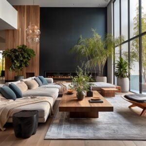
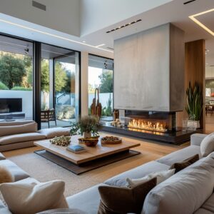
Fireplaces and Media Walls as Anchors
One of the most effective ways to create a focal point is by using a fireplace or built-in shelving. Many spaces incorporate navy-painted media walls, framing a TV or fireplace with rich, deep tones that instantly command attention.
This approach works well because the darker color grounds the space, making it feel balanced even when paired with lighter furniture and decor. For a softer contrast, open shelving can feature a mix of blue and yellow decor—ceramic vases, woven baskets, or books in coordinating shades.
Built-in lighting adds even more emphasis, making sure the shelving stands out even in the evening.

Statement Artwork That Ties Everything Together
A single oversized painting can do more than fill an empty wall—it can define the entire color scheme of a room. Large-scale abstract pieces featuring navy and mustard brushstrokes create a natural link between different elements, allowing the eye to connect throw pillows, rugs, and furniture effortlessly.
For rooms with mostly neutral furniture, bold artwork can be the key to introducing color in a way that feels fluid rather than forced. A well-placed canvas above a sofa, console table, or fireplace can set the tone for the entire space without requiring additional decorative layers.

Unexpected Pops of Color in Furniture
Sometimes, the focal point of a room comes from an unexpected place—like a mustard-colored TV console or deep blue open shelving. These bold furniture choices instantly stand out, shifting attention away from walls and making a functional piece double as a statement design element.
If a brightly colored cabinet or shelving unit serves as the centerpiece, it’s best to keep surrounding furniture slightly subdued. A navy console pairs beautifully with neutral-toned seating, while a yellow media stand can pop against a backdrop of soft blues and whites.

How to Apply These Ideas in Your Space
- Decide on one primary feature that will serve as the anchor—whether it’s a bold fireplace, a statement wall, or a striking piece of furniture.
- Use artwork to tie different colors together. A painting featuring navy and mustard can connect various elements without overwhelming the space.
- If selecting a colorful media unit or shelving, balance it with neutral decor so that it remains the star of the room.
- Built-in lighting around shelving or media walls can highlight key design features and add warmth in the evenings.
By focusing on a single standout element, a room instantly gains structure and personality, making it feel intentional and well put together.

Small Ways to Bring in Navy and Yellow Without Overhauling Everything
Adding navy and yellow to a space doesn’t have to mean a complete redesign. Small, intentional updates can introduce these colors without requiring major changes to furniture or wall paint.
Whether through textiles, artwork, or decorative accents, these subtle adjustments can create a fresh and coordinated look without a big commitment.
Quick and Effective Updates
One of the easiest ways to introduce a color scheme is through throw pillows. A neutral sofa can take on a whole new personality by swapping out pillows with navy, mustard, or patterned designs that feature both colors.
This approach allows for seasonal changes—lighter tones in the warmer months, richer shades in the colder seasons—without much effort. Artwork is another simple way to tie colors together.
A print or canvas with navy and yellow elements naturally blends the two shades in a way that feels cohesive. For a more layered look, grouping multiple framed pieces can create a gallery wall that enhances the overall theme without requiring a single statement piece.

Using Accessories for a Balanced Look
Shelf styling offers a low-commitment way to experiment with color. A navy ceramic vase, a mustard candle, or a stack of books in complementary shades can subtly reinforce the color scheme.
Arranging these items in groups of three or five keeps the styling intentional while preventing the space from looking cluttered. For those hesitant to commit to bold furniture choices, an area rug can introduce the colors in a more understated way.
A design that incorporates navy shapes or fine mustard details can ground the space while allowing flexibility in other decor choices. Similarly, lamps and lampshades in deep blue or golden tones offer an easy swap that immediately changes the feel of a room without requiring new furniture.

How to Apply These Ideas at Home
- Use throw pillows in navy and mustard to add color to a neutral sofa without making permanent changes.
- Hang artwork that incorporates both shades, creating a natural link between existing decor elements.
- Style open shelves with carefully selected accessories—vases, books, and candles in coordinating colors—to subtly reinforce the theme.
- Introduce an area rug with hints of navy and yellow to anchor the space while keeping larger furniture pieces neutral.
- Swap out lampshades or choose a lamp with a navy or mustard base to instantly bring in color with minimal effort.
These small touches can transform a space without requiring a full redesign, making it easy to adjust the look over time while maintaining a balanced and stylish feel.

Closing Thoughts
Blue and yellow can work together beautifully in a range of styles—from farmhouse to contemporary, mid-century modern to rustic industrial. The magic lies in the delicate balance of colors, textures, and shapes.
By strategically blending different shades of blue and yellow, mixing in varied materials like wood, metal, and woven fibers, and maintaining a consistent accent strategy throughout open-concept layouts, you can create a living room that feels cohesive and memorable.

Try working with small, carefully chosen accents first if you’re unsure about bigger furniture commitments. A few pillows, a throw blanket, and some coordinating accessories can instantly shift your home’s atmosphere.
As you get comfortable with the color pairings, you can venture into bolder territory—perhaps a navy accent wall, a mustard armchair, or custom built-ins—until the space reflects your personal taste in a thoughtful, harmonious way.