Pendant lights above a kitchen island do more than fill a space with light—they shape the entire look and feel of the room. This article takes a deep look into how designers approach kitchen island lighting, focusing not just on shapes and finishes, but also on how each piece interacts with surfaces, light sources, and surrounding details.
These insights aim to spark ideas for homeowners and design lovers who want their lighting to feel intentional, not random. By looking at both subtle and standout choices, we can start to understand what makes hanging kitchen island lighting feel balanced, thoughtful, and visually strong.
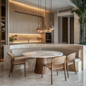
The Pendant as a Sculptural Statement
In many of the kitchens analyzed, pendant lighting becomes a kind of functional sculpture. The shape might look simple—like a clear glass orb or softly curved capsule—but slight variations make all the difference.
Rippled surfaces, uneven curves, or a slight tint in the glass can catch natural light throughout the day in surprising ways. These details help create a layered effect, with highlights, shadows, and reflections moving across nearby surfaces as the light changes.
Some of the most interesting examples use hand-blown glass pendants with tiny imperfections that actually work in their favor. Instead of a static fixture, you get one that quietly shifts in character from morning to evening.
The subtle play of light adds dimension to the space without demanding attention. And because these types of pendants don’t always look identical from every angle, they add a bit of softness to modern layouts that might otherwise feel too straight-lined or stiff.

Tip:
Choosing pendants with gentle texture or irregular shape—especially in glass or ceramic—adds a natural feel that works well in transitional and contemporary kitchens alike. Small details in your kitchen island lighting can bring a kind of softness that balances harder surfaces like stone and steel, while still feeling clean and modern.

Handling Reflection, Transparency, and DiffusionLight behaves differently depending on the type of pendant you choose, and some of the most interesting effects come from glass or pierced surfaces. Clear glass pendants, like those often used in Scandinavian-style kitchens, let natural sunlight scatter freely, brightening up the space during the day.
In contrast, tinted or frosted shades soften the light and tint the glow, adding a warmer or moodier tone, depending on the finish.

Some fixtures take this idea even further—matte surfaces with pinholes or perforations can scatter light in a delicate lace pattern. These aren’t just details for the sake of looks; they shape how the light plays across counters and ceilings, especially in natural daylight.
You’ll notice that the most effective pieces quietly change throughout the day, catching the sun differently at each hour.

Tip:
Think about how your lighting looks even when the bulbs are off. Some of the most unexpected effects come in full daylight—light hitting textured glass or pierced metal can create movement and visual interest, even without artificial light.
These kinds of subtle shifts are often overlooked in standard kitchen island lighting ideas but can completely change the feel of the room.

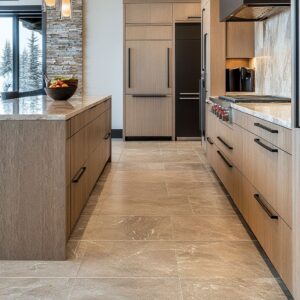
The Role of Material Contrast
Mixing finishes and surfaces is one of the easiest ways to bring balance to a space—and pendant lights play a big role in that. In kitchens with lots of cool tones, like marble or black cabinetry, a pendant with a warm brass or bronze detail can keep the room from feeling too stark.
On the other hand, in brighter kitchens with pale woods or soft whites, a matte black fixture or dark metal accent might add just enough weight to ground the space visually. It’s not only the outside that matters—many pendants have an interior lining that affects how the light reflects.
A gold interior bounces light in a soft, warm cone, while a black or dark lining creates a more focused beam. These kinds of decisions don’t always show up in photos, but in person, they’re what help modern kitchen island lighting feel layered and thoughtful.

Tip:
Don’t overlook what’s inside the pendant. A white or gold lining spreads light gently, while darker tones focus it more directly.
This small choice can help tie in surrounding finishes or highlight the texture of your island surface without needing to add more fixtures.

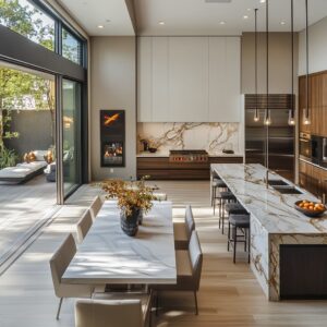
Scale and Spatial Proportions
Pendant lights can’t just be chosen by look—they have to fit the space. A wide island under a tall ceiling leaves room for larger or longer lighting, while smaller kitchens need more restraint.
If the fixture is too bulky, it can crowd the visual space. On the flip side, go too small and the pendants can look lost, especially over a wide surface.
This is where proportion makes all the difference. In kitchens with vaulted ceilings, longer drops or clustered pendants feel natural because there’s space to let them breathe.
Meanwhile, in more compact settings, pendants are often hung in tighter groups or aligned at a shorter drop to avoid visual clutter. Some designers prefer perfectly level heights for a clean, structured look.
Others purposely vary the drop length by a few inches for a more relaxed and informal feel.

Tip:
Don’t let your lighting block sightlines. A good rule is to hang pendants about 30 to 36 inches above the countertop.
It’s high enough to stay out of the way, but still low enough to define the area. And if you’re using more than one fixture, space them evenly so each one gets its moment without crowding the others.
This is especially important with larger fixtures used in luxury kitchen island lighting, where balance is key to avoid overpowering the design.

Balancing Fixture and Surrounding Details
Lighting works best when it connects to the other pieces around it. Every kitchen has a few elements that stand out more than others—whether it’s a statement range hood, bold backsplash tile, or sculptural chairs.
If you pick a standout pendant design with strong lines, shiny finishes, or sculptural shapes, then the rest of the space should ease back a bit. Otherwise, the whole setup can start feeling too busy.

On the other hand, if you go with simple lighting, that’s your chance to lean into more texture or color in the island, the stools, or even the hardware. The trick is to let a few features lead, while the others support.
In the best kitchens, everything doesn’t compete for attention at once.

Tip:
Think of lighting as a partner, not a solo act. Whether you’re looking at sleek modern metal finishes or softer woven textures, choose pendants that play well with other key features.
That way, your kitchen doesn’t just look styled—it feels intentional. If you’re collecting kitchen pendant lighting ideas, focus on how each fixture will connect with the room as a whole, not just as a standalone piece.

Subtle Regional or Cultural References
Some pendant lights quietly hint at a region’s history or a cultural tradition, even without saying so directly. In coastal kitchens, you’ll often see soft forms shaped like drops or shells—simple, sculptural silhouettes that reflect the nearby sea.
In homes inspired by Mediterranean or Spanish styles, basket-like shades or glazed ceramic pendants can reflect artisan traditions from those regions. Mountain homes lean into heavier textures, like plaster or hammered metal, which subtly tie into the natural landscape.

The beauty here lies in the balance. You don’t need to go full themed for a pendant to feel meaningful.
A pendant that reminds you of Japanese lanterns or an old-world ceramic can quietly reinforce a connection to personal roots or local surroundings—without turning the kitchen into a set piece.

Tip:
Think about shapes, finishes, and materials that link back to something familiar—either culturally or geographically. Even the slightest nod can give your unique kitchen island lighting more meaning, helping the space feel grounded in something personal.

Creating Compositions with Multiple Pendants
Spacing and layout matter just as much as the fixtures themselves. Some kitchens lean into a clean, linear setup—perfect for long islands or more structured interiors.
Others go for slightly irregular clusters, where pendants hang at different heights or vary slightly in size. This approach feels less formal and can add softness and movement above the island.
These layout choices change how a space feels. A tight line of identical pendants feels neat and direct, while a looser grouping might feel more relaxed and creative.
Either way, even a few inches of difference in spacing or drop height can shift the mood.

Tip:
Before finalizing placement, test it out visually. Use string or painter’s tape to block out how the pendants will hang.
Stand at the island, view it from the living area, and check the angles from different sides. With modern kitchen island lighting ideas, the way you compose the group is often what makes the design feel truly finished.

Pairing With Unusual Materials or Layouts
Some of the most memorable pendant lights show up in kitchens that aren’t afraid to experiment with materials. Think fabric-covered cylinders, hammered metal with tiny perforations, or fixtures that resemble carved stone.
These aren’t your usual lighting choices, but they work surprisingly well when they echo another element in the space—maybe a rough plaster hood, a live-edge slab, or hand-finished tile. This approach works best in kitchens that mix clean lines with craft-driven elements.
A rough-textured pendant can highlight the organic side of a kitchen without feeling off-theme. It’s a smart way to bring personality into a modern layout without overcomplicating it.

Tip: If your kitchen already includes something unique—like custom stonework or hand-formed tile—look for pendants that echo the same texture or finish. One of the best modern kitchen island pendant lighting ideas is to use lighting to subtly echo what’s already special in the room, giving the space more visual rhythm without adding clutter.

Handling Visual Weight in an Open-Plan Home
In open-concept layouts, pendant lighting helps define where one area stops and another begins. Since there are no walls to lean on, your eye is guided by shape, weight, and light.
Pendants over a kitchen island can act like quiet dividers—marking out the prep zone from the dining or living areas.

Heavier materials like metal or dark-toned finishes give weight and anchor the kitchen visually. On the other hand, lighter materials—clear glass, open shades, woven textures—keep the space feeling connected and open.
This balance between mass and lightness is especially useful in homes where the kitchen island is central to how the whole floorplan flows.

Tip:
Match your lighting’s texture or color to one or two elements in nearby rooms. If your coffee table has black steel legs, or your bookshelf has warm wood grain, find a pendant that picks up that note.
These small links can make lighting over kitchen island ideas feel cohesive without trying too hard.

Conclusion
Choosing the right pendant lighting for a kitchen island takes more than picking something that looks good on a shelf. It’s about paying attention to how each fixture plays with light, works with the room’s scale, and responds to nearby surfaces and materials.
The most thoughtful choices often come from small decisions—how a finish echoes nearby hardware, how texture softens harder edges, or how grouped pendants add rhythm and depth to the space.

Whether you’re drawn to sculptural shapes, handmade details, or clean, minimal forms, the key is finding lighting that fits into the bigger story your kitchen tells. From subtle cultural nods to bold contrasts in material, the best lighting choices support the overall feel of the space without forcing the attention.
Keep experimenting with different heights, textures, and compositions. A few inches up or down, a shift in shape or glow, can completely shift the mood.
With so many creative options available today, the hardest part isn’t finding ideas—it’s choosing the one that feels right for your space.