A staircase isn’t only a functional feature—it’s a design statement waiting to be explored. Whether bold and dramatic or soft and subtle, painted staircases can change the entire feel of a space, setting the tone for the home’s style.
The right combination of colors, textures, and finishes can make a staircase feel like an extension of the interior’s personality rather than just a way to move between floors. This article dives into painted stairs ideas that go beyond the obvious, bringing attention to design choices that might otherwise go unnoticed.
From unexpected color pairings to artistic details on risers, the small decisions can have a big impact. Whether inspired by classic charm, modern contrast, or something completely unique, a staircase can become a standout feature that enhances the character of a home.
Soft Pastels and Nostalgic Charm
Pastel-painted staircases have a way of bringing warmth and personality to a home without overpowering the space. Soft, muted hues, especially in vintage-inspired shades, create a balance between timeless elegance and inviting comfort.
Whether it’s a gentle mint or a sky-like blue, these tones set the stage for an interior that feels effortlessly welcoming.
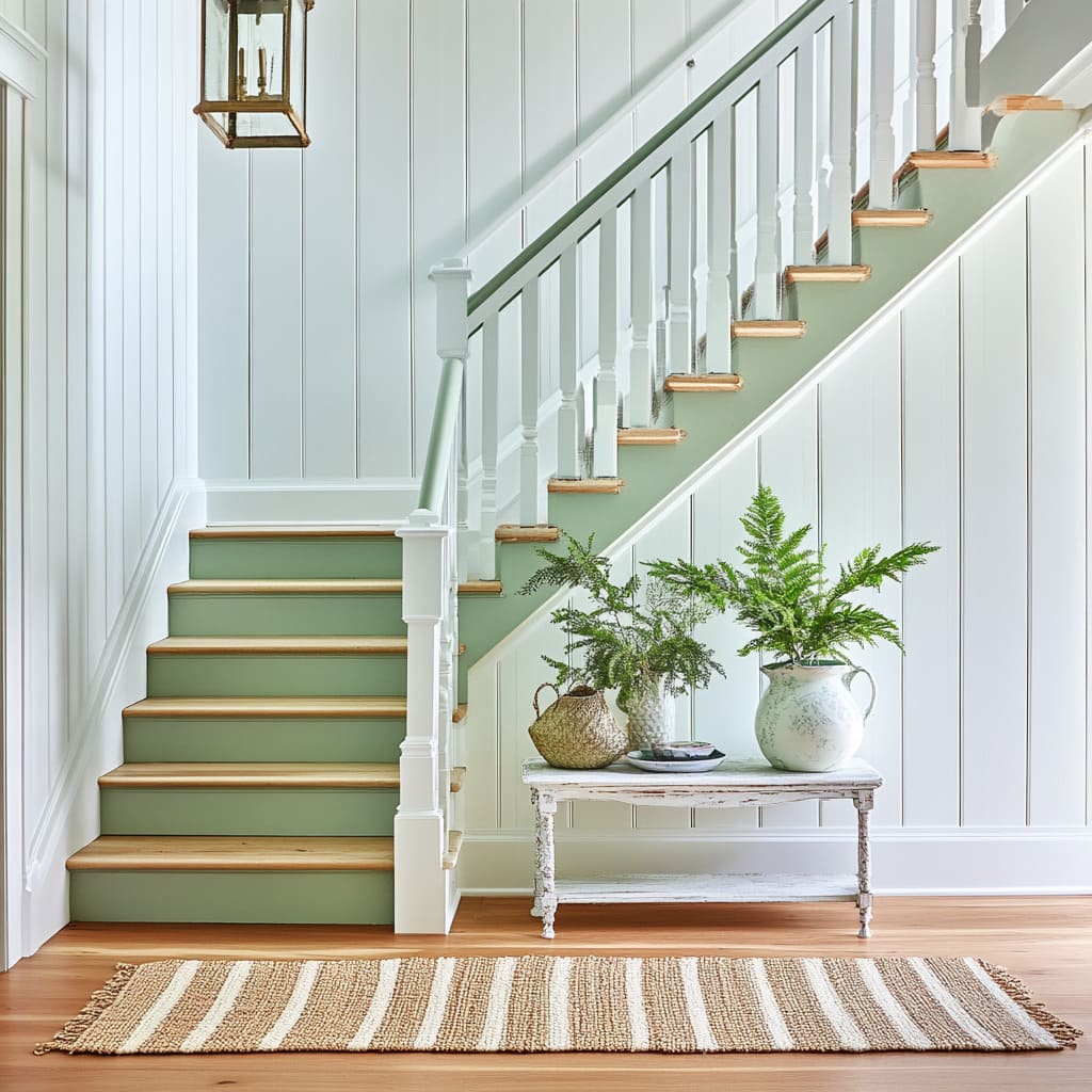
Soft Mint and White: A Vintage Whisper
There’s something undeniably nostalgic about soft mint green. Unlike bolder pastels, this shade leans into a more subdued charm, reminiscent of antique glassware and weathered enamel.
It carries the essence of homes where history meets warmth, making it a perfect choice for staircases in farmhouse, cottage, or even transitional interiors.
Subtle Curves for a Softer Look
The structure of a staircase plays just as big a role as its color. Here, gently curved handrails and stair edges prevent the design from feeling rigid.
These details work particularly well in older homes, where architectural elements often have a handcrafted quality. Even in newer spaces, softening the sharpness of a staircase can make the transition between levels feel more natural.
Muted Pastels and Aged Metals
The pairing of soft mint with aged brass accents is another key detail that brings depth to the design. A lantern-style light fixture with a slightly worn brass finish doesn’t just add illumination—it introduces a subtle contrast against the matte pastel backdrop.
When working with stair color ideas like this, the trick is to balance muted tones with metallics that have a hint of age, preventing the space from looking too polished or overly contemporary.
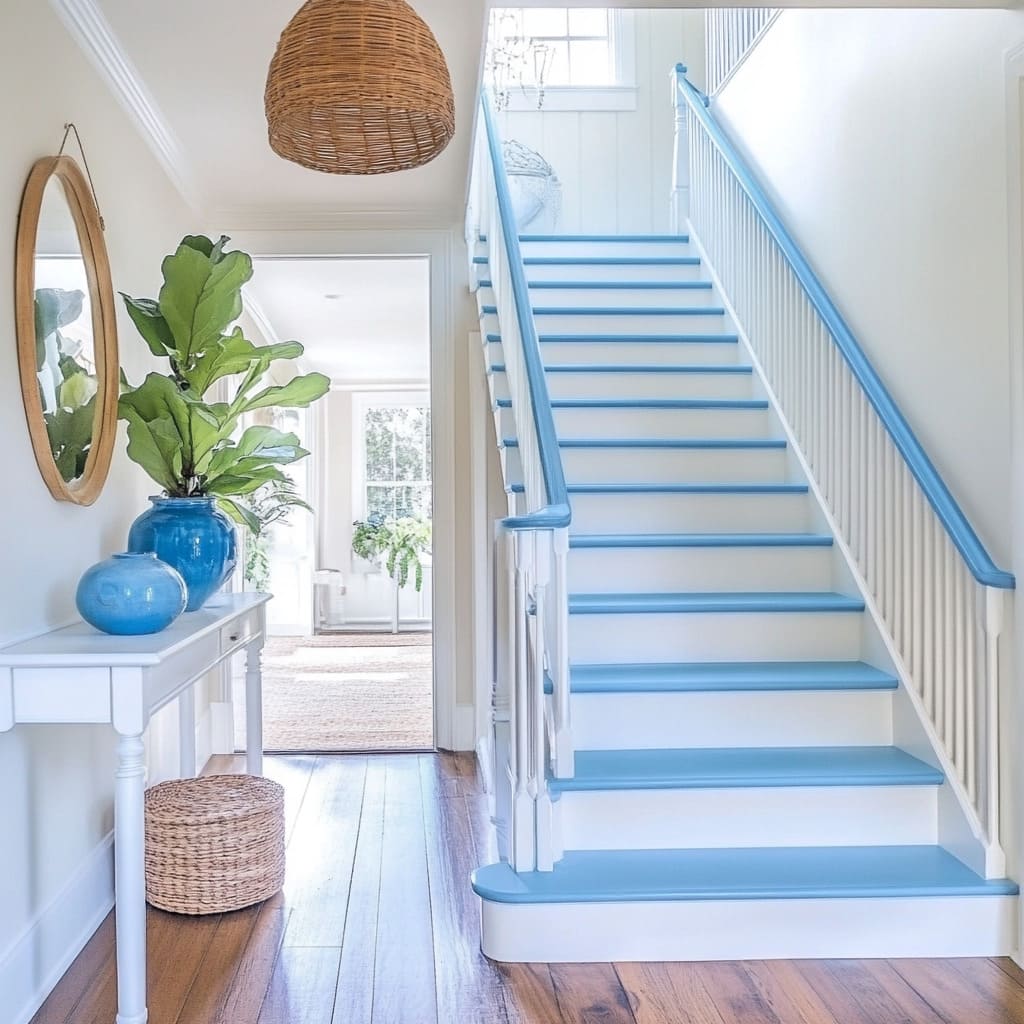
Soft Sky Blue and White: An Airy Coastal Feel
Soft sky blue has a natural lightness that makes a staircase feel almost weightless. This effect is further enhanced when paired with crisp white elements, giving the impression of an open, breezy space that echoes coastal or Scandinavian interiors.
High-Gloss for an Amplified Light Effect
A glossy finish on the blue-painted surfaces reflects natural light, making the staircase feel even more open. This can be particularly effective in spaces with limited sunlight, as the reflective surface prevents the color from looking flat.
Even in a well-lit home, this technique helps amplify the brightness, keeping the stairwell from feeling enclosed.
Color Continuity for a Seamless Look
One of the standout details in this design is how the sky blue extends across multiple elements—the risers, railings, and even the handrails. This approach creates a sense of flow, making the staircase feel like one continuous form rather than a series of separate pieces.
The contrast between the blue and the white treads and balusters sharpens the structure while maintaining an airy feel.
Minimal Accessories, Maximum Impact
A space with such a light, airy palette doesn’t need heavy decor. A woven rattan pendant light and a console table with simple blue vases reinforce the breezy aesthetic without overwhelming the design.
The balance of natural materials and soft pastels creates an effortless coastal influence, proving that sometimes, simplicity makes the biggest impact. Pastel staircases offer a quiet sense of character, bringing a homey warmth without overpowering the space.
Whether leaning into vintage nostalgia with soft mint or capturing a crisp coastal atmosphere with sky blue, these shades show how subtle color choices can completely shift the feel of a staircase.
Earthy Tones and Bold Contrasts in Stair Design
The right combination of colors and textures can turn a staircase into a focal point that shapes the entire atmosphere of a home. When deep, grounded hues meet natural textures, the result is a space that feels connected to nature while carrying a strong sense of structure.
Whether embracing forest green for a rustic appeal or using monochrome gray for a modern edge, these ideas for painting stairs and landing show how contrast and earthiness can work together to create a compelling design.
Forest Green and Warm Sand: A Natural Balance
Rich forest green has a way of making a staircase feel rooted in the space, almost as if it’s an extension of the architecture rather than an add-on. Paired with warm sand-colored treads and a textured jute runner, this look brings in the natural depth of outdoor landscapes while keeping a cozy, lived-in charm.
Texture That Feels Connected to Nature
The choice of a thickly woven jute runner isn’t just about aesthetics—it plays a key role in reinforcing the organic theme. The slightly rough texture introduces a raw, unpolished quality that feels authentic, making it an excellent contrast against the smooth painted risers.
To take this look even further, accents like reclaimed wood furniture or terracotta vases can extend the theme beyond the stairs.
A Strong and Grounded Staircase Design
This color combination isn’t just visually appealing—it also adds a sense of weight and stability to the space. The forest green risers and thick newel posts create a bold presence, making the staircase feel substantial.
This approach works particularly well in larger homes where a staircase needs to hold its own against expansive interiors.
Using Art to Expand the Space
An oversized painting of a forest path in autumnal tones can enhance the overall effect, drawing the eye upward and reinforcing the connection to nature. When staircases are positioned in a hallway or open space, artwork in complementary tones can help the entire design feel more intentional and immersive.
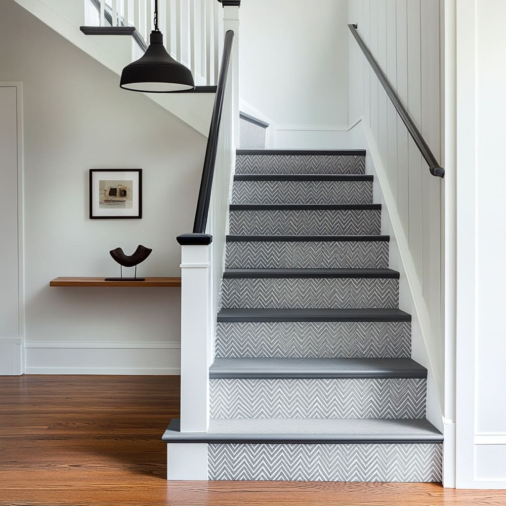
Monochrome Gray and White: A Study in Contrast
Grayscale interiors have a reputation for being sleek and minimal, but that doesn’t mean they have to feel cold or lifeless. A monochrome staircase can still carry warmth and personality, especially when textures and subtle patterning are introduced.
Pattern for Depth Without Overcomplication
A herringbone riser pattern adds a layer of detail without overwhelming the space with color shifts. The contrast between dark and light grays introduces just enough visual interest to keep the staircase from feeling too stark, making it a great choice for homes that embrace neutral palettes.
Balancing Modern and Traditional Elements
A black industrial-style pendant light and a floating shelf contribute to a contemporary aesthetic, but the warmth of honey-toned hardwood flooring softens the effect. This balance prevents the staircase from looking overly mechanical or sterile, proving that even within a grayscale palette, warmth and contrast can be thoughtfully integrated.
These stair designs prove that earthy tones and monochrome palettes don’t have to be predictable. Whether going for a natural, grounded look with deep greens and woven textures or creating a crisp, structured contrast with gray and white, the key lies in how colors interact with textures and shapes.
By layering materials thoughtfully and considering how different elements play off each other, a staircase can feel both bold and inviting.
Maritime and Nautical Influences in Staircase Design
Coastal and nautical-inspired interiors are known for their timeless appeal, blending crisp contrasts, natural textures, and subtle maritime references. Painted staircases can play a major role in bringing this aesthetic to life, whether through bold navy hues, rope details, or soft ocean-inspired tones.
These painted steps ideas explore how the right design elements can create a space that feels both sophisticated and effortlessly relaxed.
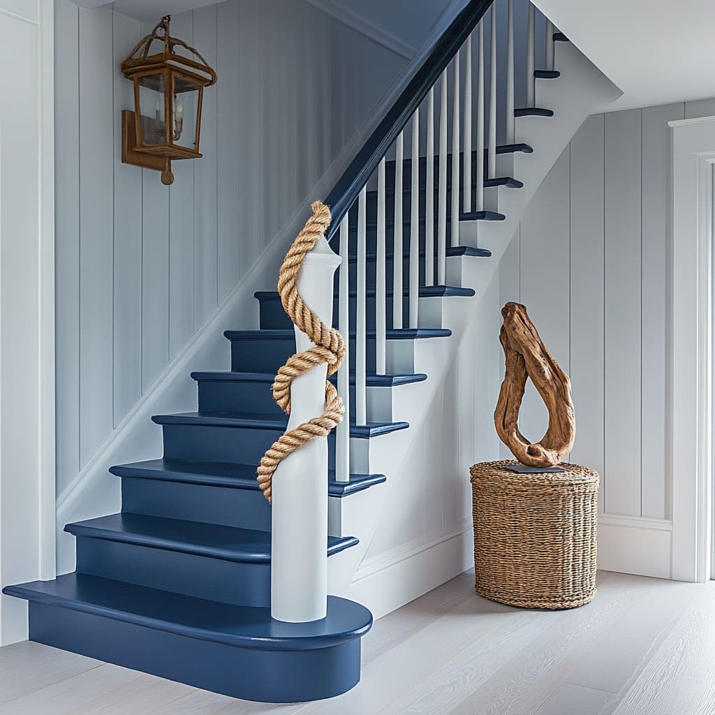
Navy Blue and White with Rope: A Seaside-Inspired Statement
Few color combinations capture a coastal mood as well as navy and white. The sharp contrast mirrors the deep ocean against bright sails, making it a natural choice for staircases in homes looking to bring in a touch of maritime character.
A Tactile Element That Feels Authentic
The rope detail wrapped around the newel post does more than just reference nautical themes—it adds a textural contrast that makes the staircase feel more dynamic. The rough, twisted fibers break up the smooth painted surfaces, reinforcing a connection to seaside landscapes where materials are shaped by wind and water.
This kind of detail can work beautifully in homes near the coast or anywhere that embraces relaxed, beach-inspired styling.
Softening the Bold Contrast with Shape
While navy and white offer a strong visual contrast, curved stair edges help keep the overall design from feeling too rigid. These rounded forms take cues from coastal architecture, where softened lines reflect the movement of waves and wind-sculpted cliffs.
Small shifts in shape like this can make a staircase feel more inviting, even when the color palette is bold.
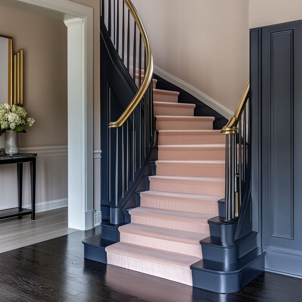
Moody Midnight Blue and Blush: A Refined Take on Nautical Design
While traditional maritime colors lean into high contrast, this design softens the theme by blending deep navy with muted blush tones. This unexpected pairing introduces warmth and elegance while still keeping the connection to classic nautical styling.
Balancing Opposites for a Dynamic Look
Midnight blue carries the depth of an evening ocean, while the soft pink runner provides a gentle counterbalance. This combination works because it plays on both color and temperature contrast—cool and dark against warm and light.
The addition of a gold railing acts as a unifying element, adding a metallic shimmer that bridges the two tones.
A Carpet That Adds Comfort and Quiet
Beyond its color, the plush pink runner serves a practical purpose. It dampens sound, making footsteps feel softer, which is especially useful in multi-level homes.
It also visually lightens the overall staircase, preventing the darker structure from feeling too heavy in the space. Coastal and nautical influences don’t always have to follow traditional formulas.
Whether using classic navy and rope for a strong maritime presence or opting for a softer take with midnight blue and blush, these staircases show how color and texture can transform a simple staircase into a standout feature.
Romantic Pastels and Florals in Staircase Design
Soft pastels, floral patterns, and textured accents can turn a staircase into a charming focal point that blends vintage elegance with a cozy, lived-in feel. Whether through delicate pink hues paired with botanical wallpaper or earthy greens that merge with the architecture, these styles show how a colored staircase can bring warmth and personality to a space.
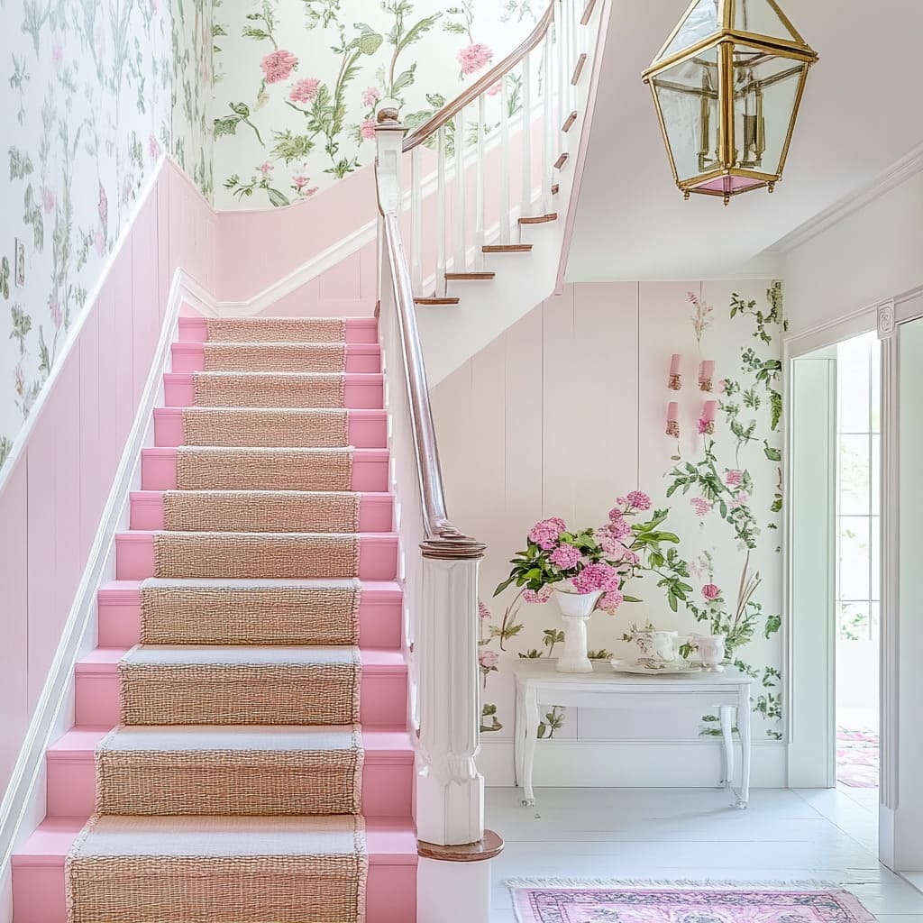
Pastel Pink and White with Floral Wallpaper: A Soft and Balanced Look
Blush pink is a shade that brings a touch of romance without feeling overpowering, but its success in a staircase design depends on how it’s balanced with texture and pattern. When paired with floral wallpaper and natural materials, the result is a space that feels layered yet light.
Keeping Patterns in Check
A floral wallpaper can easily dominate a space if used across large areas, but placing it only on the upper portion of the walls prevents the design from feeling too saturated. This technique allows the soft pink paint on the lower half to remain a focal point while still benefiting from the decorative detail above.
It also creates a sense of height, drawing the eye upward without overwhelming the space.
Blending Rustic and Feminine Details
A jute runner may seem like an unexpected addition to a staircase with floral elements, but the natural fibers introduce texture that grounds the design. The key here is color—keeping the runner in soft beige tones ensures it blends with the surrounding pastel hues rather than competing with them.
This combination of rustic and refined details creates a balanced look that avoids feeling overly delicate.
Depth Through Mixed Wall Finishes
Pairing vertical paneling with wallpaper adds subtle depth to the walls. The way light interacts with the ridges of the paneling creates soft shadows, giving the background a sense of movement.
This kind of layering works particularly well in staircases, where walls are often large and can benefit from extra dimension.
Deep Mocha and Olive Green: A Bold and Rooted Approach
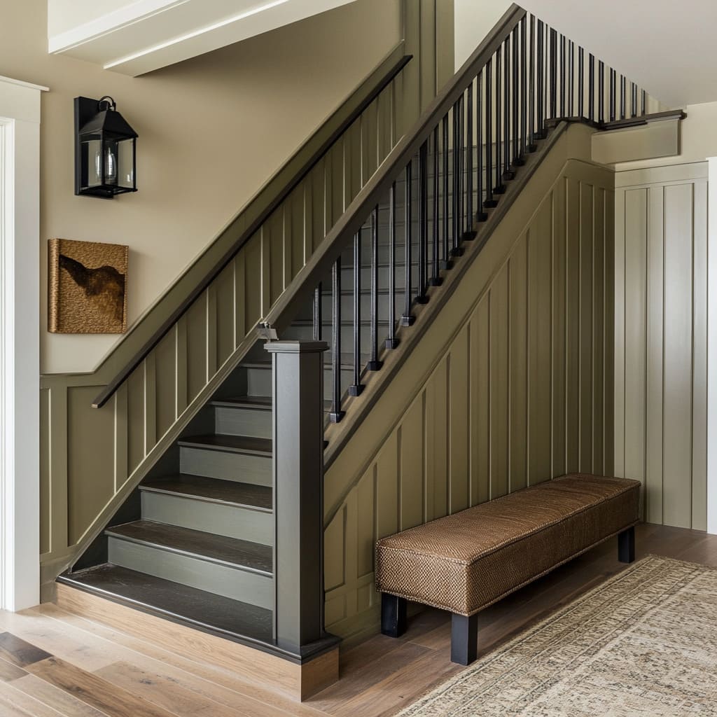
Not all romantic designs lean into soft pastels—earthy tones can create just as much depth and warmth. A deep olive green staircase, combined with rich mocha walls, brings a sense of grounded elegance, making the staircase feel like an extension of the home’s architectural framework.
Merging the Walls and Stairs into One
Painting both the stair risers and the surrounding walls in the same olive green gives the impression that the staircase was carved from a single material. This technique reinforces the staircase as a structural feature rather than a separate decorative element.
It’s a particularly effective approach in spaces with high ceilings or open layouts, where cohesion between vertical and horizontal surfaces matters.
Contrast Without Excessive Ornamentation
Slim black metal balusters introduce contrast without adding ornate details. This choice maintains the boldness of the earthy color palette while bringing in a slight industrial influence.
The simplicity of the balusters keeps the staircase from feeling too visually heavy, letting the deep green and brown tones remain the dominant feature. Whether through soft pastels and delicate florals or rich greens and architectural depth, these staircases show how color and texture can shape the atmosphere of a home.
By thoughtfully layering materials and balancing contrasting elements, a staircase can become more than just a functional transition—it can be a reflection of the home’s personality.
Hand-Painted or Patterned Artistry in Staircase Design
A staircase doesn’t have to be a uniform block of color—artistic details, whether through hand-painted designs or precise pattern work, can turn it into a feature that feels completely unique. Whether using delicate floral motifs or striking metallic accents, these styles prove that staircases can be as much about craftsmanship as they are about function.
These painting a staircase ideas show how color, texture, and artistic flourishes can elevate a space in unexpected ways.
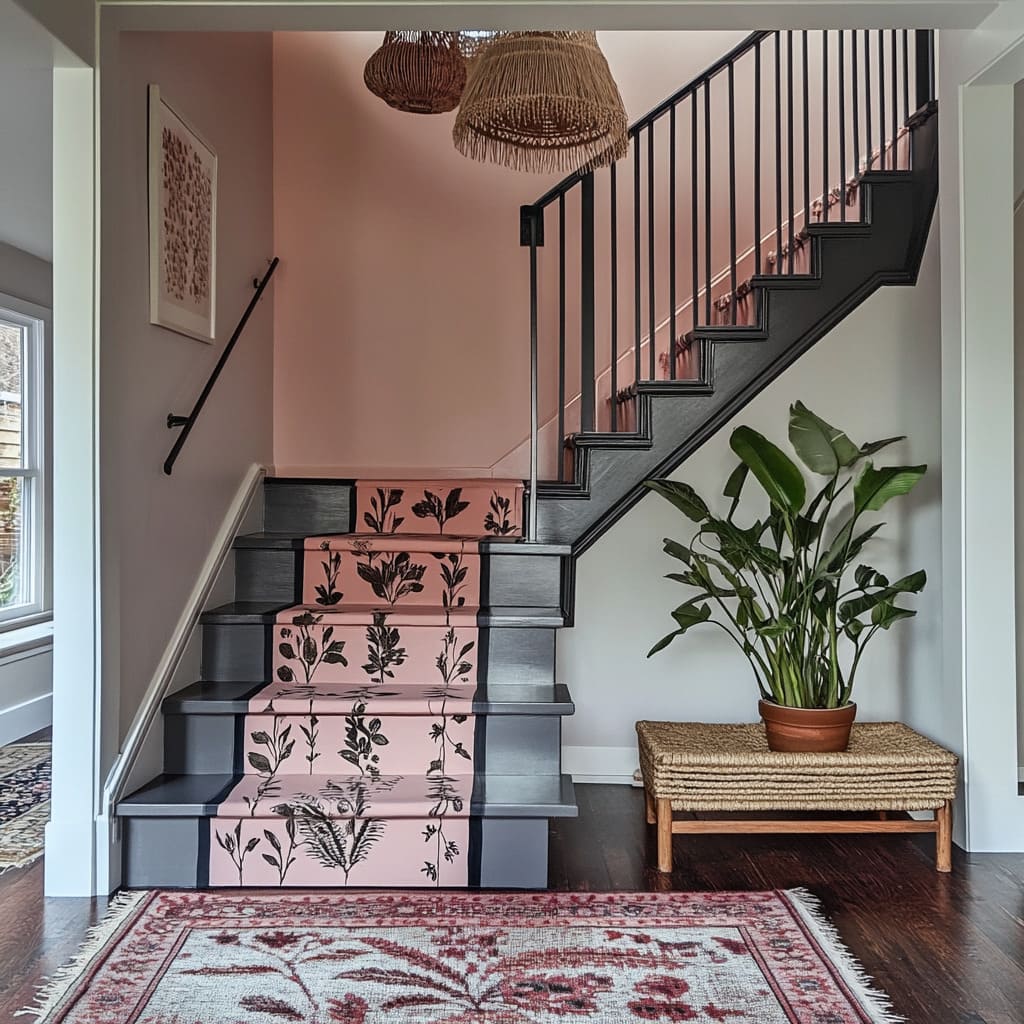
Dusty Rose and Graphite with Hand-Painted Florals: A Staircase as a Canvas
Painting floral patterns directly onto stair risers introduces a handcrafted touch that turns each step into a small work of art. Unlike wallpaper or printed decals, hand-painted details create a sense of originality, making the staircase feel custom-designed rather than mass-produced.
Strategic Placement for Visual Flow
By focusing floral motifs on the center of each riser, the design remains controlled rather than chaotic. This keeps the pattern from overwhelming the space while still drawing close-up attention to each individual step.
The effect is almost like a series of miniature murals, each step revealing a new layer of detail.
Balancing Softness and Boldness
The dusty rose base color brings a muted warmth, while the dark graphite accents introduce contrast, ensuring the staircase doesn’t fade into the background. The floral detailing plays a unifying role, bridging the light and dark tones in a way that makes the two shades feel cohesive rather than opposing.
This kind of tone-on-tone contrast is an excellent way to add visual depth without introducing too many colors.
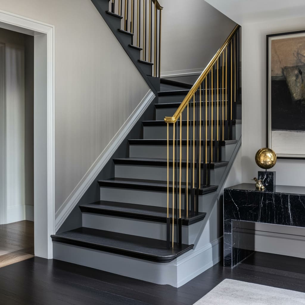
Matte Black and Soft Gray with Gold Trim: Subtle Luxury Through Contrast
For a more refined and contemporary look, a combination of matte finishes and metallic details creates a striking but understated effect. Black and gray staircases can sometimes feel too heavy, but the addition of slender gold accents changes the entire dynamic.
Using Gold as a Precision Detail
Instead of overwhelming the space with metallics, the gold elements are kept to slim balusters and trim work. This measured approach allows each gold line to stand out against the deep matte black, making the entire staircase feel more polished without looking excessive.
Gold details like this work particularly well in homes with existing brass or antique metal finishes, ensuring a seamless connection to the rest of the space.
Playing with Matte and Gloss for Maximum Impact
Matte black absorbs light, while metallics reflect it. This contrast ensures that even small gold details have a bigger impact than they would in a fully glossy design.
By limiting the reflective elements, the gold trim stands out in a controlled way, creating a design that feels both sophisticated and modern. Whether through intricate hand-painted florals or carefully placed metallics, a staircase can become a statement piece without needing an entirely new structure.
These approaches show that a little creativity—whether with brushwork or precise detailing—can make a staircase one of the most memorable features in a home.
Whimsical and Surreal Themes in Staircase Design
Not all staircases need to follow traditional rules—some designs embrace creativity, playfulness, and even a touch of illusion. Whether evoking a dreamy sky or creating a soft color transition, these approaches turn an everyday staircase into a moment of artistic expression.
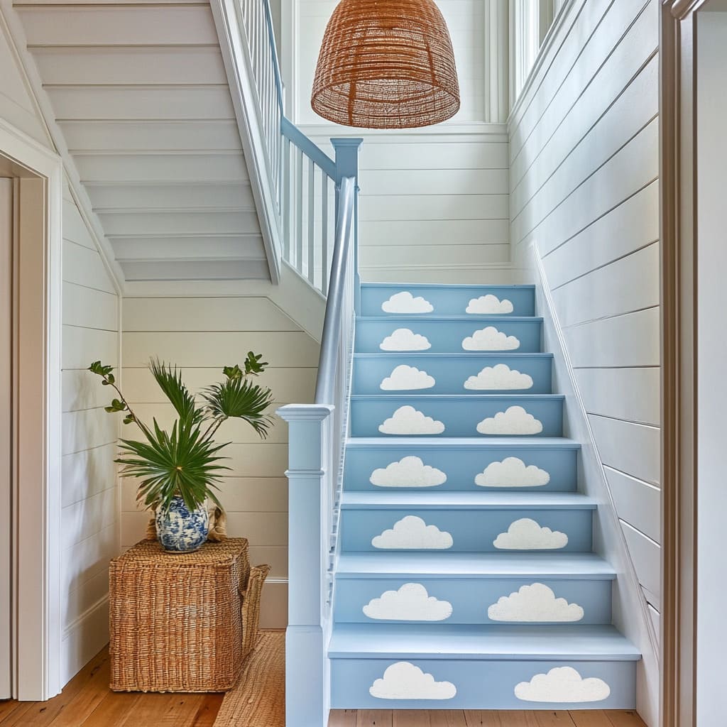
Sky Blue and White with Cloud Patterns: A Playful, Airy Effect
A staircase painted in soft blue with hand-painted cloud motifs brings a lighthearted feel, making each step feel like a climb through an open sky. This approach works particularly well in spaces where natural light enhances the painted elements, giving the illusion of depth and movement.
Organic Flow Over Repetition
The key to making cloud patterns feel natural rather than rigid is variation. By using freeform shapes instead of repeating identical designs, the clouds take on a more lifelike quality.
The softness of the brushstrokes prevents the design from looking too graphic or artificial, reinforcing the relaxed, dreamlike effect.
An Illusion That Expands Space
Painting clouds on stair risers creates a subtle sense of upward movement, helping a narrow or enclosed staircase feel less confined. This visual trick is particularly useful in smaller homes or apartments where maximizing the feeling of openness is important.
By keeping the clouds in a muted white rather than stark contrast, the design blends effortlessly into its surroundings rather than looking overly themed.
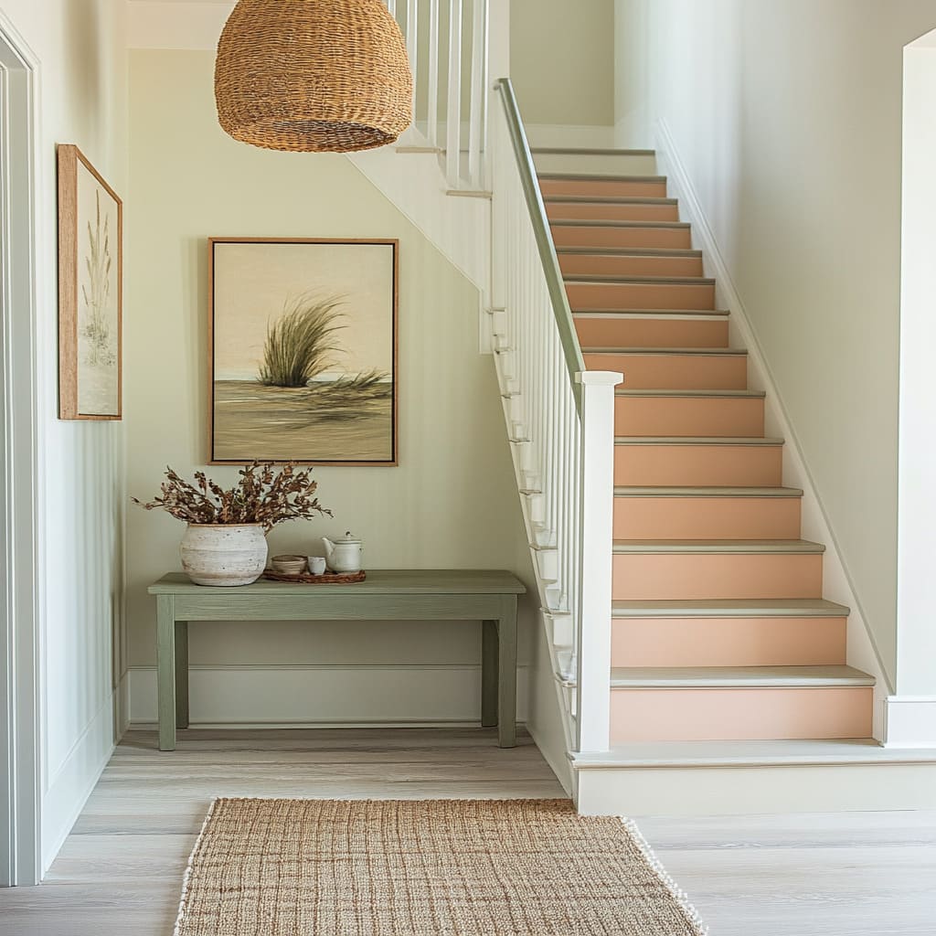
Soft Peach to Sage Green Gradient: A Gentle Color Shift
A gradient staircase offers a fresh take on painted stairs, allowing colors to flow naturally from one to the next. The shift from warm peach at the base to calming sage green at the top introduces a sense of progression, making the stairs feel more integrated with the space.
Smooth Color Transitions Without Harsh Lines
Creating a seamless gradient can be challenging, but sticking to colors within the same tonal family helps maintain cohesion. Here, the transition between peach and green is softened by blending mid-tones rather than forcing an abrupt color change.
The result is a staircase that feels almost weightless, as if the colors are naturally diffusing upwards.
Extending the Effect to the Handrail
To keep the color shift feeling intentional rather than accidental, painting the handrail in the topmost color (sage green) ensures the transition doesn’t stop abruptly. This technique carries the gradient beyond just the risers, making the design feel more complete and visually tied to the upper landing.
Whimsical staircase designs go beyond decoration—they introduce movement, storytelling, and even a touch of illusion. Whether through airy cloud motifs or a soft gradient shift, these staircases prove that paint can do more than just add color—it can shape the way a space feels.
Dramatic Darks and Reflective Contrasts in Staircase Design
Dark staircases create a bold impact, emphasizing form and contrast while adding depth to an interior. When paired with lighter surroundings or patterned elements, they become more than just a functional structure—they turn into a striking feature.
These paint steps ideas explore how deep hues like indigo and black, combined with contrasting details, can shape the way a staircase interacts with its surroundings.
Deep Indigo and Pale Sand: A Study in Contrast
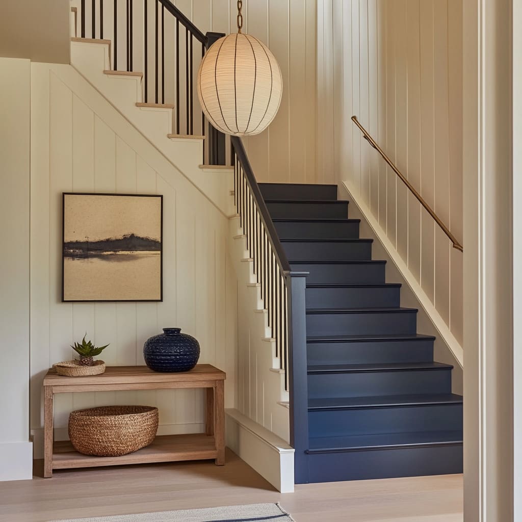
A staircase painted in deep indigo immediately draws attention, and when set against pale sand-colored walls, the contrast becomes even more pronounced. This pairing works particularly well in spaces where the goal is to highlight the staircase’s form rather than let it blend into the background.
Using Contrast to Define Shape
The eye naturally follows the shift between dark and light, making the indigo steps stand out sharply against the soft-toned walls. This approach works especially well with staircases that have an interesting silhouette, such as floating steps, open risers, or curved designs, as the contrast accentuates their form.
Subtle Eastern Influence Through Minimalism
The simplicity of dark stairs combined with light walls evokes a sense of balance, reminiscent of Japanese or Scandinavian interiors where contrast is used to define space. Adding a paper lantern overhead or keeping decor minimal enhances this effect, creating a calm yet impactful visual.
The restrained color palette allows for subtle shifts in texture to become more noticeable, such as the soft grain of wooden treads against a matte-painted riser.
Matte Black and White with a Patterned Runner: Breaking Up the Darkness
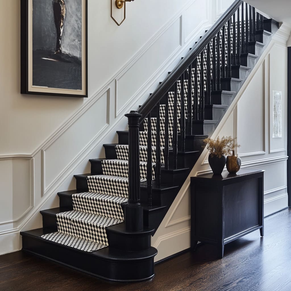
For those drawn to the drama of black staircases but looking for a way to soften the effect, a geometric stair runner provides a smart solution. By introducing a repeating pattern, it adds movement and prevents the staircase from feeling overly monolithic.
Creating Rhythm Through Pattern
A black-and-white geometric runner breaks the visual weight of the dark treads, offering a sense of rhythm as it leads the eye upward. This technique works well in homes with tall staircases, as the segmented pattern makes the climb feel more inviting rather than imposing.
Balancing Hardware Details
The choice of stair rods can make a big difference in how the pattern interacts with the overall design. Black stair rods blend seamlessly into the dark steps, allowing the runner to be the main focal point, while metallic or contrasting rods create an additional layer of visual detail.
The key is deciding whether the hardware should disappear into the background or add another element of contrast. Dramatic dark staircases prove that deep colors don’t have to feel heavy or overwhelming.
With the right balance of contrast, texture, and pattern, they can become a defining feature that adds both sophistication and boldness to an interior.
Metallic Statements in Staircase Design
Metallic accents bring a sense of refinement to a staircase, whether through striking contrasts with deep hues or integrated details that enhance the play of light. When paired with bold colors, metals like gold introduce a luminous effect that changes dynamically throughout the day.
These designs show how metallic elements can reshape the perception of space, adding depth, warmth, and movement.
Midnight Blue and Gold: A Contrast That Glows
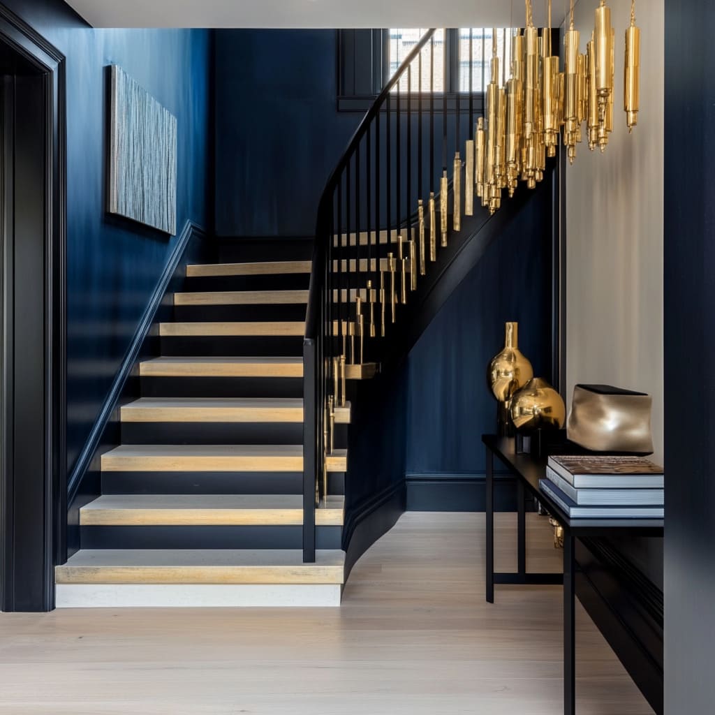
Pairing a nearly black shade of navy with gold creates an effect that feels both dramatic and inviting. The deep, inky blue provides a rich backdrop, while the gold balusters introduce vertical lines that catch and reflect light, adding movement to the space.
Warmth in the Depths of Darkness
Gold naturally stands out against a dark background, creating a glow-like effect similar to candlelight in a dimly lit room. This works especially well in staircases that rely on artificial lighting, as the reflective quality of the gold enhances the depth of the navy without making the space feel heavy.
Vertical Emphasis for Height
Slender gold rods extending from step to handrail guide the eye upward, subtly making the staircase feel taller. In homes with limited vertical space, this trick can add a sense of loftiness without requiring structural changes.
The reflective surfaces further enhance this effect, interacting with overhead lighting and creating subtle highlights that shift as the viewer moves.
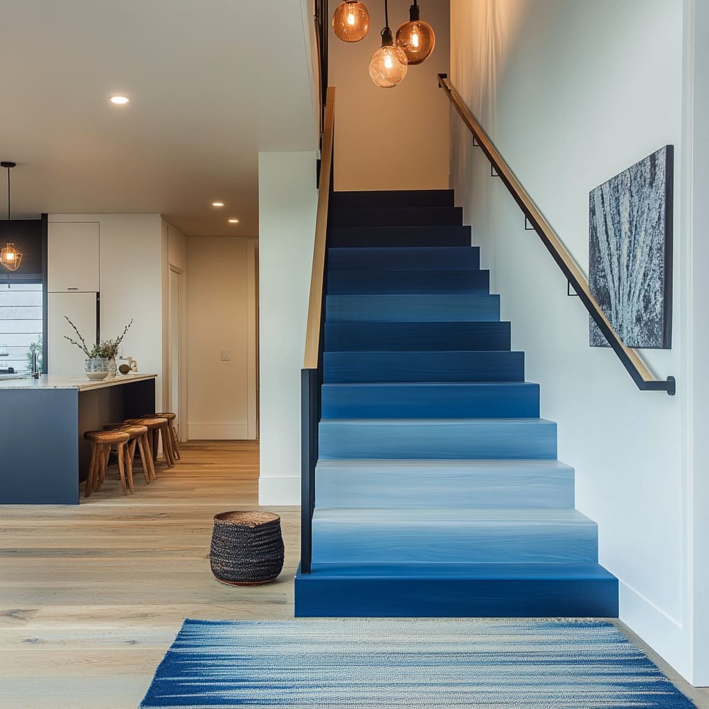
Gradient Blue Ombre: A Painted Staircase as a Modern Art Piece
An ombre staircase introduces an artistic touch, blurring the boundaries between structural design and visual composition. The gradual transition from misty gray-blue at the base to a deep navy at the top mimics the effect of shifting light, creating a soft, almost illusionary look.
A Staircase That Feels Like a Painting
The beauty of a gradient lies in its fluidity—each step appears to fade into the next, giving the staircase a sense of movement. Depending on the time of day and the angle of natural light, the colors can appear more vivid or more muted, making the space feel dynamic rather than static.
Anchoring the Look with Neutral Details
Since an ombre effect already carries a strong visual presence, balancing it with neutral framing elements prevents the design from feeling overly playful. Here, black-painted stringers outline the staircase, while warm wood handrails add a grounding element that ensures the transition of blues feels intentional rather than abrupt.
This combination allows the gradient to stand out while still maintaining a structured, cohesive look within the home. Metallics and color transitions prove that staircases don’t have to be limited to flat tones or traditional finishes.
Whether through the glow of gold against dark blue or the seamless fade of an ombre effect, these approaches show how thoughtful design choices can turn a staircase into an artistic feature that interacts with its surroundings in unexpected ways.
Glossy Jewel Tones in Staircase Design
Deep, high-gloss colors bring a striking richness to a staircase, creating a focal point that feels both luxurious and bold. Emerald green, in particular, carries a sense of grandeur, especially when paired with dark contrasts and metallic accents.
These staircases show how carefully chosen stair paint colors can completely transform an interior, making the staircase more than just a transitional space—it becomes a statement piece.
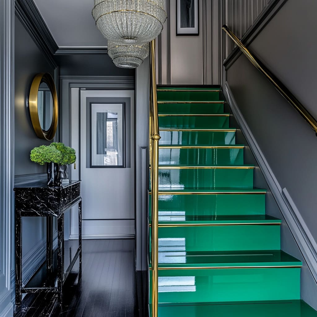
Emerald Green with Gold Touches: Reflective and Luxurious
A staircase painted in high-gloss emerald instantly draws attention, but it’s not just about color—it’s about how that color interacts with light. A glossy finish amplifies the depth of the green, making it almost shift in tone throughout the day as natural light changes.
A Staircase That Moves with the Light
Unlike matte finishes, a reflective emerald surface reacts to daylight, adding movement to the design. The result is a staircase that never looks static—shadows and highlights change as the hours pass, creating a dynamic, shifting effect.
Gold Accents as Both Function and Ornamentation
Thin gold trim on the treads isn’t just decorative—it also serves a practical role by subtly defining each step, adding clarity to the transition between levels. This detail introduces a touch of refinement, similar to how gold trim enhances fine furniture or decorative molding.
The contrast between the deep green and the metallic accents creates a sense of layered luxury.
Pairing with Deep Grays for a Bold Backdrop
Emerald green has enough vibrancy to stand on its own, but when paired with charcoal or deep gray walls, its intensity becomes even more striking. The darker surroundings frame the staircase, enhancing its jewel-like quality while preventing the color from feeling too overpowering.
This combination works particularly well in spaces that aim for a bold, high-contrast aesthetic without relying on bright or primary colors.
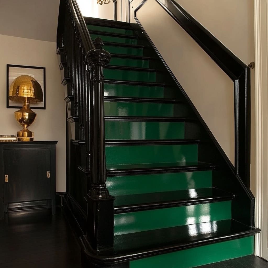
Deep Emerald and Black: Sculptural and Dramatic
For those looking for an even moodier take on jewel-toned staircases, pairing emerald with black creates a dramatic, high-contrast effect. The interplay between deep green risers and glossy black architectural details gives the staircase a sculptural presence, making it feel like an architectural centerpiece rather than just a functional element.
Bold Contrast with a Classic Touch
Traditional staircase silhouettes—such as detailed balusters, carved newel posts, or curved handrails—take on a new personality when painted in unexpected, high-impact colors. The black details almost appear sculpted against the green, turning familiar forms into statement elements.
Small Gold Lines as the Finishing Detail
Gold detailing on the risers acts like jewelry against an elegant outfit—refined and intentional. Instead of large metallic surfaces, the gold is used sparingly, allowing the green and black to take center stage while still adding a hint of warmth and refinement.
Whether softened with deep gray or intensified with black, emerald green proves to be a stair color that commands attention. The balance of gloss, contrast, and metallic accents turns an everyday staircase into a standout design element, showing how color alone can bring a sense of depth and sophistication to a space.
Classic Navy-and-White Variations in Staircase Design
Navy and white is a timeless pairing, offering both sophistication and contrast. Whether enhancing period details in a formal setting or introducing softer decorative elements, these variations show how small choices in color placement, texture, and detailing can completely shift the mood of a staircase.
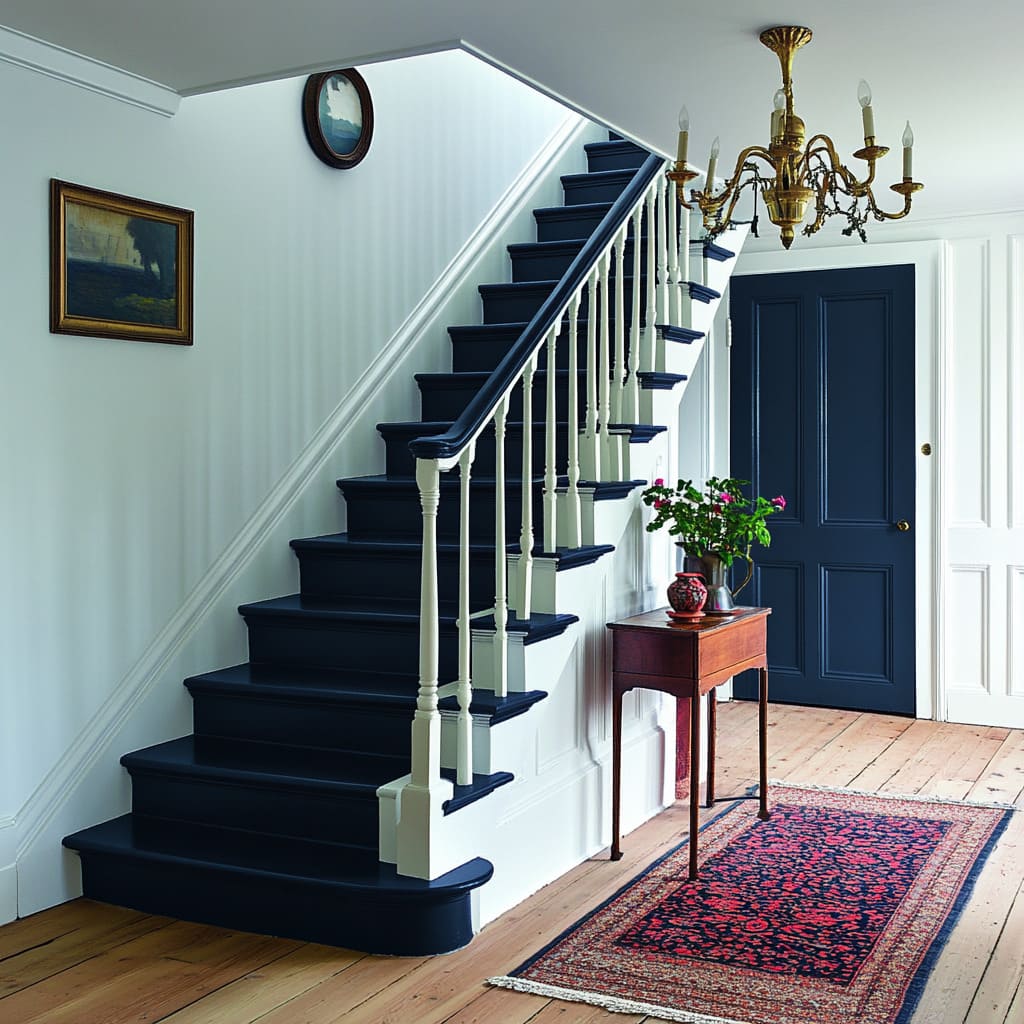
Deep Navy and White: A Formal Yet Updated Look
A navy-painted staircase immediately introduces a sense of depth, but when paired with classic white architectural elements, the result feels crisp and structured. This color combination works particularly well in homes with traditional molding, high ceilings, or heritage details.
Bringing Out Architectural Details
Dark staircases can highlight decorative moldings that might otherwise fade into the background. When paired with classic paneling or wainscoting, navy stairs create contrast, reinforcing the depth of carved details.
A brass chandelier or antique-inspired lighting fixture adds to the sense of formality without feeling outdated.
Balancing Contrast in the Railings and Balusters
A monochromatic approach—where stairs, handrails, and newel posts are painted navy while balusters remain white—adds structure to the design. The white balusters act as visual breaks, emphasizing the clean geometry of the staircase rather than allowing it to blend into a single dark form.
This combination prevents the space from feeling too heavy while still keeping the boldness of navy intact.
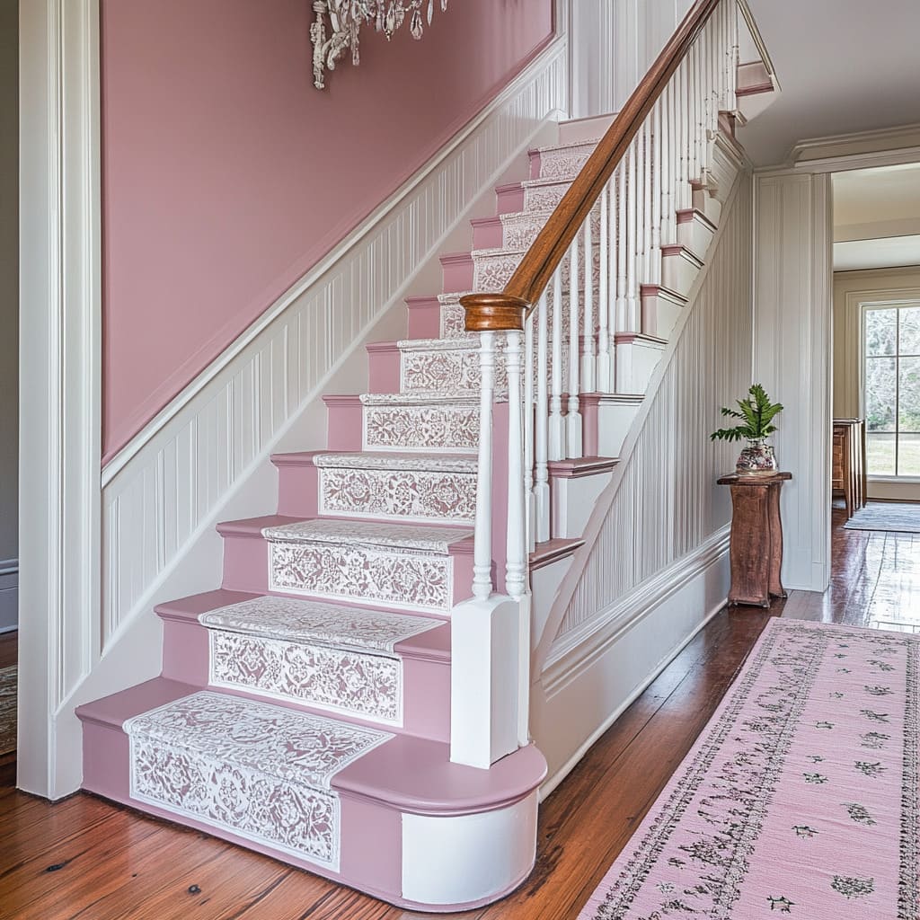
Dusty Rose and White with Lace Stencils: A Softer, Decorative Alternative
For a staircase that leans toward a vintage or cottage-inspired look, a combination of dusty rose and white introduces warmth while maintaining a classic feel. Stenciled lace patterns on the risers add a decorative layer, making the design feel custom and personal without overwhelming the space.
Adding Character with Stenciled Details
Stencils are often overlooked in stair design, but they offer an easy way to introduce intricate detailing without committing to permanent wallpaper or tile. A white lace-like pattern on dusty rose risers creates a soft contrast, preventing the design from feeling too stark.
This approach works particularly well in homes where subtle decorative elements are used throughout the interior.
Keeping the Handrail in Natural Wood for Balance
To prevent the design from becoming overly delicate, a honey-toned wooden handrail provides a grounding element. The warmth of natural wood introduces an organic contrast to the painted elements, keeping the staircase from feeling too uniform.
This small but important detail ensures that the design feels inviting rather than overly styled. Classic color combinations like navy and white or dusty rose and white offer a range of design possibilities, from formal and structured to soft and decorative.
By adjusting details such as contrast placement, stencil work, or natural wood elements, these staircases can be tailored to suit both traditional and contemporary interiors.
Modern Minimalist Gradients and Bold Runners in Staircase Design
Minimalist staircases focus on form, material, and subtle shifts in tone, while bold runners introduce energy and pattern in a controlled way. Whether blending a staircase into its architectural surroundings or making it a striking feature, these designs explore how color and texture interact to create a visually engaging space.
Monochrome Gray Gradient: Seamless Integration with Architecture
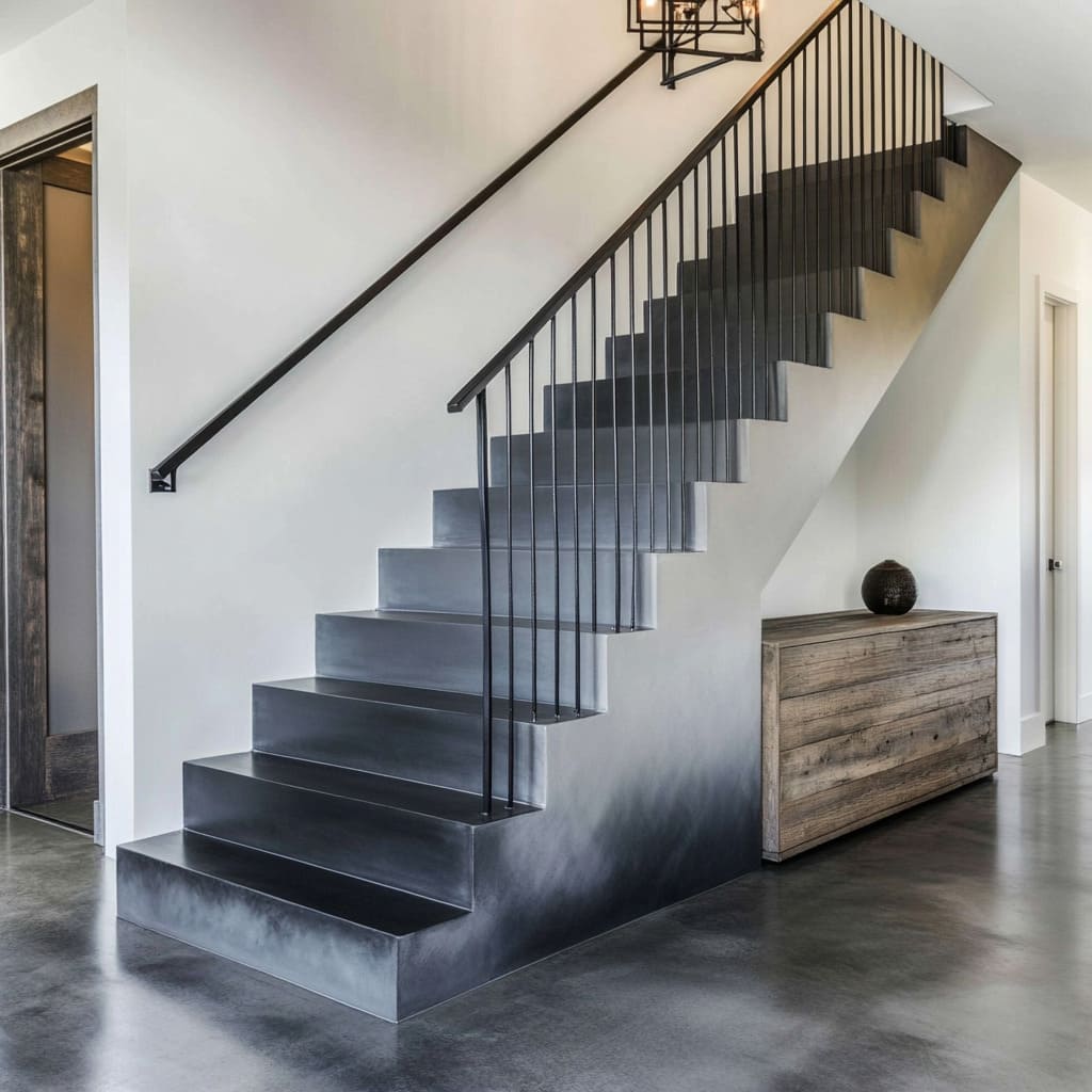
A gray gradient staircase that shifts smoothly from near-black at the top to soft gray at the bottom offers a sense of subtle movement. This effect feels sculptural, particularly when paired with polished concrete floors or walls, making the staircase appear as though it was carved from the same material.
A Staircase That Feels Like Part of the Structure
Rather than standing apart as an accent, the gradient technique allows the staircase to feel like an extension of the home’s foundation. This approach works particularly well in industrial or ultra-modern spaces, where materials like concrete, steel, and glass take priority over ornate detailing.
Keeping Accessories Intentional
When the staircase itself carries this much presence, there’s no need for excessive décor. A raw wood sideboard, a simple ceramic sculpture, or a single large abstract painting is enough to add warmth and contrast without undermining the stairway’s impact.
The key is restraint—anything too bold or colorful could disrupt the carefully balanced gray scale.
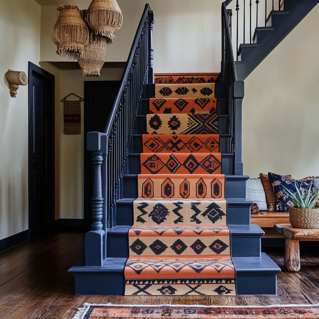
Navy and Burnt Orange Geometric Runner: A Bold Pattern in a Controlled Space
For those who want to experiment with strong patterns but worry about them overwhelming a space, a stair runner is the perfect compromise. A geometric runner in deep navy and burnt orange brings movement and visual interest, while staying confined to a narrow vertical surface.
Why Patterns Feel Different on Stairs
In a large open space, a heavily patterned rug or wallpaper might feel too dominant, but on a staircase, the same pattern is broken up by each step. This segmented placement makes it feel dynamic rather than overpowering.
Letting the Runner Take Center Stage
To balance the boldness of the runner, surrounding elements should stay neutral. Woven basket chandeliers reinforce the organic, tribal-inspired aesthetic without introducing competing patterns.
Keeping the stair rail simple—perhaps in matte black or a warm wood finish—ensures that the focus remains on the runner itself.
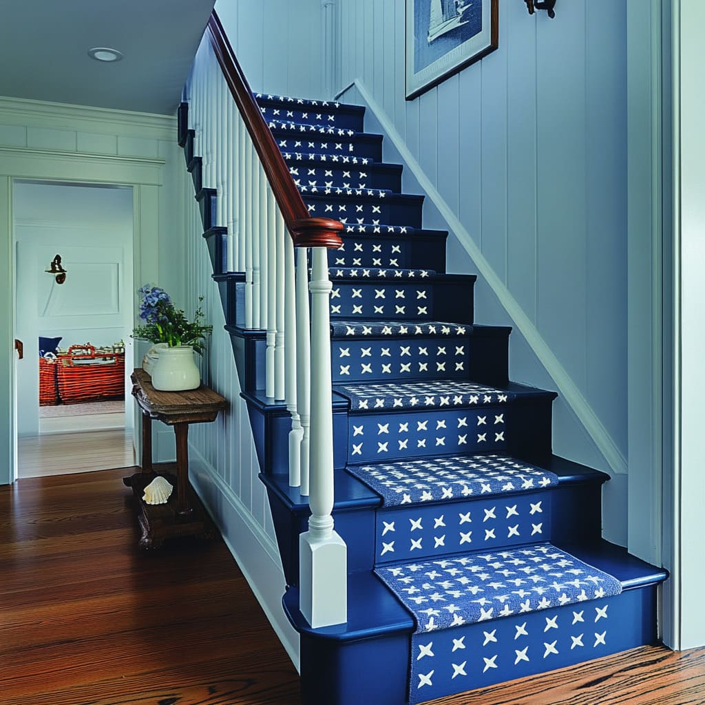
Navy Blue and White with Stars: Playful Yet Refined
A navy stair runner with white stars offers a balance of fun and sophistication. The deep blue keeps the design grounded, while the star motif introduces a lighthearted element.
This combination works well in homes where classic design meets personal touches that make a space feel unique.
A Subtle Nod to Whimsy
Unlike bright, multicolored patterns, the restrained navy-and-white palette ensures the stars feel more timeless than trendy. This makes it an easy fit for spaces with traditional architectural features, allowing for a sense of playfulness without straying too far from a polished look.
Using Warm Wood to Prevent Coolness
Since navy and white are both cool tones, introducing a rich mahogany handrail brings warmth back into the design. This small adjustment prevents the staircase from feeling too stark or sterile, ensuring the overall look remains inviting.
From sleek gradients that blend seamlessly into their surroundings to bold runners that inject color and pattern, these staircases show that modern design doesn’t have to mean minimal decoration. It’s all about balance—whether through subtle tonal shifts or carefully chosen accents that create a sense of rhythm and flow.
Soft Metallic Overlays and Pastels in Staircase Design
Soft pastels and metallic details bring an air of refinement to a staircase, introducing warmth and subtle luxury without overwhelming the space. Whether through delicate gold leaf accents or a sunlit pastel approach, these staircases embrace a light, airy aesthetic that enhances both natural and artificial lighting.
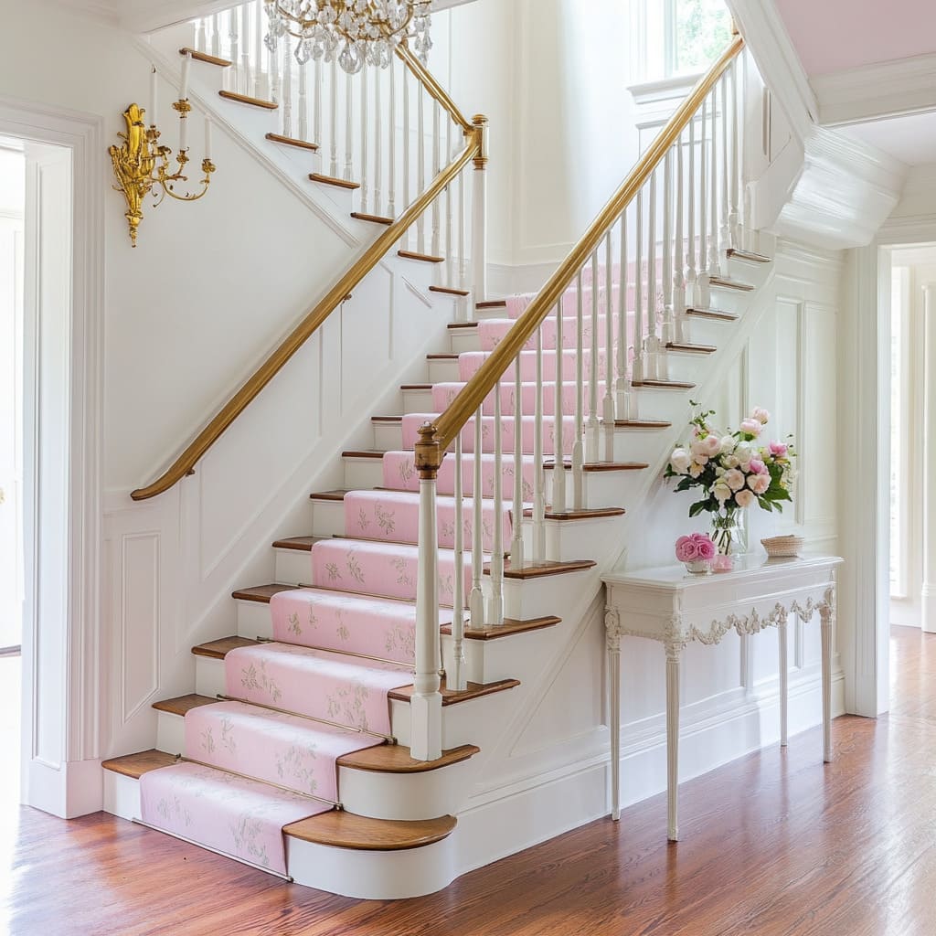
Soft Blush with Gold Leaf: A Delicate, Artisanal Touch
Gold leaf detailing on a staircase isn’t about full metallic coverage—it’s about precision and craftsmanship. Applied in delicate patterns, it adds a touch of antique elegance, reminiscent of hand-gilded picture frames or the intricate gold detailing on vintage furniture.
Gold That Feels Handcrafted Rather Than Overpowering
Instead of painting entire sections in metallic gold, fine gold leaf applications along the risers or treads introduce shimmer in a way that feels intentional rather than excessive. The irregular, slightly aged effect of gold leaf enhances the handmade quality of the staircase, making it feel like a carefully curated design rather than a mass-produced finish.
Reflected Light as a Design Feature
Pairing gold accents with a crystal chandelier amplifies the metallic’s impact. Rather than relying on large metallic surfaces, the combination of gold leaf and hanging crystals creates a dynamic interplay of light, where each reflection enhances the glow of the staircase.
This works particularly well in homes with tall ceilings or open stairwells, where the light can bounce and scatter across different surfaces.
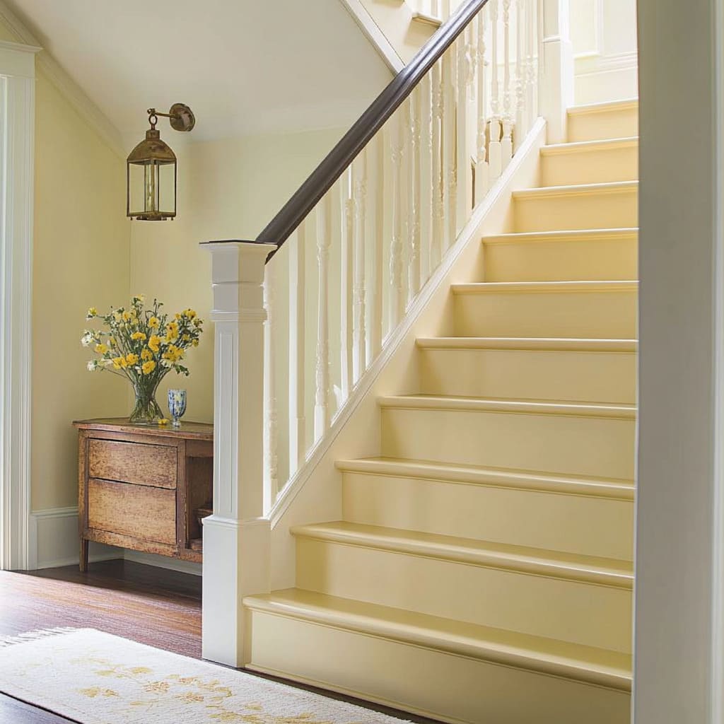
Soft Butter Yellow with Greige Walls: A Gentle, Sunlit Effect
A staircase painted in warm butter yellow creates an inviting, naturally bright look, particularly in spaces where natural light is limited. The softness of the color prevents it from feeling overwhelming while still adding warmth to the overall design.
Using a Monochrome Approach for a Seamless Look
Painting both the risers and treads in the same warm pastel tone removes harsh transitions between steps, making the staircase feel more fluid and integrated into its surroundings. This approach is particularly effective in narrow corridors or enclosed staircases, where a unified color helps prevent the space from feeling segmented or visually cluttered.
Grounding the Look with a Dark Handrail
To keep the pastel staircase from feeling too delicate, an espresso or walnut handrail introduces contrast and depth. This choice not only prevents the design from becoming overly soft but also connects the staircase to classic design elements found in older homes.
Dark wood has long been paired with golden creams and pastels in antique interiors, making this combination feel both familiar and timeless. By blending soft metallic details with pastels, these staircases introduce warmth and sophistication without relying on bold contrasts.
Whether through the refined shimmer of gold leaf or the gentle glow of a monochrome yellow scheme, these approaches show how subtle design choices can create a staircase that feels both light-filled and thoughtfully curated.
Tips and Guiding Principles for Painted Staircase Design
A staircase is more than just a way to move between floors—it’s a structural feature that can define the atmosphere of an entire space. Whether working with bold hues, delicate pastels, or intricate textures, the right choices can transform stairs into a statement that feels both intentional and well-integrated into the home.
Color as an Architectural Tool
The way color is distributed across a staircase can influence how the space feels. Darker shades on rails or newel posts establish visual weight, grounding the design.
In contrast, lighter colors on risers or stringers create a sense of openness, making a staircase feel less imposing.
Strategic Use of Color for Space Perception
- Deep hues for grounding: Dark railings or treads make a staircase feel anchored, especially in open floor plans where visual stability matters.
- Lighter shades for expansion: Pastels or bright tones on large areas like risers can make a stairwell feel wider or more open.
- Gradient or ombre effects: Subtle shifts in tone from one step to the next naturally draw the eye upward, helping smaller staircases feel taller.
Textural Counterpoints for Depth and Contrast
A staircase that relies solely on color can sometimes feel too flat. Introducing texture—whether through materials like jute runners, painted motifs, or layered finishes—adds an extra layer of depth.
Breaking Up Large Color Blocks
- Runners and stenciled details: Patterns on risers or stair runners soften bold colors and create a natural transition between floors.
- Tactile balance: Mixing smooth painted surfaces with coarser materials (such as sisal or woven textiles) enhances the sensory experience.
Metallic Accents for Subtle Brilliance
Metallic finishes don’t need to be overpowering to add refinement. Even small touches—like gold stair rods or a brushed brass handrail—can introduce warmth and dimension.
Enhancing Light with Metallic Elements
- Gold or brass against dark hues: Creates a luminous effect, particularly in staircases with limited natural light.
- Matte vs. gloss contrast: Pairing a matte-painted staircase with a single reflective accent enhances depth without overwhelming the space.
Integrating Walls and Surroundings for Cohesion
A staircase that looks visually disconnected from the rest of the home can feel like an afterthought. Tying colors, materials, and textures together ensures the stairs blend naturally into their environment.
Methods for Creating a Unified Look
- Repeating colors from the staircase on wall paneling reinforces continuity.
- Echoing textures through side tables, artwork, or lighting creates a seamless transition between the staircase and the surrounding area.
Balancing Styles Through Key Design Choices
The right combination of elements can shift a staircase between modern, traditional, or even eclectic aesthetics.
Ways to Control the Visual Balance
- A single standout piece (chandelier, vintage mirror, or console table) can tip a staircase toward a specific style.
- Contrast in shape (curved vs. angular) and color (light vs. dark) prevents the design from feeling monotonous.
Lighting and Reflection: Maximizing the Impact
The way a staircase is lit influences how colors and materials interact.
Light’s Role in Enhancing Staircases
- Glossy finishes amplify natural or artificial light, making dark colors glow or pastel shades appear almost translucent.
- Overhead fixtures can cast unique light patterns on risers, adding another layer of depth to painted designs.
Artisanal Touches for a Personalized Staircase
Adding hand-painted details or customized textures ensures a staircase feels unique to the home.
Ideas for Customization
- Stenciled motifs on risers bring an artistic, crafted feel.
- Metallic leaf accents on treads or risers add a refined, vintage-inspired detail.
A well-thought-out staircase doesn’t need to rely on overwhelming color or excessive ornamentation. The most striking designs come from a careful balance of color, texture, and surrounding elements, ensuring that the staircase enhances the home rather than simply existing within it.

