A modern Cape Cod front door usually gets described too narrowly. People talk about paint color, glass shape, lantern style, or whether the slab should be wood or painted.
Those details matter, but they do not explain why some Cape entries feel fresh and house-rooted while others slide into formal colonial display, generic coastal luxury, or a showroom version of tradition. The deeper truth is that the front door in a Cape house works as a threshold event before it works as a decorative object.
That distinction changes the whole design conversation. A good modern Cape entry is rarely a slab picked in isolation and then dressed with nice hardware.
It is a thickened center inside a weathered shell. It is a meeting point between cedar shingles, white trim, filtered light, stone, planting, and the quiet discipline of the façade.
The door can be pale, dark, painted, or wood, but it succeeds only when it behaves like part of that larger threshold structure.

Front door designs that look handsome on their own still feel slightly wrong once used on a Cape house. They may be attractive objects, but they are too self-contained.
They announce a separate design agenda instead of belonging to the house. Modern Cape work depends on the opposite move.
The threshold should hold presence, but it should still feel authored by the house around it.

The real backbone is the portal
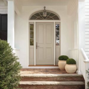
Modern Cape entries often begin with a substantial frame: a heavy white surround, a compact portico, a deep recessed opening, or a porch chamber that gives the doorway thickness and shelter. This is not decoration added afterward.
It is the architectural chassis that allows everything else to work. Without that strong threshold frame, a Cape front door can become visually thin.
Glass begins to feel too expansive. historical motifs start to look loose.
Painted color can detach from the wall. Even a beautiful wood slab may feel like a premium insert rather than a natural part of the facade.

With a strong portal, the same door changes character. A pale painted slab gains authority.
A darker wood door gains discipline. Narrow sidelights feel like light cuts rather than suburban filler.
Moderate glazing feels protected rather than flimsy. The white surround or recessed opening acts as a pressure chamber that compresses the approach and makes the entry feel settled inside the house.
This is one of the principles in present-day Cape design: strengthen the threshold first, then decide how much personality the slab itself should carry. That is also why current Cape entry ideas look calm even when they are visually rich.
Their richness is sitting in depth, framing, and material contrast rather than in overt ornament.

Freshness comes from edited geometry more than from bright color
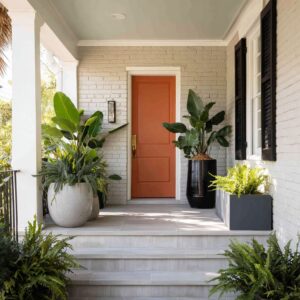
The popular image of a Cape front door is often a cheerful painted slab in blue, green, or some coastal variant. That route can still work well, but it is not the main reason a front door feels current.
Modern Cape entries usually gain freshness through editing rather than through chromatic force. A pale gray-blue door, a misty green-gray, a mushroom taupe, a graphite tone, or a drifted wood finish can feel more current than a vivid painted slab if the geometry is handled well.
What matters is not how loudly the color speaks. What matters is whether the entry has crisp edge definition, disciplined glazing, a clear lower-body mass, and a strong relation to the rest of the façade.
In other words, the update often lives in line, proportion, and threshold depth more than in paint saturation.

This is why muted doors can feel so strong on Cape houses. Their restraint lets the eye notice other things that are often more important: the weight of the surround, the relation to the windows, the way the door sits inside shadow, the contrast between smooth trim and weathered shingles, the narrowness of the sidelights, the firmness of the lower panels, the way a black handle or lantern sharpens an otherwise soft palette.
Bright color can certainly freshen a Cape entry, but it is a secondary route. If the framing is weak or the slab is too visually restless, paint will not solve the problem.
A well-judged muted door inside a thick portal often carries more lasting force.

A Cape door should belong to the windows
One of the least discussed but an important parts of front-door design is facade integration. A Cape front door should not invent a completely separate design language from the windows around it.
It should feel related to them in grid logic, proportion, tonal balance, or edge treatment. That does not mean the door must copy the window muntins exactly.
Literal matching can feel stiff. But the door should behave like a relative.

If the house has dark-framed windows with crisp internal divisions, the door often works well with a similarly disciplined upper glass pattern or with narrow black-edged sidelights. If the façade is lighter and softer, a pale painted door with a compact divided-light band often fits better than a highly graphic black slab.
If the house uses strong vertical window rhythm, the door should usually support that rhythm rather than fight it with overly wide, low, or oddly shaped glazing.

This relationship to the façade is one of the main things that keeps a modern Cape entry from drifting into another category. The more the doorway behaves as a self-contained composition with its own motif system, its own curve agenda, and its own symbolic references, the more it starts to feel detached from the house.
The entries that hold together well are the ones where the door seems inevitable once you see the full elevation. The house has prepared the eye for it.

Historical memory helps only in small doses
A Cape door does not need to erase history to feel current. In fact, a small amount of historical memory often helps.
A restrained diamond band, one oval insert handled tightly, a simplified fan influence, one compressed arch, or a modest divided-light upper section can still work beautifully. The problem begins when historical references spread too far.
Once the doorway starts stacking oval glass, arched transoms, curved sidelights, repeated fan patterns, heavily symbolic panel choreography, or multiple old-house gestures at once, the entry begins to lose present-day sharpness. It may still be handsome.
It may still look rich. But it starts leaning away from Cape restraint and toward formal revival.
This is a critical distinction. The issue is not whether history is present.
The issue is footprint. A small historical cue can give the entry local memory.
A large cluster of cues can start to turn the threshold into a period display.

Modern Cape entry ideas usually keep motif count low. The better formula is one gesture with room around it: one historical note, plain surrounding surfaces, a firm lower body, and a portal strong enough to contain the reference.
That containment is what lets an older motif survive in a newer composition.
- A diamond-pane band can work if the rest of the slab is quiet.
- An oval insert can work if the sidelights remain plain.
- A fan influence can work if it is compressed and the framing around it stays broad and simple.
- An arch can work if it is the main shape and not one curve among many.
Once several of those begin piling up together, the entry becomes less stable.

Curves in Cape Cod style house front door design
Arches, arched surrounds, curved sidelights, and shallow fanlike transoms can look beautiful on Cape houses, but they are less dependable than many homeowners expect. The reason is not that curves are wrong.
The reason is that the Cape house already carries a quiet, compact, rectilinear discipline in its wall planes, roof shapes, and window order. Curved forms have to enter that discipline carefully.

A single broad arch can soften a façade center very effectively, especially if it is housed inside a substantial white frame and supported by plain lower door panels. A shallow curved transom can add grace if the slab below remains simple.
A tight arch can even help a modest door feel taller and more ceremonial. But repeated curves create pressure.
Once the outer surround curves, the transom curves, the sidelights curve, and the slab itself repeats the gesture, the doorway begins to accumulate expressive weight. It stops feeling edited and starts feeling composed around ceremony.
That is where modern clarity weakens. For that reason, the strongest curved Cape entries are usually the ones with one dominant curve and several plainer supporting parts.
They use shape selectively, not rhythmically. The curve gives softness.
The rest of the threshold restores firmness.

Glass helps modernity, but it can weaken Cape identity
Glazing is one of the most useful tools for updating a front door. It adds light, reflection, visual depth, and a more present-day relation between inside and outside.
Yet on a Cape house, glass always has to negotiate with enclosure. A Cape entry wants some protection.
It wants a sense of wall. It wants a lower body that still feels sheltering.
That is why moderate glazing is often the sweet spot.

A gridded upper section over a solid lower slab, narrow sidelights that act as light cuts, or a transom that widens the threshold without dissolving it can all feel very current. They brighten the entry and sharpen the composition while keeping the center calm.
Too much glass changes the category. Once the opening becomes too transparent, too wide, or too thinly framed, the threshold starts moving toward broad custom coastal architecture.
That can be attractive, especially on waterfront houses, but it is not the same thing as a house-rooted modern Cape entry. The key is to let glass do one job at a time.
It can widen. It can brighten.
It can lighten the upper portion of the slab. It can establish relation to the window system.
But it should not erase the protective logic of the doorway.

This is why strong Cape entries often use glass in disciplined formats:
- compact gridded upper bands,
- narrow sidelights instead of broad glazed flanks,
- shallow transoms instead of huge vertical glass fields,
- seeded or textured glass that gives light without full exposure,
- and solid lower panels that keep the threshold grounded.
Glass modernizes the entry when it is held inside a thick wall idea.

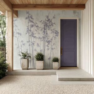
Dark doors
There is a persistent fear that dark front doors are too heavy for Cape houses, especially compared with the familiar blue or pale gray painted slab. In practice, dark entries can work extremely well.
Graphite, mushroom, taupe, smoked oak, deep stained wood, and charcoal-brown tones often look highly appropriate on Cape exteriors. What matters is not darkness alone.
What matters is what darkness is paired with.

Darkness paired with moderate glazing, strong façade relation, and low motif load can feel very stable. The dark door becomes a dense center inside a pale or weathered shell.
It gives the threshold weight and seriousness without becoming harsh. Darkness paired with too much ceremonial history is less stable.
A dark wood door already carries gravity. If it is then loaded with multiple old-house motifs, fan references, repeated curves, and ornate shaping, the entry can grow formal too quickly.
Darkness paired with very thin high-glass framing can also start sliding toward generic luxury-coastal work. So dark entries are not risky by nature.
They simply need discipline around them. On a Cape house, a dark door often feels especially good when it sits inside a bright surround, relates to dark window frames or lanterns elsewhere on the façade, and keeps its decorative language lean.

Wood as modern Cape routes
Natural or stained wood front doors have become one of the most compelling paths for modern Cape design because they allow the entry to feel richer without relying on obvious historic styling or bright paint. Wood does several things at once.
It brings warmth to weathered shingles. It gives the threshold material density.
It introduces grain and tonal movement. It often makes the entry feel more architectural because the slab seems cut from mass rather than painted as surface.
But not all wood doors work the same way.

A pale natural wood entry can brighten the center of the house and produce a washed, coastal softness. This route works especially well when the rest of the façade is crisp and pale, with black punctuation and restrained glazing.
A darker stained wood door produces a denser, more intimate center. This route works well when the portal is strong and the entry wants more gravity.
A drifted gray-brown wood finish can sit especially comfortably between painted trim and weathered shingles because it belongs tonally to both.

The danger with wood is not that it feels too warm. The danger is that it can slide toward either broad rustic language or overly polished custom-house luxury.
The cure is the same in both cases: keep the portal strong, the hardware lean, the glazing disciplined, and the house relation clear. Wood works on Cape houses when it feels like a richer member of the same broader material family as the shingles, not a foreign luxury insert.

The front door should not carry the whole mood by itself
In modern Cape design, the threshold is completed by what happens around it. The door is never acting alone.
The weathered cedar field matters because it gives age, tonal drift, and regional memory. Smooth white trim matters because it sharpens the threshold.
Stone matters because it gives groundedness at the base. Dark metal matters because it firms up softer palettes.
Planting matters because it softens geometry and keeps the entry domestic.

This is why the garden around the door deserves more attention than it usually gets. Hydrangeas, clipped shrubs, pale blooms, rounded pots, and lower planting masses are not merely decoration at the edge of the frame.
They moderate the mood of the whole threshold. They stop a very rectilinear entry from becoming too hard.
They stop a more formal entry from becoming too ceremonial. They stop a pale entry from washing out by giving it fullness at the base.
Planting also performs an important cultural task. It keeps the house feeling lived in rather than staged.
A Cape entry is usually looking strong when the doorway has some compositional order but the setting around it still feels domestic and inhabited. Without that planted softness, even well-proportioned entries can become dry.

Two especially strong modern Cape paths
Although Cape front doors can vary widely, two current routes hold together especially well.
The pale restrained route
This version uses a muted painted slab, often in a soft gray, misty blue-gray, pale sage-gray, or gray-beige. The door sits inside a substantial white surround or portico.
Glazing is moderate and usually concentrated in the upper portion. Sidelights remain narrow.
The palette stays compressed and quiet. What makes this route strong is not drama.
It is tonal discipline. The entry feels house-rooted, calm, and fresh without chasing attention.
It preserves Cape identity very well because it does not ask the doorway to become a special event beyond the threshold itself. This route suits homeowners who want the front door to feel refined and coastal without becoming too assertive.

The crisp façade-integrated contemporary route
This version is sharper. It tends to use stronger dark-edge definition, black-framed or black-accented glazing, moderate glass, deeper recess, darker woods or darker neutral tones, and a very clear relation to the broader façade grid.
This is often the modern design route because it delivers clarity without losing rootedness. The entry becomes more architectural, but it still belongs fully to the house.
It uses modern precision rather than overt historical display. This route suits Cape houses that want more graphic definition and stronger threshold presence while still staying inside regional language.
Both routes work because they keep hierarchy clear. The threshold is strong.
The motif load is low. The façade relation remains intact.

Two ways a Cape front door starts to drift
Modern Cape front doors usually lose their footing in one of two ways.
Drift path one: historical overload
This happens when the doorway gathers too many symbolic references at once: oval plus transom plus sidelights, repeated arches, fan patterns inside larger arch systems, elaborate old-house glazing, or several period cues stacked into one threshold. The result can still be attractive, but the entry stops feeling edited.
It begins leaning toward revivalist formality. The doorway becomes more about its own references than about belonging to a cedar-shingled house.

Drift path two: luxury-coastal thinning
This happens when the entry pushes too far into large glass areas, deep custom threshold chambers, dark frame systems, wide transoms, and view-oriented transparency. The design starts borrowing more from high-end waterfront houses than from Cape restraint.
Again, the result can be beautiful. But it no longer holds the same house-based compactness.
The threshold becomes more spatially open, more cinematic, and less protective. Understanding these two drift paths is very useful because they require different corrections.
The first path needs reduction of motifs and curves. The second path needs more wall presence, more opacity, and a stronger sense of contained threshold.

What makes a Cape front door feel deeply right
A truly strong modern Cape front door usually has a clear hierarchy of design decisions.
- First, the threshold feels thick. The entry has a substantial surround, recessed opening, porch chamber, or some other form of architectural containment.
- Second, the doorway belongs to the house. Its glazing, proportions, tone, and edge treatment relate to the windows and wall order around it.
- Third, the glass is selective. It adds light and freshness without dissolving the protective character of the entry.
- Fourth, history appears in small, edited doses. One reference can enrich the composition. Several references begin to compete.
- Fifth, material contrast is doing quiet but serious work. Weathered shingles, smooth trim, wood grain, stone, and dark hardware are building depth without requiring overt display.
- Sixth, the planting near the base gives the threshold a domestic softness that keeps the design from turning either too formal or too custom-showpiece.
That is why modern Cape front door design feels deeper than a conversation about slab style. The door is not simply a face on the house.
It is the point where weathering and maintenance, old memory and present clarity, enclosure and welcome, geometry and garden all come into balance.

The larger lesson
Attractive modern Cape front door designs are the ones that place complexity carefully.
- A door does not need many motifs if the surround has depth.
- It does not need bright paint if the geometry is strong.
- It does not need abundant glass if the threshold already has light and proportion.
- It does not need overt history if the house itself already carries memory in shingles, trim, and massing.
That is what gives a Cape entry lasting force. The door becomes part of a thickened, softened, well-framed center rather than a separate decorative statement.
And that may be the main design idea of all for this house type: a modern Cape front door should not feel like a special object set against the house. It should feel like the house came to a point of focus, gathered itself at the threshold, and became slightly more precise right where someone arrives.