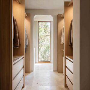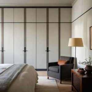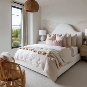
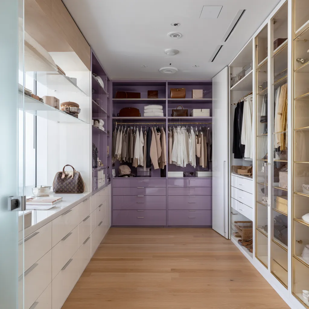
A walk-in closet is one of the few rooms where color has to work after the room is full. A bedroom can be styled around a bed, a rug, a few lamps, and art.
A kitchen can be planned around cabinetry, stone, hardware, and appliances. A walk-in closet has a different challenge: the room is constantly filled with objects that already have color, texture, sheen, pattern, and visual weight.
Shirts, shoes, handbags, folded knits, woven baskets, belts, mirrors, metal rods, marble counters, glass doors, rugs, and stools all become part of the palette.
That is why walk-in closet color ideas should not begin with the question, What color do I like? A better starting point is: What should this color do to the wardrobe?
A cabinet color can make shoes look arranged or scattered. It can make white shirts appear crisp, cream garments softer, tan leather warmer, dark clothing less heavy, or denim more intentional.
It can make a narrow closet feel like a corridor, a boutique, a dressing room, a vanity space, or a furnished private room. The color is not only a background.
It is the visual system that organizes everything placed inside it.
This is where many closet color decisions go wrong. A beautiful shade on a sample door can look weak once surrounded by clothing.
A dramatic burgundy can feel rich in a rendering but too dense in a narrow space. A pale blue can look fresh in daylight but cold under ceiling lights.
A cream closet can feel expensive with oak, brass, marble, and texture, or flat if every surface has the same finish. The walk-in closet colors work through placement, contrast, material support, and wardrobe compatibility.
The shade matters, but it is only one part of the design.
Start with the closet after it is filled, not the closet when it is empty
An empty closet makes almost any cabinet color look cleaner than it will feel in real use. The problem begins when garments, shoes, bags, baskets, hats, and folded textiles enter the space.
Every open shelf becomes a small composition. Every hanging bay creates vertical bands of fabric.
Every drawer front meets the color of the floor. Every mirror reflects another finish.
That means the real palette of a closet includes two layers.
- The first layer is permanent: cabinetry, flooring, ceiling, walls, hardware, stone, mirrors, lighting, and rugs.
- The second layer is movable: clothing, shoes, bags, boxes, baskets, perfume bottles, jewelry trays, folded sweaters, plants, and seating.
A closet color works when these two layers cooperate. If the permanent palette ignores the movable one, the room can feel visually noisy even when it is well organized.
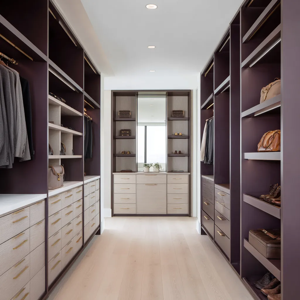
For example, deep plum cabinetry can be beautiful behind ivory shirts, camel coats, taupe knitwear, cognac leather, black shoes, and gray wool. Those wardrobe colors already belong to the wine-brown family or create useful contrast against it.
The plum then makes the closet feel like a fitted dressing salon.
The same plum can feel chaotic if the closet contains many bright athletic colors, high-saturation prints, neon accessories, and strongly unrelated tones. In that case, the cabinet color competes instead of organizing.
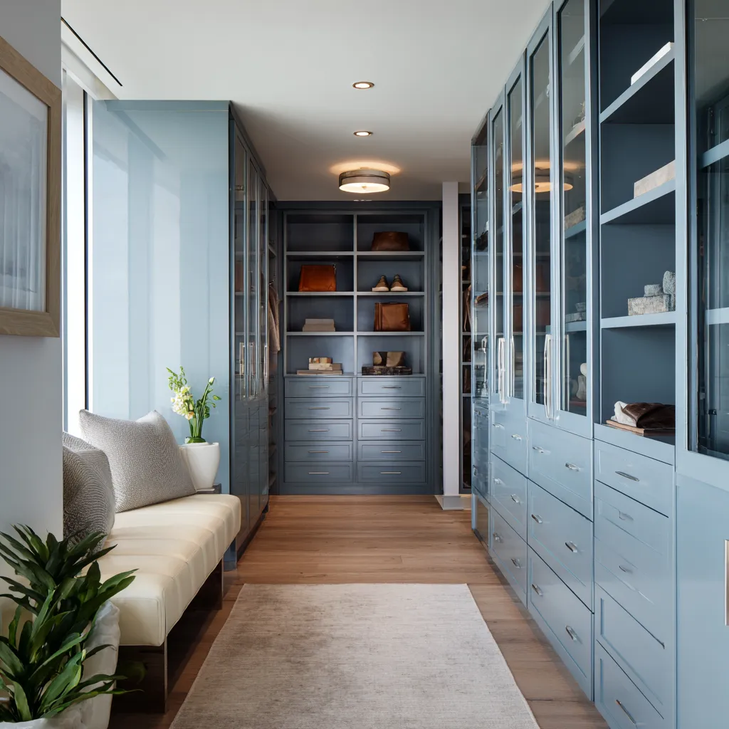
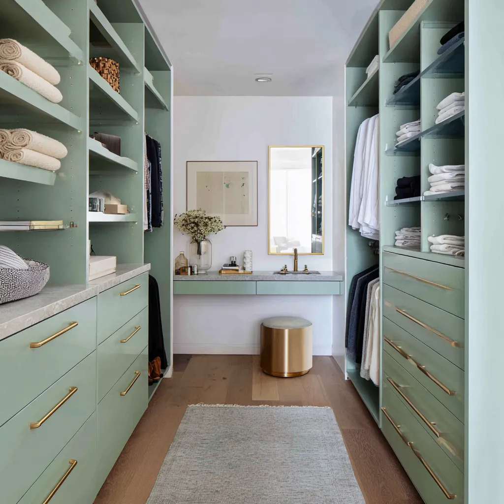
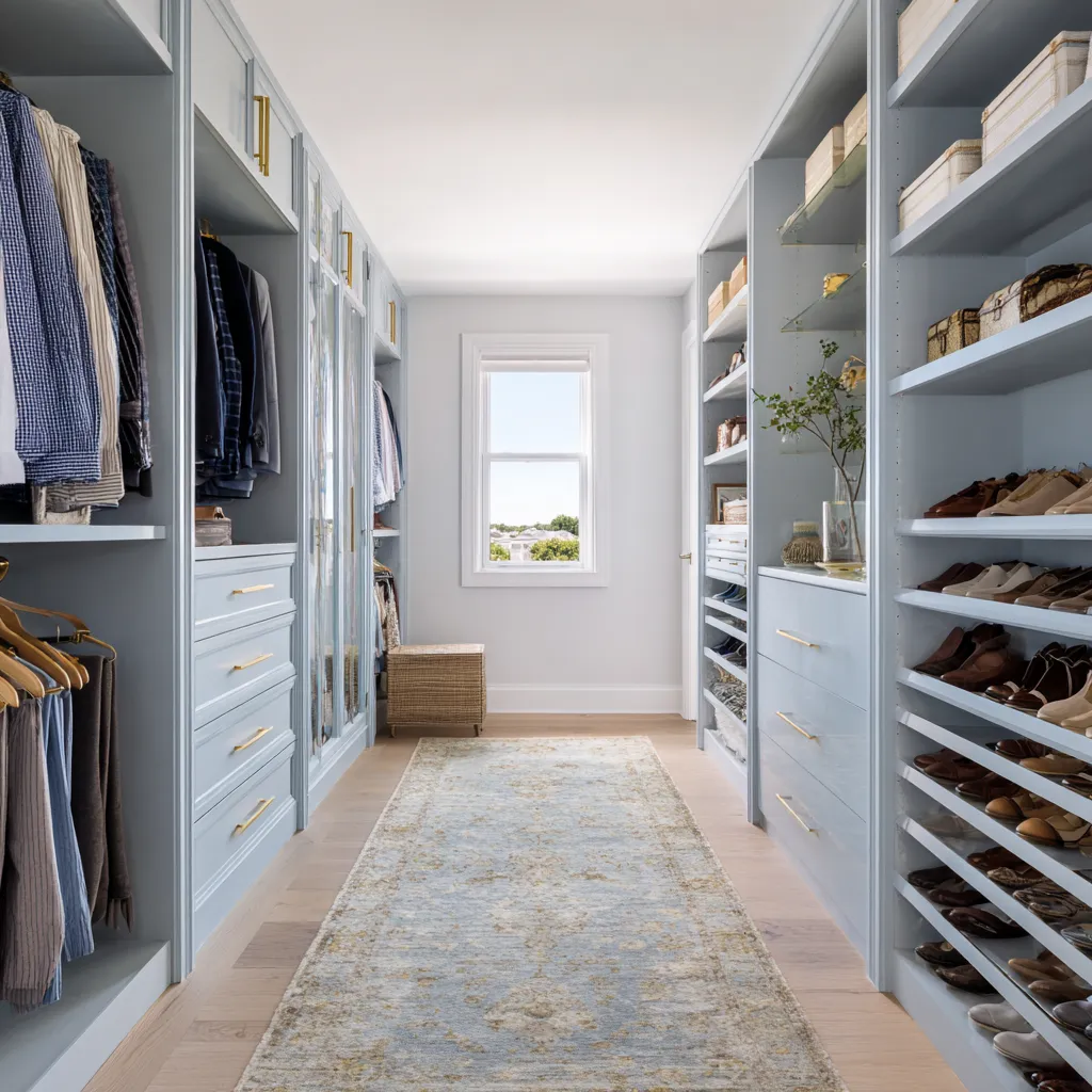
A pale blue-gray closet works especially well with denim, navy, white shirts, gray suits, tan leather shoes, and striped fabrics. The blue cabinetry makes those pieces feel connected.
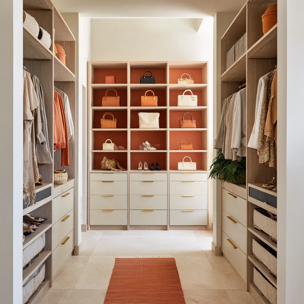
A sage-green closet supports cream, khaki, oatmeal, camel, gray, navy, and tan leather. A terracotta or apricot closet feels natural with straw baskets, camel bags, ivory linen, beige knits, and cognac shoes.
Before choosing the cabinet shade, study the wardrobe itself. Not the ideal wardrobe, but the real one.
Look at the colors that repeat most often. Look at the shoes.
Look at the bags. Look at the folded pieces.
A closet palette should make these items look intentional.
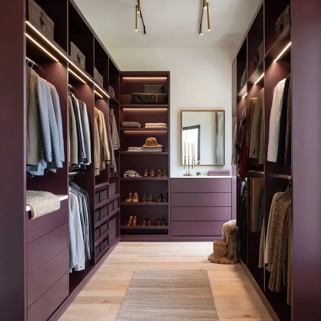
Give the color a job before giving it a name
The same color family can create very different effects depending on where it is placed. A green closet is not one idea.
A sage full wall, a dark olive display niche, a jade drawer run, and green cabinet interiors behind clothing are completely different design decisions. Instead of naming the color first, define its job.
- A closet color can act as a full envelope. This works when the shade is muted, pale, gray-based, or carefully balanced with light flooring and a pale ceiling. Soft sage, moonstone blue, silvered olive, cashmere beige, and warm cream can cover large built-in systems because they are not visually aggressive.
- A color can act as inner depth. This is especially useful for burgundy, mulberry, dark olive, laurel green, and blackcurrant. These colors are beautiful inside open bays, behind hanging garments, at the back of shelves, or behind shoes and bags. They create shadow and richness without covering the whole room.
- A color can act as a lower anchor. Deep glossy drawer fronts, darker lower cabinetry, or a richer island base can ground the closet while the upper shelves remain light. This is useful in rooms that need depth but cannot tolerate dark color at eye level.
- A color can act as a destination. A terracotta display wall, a deep green back shelf unit, an amber mirror wall, an arched parchment-yellow niche, or a vanity wall gives the long closet a clear endpoint.
- A color can act as a frame. Blue-gray cabinet frames with oak interiors, cream outer cabinetry with mulberry backs, white perimeter cabinets with a deep green display wall, or sage cabinetry with one oak display column all use color to organize storage sections.
- A color can act as a surface accent through reflection or texture. Amber-smoked mirror, ribbed glass, grasscloth, marble, woven baskets, and brass can create a color atmosphere even when the painted cabinetry remains neutral.
This distinction matters because many homeowners say they want a colored closet but are unsure how much color they can live with. The answer often depends less on the hue and more on the role.
A deep burgundy full shell is bold. Burgundy inside open wardrobe bays is much easier.
Burgundy on glossy closed drawer fronts feels like fine furniture. Burgundy at the far end creates a focal wall.
The same color has four different levels of intensity.
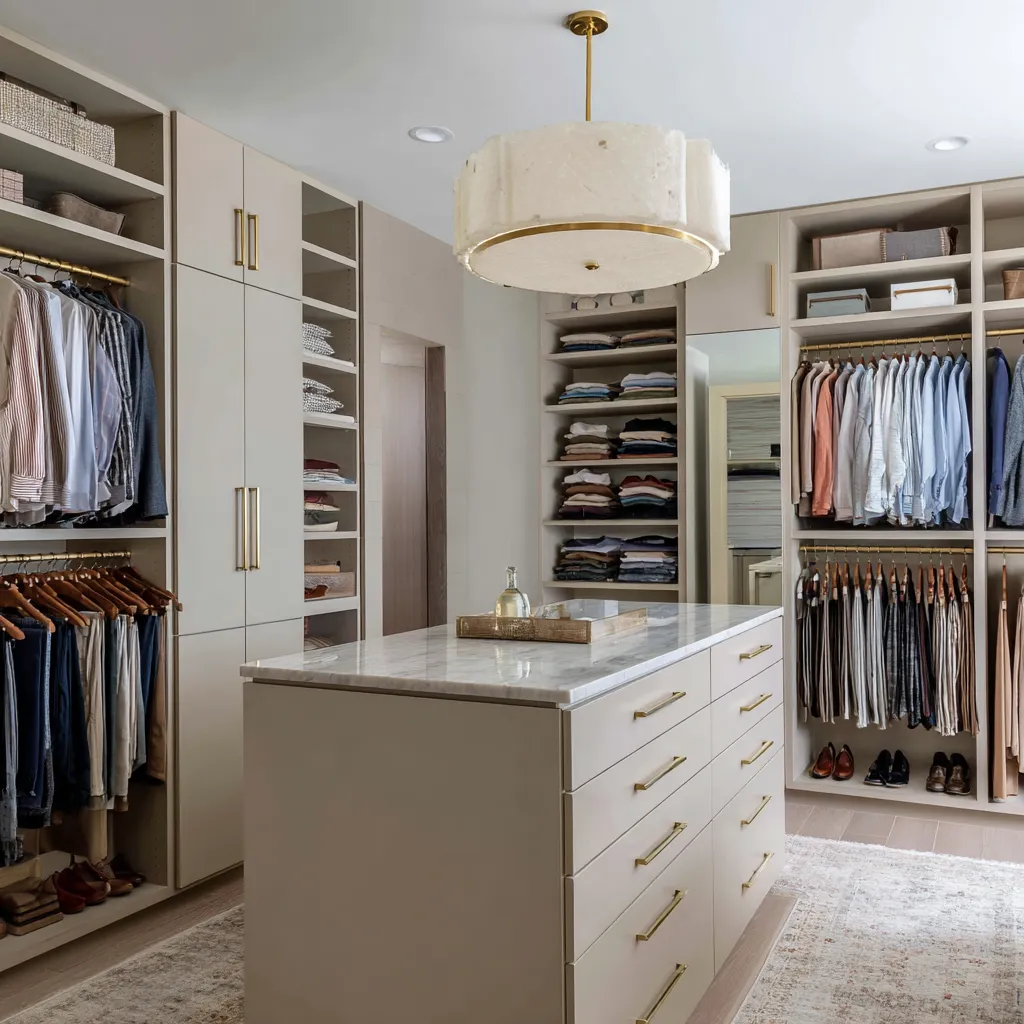
Dark closet colors should create depth, not heaviness
Deep closet colors can be beautiful: blackcurrant, plum, roasted fig, mulberry, laurel, dark olive, and midnight green all have a natural connection to fashion, leather, wool, brass, and display. They can make shoes look sculptural, bags look collected, and pale garments stand forward.
The danger is not the darkness of the shade itself. The danger is allowing dark color to occupy too many surfaces without relief.
A dark walk-in closet needs at least several of these balancing elements: pale oak or pale stone flooring, a white or cream ceiling, warm linear lighting, cream open shelves, glass display shelves, mirror at the end, brass rods, pale drawer bands, light textiles, or a bright vanity zone.
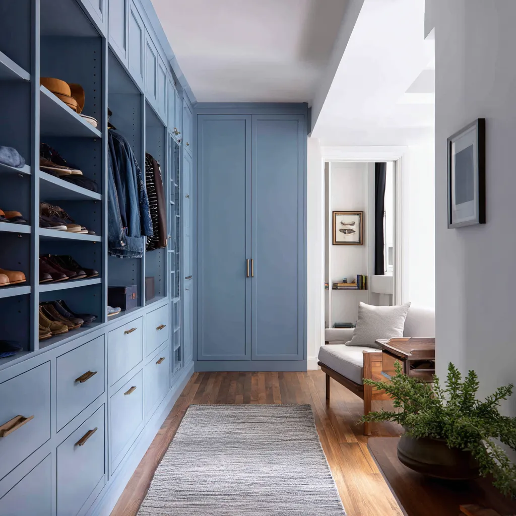
A deep blackcurrant closet can work when the floor stays pale, the ceiling remains light, and the rods and lighting create fine warm lines. A plum closet becomes easier when pale oak drawer fronts form a light lower band.
Mulberry becomes practical when it appears only inside cream-framed wardrobe bays. Roasted fig can feel polished when placed on glossy drawer and door fronts while the open shelving remains cream.
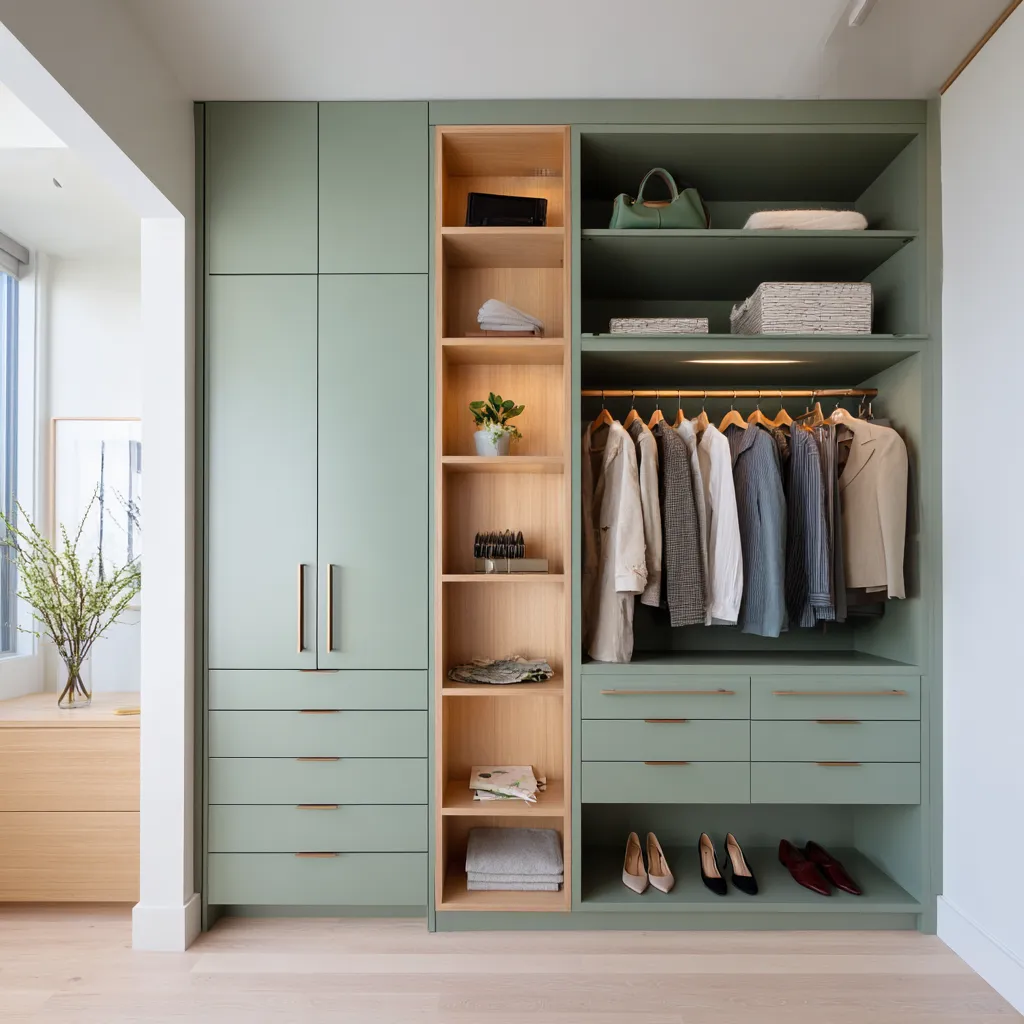
The color idea is this: dark color should behave like depth. It can sit behind clothing, inside shelves, on a back wall, inside a display tower, or on closed fronts.
It should not automatically cover every visible plane. Dark color is very effective behind pale garments.
White shirts, ivory knits, cream boxes, tan shoes, and camel bags become clearer against plum, laurel, or burgundy. Dark shelves also hide shadow gaps and make accessories feel grouped.
This is why deep cabinet interiors often look more refined than plain white interiors in open storage. But dark side walls plus dark floor plus low light can make the closet feel compressed.
If the room is narrow, use dark color with framing. Keep the walking lane bright.
Let the floor and ceiling give air to the composition.
Cool colors need warmth in the places the body notices
Blue, aqua, and cool green can be excellent walk-in closet colors, but they need warmth in very specific places. This is because a closet is used for dressing.
Skin tone, fabric color, mirror reflection, and daily comfort all matter. A blue-gray closet with cold lighting, chrome hardware, gray flooring, and stark white shelves can feel clinical.
The same blue-gray with oak interiors, brass rods, tan leather, cream seating, a pale runner, warm LEDs, and woven storage feels much softer and more livable.
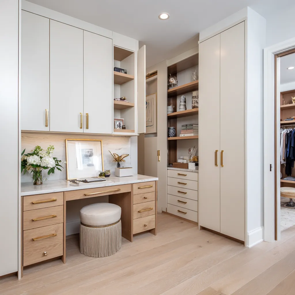
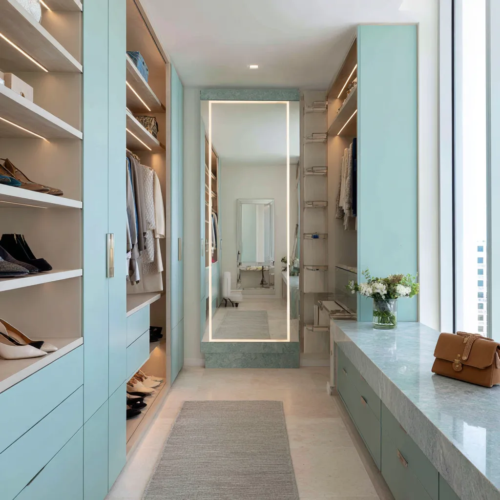
Warmth should appear where the user physically interacts with the room: underfoot through oak or walnut flooring, at hand level through brass pulls, inside shelves through warm wood, near the mirror through sconces or a brass frame, on seating through cream upholstery, and through accessories such as tan leather bags or woven baskets. Aqua cabinetry becomes much more usable when paired with beige shelf interiors and green-blue stone.
Moonstone blue feels warmer with a beige patterned runner and a woven trunk. Smoky cornflower blue becomes grounded over walnut flooring.
Blue-smoke cabinetry works beautifully with cognac leather because the warm brown makes the blue appear cleaner, while the blue makes the leather richer. The same principle applies to jade and mineral turquoise.
These shades can feel fresh and luminous, but they need stone, wood, brass, cream textiles, or warm light to prevent them from feeling too sharp. Cool closet color should not be treated as a cold room.
It should be treated as a cool cabinet finish inside a warm dressing environment.
Green can be a neutral if the undertone is softened
Green is one of the flexible color families for walk-in closets. It can feel natural, fresh, traditional, modern, polished, or relaxed depending on undertone and placement.
The key is the amount of gray, olive, or beige inside the green. Soft sage, celadon, olive-pearl, silvered olive, and muted eucalyptus tones can cover large cabinetry surfaces because they sit close to linen, stone, khaki, pale wood, and dried herb tones.
They work with many wardrobe colors: white shirts, gray sweaters, navy jackets, camel coats, tan shoes, cream bags, and beige folded textiles.
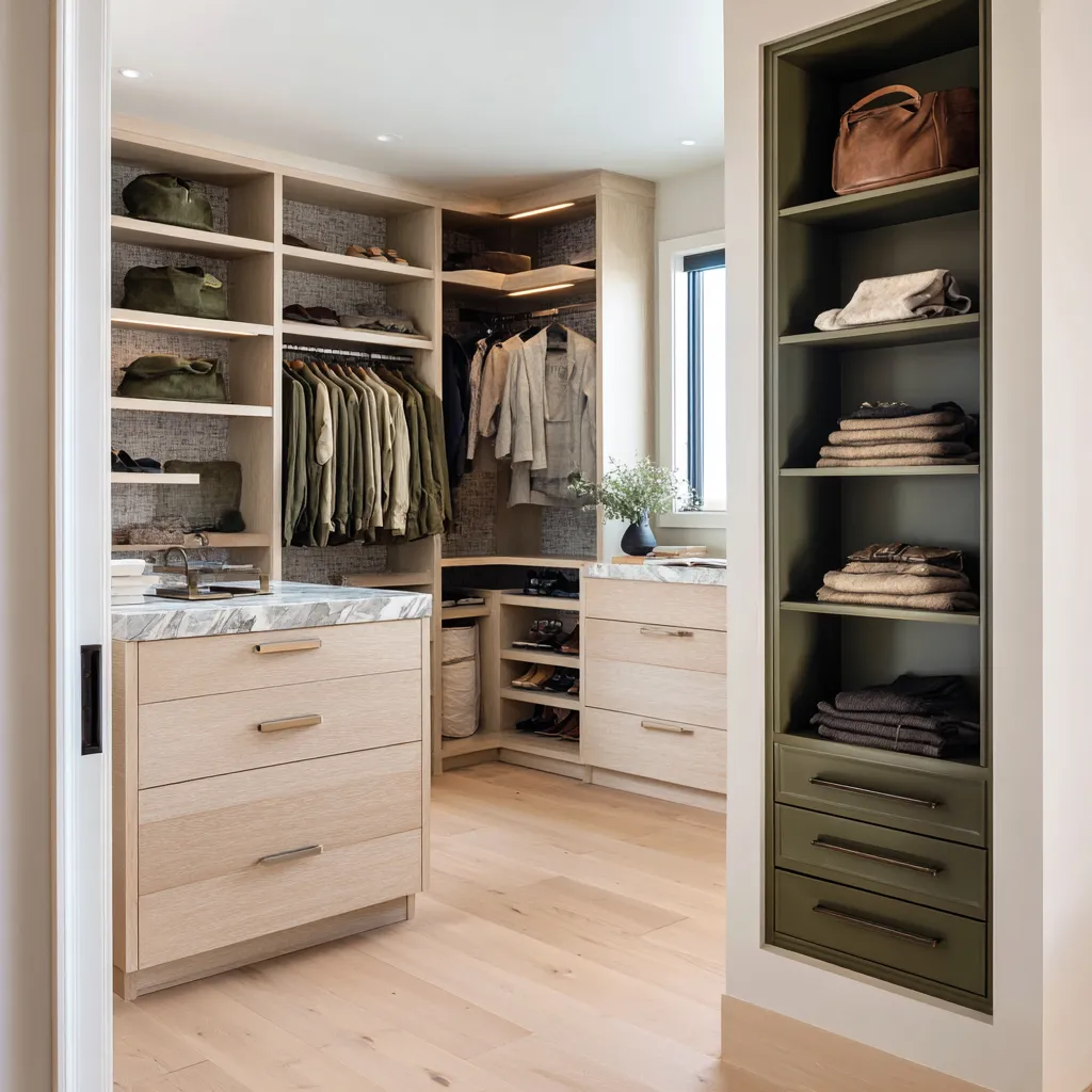
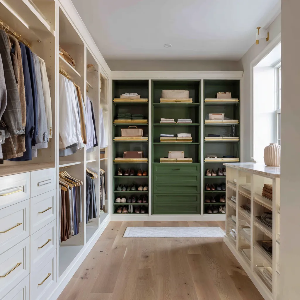
Darker greens, such as laurel, dark olive, and midnight juniper, behave differently. They are better as depth colors.
Use them on a back display wall, in one tower, behind open shelves, inside a niche, or on accent drawers. They make cream boxes, pale shoes, brass rails, and tan leather stand out beautifully, but they can become heavy if spread through a narrow closet without enough light.
A soft green closet also benefits from living green. A small plant, leafy branch, or floral arrangement can make painted green cabinetry feel more connected to natural materials.
The plant does not need to dominate. Even one small botanical note can bridge sage cabinetry, oak shelving, brass hardware, and cream upholstery.
Green is especially useful for people who want color without a dramatic mood. A gray-green closet can function almost like a warm neutral, but with more personality than white or beige.
Warm neutral closets need texture, not more beige
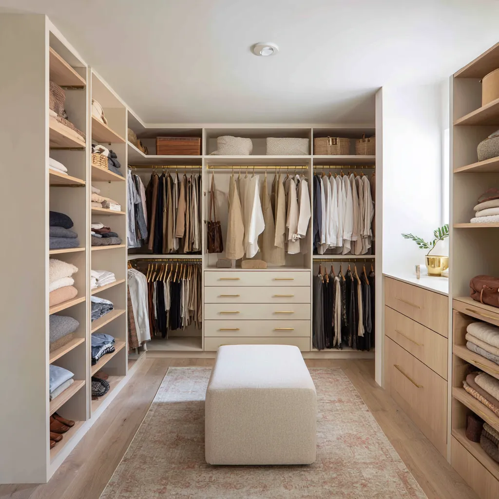
Warm white, cashmere, greige, ivory, khaki, and buttercream closets can be beautiful, but they are easy to flatten. If the cabinetry, shelves, walls, floor, and rug are all similar in value and finish, the room may feel washed out.
A neutral closet needs a hierarchy of material surfaces. Painted cabinetry gives the base.
Oak interiors add grain. Marble or stone adds movement.
Brass adds fine lines. A rug adds textile softness.
Woven baskets add fiber. A stool or ottoman adds volume.
A grasscloth-like wall or amber mirror adds depth. Ribbed glass or a sculptural pendant can give the room a central feature without introducing a strong paint color.
This is why neutral closets often benefit from a vanity, island, or desk zone. A marble counter immediately changes the room from storage to dressing.
It creates a surface for jewelry, perfume, folded garments, flowers, trays, and daily rituals. A pendant above an island can make the center of the room feel complete.
A stool under a desk or vanity softens the built-ins and introduces fabric. Warm neutrals work especially well when the wardrobe is varied.
If clothing includes black, navy, denim, beige, camel, gray, white, blush, and pattern, a warm neutral cabinet color can hold everything together. The interest then comes from material contrast rather than cabinet hue.
The mistake is assuming warm white cabinetry alone will feel finished. It usually needs oak, stone, brass, textile, woven texture, mirror, and at least one designed focal point.
The end wall decides whether a long closet feels like a room or a corridor
Many walk-in closets are long and narrow. In these spaces, the end wall has enormous influence.
If the eye simply stops at another set of storage shelves, the closet can feel like a passage. If the end wall has a mirror, vanity, bench, window, colored display, arched niche, or textured panel, the room gains purpose.
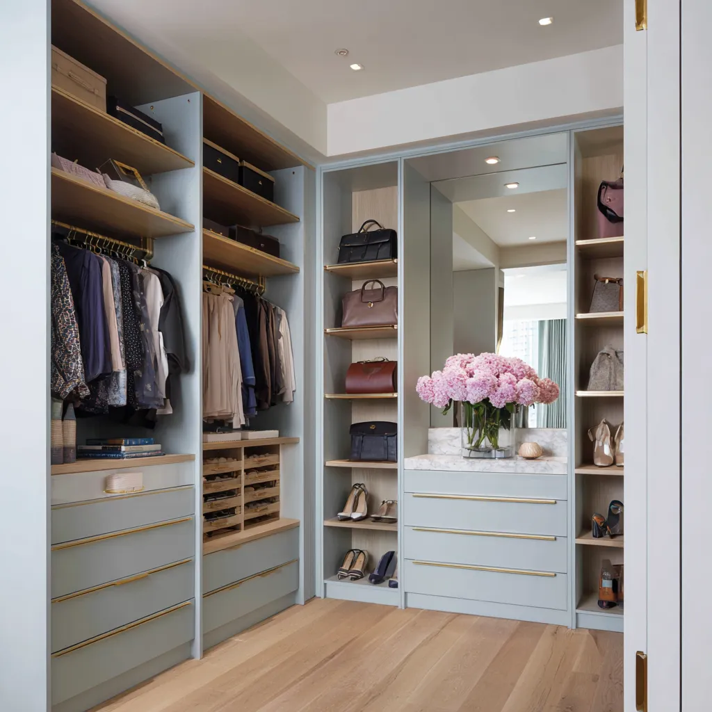
A mirror at the end adds depth and returns light. A vanity turns the closet into a dressing station.
A bench softens the final view. A window gives natural brightness.
A deep green, apricot, or parchment display wall creates a visual destination. A textured wallcovering gives interest without strong color.
This is why the end wall should often be planned before the side storage. The side cabinetry can be simple if the far end has a clear role.
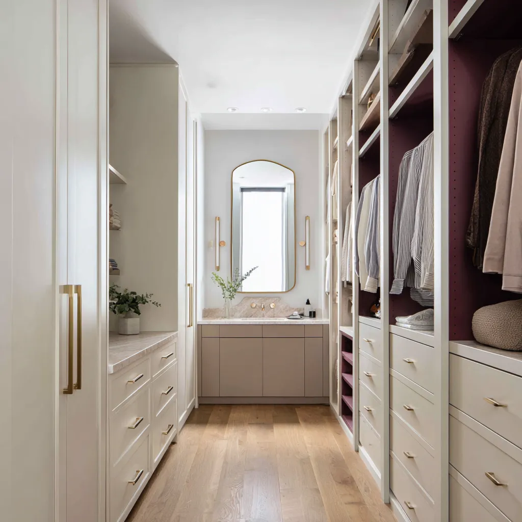
A narrow closet with cream side cabinetry can become memorable with mulberry backs on one side and a brass-framed vanity mirror at the end. A pale oak closet can gain warmth from a terracotta display wall.
A sage closet can feel complete with a bench and mirror. A turquoise closet can use an illuminated mirror to make the far end glow and brighten the whole corridor.
The end wall is also a useful place for color if the homeowner is afraid of committing to colored cabinetry throughout the whole room. A single back wall in laurel green, apricot, parchment yellow, amber mirror, or textured greige can give the closet identity without overwhelming the storage runs.
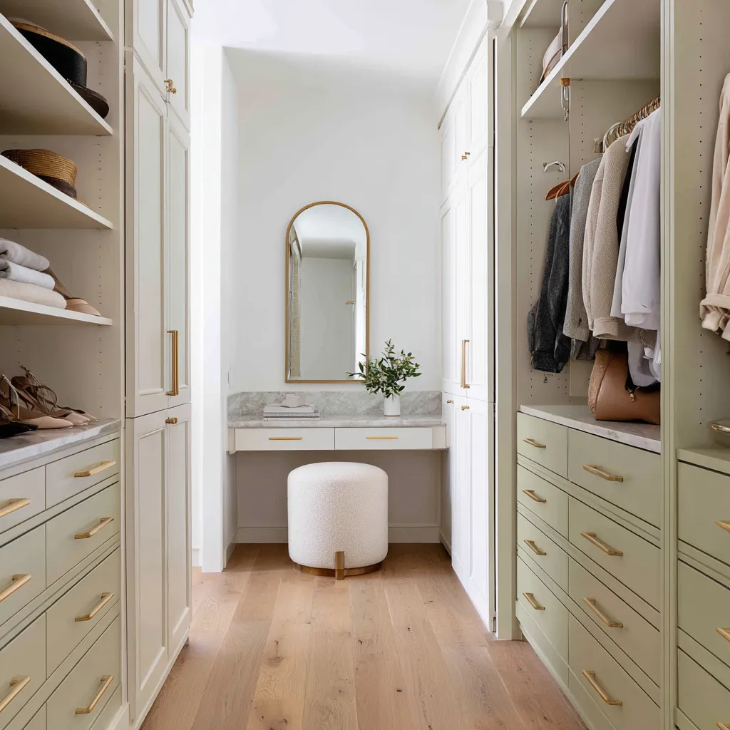
The lower third controls perceived width
The lower third of a closet includes flooring, rugs, drawer banks, shoe shelves, plinths, benches, and island bases. This area has a major effect on how wide or narrow the room feels because it sits beside the walking lane.
Pale lower drawers can make a long closet feel wider. This is especially effective when pale oak drawer fronts connect visually with a light floor.
The eye sees a bright horizontal band rather than two heavy storage walls. Dark lower drawers can ground the room, but they should usually have gloss, cream shelves above, pale flooring, or strong lighting nearby.
A roasted fig drawer bank below cream open shelving can feel rich and furniture-like. The same deep color on all side surfaces may feel too dense.
A rug can mediate between cabinetry and floor. A terracotta rug can echo an apricot back wall.
A mint-bordered rug can support sage cabinetry. A pale blue runner can repeat moonstone blue built-ins.
A gray runner can connect smoky blue cabinets with walnut floor. A blush rug can warm cream and oak.
The rug is not an afterthought in a closet. It is often the central color bridge.
It softens the lane, adds pattern without clutter, and connects side walls to the end focal point.
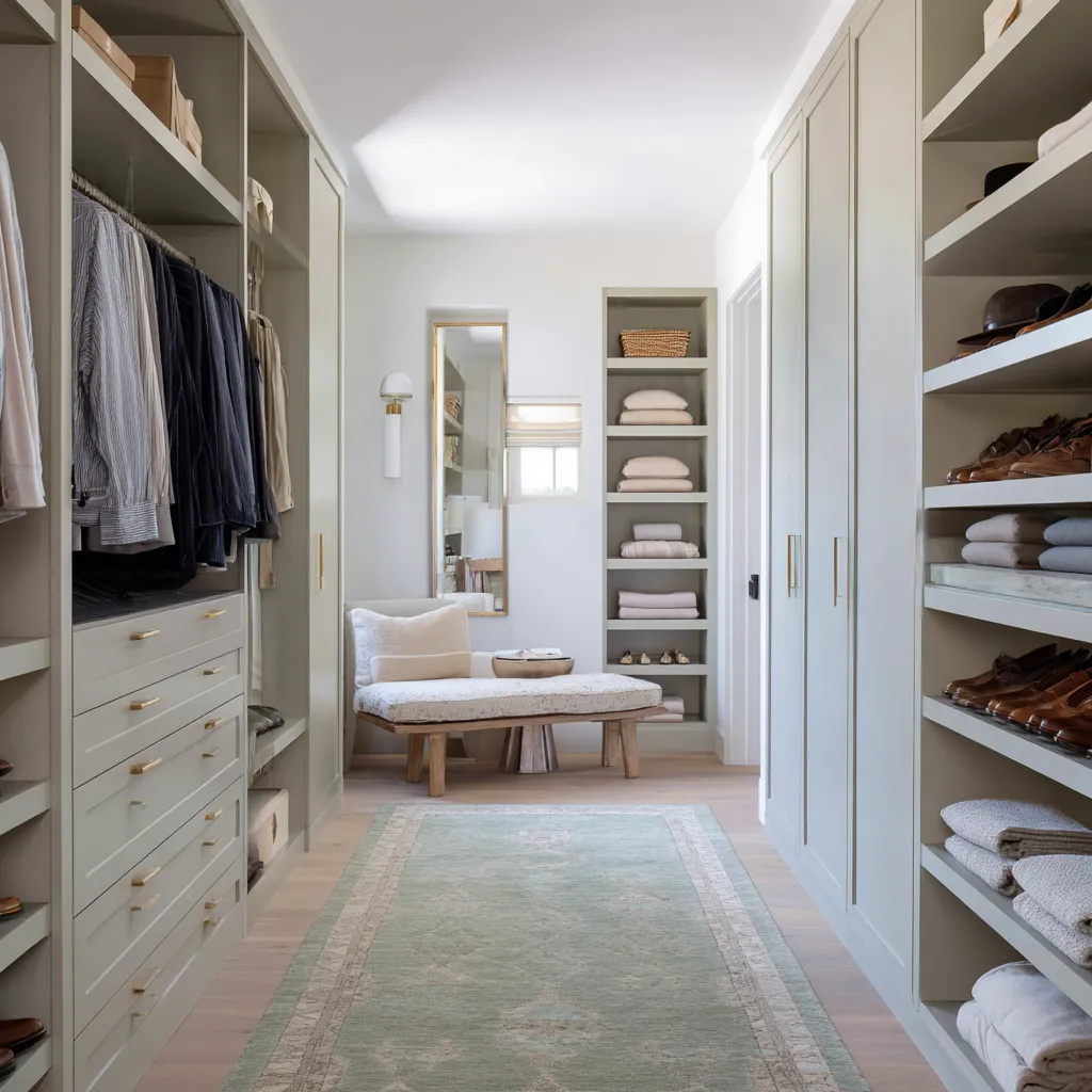
Open storage needs more color discipline than closed storage
Open storage is visually complex. It includes sleeves, hangers, shoes, bags, boxes, hats, folded stacks, baskets, and shadows.
Because of this, open storage needs a stronger color strategy than closed cabinets. There are three especially useful approaches.
- The first is dark backs with pale frames. Cream cabinetry with mulberry interiors, white perimeter storage with deep green shelves, or pale oak with dark olive display backs can make clothing and accessories stand forward while the room stays bright.
- The second is colored frames with warm interiors. Blue-gray frames with oak shelves, sage cabinetry with wood inserts, or aqua doors with beige shelf interiors allow color to define the built-in structure while the storage compartments remain warm and easy to use.
- The third is pale shelves with dark closed fronts. Cream open shelves combined with glossy burgundy drawers or dark fig doors create richness without making the displayed items hard to see.
The busier the storage, the more important it is for color to unify the composition. A single thoughtful cabinet color can make many different objects feel collected.
Without that unifying surface, open shelves may look busy even when organized.
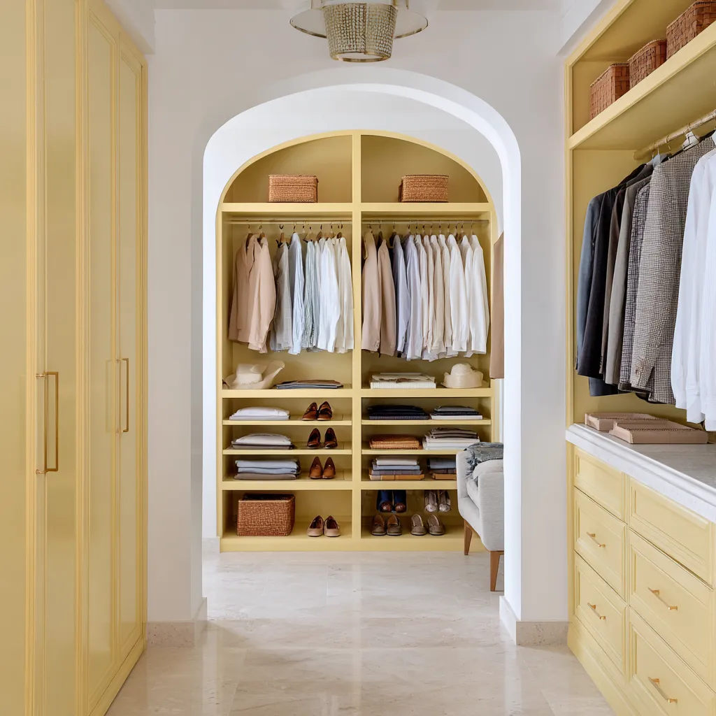
Brass and warm metal lines give the closet visual order
Brass appears so often in successful closet color ideas because it does several things at once. It warms cool colors.
It gives pale neutrals a fine outline. It separates drawers.
It marks shelf rhythm. It connects rods, pulls, mirror frames, pendant bands, and display rails.
It gives small repeated points of light without adding another large color field. In a deep plum closet, brass rods and slim pulls create warmth and precision.
In a blue-gray closet, brass prevents the palette from feeling cold. In a sage closet, brass connects green cabinetry to oak and cream textiles.
In a parchment yellow closet, brass reinforces the warm undertone without harsh contrast. In a cream closet, brass provides definition.
The scale of the metal matters. Fine lines usually work better than broad metallic surfaces.
A slim rod, narrow drawer pull, thin shelf rail, or delicate mirror frame gives order. Large metal panels can become too dominant, especially in dark or highly colored closets.
Warm metal is not simply decorative. It is a measuring system for cabinetry.
It gives the eye repeated points of alignment in a room filled with many vertical and horizontal divisions.
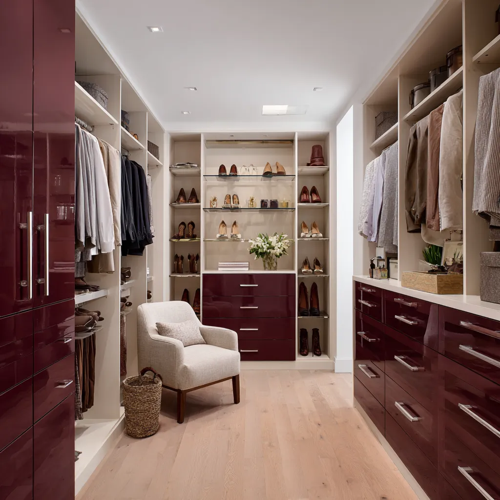
Mirrors and glass are part of the color scheme
Mirrors are often chosen for function, but in walk-in closets they also change color behavior. A clear mirror at the end of a long closet can make the room feel deeper.
An amber-smoked mirror can warm greige cabinetry and oak flooring. An illuminated mirror can soften turquoise.
A brass-framed arched mirror can warm cream or olive-pearl cabinetry. Glass-front cabinet doors can lighten blue, green, or amethyst built-ins by introducing reflection and transparency.
The mirror should be chosen for what it reflects. If it reflects a pale floor, daylight, warm wood, or a soft ceiling glow, it becomes a light source.
If it reflects clutter, dark corners, or harsh ceiling spots, it can make the closet feel busier. Glass doors also have a color role.
They interrupt solid cabinetry, add shine, and make colored cabinets feel less heavy. Blue behind glass, amethyst behind glass, or cream shelving behind brass-framed glass gains depth because the surface changes with light.
A mirrored or glass detail is especially helpful in narrow closets, where colored cabinetry can otherwise feel too solid.
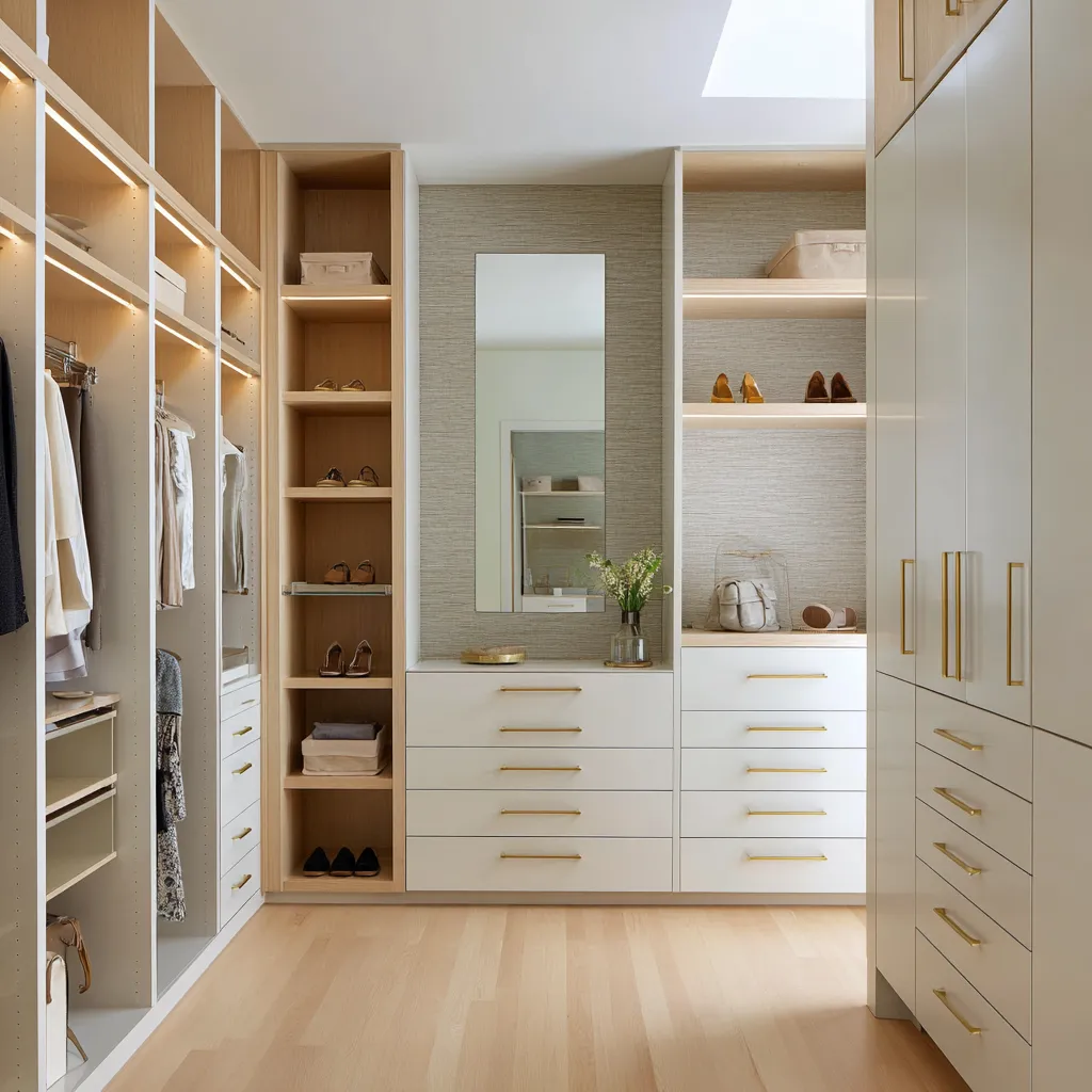
Stone surfaces turn storage into a dressing space
Marble, limestone, quartzite-like stone, and pale mineral surfaces appear often in refined closet palettes because they introduce a different kind of surface. Cabinetry is vertical and repetitive.
Stone is horizontal, smooth, and useful for daily actions. A stone top on an island gives the room a central working surface.
A marble vanity ledge creates a place for jewelry, perfume, makeup, flowers, and folded garments. A stone counter under a mirror turns the far wall into a dressing station.
A mineral turquoise stone paired with aqua cabinetry deepens the color story. Pale marble with cashmere cabinetry adds brightness without needing more white.
Stone also helps transition between open clothing and closed drawers. It creates a horizontal pause.
In color terms, it can soften contrast between dark interiors and pale frames, or between cool cabinetry and warm wood. A closet with stone often feels less like storage and more like a room where dressing is an intentional daily act.
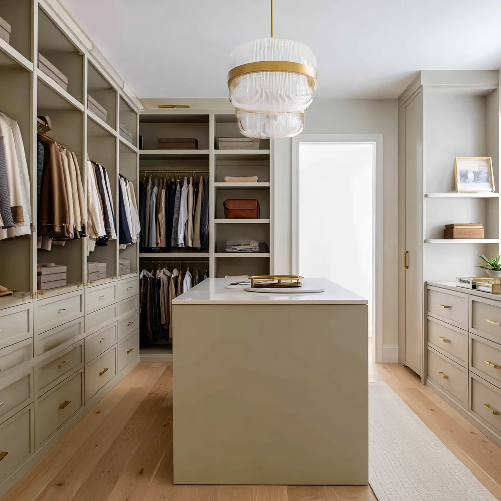
Color family guide for walk-in closets
Berry, plum, burgundy, and roasted fig
- These colors are rich, intimate, and fashion-oriented. They work beautifully with ivory, camel, taupe, gray, black, cognac leather, pale oak, cream shelves, brass, and glass.
- Use them on cabinet interiors, back walls, side shells with light floors, glossy drawer fronts, or dark closed doors surrounded by cream shelving.
- Be careful with dark flooring, low light, heavy brass, and bright wardrobes with unrelated colors. The darker the berry tone, the more important light relief becomes.
Blue, blue-gray, smoky cornflower, and aqua
- These colors suit closets with denim, navy, white shirts, tan shoes, gray garments, and striped fabrics. They work with oak, walnut, brass, leather, cream seating, beige runners, glass doors, and warm LED lighting.
- Use pale or smoky blue for broad cabinetry. Use aqua with beige interiors and mineral stone. Use blue-gray frames with oak shelves if you want color but still need warmth inside the storage.
- Avoid cold gray flooring and cool lighting as the only support. Blue needs warm companions near the user.
Sage, olive, celadon, laurel, and jade
- Green can be soft or dramatic. Pale sage, olive-pearl, celadon, and silvered olive can cover large cabinetry areas. Deep olive and laurel work better as niches, display shelves, back walls, or accent drawers.
- Green pairs well with brass, pale oak, cream, marble, wicker, plants, tan leather, gray clothing, navy, and white shirts.
- A gray-green closet is practical for many wardrobes because it works almost like a neutral. A dark green closet needs framing and light.
Warm white, cashmere, greige, khaki, and buttercream
- These shades are flexible and bright, but they need material variation. Pair them with oak inserts, marble, brass, textured wallcovering, rugs, woven baskets, mirrors, pendants, stools, ottomans, flowers, and plants.
- Use them for closets with mixed wardrobes or for rooms that include a vanity, island, or desk.
- The goal is not to add more beige. The goal is to create contrast between smooth, grained, veined, woven, reflective, and soft surfaces.
Terracotta, apricot, and parchment yellow
- These warm colors can make a closet feel personal and sun-warmed. They are most effective when softened with beige undertones and placed in a clear architectural zone.
- Use terracotta or apricot on a back display wall, inside an arched niche, as shelf color, or as a rug echo. Pair with white plaster, pale stone, brass, oak, woven baskets, cream garments, gray suits, and tan leather.
- These colors work better when they feel built into the room, not sprinkled as small accents.
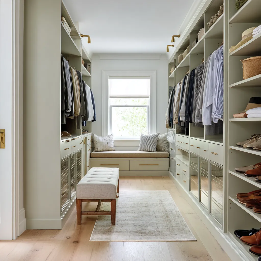
Closet color ideas by layout
For a long narrow walk-in closet
- Use a pale floor, light ceiling, rug runner, warm metal, and a meaningful end wall. Muted side cabinetry works well if the room has enough light. Dark side cabinetry needs pale flooring and strong linear lighting.
- Good directions include smoky blue with warm wood, sage-gray with cream textiles, plum with pale oak drawers, cream cabinetry with mulberry interiors, or greige cabinetry with amber mirror at the end.
For a closet with many open shelves
- Use a color that reduces visual noise. Consider dark backs with pale frames, colored frames with oak interiors, or pale shelving with deeper closed fronts. Use baskets on upper shelves to add texture and reduce visual clutter.
- Good directions include blue-gray frames with oak interiors, sage cabinetry with a wood display insert, cream shelves with glossy fig drawers, or deep green shelves framed by white cabinetry.
For a closet with a vanity
- Use a stone top, mirror with a warm frame, sconces or soft lighting, and a stool or bench. The vanity can carry a middle tone that connects pale cabinetry to deeper accents.
- Good directions include olive-pearl with marble and brass, cream cabinetry with mulberry interior bays, jade cabinetry with pale stone, or warm white with oak drawers and marble backsplash.
For a closet with an island
- The island should relate to the wall cabinetry but may carry stone, a pendant, or a slightly richer base. A rug or warm floor should ground it. Repeat the same metal on island drawers and wall storage.
- Good directions include cashmere-clay, warm khaki, smoked buttercream, pale sage, or greige with a sculptural pendant.
For someone who wants bold color
Do not begin with full-room color. Try color inside open bays, on the back wall, on lower drawers, on one niche, on closed fronts only, through a rug echo, or through tinted mirror.
This allows the room to gain identity while keeping the main structure light.
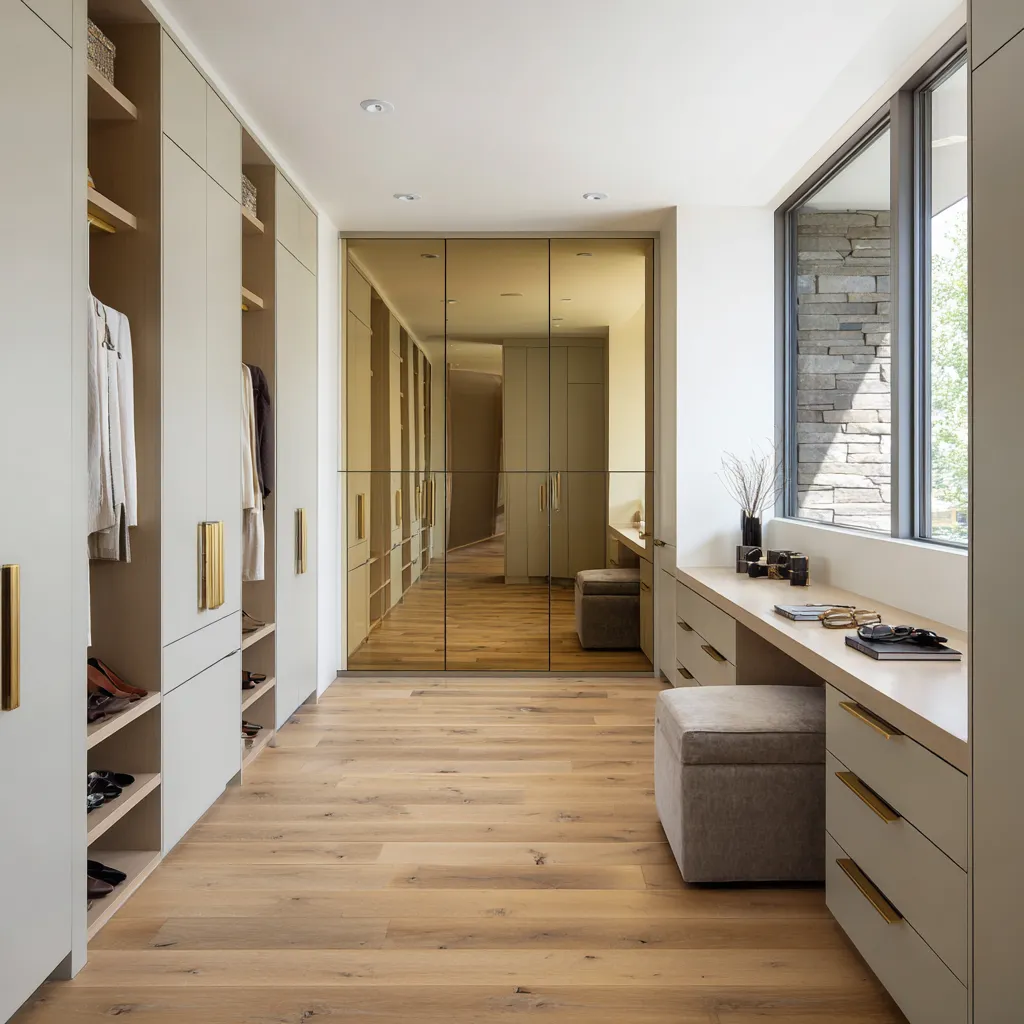
The walk-in color lessons: the wardrobe is part of the color plan
A walk-in closet is never only cabinetry. It is a living arrangement of stored objects.
That is why the closet color should be chosen in relation to what will sit inside it.
- If the wardrobe is full of denim, navy, white, tan leather, and gray, smoky blue or blue-gray cabinetry can make the closet feel naturally organized.
- If the wardrobe contains camel coats, ivory knits, cognac shoes, straw bags, and warm linen, smoked buttercream, apricot, terracotta, or warm oak may feel natural.
- If the wardrobe is mostly black, cream, gray, taupe, and leather, burgundy, deep green, plum, or laurel can create a powerful display background.
- If the wardrobe is varied and colorful, warm neutral cabinetry with oak, stone, brass, and textured surfaces may be the more flexible choice.
The question is not only What color should the closet be? The more useful question is What color will make the things inside the closet look intentional?
A good walk-in closet palette edits the room. It decides where the eye rests, which accessories stand forward, which garments recede, how warm the mirror area feels, how wide the lower corridor appears, and whether the room feels like storage or a private dressing space.
The color itself matters. But the placement of that color, the warmth of the floor, the thickness of the rug, the metal lines, the stone surfaces, the mirror reflection, the shelf interiors, and the wardrobe contents matter just as much.
That is why walk-in closet color ideas should be planned as complete systems. A beautiful shade becomes successful only when it has the right job, the right material family, the right lighting, and the right relationship to the clothes it holds.