In the most thoughtfully composed living spaces, color works like structure. It’s not scattered for effect—it’s planned, repeated, and grounded.
What sets apart today’s most refined living rooms isn’t how many shades are used, but how precisely each tone is placed, how it relates to materials around it, and how finishes change the way a single hue behaves. This article explores what makes certain combinations feel expensive without relying on dramatic contrasts or oversized statements.
From the texture shifts of stone and plaster to the quiet placement of dark metal lines, there’s a system at work beneath every calm palette. Even the smallest room can carry the look of depth and balance when color is treated as a measured element, not just decoration.
We’re breaking down the details behind some of the most effective luxury color combos for living rooms, looking closely at what happens when tone, texture, and light are handled with control—right down to the placement of a throw pillow or the shift in sheen between wood and paint.
Layered Neutral Fields Are the New “Color”
In the most carefully styled homes, a neutral shade isn’t a background—it’s the whole visual plan. What designers often do is pick a single tone—camel, sage, slate, or ivory—and stretch it wide across different surfaces without switching color families.
The effect is anything but plain. This technique works best when there’s subtle change in texture or finish.
A space may begin with a soft camel-tone velvet sofa, then carry the same tone into suede throw pillows, and extend the warmth into pale wood cabinetry or flooring. These aren’t separate accents—they’re part of one extended field.
That’s what makes the space feel layered without appearing busy.

The same holds true for cooler schemes. A mix of gray tones might begin with powdery off-white wall paint, pick up depth in a charcoal boucle armchair, and then transition into the cool grit of concrete tile or stone.
Every item reflects a different level of light, which gives the room natural visual rhythm. The result doesn’t rely on adding color—it moves through shifts in surface character.

Rather than scattering multiple tones, these rooms stay loyal to one—and explore its range through polish, weave, grain, and shadow. This creates luxury color combinations that carry depth without needing bold contrast.
It’s a method used widely in upscale sitting rooms and interiors where color control speaks louder than variety.

Dark Anchors Are Slim and Sharp
Rather than placing a large black piece in the center of a room, these interiors use depth in smaller, more careful ways. Thin black frames around artwork, slender pendant rods above a table, a narrow leg under a bench—these quiet details pull light palettes into order.
Their size is kept minimal, often no thicker than a thumb, which makes them feel structural instead of heavy.

This subtle method adds contrast where it matters—at the edges, along sightlines, or near sources of light. It lets white walls, pale upholstery, and creamy stone remain the focus while preventing the space from drifting into visual blur.

Black becomes a tool of restraint, not a shout. Instead of broad strokes, it’s used like punctuation in a sentence—measured, quiet, but clearly felt.
That’s why so many of the current colors schemes for living room design now depend on these fine dark elements. They create shape around softness and help layered neutrals keep their sharpness without the need for bold artwork or pattern.
In homes across different regions, especially where light is strong and walls are pale, these small touches of depth help define space without pulling attention away from the overall calm of the palette.

Green as a Chameleon Neutral
Muted green tones—like sage, eucalyptus, and olive—have taken on a different role in today’s most thoughtful interiors. Rather than acting as contrast, they often replace the usual beige or taupe foundation.
In many of the most current luxury color scheme approaches, green sits low in saturation and behaves more like a background tone than a feature hue.

What makes it so adaptable is its softness. Designers keep green desaturated—usually below 30% chroma—so it doesn’t pull attention or clash with the golden undertones found in common woods like oak or hickory.
This soft quality allows green to fade into its surroundings when needed, or gently stand forward when paired with lighter fabrics.

To keep the scheme feeling mature and refined, adjacent materials often lean into the same section of the color wheel. A sage green sofa may be flanked by pillows that pull from dusty gray or warm clay, rather than stark white or primary tones.
That side-step into neutrality helps the green act as both color and structure. It’s one of the smartest moves in current living room color combination ideas—green without gloss, used as a foundation rather than decoration, shaped by tone instead of theme.

Accent Restraint: The “Rule of Three Touches”
In interiors where the palette feels intentional and complete, the brightest notes are applied with extreme care. Designers often follow a quiet guideline—introducing any bold color, such as rust, coral, mustard, or blush, no more than three times in a room.
And even then, those touches rarely sit next to each other.

Take coral as an example. A chair in matte coral velvet might be echoed in two framed prints on opposite walls, then appear again in a small floral stem on the coffee table.
The result is balanced without feeling repetitive. No single placement steals attention—but together, they form a triangle that the eye picks up without needing to track it.

This technique makes luxury color scheme work in living rooms without tipping into oversaturation. The three placements act as small anchors for the viewer—quiet references that tie parts of the room together while keeping the overall atmosphere soft and measured.
The math stays invisible. What’s felt instead is a sense of ease—built from proportion, tone, and the silent rhythm of well-placed color.

Tone-on-Tone Stone + Plaster Elevates Walls Without Art
Some of the most visually refined living rooms rely on texture shifts rather than framed artwork to build interest. One of the most effective examples of this is when stone finishes are matched with nearby plaster walls within a narrow range of brightness—usually within a 5% lightness difference.
This nearly seamless transition allows the wall itself to become the feature, without needing any large focal piece to break it up.

Instead of relying on color contrast, these rooms play with movement in surface—like the subtle grain in travertine next to the brushed look of limewash. In upscale settings, this might come through in hand-troweled finishes or honed stone tiles.
But even in more modest interiors, pairing a soft neutral tile with painted or limewashed walls in a similar undertone achieves a surprisingly high-end effect.

This method is especially effective in small rooms, where visual noise needs to stay low. It’s a clever answer to the common problem of how to create interest without clutter—making it one of the most functional and visually rich color combination for a small living room.

Region Shapes Neutral Temperature
Color tone isn’t picked in isolation—it often begins with the natural light of the area. In design projects across different parts of the country, the most refined interiors tend to mirror the light conditions outside rather than compete with them.

In drier climates like desert or mountain areas, sunlight has a red tilt. That’s why you’ll see more clay browns, wheat, and faded olive showing up in those homes—these tones reflect back the warmth of the surrounding land, making the space feel grounded without becoming orange or overly warm.

Near the coast, where the light tends to be sharper and cooler, blue-grays and ash tones step in. These help balance the midday glare and keep interiors from reading too stark.
The same blue-influenced grays work well in places with high humidity, where creamier whites might go yellow too quickly.

Further north, where light is scarce in winter months, many designers shift toward powder blues, soft graphite, and the occasional cool oak detail. These tones keep rooms from feeling flat while still responding to lower natural light.
Across all these examples, one clear idea repeats: start with the color of the daylight, and the palette settles itself. That decision shapes whether the space reads warm, cool, or neutral, and is often the silent foundation behind any successful luxury colour combination.

Texture Hierarchy Overrides Square Footage
In smaller living rooms where space is limited, the use of surface detail can often matter more than the color itself. Rather than relying on strong contrast or bold color breaks, many interiors establish a kind of textural ladder—one that starts coarse and gradually refines.

You’ll often see this approach begin at the floor: a thick jute or sisal rug sets a rough base. Above that, furniture might introduce mid-texture materials like linen or tightly woven cotton—neither glossy nor flat, offering balance.
Finally, accents such as throw pillows or drapes step into finer textures, with smoother surfaces like brushed cotton or light boucle.

This type of material layering creates a sense of depth that doesn’t rely on square footage. The eye reads distance through the change in fiber density, much like a camera focuses by depth of field.
In these cases, the texture tells the story, not the color wheel. For anyone analyzing the success of many current living room designs and colours, this approach to surface control explains why even compact spaces can carry visual richness.

Micro-Metal Moments Beat Large Fixtures
Some of the most visually successful luxury interiors aren’t led by grand chandeliers or oversized lighting. Instead, what stands out are the slim, purposeful uses of metal—barely noticeable until they’re viewed in motion or under soft light.
A narrow brass picture light placed above a muted artwork, a copper detail on a pendant’s hardware, or a tiny bronze pin at the base of a wall sconce—these aren’t decorative flourishes, they’re calculated touches that shift how light behaves in the room. Because these accents sit lower than the ceiling and closer to the eye, they catch lamplight at just the right angle to reflect warmth across nearby fabrics and skin.

This is how a space builds luxury without being loud. These compact glints of metal don’t crowd the design or act as centerpieces.
Instead, they move the atmosphere into a more finished place. In today’s most refined rooms, especially those working with a luxury colour combination, this understated handling of shine is what sets the tone apart—no spotlight needed.

Sheen Shifts Signal Zone Changes
In open-plan layouts, where walls don’t divide space, shifts in finish often do the work of boundaries. Designers increasingly rely on transitions in surface sheen—moving from matte to satin to soft gloss—to quietly guide how a room unfolds.
These differences are subtle but effective, helping one area fade gently into the next without calling attention to itself.

For example, a seating area might be grounded by matte plaster walls that absorb light, giving it a calm, resting quality. A few feet away, the kitchen’s cabinetry may feature a satin finish—still restrained, but reflective enough to suggest activity and function.
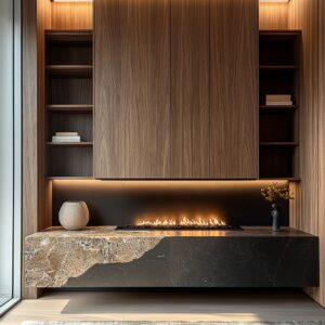
Around a fireplace or hearth, stone in a low-gloss sealant adds depth and clarity without tipping into shine. It reflects natural light differently than the adjacent surfaces, helping to define its purpose without visual conflict.

This sheen layering doesn’t interrupt the color field—instead, it extends the same tone across zones, while changing the way light reacts to each surface. It’s an approach that works especially well in rooms where a consistent color story is important.
Many current living room color combinations rely on this technique to keep spaces cohesive while still introducing contrast through finish alone.

Practical Translation for a Typical Home
Bringing a high-end color logic into a regular living space isn’t about matching designer catalogs—it’s about applying principles that stay quiet but intentional. One of the most reliable methods is choosing a neutral anchor and weaving it through three key areas: the walls, the largest piece of furniture, and one substantial wood finish.
That trio becomes the base tone, which can shift slightly in texture, but stays connected in undertone. To keep the composition balanced, dark lines are kept slim—no wider than the thickness of a finger.
Window frames, side table legs, or drawer pulls in deep bronze or black can hold light tones in place without weighing them down.

Accent colors, if used, are better kept to three repeating points in the room. Not side-by-side, but spaced in a loose triangle so the eye moves across them naturally.
It’s less about saturation, more about touch—using texture or shape to mark the change, not brightness. If there’s a bold surface—like a feature wall or a standout chair—it works best when the neighboring elements stay in the same color family, but with a change in finish.
Gloss, matte, and soft sheen can do the work of contrast without splintering the palette.

Material choices round out the method: matte velvet adds weight where needed, boucle introduces softness in small doses, and tightly woven linen gives structure to cushions or slipcovers that need to hold form. This formula is especially useful for refining a living room color palette where space is open but the need for visual order is high.

Closing Insight
What defines the most refined living rooms isn’t an overload of color but rather the restraint behind the choices. Instead of building contrast through a long palette list, designers focus on how tones relate—how one shade echoes in stone, repeats in fabric, and reappears quietly in timber.
There’s a discipline to it. Hues don’t compete; they support.
Surfaces are chosen not just for their tone but for how they hold or bounce light, how they fade into shadow, or how they sharpen a line.

In these interiors, repetition isn’t accidental—it’s deliberate. A bronze detail in one corner may return on the other side of the room in a lamp base.
A pale gray with a warm cast might cover the wall, appear again in a woven rug, and finish off a stone tile edge by the fireplace. These subtle repetitions are the glue that holds the space together.
Sheen matters too. The soft transition from matte to satin, from open-grain wood to flat-painted plaster, guides the eye without fanfare.
This control over finish lets even compact homes feel ordered, refined, and complete without any need for boldness. This kind of control is what separates rooms that feel expensive from those that simply appear trendy.
A luxury modern color combination for a living room succeeds not by stacking statement colors, but by limiting them—and making sure that whatever remains is balanced across materials, tones, and textures. It’s quiet design that lingers longer, built on thoughtful layers instead of loud gestures.