Light paint colors are often seen as the easy choice for a living room, but there’s more happening behind those soft neutrals than meets the eye. The right shade can make a space feel fresh, open, and balanced—while the wrong one can leave it looking flat or cold.
It’s all about subtle undertones, the finish you choose, and how the color reacts to natural light throughout the day.
Whether you’re thinking about warm off-whites, soft grays, or muted beiges, finding the right color can pull everything together. From modern farmhouses to coastal homes and clean-lined city spaces, the most inviting living rooms often have one thing in common: carefully chosen light paint that works quietly in the background.

In this guide, we’ll take a close look at how to make smart choices with light shades. You’ll find ideas that go beyond the basics—like pairing wall colors with wood tones, adding texture through fabrics and finishes, and creating flow in open-plan homes.
If you’re searching for the best light paint colors for a living room that feels natural and lived-in, you’re in the right place.

Soft Neutrals That Shape a Living Room Atmosphere
Choosing the right light paint color might seem like a simple task—until you realize how much depends on subtle details you can’t always catch at first glance. What looks like a warm ivory in morning light can cool into a soft gray by afternoon.
And that change can completely shift the mood of your living room.

Some of the best light paint colors for living room interiors tend to have a quiet complexity that makes them popular for good reason. Shades like Benjamin Moore’s Swiss Coffee, Sherwin-Williams’ Alabaster, or Farrow & Ball’s Shaded White have an adaptable quality that responds to different levels of daylight.
They seem to shift temperature slightly, giving the room an easygoing warmth when the sun pours in and a softer, more muted tone in the evening.

But it’s not just about the color. The type of finish you choose plays a big role in how the paint looks on the wall.
Eggshell or satin finishes, on the other hand, tend to catch a bit of light—bringing out the texture in plaster or skim-coated walls in a way that adds quiet interest without calling too much attention to itself.

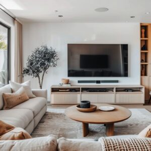
In homes where materials like natural oak, honed stone, and aged leather are part of the design, these light wall colors become the backdrop that ties everything together. They let the texture of the furniture, the weave of the rugs, and the grain of the wood stand out.
Whether you’re styling a coastal-inspired space in California or a minimalist farmhouse in the Midwest, choosing the right light paint color gives the room an understated polish.

The secret? Spend time with your color choices.
Test them on the walls, watch how they change from morning to night, and see how they play off your furnishings. That’s where the real magic happens.

How Light Colors Change Character with Materials and Light
One of the quiet tricks in designing with pale shades is understanding how they behave next to other surfaces. Light wall colors for living room spaces have a way of picking up influence from everything around them—whether it’s the rich warmth of reclaimed wood, the cool smoothness of marble, or the worn patina of vintage leather.
A soft, chalky off-white can appear almost velvety beside honed stone, while the same color might feel sharper and more defined next to bright white trim. On the other hand, a gentle greige tone set against natural oak or weathered beams tends to feel deeper and more grounded.

Small changes in lighting also have a big effect. Daylight streaming through large windows gives walls a cooler, fresher look in the morning, while warm afternoon light can bring out subtle undertones you didn’t notice before.
Add in soft lamp light or the glow from sconces in the evening, and the same walls take on a completely different tone. Even trim choices can shift the balance.
A crisp, satin-finished white makes wall color pop, while a softer, creamy trim adds a quieter, more blended transition.

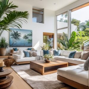
Designers often use this to their advantage, especially in spaces with layered textures and mixed materials. In areas influenced by coastal design or modern farmhouse styles, for example, pale walls act as the anchor for more tactile finishes like linen upholstery, aged wood, or hand-thrown pottery.
The key is to test your chosen color at different times of day and consider how it reacts to both natural and artificial light. That’s where the subtle beauty of light neutrals really shows up.

Layering Texture and Tone with Soft Paint Colors
Creating a calm space with pale walls sounds simple, but it often requires more thought than people expect. Soft, neutral shades need balance.
Without it, a room can easily feel flat. One way to bring life into a space painted in warm light living room paint colors is by adding plenty of texture through fabrics and finishes.
Think boucle throws, washed linen slipcovers, or wool rugs with chunky weave—these materials break up the smoothness of the walls and add interest without shouting for attention.

Minimalist rooms in particular benefit from this approach. Instead of filling shelves with clutter, a few carefully placed ceramic vases or sculptural objects can bring quiet character.
Accent colors like rust, sage, or deep charcoal add just enough contrast, keeping the space grounded while letting the walls remain the main feature.

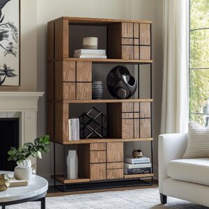
And it’s not only about what’s on the sofa or shelves—materials like raw wood, honed concrete, and natural jute help create that understated depth. A concrete table with a suede finish, or oak left unfinished so its grain stands out, adds variety and keeps things from feeling one-note.

In homes where the walls are painted in these subtle tones, whether it’s a farmhouse outside of town or a coastal house near the water, this layering of texture is what makes the space feel lived-in and complete. It’s about letting the materials speak quietly, while the soft paint color ties it all together.

How Undertones Bring Subtle Balance to Light Paint Colors
Choosing beautiful light living room paint colors isn’t only about picking a soft neutral. What gives these shades their character—and their ability to work with different materials—is the undertone.
Sometimes it’s barely noticeable until the room is fully furnished, but once you see it, it makes all the difference.

Take a neutral with a hint of green or peach. On its own, it might seem simple, but place it next to terracotta pots, dusty-pink cushions, or a pale clay sculpture, and it pulls the whole space together.
The color feels like it belongs there, even if you can’t quite explain why. That same thinking applies to warmer beige tones.
A subtle warmth in the wall color plays nicely with oak shelves, letting earthy ceramics and linen-bound books become quiet focal points.

Cooler shades work differently. A soft gray with a faint lavender undertone can lighten a space in ways a plain gray won’t.
Especially when framed by crisp white moldings or paired with dark bronze accents, it creates a fresh, balanced look that feels right at home in minimalist or contemporary interiors.

In many modern homes, especially those influenced by Scandinavian or transitional styles, these small undertone choices are what give a room its calm, polished feel. It’s a thoughtful layer that turns simple walls into the perfect backdrop for everything else.

Ceilings Matter: How to Extend the Impact of Light Paint Colors
One of the simplest ways to make light neutral paint colors for living room spaces feel even more effective is by giving attention to the ceiling. Matching the ceiling to the wall color—but stepping it up a shade or two lighter—creates a soft, open effect.
Without crown molding breaking the line, the eye moves without interruption, and the room often feels taller and more spacious as a result.

This approach works especially well in smaller homes or spaces with lower ceilings. The subtle fade from wall to ceiling helps blur the edges, making furniture and artwork stand out instead of the architecture itself.

On the other hand, traditional homes with exposed beams or statement mantels can benefit from contrast. Painting the beams a slightly deeper tone or keeping them in natural wood draws attention to those features without overwhelming the rest of the space.

In many modern living rooms, where light neutrals dominate, these ceiling treatments offer an easy way to add depth and definition without relying on bold colors or heavy decor. It’s all about small shifts that have a big payoff, whether you’re working with an open-concept floor plan or a more classic layout.

Creating Flow with Color in Open-Plan Living Spaces
In homes with open layouts, color choices can quietly guide the eye and bring a sense of balance from one area to the next. The real difference comes from layering finishes and textures while keeping the palette cohesive.
For example, a soft greige might cover the main living room walls, while a fireplace feature gets a limewash treatment in the same tone, giving it a slightly chalky texture that stands apart without breaking the flow.

Built-ins painted in satin enamel—just a touch glossier—can add a subtle shift that makes them feel intentional, while still staying within the same color family. It’s these small decisions that tie the space together without making it feel repetitive.
Someone walking through may not immediately pinpoint why everything feels so balanced, but the combination of paint finish, furniture materials, and textiles works together behind the scenes.

For anyone gathering living room colors ideas, it’s worth thinking beyond just the swatch. In open-plan spaces, it’s how the color moves from room to room that creates a polished result.
Smooth transitions don’t have to mean uniformity—thoughtful changes in sheen, texture, or material can make the palette feel natural and lived-in, rather than static. It’s the quiet details that hold the design together.

Final Thoughts on Choosing Light Paint Colors for Your Living Room
Choosing the right paint color for your living room isn’t something to rush. Light shades carry quiet power—how they react to sunlight, work with your furniture, and tie into the rest of your home makes all the difference.

Whether you’re leaning toward a soft greige, a creamy white, or a muted gray, the details matter. Look at how they shift throughout the day, how they sit next to natural wood, stone, or textiles, and how different finishes can change the feel of a room without adding more color.

The best spaces often use these pale tones to create calm backdrops that still feel warm and welcoming. Layered textures, thoughtfully placed materials, and a smart approach to lighting help these colors do their job quietly.
Whether you’re taking inspiration from minimalist homes, coastal interiors, or modern farmhouses, light neutrals are a dependable choice—if you treat them with care.

If you’re exploring light paint options for your living room, take your time. Sample a few shades, live with them for a few days, and see how they behave.
That patience often pays off, leaving you with a space that feels effortless, balanced, and ready for daily living.