Grey and white kitchens have long been a favorite in modern design, but there’s much more happening beneath the surface than just a stylish color combination. While the contrast between crisp white and deep grey is easy to spot, the finer details—the way different textures interact, how lighting plays off the surfaces, and the subtle shifts in tone—are what truly define a well-designed space.
This article takes a deeper dive into the choices that bring these kitchens to life. From the strategic placement of white elements to enhance brightness, to the subtle undertones in grey cabinetry that shift depending on the surrounding materials, every decision shapes the final look.
Thoughtful combinations of matte and glossy finishes, the warmth of natural wood, and the unexpected role of metallic accents all contribute to the personality of the space.
Beyond color, layout and material choices create their own visual rhythm. Some kitchens lean into high contrast, pairing charcoal cabinetry with marble surfaces, while others soften the divide with greige tones that balance warm and cool influences.
Even the choice between polished countertops or honed stone can alter the mood of a space, making it feel sleek and modern or rich and textured. In the sections ahead, we’ll break down these nuances and highlight the clever details that might not be obvious at first glance.
Whether you’re planning a kitchen update or just appreciating the art behind a well-composed design, this guide will open up new ways to look at these refined interiors.

The Role of White in Creating Vertical Lightness
One of the smartest design choices in many kitchens is the way white is used to shape the visual structure of the space. Instead of letting darker tones dominate, white is often placed at eye level or higher, ensuring that the upper portion of the room feels bright and open.
This contrast between light and dark isn’t just about aesthetics—it plays a key role in balancing proportions and maximizing natural light.
Brightening the Upper Zone
White upper cabinets, ceiling paint, and trim serve as natural reflectors, bouncing light around the kitchen to prevent any sense of heaviness. Whether the light source is a large window, recessed ceiling fixtures, or pendant lamps, white surfaces help distribute brightness evenly.
This approach is especially effective in spaces with dark lower cabinetry, where the lighter upper half prevents the kitchen from feeling visually weighed down.

Window and Door Frames as Design Anchors
Window trim plays an understated yet important role in framing the kitchen. In some designs, white window and door trim blends seamlessly with the walls, creating an almost invisible transition that makes the space feel uninterrupted.
In other cases, designers opt for near-black or deep charcoal frames, subtly tying in the lower cabinetry. This creates a structured outline, adding definition to the space without needing bold decorative elements.
Continuity with the Ceiling
A clever way to create an illusion of height is by extending the white of the upper cabinets into the ceiling. When the cabinetry color is close to the ceiling shade, there’s a seamless flow that makes the space feel larger.
This trick is particularly effective in kitchens with lower ceilings, where maintaining an unbroken vertical line helps enhance the sense of spaciousness.

A Detail That Often Goes Unnoticed
In some kitchens, designers take a more integrated approach by using dark window trims or range hood accents that match the lower cabinetry. This technique strengthens the overall balance of the space while avoiding the look of strictly separated light and dark zones.
Instead of creating a sharp divide, these subtle dark accents act as connectors, allowing the deeper grey tones to extend upward without overpowering the lighter elements. This careful layering of white and grey is one of the key elements in well-thought-out grey and white kitchen ideas.
The way these colors interact isn’t just about contrast—it’s about finding the right rhythm between brightness, depth, and seamless transitions.

Window and Door Frames as Design Anchors
Window trim plays an understated yet important role in framing the kitchen. In some designs, white window and door trim blends seamlessly with the walls, creating an almost invisible transition that makes the space feel uninterrupted.
In other cases, designers opt for near-black or deep charcoal frames, subtly tying in the lower cabinetry. This creates a structured outline, adding definition to the space without needing bold decorative elements.
Continuity with the Ceiling
A clever way to create an illusion of height is by extending the white of the upper cabinets into the ceiling. When the cabinetry color is close to the ceiling shade, there’s a seamless flow that makes the space feel larger.
This trick is particularly effective in kitchens with lower ceilings, where maintaining an unbroken vertical line helps enhance the sense of spaciousness.

Shades of Grey: Undertones and Temperature
Grey might seem like a straightforward color, but in grey and white kitchen design, the specific shade chosen can completely change the atmosphere. Some greys lean cool with a crisp, modern edge, while others carry warm undertones that create a more inviting and relaxed environment.
The way grey interacts with surrounding materials, lighting, and hardware plays a huge role in the final look of a kitchen.
Cool Bluish-Greys: A Crisp, Modern Edge
Greys with a subtle blue tint create a sleek, contemporary feel, especially when paired with stainless steel or chrome fixtures. These shades thrive in spaces with plenty of natural light, as they reflect brightness and enhance the room’s airy quality.
High-gloss finishes amplify this effect, giving surfaces a polished, almost mirrored appearance. However, in dim lighting, these cool greys can take on a sharper tone, so balancing them with warm wood floors or brass accents can prevent them from feeling too stark.

Warm Greige: Soft and Welcoming
When grey incorporates hints of beige, the result is greige—a tone that bridges modern coolness with a touch of warmth. This shade works beautifully with gold or brass hardware, making the space feel inviting without looking overly traditional.
Greige also adapts well to different lighting conditions, shifting subtly throughout the day to maintain a balanced, natural appearance. It’s an ideal choice for homeowners who want a versatile grey without the risk of it feeling cold.
Greenish Undertones: A Natural Connection
Greys with a faint green undertone bring an organic, grounded quality to a kitchen. These shades pair well with natural materials like woven barstools, wood beams, and stone countertops.
The slight green hue helps grey feel less industrial and more in sync with elements inspired by nature. In daylight, these tones appear earthy and calming, while in artificial lighting, they can take on a richer depth that blends seamlessly with rustic or farmhouse-inspired spaces.

Dark Charcoal: Bold and Dramatic
For those who prefer a stronger visual statement, deep charcoal greys provide a moody, sophisticated look. Depending on the specific shade, charcoal can lean either cool or neutral.
When combined with crisp white countertops and warm wood flooring, the result is a dramatic contrast that feels both modern and timeless. These darker greys absorb more light than their lighter counterparts, making strategic lighting placement essential.
A mix of recessed lights, under-cabinet illumination, and metallic accents can keep a charcoal-heavy kitchen from feeling too shadowed.
Why Lighting Matters More Than You Think
One of the most overlooked aspects of choosing a grey is how lighting changes its appearance throughout the day. A grey that looks perfectly neutral in morning light might reveal hints of blue, green, or beige under artificial lighting at night.
Designers often test swatches in different lighting conditions before finalizing a selection. If a kitchen receives a lot of cool-toned daylight, warmer greys can help balance the overall look, while kitchens with softer, yellow-toned lighting might benefit from cooler greys to prevent an overly warm cast.
Understanding these subtle variations ensures that grey isn’t just a background color but an active part of a kitchen’s overall style. The right shade can enhance everything from cabinetry to countertops, creating a layered and intentional look that complements both modern and classic designs.

White Surfaces as Reflective Canvases
White plays a crucial role in brightening up a kitchen, acting as a natural reflector that bounces light around the space. Whether it’s used in countertops, backsplashes, or even entire walls, the placement of white surfaces is rarely accidental.
In many grey-and-white kitchen ideas, white elements help prevent darker tones from feeling too heavy, keeping the space open and well-balanced.
Quartz Counters: The Brightest Surface in the Room
Polished white quartz is a popular choice for kitchen countertops, and for good reason. Its smooth, reflective surface catches both natural and artificial light, making the kitchen feel more spacious.
Unlike natural stone, quartz has a uniform brightness without deep veining, which keeps the overall look clean and minimal. When paired with darker lower cabinets, the contrast makes the counters stand out even more, adding a crisp, structured effect.

Marble & Subtle Veining: A Bridge Between Tones
For those who want a bit more movement in their design, white marble is often the preferred choice. What makes marble particularly effective in grey-and-white kitchens is its veining—thin lines of soft grey weave through the white stone, creating a visual link between light and dark elements.
This makes it an ideal material for both countertops and backsplashes, tying together upper and lower cabinetry without abrupt shifts in color. The natural variation in veining also adds a touch of texture, preventing the kitchen from feeling overly flat or sterile.
High-Gloss White Backsplashes: Amplifying Light and Depth
In more contemporary kitchens, glossy white backsplashes play a significant role in enhancing brightness. Whether in the form of subway tiles, large-format slabs, or even glass panels, high-gloss surfaces reflect light across the kitchen, creating a sense of openness.
The effect is particularly striking when paired with darker lower cabinets, as the backsplash almost acts like a mirror, preventing the upper section of the room from feeling closed in.

The Power of Material Continuity
One of the most effective ways to create cohesion in a grey-and-white kitchen is through material continuity. Instead of using separate finishes for countertops and backsplashes, some designs extend quartz or marble from the worktop up the wall, eliminating the visual break between surfaces.
This seamless transition makes the space feel more intentional and polished, while also reinforcing the balance between white and grey. If the backsplash is made from a different material, choosing a tile with a subtle grey pattern can create the same sense of flow without looking disjointed.
By carefully selecting where white surfaces are placed and how they interact with grey tones, designers create kitchens that feel bright, structured, and well-balanced. Whether through high-gloss backsplashes, marble veining, or expansive quartz countertops, white isn’t just a background color—it’s an active element that shapes the entire atmosphere of the space.

Hardware and Metal Tones: Quiet Game-Changers
At first glance, cabinet hardware might seem like a minor detail in kitchen design, but in reality, it plays a huge role in setting the overall tone of the space. The right metal finish can subtly shift the atmosphere, making a kitchen feel warmer, bolder, or sleeker depending on the choice.
Since grey and white kitchen cabinets create a neutral base, hardware acts as a finishing touch that brings character and depth.
Gold and Brass: Adding Warmth to Cool Greys
For kitchens featuring cooler shades of grey, gold and brass hardware introduces a layer of warmth that softens the overall look. These finishes stand out against both white and grey cabinets, catching light and creating subtle focal points.
They also work particularly well in transitional and classic designs, where a mix of modern and traditional elements come together. Whether used for drawer pulls, faucets, or pendant lights, gold and brass accents prevent a grey-and-white palette from feeling too cool or sterile.

Black or Aged Iron: Defining Contrast
For those who want a bold and structured aesthetic, black metal hardware is a go-to choice. When paired with light grey or white cabinetry, black pulls and handles create striking contrast, making even the simplest designs feel more dynamic.
In kitchens where the lower cabinets are a deep charcoal, black hardware blends seamlessly, reinforcing a monochromatic, modern look. Aged iron offers a slightly softer alternative, often used in farmhouse and industrial-inspired spaces, where a hint of vintage character adds depth.
Chrome and Stainless Steel: A Polished, Modern Touch
Sleek and refined, chrome and stainless steel hardware work best in contemporary kitchens with glossy surfaces and cool-toned greys. These finishes enhance the clean lines of modern cabinetry, reflecting light and creating a polished effect.
Stainless steel is especially popular in kitchens where the appliances match, ensuring a consistent, streamlined appearance. Unlike brass or black, chrome tends to disappear into the design rather than standing out, making it an excellent choice for those who prefer a more understated look.
Creating Harmony with Repeated Finishes
One of the easiest ways to ensure a kitchen feels cohesive is by repeating the same metal finish across multiple elements—cabinet hardware, faucets, light fixtures, and even barstool frames. This subtle repetition keeps the design from feeling disjointed and creates a sense of balance.
However, a mix of finishes can also be intentional. For example, a kitchen with brass cabinet handles might incorporate black pendant lights for contrast, or stainless steel appliances might be paired with black pulls to add definition.
The key is to use these combinations deliberately rather than randomly, ensuring that each metal finish has a purpose within the space. Even though they are small in size, the choice of cabinet hardware and metal details can completely shift the perception of a kitchen.
Whether adding warmth, depth, or modern sophistication, these quiet design choices play a major role in shaping the final look and feel of a well-composed grey-and-white kitchen.

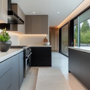
Hidden Impacts of Flooring Choices
Flooring does far more than just complete the look of a kitchen—it actively influences how colors appear, particularly in a gray and white kitchen. The way light reflects off different surfaces, the warmth or coolness of the flooring material, and its contrast with cabinetry all play a role in shaping the overall feel of the space.
While walls and cabinetry set the visual framework, the floor subtly shifts the perception of color temperature and design balance.
Light, Natural Wood: Softening Grey with Warmth
Lighter wood flooring, especially in oak, maple, or ash, helps counteract any coolness in grey cabinetry. This is particularly important when using soft blue or slate greys, as these shades can sometimes feel stark if not balanced properly.
A honey-toned or slightly whitewashed wood floor reflects warm light into the space, creating a cozy contrast against cooler elements. This pairing works especially well in kitchens aiming for a Scandinavian, coastal, or transitional look, where the goal is a bright, airy atmosphere.

Dark Wood: Anchoring the Space with Rich Contrast
For kitchens that embrace a more dramatic contrast, deep walnut, espresso, or even black-stained wood flooring grounds the design. This works particularly well when white upper cabinets are paired with deep grey base cabinets, as the dark floor reinforces the two-tone effect.
Dark wood floors also add a touch of traditional warmth to spaces that might otherwise feel too modern. However, they do require good lighting—both natural and artificial—to prevent the space from feeling visually heavy.
Tile and Polished Concrete: A Sleek, Modern Foundation
For kitchens leaning toward contemporary or industrial aesthetics, large-format tiles or polished concrete flooring create a seamless, structured look. Neutral-toned porcelain tiles in soft grey or beige complement both white and grey cabinetry without overpowering the space.
In ultra-modern kitchens, a high-gloss concrete or large-scale tile floor reflects light beautifully, enhancing the clean lines of minimalist cabinetry. Since these surfaces lack the organic grain of wood, they keep the focus on the textures and finishes of cabinetry and countertops.

How Flooring Affects Grey’s Perceived Temperature
A lesser-known trick in kitchen design is that grey cabinetry doesn’t exist in isolation—it absorbs and reflects surrounding colors. This means that a cool grey cabinet might take on a slightly warmer appearance if placed above a honey oak floor, while that same shade could appear crisper when paired with white or light grey tile.
The undertones of the flooring material—whether warm, cool, or neutral—can subtly shift the mood of the entire kitchen, making it feel cozier or more structured depending on the combination. Selecting the right flooring is about more than just choosing a color that goes well with the cabinets.
It’s about shaping the way light moves through the space, balancing warm and cool tones, and ensuring that the kitchen feels cohesive from the ground up.

Fusion of Styles: Transitional, Industrial, Farmhouse, and More
A grey white kitchen isn’t defined by color alone—it’s the design elements, finishes, and materials that shape the overall style. While some kitchens lean into sleek minimalism, others blend classic details with modern updates.
The beauty of a neutral palette is that it serves as a flexible foundation, allowing different influences to merge in a way that feels intentional rather than forced.
Modern and Minimalist: Sleek and Streamlined
For kitchens that embrace a clean, contemporary look, high-gloss finishes, handle-free cabinetry, and integrated appliances take center stage. The contrast between bright white and deep grey is often used in a bold, structured way, sometimes with reflective surfaces that amplify light.
These kitchens keep ornamentation to a minimum, relying on the sharp geometry of cabinets and countertops to create visual interest. The use of polished concrete or glossy tile flooring enhances the sleek effect, making the entire space feel effortless and uncluttered.

Transitional and Traditional: Classic with a Modern Twist
A transitional kitchen bridges the gap between modern and classic, often featuring shaker-style doors, decorative molding, or soft arches. Instead of stark contrasts, these kitchens use softer greys—sometimes leaning toward warm greige—blended with off-white cabinetry.
Gold or brass hardware introduces warmth, making the space feel more inviting. Some traditional designs lean into detailed millwork, but the grey-and-white palette keeps everything feeling fresh rather than overly ornate.
Industrial: A Structured, Edgy Look
Industrial-inspired kitchens incorporate raw materials like exposed steel, matte black fixtures, and textured surfaces. Grey cabinetry in charcoal or slate shades works particularly well in these spaces, giving depth and contrast.
Exposed beams, metal-framed shelving, and black pendant lights reinforce the industrial feel, while subway tile or concrete backsplashes add another layer of texture. The key here is balance—pairing rough, factory-inspired elements with smooth white surfaces keeps the look refined rather than overwhelming.

Farmhouse and Coastal: Airy and Inviting
For those who prefer a more relaxed feel, farmhouse and coastal kitchens introduce natural textures and softer tones. Wicker, rattan, and reclaimed wood bring warmth, while creamy off-white cabinetry keeps the space bright.
Instead of deep charcoal greys, these kitchens often use softer blue-grey or greige tones that work well with natural light. Open shelving, farmhouse sinks, and vintage-style fixtures complete the look, giving the space a timeless charm that never feels outdated.
Where Styles Overlap
One of the most interesting aspects of grey-and-white kitchens is how different styles can blend. A kitchen with classic moldings and shaker cabinets might incorporate modern pendant lights, while a farmhouse-inspired space could use industrial-style barstools for contrast.
The key to making these combinations work is restraint—focusing on neutral tones and letting textures and materials create variation. Regardless of the style direction, a grey-and-white foundation allows for a mix of influences, creating kitchens that feel current while still retaining depth and personality.
The trick is knowing how to balance contrast, texture, and subtle details to bring everything together seamlessly.

The Art of Mixing Textures
A grey-and-white kitchen isn’t just about color—it’s the textures that truly bring the space to life. The best-designed kitchens use a careful balance of matte and glossy surfaces, natural wood elements, and stone finishes to create depth without needing bold hues.
This layering of textures prevents the space from feeling flat and gives it a refined, well-composed look.
Matte vs. Gloss: Playing with Light
One of the easiest ways to add contrast without introducing new colors is by pairing matte and glossy finishes. A common approach is using matte grey lower cabinets against high-gloss white upper cabinetry.
This contrast makes the kitchen feel more dynamic, as the glossy surfaces reflect light, keeping the upper space airy, while the matte textures below create grounding and depth. In some modern kitchens, a polished quartz or marble backsplash adds another layer of shine, ensuring that light bounces throughout the space.

Woods and Woven Materials: Softening the Look
Natural materials play a big role in making a grey-and-white kitchen feel inviting rather than cold. Wood elements—whether in the form of open shelving, butcher block countertops, or exposed ceiling beams—bring in warmth and texture.
Lighter wood tones complement soft grey cabinetry, while richer, darker wood adds contrast against bright white walls. Woven details, like rattan barstools or wicker light fixtures, introduce an organic quality that balances sleek finishes.
Even small details, such as textured linen curtains or woven placemats, can help soften a kitchen with high-contrast tones.
Stone and Marble: Natural Variations That Add Character
Marble and stone aren’t just functional—they add subtle visual movement to a kitchen. A white marble backsplash with fine grey veining serves as a natural connector between white cabinetry and darker lower cabinets.
Honed stone surfaces provide a soft, matte texture, while polished marble or quartz reflects light, creating a sleek, high-end feel. Since natural stone has unique variations in color and pattern, it introduces an element of unpredictability that makes the kitchen feel less staged and more organic.
How Texture Creates Depth Without Color
The most visually interesting kitchens often layer at least two or three textures, even if the palette remains simple. A smooth quartz countertop, matte cabinetry, and wood shelving might not seem like an obvious combination, but together they create a balance of cool and warm, soft and structured.
Metallic finishes—whether brushed brass, matte black, or polished chrome—add another dimension, catching light in different ways depending on their placement. By thoughtfully combining finishes, a grey-and-white kitchen can feel rich and layered rather than overly uniform.
It’s this subtle interplay of textures that makes the space feel lived-in, welcoming, and visually engaging.

Accessories and Greenery: Subtle Punctuation
The right accessories can make a grey and white kitchen decor feel more inviting, breaking up the neutral palette with natural warmth and personality. While the foundation of the design remains crisp and structured, small details like plants, ceramics, and carefully chosen accents bring balance to the space.
These finishing touches aren’t just decorative—they play a functional role in softening contrasts, adding depth, and preventing the kitchen from feeling too uniform.
Vases of Greenery: A Natural Contrast
Adding greenery is one of the simplest ways to introduce freshness into a grey-and-white kitchen. Whether it’s a vase of eucalyptus, a small potted herb plant on the counter, or a branch arrangement on the island, these subtle splashes of green bring life to the space.
The organic texture of leaves or stems provides a contrast to the smooth surfaces of cabinets and countertops, making the room feel less rigid.

Ceramic Bowls and Wooden Cutting Boards: Grounding the Space
For kitchens that lean toward cooler grey tones, incorporating natural materials like wood or unglazed ceramics helps balance the color temperature. A warm-toned wooden cutting board resting against a backsplash or a neutral ceramic fruit bowl on the island can make a noticeable difference.
These elements prevent the kitchen from feeling too sleek or sterile, adding just enough warmth to create a welcoming atmosphere.
Pops of Citrus or Fresh Produce: Small but Impactful
A bowl of lemons, a handful of apples, or even a simple display of garlic and shallots can subtly break up a monochrome color scheme. These small touches don’t require any commitment, but they create an instant focal point and bring in a seasonal feel.
The contrast between the bright tones of citrus and the muted backdrop of grey and white cabinetry helps energize the space without overwhelming it.
The Balance Between Cool and Warm
Accessories might seem like minor details, but they can influence how a kitchen’s color palette is perceived. A cool-toned grey and white space can feel slightly warmer with the addition of a woven basket, a linen dish towel in a soft neutral, or a small rug with subtle earthy tones.
On the other hand, a kitchen with warm greige cabinetry might feel more balanced with a few sleek black or brushed steel accents. Ultimately, these small details are what personalize a kitchen, making it feel lived-in rather than overly styled.
The key is in the balance—too many decorative elements can clutter the space, but just the right amount will make the kitchen feel cohesive, welcoming, and effortlessly refined.

Architectural and Layout Nuances
Beyond color and texture, the layout and structural elements of a kitchen can shape how a grey-and-white palette is perceived. The best designs don’t rely solely on color contrast but also use architectural choices to balance proportion, highlight focal points, and add depth.
From open shelving to statement range hoods, these details play a key role in refining the overall composition.
Strategic Open Shelving: Lightening the Look
Replacing some upper cabinets with open wooden shelves is a simple but effective way to prevent darker lower cabinetry from feeling too heavy. This approach works especially well in kitchens with charcoal or slate base cabinets, as it introduces warmth and keeps the space visually open.
Open shelving also creates an opportunity to display decorative items, cookbooks, or everyday dishes, adding a personal touch without overwhelming the design. When paired with a white backsplash, these shelves provide an airy break that balances the deeper tones below.
Range Hoods: Blending In or Standing Out
The treatment of the range hood can influence the kitchen’s overall structure. Some designs integrate the hood into the surrounding cabinetry, painting it white to maintain an uninterrupted look.
This works well in kitchens that prioritize a seamless aesthetic, where the focus is on subtle detailing rather than bold contrasts. On the other hand, some kitchens turn the range hood into a sculptural centerpiece by wrapping it in grey, stone, or even wood.
This adds depth and can shift attention away from standard cabinet arrangements, creating a custom-built look that reinforces the kitchen’s personality. A hood clad in veined marble or finished with decorative trim brings in a layer of craftsmanship, making it more than just a functional necessity.

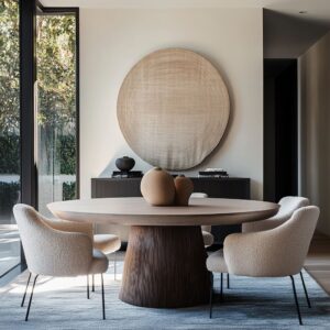
Peninsulas and Islands: A Natural Focal Point
The island or peninsula often acts as the kitchen’s anchor, and in many designs, it features a distinct finish to draw attention. A waterfall marble countertop, for example, introduces a striking contrast against grey cabinetry, allowing the material itself to become a design element.
In kitchens where the base cabinets are already a dark shade, keeping the island a lighter grey or incorporating wood details can create a layered effect that prevents the space from feeling too uniform. Curved peninsulas are another architectural choice that subtly shifts the kitchen’s structure.
Instead of relying on color contrast alone, the gentle curve softens the overall layout, making the space feel more inviting. Similarly, decorative molding on islands or detailed range hood trims can bring a level of sophistication that enhances the grey-and-white scheme without overpowering it.
Beyond Color: Using Structure to Enhance Design
The best grey-and-white kitchens don’t just rely on their color palette—they use shape, material, and proportion to guide the eye. Whether through open shelving that lightens the space, a bold range hood that adds character, or an island with an unexpected finish, these architectural details ensure that the kitchen feels intentional and refined.
The color scheme is just one part of the equation—the way it’s framed through layout choices is what ultimately makes it stand out.

Observing Repetition and Balance
Even the most effortless-looking kitchens are built on careful repetition. Whether through materials, colors, or structural alignment, repeating elements create a sense of rhythm that makes the space feel cohesive.
In grey-and-white kitchens, where contrast plays a major role, balancing both tones requires thoughtful placement of details to prevent one from overwhelming the other.
Metal Echoes: A Thread of Consistency
One of the most effective ways to create visual harmony is through repeated metal finishes. If the cabinet hardware is gold, that same tone might appear in the faucet, pendant lights, or even a small accent frame on an open shelf.
Similarly, kitchens with matte black drawer pulls often continue that theme in barstool legs or industrial-style sconces. These subtle connections help tie the room together without relying on a single dominant color.

Cabinet and Window Alignment: Structuring the Space
In well-planned kitchens, cabinetry doesn’t just fill available space—it aligns with architectural elements for a natural flow. When the top of a cabinet run lines up with a window frame or floating shelf, it creates an uninterrupted visual line that makes the kitchen feel structured and intentional.
Even in asymmetrical layouts, repeating horizontal or vertical elements can subtly guide the eye, preventing the space from feeling disjointed.
Symmetry: A Natural Sense of Order
While not every kitchen follows a perfectly symmetrical layout, repeated forms can bring balance. Double pendant lights over an island, matching sets of open shelves, or evenly spaced cabinet doors all contribute to a sense of order.
Even when asymmetry is part of the design, the strategic placement of similar elements—such as a pair of statement sconces flanking a range hood—can restore equilibrium.
Creating Balance Without Rigidity
The key to repetition is restraint. When every single element is perfectly mirrored, the kitchen can start to feel overly rigid.
Instead, the best designs repeat patterns in a way that feels natural—mirroring metal finishes across different surfaces, aligning cabinetry with architectural features, or using pairs of decorative elements to create structure. This balance allows grey and white to interact seamlessly, ensuring that neither dominates the space but instead works as part of a carefully composed whole.

Conclusion
A grey-and-white kitchen can appear simple at first glance, but the layered choices of undertones, textures, metals, and architectural elements elevate the final outcome. What might seem like a straightforward combination actually relies on careful calibration of color warmth, reflective surfaces, strategic hardware, and subtle balancing through accessories.
Each of the kitchens described above demonstrates how diverse the results can be, even within the same neutral palette. The true intrigue lies in all those near-invisible or underappreciated details—like the precise shade of greige chosen to match a particular hardwood floor, or the height at which a glossy backsplash meets open shelving.
By examining these nuanced decisions, one can appreciate the complex orchestration behind a grey-and-white kitchen’s refined visual harmony.