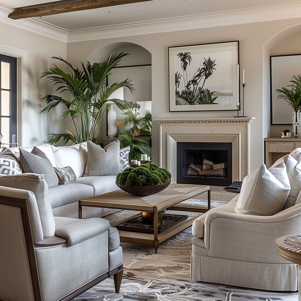
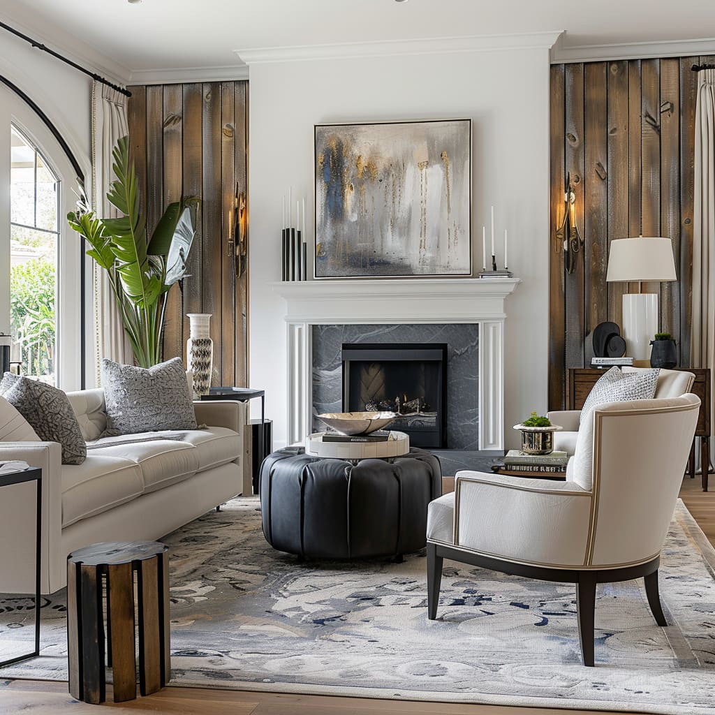
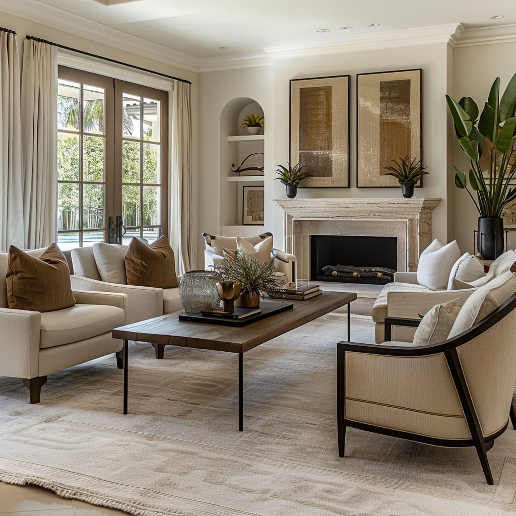
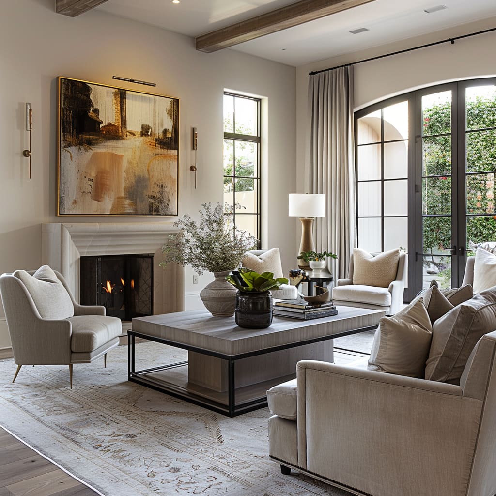
The creation of space is akin to composing a symphony—a harmonious blend of elements that resonate with those who inhabit it, creating experiences that extend beyond the visual. This narrative is not just about placing objects in a room; it is about orchestrating a symphony of design elements that speak to our deepest senses of comfort, beauty, and continuity.
As we delve into the realms of human-centered comfort and design, the architectural canvas, the crafting of mood and continuity, the narrative told by textiles and details, and the evolution of design itself, we see how these components play together to compose spaces that are not only aesthetically compelling but also deeply resonant with our human needs and aspirations.
Human-Centered Comfort and Design
In the realm of interior design, the convergence of form and function takes center stage, particularly through the lens of ergonomic design. Furniture and spaces are not merely for viewing pleasure but are crafted to cradle the body, ensuring comfort that is both physical and psychological.
This section explores the characteristics that make up human-centered design, focusing on the ergonomic crafting of furniture and the sensory experience they offer. It’s where design meets the human touch, ensuring that every curve, texture, and material is chosen to cater to our innate need for comfort and sensory satisfaction.
Ergonomic Design
The essence of ergonomic design is evident in furniture that is not only aesthetically appealing but also meticulously tailored to fit the human form. Chairs with gentle curvatures mimic the spine’s natural alignment, while sofas with plush, responsive cushioning invite long periods of lounging without discomfort.
Even the height and depth of seating are calculated to ensure that feet rest comfortably on the floor, and knees are bent at an ergonomically supportive angle. Tables and surfaces feature softened edges and are positioned within easy reach to prevent overextension, reflecting a dedication to comfort that is both physical and inclusive.
Sensory Experience
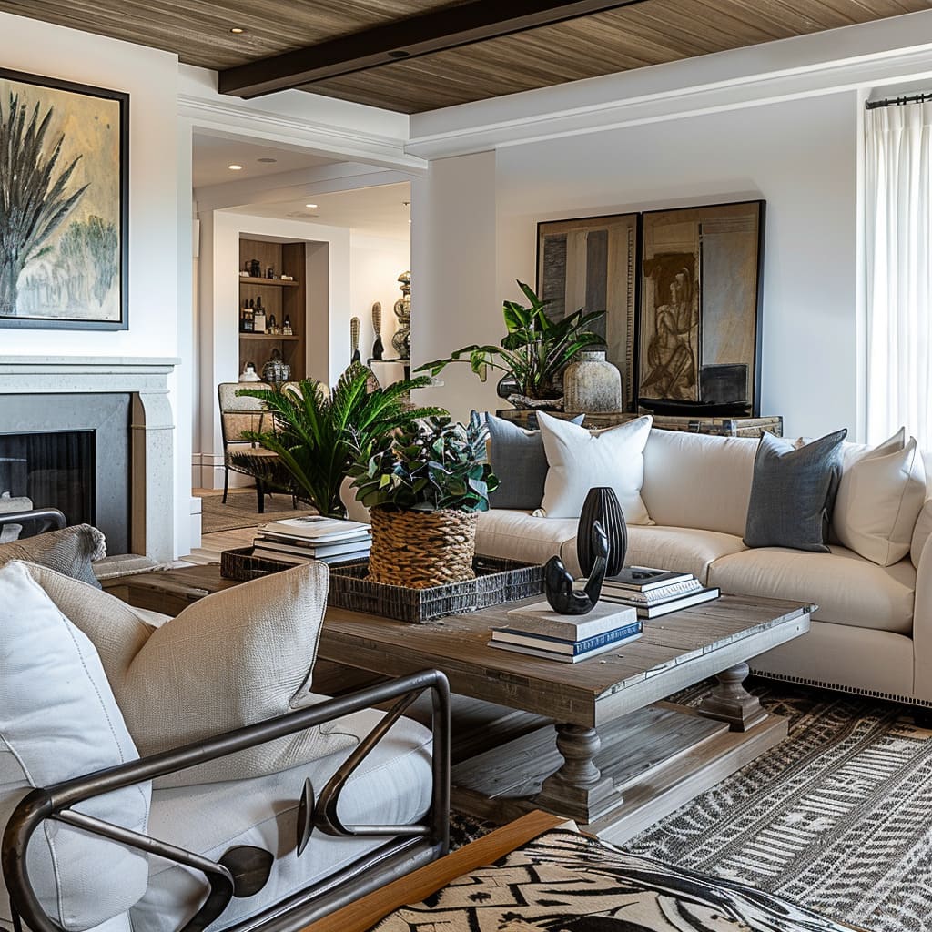
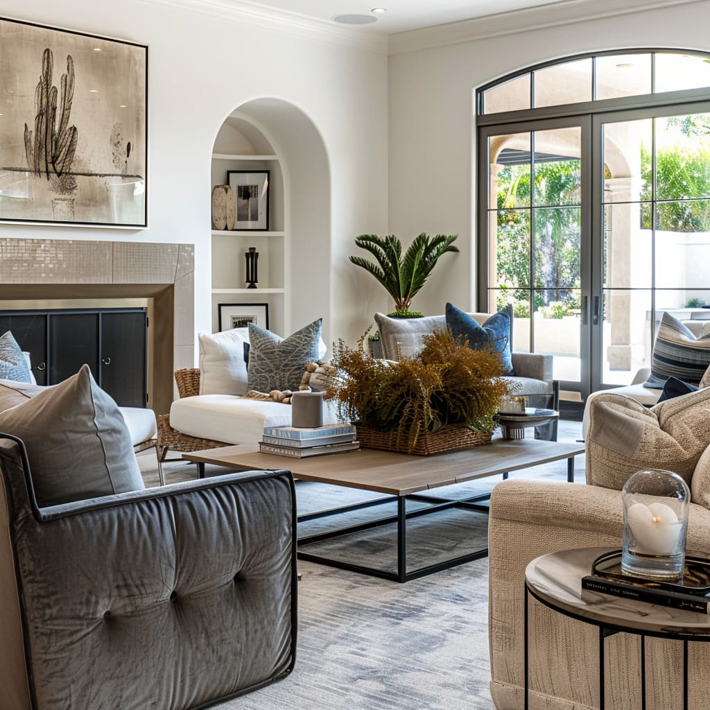
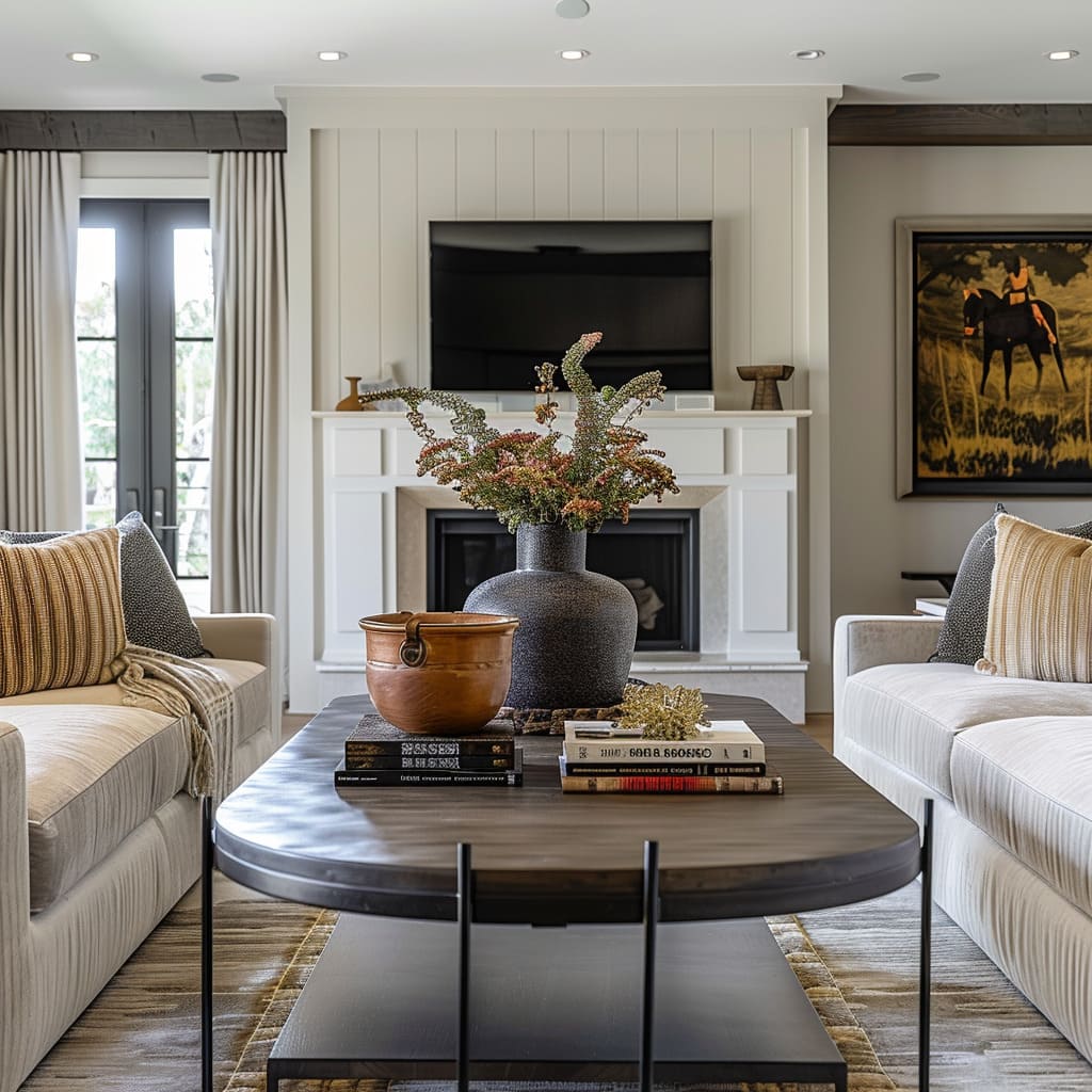
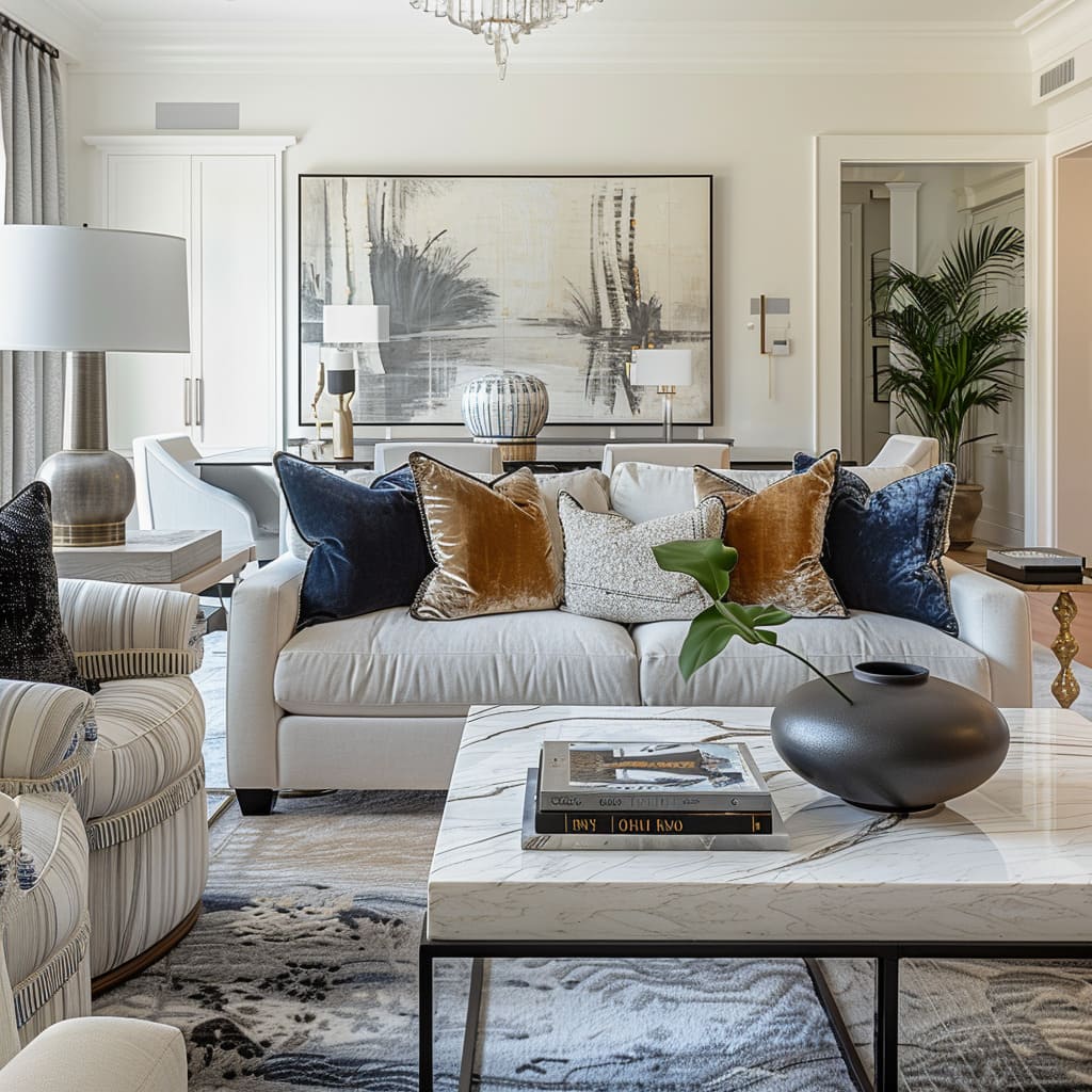
In the sensory experience of design, textures play a profound role, with materials chosen for their touch as much as their appearance. Upholstery in rich velvets or supple leathers invite the hand to brush across surfaces, experiencing the space through touch.
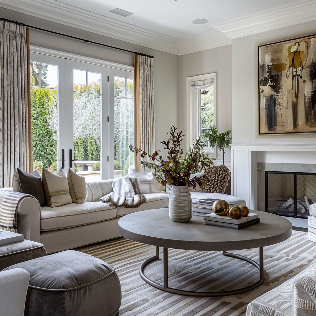
Rugs underfoot are thick and sumptuous, transforming the simple act of walking into a sensory delight. Even the visual textures of wall finishes and draperies contribute to the overall sensory experience, with their patterns and weaves creating a backdrop that is dynamic yet soothing.
The careful orchestration of these elements results in a living environment that delights the senses, inviting inhabitants to not just see but feel their surroundings.
The Architectural Canvas
The structure of a space defines its potential. By emphasizing vertical space and respecting the use of negative space, designers create an architectural canvas that frames the rest of the interior elements.
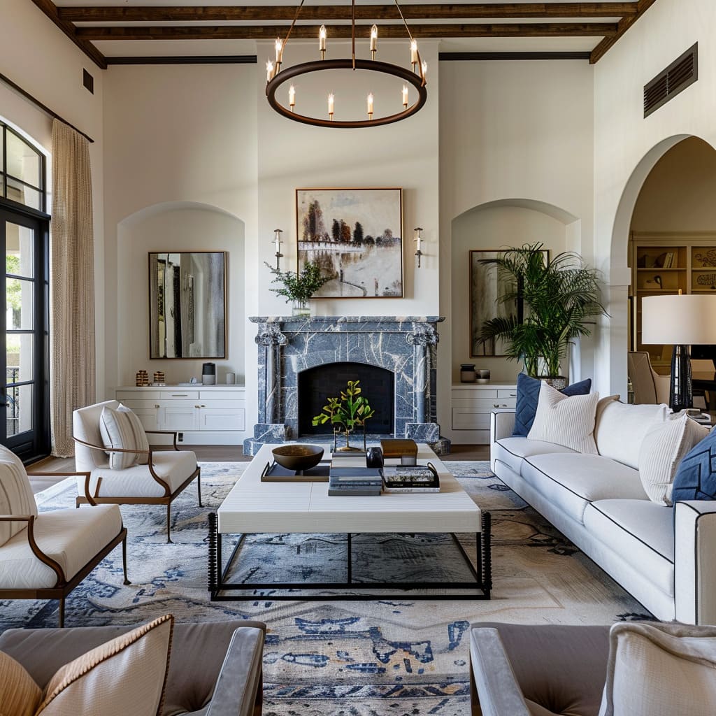
High ceilings and expansive windows lift the gaze and spirit, creating a sanctuary that breathes openness and possibility. Meanwhile, the strategic use of negative space prevents a room from feeling cluttered or cramped, regardless of size.
This section delves into how these design choices not only enhance the aesthetics but also fundamentally influence the feel of a space.
Emphasis on Vertical Space
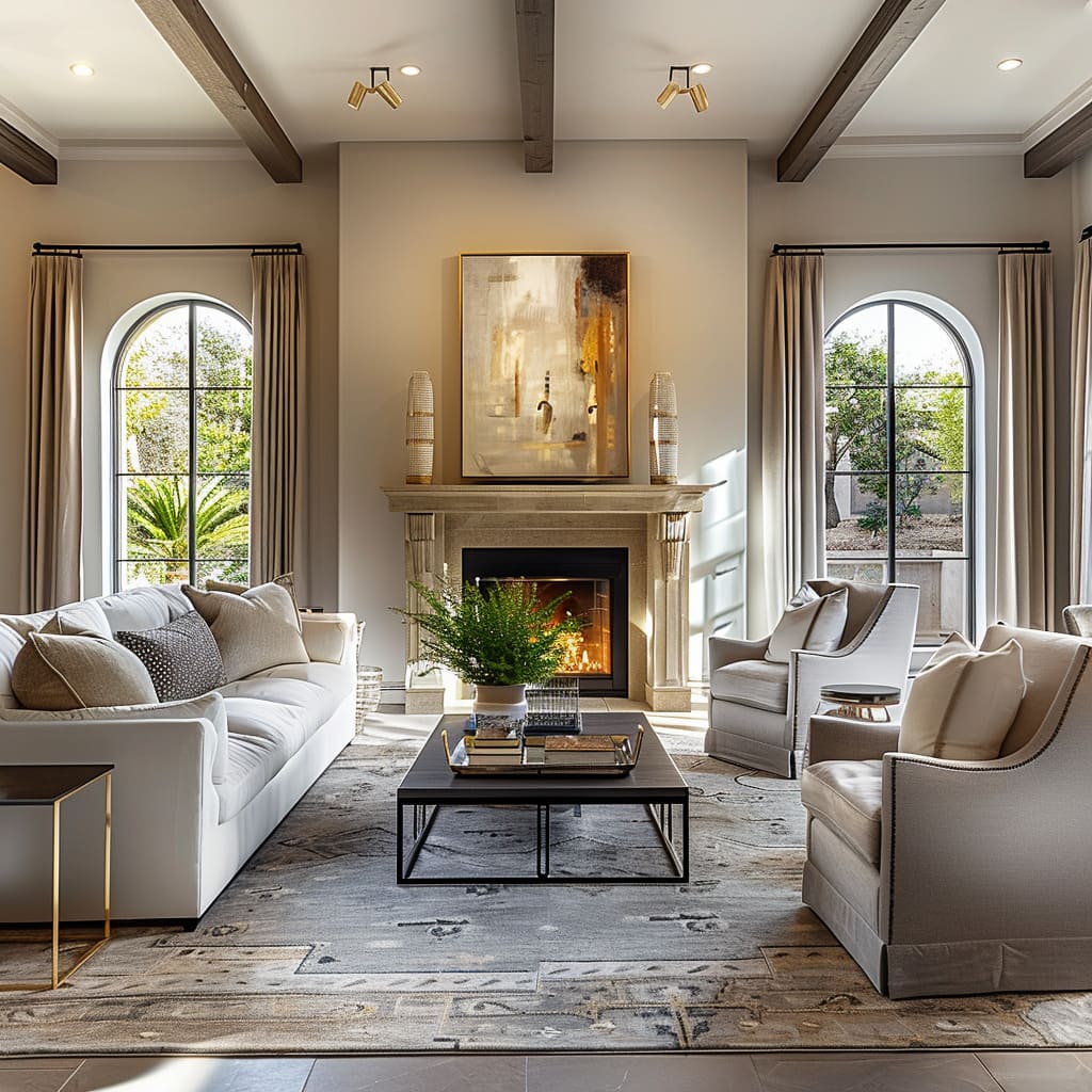
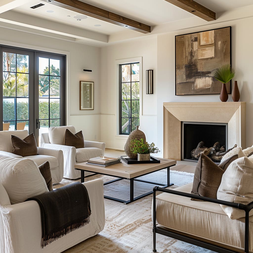
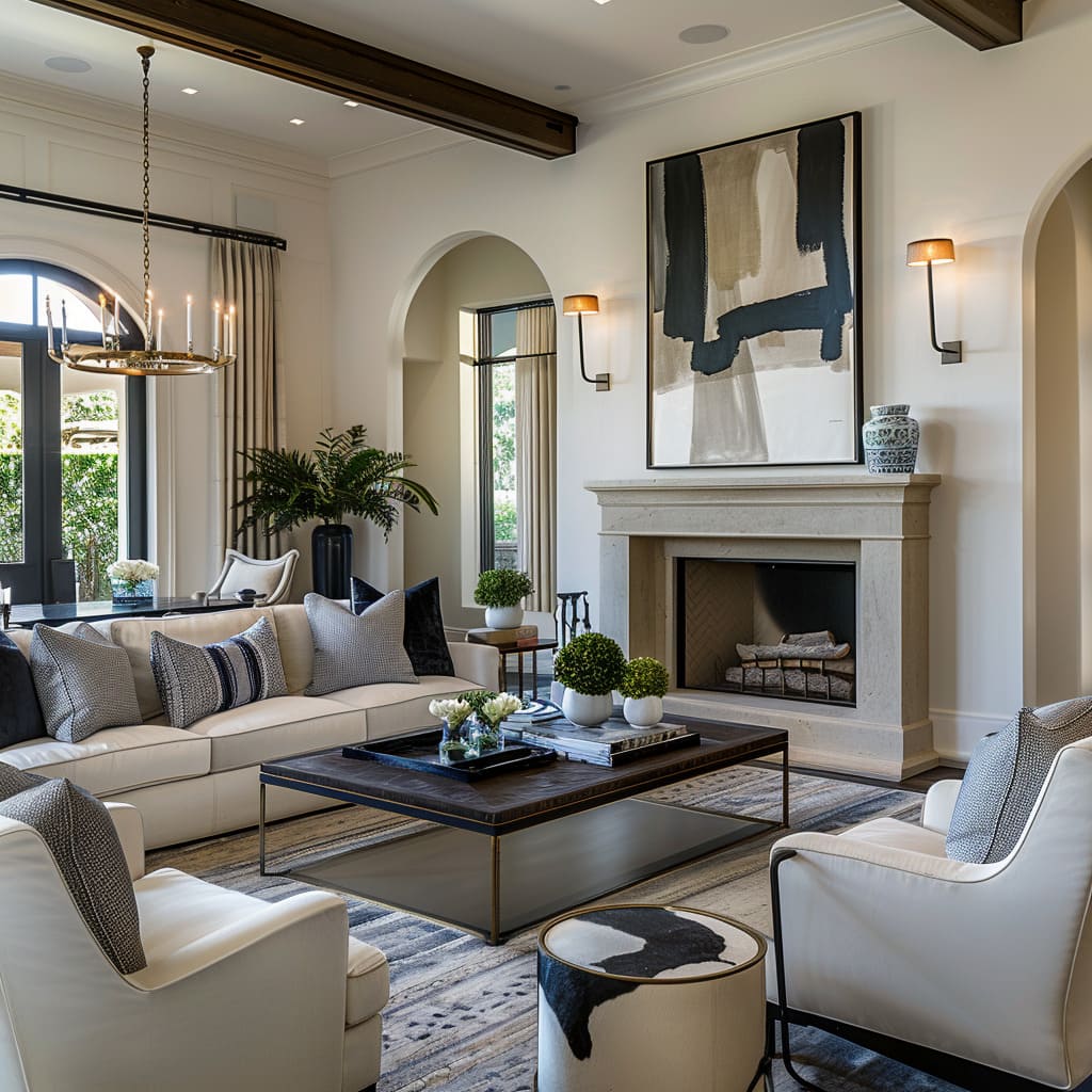
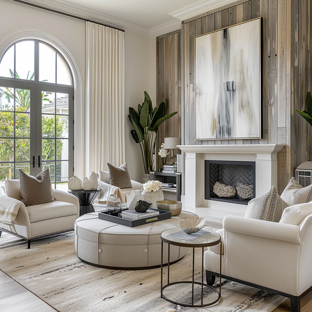
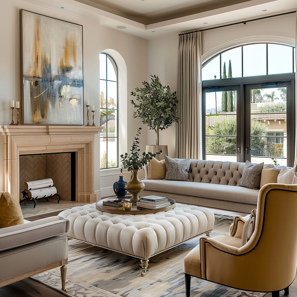
The emphasis on vertical space is a hallmark of design that seeks to create an airy, open environment. By employing tall windows, the boundaries between interior and exterior blur, ushering in not just light but also the grandeur of the sky and surrounding views.
High ceilings echo the expansiveness of the outside world, offering a sense of liberation and potential. Architectural elements like long, flowing curtains and vertically oriented decorative pieces draw the eye upwards, further emphasizing the loftiness of the rooms.
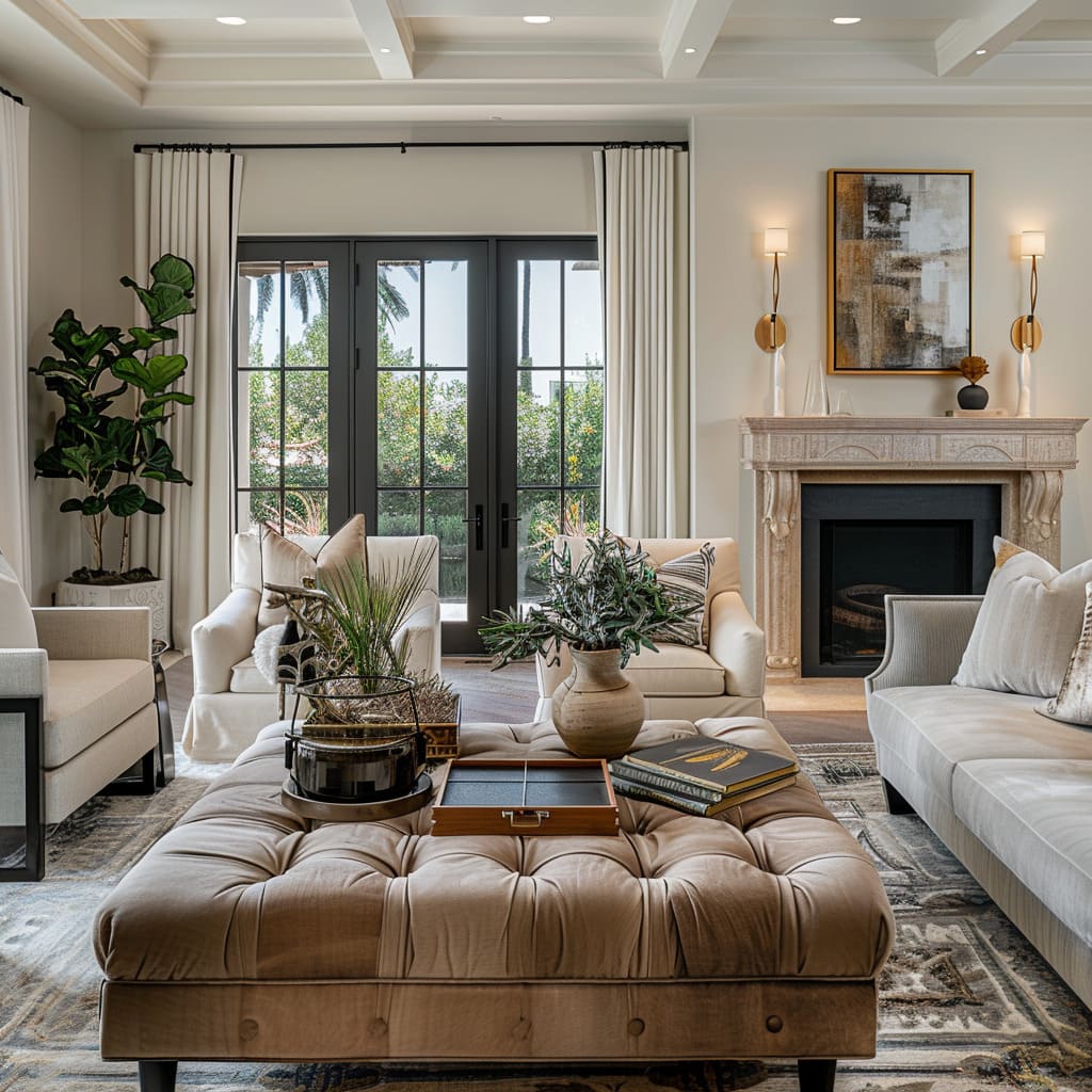
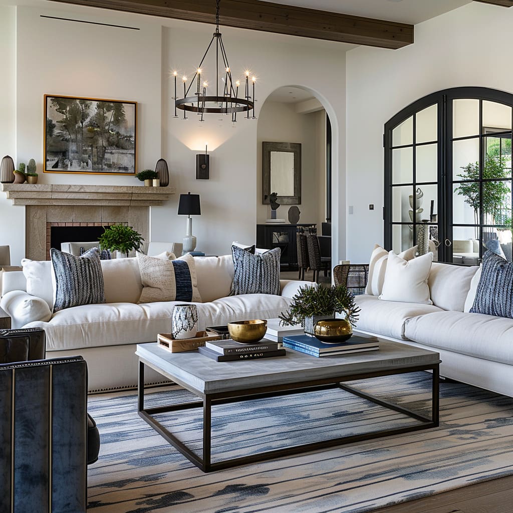
This verticality is complemented by light fixtures that hang like celestial bodies, casting a glow that enhances the feeling of elevation.
Use of Negative Space
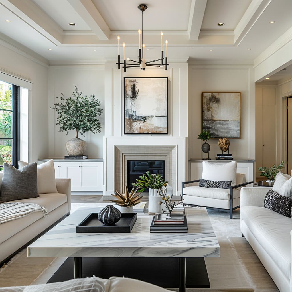
Negative space is harnessed to create an atmosphere where every object is afforded its own area of influence, allowing individual pieces to be appreciated both for their function and form. In these designs, the space around objects is as carefully considered as the objects themselves, creating a visual pause that emphasizes the beauty of simplicity.
Furniture is arranged to allow for ample movement, ensuring that the environment remains uncluttered and open. The strategic placement of art and decor within these open spaces becomes a focal point, drawing the eye and engaging the viewer without overwhelming the senses.
The mastery of negative space is a subtle reminder of the importance of absence, providing a restful counterpoint to the carefully curated selection of furnishings and accessories.
Creating Mood and Continuity
Mood setting through design transcends the simple placement of objects and color choices. It involves the delicate art of lighting and a conscious effort to create visual continuity.
The ambient atmosphere set by indirect lighting casts a glow that can transform the mundane into the sublime. Visual continuity, on the other hand, allows for a seamless experience as one transitions from space to space.
In this section, we explore the subtle artistry involved in weaving a continuous thread throughout the home, creating an environment that’s not only cohesive but also emotionally resonant.
Ambient Atmosphere
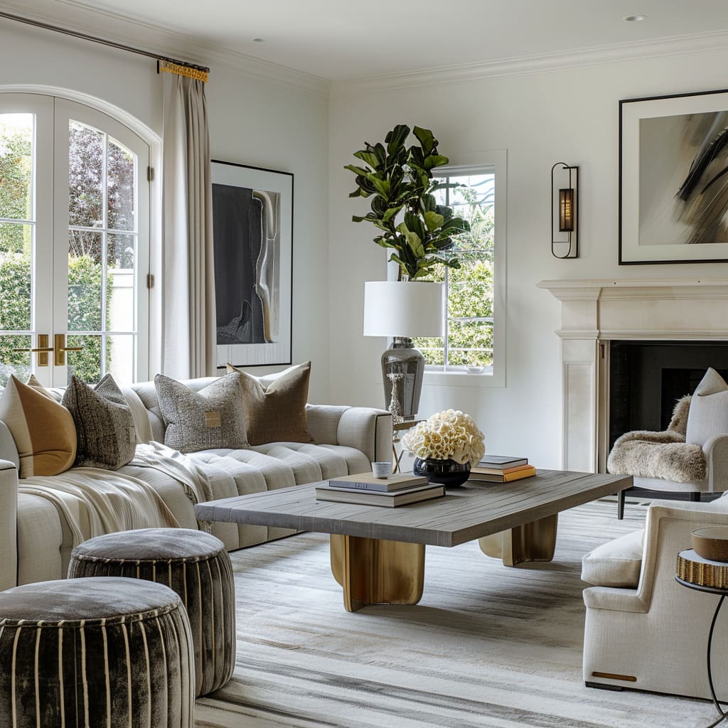
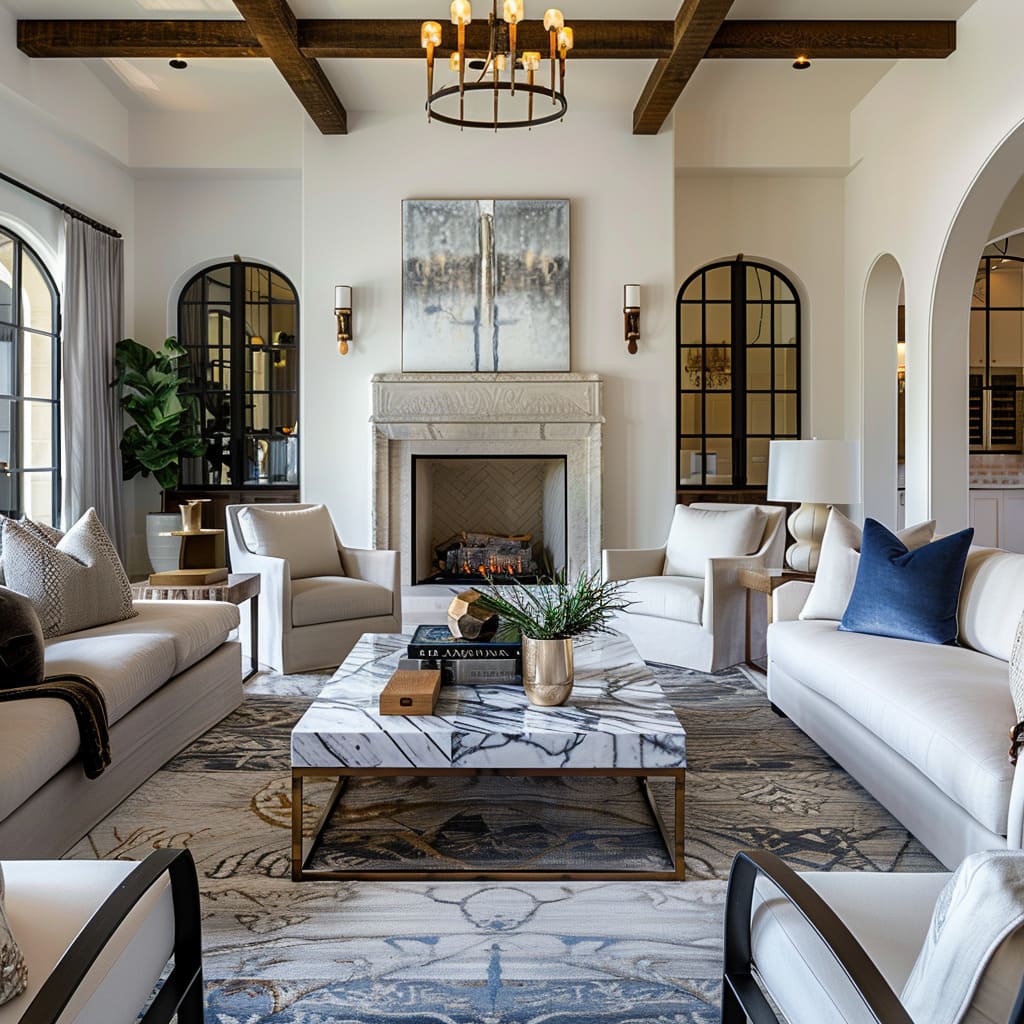
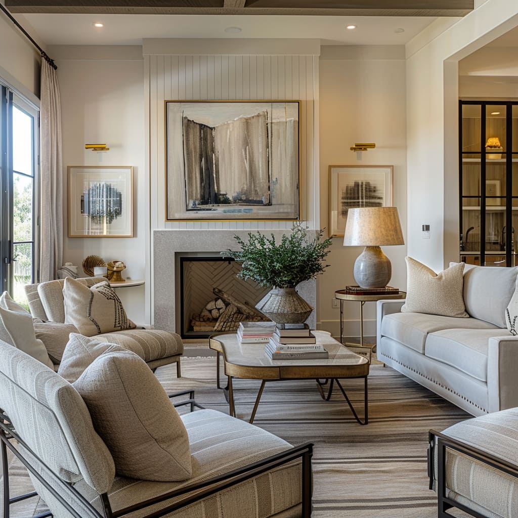
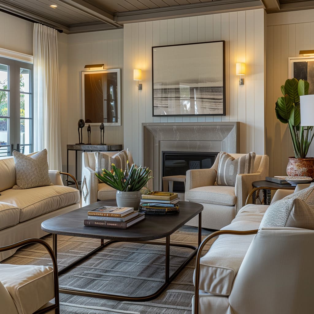
The ambient atmosphere within a space is crafted through a symphony of light and shadow, where indirect lighting fixtures are placed strategically to highlight architectural features and bathe the room in a soft glow. Wall sconces, floor lamps, and recessed lights cast their luminescence in a way that softens edges and corners, allowing the room to envelop its inhabitants in warmth.
The deliberate avoidance of harsh lighting creates an inviting sanctuary, perfect for relaxation or intimate gatherings. This gentle illumination not only showcases the textures and colors within the room but also works in tandem with the natural light that filters in, creating a dynamic interplay between the light sources that shifts pleasantly as the day progresses.
Visual Continuity
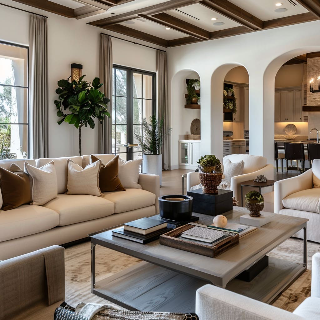
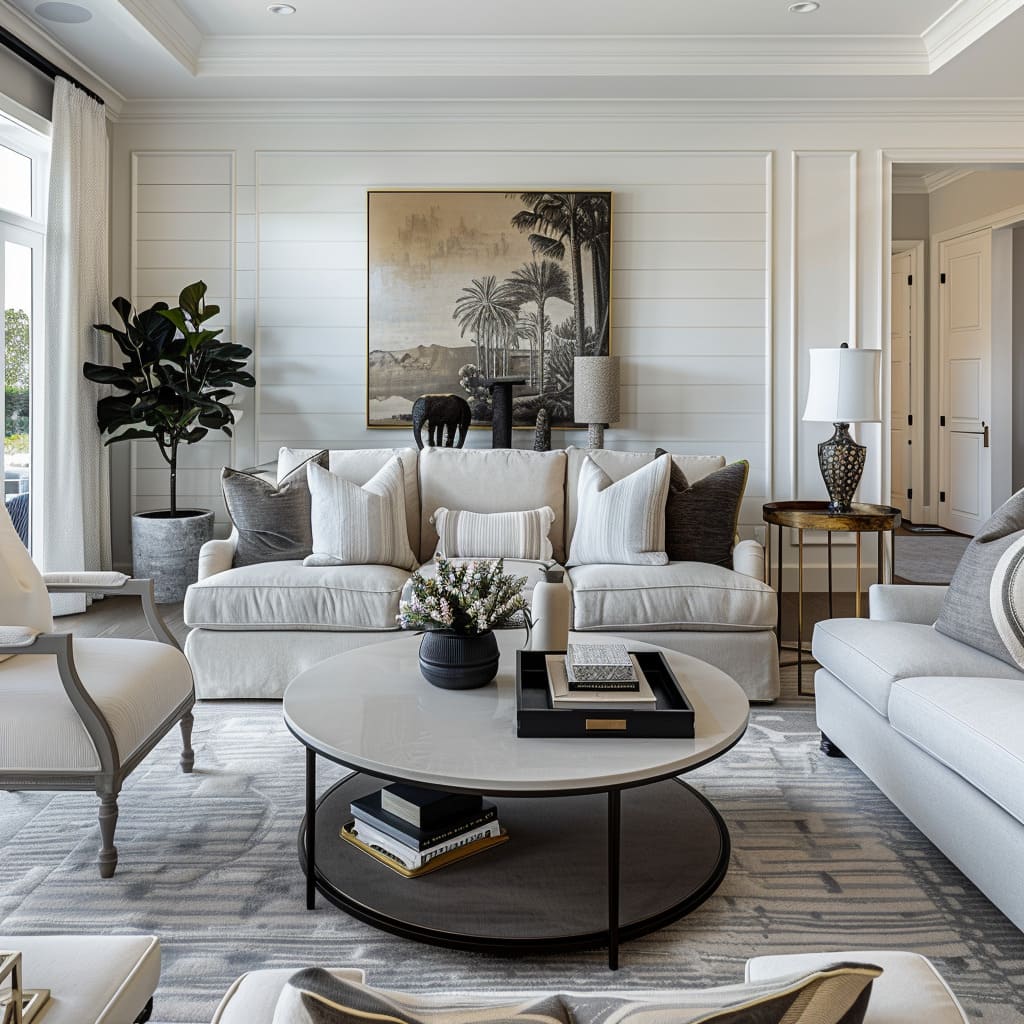
Visual continuity is the invisible thread that connects one room to the next, creating a cohesive story that unfolds as one moves through the space. This is achieved by carrying through certain key elements such as a consistent color scheme, repeated use of materials, or a recurring design motif.
Transitional areas are designed to guide rather than disrupt, with elements like flooring that flows from one space to another or doorways that frame views, enticing one to venture further. The thoughtful placement of furnishings and decor creates a natural progression, where each area complements the next.
Even in the presence of distinct functional zones, there remains an overarching sense of unity, a continuous and harmonious journey through the home’s interior landscape.
Artistic and Tactile Narratives
Every room tells a story, spoken through the textiles that adorn it, the precise details in its finishes, and the composition of its elements. Dynamic textiles bring a room to life with textures that invite touch and patterns that please the eye.
Precision in detailing ensures that every inch is considered, from the stitching on a cushion to the grain of a wooden tabletop. An artful composition turns everyday living spaces into galleries, where the placement of each item is a statement in itself.
This section is dedicated to the narrative that unfolds through these tactile and visual elements, showcasing how the subtleties of design can create rich, layered stories within a space.
Dynamic Textiles
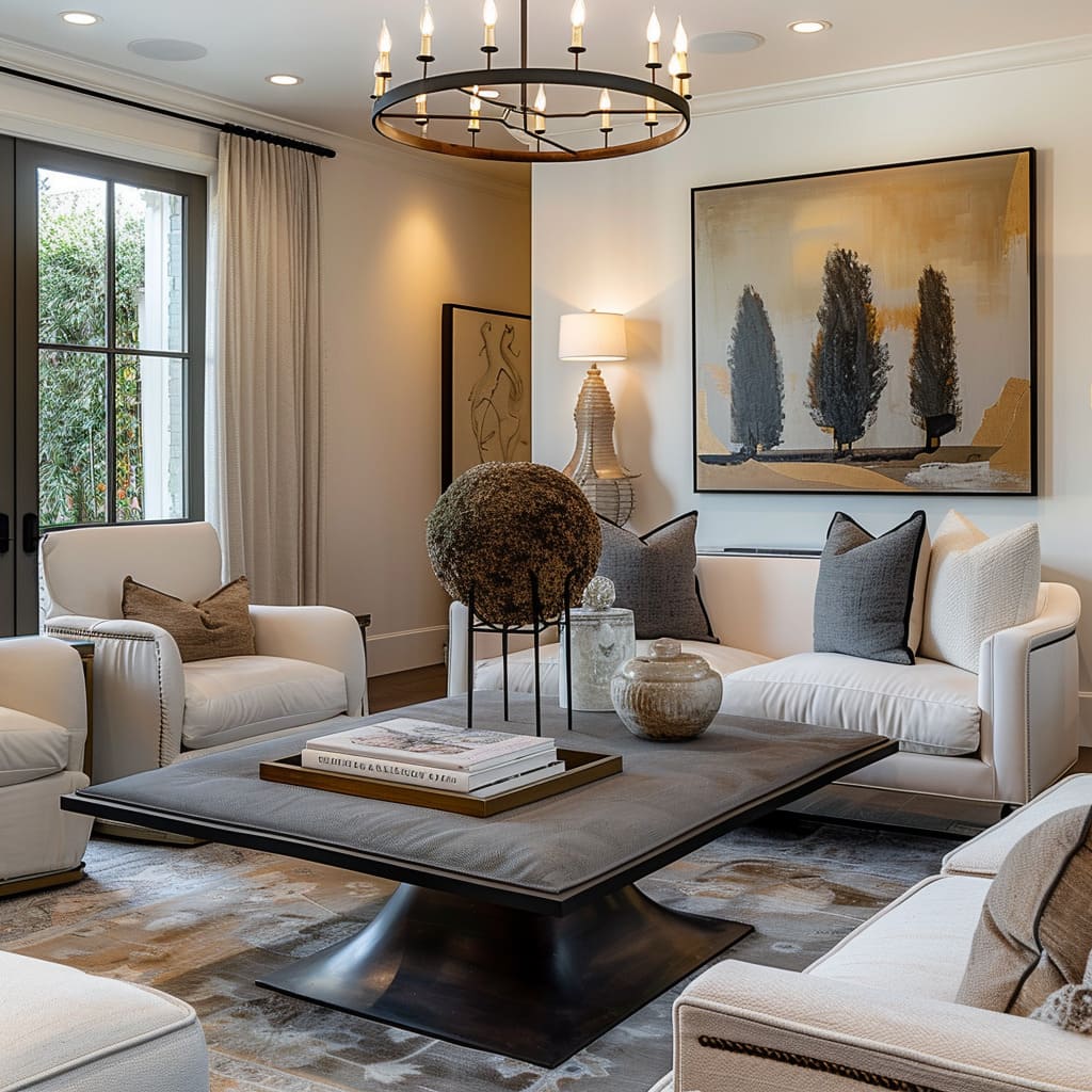
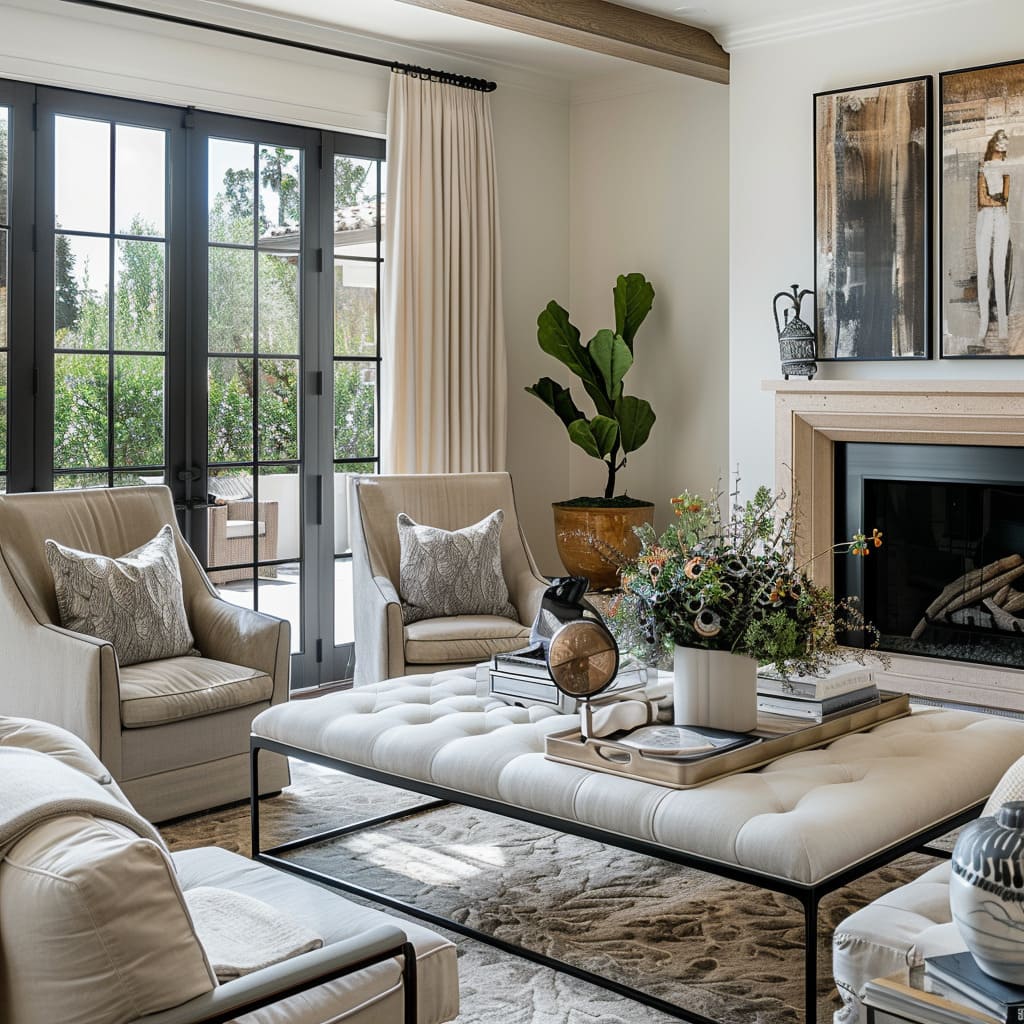
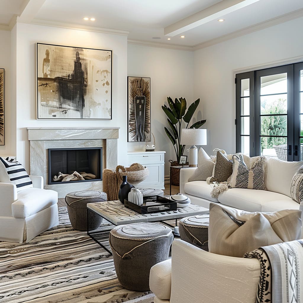
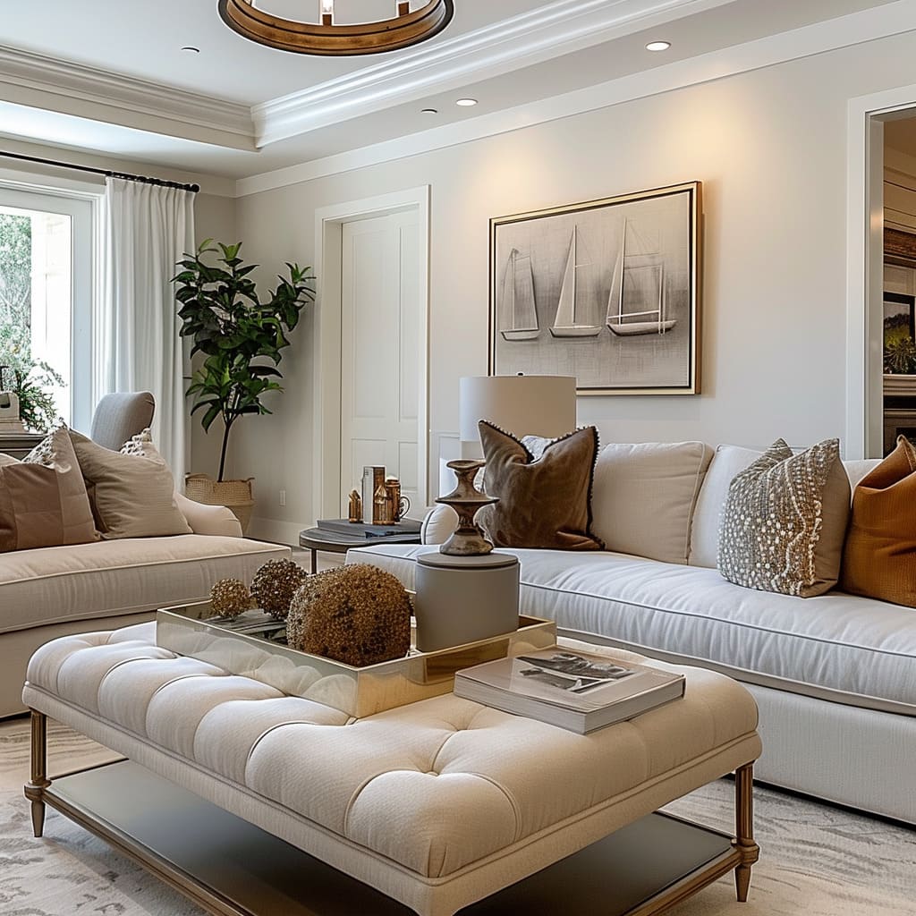
Textiles are chosen not only for comfort but for their ability to animate a space with texture and subtle visual interest. Fabrics with intricate weavings add a layer of sophistication, their surfaces changing appearance with the shifting light throughout the day.
Throws and pillows offer not just a splash of texture but serve as tactile invitations, their plushness suggesting luxury that can be touched and felt. The grain of each textile tells a story, from the smoothness of finely woven linens to the rustic charm of nubby tweeds.
These dynamic textiles, in their careful placement and selection, provide both a visual anchor and a sensory caress, enhancing the lived experience of the space.
Precision in Detailing
Attention to detail transforms ordinary objects into works of art. The precision in joinery, the careful beveling of edges, and the deliberate selection of hardware speak to an artisanal quality rarely found in mass-produced items.
Each stitch in a piece of upholstery is considered, contributing to the item’s beauty and longevity. Woodwork is crafted with respect for the material’s innate qualities, with grains aligned for maximum visual impact.
Paint finishes are applied with an eye for depth and richness, ensuring that surfaces are not only smooth to the touch but also complex in their hues and shading. This precision in detailing serves as a testament to the value of craftsmanship in a world increasingly oriented towards the ephemeral.
Artful Composition
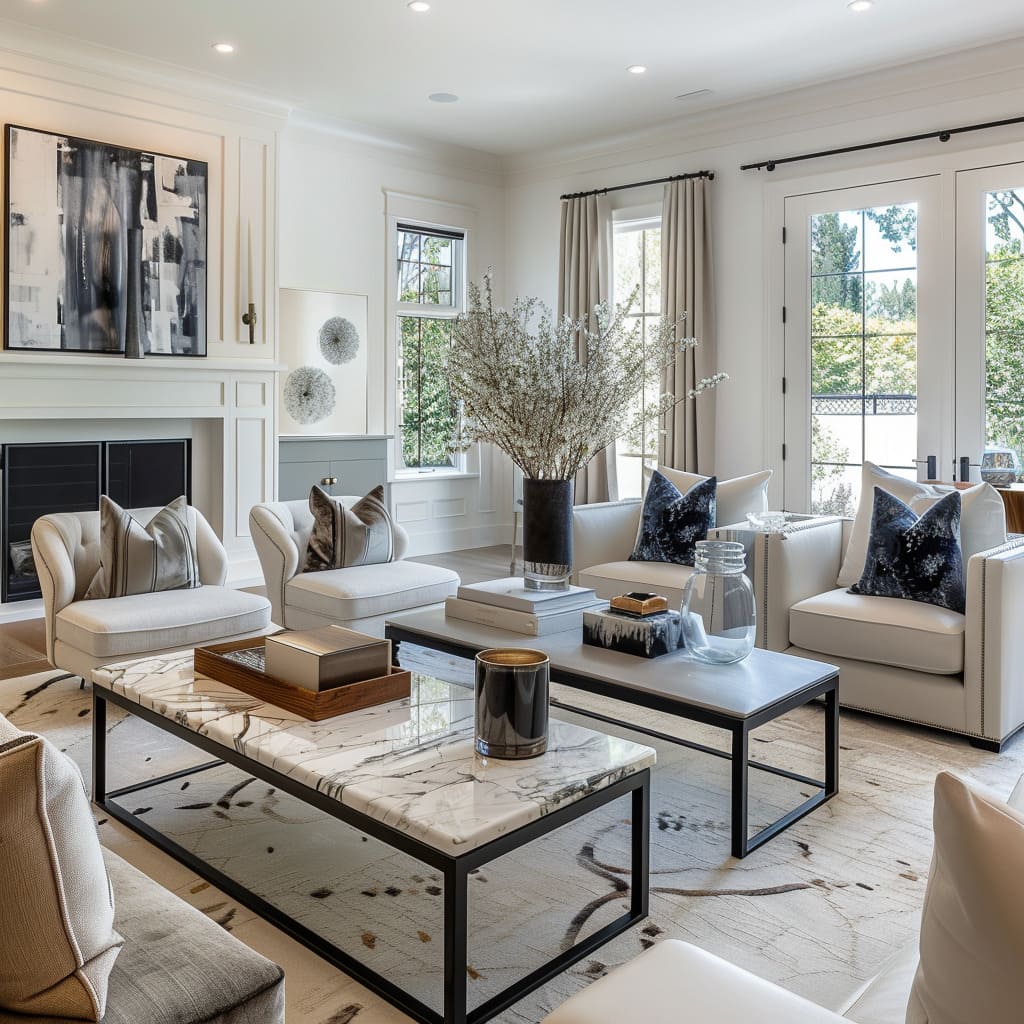
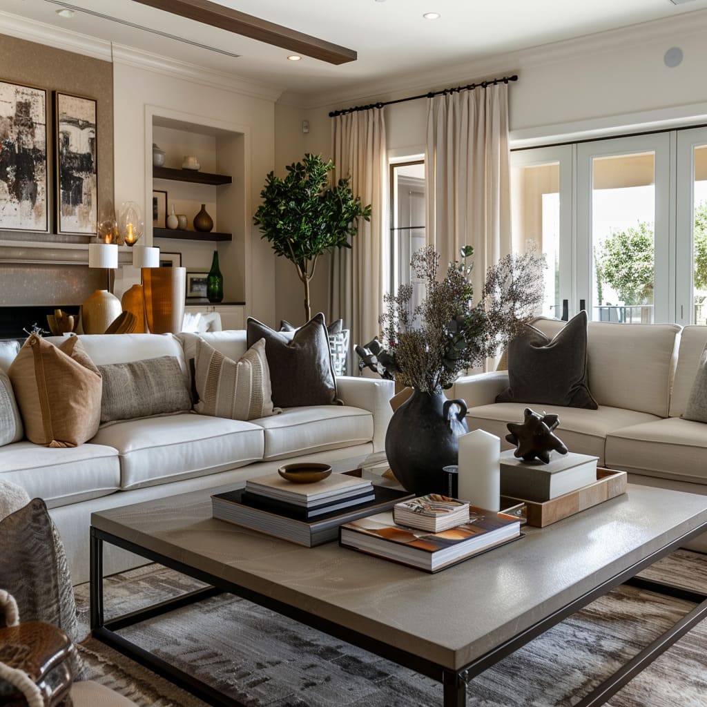
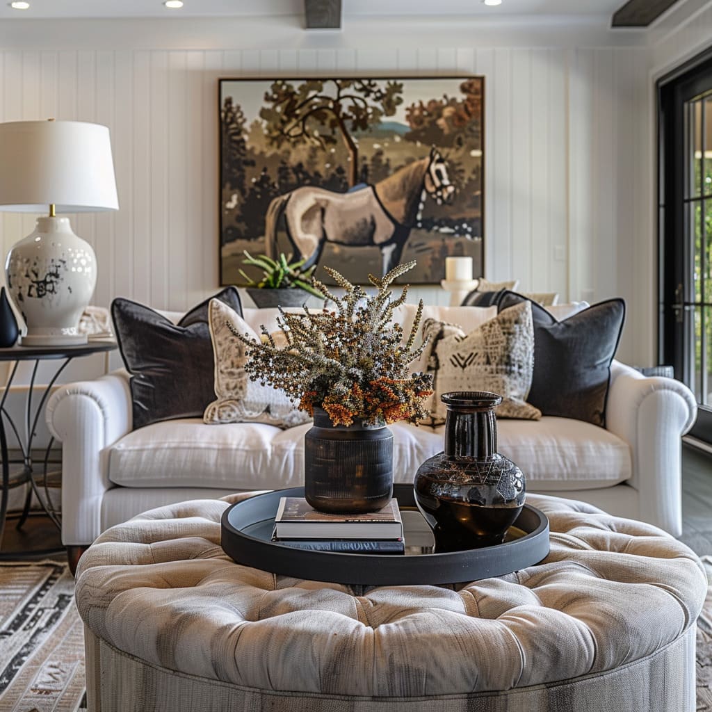
Within these spaces, the composition of objects is executed with an artist’s sensibility, each item chosen and placed with intentionality. The arrangement of books, the positioning of vases, and the angling of chairs—every decision is made to create a visual and functional harmony.
The balance is not accidental but the result of a keen eye for proportion and an understanding of how shapes and volumes interact. The interplay between the objects gives rise to a stillness, a moment captured and extended in time, reminiscent of a carefully composed still-life painting.
This deliberate arrangement invites the viewer to pause and contemplate, to appreciate not only the individual beauty of each object but the dialogue they create when brought together.
Evolution and Cohesion in Design
Design is an ever-evolving discipline, drawing from the past to shape the future. In this section, we explore how the tradition in design is being continually reinvented, striking a balance between time-honored techniques and modern aesthetics.
The subtle interplay of shapes within a space adds complexity without overwhelming the senses, while repetitive elements forge a sense of cohesion and rhythm. These characteristics underscore the evolutionary process of design, where history is honored and the future is anticipated through the very shapes and patterns we find in our living spaces.
Evolving Tradition
Tradition in design is not static; it is a canvas for innovation. Classic motifs are refined and reimagined, creating a dialogue between the old and the new.
Upholstery, though reminiscent of historical styles, is streamlined for contemporary sensibilities, shedding excessive ornamentation in favor of form and fabric that speak to both comfort and class. Woodwork and cabinetry retain the warmth of traditional craft but are infused with modern functionality, ensuring their relevance in today’s lifestyles.
This evolution of tradition is about honoring the past while crafting pieces that are timeless in their appeal and utility, ensuring that they resonate with the current ethos of design.
Interplay of Shapes
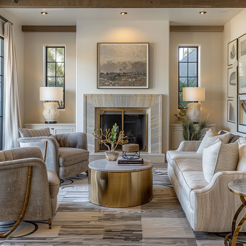
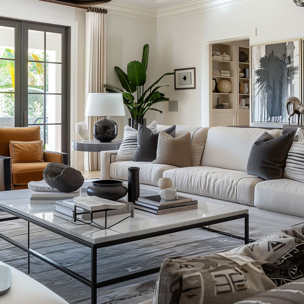
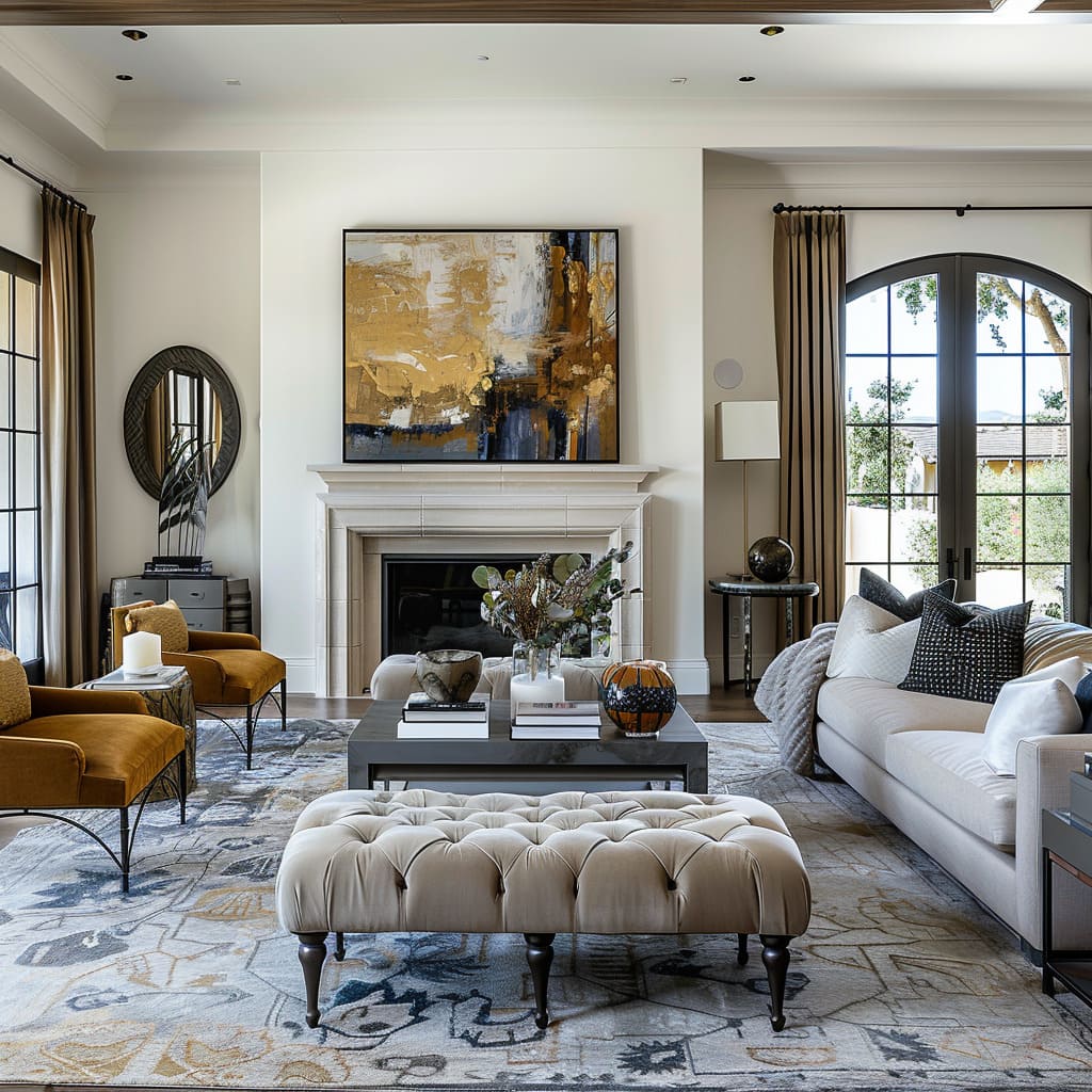
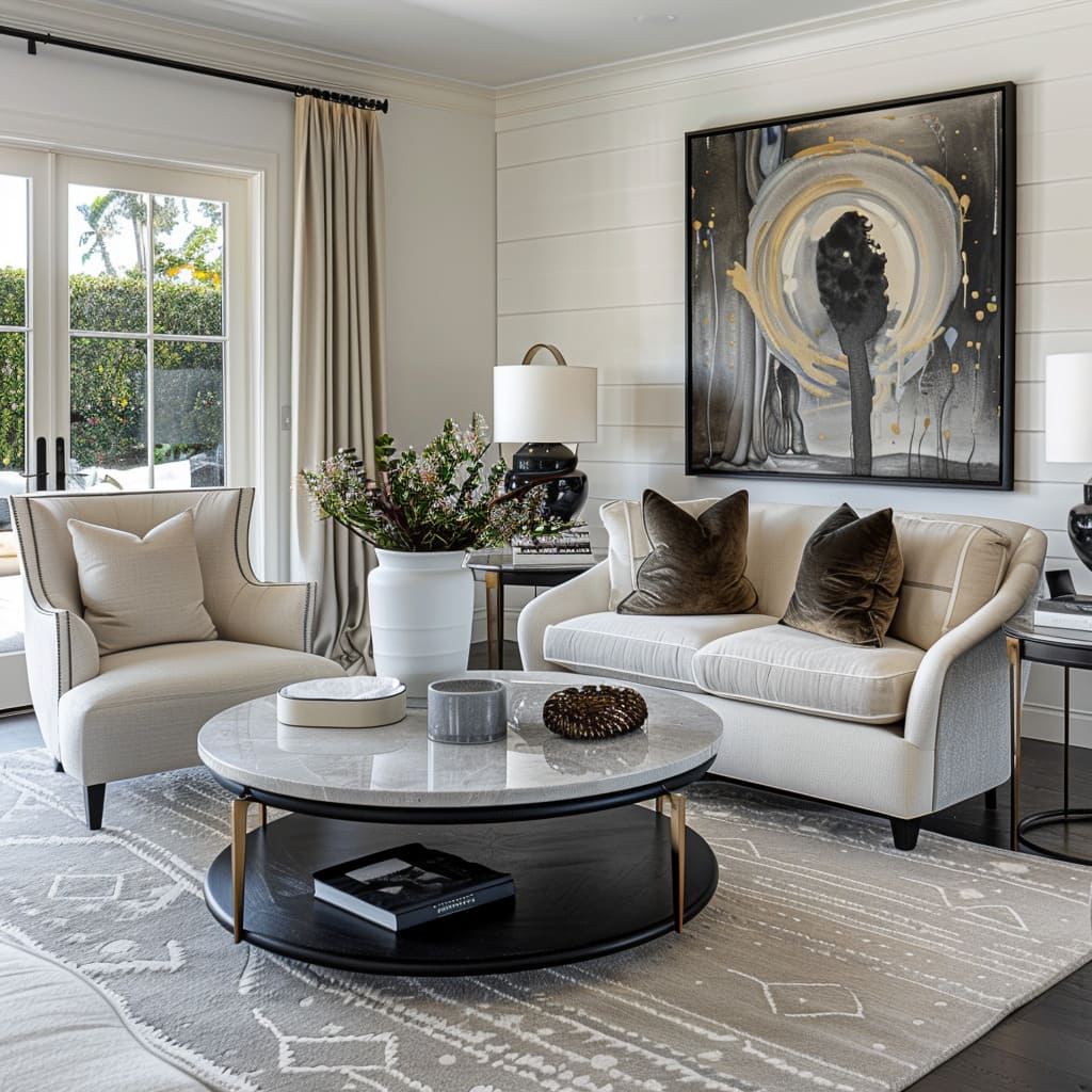
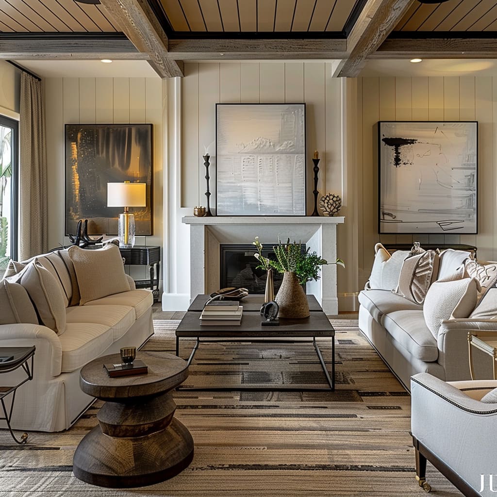
In a subtle dance of geometry, the interplay of shapes within these spaces contributes to an underlying complexity that belies their apparent simplicity. Circular tables converse with rectangular seating, and the gentle curves of a lamp stand against the straight lines of a shelf, creating a dynamic tension that is visually engaging.
This dance is choreographed with a deft hand, ensuring that no single form overwhelms but rather, each complements the other, contributing to a cohesive design language that speaks of thoughtfulness and a sophisticated understanding of spatial dynamics.
Repetitive Elements
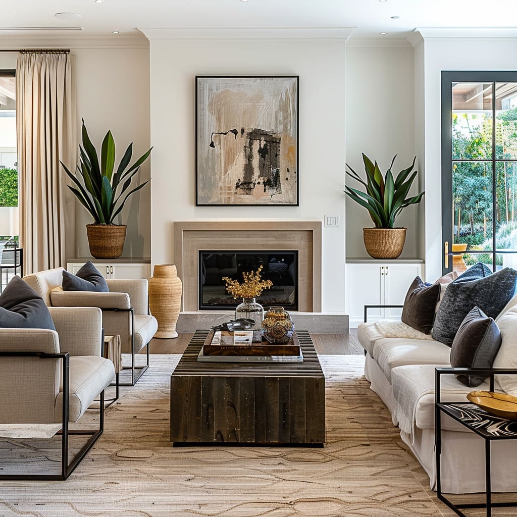
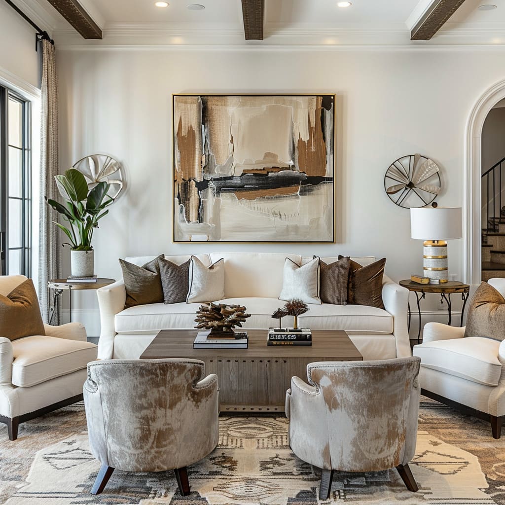
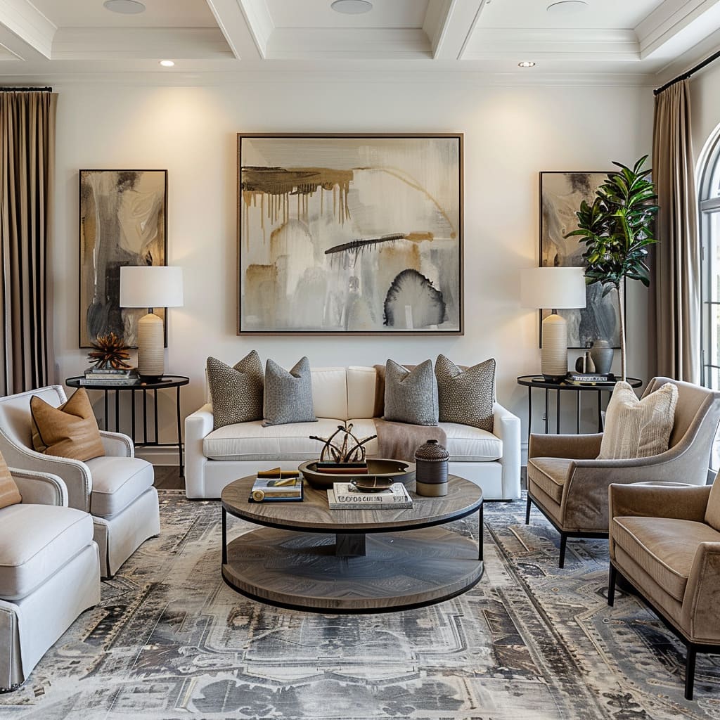
The use of repetitive elements is a rhythmic device in the symphony of design, creating a visual cadence that guides the observer through the space. These elements, whether they manifest as a series of frames along a wall or the repeated use of a particular material, serve as motifs that reinforce the design narrative.
They bring order to a space, offering a thread of continuity that allows the eye to move effortlessly from one element to the next. This repetition is not monotonous but rather a celebration of pattern and rhythm that underpins the harmony of the space, much like the chorus in a piece of music that ties the verses together.
Balance and Harmony
The final section brings us to the equilibrium of design, where colors, forms, and traditions converge to create balance and harmony. A reticent palette sets the emotional tone of a room, enveloping it in tranquility and calm.
Purposeful asymmetry injects a modern vibe into spaces, offering a fresh take on traditional symmetry and balance. Lastly, the progressive tradition in design looks forward while keeping one foot grounded in the past.
This section will dissect how these elements interact to create interiors that are at once serene and stimulating, classic yet contemporary.
Reticent Palette
The reticent palette used within these designs speaks to an understanding of color as an emotional language. The hues are subdued, fostering a tranquil atmosphere where relaxation is intuitive.
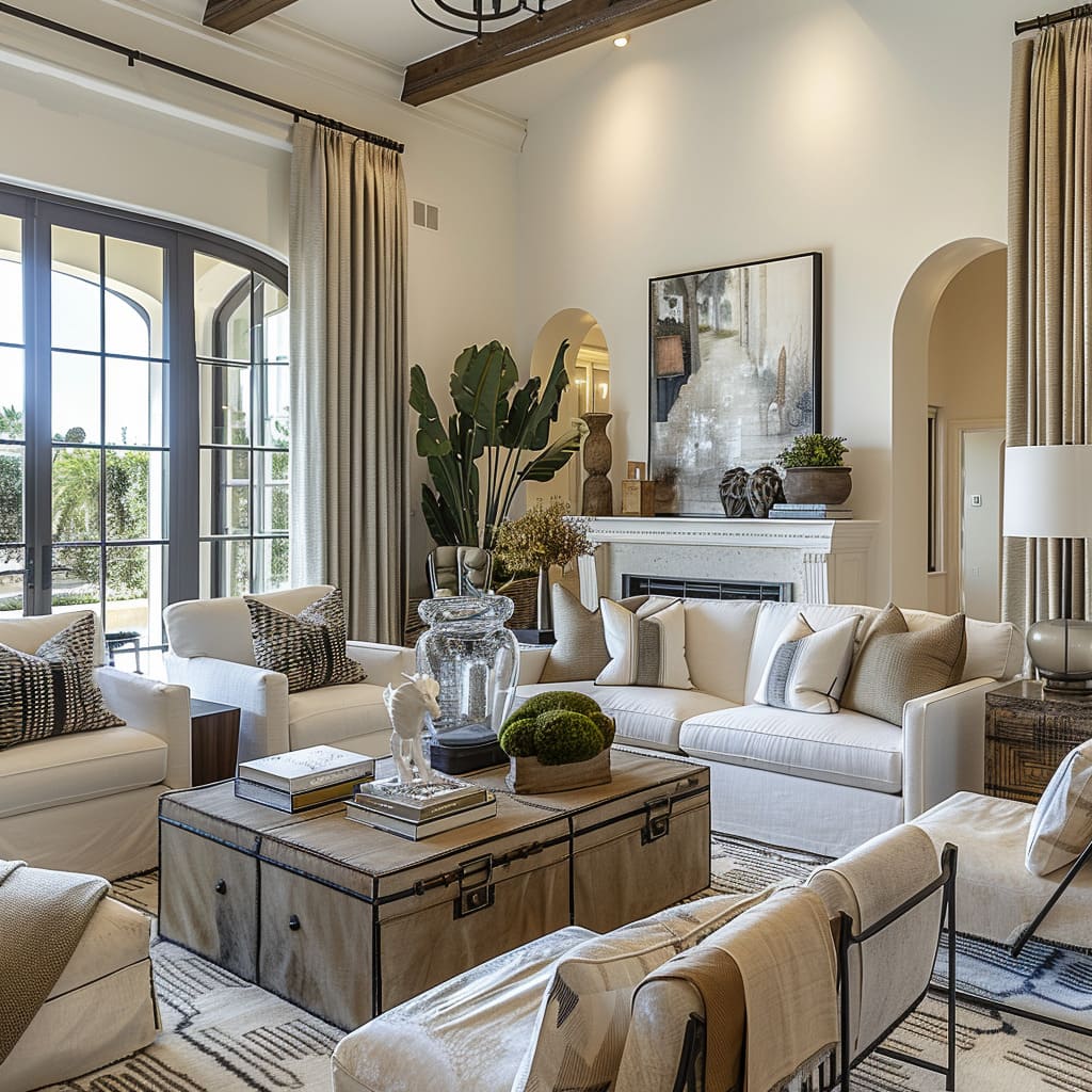
This restraint in color selection is not mere minimalism; it’s a choice that reflects a nuanced approach to design, where the whisper of color has more impact than a shout. Soft taupe, gentle greys, and warm off-whites serve as the backdrop, while the occasional infusion of deeper tones adds depth without disturbing the peaceful chromatic harmony.
The result is a visual experience akin to a quiet conversation rather than a boisterous dialogue, allowing for reflection and repose.
Purposeful Asymmetry
In embracing purposeful asymmetry, these spaces challenge the traditional dictates of balance. This deliberate departure from symmetry brings an element of surprise and modernity to the layout.
Furnishings are placed to not only optimize space but also to create points of interest and functional zones that break the monotony of mirrored design. Decorative elements are balanced in such a way that they seem to be in a natural, casual state, rather than one that is overly contrived.
Asymmetry here is not random but a considered choice that adds a layer of sophistication and freshness to the classic foundation of the space.
Progressive Tradition
Progressive tradition in design acknowledges that the aesthetics of the past are the building blocks for the future. In these spaces, classic forms are given new life with updated materials and a streamlined aesthetic that eschews fussiness in favor of clean lines and functionality.
The reverence for historical design is evident, yet there’s an unmistakable push towards a future where practicality and beauty coexist in equal measure.
This approach to tradition is not about recreating the past, but rather reinterpreting it, distilling its essence into forms and functions that resonate with the contemporary dweller. It’s an alchemy of sorts, turning the time-tested metals of design into the gold standard for modern luxury living.
As we conclude our exploration of the nuanced layers that make up these thoughtfully designed spaces, we recognize that each characteristic serves a higher purpose. From the ergonomic consideration that cradles the human form to the ambient lighting that paints our moods; from the textiles that speak a tactile language to the very structure of our surroundings that commands our gaze upward and outward—the sum of these parts is a holistic environment that balances form and function, tradition and innovation, continuity and contrast.
The result is an interior not just built to be seen, but to be felt, experienced, and lived in—a testament to the idea that the best design is not one that simply fills a space, but one that fulfills the human experience within it.


