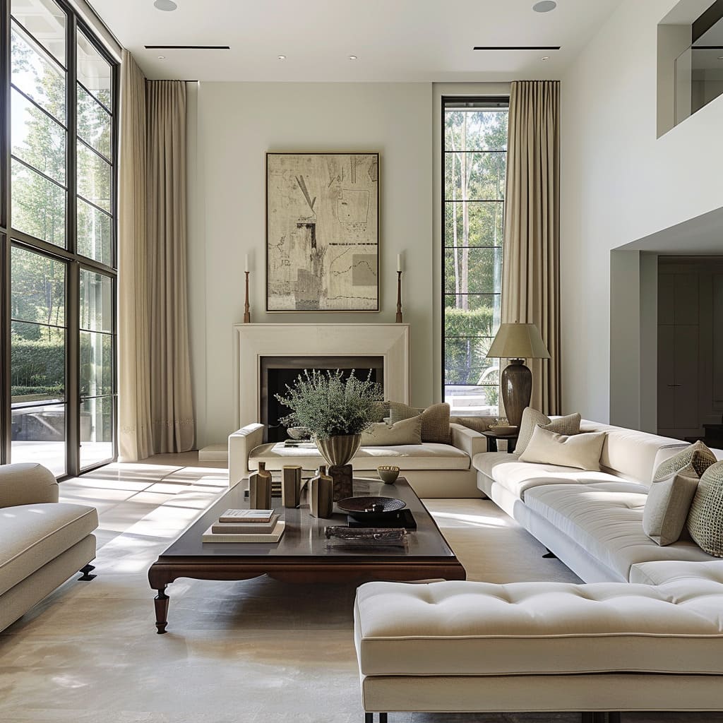
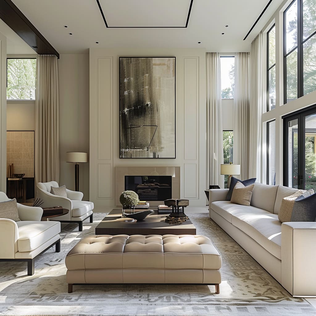
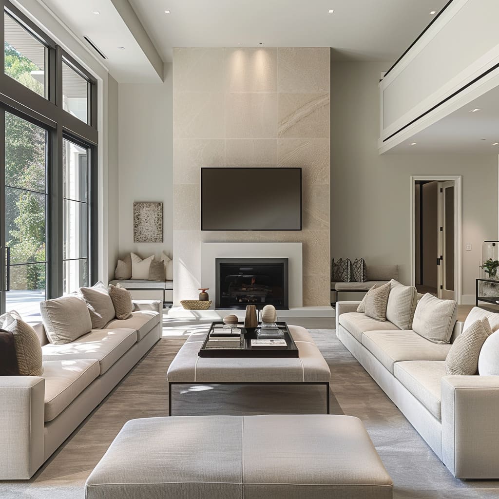
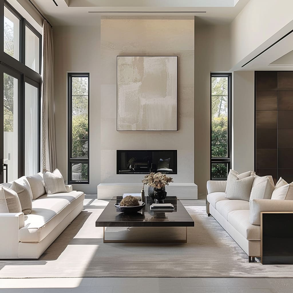
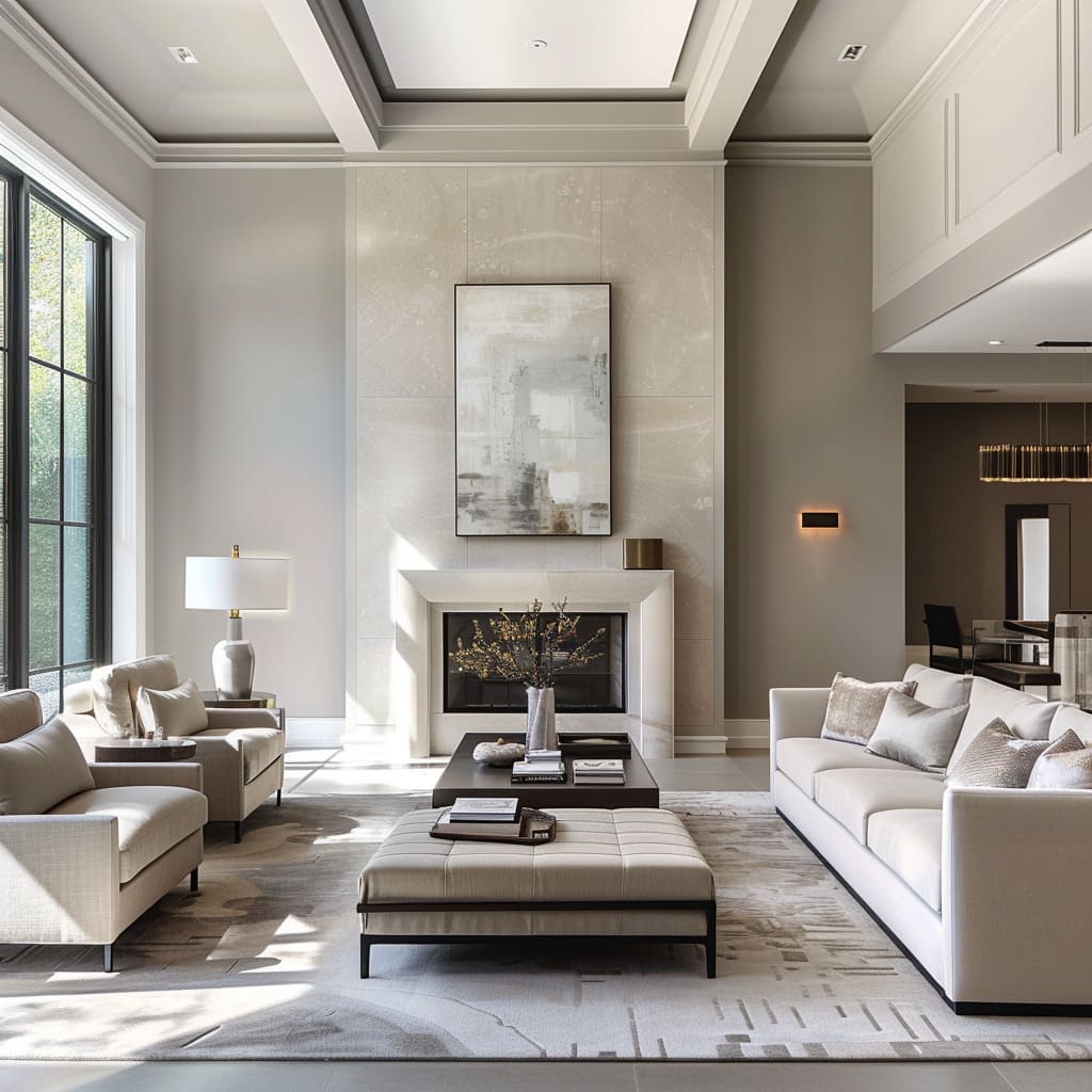
In an era where the essence of space transcends mere functionality, the concept of functional design emerges as a beacon of innovation and comfort. This article delves into the intricate layers of functional design, a philosophy that harmonizes aesthetics with practicality, creating environments that are not only visually appealing but also inherently user-centric.
Through the exploration of ample walkways, strategic furniture placement, and the artful use of mirrors and colors, we uncover how these elements coalesce to craft spaces that breathe simplicity yet exude sophistication. The journey through functional design is a testament to the meticulous orchestration of every detail, ensuring that each component contributes to a cohesive and inviting atmosphere.
Functional Design
Ample Walkways
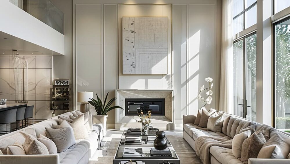
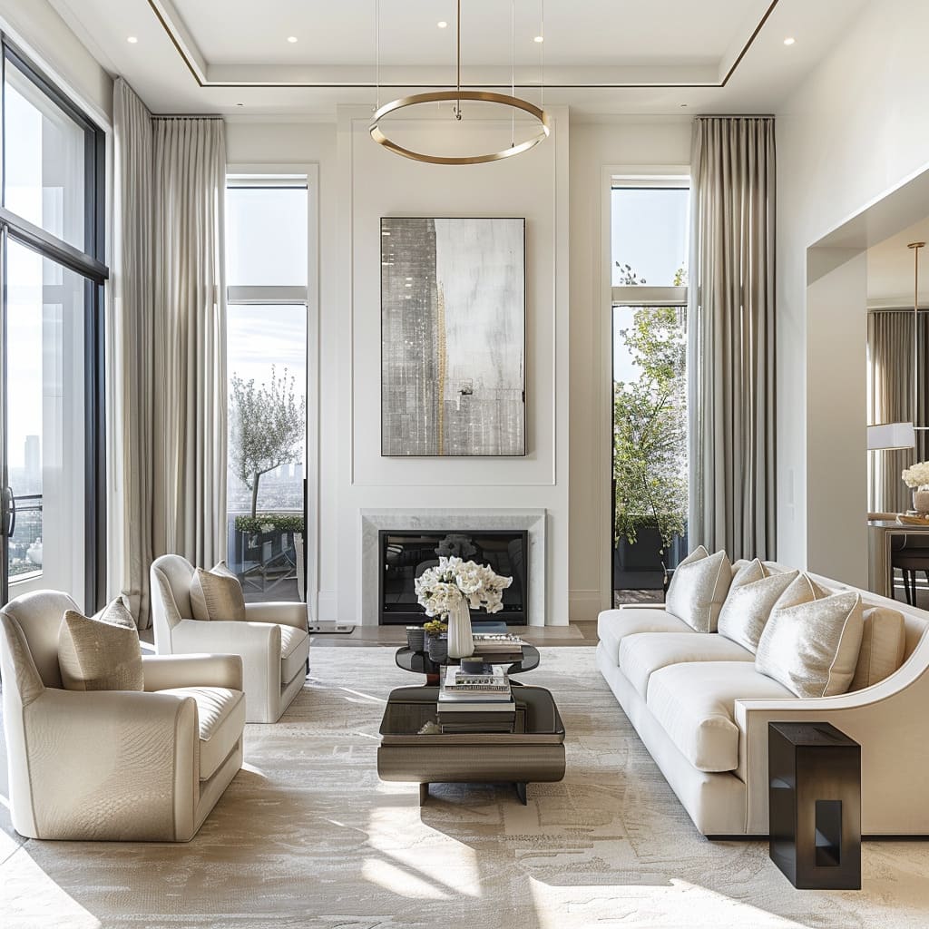
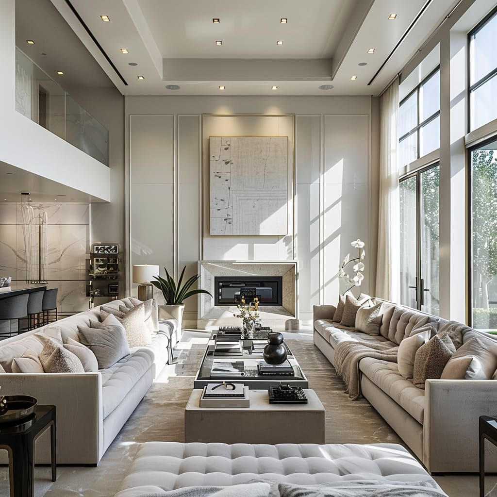
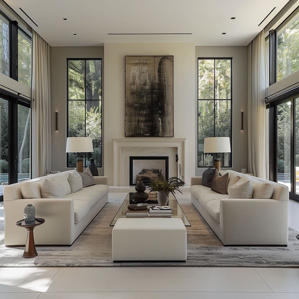
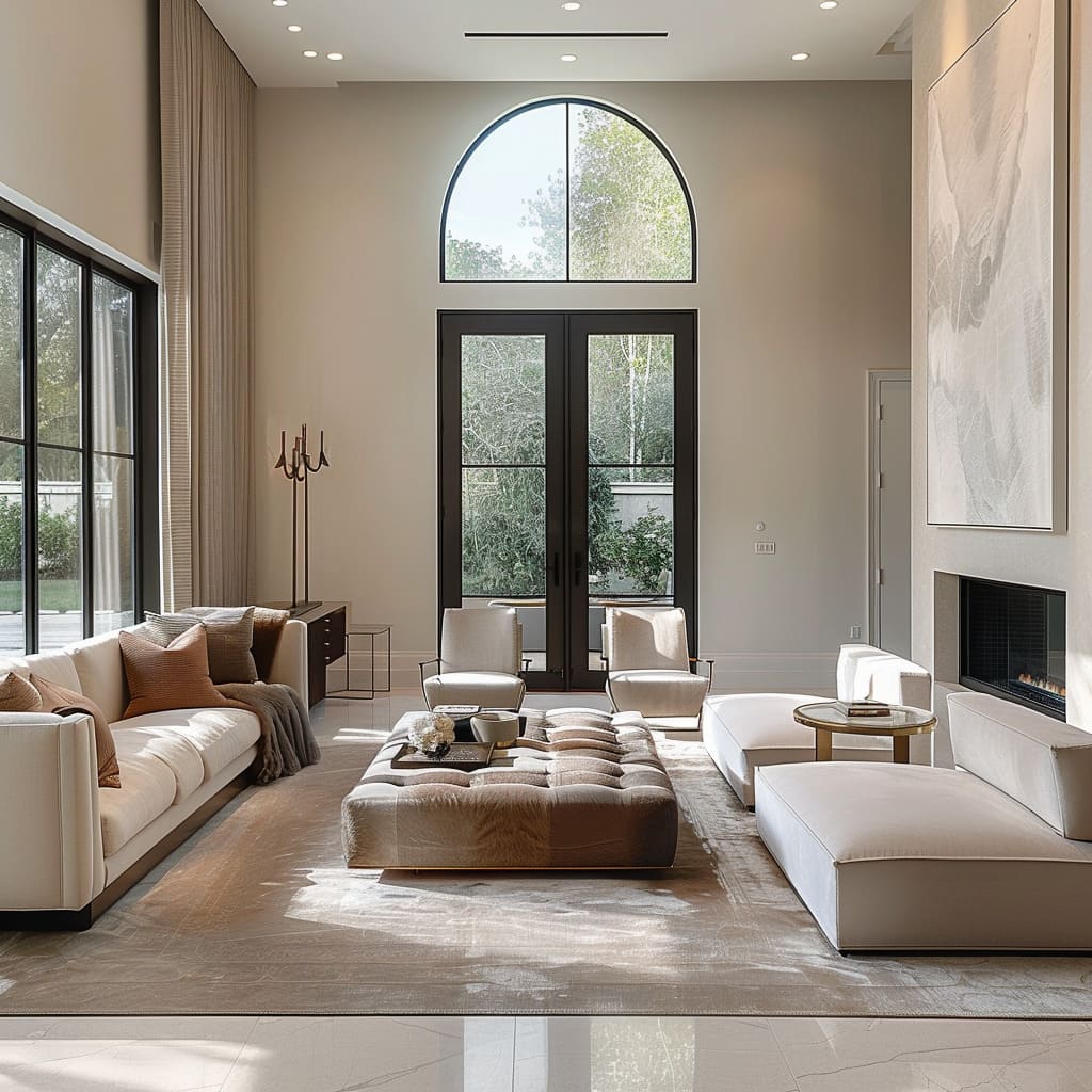
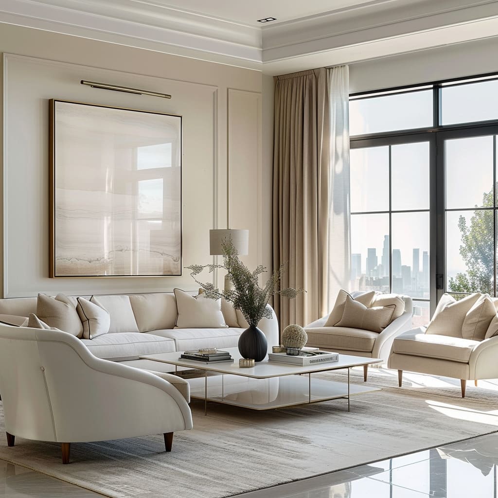
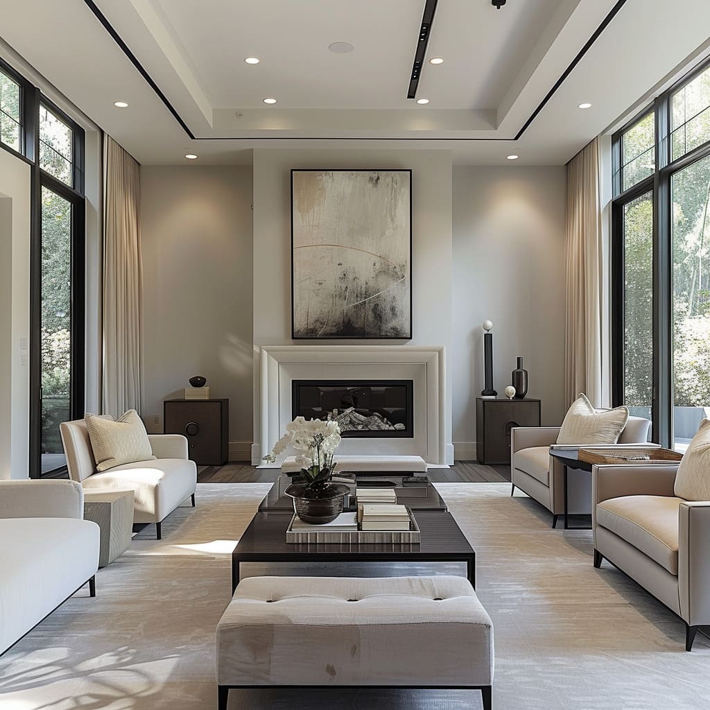
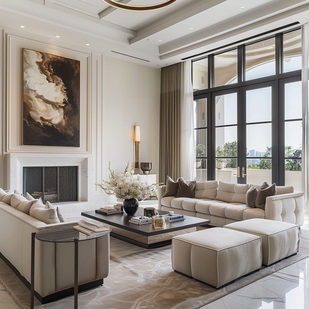
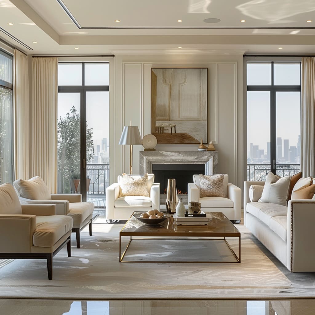
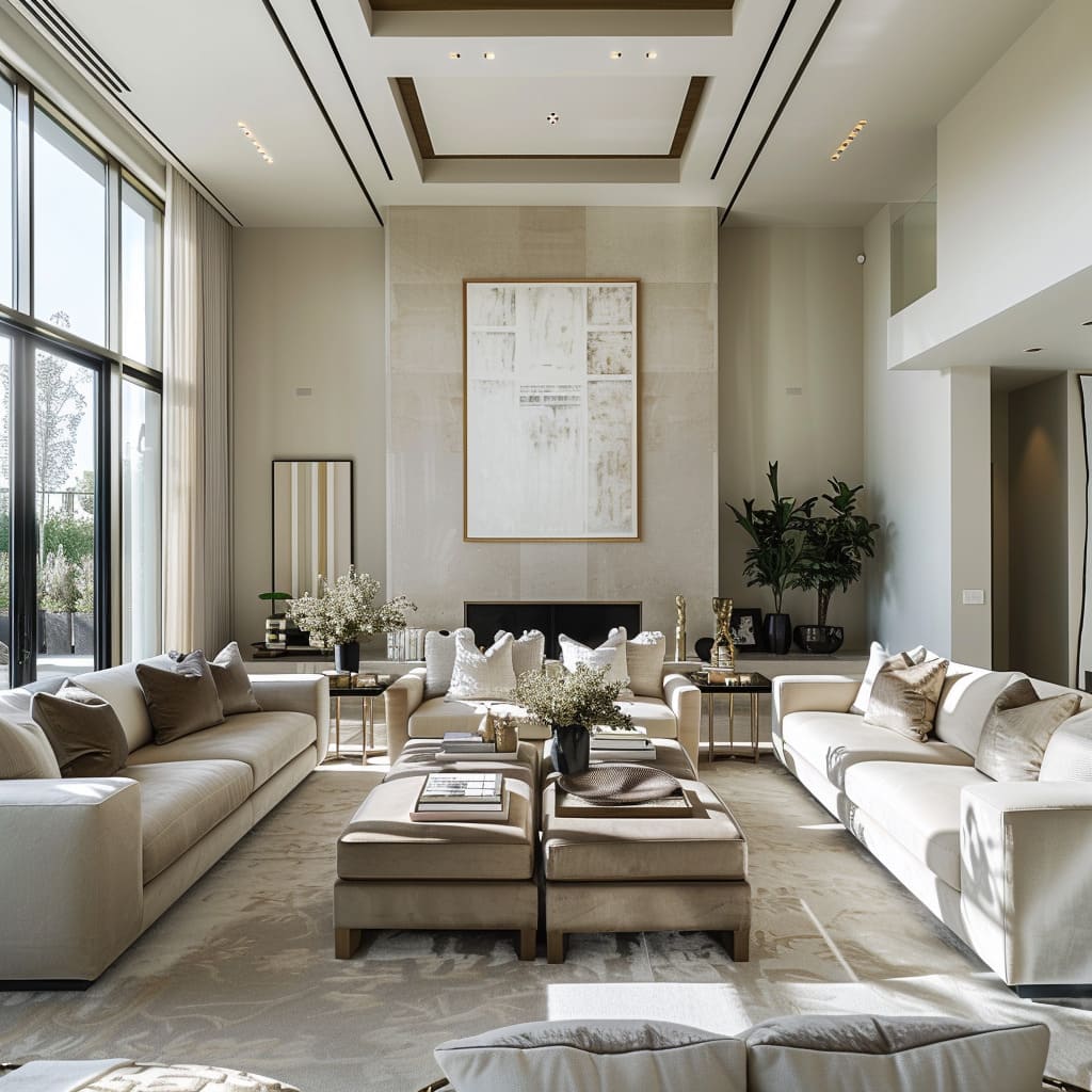
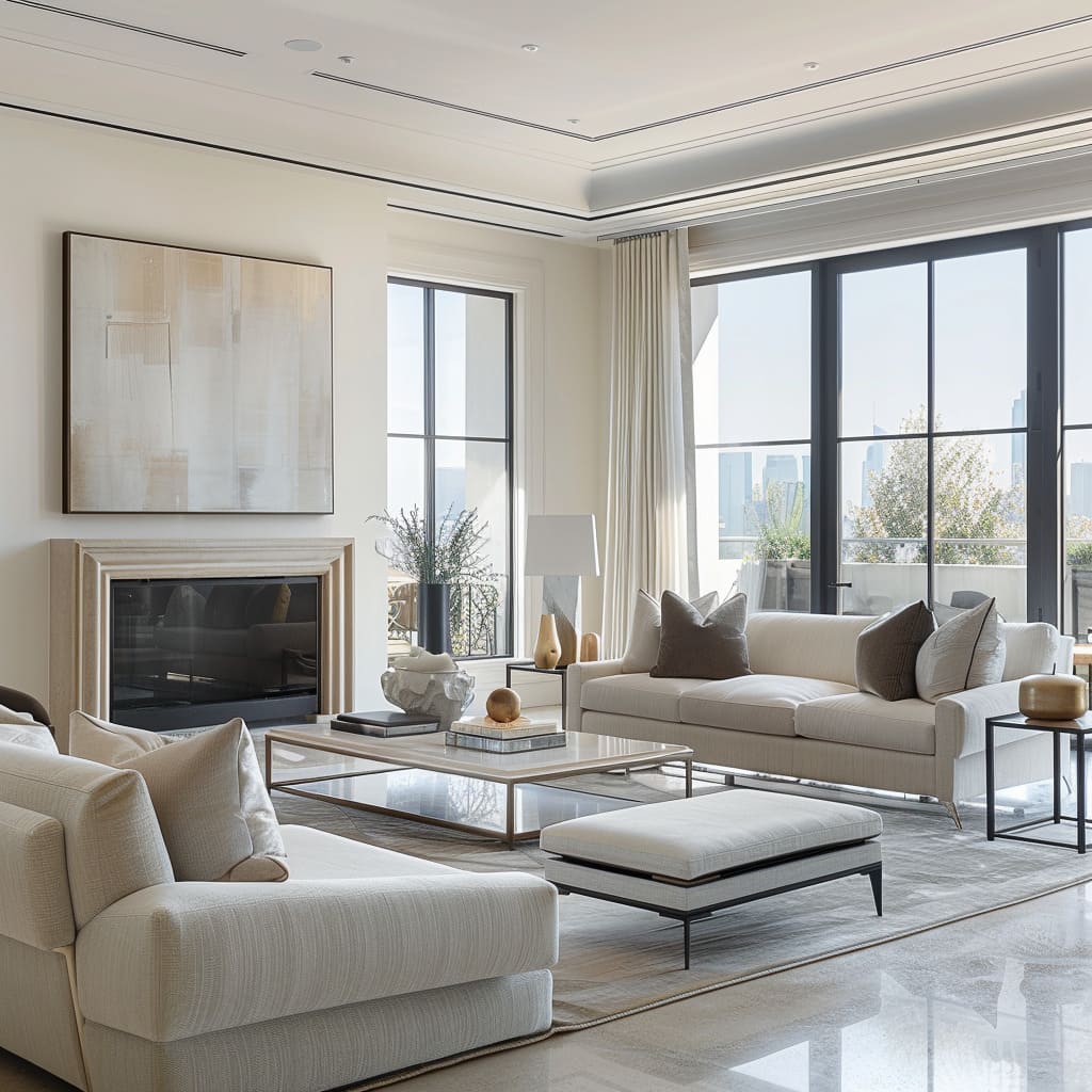
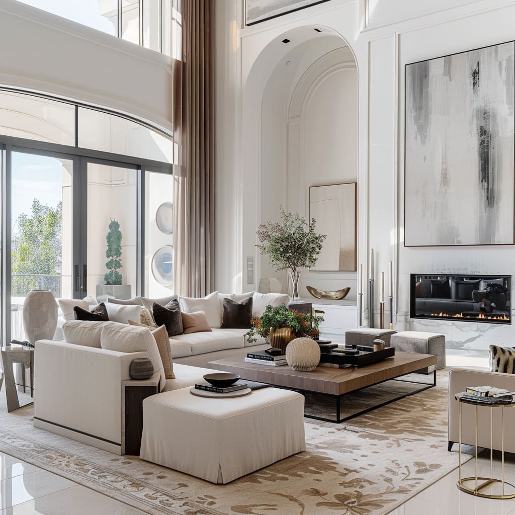
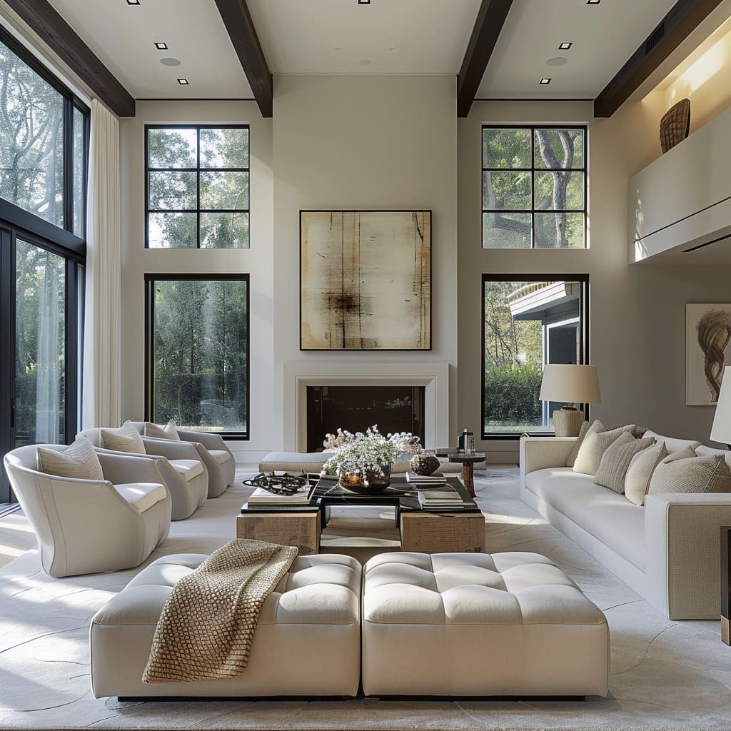
The design generously incorporates wide and unobstructed walkways, offering ease of movement throughout the space. These spacious paths are deliberately planned to allow multiple individuals to pass by each other comfortably, which is especially valuable in gathering areas.
This approach not only facilitates smooth foot traffic but also gives the room an airy, open feel, enhancing the overall sense of space.
Functional Layout
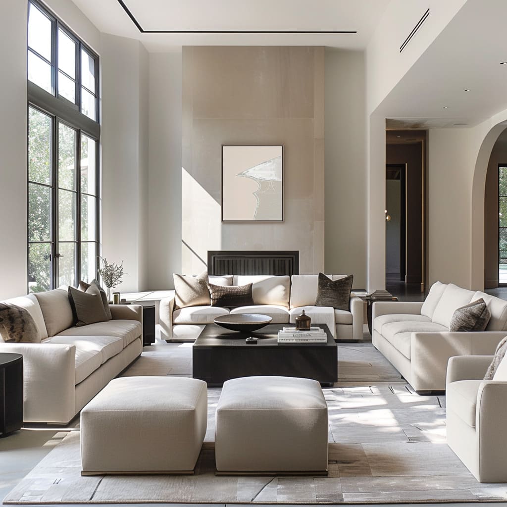
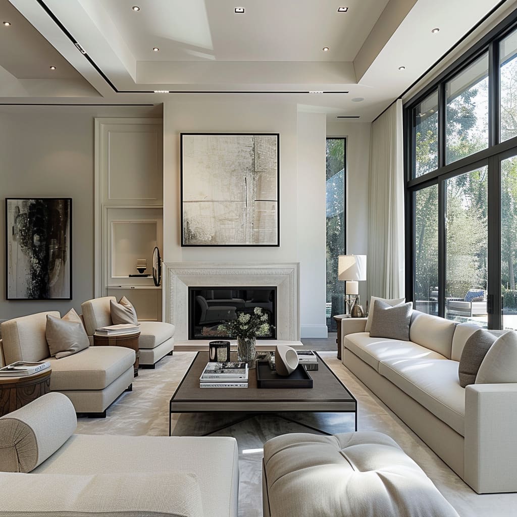
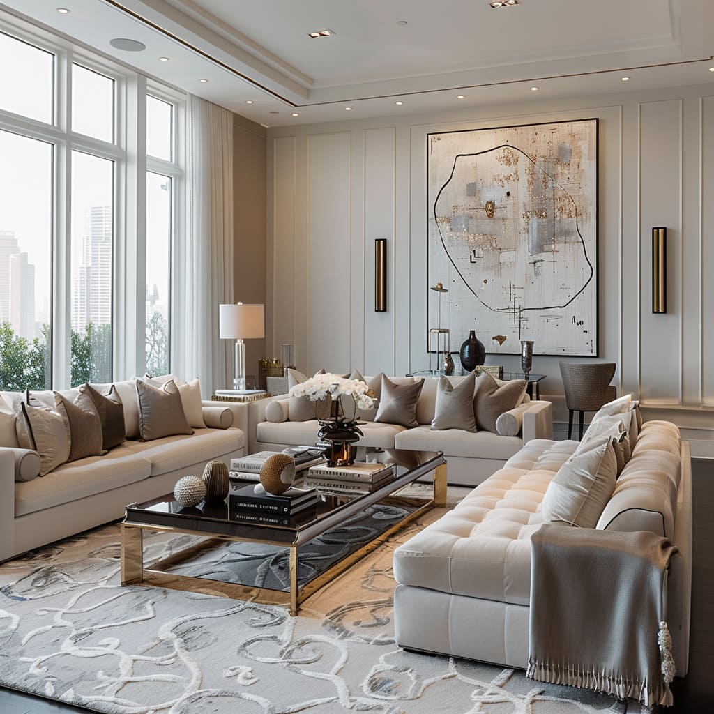
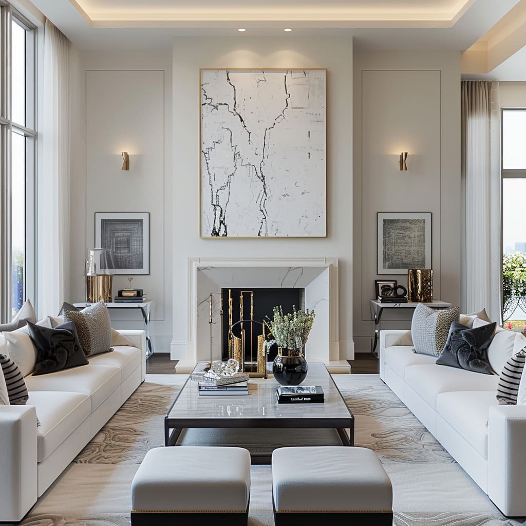
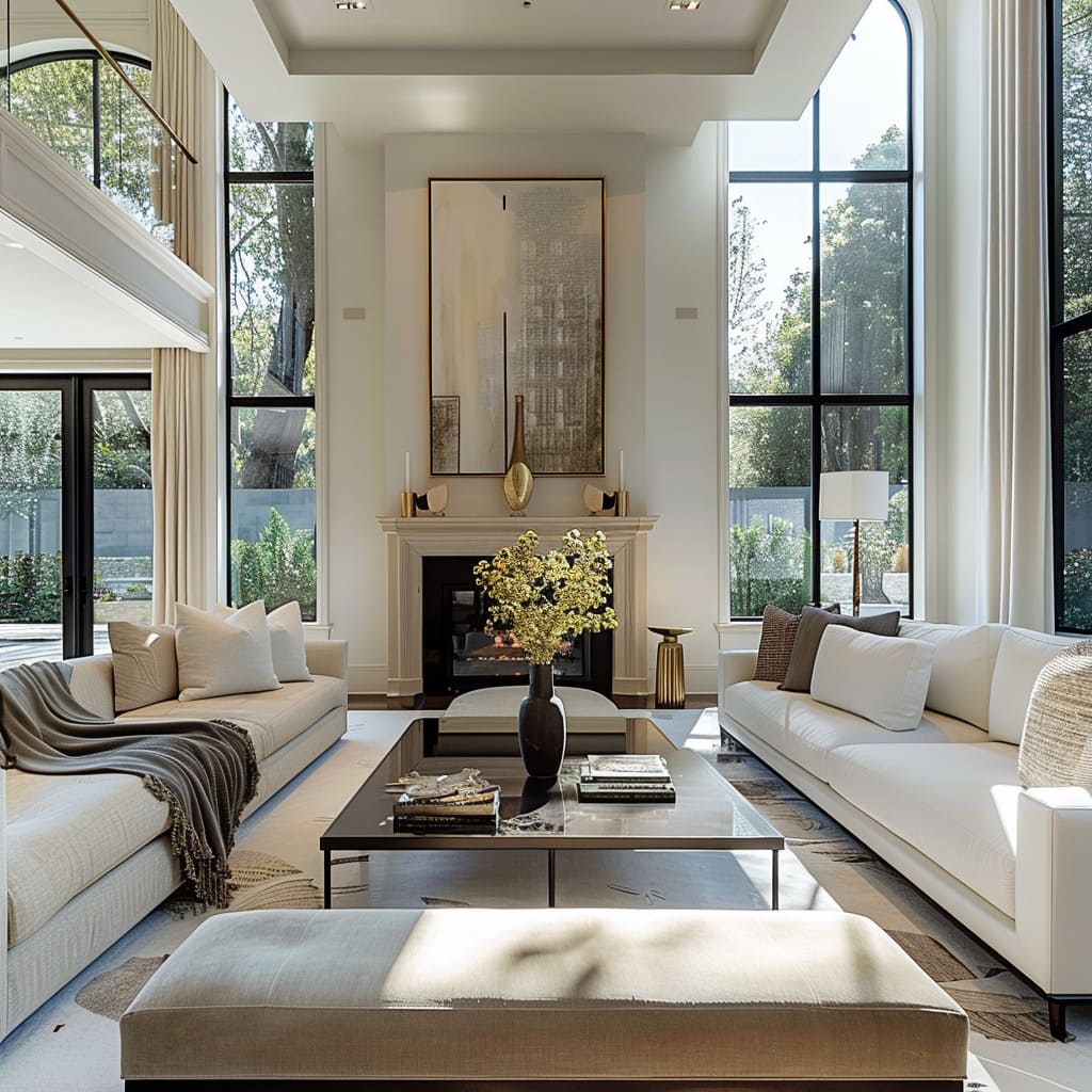
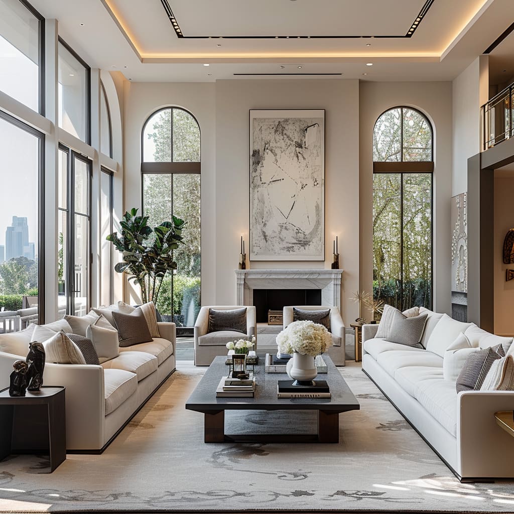
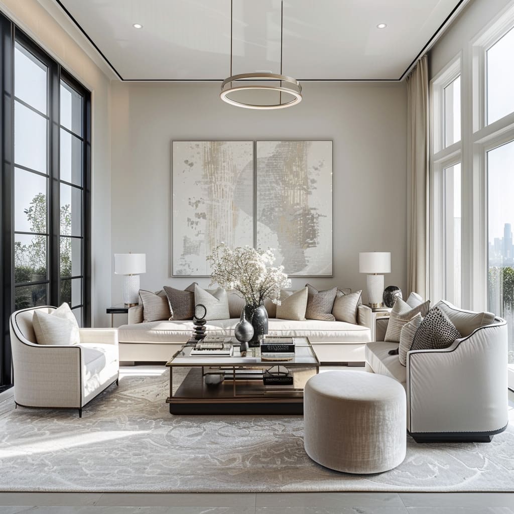
Each piece of furniture is meticulously placed, ensuring that the arrangement serves practical needs without sacrificing aesthetics. The layout is crafted to encourage both interaction and personal space, with seating arranged to facilitate conversation while also providing individual comfort.
Accessibility and flow are taken into account, with every item easily reachable and the room remaining navigable even when all seats are taken.
Strategically Placed Mirrors
Mirrors are thoughtfully positioned to optimize the natural light entering through windows and to visually expand the space. By reflecting the room, they double the visual impact of key design elements and bring a dynamic layer to the static environment.
Moreover, their placement is such that they can highlight architectural features or artwork, adding depth and dimension to the design.
Unified Hardware Finishes
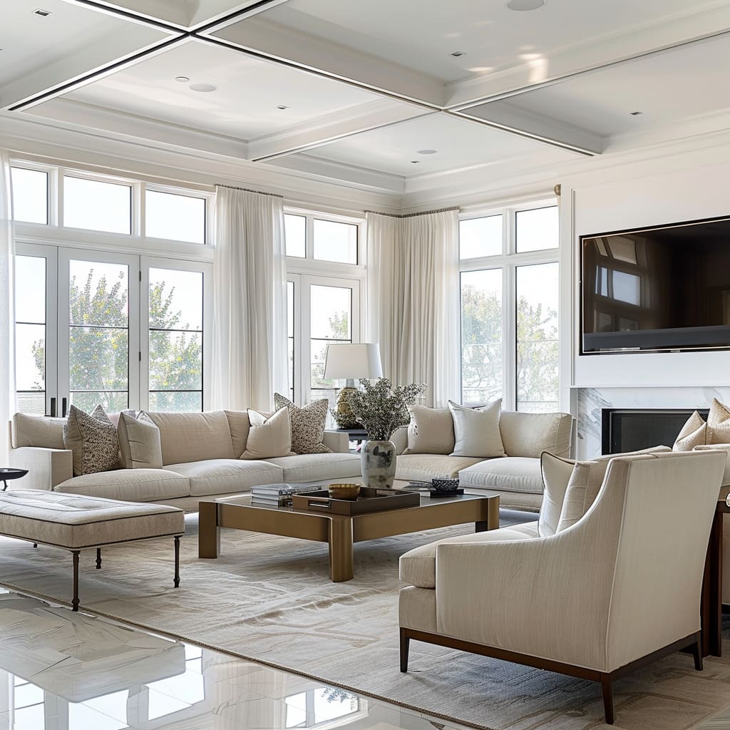
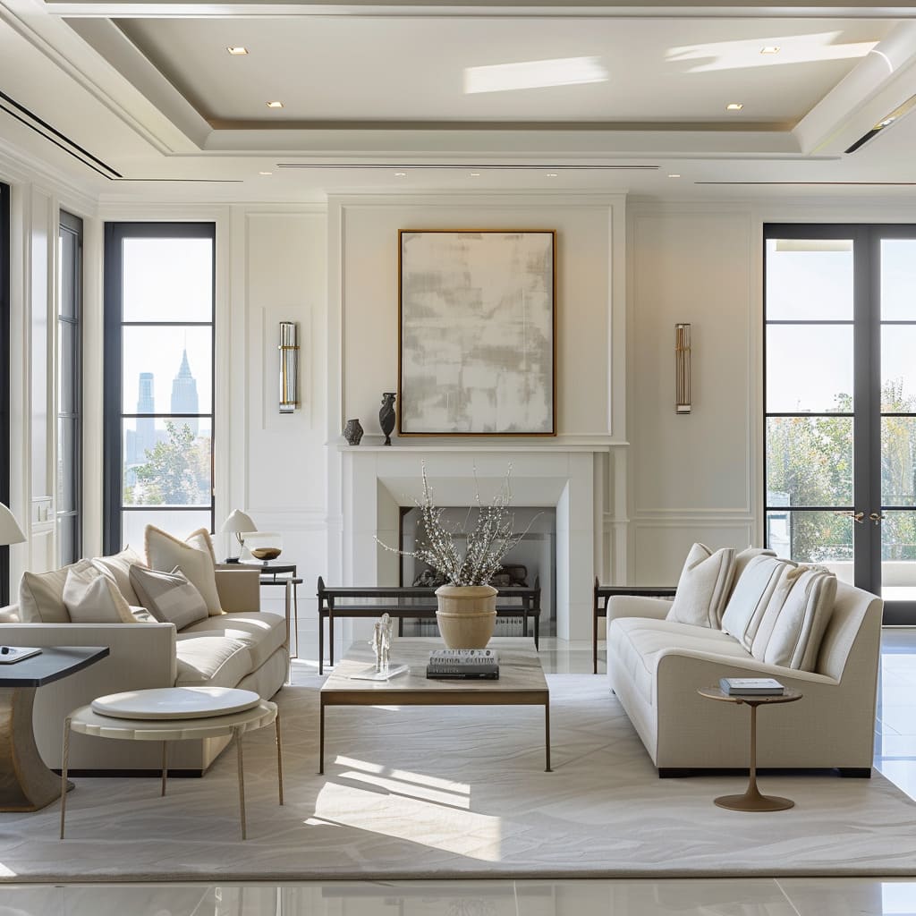
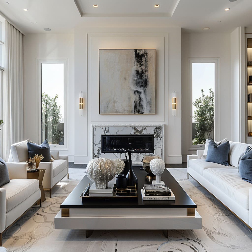
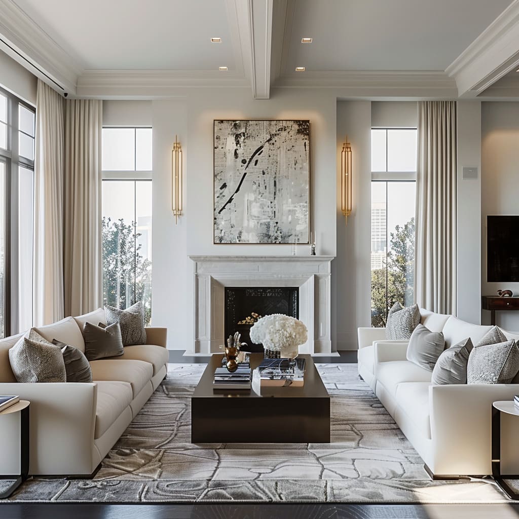
The metal hardware throughout the room boasts a cohesive finish, creating a subtle continuity that ties the space together. Whether it’s the handles, light fixtures, or decorative elements, this uniformity in finish ensures that the metal accents do not distract but instead complement the room’s overall palette and texture.
Discreet Storage Solutions
Storage is integrated into the design so seamlessly that it becomes almost invisible, preserving the room’s sleek lines and uncluttered appearance. The storage units are often built into walls or tucked beneath other furniture, maintaining the room’s minimalist aesthetic while offering ample space to stow away belongings, ensuring that functionality is not compromised.
Simplified Color Scheme
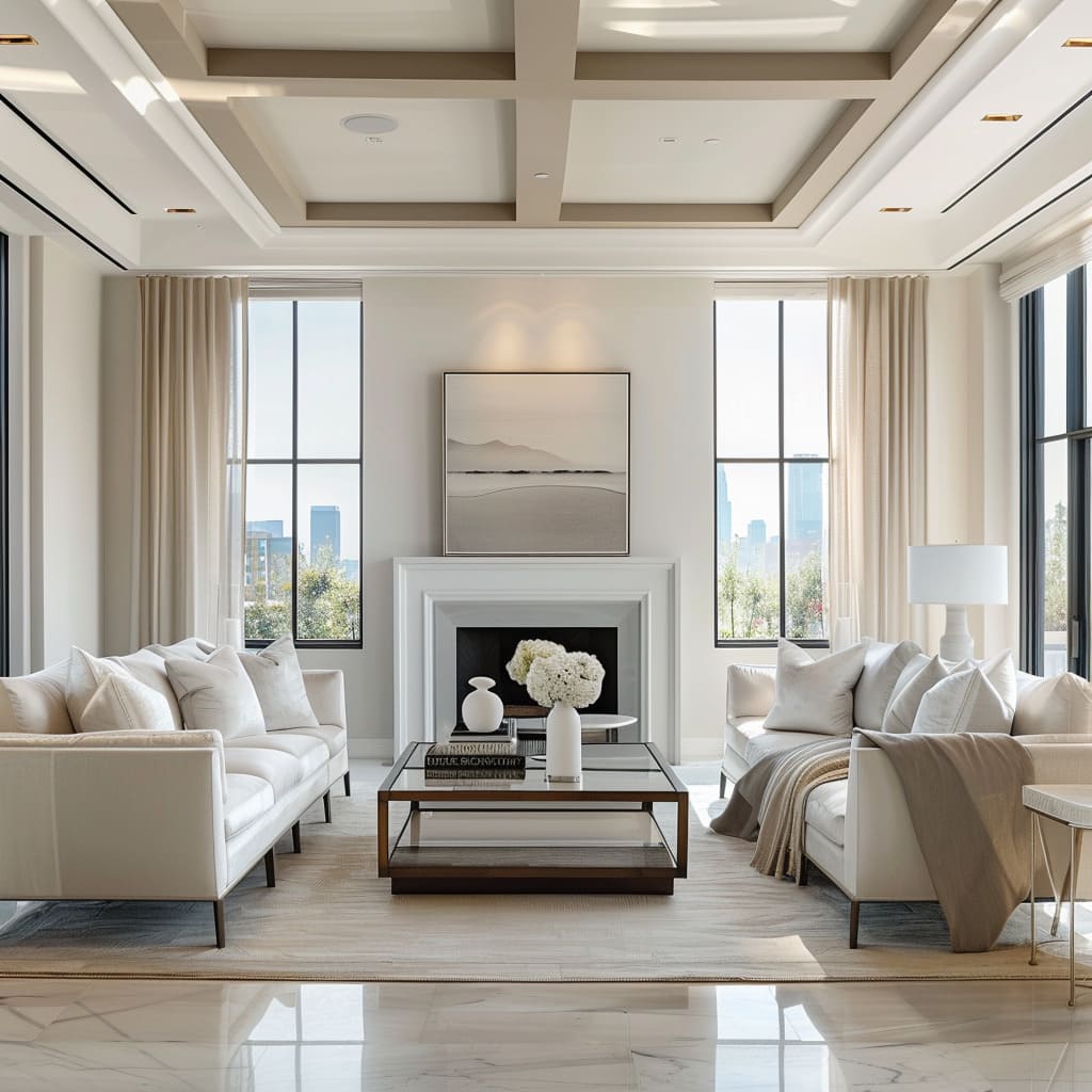
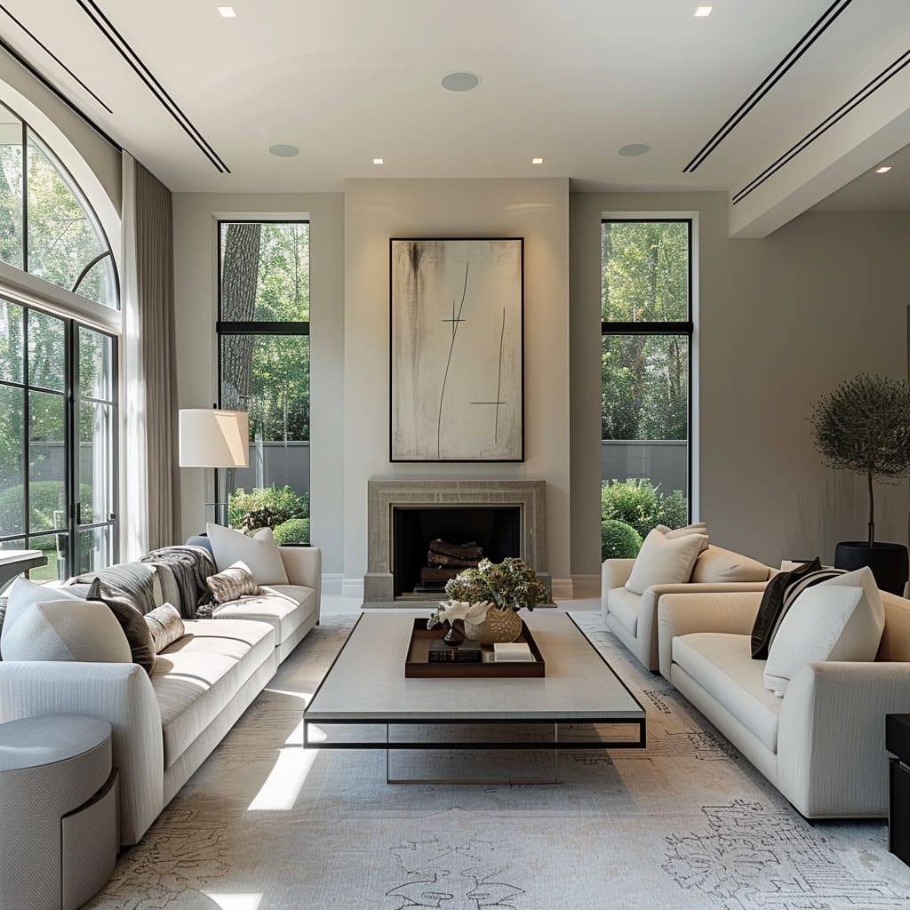
The color scheme is carefully curated to embody simplicity and sophistication, often limited to two or three complementary hues. This restrained palette fosters a serene and cohesive environment, where the interplay of colors is subtle yet impactful.
The chosen hues work in harmony to create a tranquil backdrop for both the inhabitants and the design features to stand out.
Intentional Negative Space
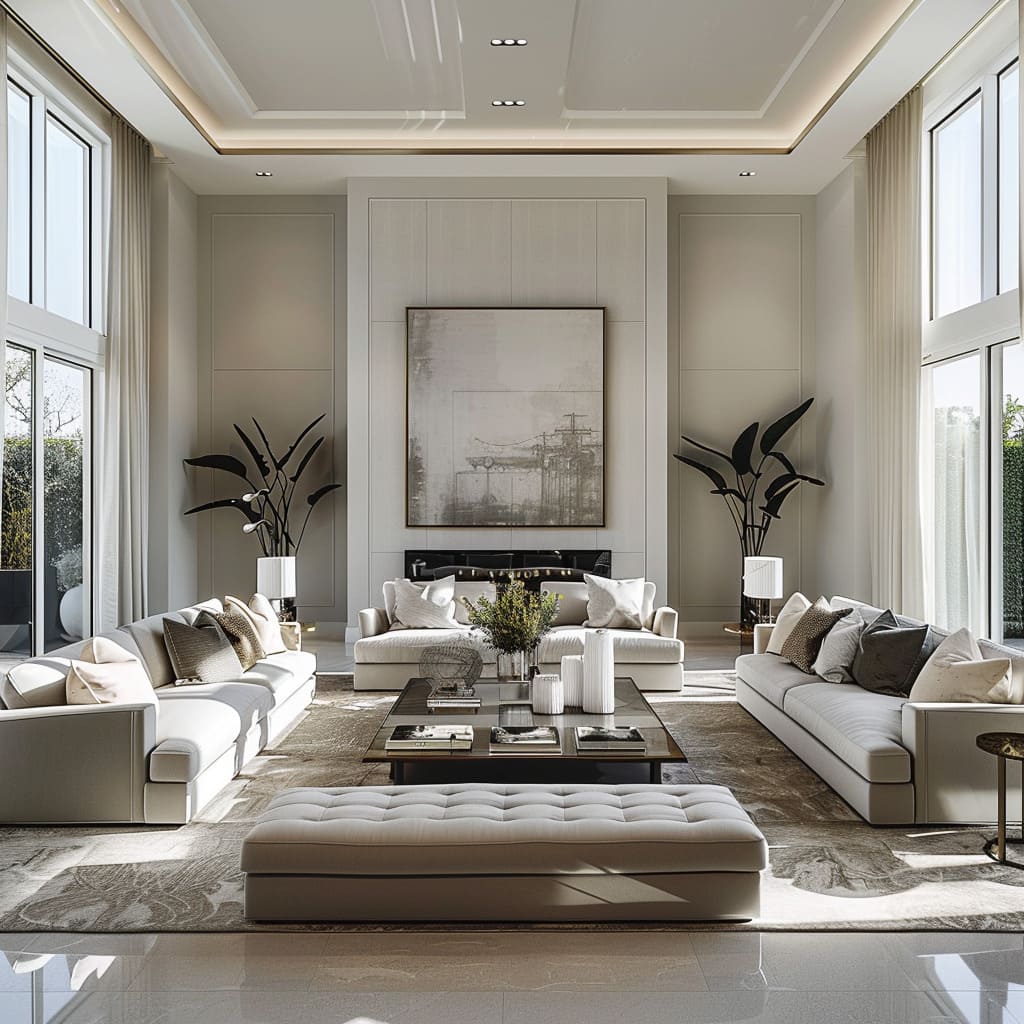
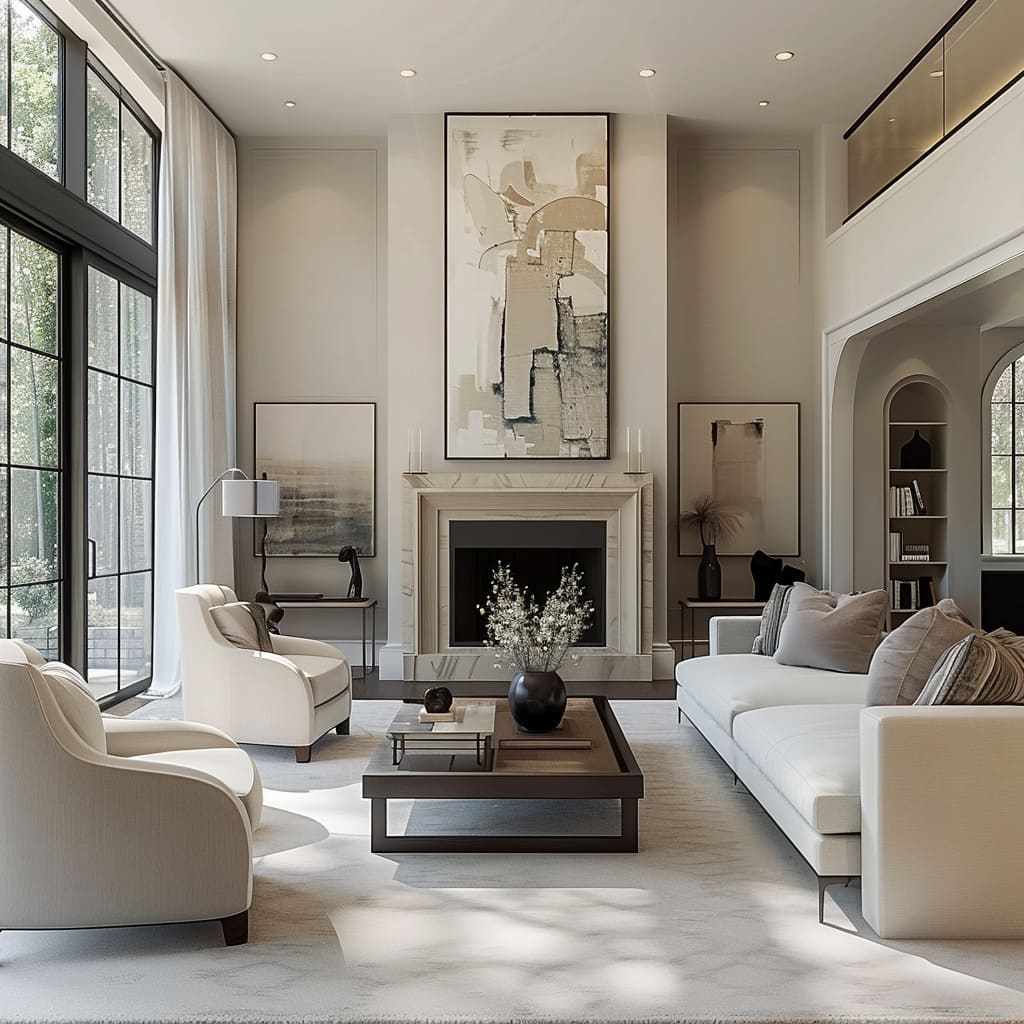
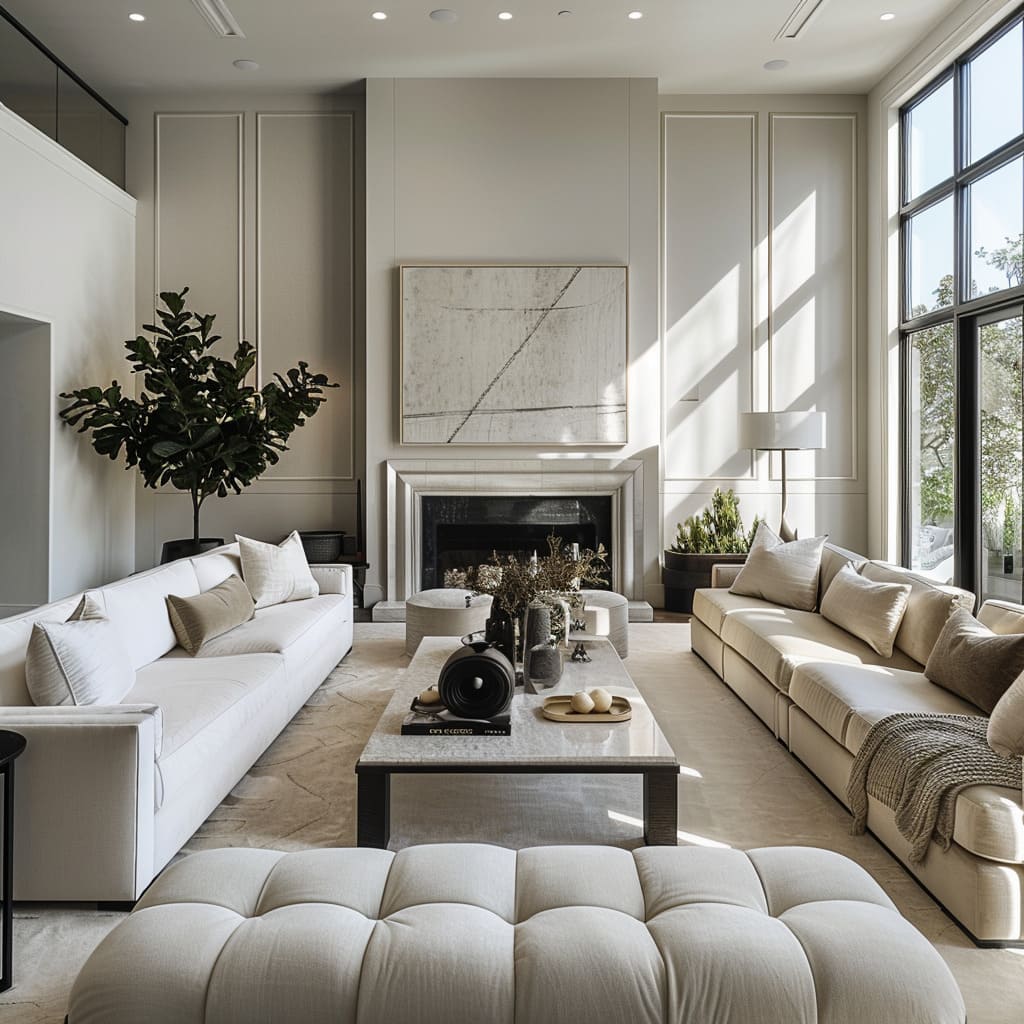
The design intentionally embraces negative space, avoiding the temptation to fill every corner. This conscious choice to leave certain areas unoccupied lends a tranquil and spacious atmosphere to the room.
It allows the existing design elements to breathe and stand out, ensuring that the room feels balanced and the occupants can enjoy a sense of peacefulness and decluttered living.
The principles of functional design, as elucidated through this article paragraph, serve as a testament to the fact that beauty and practicality need not be mutually exclusive. The incorporation of ample walkways exemplifies a profound understanding of the symbiosis between spatial planning and human interaction, where the capacity for movement is as much about ease as it is about the fluid dance of social engagement and personal freedom within a shared environment.
It is this fusion of the pragmatic with the poetic that gives rise to a living space that breathes and evolves in concert with its inhabitants.
Harmonious Elements
Sleek Surface Finishes
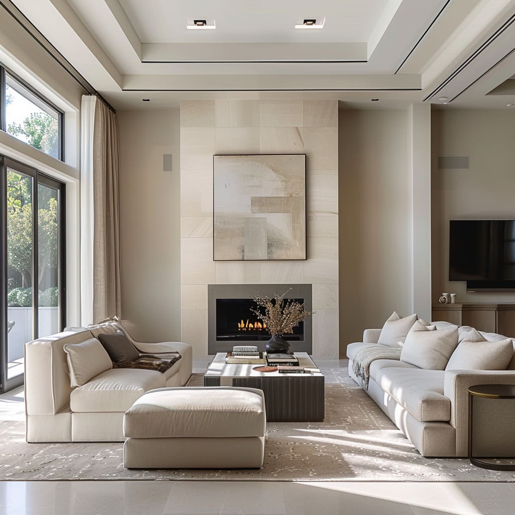
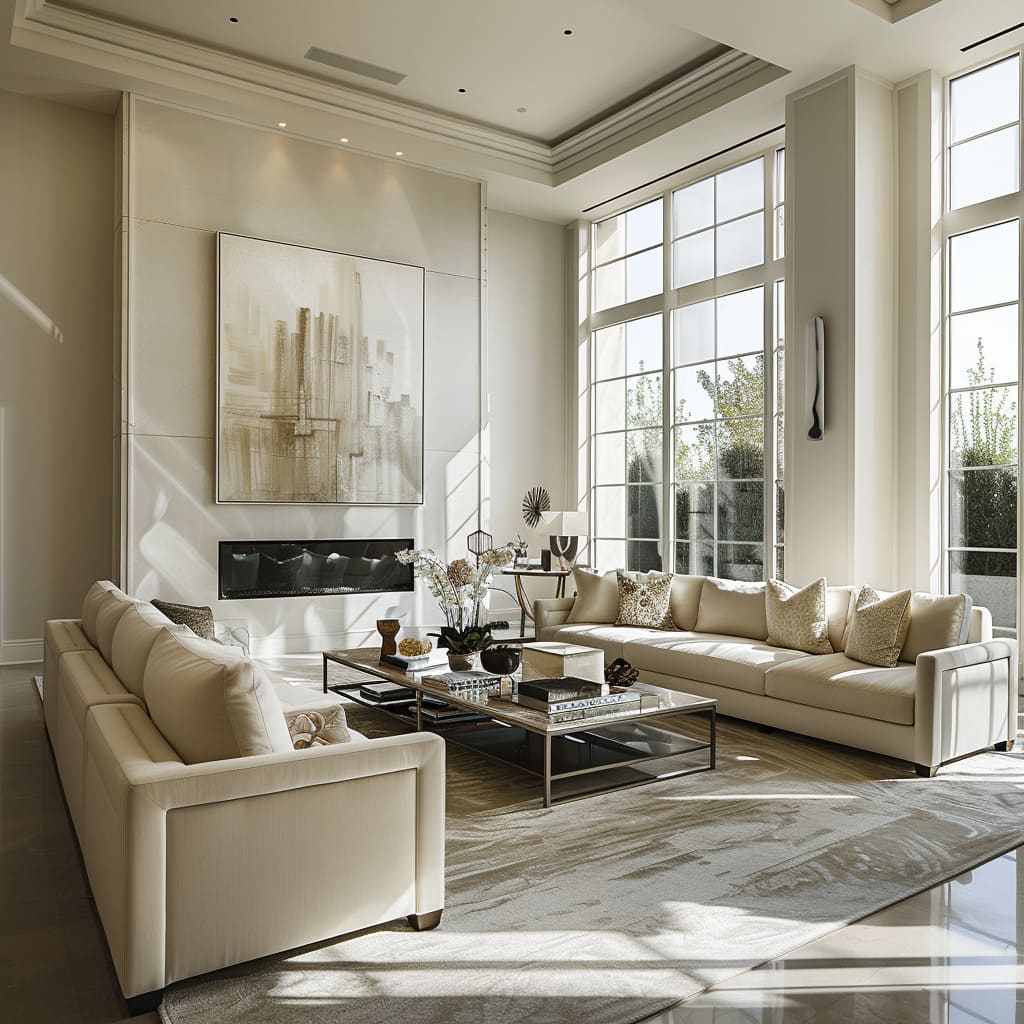
Surface finishes throughout the environment are characterized by their sleekness, with a preference for matte or semi-matte treatments that diffuse light gently, reducing glare and creating a sophisticated ambiance. The choices of materials, whether for flooring, wall treatments, or furniture finishes, are consistent in their understated elegance, promoting a calm and contemporary feel.
These surfaces are not only visually pleasing but also practical, as they tend to conceal fingerprints and smudges, contributing to the clean and well-maintained appearance of the space. The matte finishes offer a tactile experience that invites touch while still maintaining an aura of refinement.
They play a crucial role in the absorption and soft dispersion of light, enhancing the overall muted and luxurious tone of the design.
The sleek surface finishes, while aesthetically pleasing, are far more than visual treats. They are the tactile elements of a design language that speaks in textures and temperatures, inviting touch and exploration, and creating a sensory dialogue between the space and those who inhabit it.
Soft Textural Elements
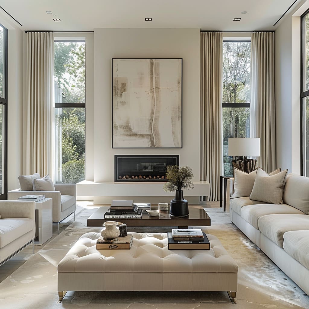
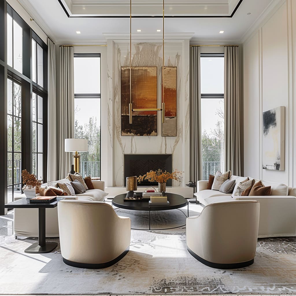
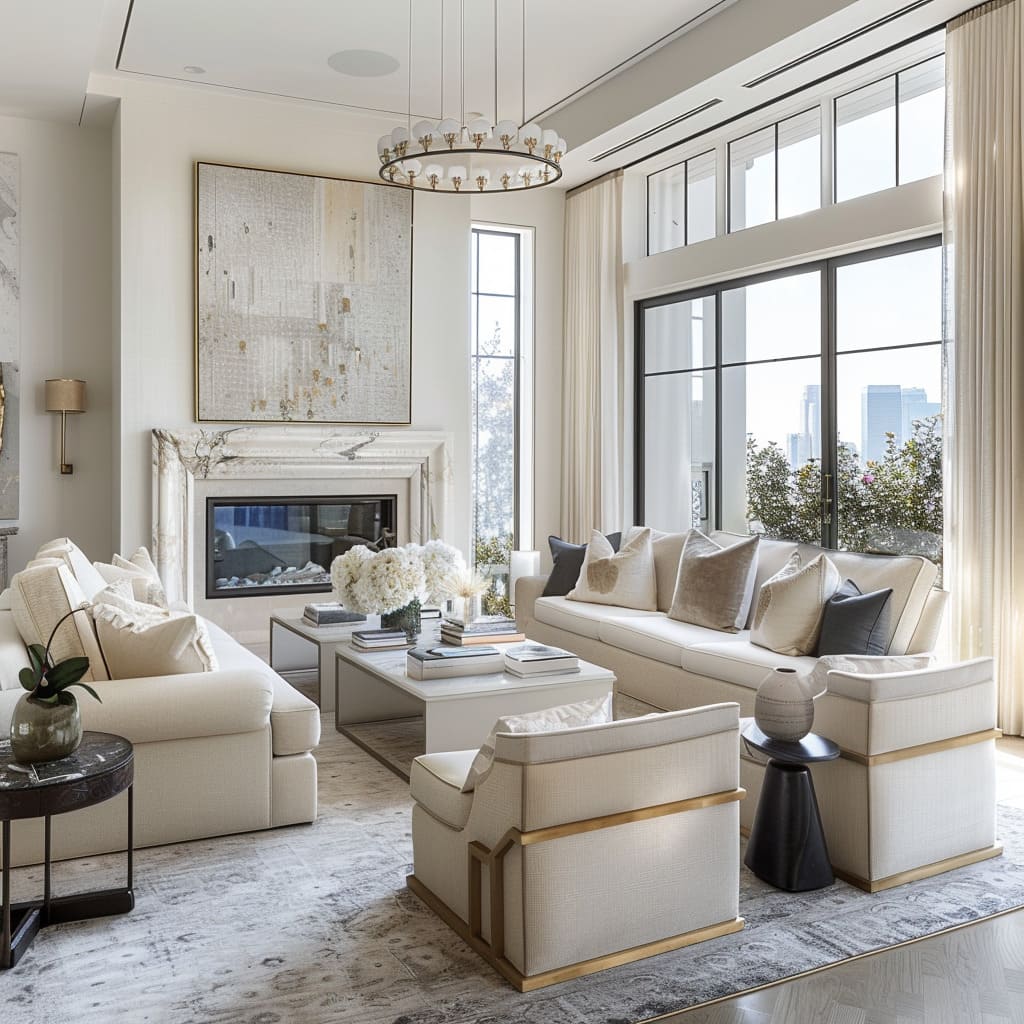
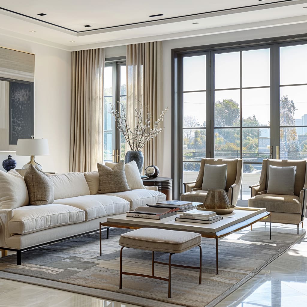
The space is enriched with textures that are pleasing to the touch, incorporating fabrics and materials that invite interaction and comfort. Upholstery in furnishings is carefully selected for its softness and ability to create an inviting, cozy atmosphere, whether it be through plush sofas or cushioned armchairs.
Rugs and throws add layers of warmth and texture, further enhancing the tactile experience and contributing to the homeliness of the setting.
These soft textural elements are strategically used to balance the sleekness of hard surfaces, ensuring the environment feels approachable and lived-in. The interplay of textures not only elevates the comfort level but also adds visual interest without overpowering the space with too much pattern or color, maintaining the harmonious and tranquil aesthetic.
Minimalist Aesthetics
Streamlined Furnishings
Furniture pieces within the space exemplify minimalist design, boasting clean lines and smooth surfaces that suggest functionality and modernity. These pieces shun unnecessary ornamentation, such as intricate carvings or bold patterns, favoring a less is more philosophy.
The furnishings are chosen for their geometric simplicity, which lends an orderly and tranquil feel to the room. Their streamlined nature also allows for easy maintenance, as there are fewer crevices where dust can accumulate.
The simplicity in form does not compromise on comfort or quality; rather, it emphasizes the purity of design and the thoughtful selection of materials that stand the test of time.
Purposeful Accent Pieces
In a minimalist setting, every accent piece is selected with intent, chosen to bring a specific function or to create a desired visual impact. These items are few but impactful, providing a focal point or a subtle compliment to the overall design without creating clutter.
Each piece, whether it’s a lamp, a piece of art, or a vase, is there to either serve a practical purpose or to contribute to the narrative of the space, embodying the aesthetic of less but better. The thoughtful curation of these accent pieces ensures that they are in harmony with the room’s architecture and the lifestyle of its occupants.
Understated Window Treatments
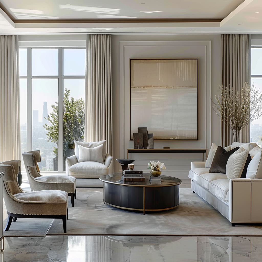
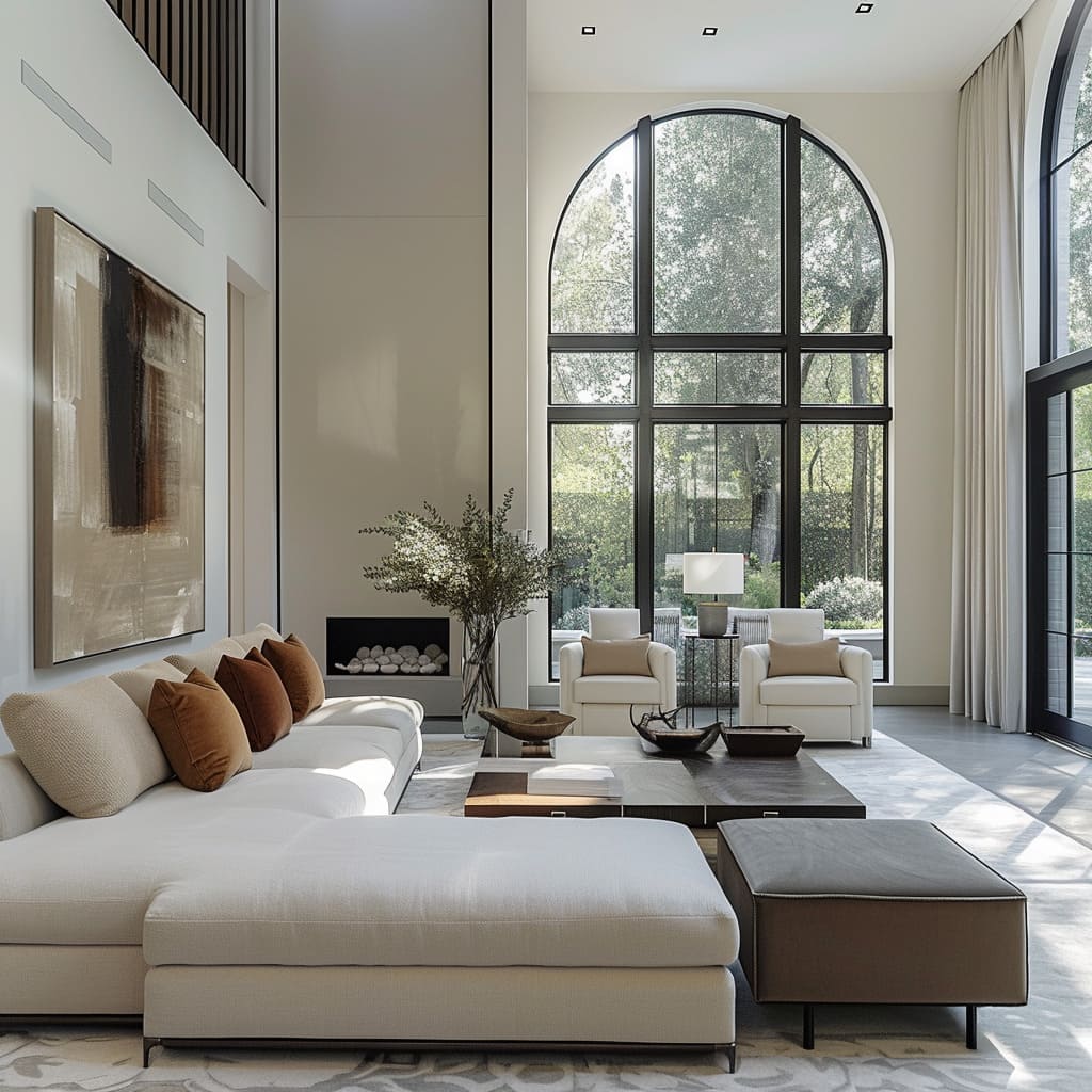
Window treatments are designed to work seamlessly with the room’s architecture, enhancing natural light and views without becoming a visual centerpiece. The curtains or blinds used are typically of a neutral palette, with clean lines that blend into the walls when not in use.
They are functional yet discreet, providing privacy and light control without heavy fabrics or complex mechanisms that would detract from the minimalist ethos. The choice of material for the window treatments often reflects the same quality and texture found in the room’s furnishings, creating a cohesive look throughout.
Bare Floors with Area Rugs
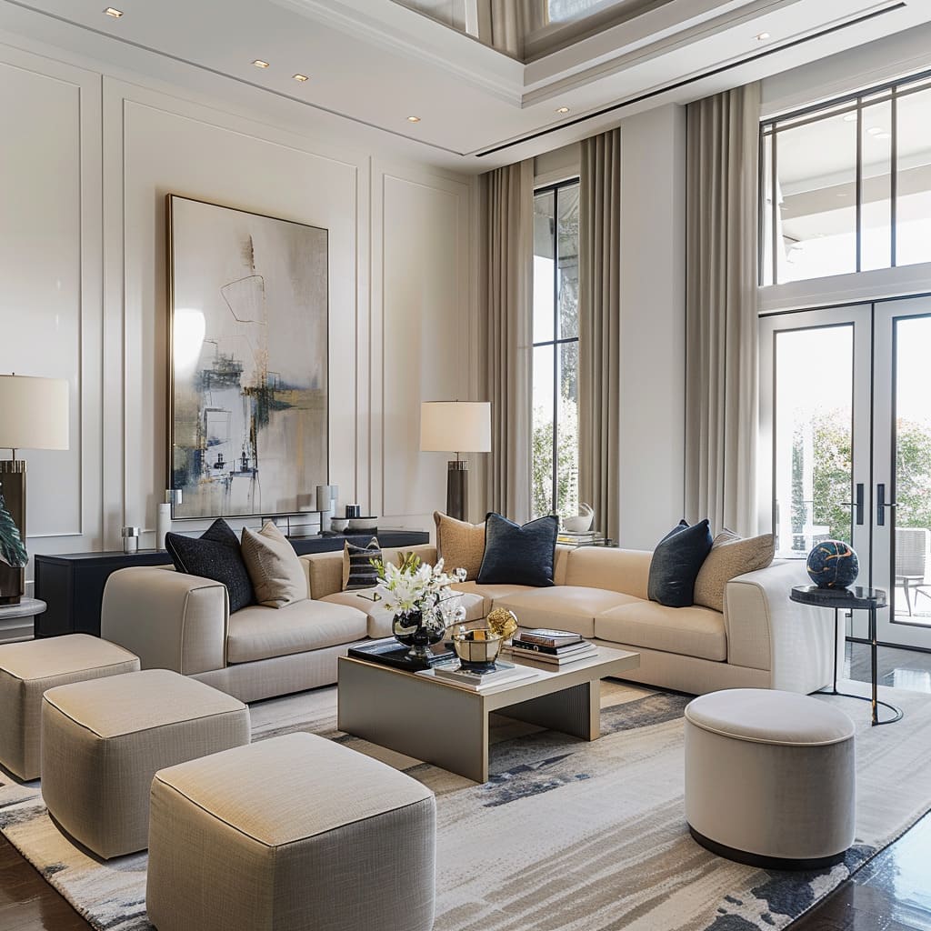
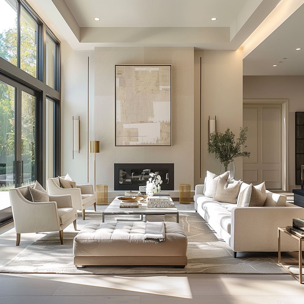
The flooring in a minimalist space is predominantly bare, showcasing the material’s natural beauty and contributing to a sense of cleanliness and openness. Area rugs are strategically placed to define seating or dining areas within the larger room, adding warmth and acoustic softness without overwhelming the space.
These rugs often have a subtle pattern or texture that complements the overarching color scheme and design theme, ensuring that they enhance rather than disrupt the minimalist appeal.
Low-profile Furniture
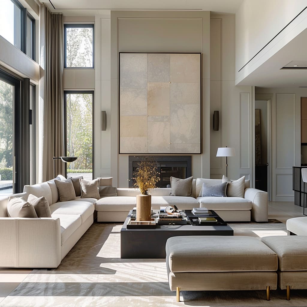
Furniture pieces are deliberately chosen to have a low profile, sitting closer to the ground and thus creating an illusion of a higher ceiling and a more expansive space. This strategy emphasizes horizontal lines, which have a calming effect and can make even compact rooms feel more spacious.
By lowering the sightline, the design encourages a gaze that sweeps across the room unhindered, further accentuating the minimalist approach. The low-profile furniture pieces are often modular, allowing for flexibility in layout and can be easily reconfigured according to the needs of the space.
Absence of Knick-Knacks
This design philosophy embraces the idea that less is more. Rather than filling the space with knick-knacks, there is a notable absence of small decorative items, which allows the quality and craftsmanship of the selected pieces to stand out.
The decor is deliberate, with each item chosen not only for its aesthetic but also for its ability to complement the overall design narrative.
Sophisticated Simplicity
The essence of the design lies in its ability to convey complexity through minimal elements, creating an effortlessly sophisticated ambiance. The clean lines and uncluttered surfaces contribute to a serene environment where each piece of furniture and decor is purposeful and thoughtfully placed.
The simplicity is not mere absence but a careful selection of elements that speak to quality and refinement.
Understated Sophistication
In this space, sophistication is whispered rather than shouted. It is articulated through high-quality materials and a restrained color palette, focusing on neutrals and earth tones that evoke a calm and elegant atmosphere.
The furniture is contemporary yet timeless, avoiding trends that quickly date, embodying a style that is both modern and enduring.
Light Tonal Contrasts
The contrast in the space is achieved with a masterful subtlety, using a palette of light tones to introduce slight variations that define different areas without creating harsh divisions. This nuanced approach to contrast ensures that the space feels open and airy, with each tonal shift bringing a new layer of depth and interest.
Consistent Wood Tones
Throughout the space, wood surfaces offer a consistent tone that ties different rooms together, creating a sense of unity. The wood is selected for its warm undertones, which add a touch of organic warmth to the otherwise cool neutrality of the color scheme.
The wood’s grain and texture also introduce a natural element that is both tactile and visually appealing.
Solid Fabric Choices
In the selection of fabrics, there is a clear preference for solids over patterns, contributing to the clean and contemporary look. This choice allows for the shape and form of the furniture to stand out, while also creating a canvas for subtle textural plays that add richness and variety to the space without overwhelming it with visual noise.
Relaxed Atmosphere
Despite its polished look, the space exudes a sense of relaxation. The furniture is plush and inviting, with generous cushions and soft upholstery that invite you to sink in and unwind.
The layout of the room is designed to facilitate conversation and interaction, making it as suitable for a quiet evening at home as it is for entertaining guests.
Visual Comfort
The design prioritizes visual comfort, with a balanced composition that allows the eye to move smoothly through the space. The strategic placement of lighting, both natural and artificial, highlights architectural features and artwork, while also creating intimate pockets of warmth that make the space feel lived-in and cozy.
The journey through the realms of functional design culminates in a profound appreciation for the nuanced interplay of elements that define these spaces. From the strategic use of negative space to the understated elegance of the chosen color palettes and materials, every aspect of functional design serves a purpose, elevating the mundane to the extraordinary.
This design philosophy champions an environment where every detail is infused with intentionality, creating spaces that are not just places of residence or work but sanctuaries of peace and creativity. As we step back and gaze upon the tapestry of functional design, it becomes evident that the true beauty of these spaces lies in their ability to marry form with function, simplicity with elegance, and utility with aesthetics, crafting environments that resonate with the essence of sophisticated simplicity.

