Headboards have moved far from their past as simple padded slabs or carved panels tacked behind a bed. Today, they stretch across entire walls, turn corners, wrap in alcoves, and often define the entire visual language of the bedroom.
What once played a supporting role now often leads the room—quietly but with complete control.
This article explores a shift in how headboards are approached in modern interiors: not as standalone decor, but as extensions of architecture, texture, and mood. Across a range of formats—grids, flutes, slats, arches, or stone-backed fields—the bed wall becomes the main structure, not just an accessory.

Softness is created through depth, not fluff. Light is part of the surface, not an afterthought.
And instead of layering more objects, many of these spaces remove the need for extras by refining what’s already built in. The details are careful, but the overall effect is calm and clear.
Shape, material, and proportion carry more meaning than color alone. What follows is a close look at current patterns in modern headboard design, pulling together key moves that combine spatial clarity, surface rhythm, and quiet presence—all through the lens of the bed wall.

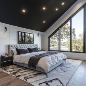
The Wall‑Sized “Soft Faсade”
A growing pattern in modern headboard design is the disappearance of the standalone unit. What now defines the space behind the bed is something broader—fully integrated into the wall itself.
These headboards don’t float in isolation; they span wall-to-wall or floor-to-ceiling, forming a backdrop that reshapes how the bed is seen in the room. Thickness plays a central role.
Instead of flat panels or thin upholstery, many of the latest modern headboard ideas rely on deeply padded modules that project forward. Whether arranged in large rectangles, soft tubular forms, or oversized cushions, these padded sections break the vertical plane, casting real shadows that change with the light throughout the day.
The depth adds more than volume—it brings the feeling of architecture, anchoring the bed into its environment.

Another visual detail that becomes noticeable only on close observation is the use of ultra-fine seams. In many of these designs, the stitching or joining between fabric sections is so tight and controlled that it draws the eye like a soft line sketch.
These seams act as quiet geometry. The matte finishes of suede, velvet, or boucle don’t bounce light—but instead absorb it—so these seams turn into shadowed edges that give structure without noise.

Framing completes the composition. Instead of letting the padded surface bleed into its surroundings, some designs wrap the upholstered field inside slim wood or metal borders.
These frames don’t scream for attention—they focus the viewer’s eye and create a sense of order. The result feels more like a deliberate wall panel installation than a furniture accessory.
By shaping the surface into a strong, quiet presence, the headboard becomes part of the architecture, not just an attachment.

Vertical Rhythm as Mood Setter
In several refined bedrooms, vertical detailing takes the lead—not with pattern, but with direction. These surfaces guide the eye upward while quietly organizing the entire wall behind the bed.
Whether made from oak slats, upholstered tubes, or backlit stone inserts, this upright rhythm has become a subtle method for shaping space. Spacing is where the effect begins.
By alternating the width, thickness, or depth of the vertical components, designers build a visual cadence that reads like a measured tempo. The trick lies in the restraint: none of the parts shout, but their repetition creates a steady visual flow.
It’s not uniformity, but alignment that creates calm.

Lighting makes the vertical rhythm more noticeable—without putting fixtures front and center. Narrow grooves lined with hidden LEDs wash the texture in a soft gradient, casting shadows along the slats or padded forms.
In some layouts, recessed niches on either side of the bed are turned into low-glow columns, glowing softly like candlelight, but without revealing their source. These lights shift the look from simple wall detail to something atmospheric, adding dimension by day and a warm backdrop by night.
The variation in material texture between hard and soft also changes how the verticals are read. Some rooms use rigid oak fluting with crisp lines, while others wrap curved fabric tubes in muted tones that soften the whole view.
This contrast between precision and comfort is what makes vertical rhythm such an effective visual tool in contemporary spaces.

Framing Devices that Turn Beds into Installations
Some of the most memorable modern bed headboard design ideas aren’t focused on color or upholstery—they rely on structure. Not the structure of the bed itself, but of the wall and ceiling that surround it.
In many refined layouts, the bed is no longer a stand-alone piece—it’s framed like an exhibit, quietly set into place with architectural precision. The full alcove approach is one of the clearest examples.
Here, wood surfaces climb the wall behind the bed, wrap over the ceiling, and return down the opposite side, forming a continuous three-sided shell. Within that quiet envelope, the mattress feels intentionally placed, as if the room was planned around it.
What keeps this from becoming visually heavy is the careful use of shadow lines—those narrow, often hidden gaps between panels that let light breathe between surfaces. They prevent visual flattening and help the structure feel grounded without becoming overbearing.

Then there’s the use of vertical pilasters—wide upright wood or veneer panels at each side of the bed that echo the proportions of old door frames. These thick verticals flank the headboard like quiet columns.
With these in place, everything that follows—the pendant lights, artwork, shelves, and even the outline of the bed frame—begins to align with their spacing. The composition becomes a single field, not a collage of disconnected elements.
Ceiling carry-through adds another layer. Beams, canopy frames, or overhead paneling in the same wood tone as the wall cladding build a kind of visual continuity that isn’t loud but is instantly sensed.
These horizontal elements don’t pull attention upward—they just reinforce the lines already established below. The result feels calm and settled, like the entire room has been wrapped around the sleeping space with quiet confidence.
It’s a move especially common in houses where the bedroom structure is used to imply order, rather than add decoration.

Light as a Material, Not an Accessory
One of the most understated shifts in luxury modern headboard design is how light is treated—not as an add-on, but as a part of the surface itself. Instead of relying on exposed fixtures or traditional lamps, many bedrooms now weave light into the fabric of the wall.
Edge lighting makes this clear. Frosted glass panels or onyx-like slabs can be fitted with concealed LEDs along the edges, creating a soft halo that seems to float off the wall.
Because the source of the glow is hidden, the material itself becomes the lamp. It glows at its border, creating depth where there is no added thickness.
The result is sculptural—not flashy, but undeniably dimensional. Hidden grazers bring a different effect.
Here, the light is tucked above or beside the headboard surface—especially effective with fabrics like suede, velvet, or boucle. These materials catch even the gentlest side-light, turning their natural textures into soft gradients.
A single wash of warm light from above can make a wall of flat panels feel layered, simply by exaggerating the changes in fiber direction.

Pendant lighting plays with vertical space. In many setups, the pendants are hung far lower than expected—sometimes floating just inches above the nightstands.
Their purpose isn’t to spotlight objects, but to frame the bed area. Some rooms go further, using multiple pendants at different drops, like notes in a vertical rhythm.
One is fixed, one swings, and together they break the static line of the headboard into zones. This kind of layering—of glow, material, and motion—adds richness without needing bright color or decorative accessories.
These light strategies don’t perform like overhead fixtures—they behave more like a second skin on the wall. In the quiet context of neutral palettes and soft upholstery, they’re often what gives the room its tone.

Mirror & Mother‑of‑Pearl: Reflection Without Showiness
In some master bedroom modern headboard design setups, reflectivity plays a surprisingly understated role. While shine is often associated with flashiness, here the glint is restrained—woven into the background, not placed at center stage.
These designs introduce light play without relying on full mirrors or polished metals, using quiet luster instead of hard glare. Take the iridescent mosaic approach.
In one example, a wall behind the bed is clad in mother-of-pearl hexagonal tiles, each with subtle variations in hue and angle. Instead of bouncing back a clear image, these tiles scatter daylight into shifting shimmer—more like a soft ripple than a mirror.
Because no single tile dominates, the result feels organic. The surface moves slightly as the viewer shifts, staying alive without ever becoming overpowering.
Elsewhere, tall mirror strips are inserted into a field of vertical wood slats. These mirrors are narrow—more punctuation than headline.
They interrupt the wood pattern in just the right places to keep the composition from becoming monotonous. Each strip acts like a pause or breath, catching light briefly, then letting it go.
Because they’re flush with the wood and carefully aligned, the effect is rhythmic, never random.

Then there’s the use of tinted mirror bands in alternating finishes. Instead of a standard reflective slab, a series of vertical panels ranges from clear to smoky bronze, arranged in a gradient.
As daylight crosses the wall, the surface doesn’t simply shine—it shifts tone. One section glows faintly, another deepens into shadow.
This avoids the problem of a single bright rectangle, turning the reflection into a layered texture rather than a spotlight. The overall effect is polished but controlled, introducing light variation with almost no added ornament.
These mirror-based layouts don’t aim for drama—they rely on movement, soft sheen, and rhythm to carry the wall. Reflection becomes a part of the surface vocabulary, not a visual demand.

Curves Wrestle Control from Straight Lines
Many modern contemporary headboard designs still lean into verticals, angles, and symmetry—but a few take a gentler turn. Literally.
In some layouts, curves interrupt the linear logic of the room, reshaping how the eye moves across the space. The change is quiet but powerful.
It’s the shift from frame to flow. The concave headboard wall stands out in this regard.
Rather than building the padded surface on a flat vertical plane, the entire upholstered backdrop bends slightly around the bed. Narrow vertical tubes of fabric follow the curve in perfect spacing, creating a soft cradle effect.
The arc is subtle enough not to scream for attention—it emerges slowly as you stand inside the room. The change in angle creates a soft wraparound visual, almost like the bed is being held without touch.
It feels quiet, enveloping, and intentional.

A different curved approach uses an arch instead of a concave sweep. Here, vertical upholstered channels follow the line of a semi-circle, rising behind the bed in a motion that’s both architectural and plush.
What might start as a bold shape quickly becomes more textural once the viewer notices that the curve is built from fabric. The geometry is clear, but the softness of the materials stops it from feeling rigid.
The arch pulls the eye up, then gently lowers it again, creating a loop of attention around the headboard area. These soft, rounded elements don’t break the structure of the room—they loosen it.
It doesn’t fight the lines—it absorbs them. In spaces filled with horizontal beds, squared rugs, and framed windows, a curve offers release.
It catches the light differently. It disrupts the grid.
And in these layouts, that single arc often becomes the quiet center of the entire room.

Subtle Asymmetry Keeps Order from Feeling Stiff
Even in rooms where everything looks precise—where grids of upholstered panels or lined wooden slats span the wall—small shifts in symmetry make the entire composition breathe. A space can be highly structured, yet still feel relaxed, simply by letting one detail fall out of line.
In many modern layouts, that moment of asymmetry is deliberate. It might be a single nightstand styled more heavily than the other, or a plant placed only on one side.
These small moves break the echo effect, pulling the viewer’s eye slightly off the central axis. In headboard compositions built around repeated squares or stripes, this kind of interruption brings character.
The surface no longer feels like graph paper—it feels lived in.

Lighting plays a part too. Instead of centering sconces exactly within each panel or segment, they’re sometimes aligned to the outer bed edge or shifted by a few inches.
This minor adjustment changes the perception of the wall’s rhythm. It breaks formality without disrupting order.
Pillow arrangements follow the same logic. One side might carry a heavier stack—charcoal behind beige, velvet in front of linen—while the other tapers down to a single lumbar.
Because the background stays neutral and structured, the variation reads as intentional, not unfinished. Especially with large headboard fields, this kind of asymmetry keeps the eye engaged.
The overall effect is casual without being careless. It’s a subtle move often found in modern king headboard ideas where the width of the bed can invite too much repetition if not interrupted.
A room can still follow lines—but with just one detail nudged off-center, it speaks in a lower tone.

Monochrome, but Never Flat
Many of the strongest modern padded headboard designs work with just a handful of tones—sometimes only one. But a narrow color palette doesn’t mean the space fades into uniformity.
Instead, the richness comes from how texture, material, and surface finish are handled within those limits. The difference between suede and velvet, even when both are taupe, is noticeable.
Suede absorbs light, while velvet shifts it gently across its pile. When placed side by side—like on a panel wall behind a bed and on a few accent pillows—these materials form a quiet contrast that reveals itself gradually.
The layering goes deeper. In one setup, a single leather cushion—caramel or saddle brown—sits within a sea of gray and oatmeal.
The effect is subtle, not loud. That one item, with its low shine and smoother surface, brings depth through difference, not color.

And sometimes, the fabric itself takes on architectural value. Boucle, when used across both the headboard and bed frame, pulls together softness and mass into one visual idea.
It’s not just a covering—it defines the shape, rounding corners, blending planes, and catching light in its weave. The repetition of the same fabric in different thicknesses and densities reinforces the palette while building variation.
This kind of monochrome approach isn’t empty. It asks for attention to finish, edge, and shadow.
The success lies in material shifts that create contrast without relying on boldness. The colors may remain quiet, but the composition stays active.

Headboard as Quiet Acoustics
In many contemporary master bedrooms with open layouts and hard flooring, the role of the headboard extends beyond visual design. Deep upholstery, particularly in panel or grid formats, plays an unexpected role in shaping the sound of the room.
While it may not be immediately visible, the effect is felt—and heard—through the softened atmosphere. The thickness of these padded surfaces does more than create depth.
It subtly absorbs sound, taming echoes that would otherwise bounce off tile, glass, or concrete. The result is a space that feels calm without needing visible treatments.
Especially in rooms that favor minimalism and exposed surfaces, these fabric-covered walls bring in softness without adding visual clutter.

The grid structures help too. Each seam, each individual panel, breaks up flatness—not only in appearance but also in acoustics.
These micro divisions help diffuse sound in a quiet, non-technical way. It’s a design choice that adds comfort without relying on traditional methods.
This approach is particularly evident in spaces where textiles are limited. Without thick curtains or plush rugs, the headboard often becomes the main absorber in the room.
That gentle hush it brings is part of the overall design feel—integrated, silent, and deeply effective.

Furniture That Grows Out of the Wall
Some of the most refined bedrooms blur the boundary between furniture and architecture. A recurring theme in new bed headboard design is the way nightstands are no longer separate—they emerge directly from the wall.
Made from the same wood or veneer as the headboard paneling, these floating tables feel like extensions rather than additions. The visual benefit is immediate.
With the floor left untouched beneath the nightstands, the space stays open and clean. The eye travels uninterrupted along the wall, allowing the headboard’s full height and width to be appreciated without competition.
But the visual clarity is only part of the story. This built-in approach hides function within form.
Wiring for lighting or charging can disappear behind the panels, keeping cables out of sight. The surface remains quiet, even when supporting functional items.

What’s placed on these floating ledges—books, ceramics, sculptural lighting—seems to hover. Without legs, trim, or framing, the pieces feel suspended.
This illusion strengthens the crafted character of the room, where each piece is precisely where it should be—without announcing itself. This kind of design doesn’t require excess.
It uses alignment, material consistency, and small reveals to produce calm. By letting the wall absorb the furniture, the headboard becomes part of a single, continuous structure.

Conclusion: Quiet Structures, Strong Intent
Across all these modern bedroom compositions, a clear shift has taken hold—one that favors structure over statement and refinement over show. Headboards no longer float as isolated furniture.
They expand, stretch, and anchor themselves into the room as part of the wall’s framework. This shift in scale resets how space is read, especially in compact bedrooms where full-wall treatments offer clarity instead of clutter.
Surface treatment now leads with texture rather than bold pigment. Suede that absorbs light differently from velvet, boucle that stands apart from matte linen—these pairings let quiet materials do more than loud colors ever could.
A palette can remain soft and pale, but feel active when sheen, nap direction, and weave density vary in just the right places.

Lighting has taken a quieter role too. It doesn’t spotlight—it glides.
Concealed LEDs skim grooves, wash over fabric seams, and edge glass panels in soft gradients that change through the day. Instead of acting like a fixture, light becomes part of the material—always present but never assertive.
Balance remains important, but no longer means perfect halves. A plant that leans off-center, a pendant dropped slightly lower on one side, or a pillow stack that shifts by one cushion—all keep symmetry from turning stale.
This micro-asymmetry lets otherwise formal headboard grids feel relaxed, even personal.
And through it all, the materials speak for themselves. Grain is left visible, texture stays tactile, and seams are aligned with the kind of precision that doesn’t call attention to itself.
There’s no need for added flourish. The strength lies in how the pieces fit, how the joints hold, how the lines carry across surfaces without being interrupted.
All of this points to one shared direction: the headboard is no longer treated as an accessory. It is the anchor, the wall, the outline that shapes everything else.
These rooms aren’t filled—they’re tuned, until every part, from lighting to padding to the smallest gap, holds its place with quiet purpose.