In the intricate dance of form and function, modern interior design articulates a language that speaks to both the eye and the spirit. The following pages unfold a visual narrative where architecture and decor converge, not merely to inhabit space but to redefine it.
Beyond the tangible aspects of texture and form, these interiors whisper of stillness and movement, opacity and clarity, presenting a house not as a mere shelter but as a canvas for living.
Visual Harmony and Monochrome Mastery
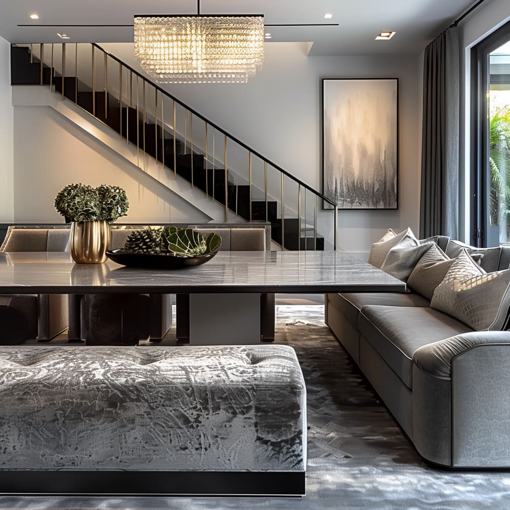
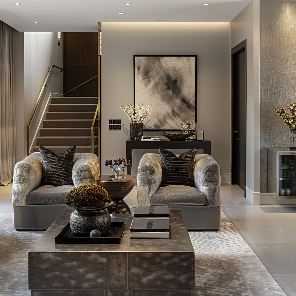
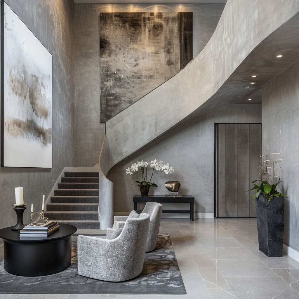
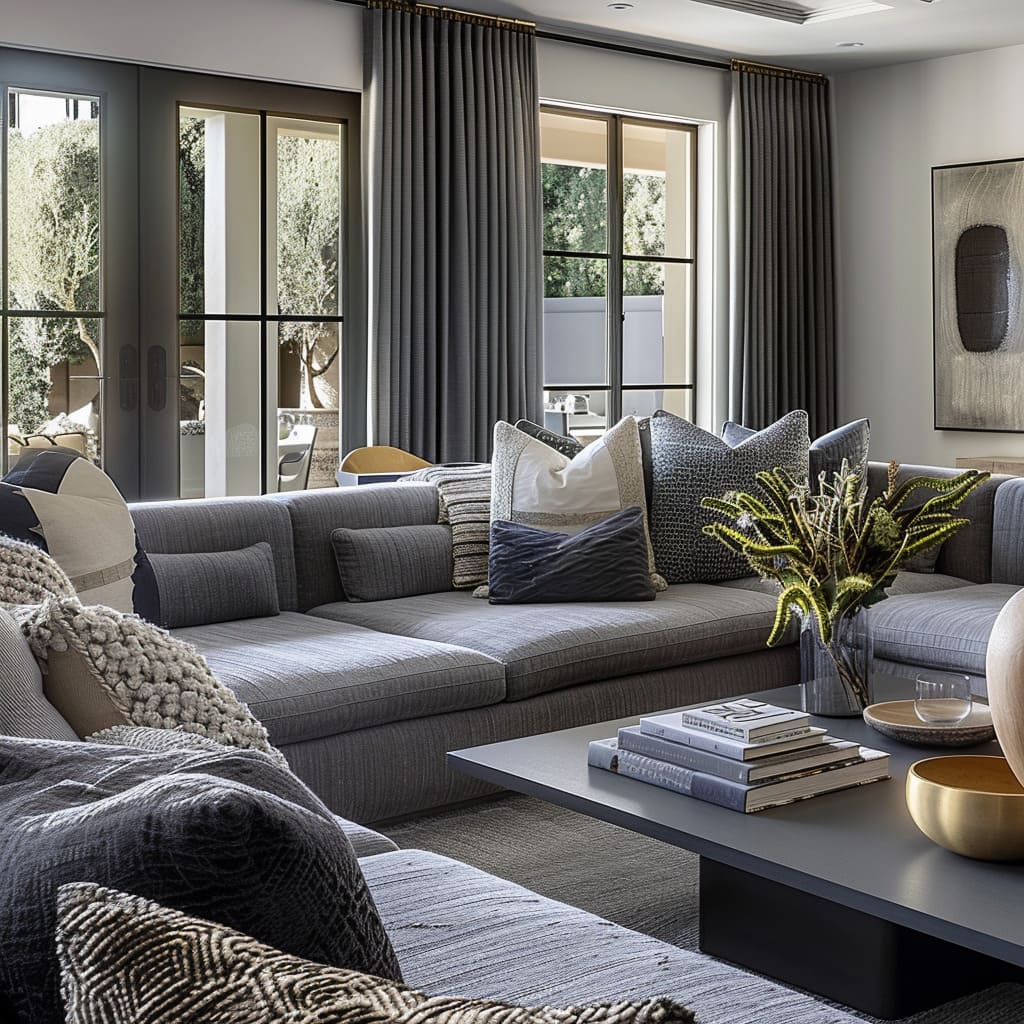
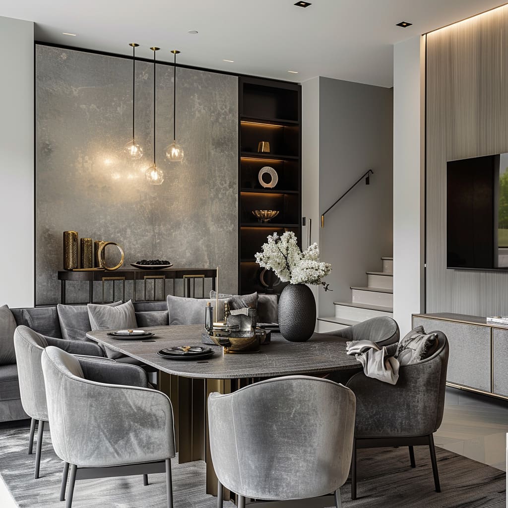
The serene atmosphere within these spaces is masterfully created through a carefully selected monochromatic color scheme. Shades of gray not only set a tranquil tone but also allow for a seamless flow from one area to another.
The judicious use of bold, dark colors in select spots provides necessary visual weight and an anchor within the airy expansiveness.
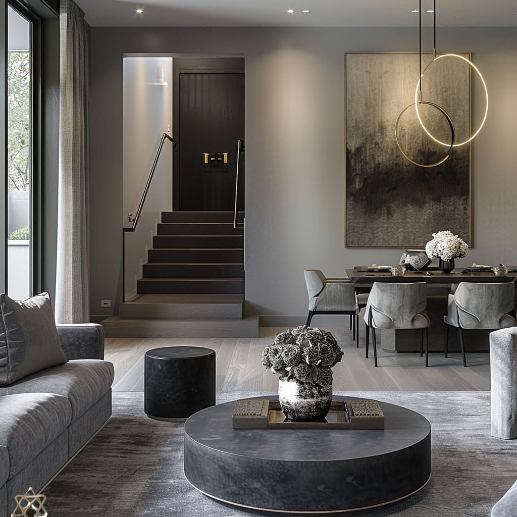
The visual narrative of these spaces is conveyed through a thoughtful selection of monochromatic hues. In a gradient of grays, each room unfolds with an understated complexity, where the lightest of tones meets the darkest with an intentional subtlety.
This choice in palette speaks to a preference for nuance over spectacle, where the absence of color becomes a canvas for the interplay of shadow and light.
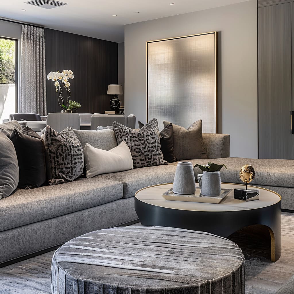
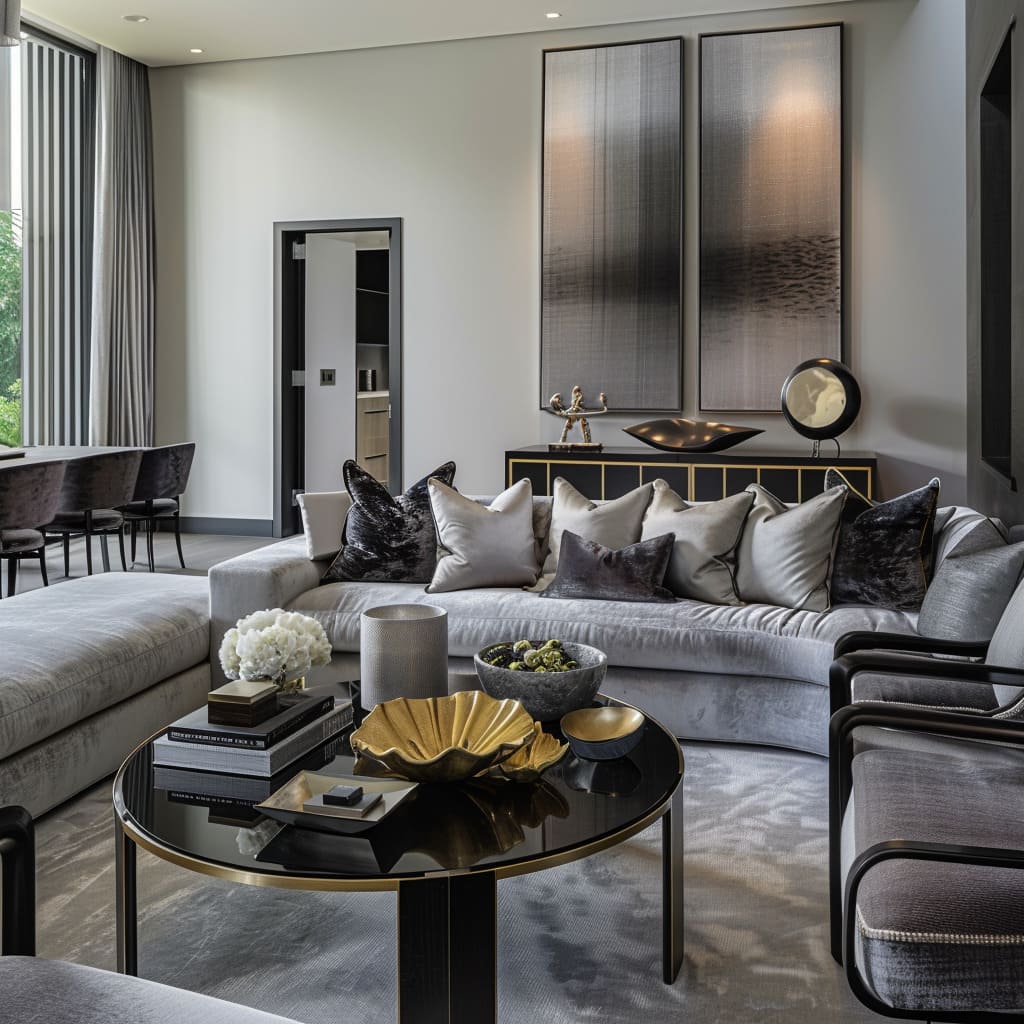
In this grayscale spectrum, moments of depth are artfully introduced with dark, saturated colors that anchor the eye and ground the airy spaces. A wall, a piece of furniture, stands as a statement within the calm—each a calculated decision to add dimension to the rooms.
These dark tones serve as visual punctuation, bringing rhythm to the continuity of grays. The use of gray extends beyond the walls to the textiles and finishes, a seamless flow that draws the outside in.
Where one might expect a starkness, there is instead a smooth transition, a quiet conversation between spaces that is both fluid and coherent. It’s a design choice that respects the integrity of each element, allowing them to stand alone yet contribute to the whole.
Amidst this tonal symphony, the boldness of dark hues is never jarring but rather an anchor amidst the lighter shades. Furniture in rich, deep colors stands not as an interruption but as a focal point, a moment of visual rest in the continuum of the space.
These strategic touches of darkness do not compete with the prevailing tones but instead enrich them, adding layers and depth to the spatial composition.
The monochromatic scheme is, thus, far from monotonous. It’s a deliberate layering of shades and textures that evoke a sense of calm without complacency, a testament to the sophisticated simplicity of the design.
The bold, dark colors are the whispers in a quiet room, subtle yet significant, drawing the eye and completing the visual harmony with a masterful stroke. For those seeking to achieve a seamless flow in their home design, incorporating a modern kitchen in a gray color scheme can be the perfect complement.
The muted, sophisticated tones of gray can align beautifully with the rest of your home’s monochrome aesthetics, creating an elegant and cohesive look. Explore this collection of modern kitchens to see how a modern gray kitchen can enhance your design scheme.
Natural Elements and Authentic Textures
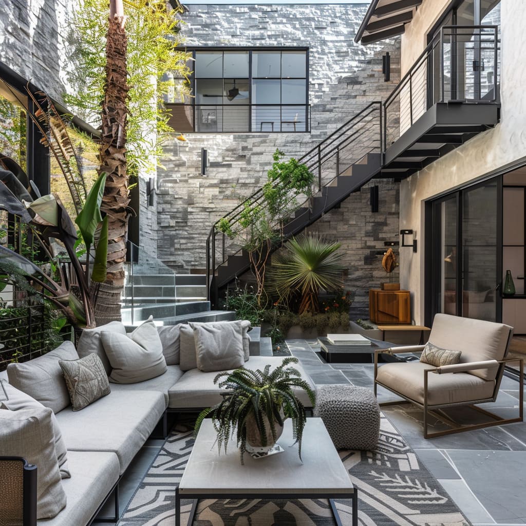
Spaces come alive with the textured presence of natural materials. The stone surfaces and large-format tiles bestow each room with an organic touch, while oversized planters infuse a natural vibe within the constructed environment.
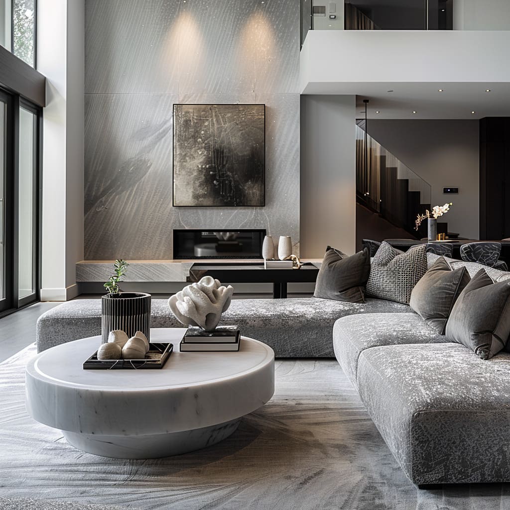
This group of features celebrates the raw and unrefined textures brought indoors. A refined use of stone, evident in many surfaces, adds a touch of nature’s raw beauty and textural contrast.
The thoughtful selection and placement of stone throughout various surfaces bring forth a vivid reminder of the earth’s inherent splendor. This choice introduces a contrast of textures, offering a tactile experience that is both unexpected and grounding.
This integration of organic materials serves as a visual anchor within the space, providing a balance to the sleekness of modern design elements.
Large-format tiling on walls in some areas brings an unexpected scale to the standard use of tiles. The employment of expansive tiling across specific wall areas challenges the conventional scale and application of tiles.
Such a design choice creates an impactful visual statement, transforming what is typically a background element into a striking focal point. The large tiles form a continuous visual field that can alter perceptions of space and volume.
There is a subtle introduction of plant life, not overwhelming but as an accent to the human-made environment. Throughout the space, there is an understated yet strategic placement of plant life that complements rather than overwhelms.
The careful incorporation of greenery serves to soften the man-made surroundings, subtly infusing vitality and a breath of fresh air into the environment.
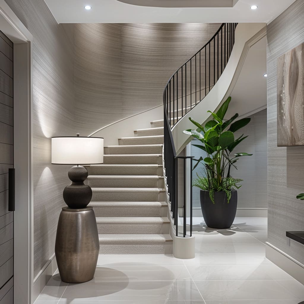
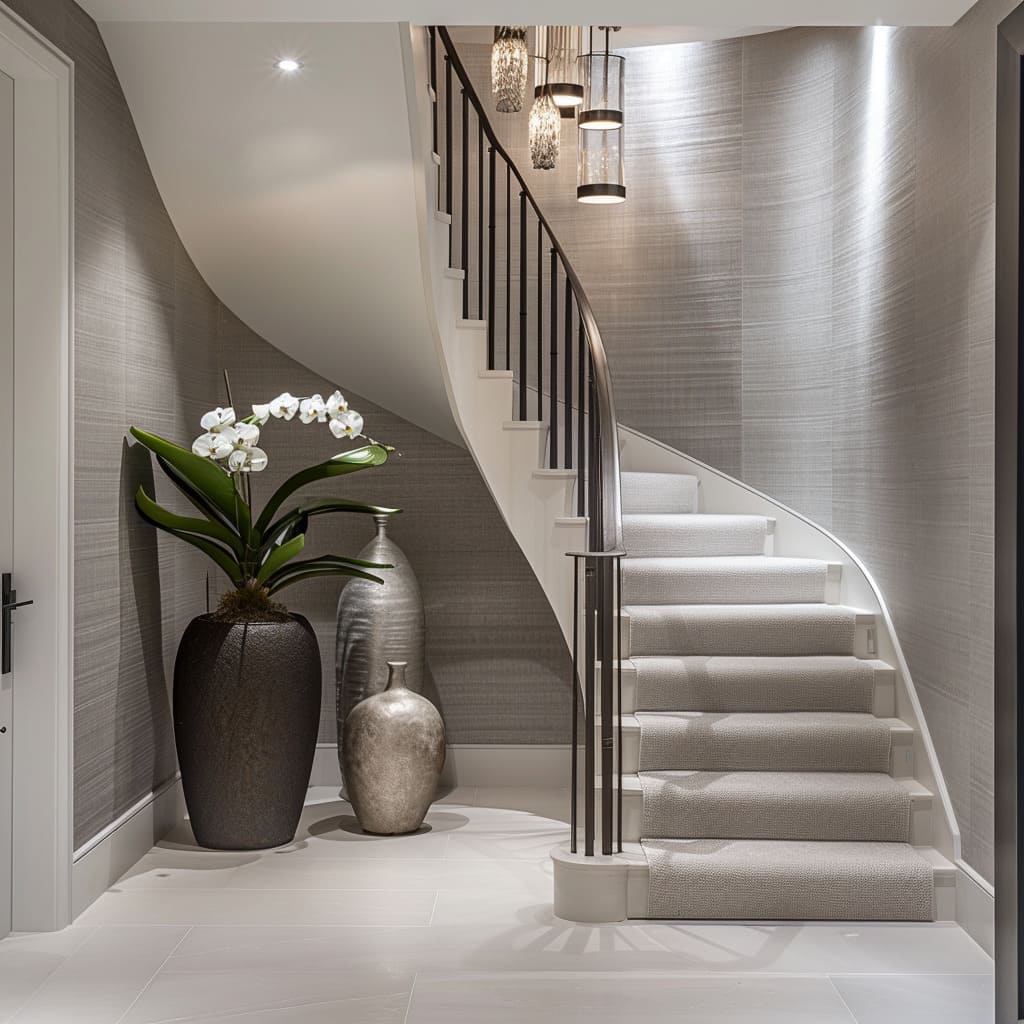
The use of oversized pots and planters indoors reinforces the architectural scale and introduces organic shapes. Indoors, the use of sizable pots and planters not only serves a functional purpose but also acts as sculptural elements that resonate with the building’s structural dimensions.
These organic shapes juxtaposed against the architectural backdrop create a dynamic interplay between the built and the natural.
Architectural Dynamics and Light Play
The architectural nuances of varied ceiling volumes and thoughtful lighting choices produce a dynamic interplay of light and shadow. Staircases rise as significant elements, merging utility with visual artistry, while glass installations invite openness and fluidity.
Varied ceiling heights and volumes create dynamic spaces, with recessed areas offering a play of shadows and light. The design within these spaces deftly manipulates ceiling elevations, crafting an engaging visual rhythm that invites both the eye and mind to consider the vertical landscape.
As light cascades from above, it is artfully intercepted by the differing heights, casting an array of shadows that lend depth and dimension. This interplay of luminescence and shadow is further accentuated in recessed spaces, where light seems to pool, creating islands of warmth.
Carefully placed recessed and track lighting contribute to the ambiance without overpowering the space. Illumination is considered and curated with a deft touch, utilizing recessed and track lighting fixtures that provide a subtle, yet effective luminosity.
These lighting elements are integrated seamlessly, enhancing the overall mood without becoming an intrusive presence. The light itself becomes a guiding force within the space, drawing attention to textures and surfaces, and acting as a silent narrator of the space’s design story.
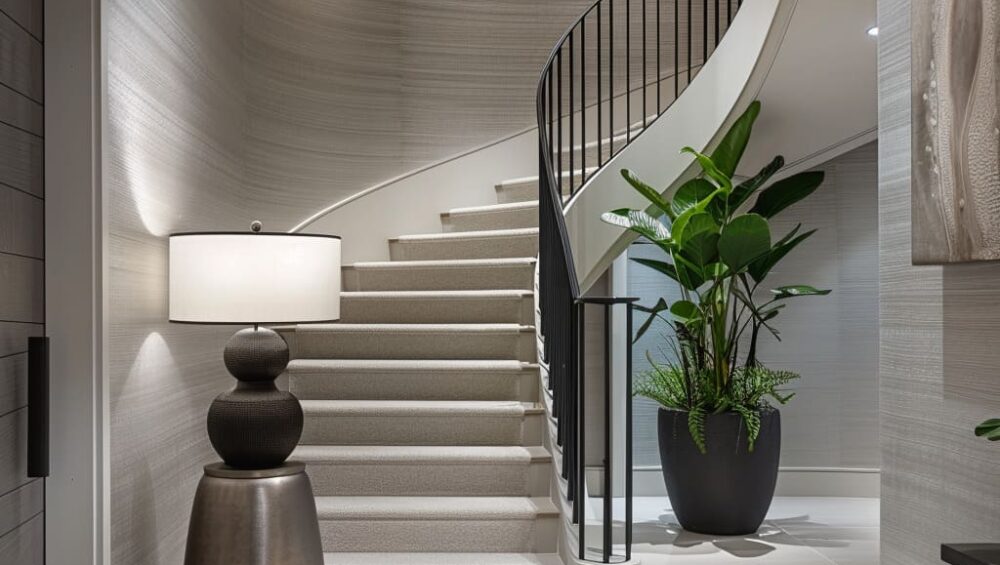
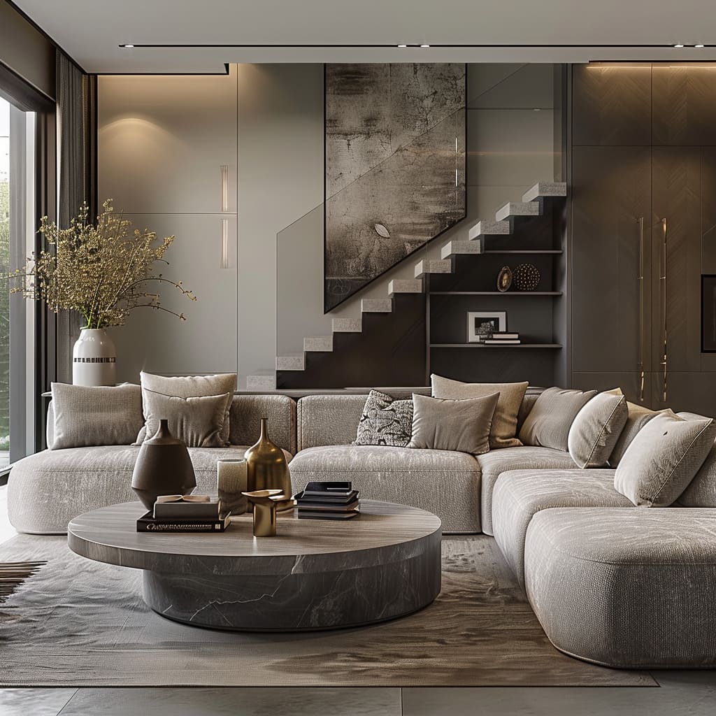
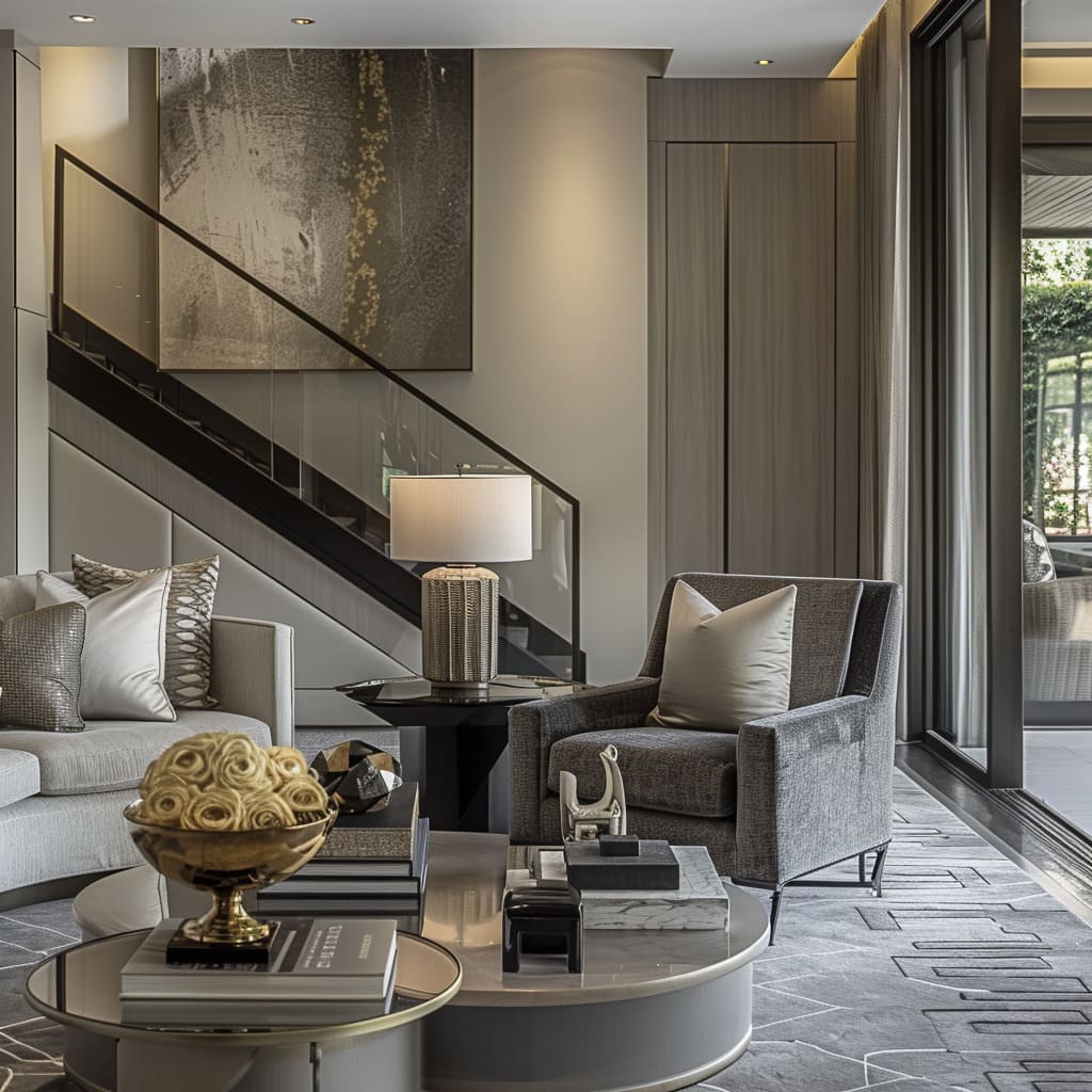
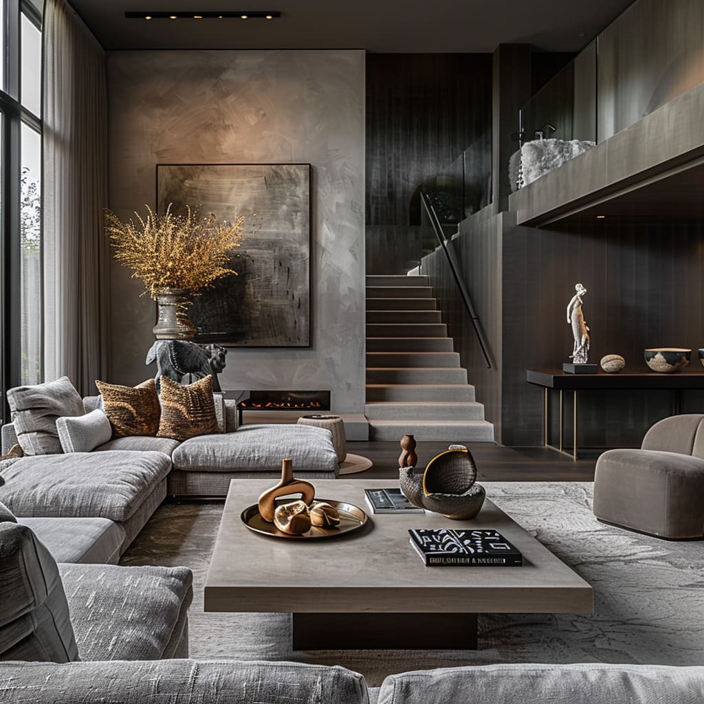
The staircases are not just functional but also form a visual anchor with their striking designs and materials. Staircases ascend beyond their utilitarian roles, morphing into sculptural forms that command attention.
For inspiring ideas on blending living room spaces with elegant staircases, check out this detailed guide on the fusion of architecture and interior design. The materials chosen for their construction—a melding of wood, metal, and glass—speak to both innovation and tradition, bridging the two in harmonious design.
These structures serve as central pillars within the interior landscape, around which the flow of life and movement organically revolves.
Inclusion of large glass windows and doors is prominent, enhancing indoor visibility and creating a transparent barrier with the outdoors. Transparency plays a key role in the interface between the interior and exterior worlds, facilitated by expansive panels of glass in windows and doors.
These transparent elements frame views and invite natural light to traverse freely, blurring the distinctions between inside and outside. The result is a space that breathes with the rhythms of the day, changing its character with the shifting light and seasons.
Foundations and Surface Finishes
A foundation of polished concrete floors sets the stage for an array of finishes above. Matte metalwork and softly textured walls add understated complexity to the environment, promoting an ambiance that respects the finesse of subtle details.
A focus on smooth, polished concrete floors provides a sleek, uniform foundation for the space. The spaces rest upon the cool solidity of polished concrete, a material selection that offers both a minimalist appeal and a seamless continuity.
These floors are a masterclass in subtlety and refinement, providing a clean canvas upon which the interplay of furniture and light can occur. With their honed surfaces, they reflect just enough light to enhance the spatial dimensions, lending an air of openness and fluidity to the surroundings.
Matte finishes on metalwork defy the traditional shine, contributing to the understated aesthetic. The decision to employ matte finishes on various metal elements defies expectation, favoring a restrained luster over a traditional gleam.
This choice speaks to a preference for sophistication over opulence, allowing the shapes and forms of the metalwork to stand out. The resultant effect is one that emphasizes form and function in equal measure, establishing a dialogue between the object and its environment without overwhelming visual clamor.
The walls present a canvas where texture becomes a subtle, yet significant player. In lieu of vibrant colors or intricate patterns, the choice to use textured finishes on the walls adds a layer of complexity and visual interest.
These surfaces capture light and shadow uniquely, creating an evolving visual experience that shifts with the viewer’s perspective and the time of day. The absence of additional adornments underscores a confident restraint, allowing the texture itself to become the focal point.
Furniture Form and Function
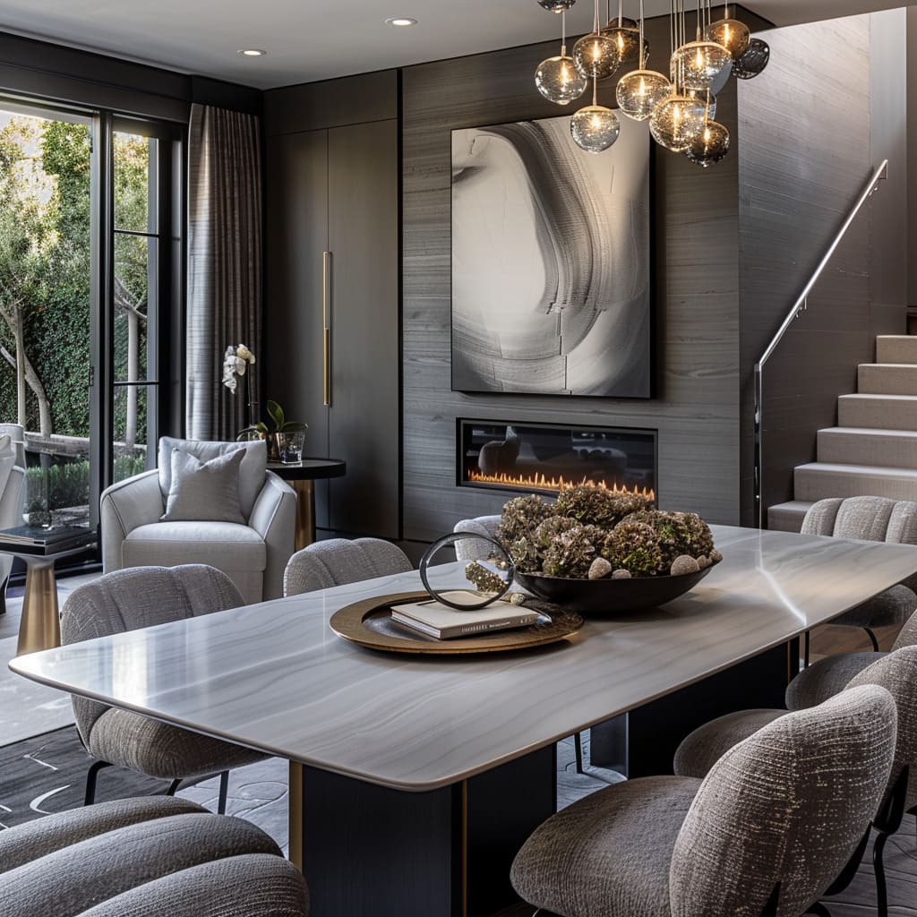
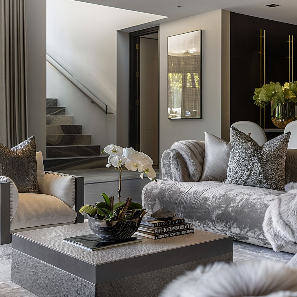
Within these interiors, furniture is chosen not merely for function but as an embodiment of form—a dialogue between structure and space. The boxy and clean-edged designs of the furnishings affirm a contemporary aesthetic while fostering practical pathways and areas for repose.
Furniture across the space adheres to a design ethos that values precision and clarity, evidenced by the prevalence of straight, crisp edges. This aesthetic choice embodies a minimalist philosophy, where each piece is reduced to its essence without superfluous details.
The sharp lines and angles thus contribute to a sense of order and modernity, forming a visual synergy with the more organic architectural elements.
In keeping with a contemporary design vocabulary, the furniture pieces exhibit a geometric solidity. The cubic and rectangular forms of the furniture communicate stability and functionality, serving as foundational elements within the room’s layout.
This structured approach to furniture design anchors the space, providing a counterpoint to the fluidity of human movement and the ephemeral play of light and shadow.
The careful curation of armchairs and sofas in the space prioritizes comfort and connectivity. These pieces are arranged to foster engagement and dialogue, inviting occupants to gather and share moments.
The strategic placement ensures that each seating area is accessible yet distinct, maintaining a sense of spaciousness and ensuring that the flow of conversation is as unimpeded as the flow of the room itself.
The deliberate organization of furnishings and decorative elements is more than an exercise in aesthetics; it is a subtle guidance system for inhabitants. The arrangements create clear lanes for passage, allowing for an intuitive and unforced exploration of the space.
These pathways reflect an understanding of movement and rest, channeling and dispersing energy in a manner that is both practical and pleasing to the senses.
Textile and Transparency Interplay
The softening effect of textiles contrasts with the predominantly hard surfaces, while transparent materials like glass and frosted elements offer a delicate balance between privacy and openness. These design choices highlight a refined interplay between the tangible and the ethereal.
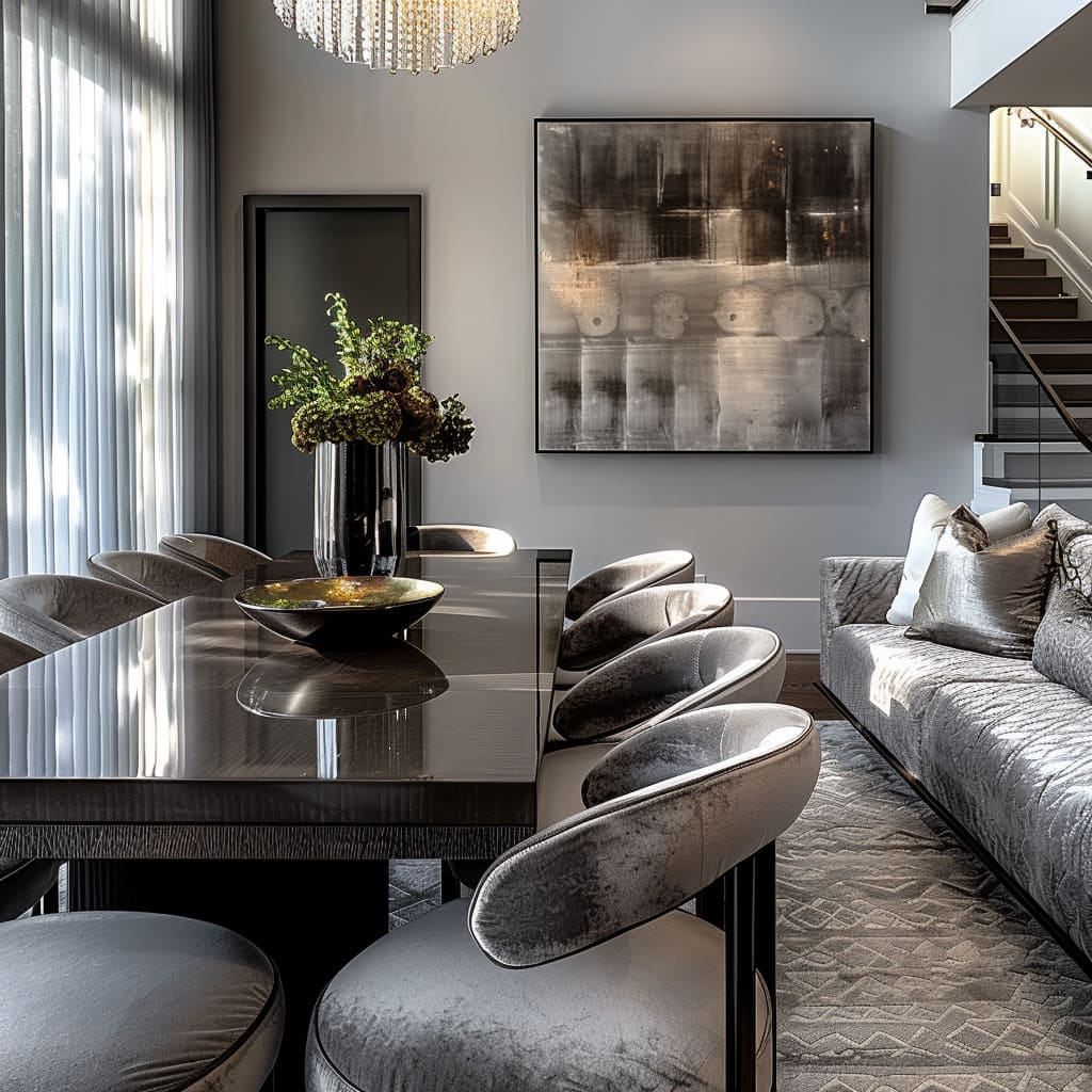
Although the foundational elements of these spaces are composed of hard, reflective materials, there is a conscious effort to integrate textiles to instill a sense of warmth and comfort. Accessories such as plush throw pillows and generously sized area rugs in subdued hues bring a softness that tempers the rigidity of the surroundings.
These fabric elements not only contribute to the visual appeal but also to the tactile experience, inviting touch and enhancing comfort.
The choice of glass in the construction of stair railings and partitions within these areas is no mere functional afterthought; it is a deliberate design statement that promotes an airy and open ambiance. This material selection allows for uninterrupted sight lines, fostering a sense of connection between different levels and areas while maintaining a distinct spatial hierarchy.
The clarity of glass introduces a lightness, encouraging a visual continuity that can make the spaces feel expansive and unconfined.
In the realm of the visual experience, the dance between what is revealed and what is obscured is artfully managed through the use of various glass treatments and fabrics. Curtains that drape gracefully and frosted glass that scatters light gently across its surface, play with visibility and illumination.
These materials allow for control over privacy and natural light, enabling a versatility that can transform the ambiance of the space with a simple adjustment. The nuanced use of these elements adds a layer of sophistication to the environment, engaging the senses and mind alike.
Exterior and Interior Synchronization
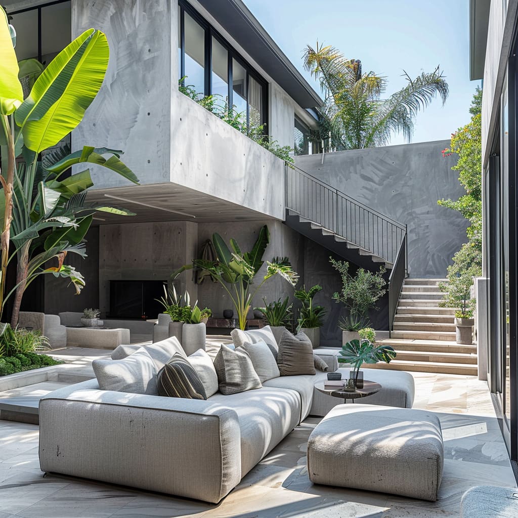
The exterior spaces echo the interior’s design principles, blurring the lines between indoors and out. Organized outdoor seating reflects the same level of sophistication as the interior, ensuring a harmonious transition and extending the living space beyond the confines of walls.
In the design of these spaces, continuity is key, with color and material choices extending from the interior to the exterior, creating a cohesive visual narrative. The consistent use of a monochromatic scheme and similar materials in different rooms and areas allows for a seamless flow that does not stop at doorways but rather extends outward, integrating the home with its surroundings.
This strategy ensures that the aesthetic feels unified, enhancing the spatial experience and creating an environment where transitions are almost imperceptible.
The arrangement of outdoor areas is a reflection of the interior’s considered approach, mirroring its refinement and composure. The structured furniture selected for these spaces exhibits a disciplined form and an orderly placement that is in dialogue with the indoor layout.
This deliberate replication of style ensures that the elegance of the interior is not lost when stepping outside but rather continues in a fluid conversation with the natural environment, making the outdoor seating not just an extension but an integral part of the living space.
Through these curated sections, the interior design is decoded into a symphony of styles and elements, each contributing to the overarching narrative of a home that is as aesthetically potent as it is habitable.
As the last page turns on this exploration of design, it’s clear that these spaces are not just crafted but composed—each room a stanza, each element a note in a greater symphony of contemporary living. Beyond serving the needs of daily life, these interiors offer a retreat, a space for thought, where the boundaries of indoors and outdoors blur, and every detail sings in harmony.
This is a home that stands as a testament to the poetry of modern design, a space where life unfolds in a spectrum of grays—each one capturing a different shade of human experience.
Discover more luxurious living room interior designs with rich gray hues on FancyHouse Design’s blog.

