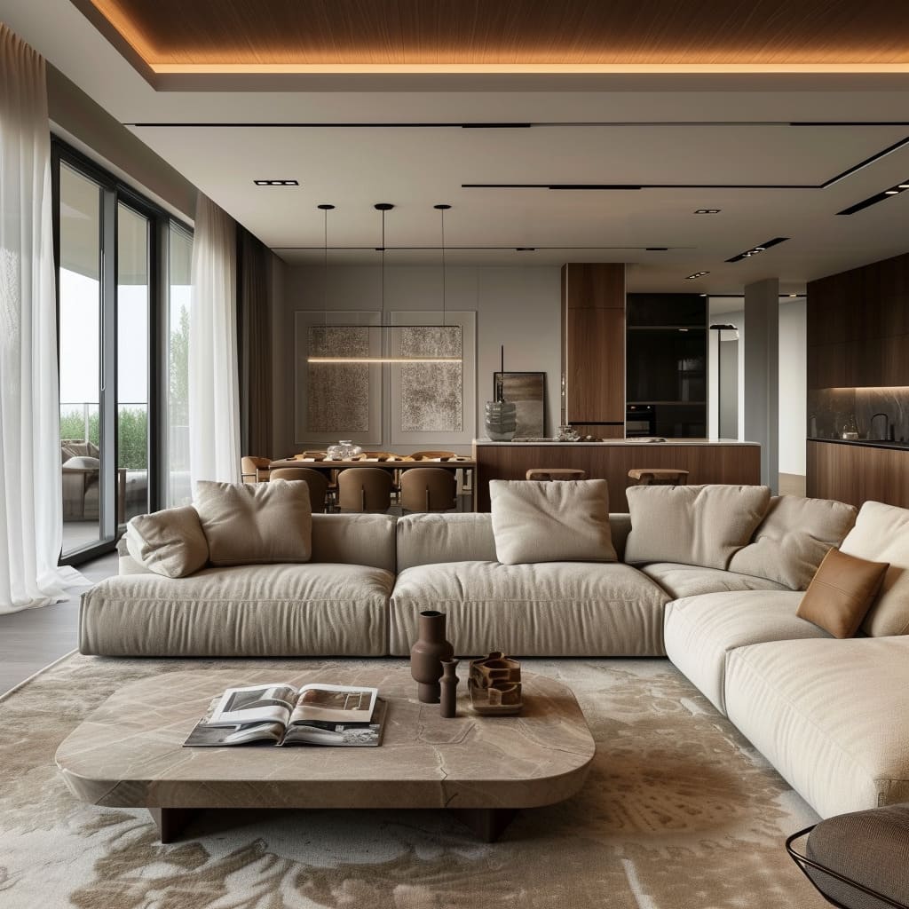
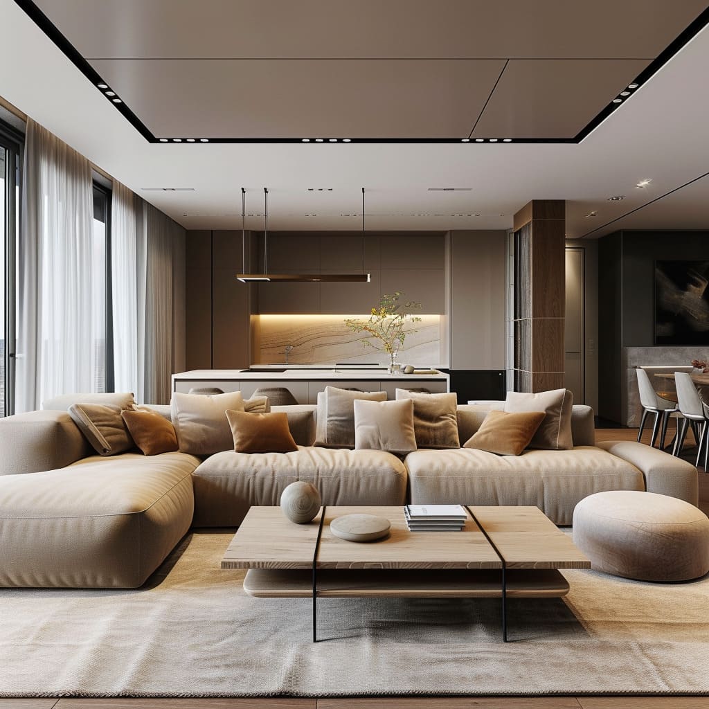
In the ever-evolving world of interior design, a trend that masterfully marries the tranquility of neutral tones with the understated opulence of minimalist luxury is making a definitive mark. Neutral-Toned Minimalist Luxe Open Living Spaces represent a lifestyle that values spaciousness, light, and a seamless blend of functionality and aesthetic appeal.
This article delves into the heart of this contemporary design trend, exploring how the subtle sophistication of neutral palettes, combined with the open, airy layouts and meticulously chosen decor, culminates in living spaces that are as calming as they are captivating.
Key Features of The Minimalist Luxe Open Spaces
Open-plan living spaces are celebrated for their ability to blend sleek aesthetics with everyday functionality. This design approach focuses on creating a harmonious environment where each element is both a visual delight and serves a practical purpose.
Below, we delve into the nuanced characteristics that define this style, from the thoughtful integration of natural light to the strategic use of functional decor, each contributing to a cohesive and fluid living experience. As we explore the key features, we uncover how the sophisticated interplay of design elements can transform any space into an epitome of modern elegance and comfort.
Color Palette
The chosen color palette in these spaces leans heavily towards a range of neutral tones, with a particularly strong presence of beige, taupe, and grey. This not only brings a sense of serenity and understated elegance to the rooms but also serves to unify the different living zones within the open-plan area.
The neutrality of the colors acts as a canvas, allowing the textures and forms within the space to take center stage, and the occasional hints of muted golds or soft pastels in accessories provide subtle highlights without overwhelming the design.
Expanding further, these neutral hues are strategically chosen for their reflective qualities, which bounce light around the room, enhancing the sense of space. They’re also incredibly adaptive, offering a backdrop that can evolve with changing tastes or seasonal decor updates.
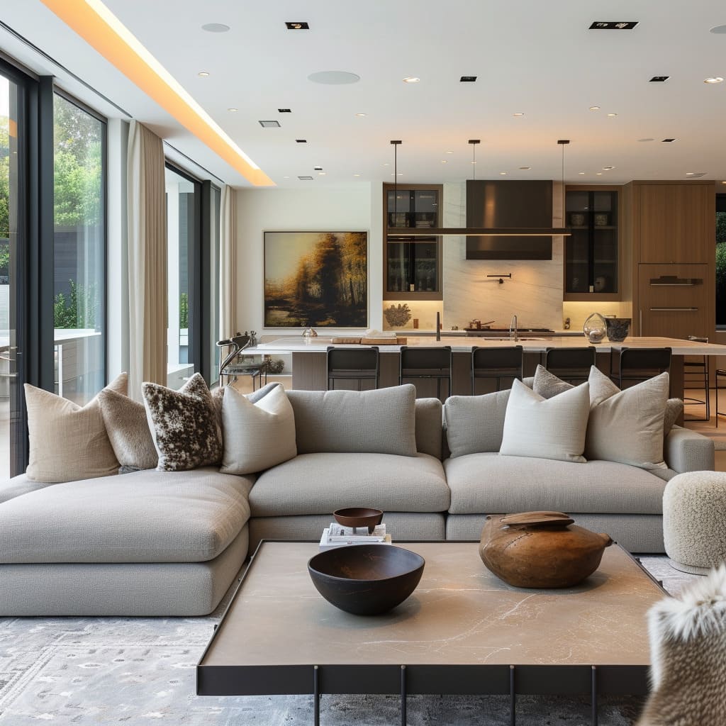
For instance, the soft grey of the sofa upholstery is timeless, yet it can be easily refreshed with throw pillows in vibrant summer colors or rich, deep tones in the winter.
To achieve a similar color palette in one’s own space, start with a base of neutrals for large surfaces like walls and floors. Introduce variety with different shades and undertones—from cool greys to warm beiges—to add visual interest.
Use texture and material variation to keep the monochromatic scheme dynamic, and don’t be afraid to layer similar colors, as this can add depth and sophistication to the space.
Furniture
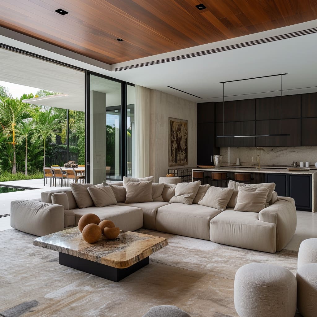
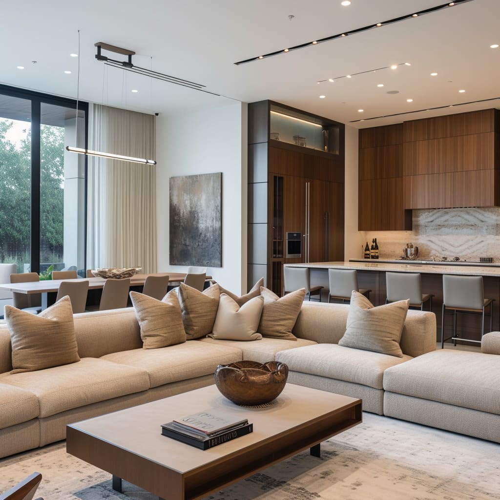
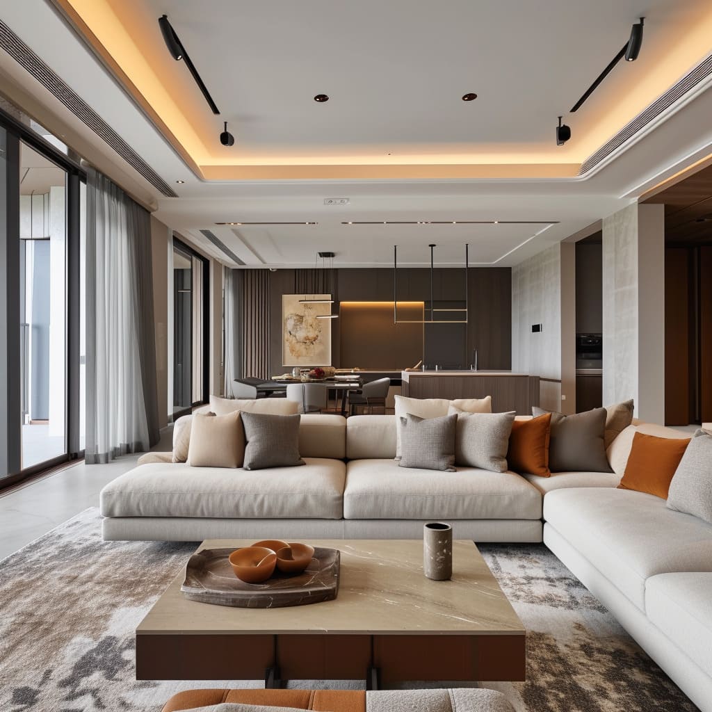
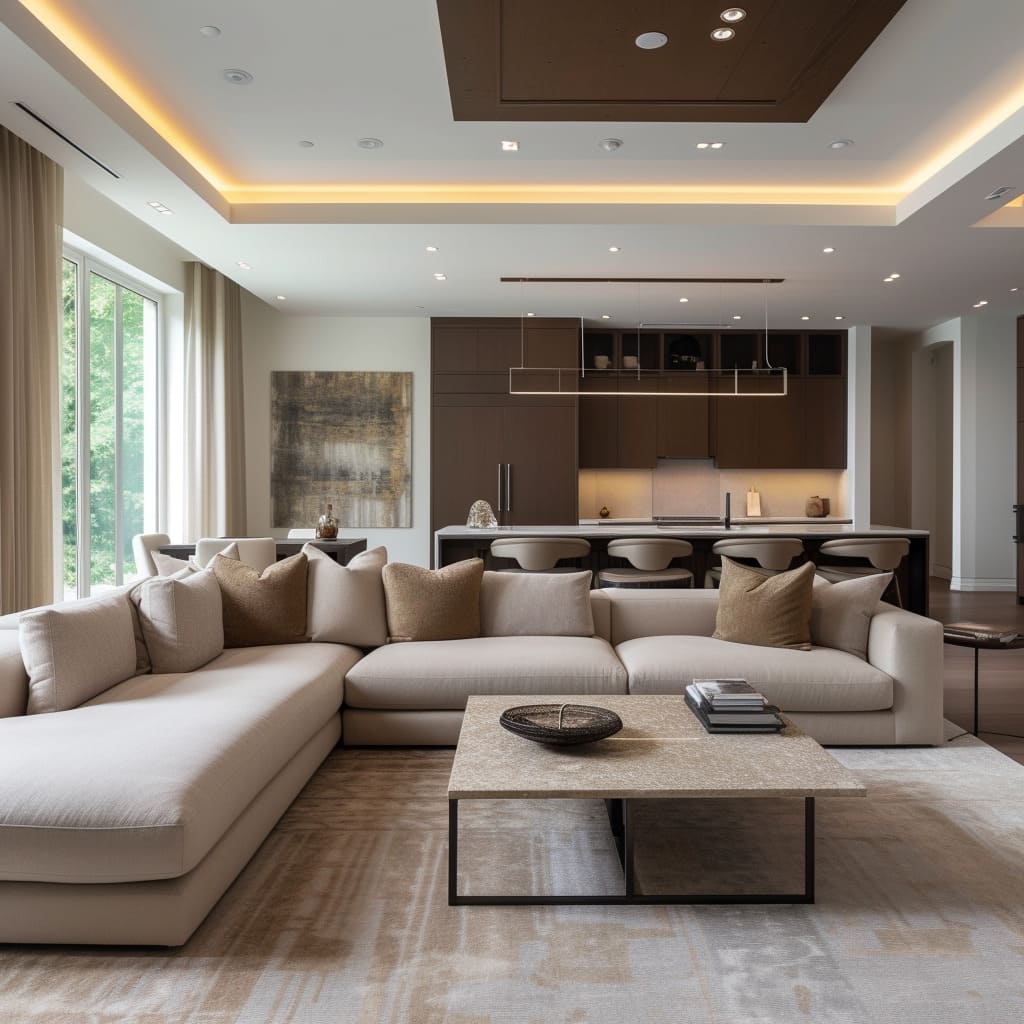
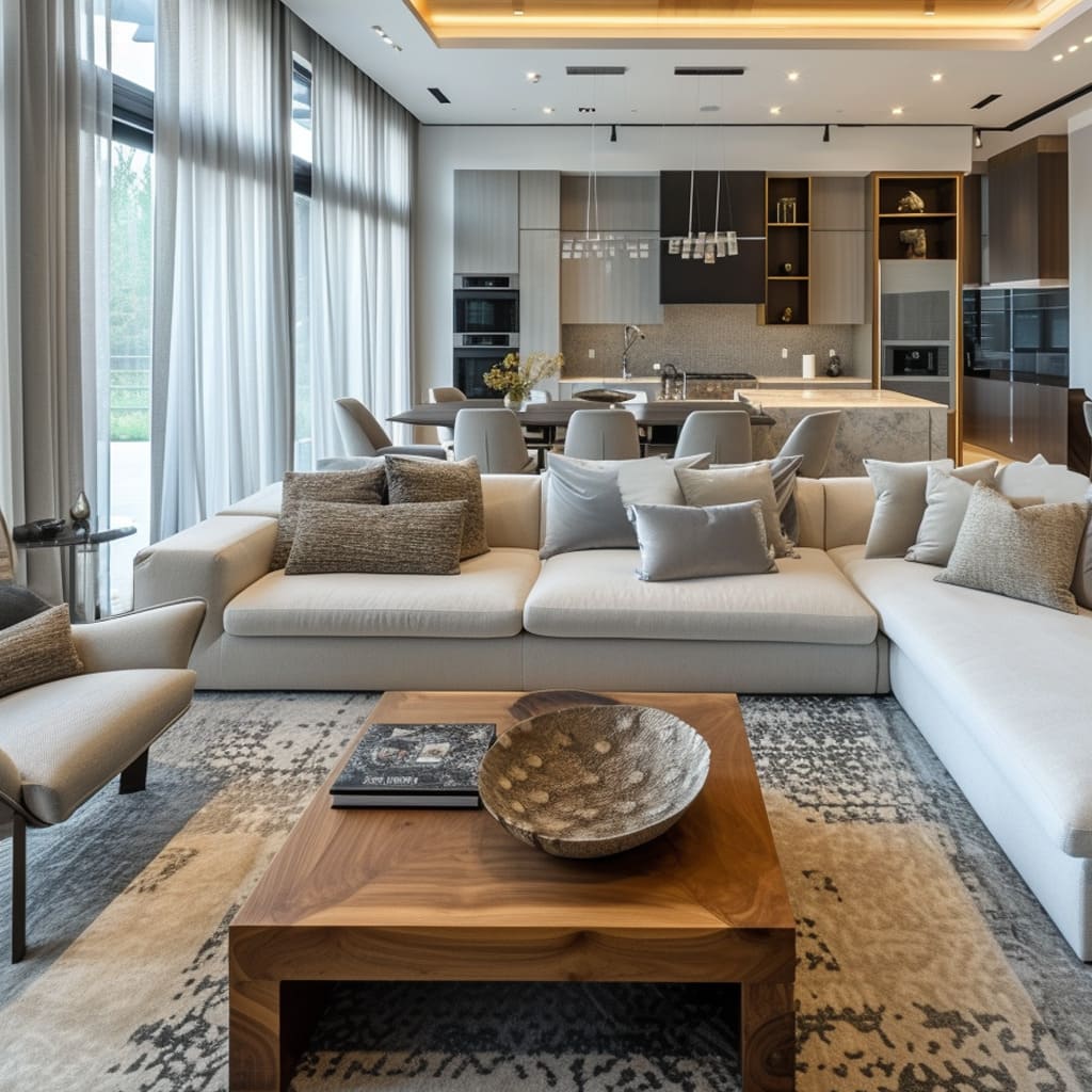
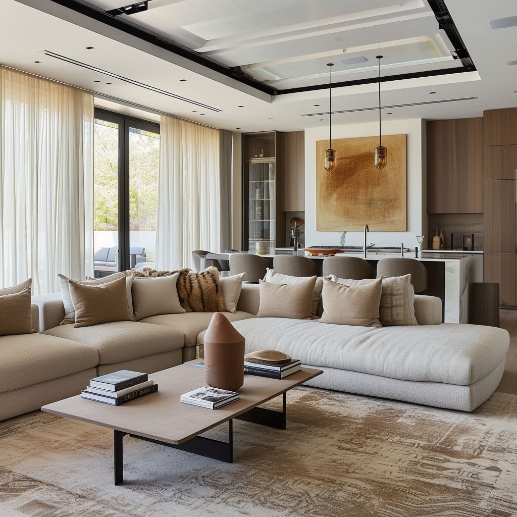
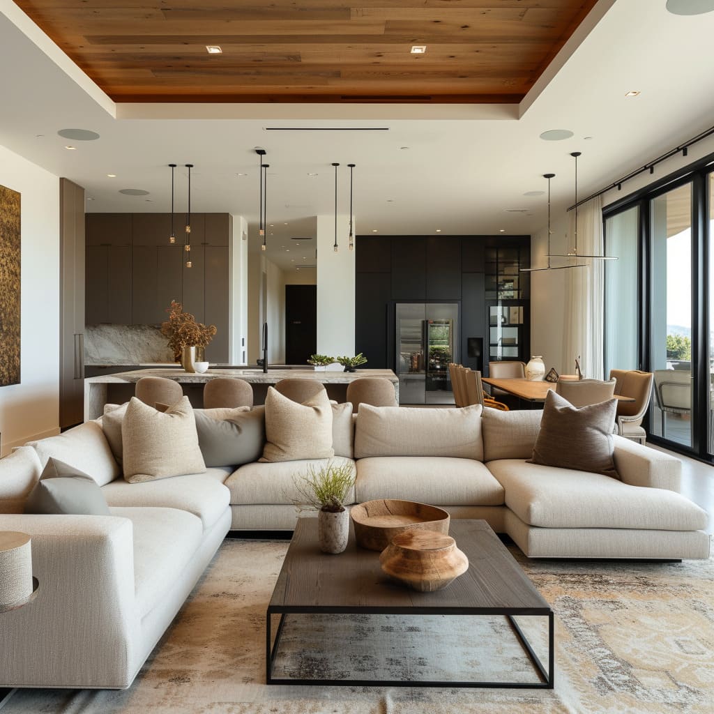
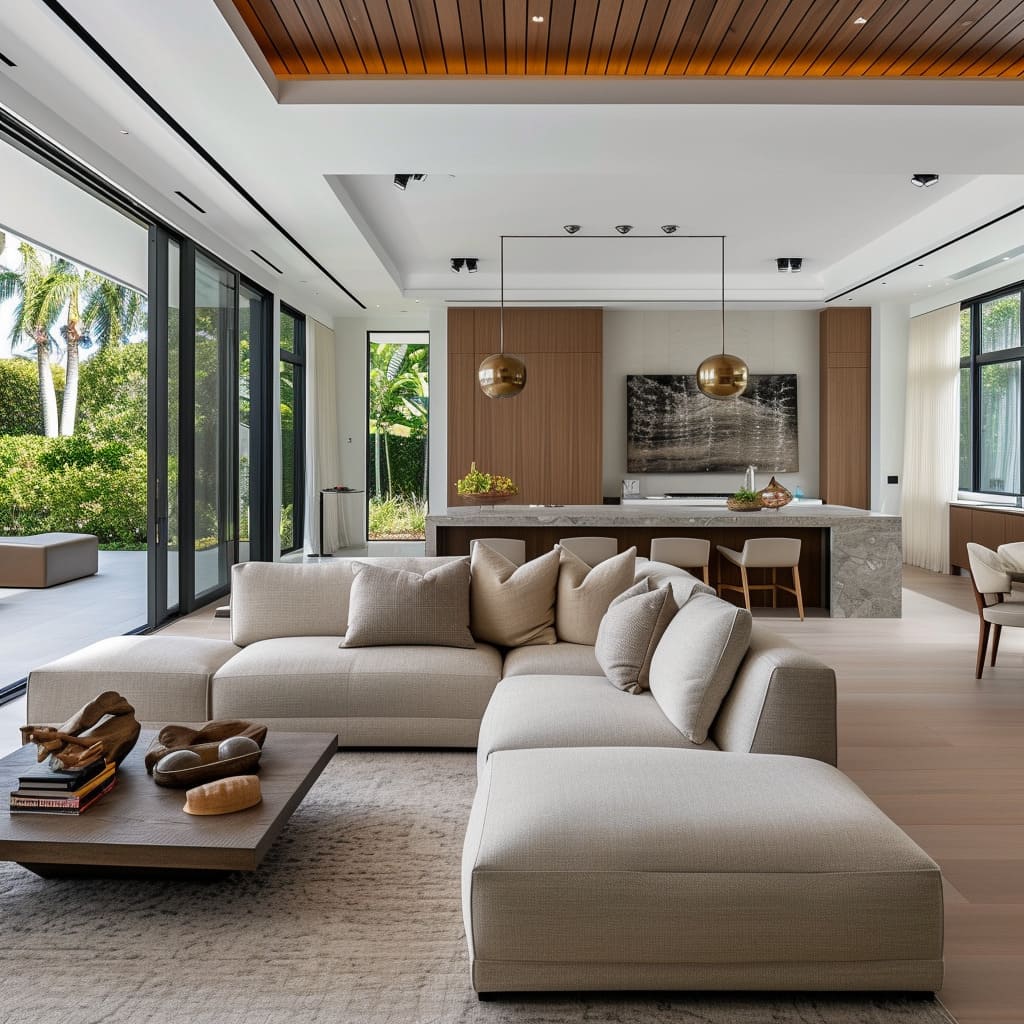
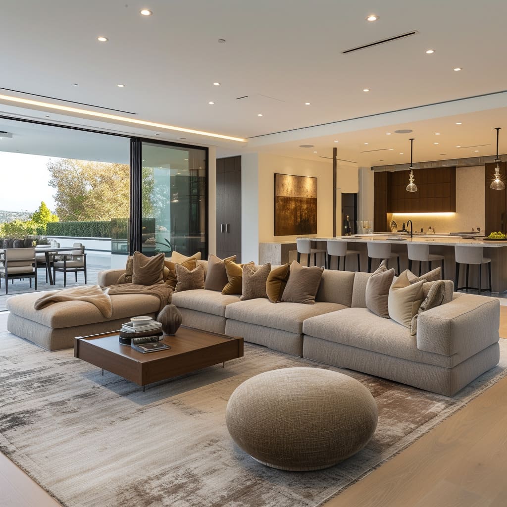
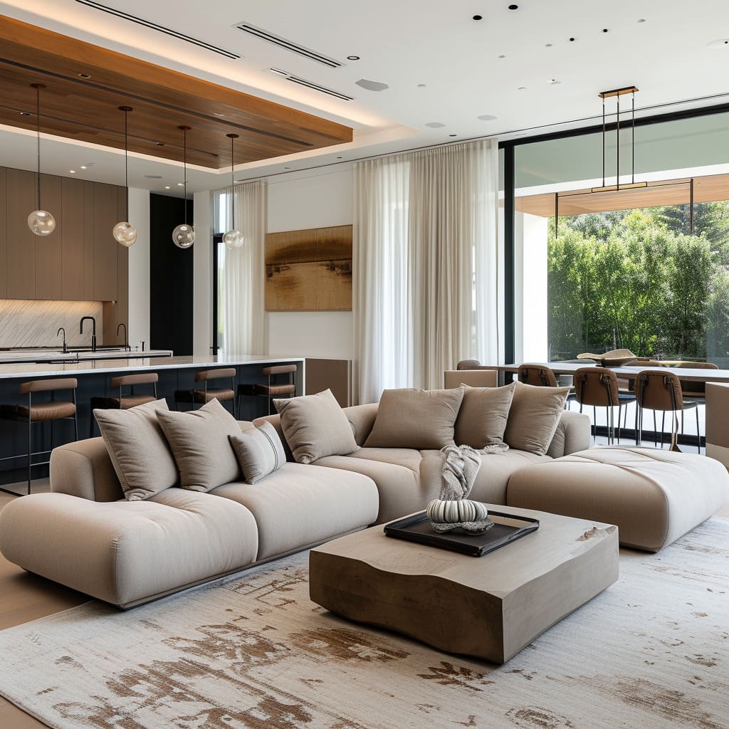
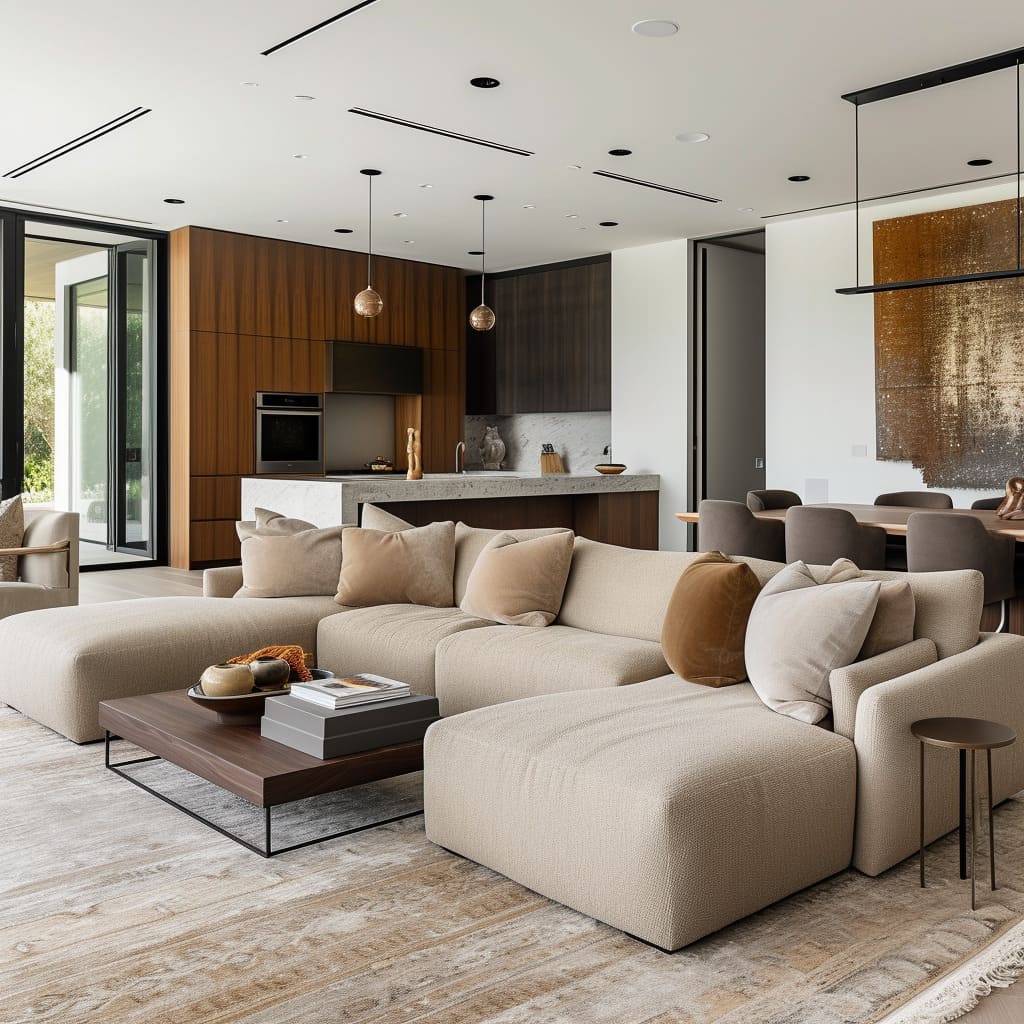
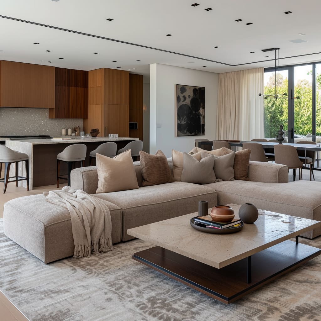
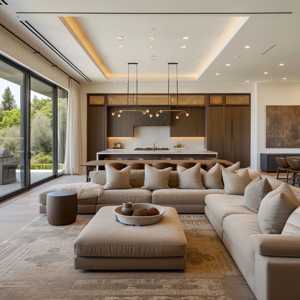
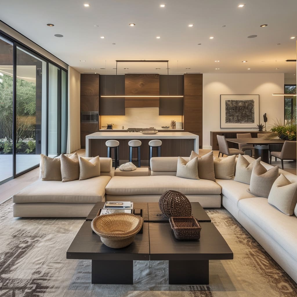
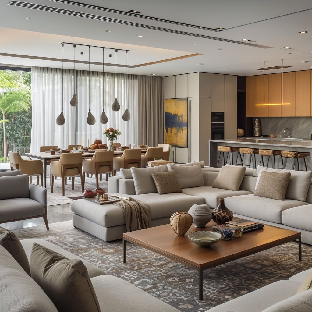
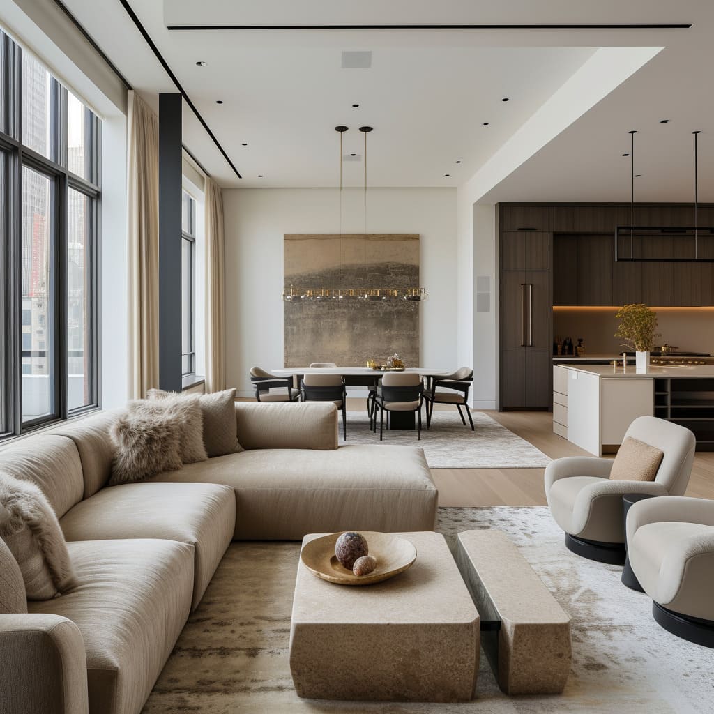
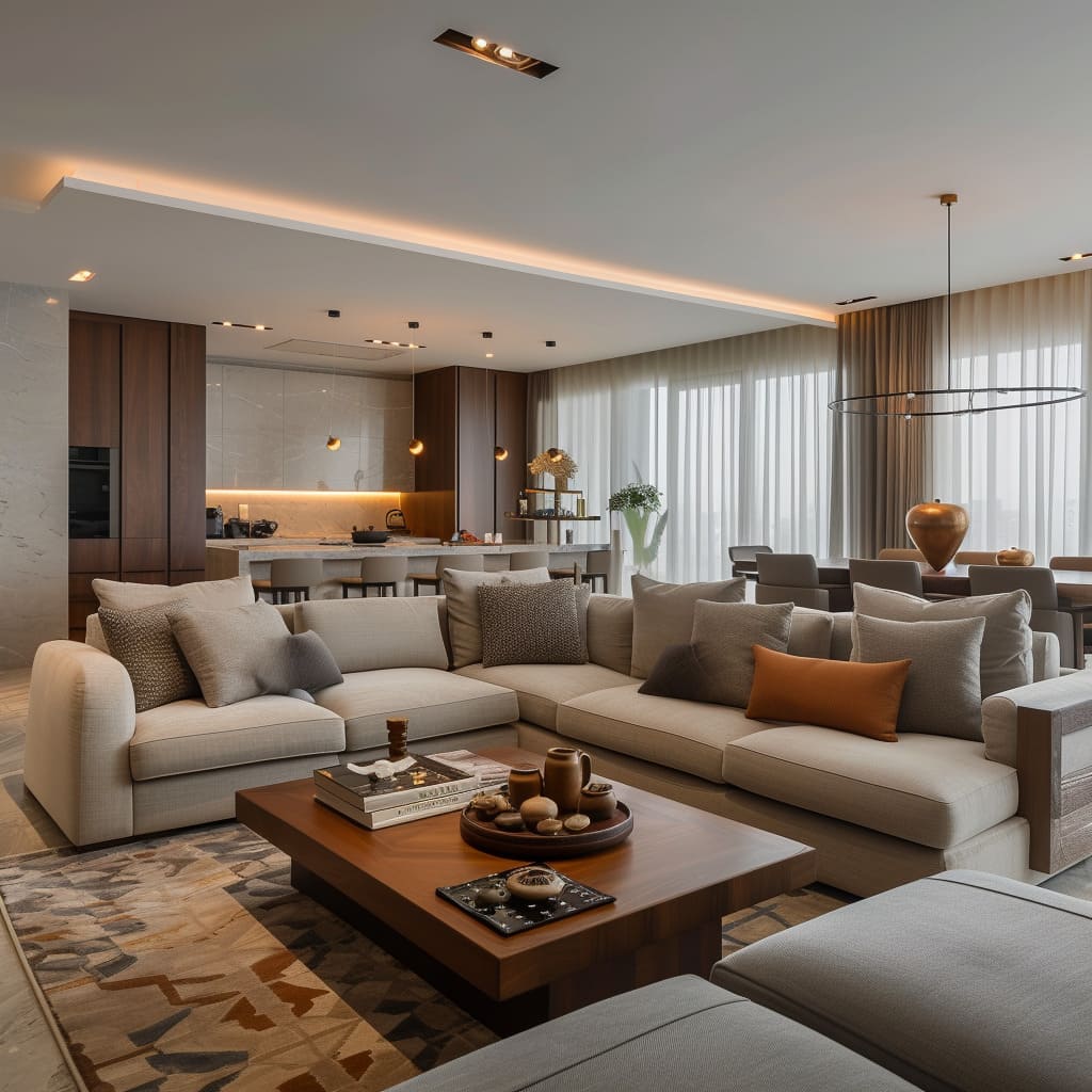
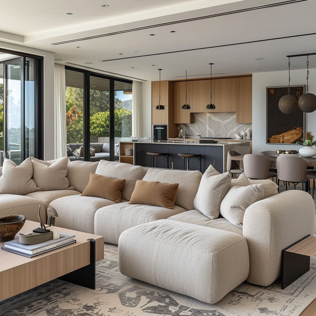
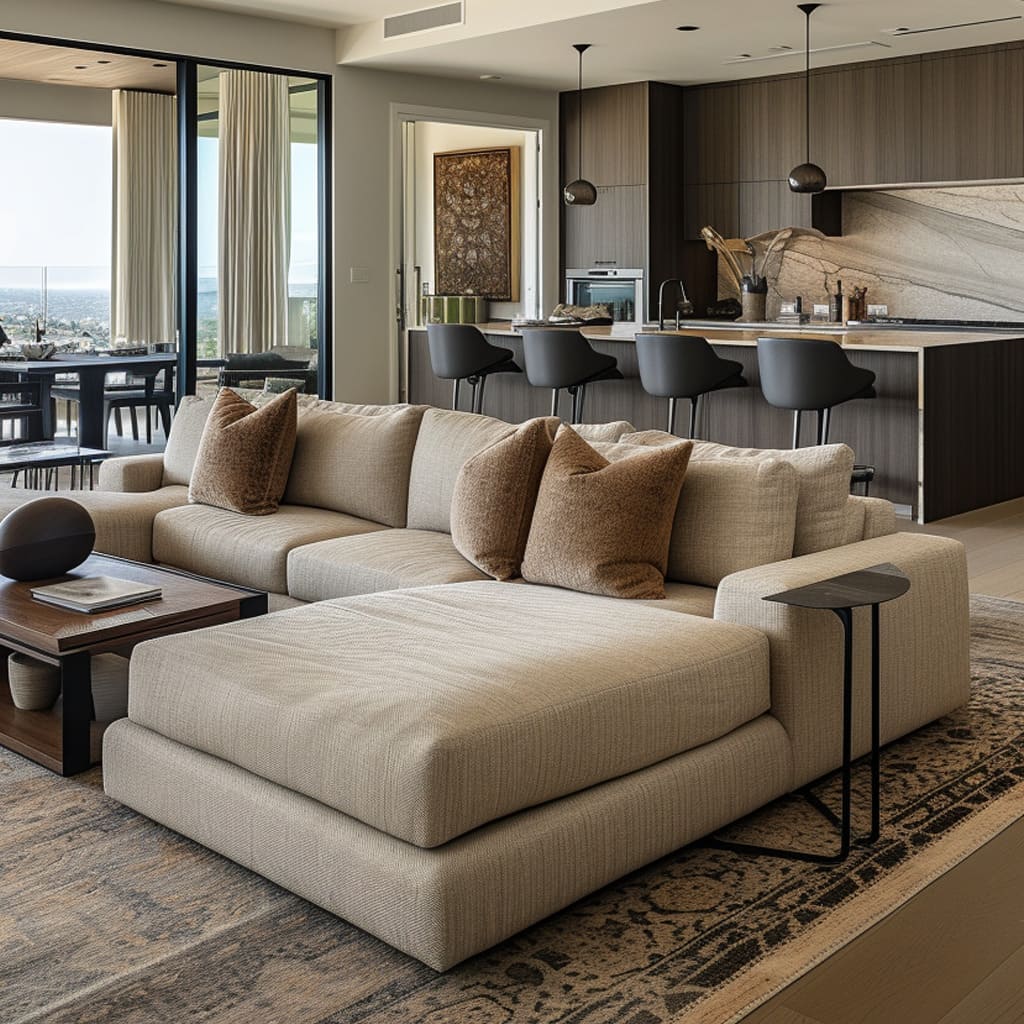
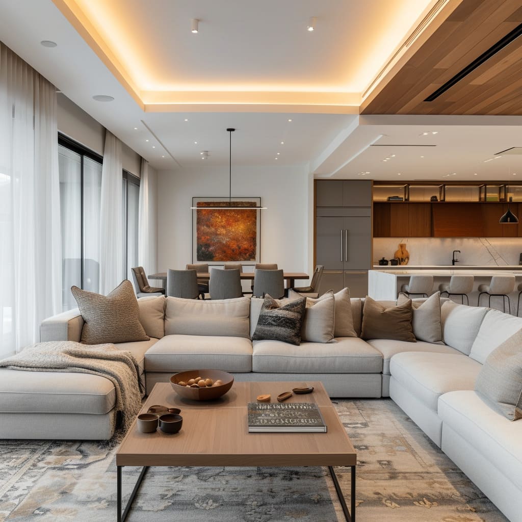
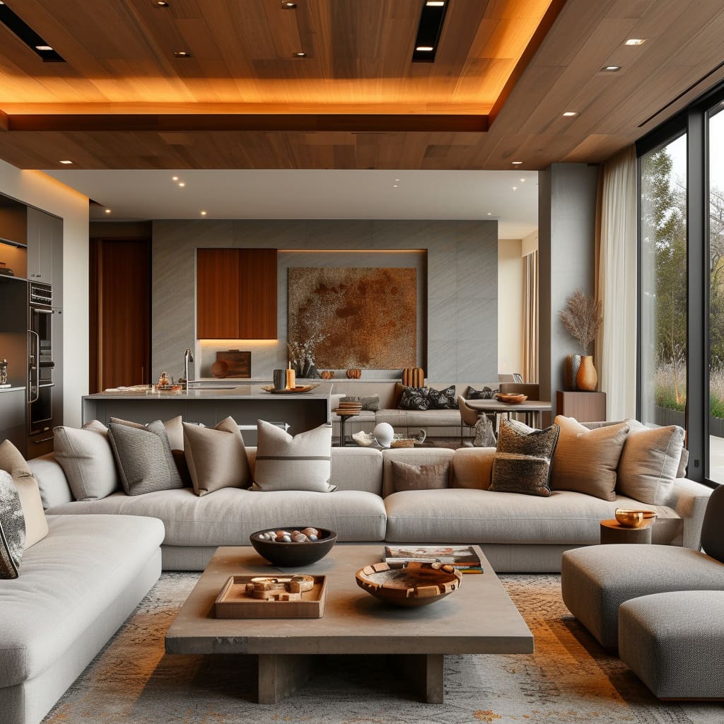
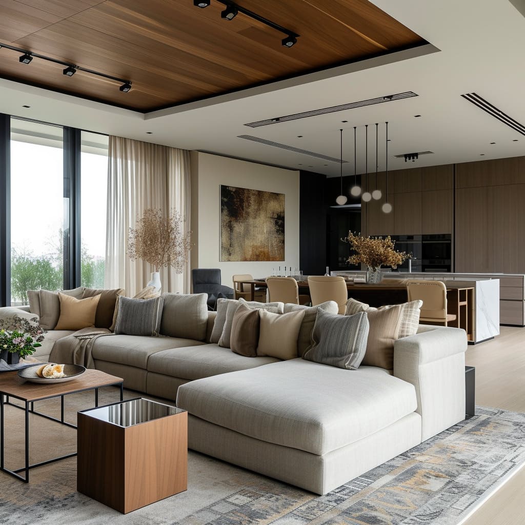
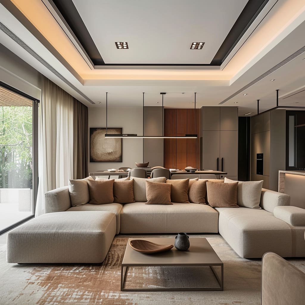
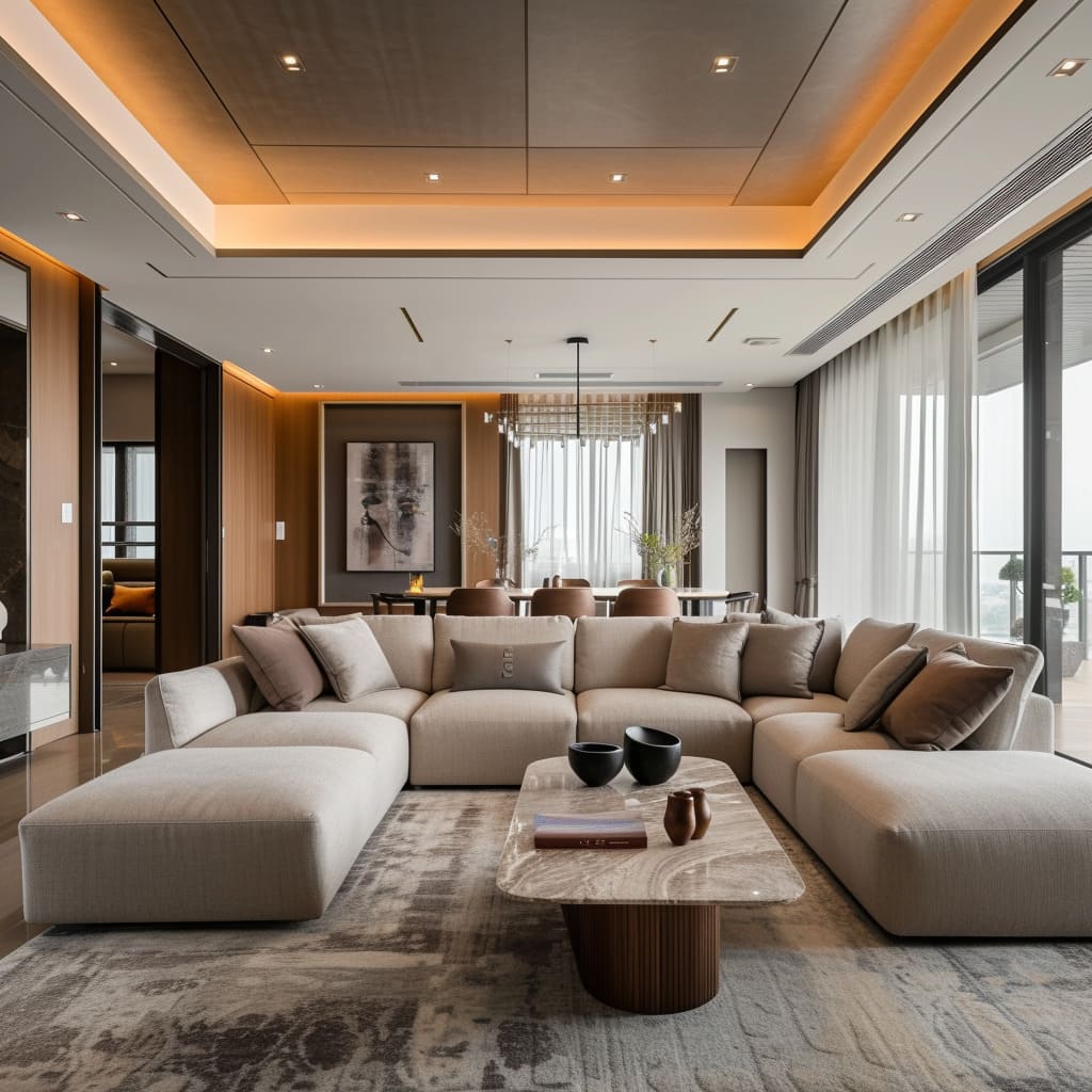
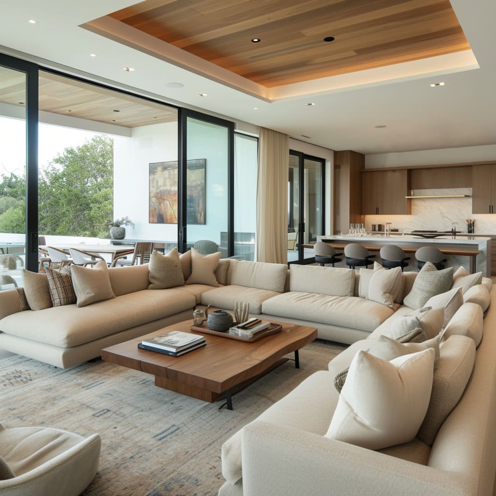
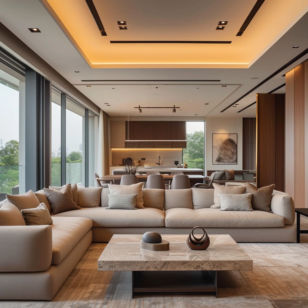
The modern furniture showcased across these living spaces is characterized by its simplicity and emphasis on form. Sofas with wide, inviting seats, low backs, and arms, as well as chairs with a more structured design, promote a sense of modern elegance.
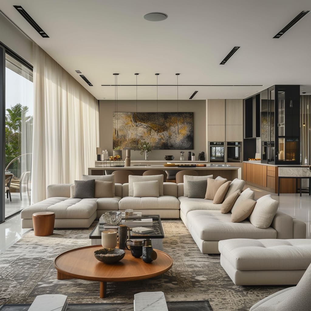
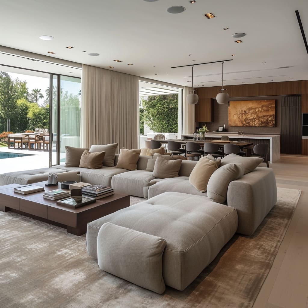
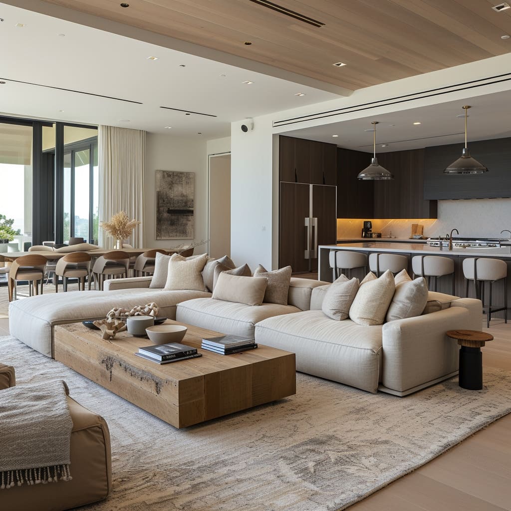
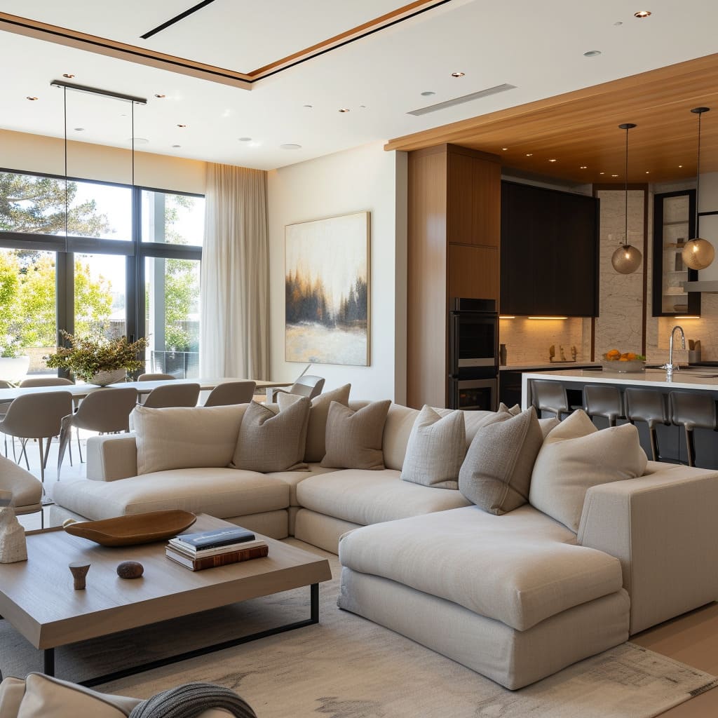
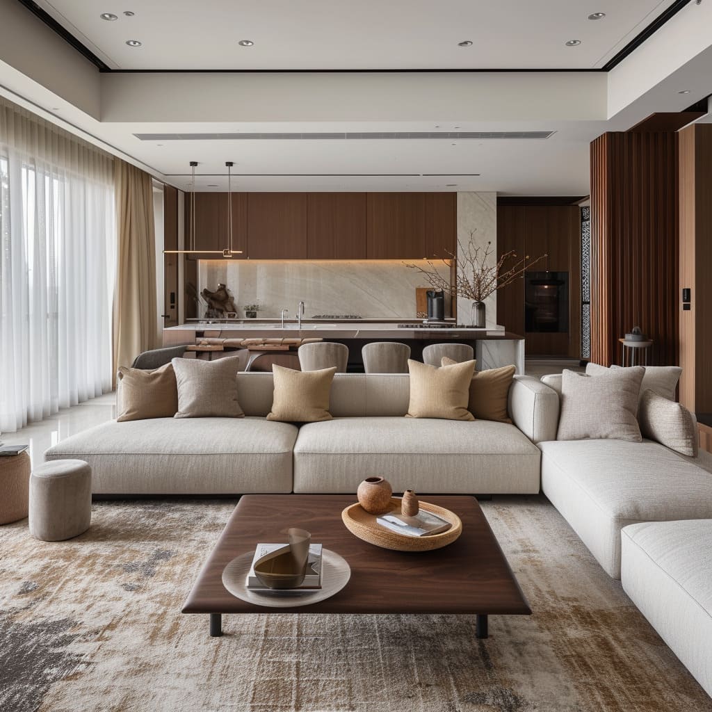
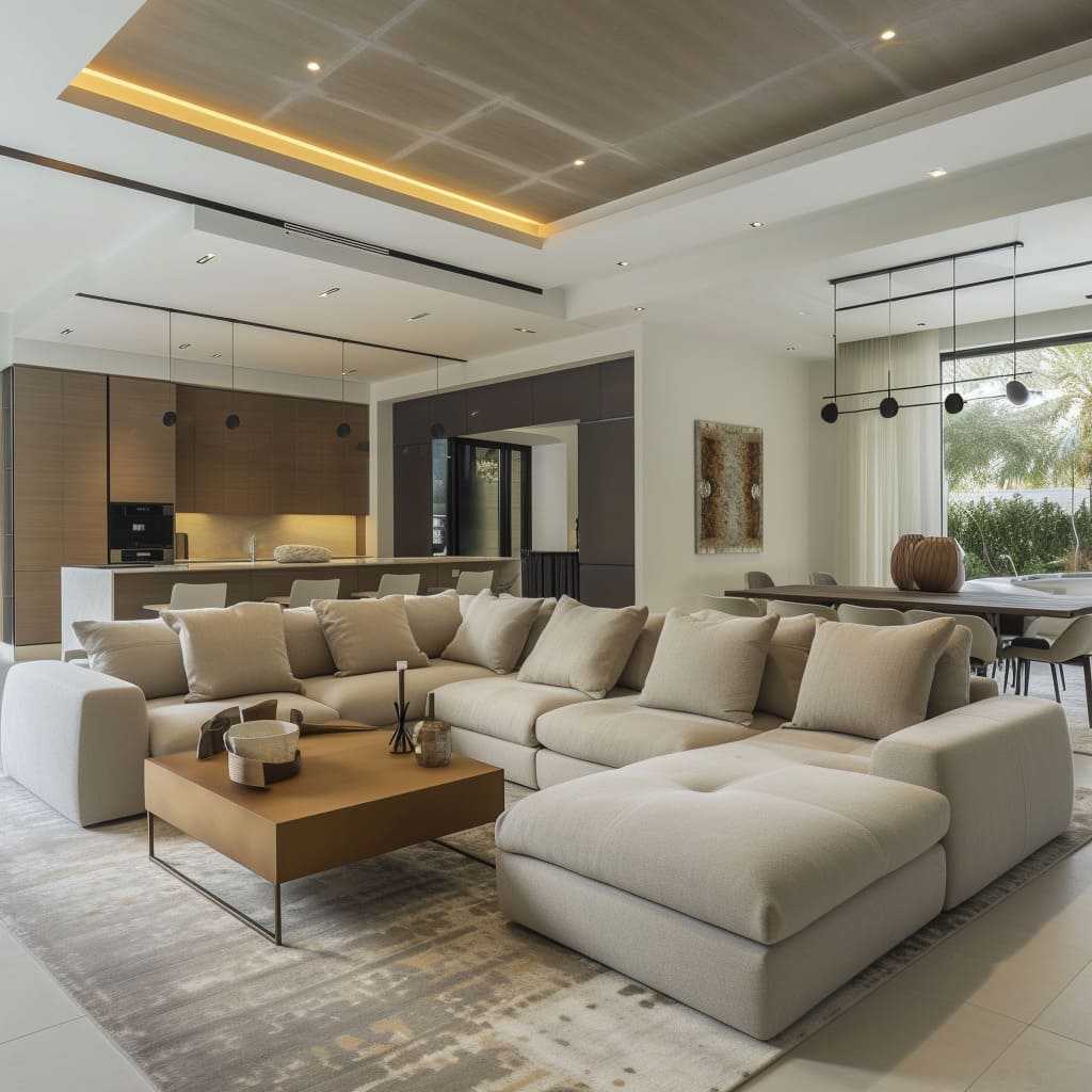
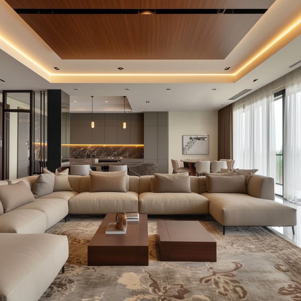
The use of modular pieces not only demonstrates the versatility of the furniture arrangements but also reflects a contemporary approach to living where adaptability and functionality are key. In some of the interiors, the sofas are arranged to facilitate conversation, with the generous use of cushions enhancing the inviting quality of the spaces.
Further examination reveals thoughtful consideration of proportions and scale. The oversized sofas do not overpower the rooms but rather complement the expansive nature of the open-plan design.
The clean lines of the furniture ensure that despite their size, they maintain a sleek profile, contributing to the uncluttered aesthetic. For those looking to replicate this furniture style, selecting pieces that offer both form and function is crucial.
Opt for modular furniture that can be easily reconfigured to suit different occasions. Invest in high-quality materials that promise durability and choose designs that prioritize comfort without sacrificing style.
Remember, a minimal number of well-chosen pieces can make a stronger statement than a room full of furniture.
Material Mix
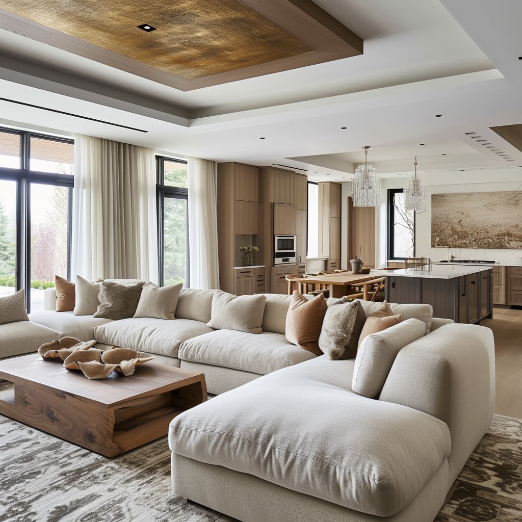
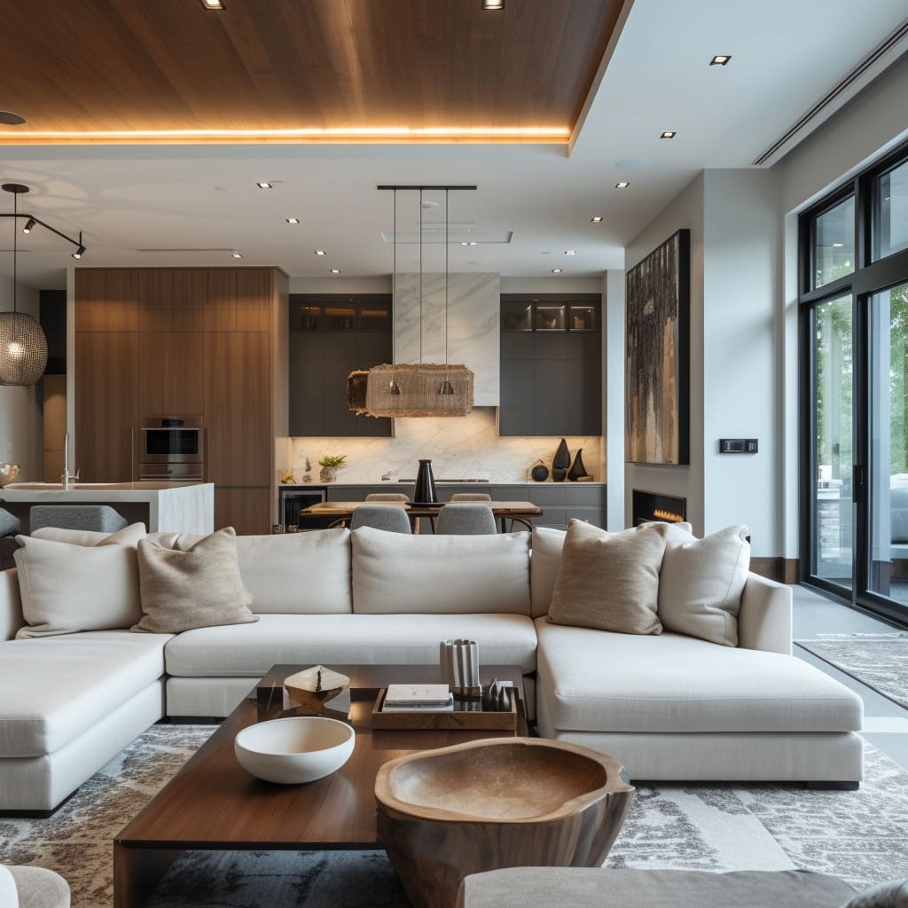
The interior spaces depicted make masterful use of a diverse range of materials, which add layers of texture and interest to the neutral color scheme. The wooden elements range from pale Scandi-inspired tones to richer walnuts, each bringing a different character to the spaces they inhabit.
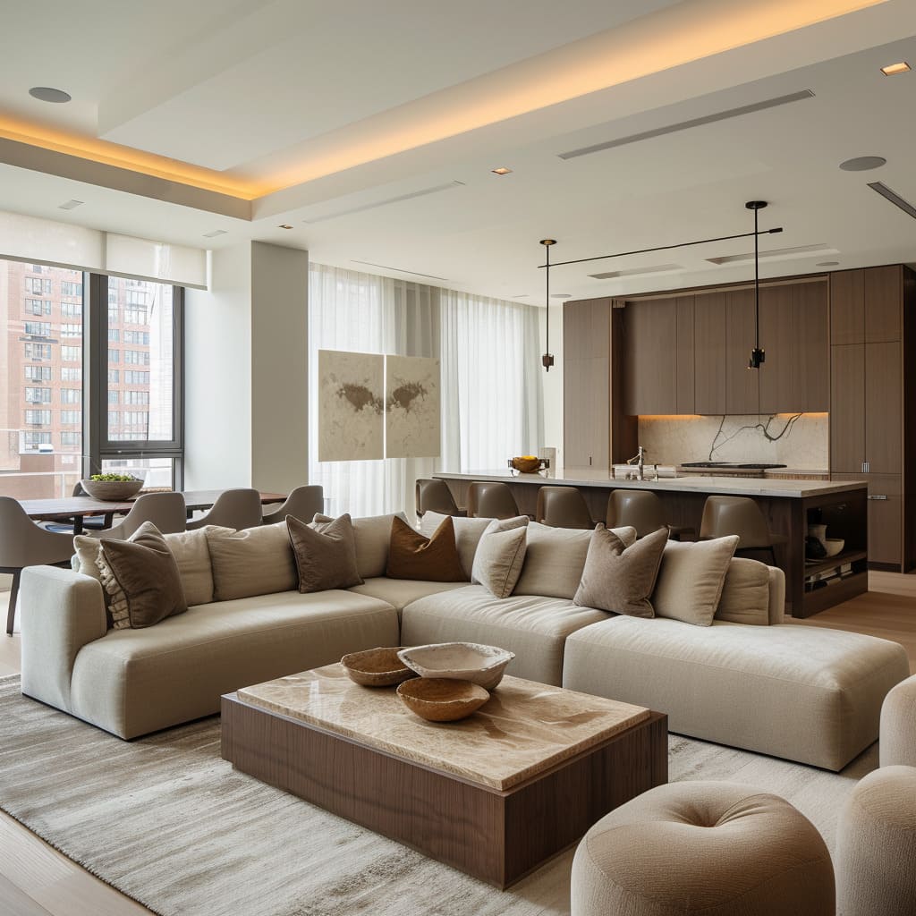
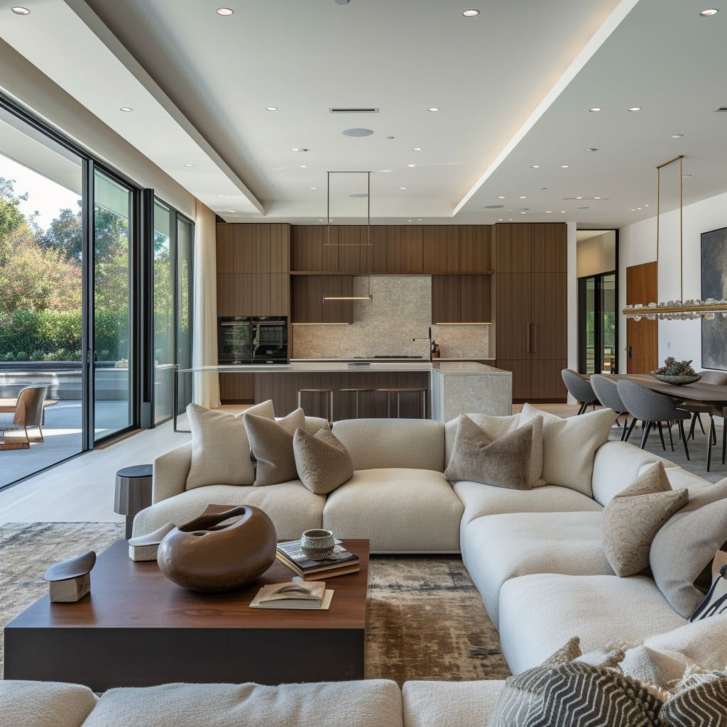
Marble surfaces add a touch of luxury and are often seen in the kitchen countertops or as statement coffee table tops. Metal accents are discreet yet impactful, with matte black or brushed brass finishes on fixtures and furniture legs adding a contemporary edge.
Delving deeper, the textures in these spaces are particularly notable. Linen and cotton upholstery fabrics offer a tactile quality that invites touch, while the smooth leather of dining chairs or kitchen stools provides a sleek contrast.
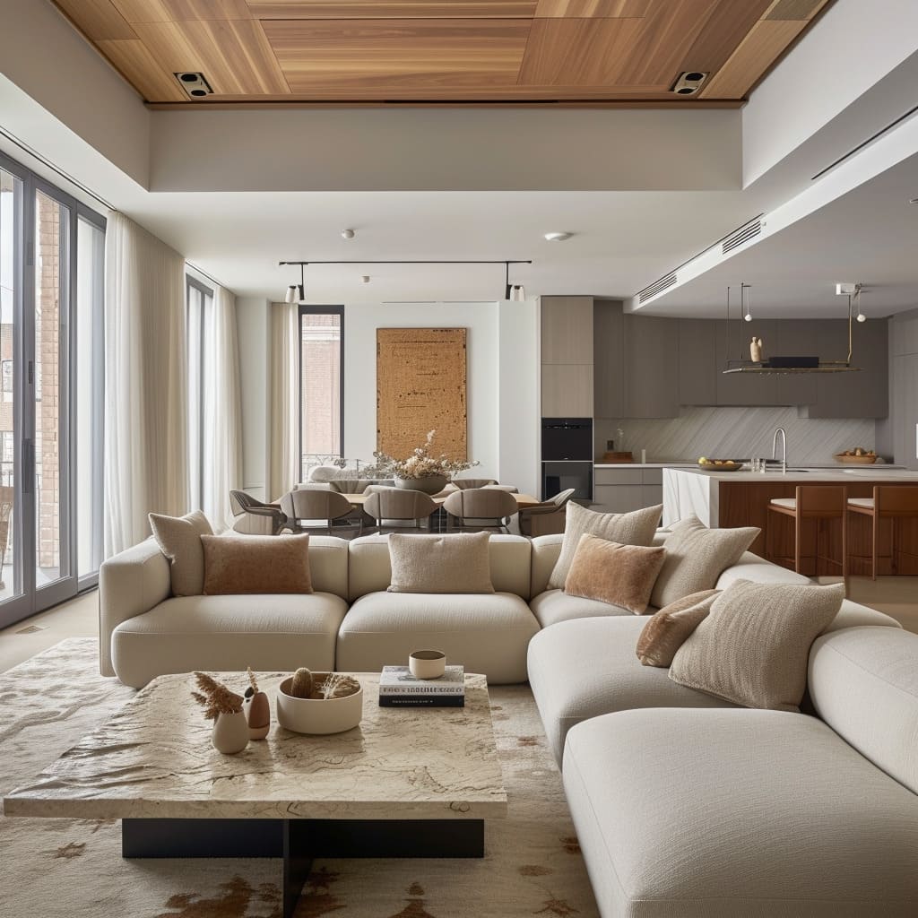
The area rugs underfoot, with their abstract designs, not only delineate different zones within the open-plan layout but also contribute to the acoustic comfort of the space, softening sounds and creating a cozier ambiance.
To incorporate a similar material mix in a personal interior, one should focus on balancing hard and soft textures. Pair smooth, hard surfaces like marble or glass with softer, woven textures in rugs and throws.
Use metal accents sparingly to highlight and frame the space, and don’t shy away from mixing wood grains and finishes to add depth and natural warmth to the room. The key is to maintain a cohesive look by ensuring all materials complement the neutral color palette.
Lighting
The lighting in these living spaces is meticulously planned to serve both aesthetic and practical purposes. The recessed ceiling lights are evenly spaced, providing ambient lighting that fills the room without creating harsh shadows.
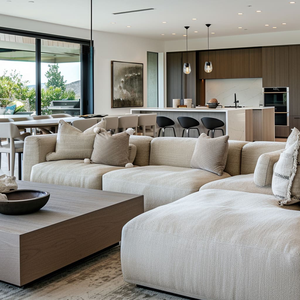
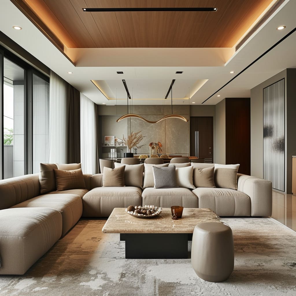
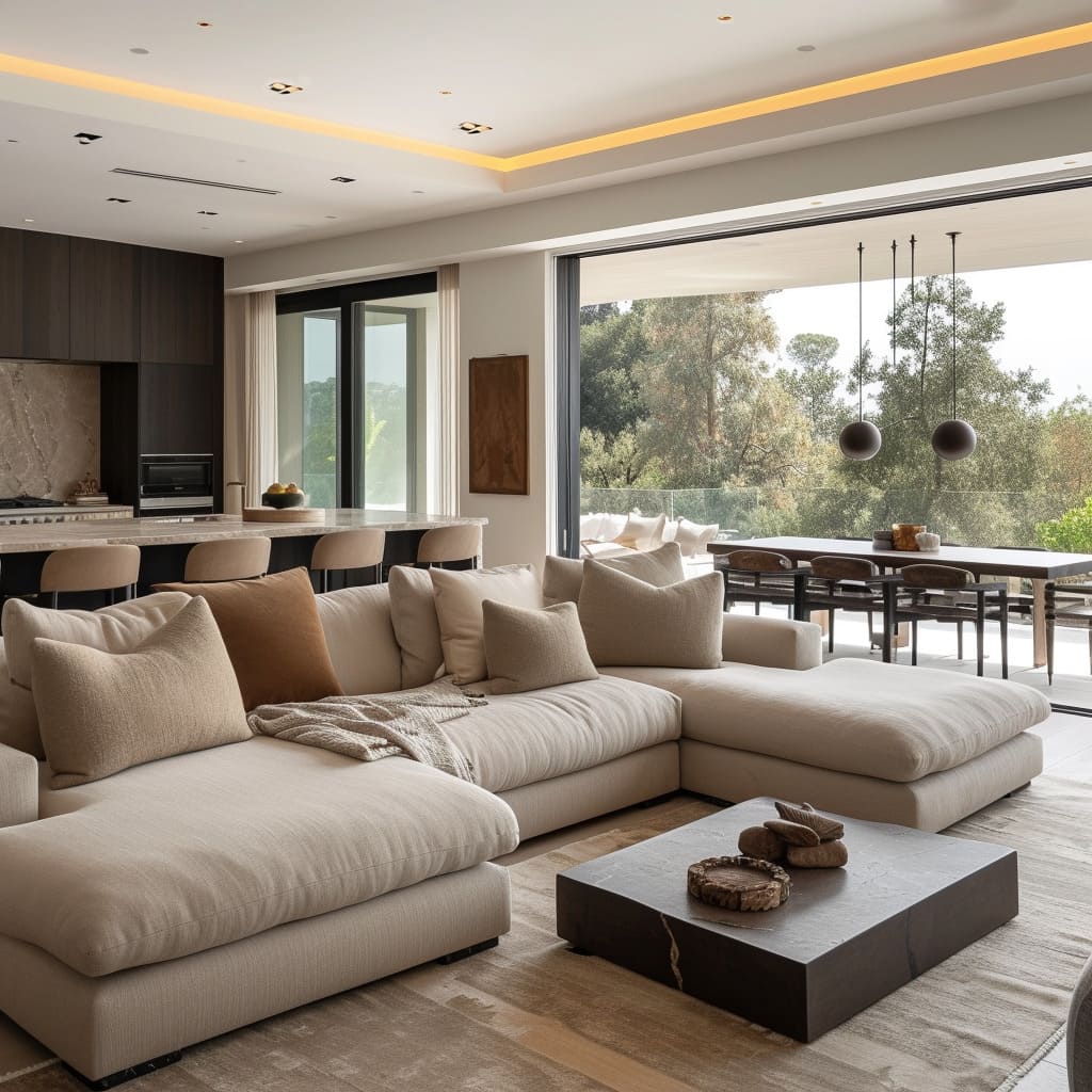
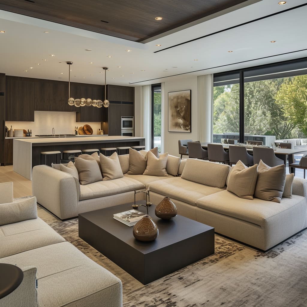
Pendant fixtures, ranging from sleek single bulbs to more elaborate multi-light arrangements, hang with precision, often centered over coffee tables or dining areas. These not only illuminate the spaces beneath but also serve as sculptural elements that draw the eye.
Task lighting, such as directional spots or under-cabinet strips, ensures that work areas in kitchens or reading nooks are well-lit.
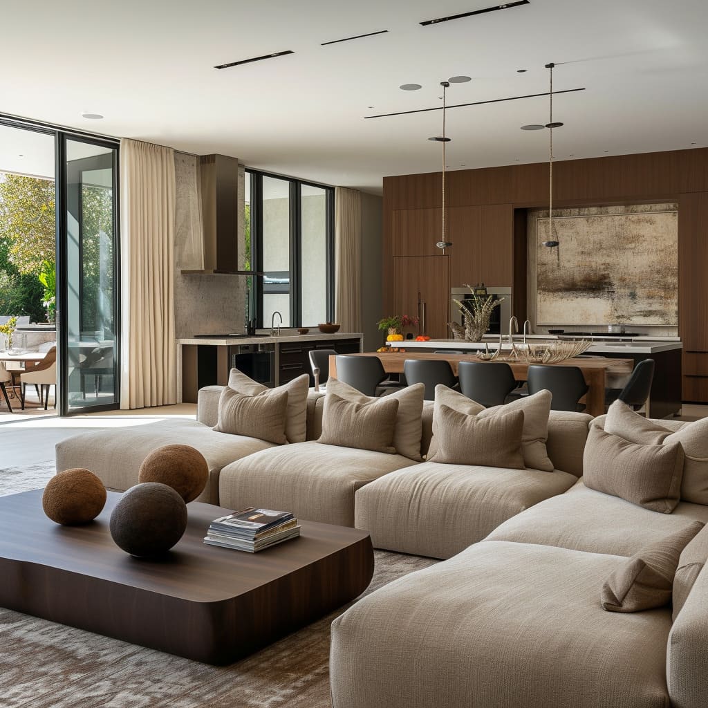
The choice of light fixtures contributes to the overall design narrative of each space. For example, black pendant lights offer a stark contrast against a light ceiling, creating a modern industrial vibe, while softer, round-edged fixtures echo the curves of the furniture below.
The strategic placement of lighting also highlights architectural features such as high ceilings or textured walls, enhancing the spatial experience.
For incorporating such lighting in your own space, consider the function of each area within the room and choose lighting that serves those needs. Combine overhead lighting with floor lamps and table lamps to create a warm and inviting environment.
Consider dimmable options to adjust the mood and energy of the space as needed. Selecting fixtures with design elements that complement your decor can also serve as a unifying theme throughout the open-plan area.
Art and Accessories
The art and accessories in these spaces are carefully curated to provide balance and personality. The artwork ranges from abstract canvases to framed modern prints, each piece selected not just for its aesthetic appeal but for the way it interacts with the space around it—some providing a stark contrast to the clean lines of the furniture, others offering a continuation of the room’s color story.
Accessories are chosen for their ability to blend seamlessly into the decor; vases, bowls, and sculptural objects are often in neutral tones that complement the overarching design scheme, while also providing subtle textural differences.
On a closer look, the placement of art and accessories is intentional, often creating a visual pathway through the room or serving as a focal point within a defined area. Decorative pillows and throws add layers of comfort and can be easily swapped out to update the look.
Books and curated objects on coffee tables or shelves invite personalization and conversation, making the spaces feel lived-in and welcoming. To bring this level of detail into your own home, start with art that speaks to you and consider its placement carefully; art should enhance the space without overwhelming it.
Choose accessories that have both aesthetic and functional value, and keep them to a minimal to avoid clutter. Varying the heights and scales of objects on display can add interest and draw the eye through the room.
Flooring
The flooring choices reflect a commitment to both style and practicality. Large format tiles in lighter shades contribute to the seamless flow of the space and are easy to clean, making them an excellent choice for high-traffic areas.
The use of wide-plank wood introduces warmth and a natural element that complements the neutral tones of the walls and furniture. These materials not only provide a sturdy foundation for the furniture but also play a significant role in defining the overall ambiance of the space.
Further observation shows that the transition between different flooring materials is handled with care, often demarcating different zones within the open-plan layout. The positioning of rugs is equally thoughtful; they anchor seating arrangements and add a layer of texture and color that enhances the room’s design.
The patterns and colors of the rugs are chosen to harmonize with the surrounding decor, reinforcing the cohesive feel of the interior.
For those aiming to replicate these flooring choices, it’s essential to start with a clear understanding of your space’s needs. Consider the durability and maintenance of the materials, especially in open-plan areas that see a lot of foot traffic.
Use rugs to define ‘rooms’ within the space, and select patterns and colors that tie in with your overall design scheme. Ensure that transitions between different flooring materials are smooth and visually pleasing to maintain the open feel of your layout.
Kitchen Integration
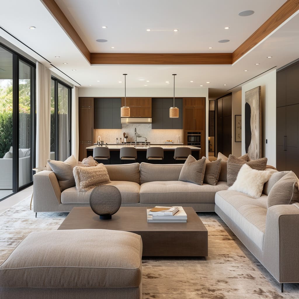
In these designs, the kitchen is not just a separate space for cooking; it’s a centerpiece that complements and seamlessly transitions into the living areas. The cabinetry is often handle-less, boasting a sleek and unobtrusive profile, while state-of-the-art appliances are built-in, maintaining the clean lines of the design.
The islands and breakfast bars act as informal dining spots, social hubs, and additional workspaces, underlined by stylish pendant lighting that delineates the kitchen area from the rest of the living space.
Expanding further, we notice that the kitchen areas make use of open shelving or glass-fronted cabinets, which add to the open feel and can display fine dinnerware as decorative elements. The backsplash is typically of subtle design, harmonizing with the rest of the space, and countertops are kept clear, with most appliances tucked away, reinforcing the minimalist and uncluttered aesthetic.
To achieve such a kitchen integration in your home, focus on creating a cohesive design with the living space. Choose cabinetry that matches or complements your living area’s color scheme and opt for integrated appliances where possible.
Consider a kitchen island not just as an additional prep area but as a social focal point, and ensure good lighting above it. Use open shelves to display curated kitchenware that matches your overall interior theme.
Spatial Layout
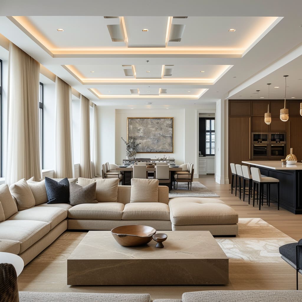
The spatial layout of these open-plan living spaces is meticulously crafted to encourage a harmonious flow between different functional areas. There’s a clear visual connectivity between the living, dining, and kitchen zones, yet each area is defined, often by the strategic placement of furniture, variations in ceiling design, or subtle changes in flooring.
The arrangement of the furniture is such that it creates an intuitive path through the space, with ample room for movement, enhancing the feeling of openness.
Upon closer inspection, each area within the open-plan is scaled to ensure balance and proportion. The dining areas are positioned to take advantage of natural light, often near windows or under a statement lighting fixture, while living areas are made cozy with the use of plush sofas and soft textiles.
The absence of walls allows for a dialog between the various pieces of furniture, artwork, and decorative elements, contributing to a cohesive narrative across the entire space.
To create a similar layout in your own home, start with the largest piece of furniture and place it in a way that defines the main area, such as a living room or dining area. Use rugs to anchor these spaces and to provide visual boundaries.
Keep pathways clear to maintain the open feel, and use consistent design elements to tie the different zones together while still allowing each to have its own identity.
Natural Light
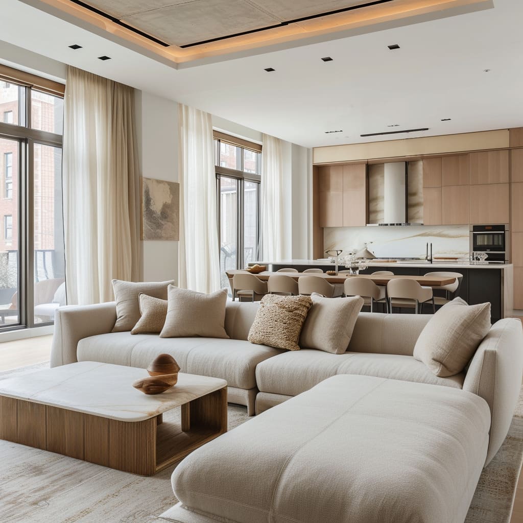
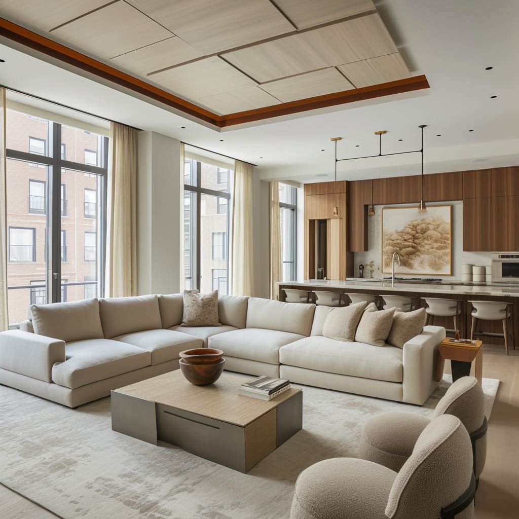
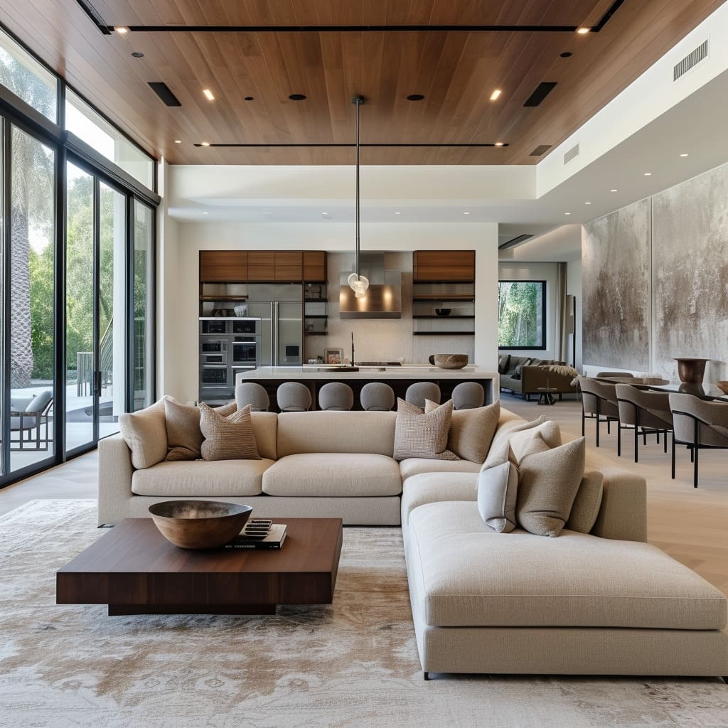
The abundance of natural light in these spaces is a key element, enhancing the open and expansive feel of the interior. Floor-to-ceiling windows and glass doors not only let in streams of daylight but also establish a visual connection with the outdoors, blurring the lines between inside and outside spaces.
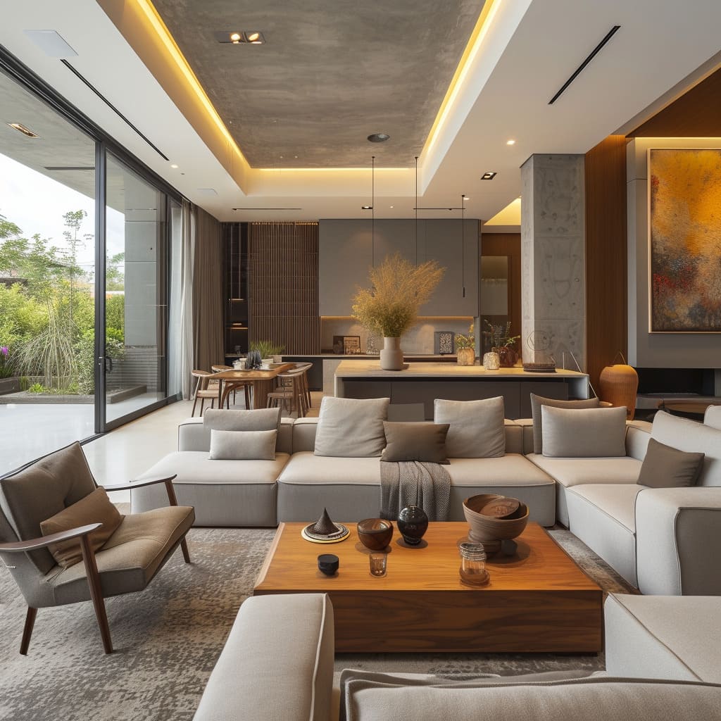
This is particularly evident in some of the spaces that feature expansive glass panels offering views of gardens, patios, or urban vistas, which become a living backdrop to the interior scenes.
Delving deeper, the way natural light plays through these spaces changes throughout the day, creating a dynamic ambiance. The use of sheer curtains allows for light filtration, softening the daylight while still maintaining privacy.
In spaces with direct sunlight, strategically placed light-diffusing treatments or indoor plants can mitigate glare while adding to the aesthetic.
To maximize natural light in your own space, consider the orientation of your home and place seating areas where light is most abundant. If possible, choose larger windows or sliding doors.
Use reflective surfaces and a light color palette to enhance the natural light, and opt for window treatments that can be adjusted according to the time of day and your privacy needs. Integrate indoor-outdoor living by ensuring your garden or balcony is visually connected and easily accessible from the living space.
Ceiling Design
The ceilings are more than just an overhead surface; they play a significant role in the interior architecture. In some instances, the ceilings are kept sleek and flat, painted in the same neutral tones as the walls to give a sense of continuity and to maximize the sense of height.
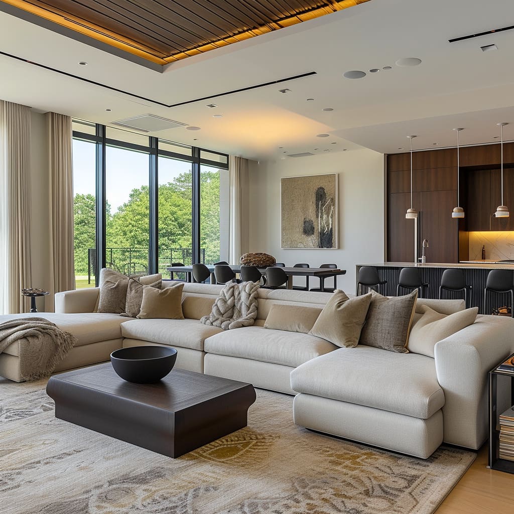
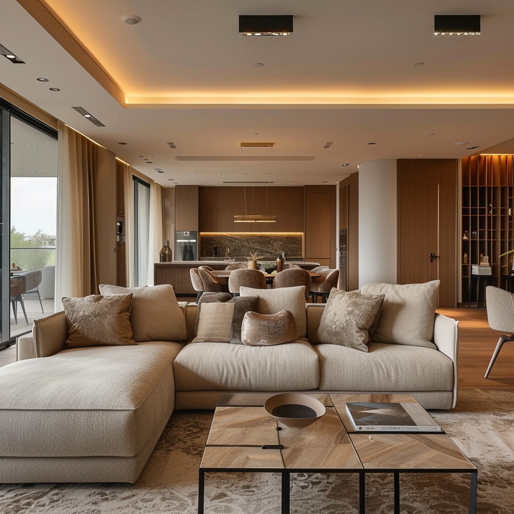
In others, they feature bold wooden beams that add a rustic or industrial touch, depending on the style of the beams and the surrounding decor. Recessed areas are often utilized to house indirect lighting, which adds warmth and depth to the space, highlighting the ceiling as a key design element.
Expanding on this, we see that some ceilings have been designed with geometric cutouts or bulkheads that help to define different areas within the open-plan space, such as dining or sitting areas. The integration of lighting within these features creates a subtle yet effective zoning technique, and the choice of materials and finishes for the ceiling can either amplify light or bring a cozy intimacy to larger spaces.
To incorporate such ceiling designs into your own home, consider the height and style of your space. Flat, unadorned ceilings can benefit from the addition of subtle architectural elements like crown molding or a contrasting paint color.
If your space allows, exposed beams can add drama and a sense of history. For a modern look, consider a drop ceiling with integrated lighting in strategic areas to create ambiance and define the space without the need for physical dividers.
Window Treatments
The window treatments in these living spaces are thoughtfully selected to complement the large windows and glass doors, serving both functional and aesthetic roles. The full-length curtains extend from ceiling to floor, enhancing the height of the rooms and adding an element of luxury.
The light fabrics chosen for the curtains ensure that they move gracefully with the breeze and don’t obstruct the natural light, while still offering the necessary privacy. In some designs, the curtains are layered with sheer and opaque materials, allowing for versatility in light control and privacy.
Further analysis reveals that the hardware and accessories for these window treatments are chosen with a minimalist approach. Simple curtain rods or concealed tracks ensure that attention remains on the fabric and the view outside.
The color of the curtains often coordinates with the wall color for a cohesive look or contrasts slightly to frame the view and add depth to the space.
To implement effective window treatments in your home, measure your windows to ensure full coverage with your curtains, and choose a fabric that complements the room’s color scheme and style. Consider layering sheers with blackout options for flexibility in light and privacy control.
Select hardware that matches the style of your space—whether that’s a simple hidden track for a modern look or more decorative rods for a traditional setting.
Functional Decor
Functional decor is not just about utility but also about integrating storage into the overall design aesthetic. Bookshelves are styled with a mix of books, decorative objects, and art, turning them into feature walls rather than mere storage units.
Sideboards and console tables often bear minimalistic designs, aligning with the modern and sleek feel of the space, and are accessorized with items such as designer lamps, bowls, or sculptures that enhance the room’s theme.
It’s apparent that these functional pieces are selected for their form as much as their function. A bookshelf in one image is built into the wall, its wood finish matching the cabinetry elsewhere in the room, which helps maintain design continuity.
The sideboards are often low and long, contributing to the horizontal lines of the space, and their tops provide additional surfaces for display and serving during gatherings.
For those looking to incorporate functional decor into their interiors, the key is to choose pieces that serve their purpose without sacrificing style. Consider built-in solutions for a streamlined look or select free-standing pieces that reflect the aesthetic of your space.
When styling shelves and surfaces, mix practical items with decorative ones to create a curated look. Keep clutter to a minimum to maintain the sleek, modern vibe seen in these designs.
In conclusion, Neutral-Toned Minimalist Luxe Open Living Spaces stand as a testament to the elegance and efficiency of modern interior design. This style, with its emphasis on serene color palettes, open and fluid layouts, and a balance between minimalism and luxury, offers more than just an aesthetically pleasing environment.
It creates a sanctuary that resonates with tranquility and sophistication, making every space not just a place to live, but a retreat to rejuvenate and inspire. As we’ve explored the various elements that harmonize to form this distinctive style, it’s clear that this design philosophy is about embracing simplicity, indulging in comfort, and making a statement with subtlety.
Whether you’re redesigning your home or just seeking inspiration, the principles of Neutral-Toned Minimalist Luxe Open Living Spaces offer a blueprint for creating environments that are timeless in their beauty and functional in their design.


