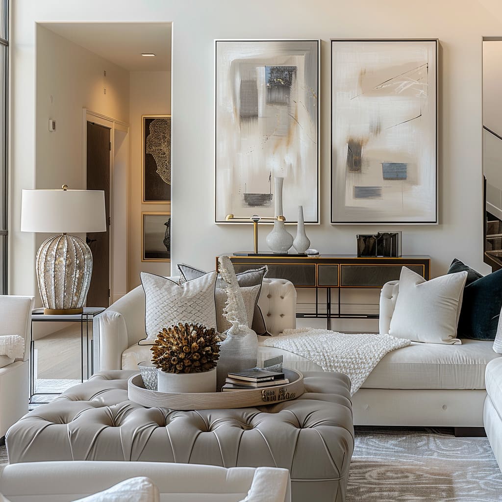
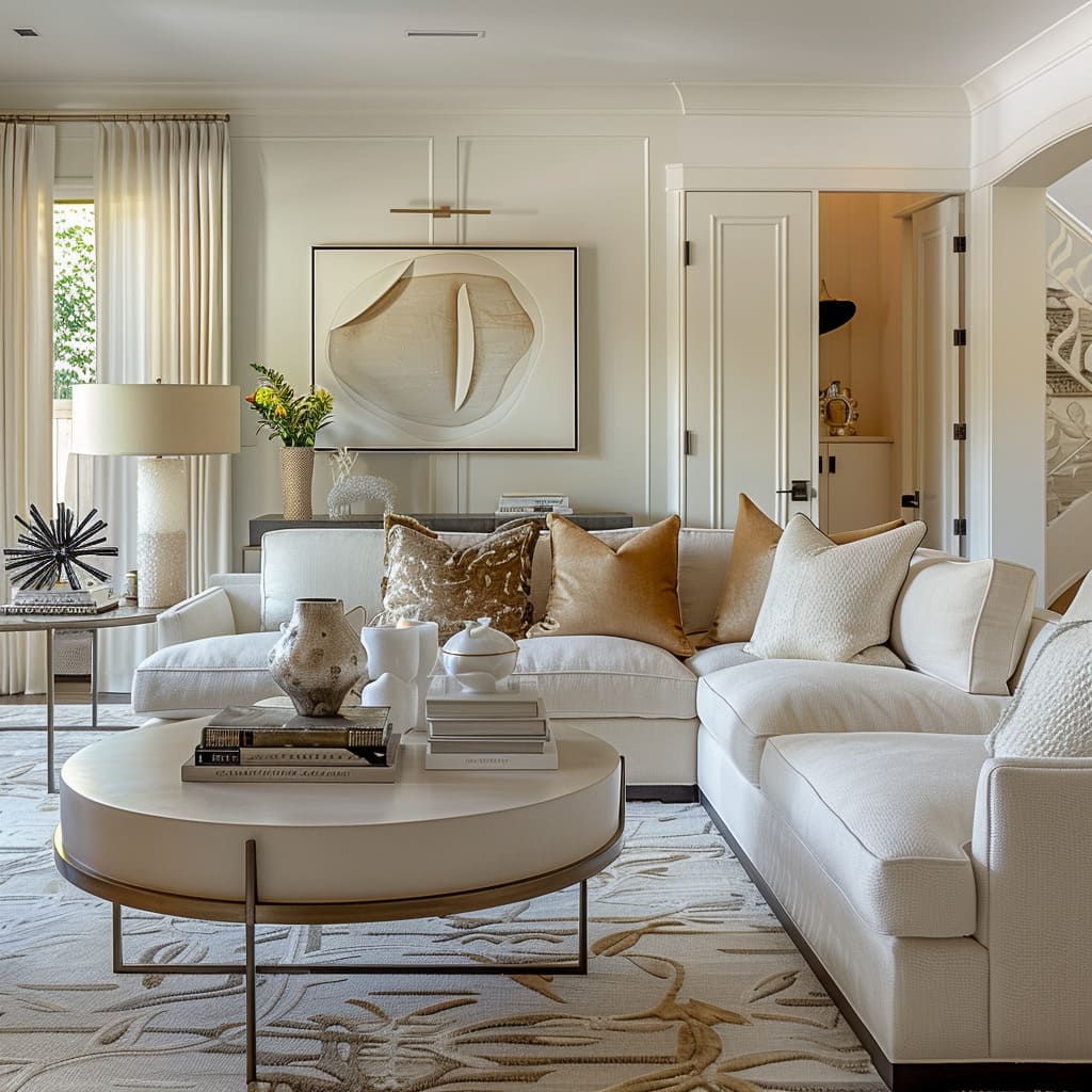
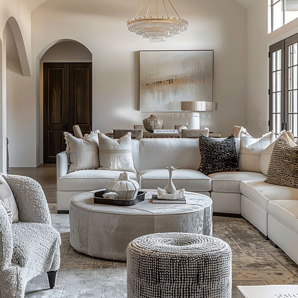
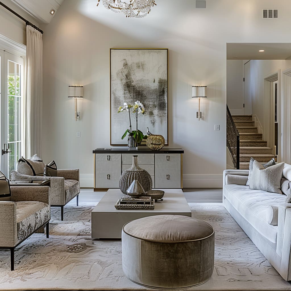
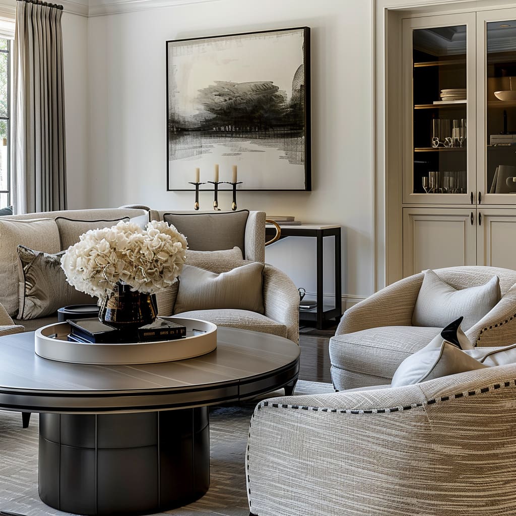
Every element plays a crucial role in these interior designs in shaping the overall ambiance and functionality of a space. This article delves into the intricate layers of design, focusing on how structural elements, material choices, decorative touches, and thoughtful utility converge to create environments that are not only visually appealing but also inherently comfortable and adaptable.
From the deliberate symmetry of layouts to the nuanced interplay of textures and the strategic placement of lighting, each aspect is a testament to the meticulous craft of designing spaces that resonate with those who inhabit them.
Structural Cohesion and Flow
Balancing Form and Function
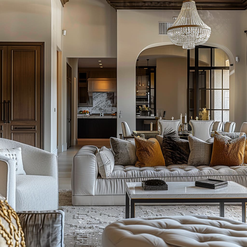
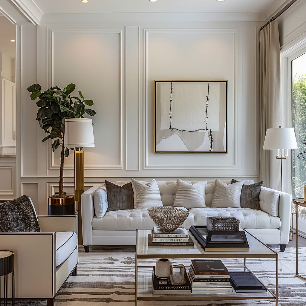
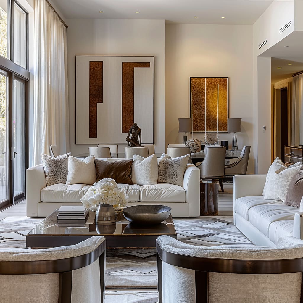
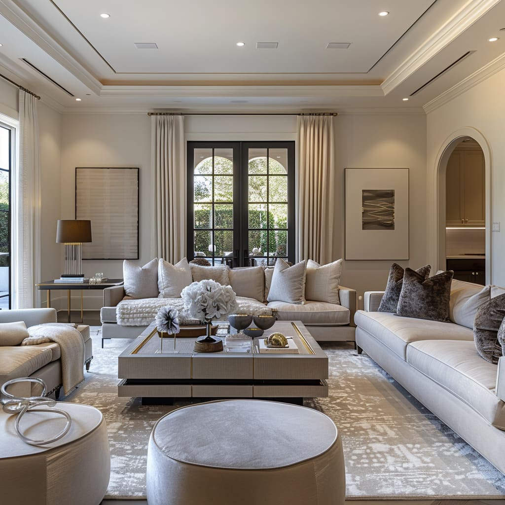
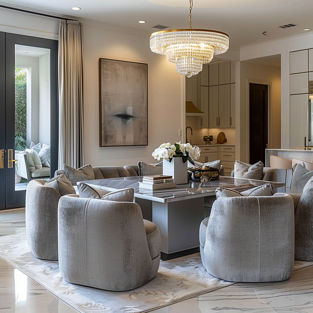
An interior design that captures the essence of structural integrity with an effortless flow can be seen through the use of symmetrical layouts, the incorporation of glass to enhance spatial lightness, and the softening effect of fabric draperies. These elements work in concert to create spaces that are both grounded and airy, allowing for an ambiance that is both anchored and liberating.
An interior design that showcases structural coherence, with an emphasis on effortless circulation, is evident in the strategic use of symmetrical layouts. These layouts, characterized by a mirrored arrangement of furniture and decor, introduce an orderly aesthetic while avoiding a monotonous atmosphere.
The symmetry is not merely about balance but also about creating a visual pathway that guides the observer through the space, enhancing the sense of order and calmness.
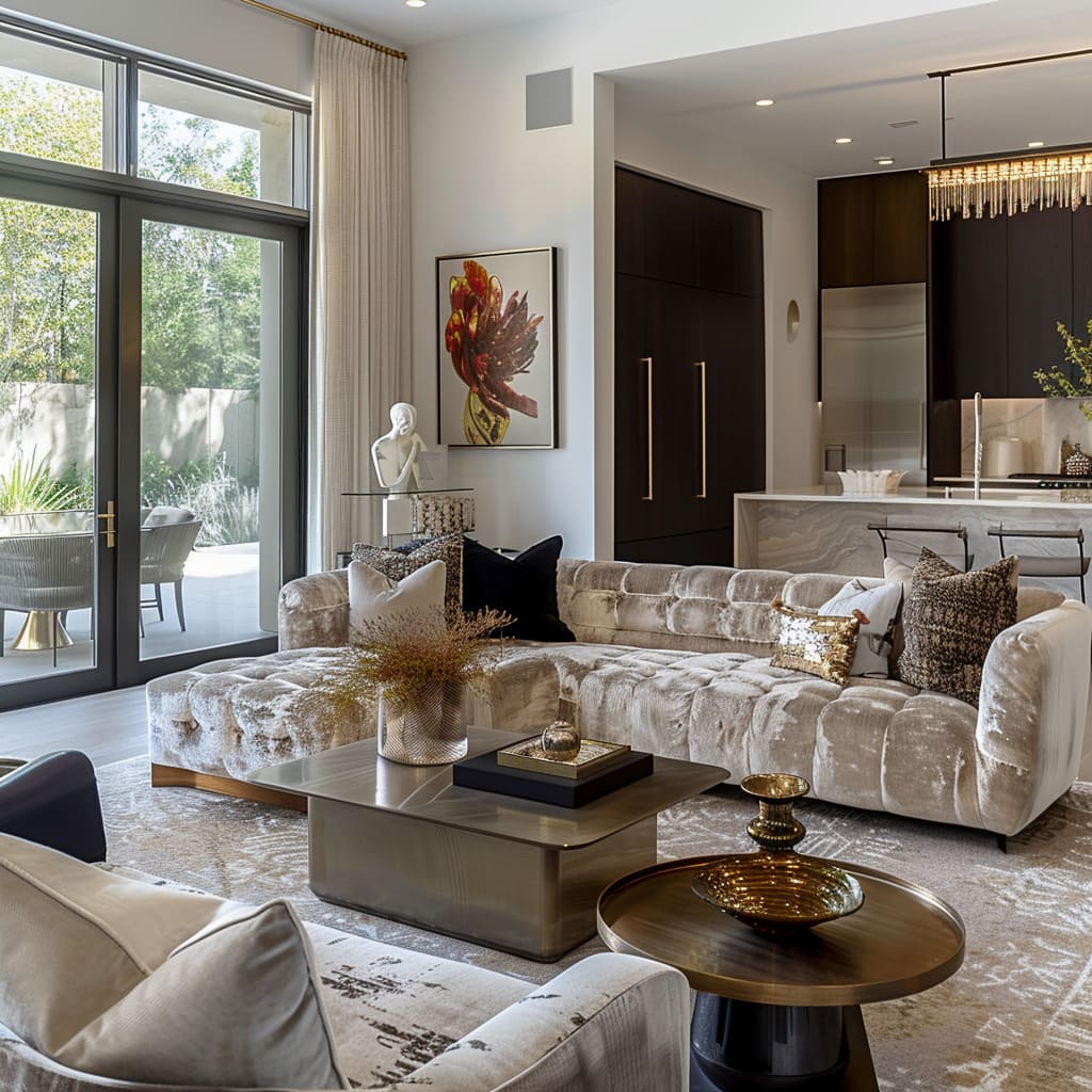
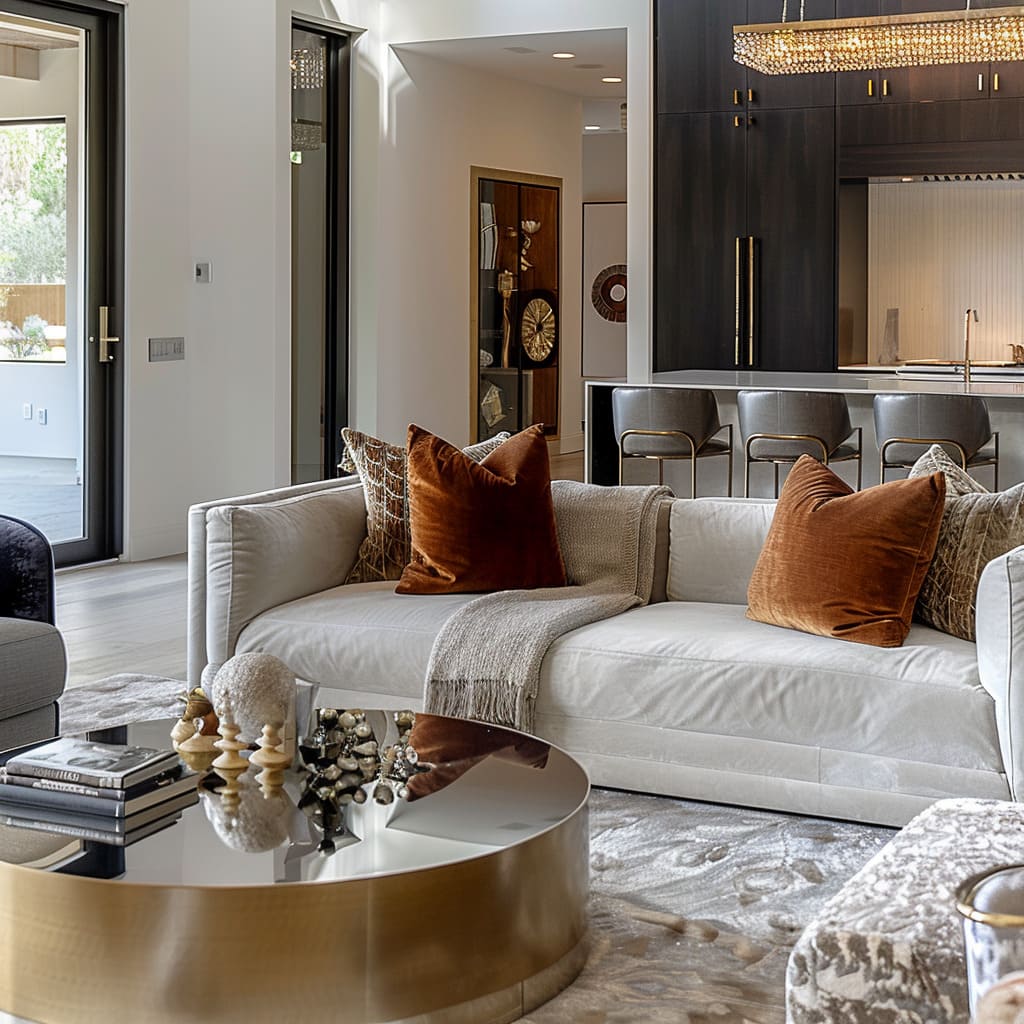
The incorporation of glass in strategic locations like tables and doors contributes significantly to the feeling of spaciousness. The transparency of glass allows the eye to travel uninterrupted, providing continuity between different areas of the home.
It also amplifies the natural lighting, giving the space an airy quality that breathes life into every corner. Glass, being both present and invisible, acts as a subtle connector of spaces without imposing barriers.
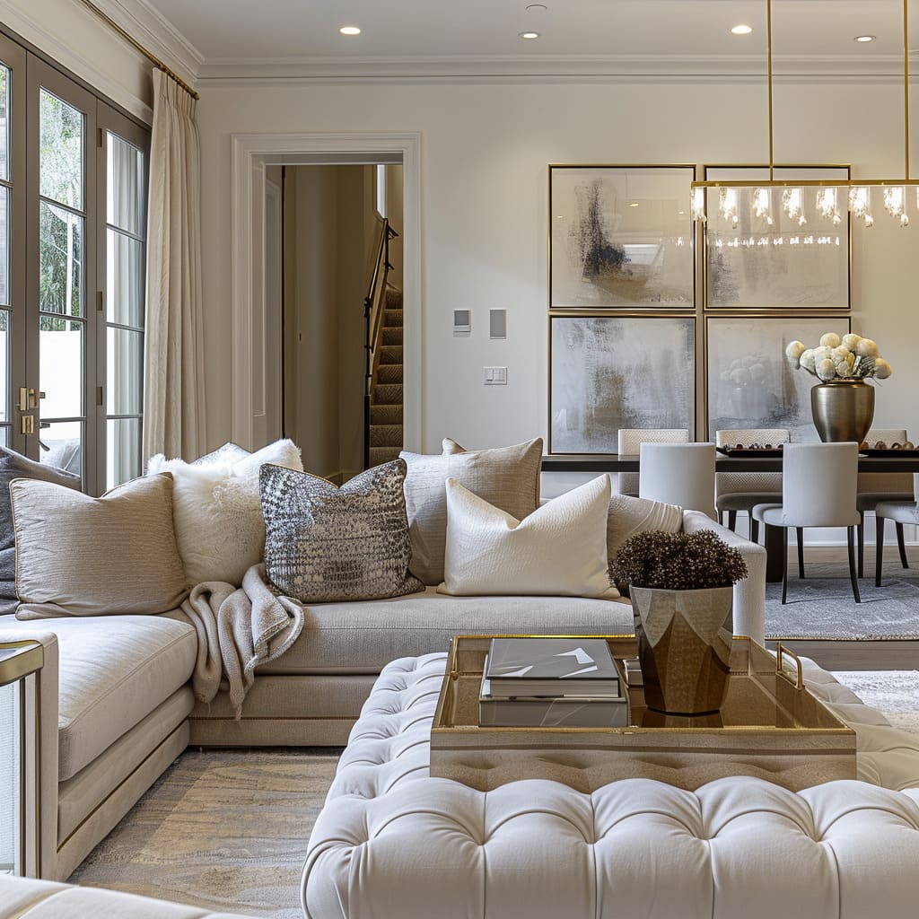
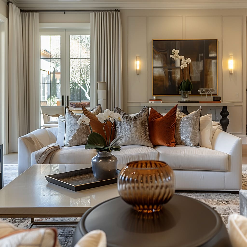
Fabric draperies complement this openness by introducing a texture that contrasts with the clean lines of the architecture. The choice of fabrics brings a soft, tactile quality that tempers the hardness of glass and stone, making the environment feel welcoming.
The draperies move with grace, responding to the slightest of breezes, and in their movement, they contribute to the dynamic yet serene atmosphere of the room.
In these spaces, there is a dance between the solid and the void, the seen and the unseen. Each component, from the symmetrical furniture layout to the ethereal quality of the glass and the softness of the draperies, works in harmony to achieve a design that is both anchored and free-flowing.
This approach allows for an environment that feels both expansive and intimate, where the structures enable rather than confine the living experience.
Material and Texture Play
The Canvas of Sensory Experiences:
The tactility of a space contributes significantly to its overall impact. This interior style celebrates the interplay of materials and textures through a preference for matte surfaces, a diversity of cushion shapes, and understated rug designs.
Each choice is intentional, contributing to a layered narrative of touch and sight, with the thoughtful use of patterns and varied window treatments adding to the visual and tactile experience.
Within the interiors, matte surfaces prevail, offering a sophisticated backdrop that diffuses light softly. This choice subdues the glare that often accompanies glossier finishes, allowing for a calm and focused ambiance.
The matte finish also invites touch, as its texture stands in contrast to the sleekness of glass and the smoothness of metal, creating a layered sensory experience that is both seen and felt.
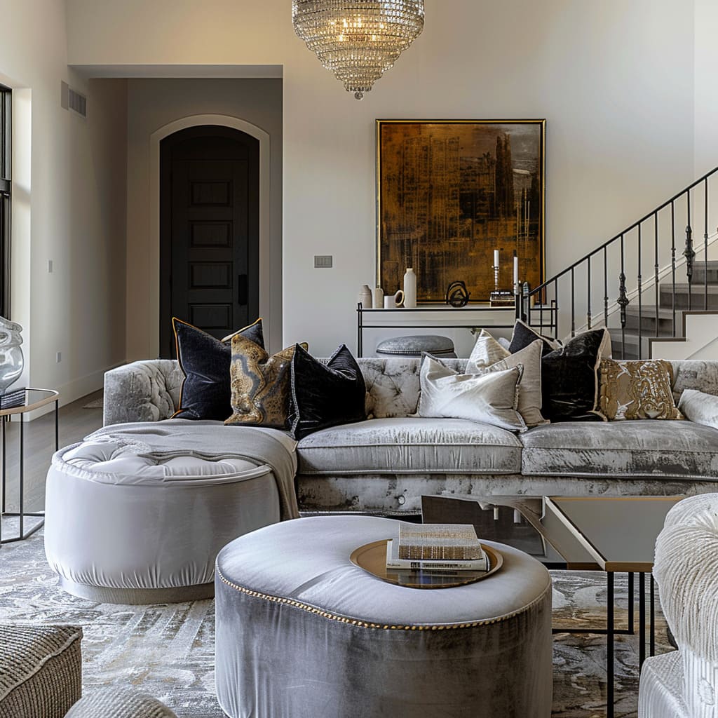
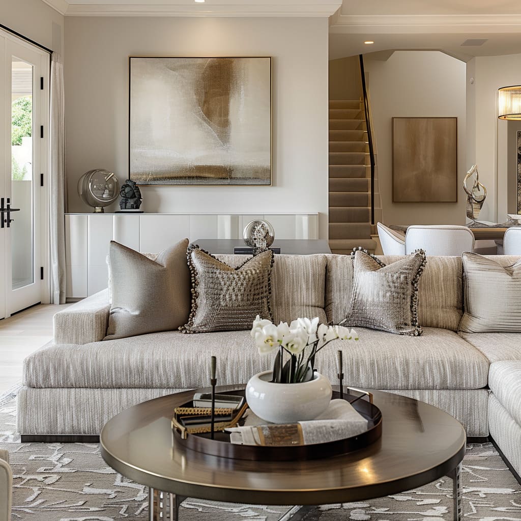
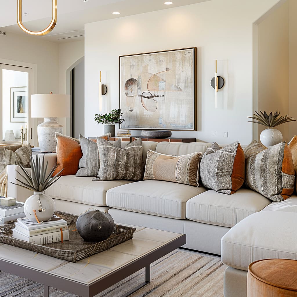
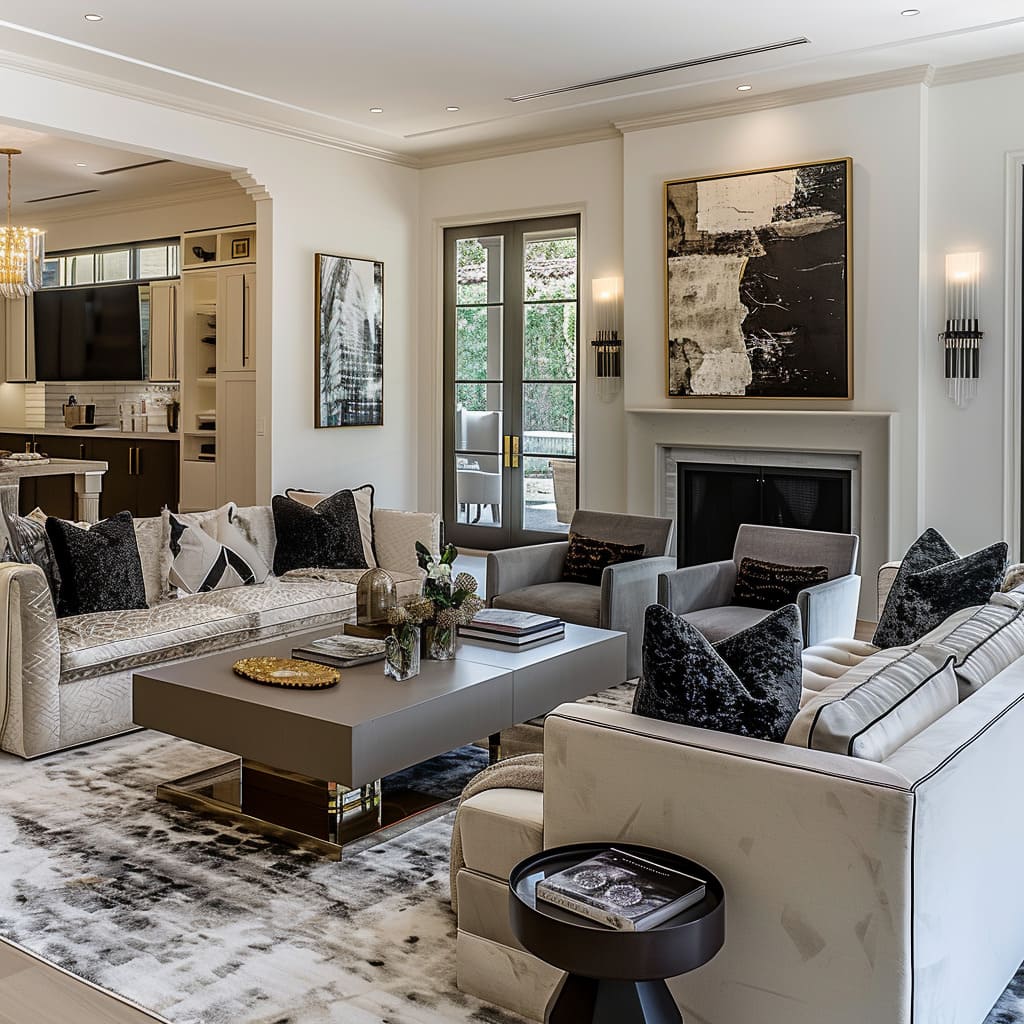
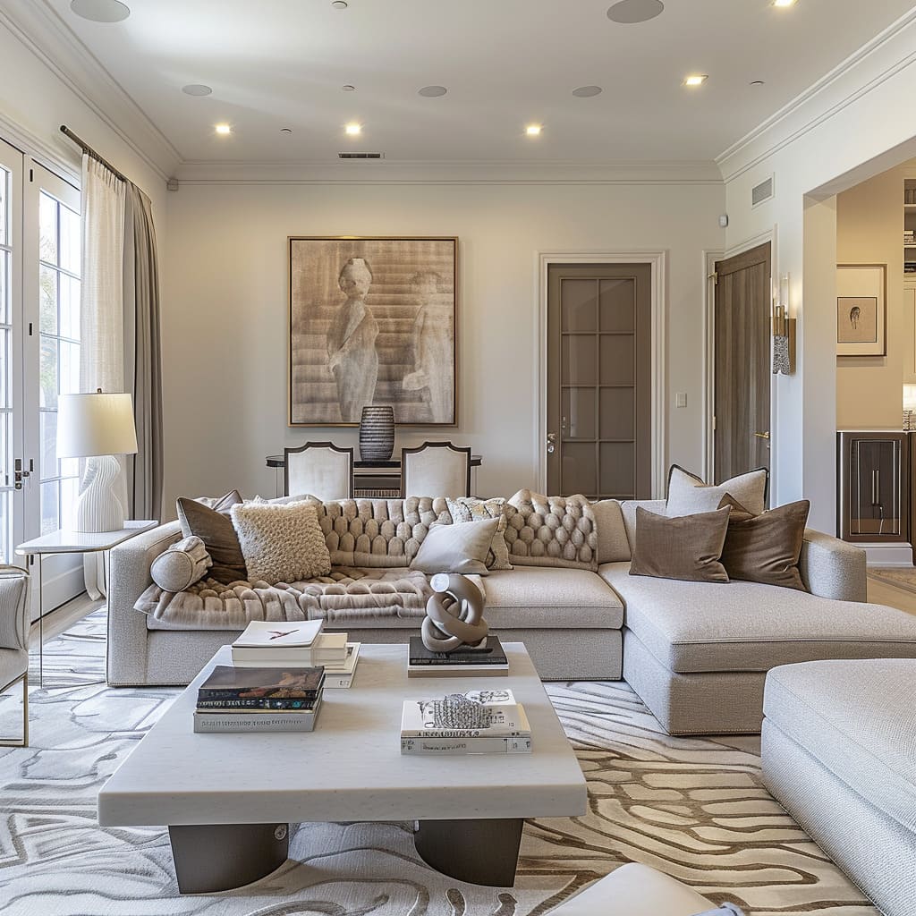
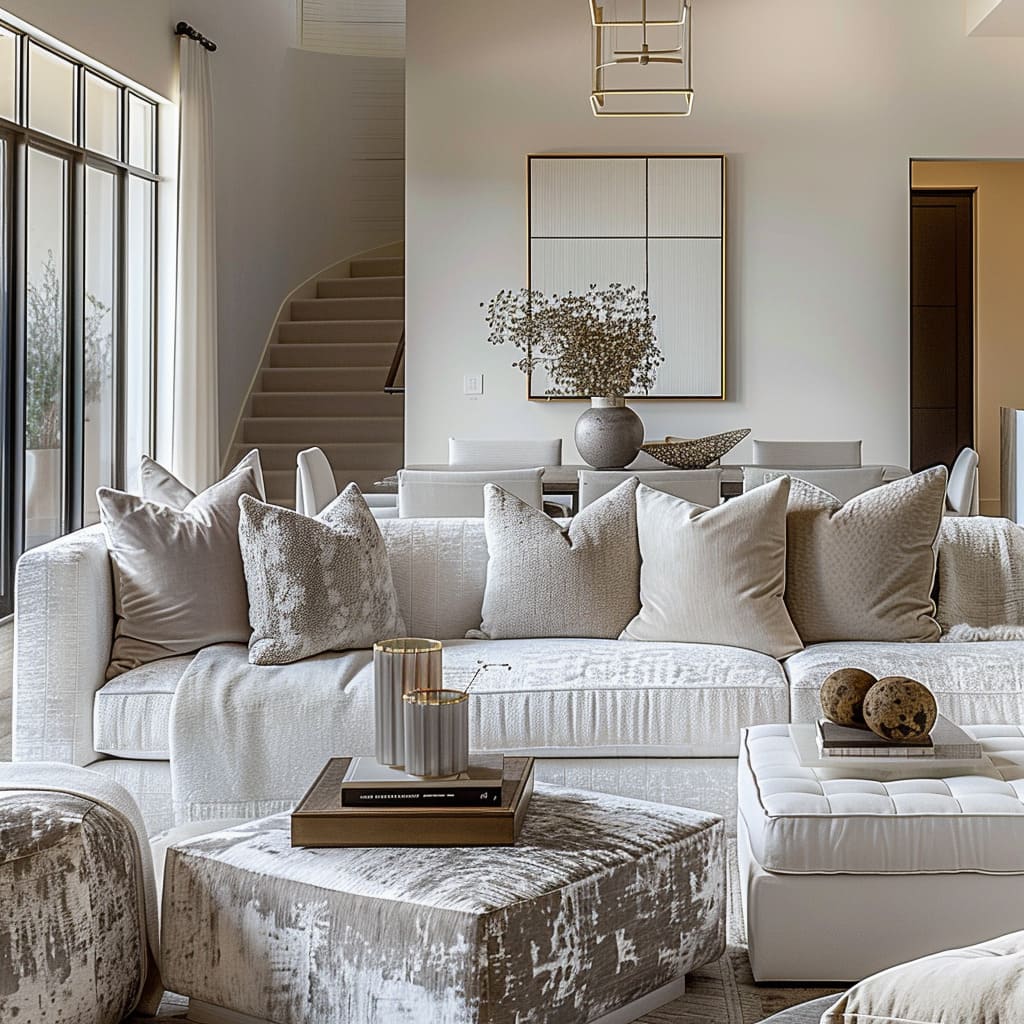
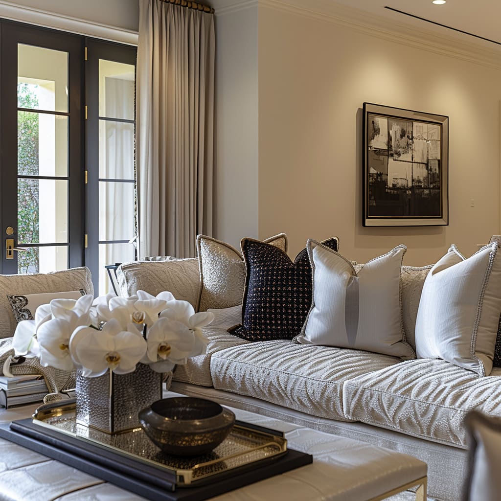
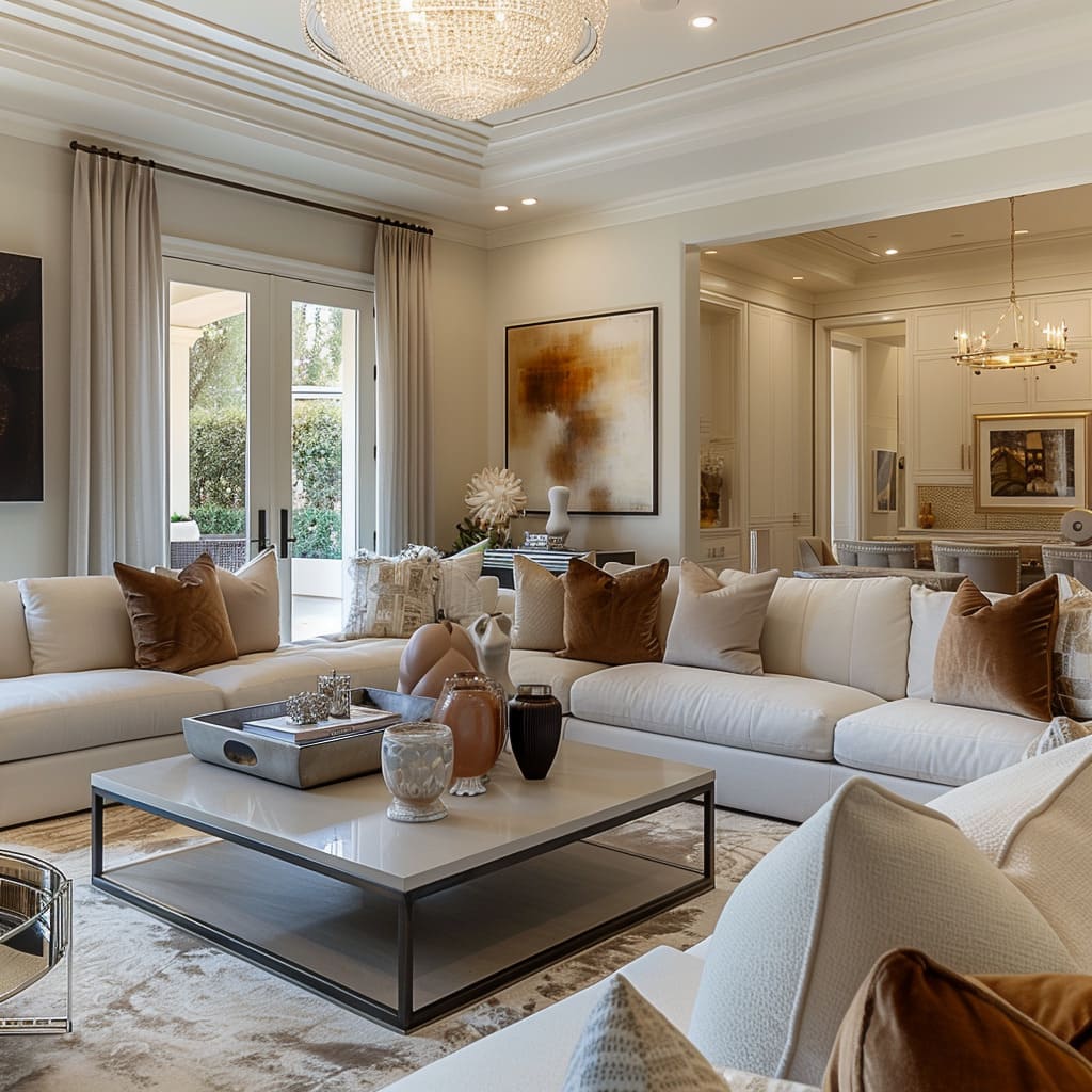
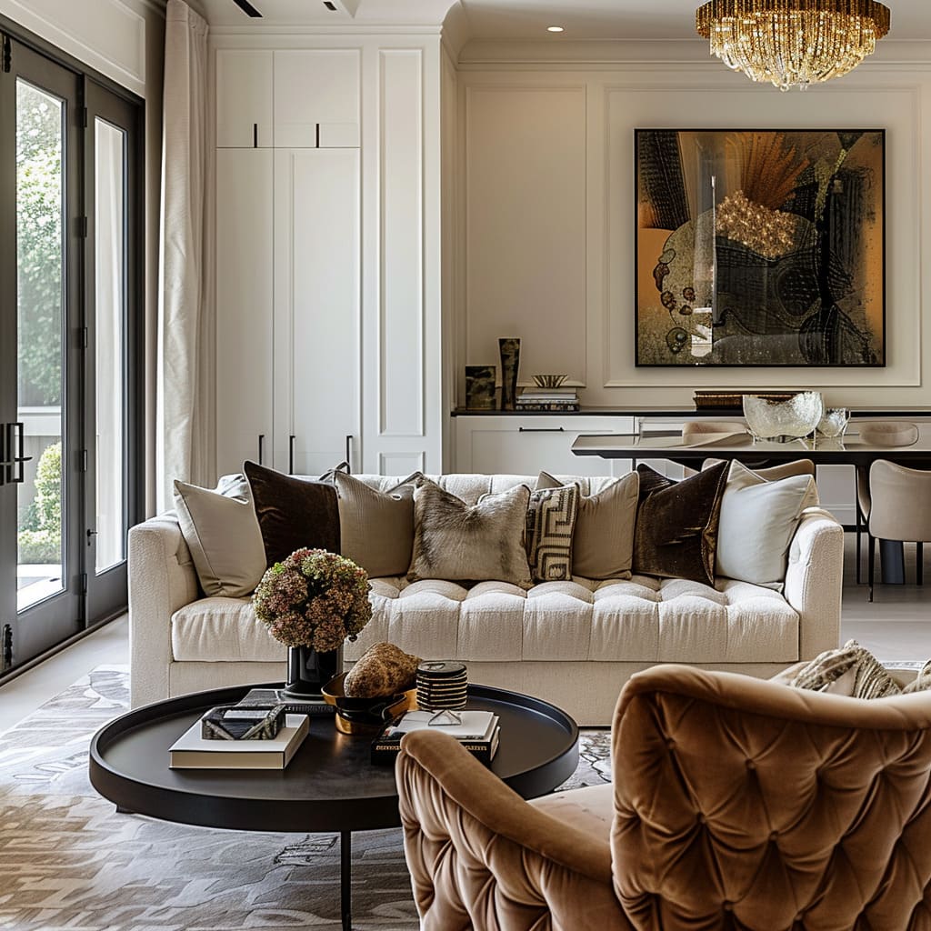
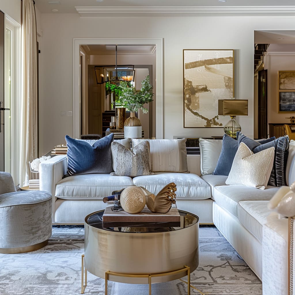
Cushions, abundant and sculptural in form, serve as an invitation to comfort, beckoning one to sit and linger. The variety in their shapes—some square, some oblong, some cylindrical—provides a visual feast that tempts the hands to explore their contours.
The textiles chosen for the cushions vary, some with a delicate weave, others with a bold pattern, each contributing its own voice to the symphony of textures within the room.
Rugs laid upon the floors contribute an essential layer to the design, their patterns subtle and their colors complementary to the overall palette. These rugs do not clamor for attention but rather whisper their presence, allowing the feet a soft landing.
The designs woven into their fabric hold history within their threads, suggesting a story underfoot that is as intricate as it is subdued.
A judicious use of patterns on select furnishings acts as a visual accent, providing a break in the monochromatic tones without disrupting the cohesive narrative of the space. These patterns are like the quiet hum of a background melody, present but not overpowering, enhancing the overall experience without leading it.
The strategic use of these designs shows a restraint that appreciates the power of subtlety in a world often dominated by the bold and the loud.
Decorative Harmony
Curating the Personal and the Aesthetic:
There is a harmonious blend of function, form, and personal expression. Books serve as intellectual and design statements, while bowls, candles, and jars provide visual rhythm and versatility.
Objects are chosen not only for their function but also for their ability to intrigue and engage, imbuing the space with a sense of personal history and curiosity.
In these thoughtfully composed interiors, books are not mere literary vessels but integral components of the visual and intellectual landscape. Positioned deliberately on tables or nestled in built-in shelves, they invite not only reading but contemplation, suggesting a resident who cherishes knowledge and design equally.
Their spines bring a variety of hues and textures to the space, contributing to the color story and thematic depth of the room.
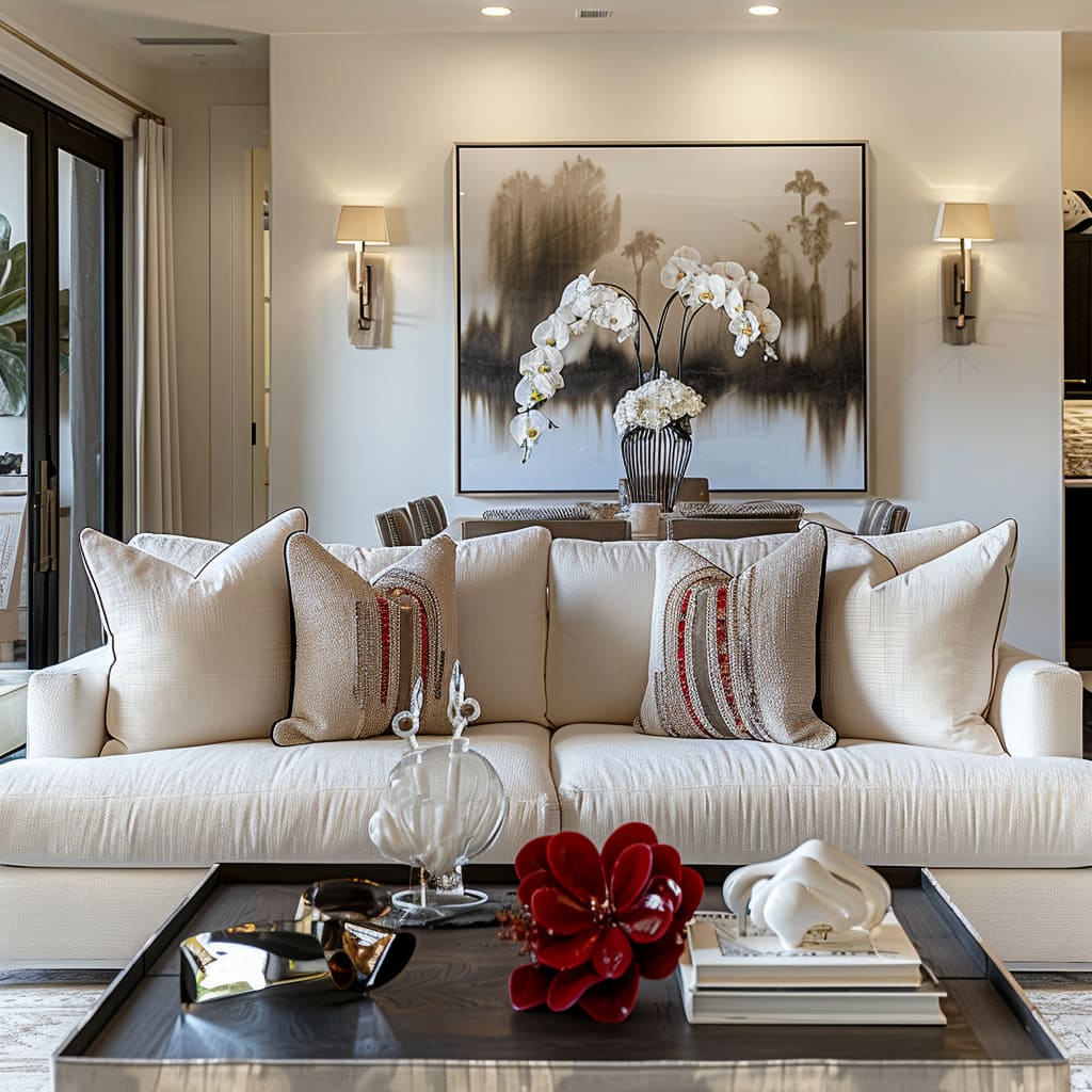
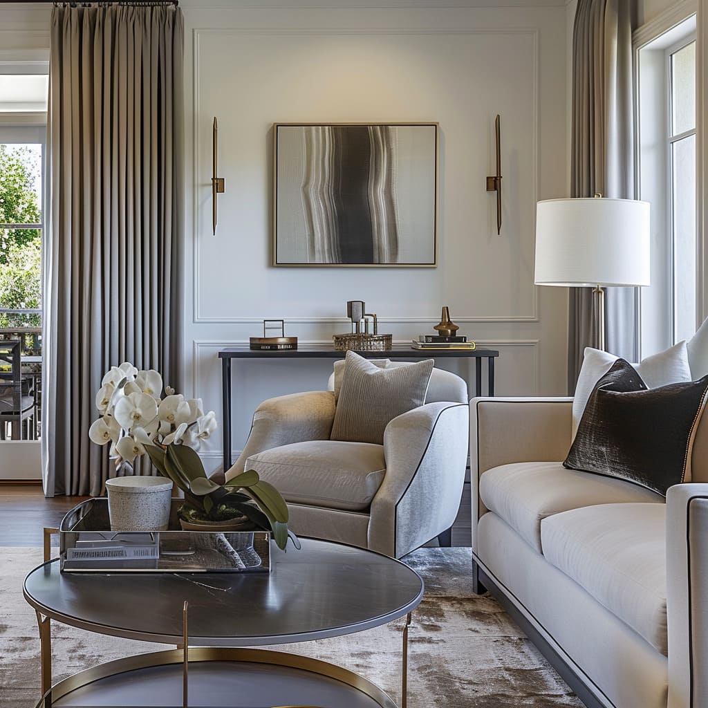
Orchids, with their delicate structure and captivating bloom, emerge as a recurring element within these spaces. They introduce an organic silhouette that breaks the monotony of straight lines and flat surfaces, offering a natural counterpoint to the crafted environment.
Their presence is a nod to the beauty of the natural world, seamlessly blended into the man-made sanctuary.
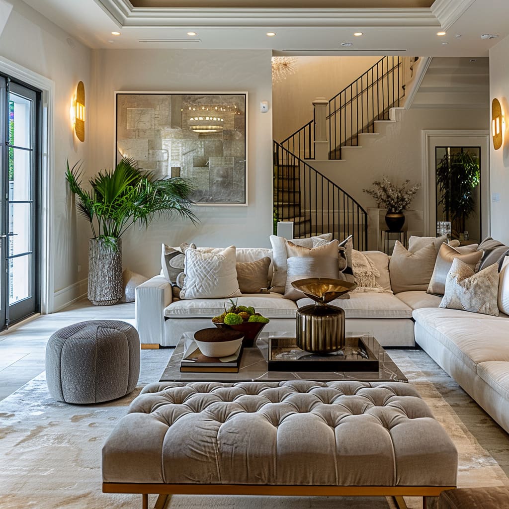
The selection and placement of decorative bowls across the spaces serve multiple roles, as vessels of beauty and utility. These bowls, with their robust forms or intricate patterns, become focal points on tables and shelves.
Whether holding fruit or standing empty, they draw the eye, providing a center of gravity around which the room’s design orbits.
A collection of intriguing decorative objects acts as visual punctuation marks throughout the living space. These pieces, each with a story or a mystery behind their creation, stimulate interest and dialogue.
Their varied shapes and textures – some smooth and reflective, others intricate and tactile – are carefully curated to invite closer inspection and engagement.
Groupings of jars and vases play with the principle of rhythm in design, creating a pattern that leads the gaze across the space. These collections, arranged with consideration to height and volume, foster a sense of continuity.
The repetition of similar elements, while maintaining individuality through subtle differences, orchestrates a visual harmony that resonates throughout the space.
Comfort and Approachability
Inviting Spaces that Embrace:
The design invites one to experience comfort in a space that feels lived-in. Throw blankets, varied seating options, and the strategic selection of chairs and couches are all curated to offer a welcoming embrace.
The design speaks to a desire for environments that support relaxation and adaptability to different group dynamics, without compromising on design quality.
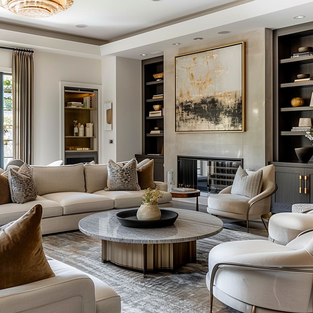
There is an appreciation for diversity that transcends mere aesthetic. Armchairs with generous proportions stand alongside ottomans and accent chairs, each varying in height and depth.
This variation not only creates a dynamic visual landscape but also ensures that the room can accommodate a range of activities, from solitary reflection to social gatherings. The seating arrangement is a testament to inclusivity, allowing for different postures and preferences, ensuring that every individual can find their own corner of comfort.
Throw blankets, casually draped over sofas and chairs, add a layer of texture and warmth, making the space feel inhabited and welcoming. They imply movement and use, as if someone has just unfolded one for an afternoon nap or to wrap around themselves on a cooler evening.
This touch of casualness underscores the notion that comfort should be within arm’s reach, seamlessly blending coziness with luxury.
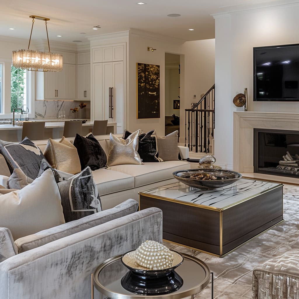
Chairs and couches, carefully chosen, articulate a silent promise of comfort without sacrificing sophistication. The upholstery, in a variety of fabrics, from velvet to linen, invites the touch, while the cushions ensure that the seating is not just for show but for sustained relaxation.
The design integrity of each piece contributes to the narrative of a space that is lived in and loved, where every item of furniture is selected for its ability to support the human form with grace.
The medley of seating options indicates a flexible approach to space utilization. Low slung lounge chairs suggest repose, while more upright seating implies engagement and conversation.
The assortment allows the room to morph in function, catering to different group dynamics, be it an intimate chat or a larger social event. The thoughtful positioning of each piece ensures that movement within the space is intuitive, fostering an ease of interaction within the environment.
Lighting and Artistic Highlights
Illuminating and Accentuating with Purpose:
Lighting and artistic elements in this style are not mere afterthoughts but are integral to the spatial narrative. Wall sconces, decorative jars, and lighting fixtures are thoughtfully chosen to highlight art and architecture without overshadowing them.
Wall art, with restrained palettes and bold scales, stands as testament to the designer’s ability to use art as a defining yet harmonious component.
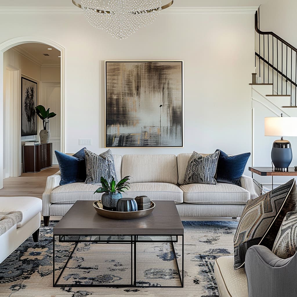
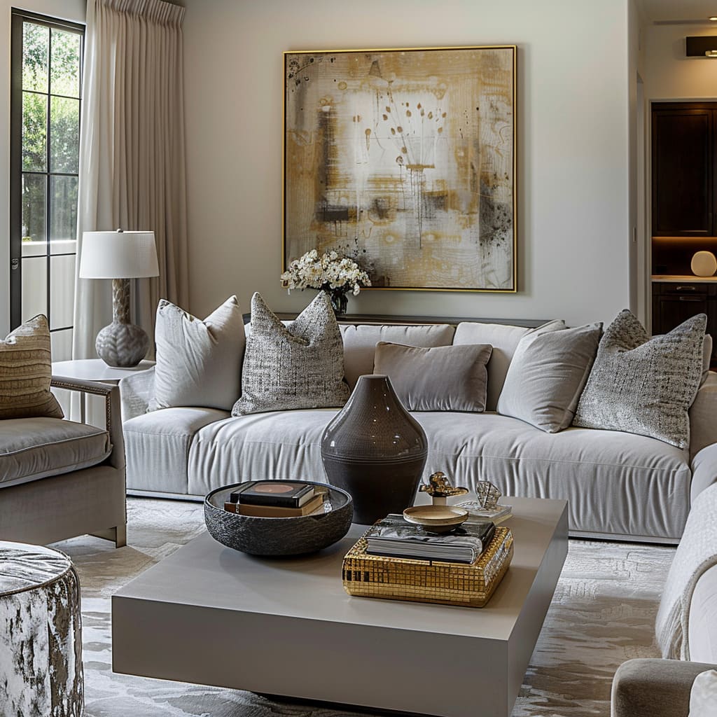
Wall art, chosen with restraint in color yet audacious in size, acts as a visual anchor in these rooms. The art pieces, with their expansive canvases, command attention without competing with the surrounding decor.
They speak a visual language that is contemplative, drawing the viewer in for a closer look, allowing the subtle interplay of tones and textures to come forth. The art serves as a focal point, yet its integration is such that it feels like a natural extension of the space.
Candles, placed with intention on tables or along shelves, offer more than mere illumination—they are vessels for ambiance. With the flicker of their flame, they bring a dynamic element to the rooms, casting shadows that dance against the walls and ceilings.
The holders themselves are as much a part of the decor as the candles, selected for their ability to harmonize with the room’s aesthetic while adding a sculptural element to the tableau.
Objects of art, whether they be small statues or intricate pieces brought back from travels, infuse the space with personality and narrative. These pieces are conversation starters, each with a history or a story that adds depth to the environment.
Strategically placed within the line of sight, they do not clutter the space but instead serve as points of interest, prompting inquiry and admiration.
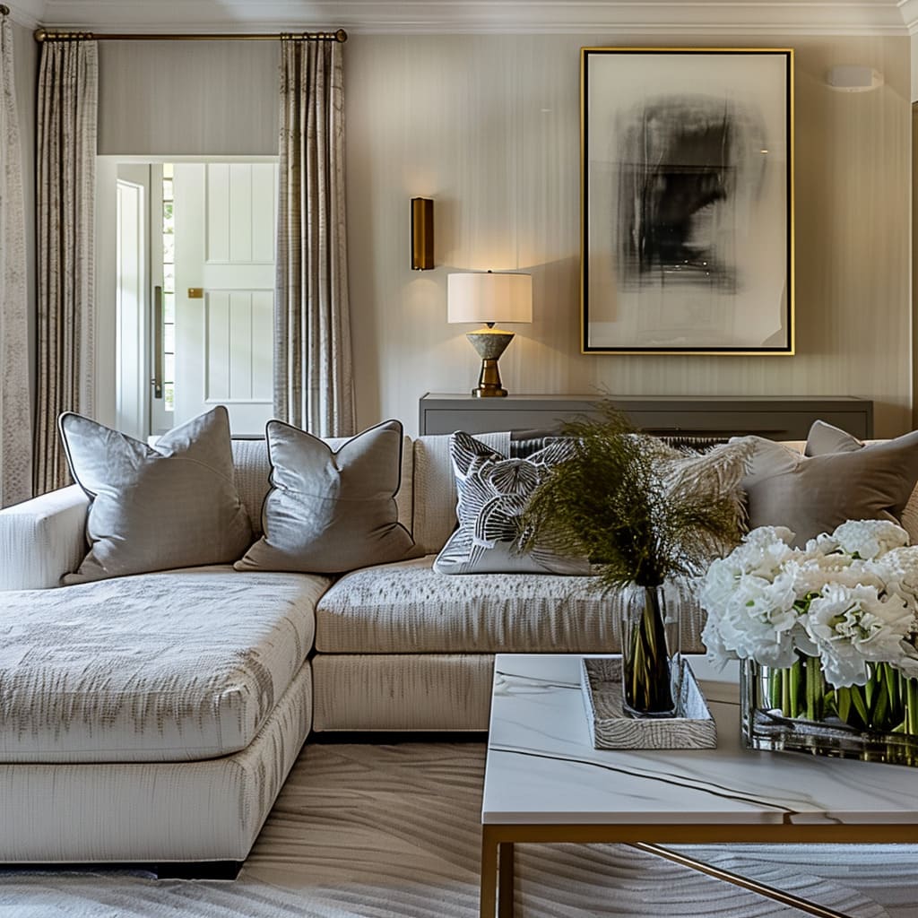
Wall sconces are more than just sources of light; they are deliberate in their placement, serving to draw the eye towards architectural nuances or to highlight other works of art. Their light is gentle, designed to flatter rather than flood, to complement the natural light that pours in through the windows.
Their designs are varied—some sleek and modern, others more traditional, yet all are chosen to resonate with the design ethos of the space.
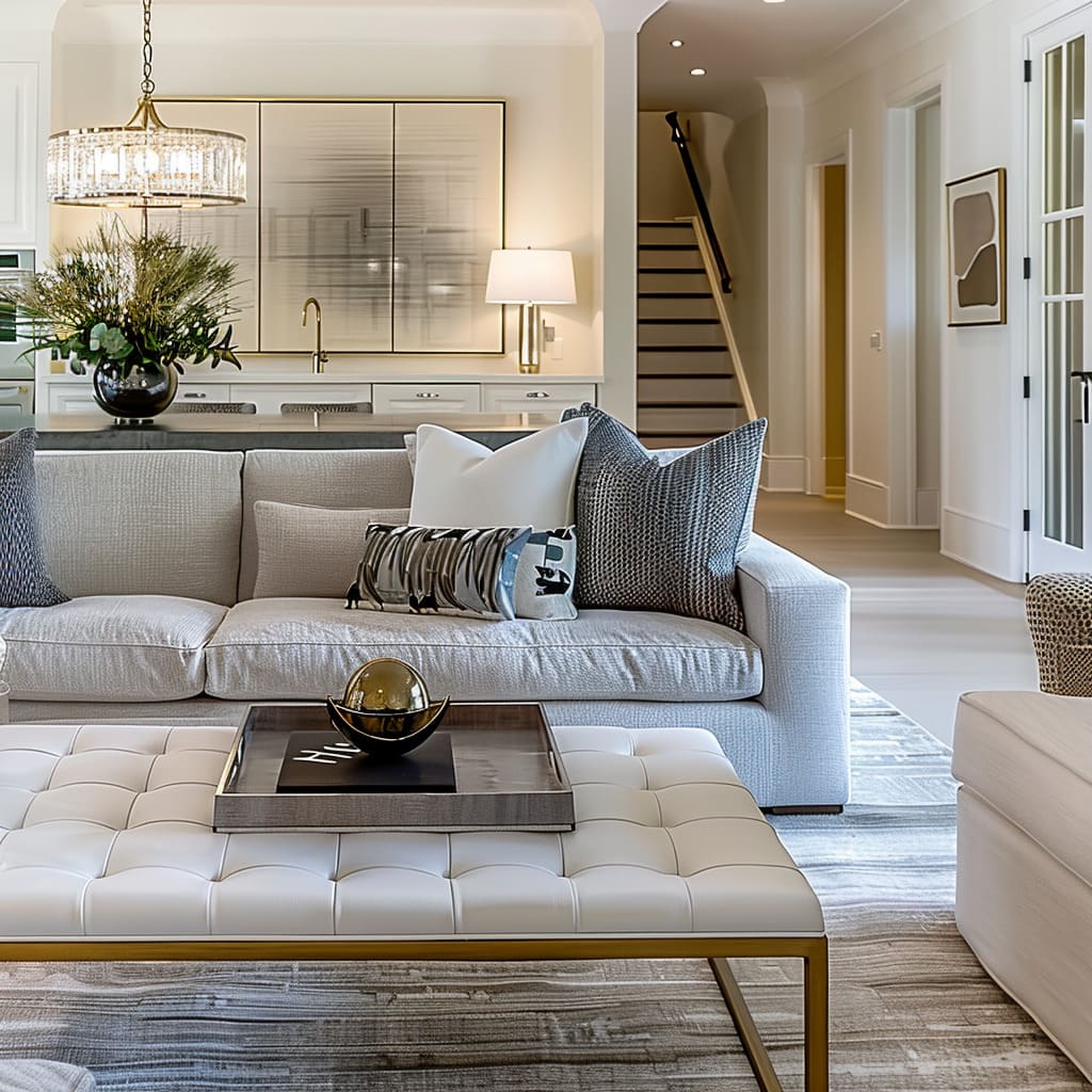
The selection of lighting fixtures speaks to an understanding of their role in the ambiance of the room. They are not merely functional but part of the design journey, enhancing the mood without becoming the center of attention.
Overhead fixtures are chosen for their ability to spread light evenly, their design sophisticated yet subdued, allowing them to exist in harmony with the overall design scheme.
Architectural and Design Integrity
Subtle Elegance in Architectural Detailing:
Every architectural detail is selected to contribute to the overall aesthetic without overwhelming the senses. From crown molding to staircase design and glass-fronted cabinetry, these elements enhance the design language of the space.
Wall colors are carefully chosen to create a backdrop that highlights rather than competes, ensuring that the overall composition is cohesive and considered.
The subtle incorporation of crown molding introduces a fine line of distinction to the ceiling, marking the transition from wall to expanse above with finesse. The molding is designed with simplicity in mind, avoiding ornate complexities, and instead follows the principle that less is often more.
It runs along the perimeter, adding a dimensional layer that is felt more than it is noticed, lending an air of finish to the rooms.
Cabinetry with glass fronts is strategically placed, serving both functional and aesthetic purposes. The transparency of the glass allows for the display of curated items, turning storage into a visual experience.
The items within these cabinets are carefully arranged, turning everyday objects into a tableau of personal style and preferences. This transparency also serves to make the space feel larger, as the eye travels through the glass to the objects within.
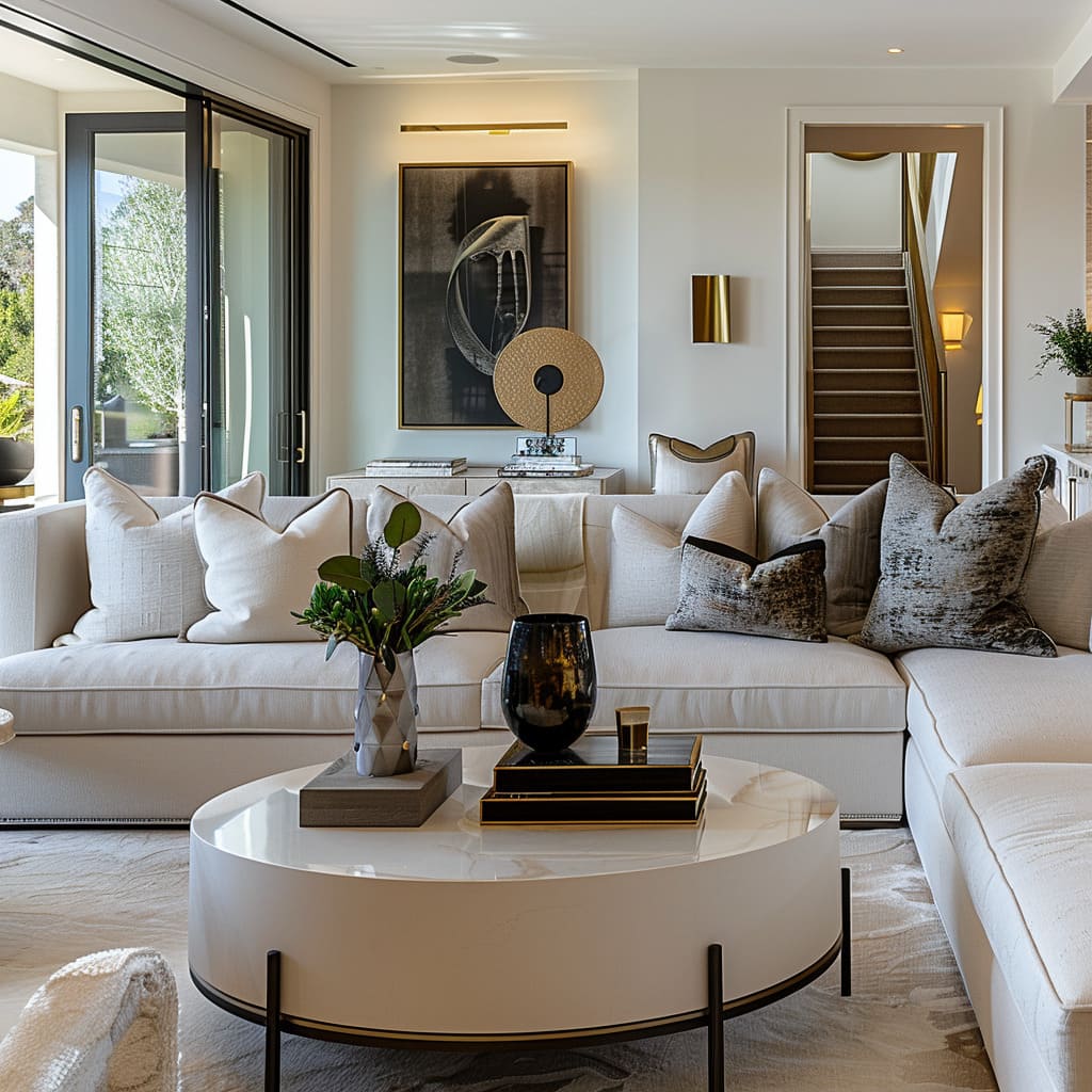
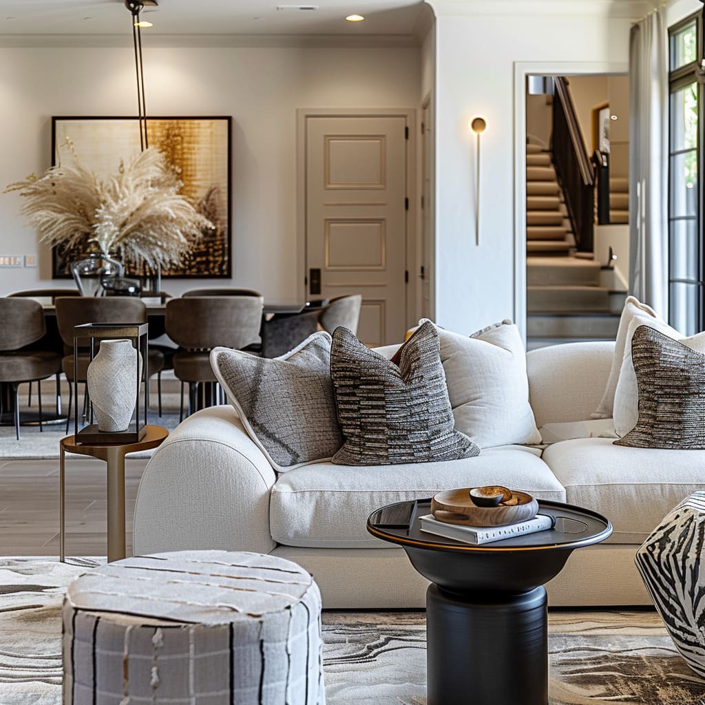
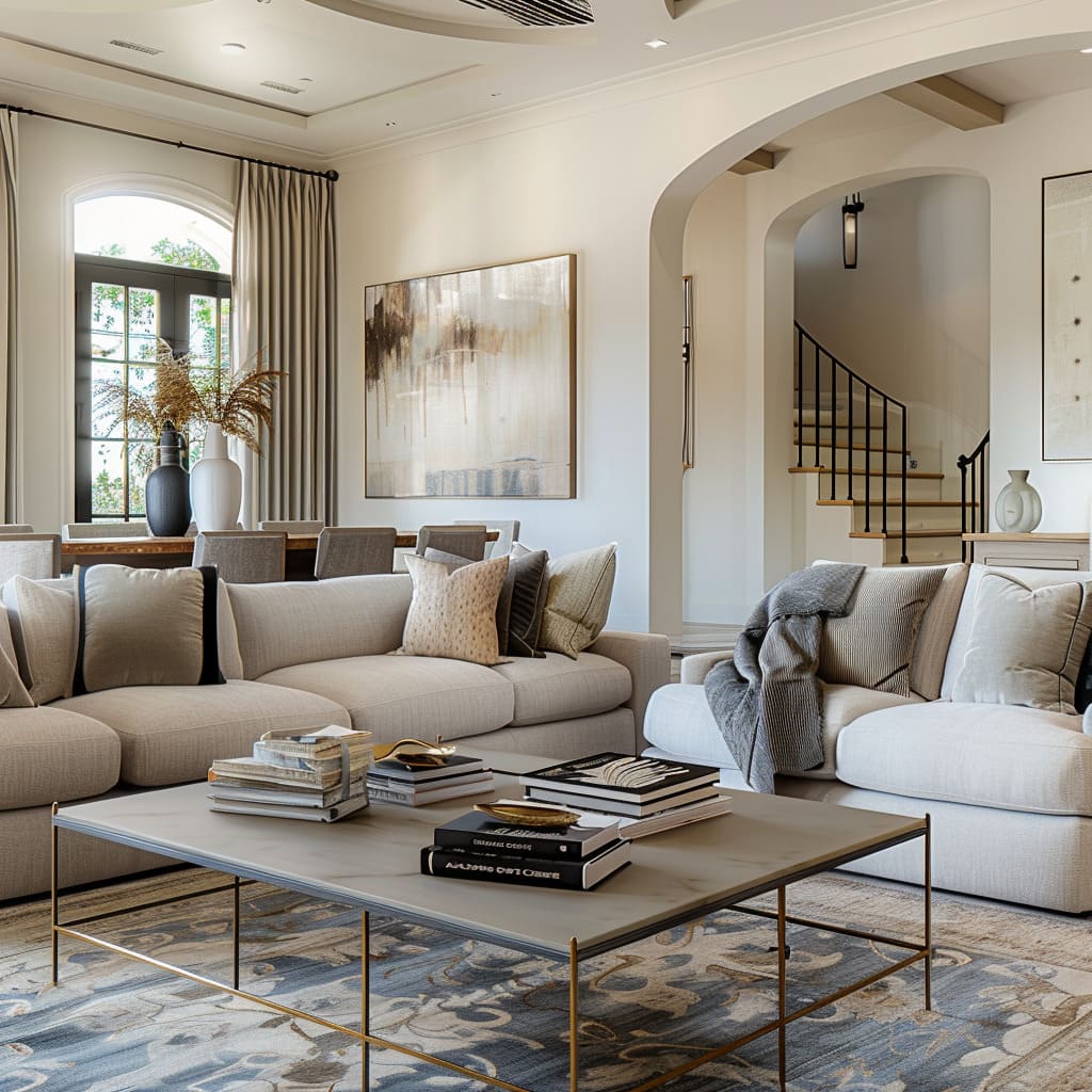
Staircases in these interiors are crafted not merely as functional structures but as integral parts of the overall design narrative. They are built from materials that echo those found elsewhere in the home, with colors that are in conversation with the surrounding space.
The design of each staircase is considerate of the flow of movement, allowing them to serve as graceful transitions between levels.
Wall colors have been chosen with an attentive eye, selected for their ability to complement the natural light as it changes throughout the day. The hues are soft, providing a serene backdrop against which the drama of daily life can unfold.
These colors do not fight for attention but rather recede, allowing the furnishings and art to take center stage. They create an environment that feels cohesive, where every element is part of a greater whole.
Flexibility and Utility
A Design that Adapts and Serves:
A hallmark of this design approach is its versatility. Side tables, coffee table books, and varied seating styles are a nod to the design’s utility and adaptability.
These elements offer both visual interest and functional benefits, suggesting a space that is as useful as it is beautiful.
Side tables are not just an afterthought; they are carefully selected for their ability to serve multiple purposes within the living space.
Positioned within reach of the main seating, they hold lamps for reading, vases for aesthetics, or beverages for convenience, all while contributing to the completeness of the space. Their design is thoughtful, with sizes and shapes that complement the primary furniture pieces, ensuring they are not obtrusive but integral to the flow of the room.
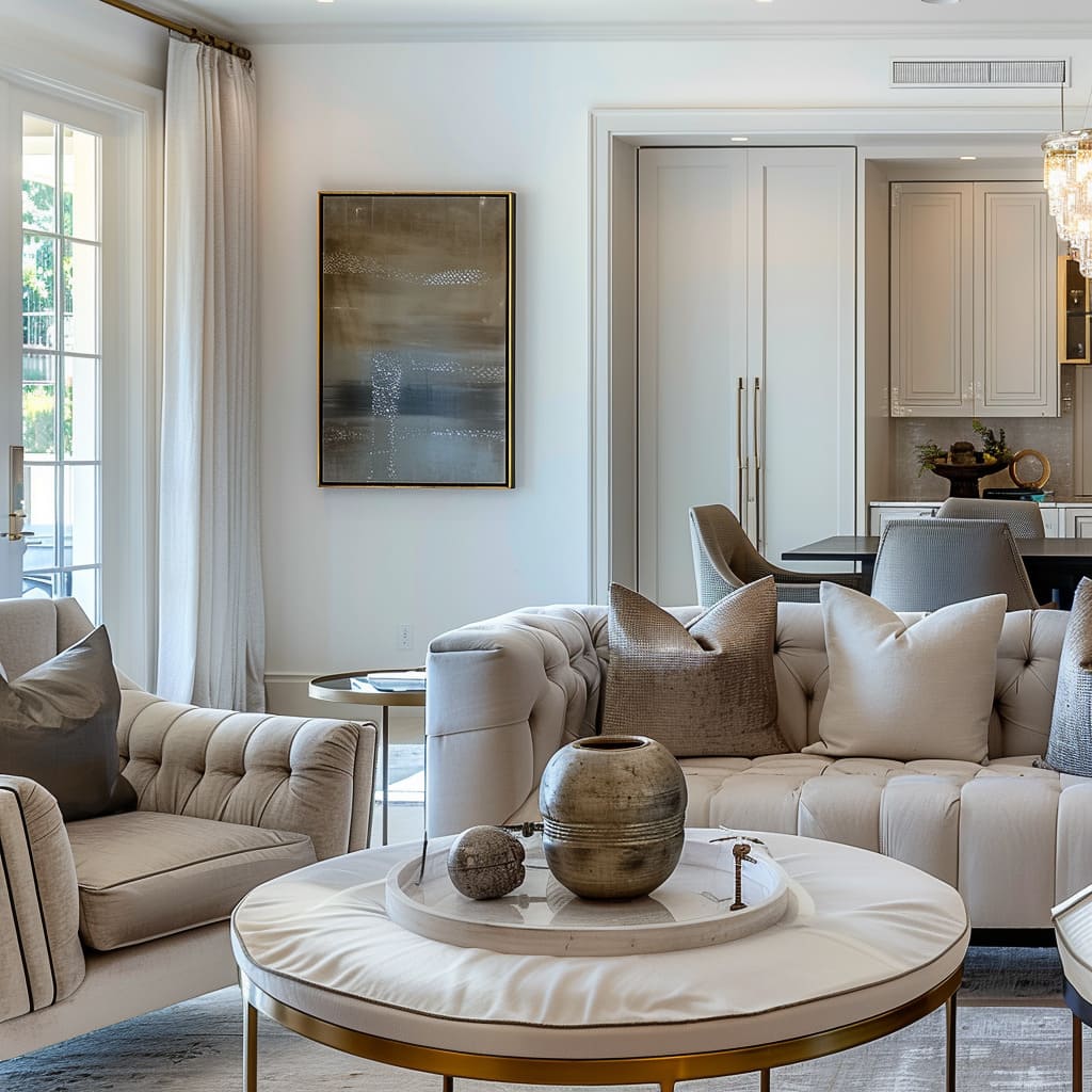
The treatment of windows in these spaces showcases an understanding of light’s importance in daily life. Sheer curtains allow a diffused light to enter, creating a soft, serene glow, while thicker drapes can be drawn to provide privacy and darkness when desired.
This versatility in window treatments allows the room’s ambiance to be altered with the pull of a string, giving the inhabitant command over the mood and lighting at any given time.
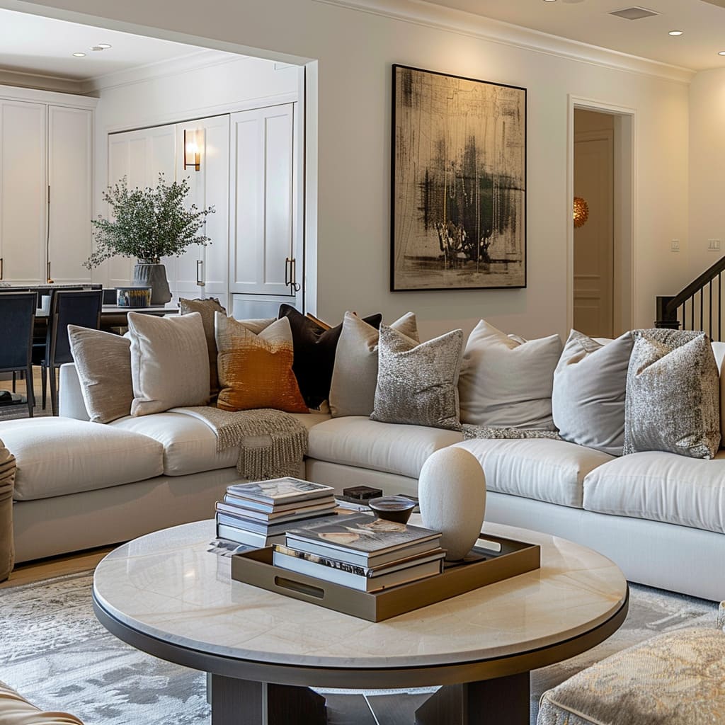
Coffee table books, selected with an eye for design, contribute more than just reading material. Their spines are as much a part of the decor as any other element, carefully chosen to align with the room’s color scheme and to resonate with the overarching theme.
These books are placed not only for their intellectual content but also for their role in the visual harmony of the space, adding a layer of sophistication.
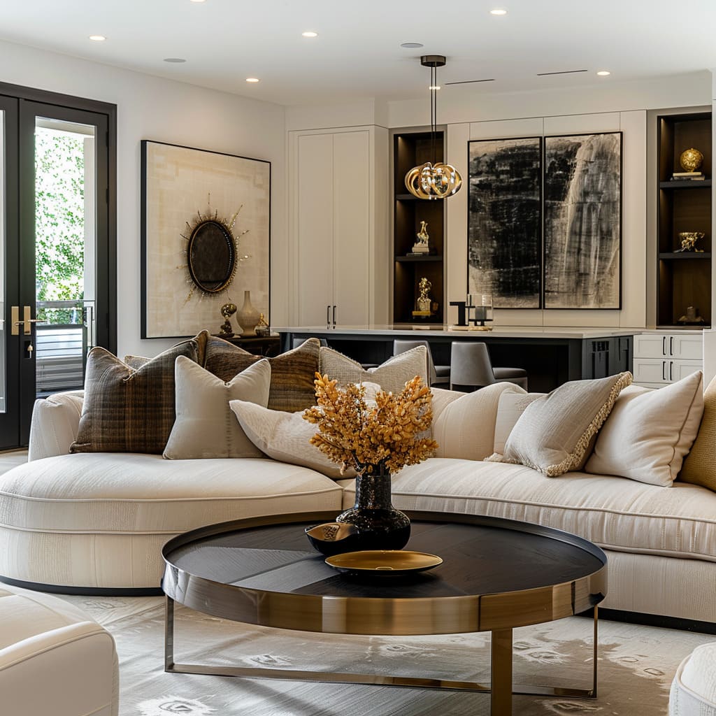
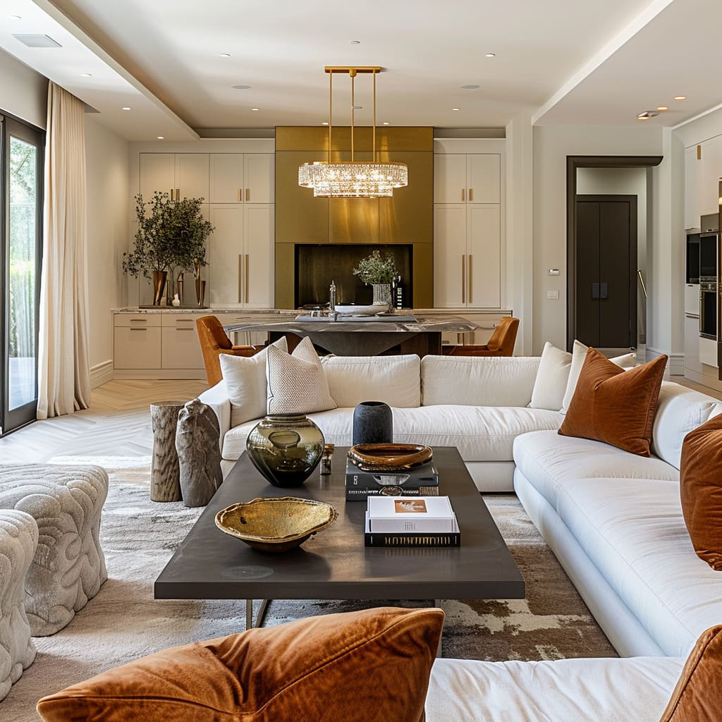
The strategic incorporation of dark-toned elements in the room serves to anchor the lighter tones that dominate the space. These darker accents are used sparingly, allowing them to stand out against the softer backdrop and providing a visual weight that is both grounding and focal.
Whether it be a dark wood table or a deep-hued accessory, these elements bring depth and dimension to the room.
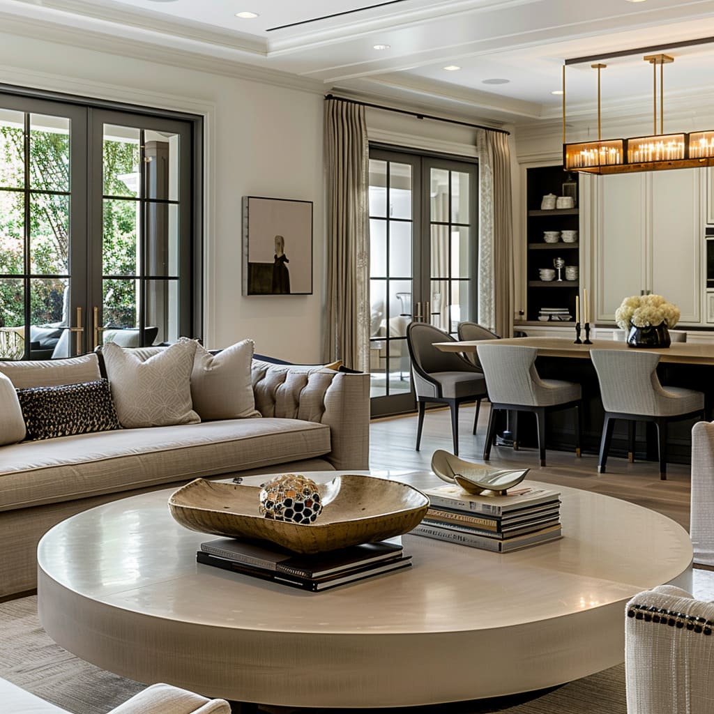
Round tables offer a visual softening effect amidst the predominance of angular forms. Their curves introduce a new shape language into the room, breaking up the straight lines of the walls and furniture.
This contrast in forms creates a balance, ensuring that the room feels both ordered and organic. Their presence is a deliberate choice to introduce fluidity and to offset the rigidity that can come with too much geometry.
As we journey through the myriad facets of interior design, it becomes evident that creating a harmonious space is akin to conducting a symphony, where each note and pause is critical to the overall experience. The thoughtful consideration of structure, materiality, decoration, and utility underscores a profound respect for the interplay between form and function.

