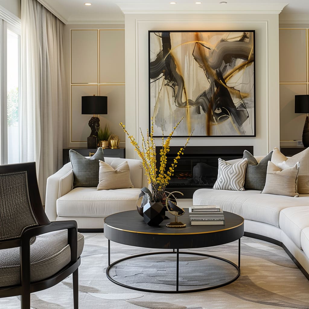
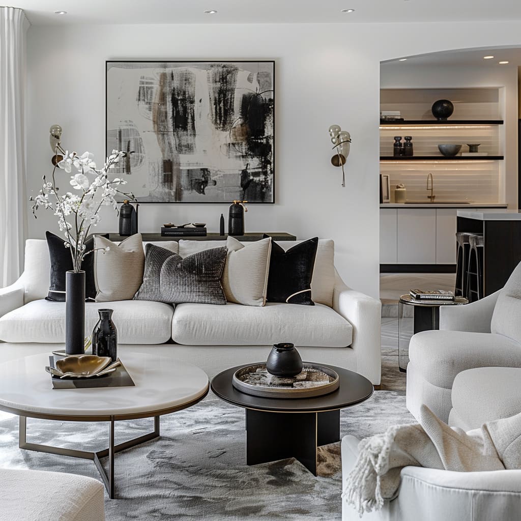
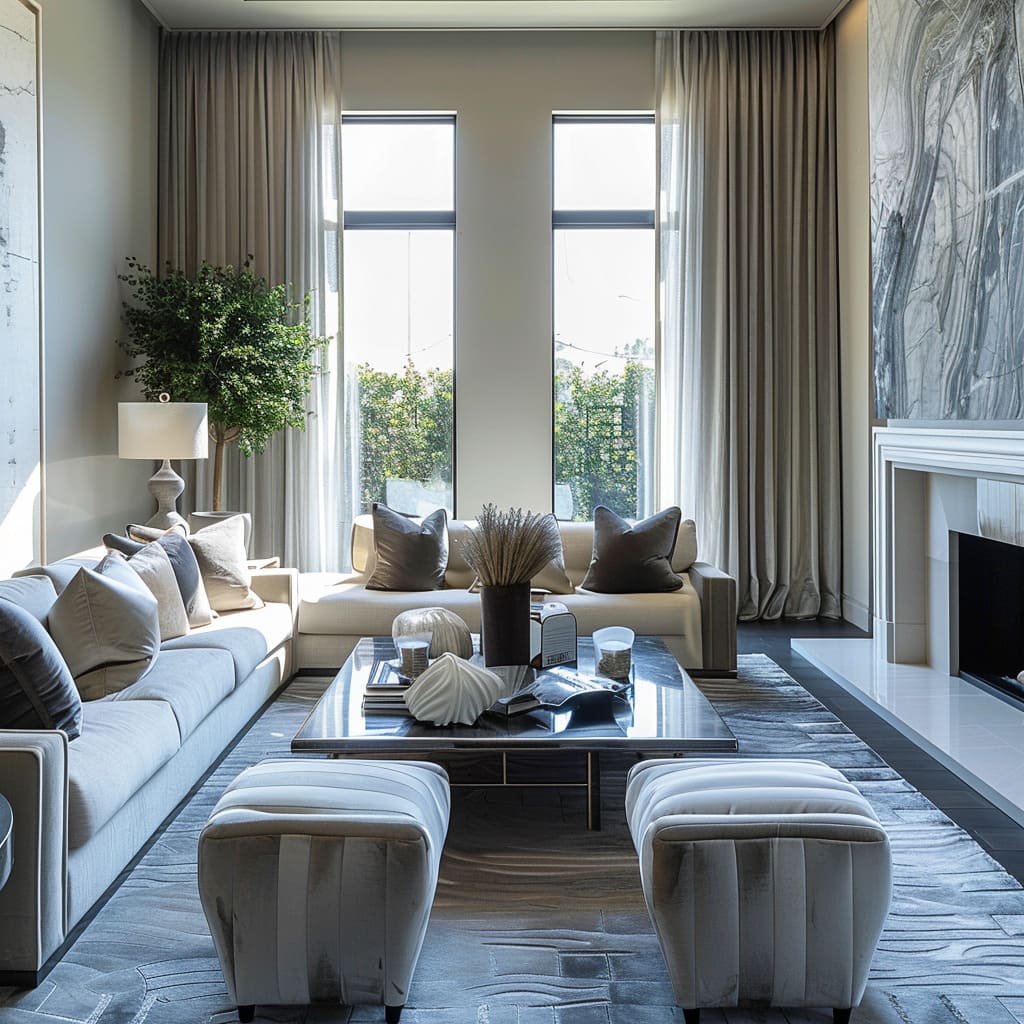
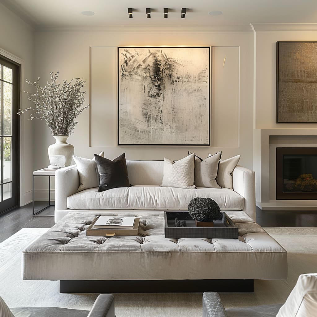
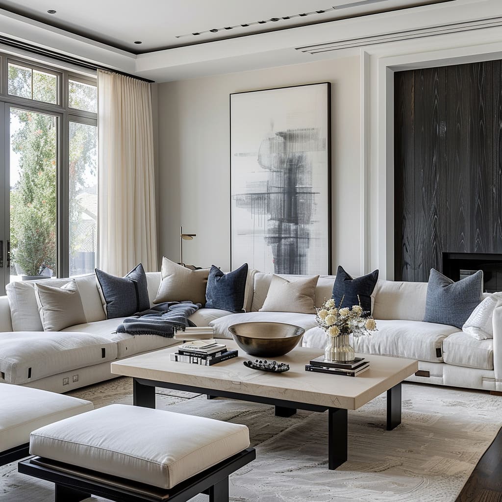
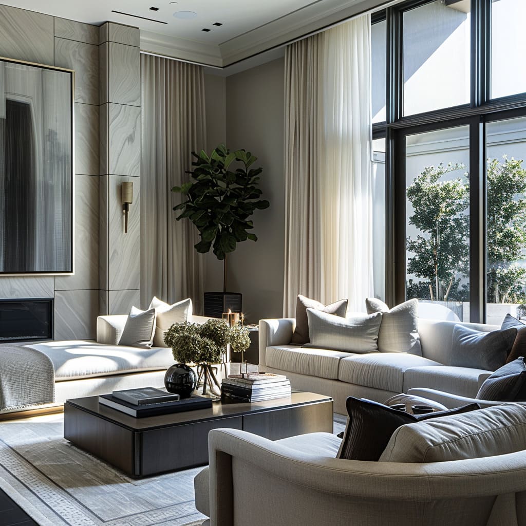
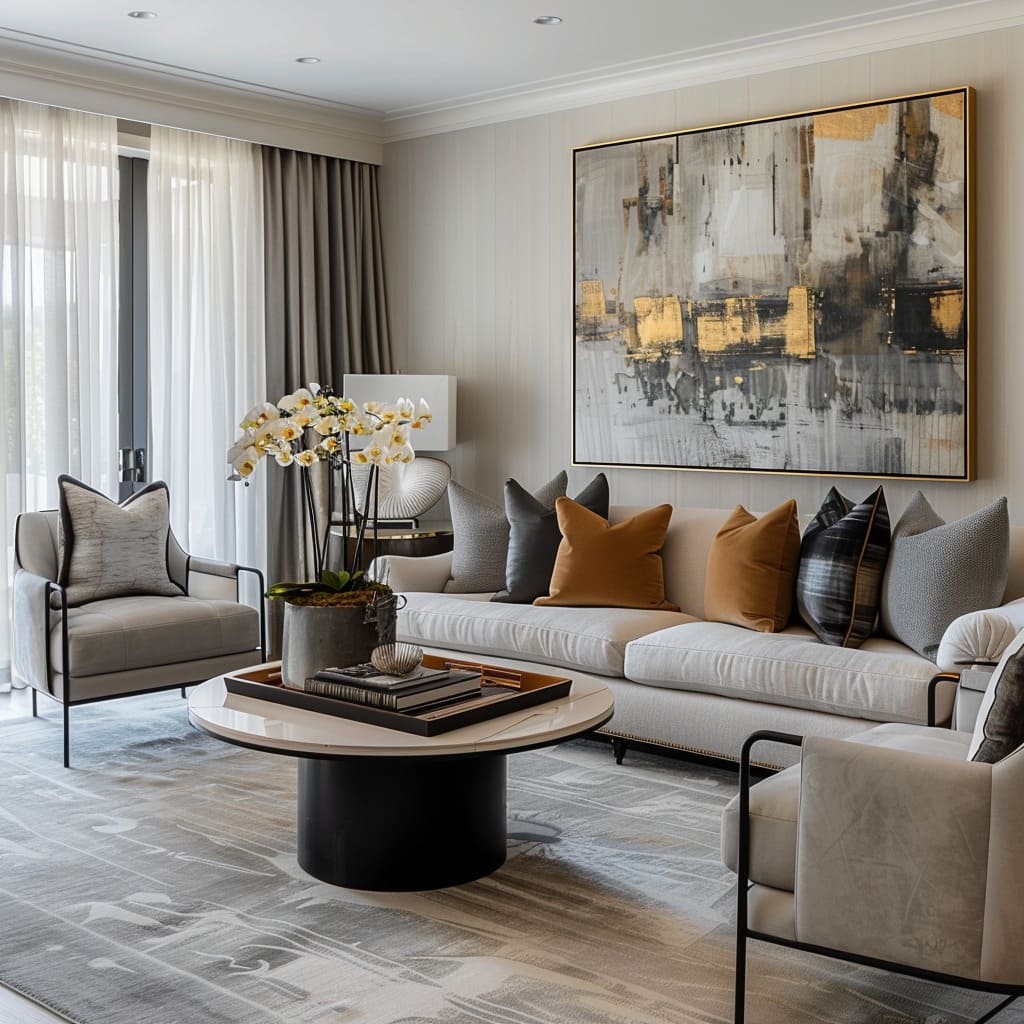
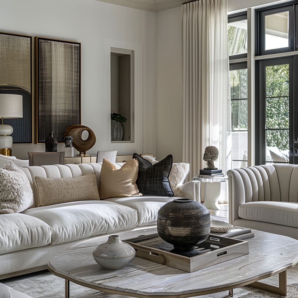
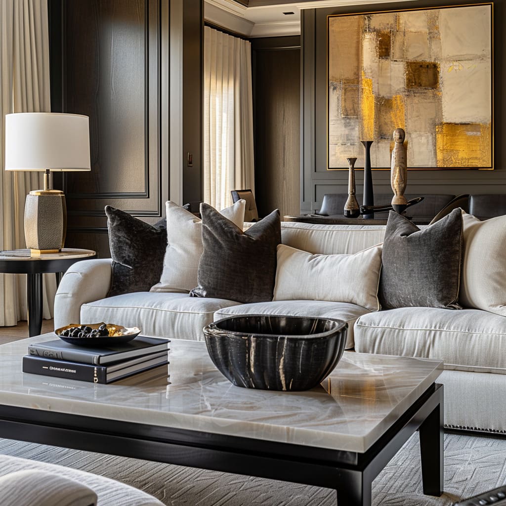
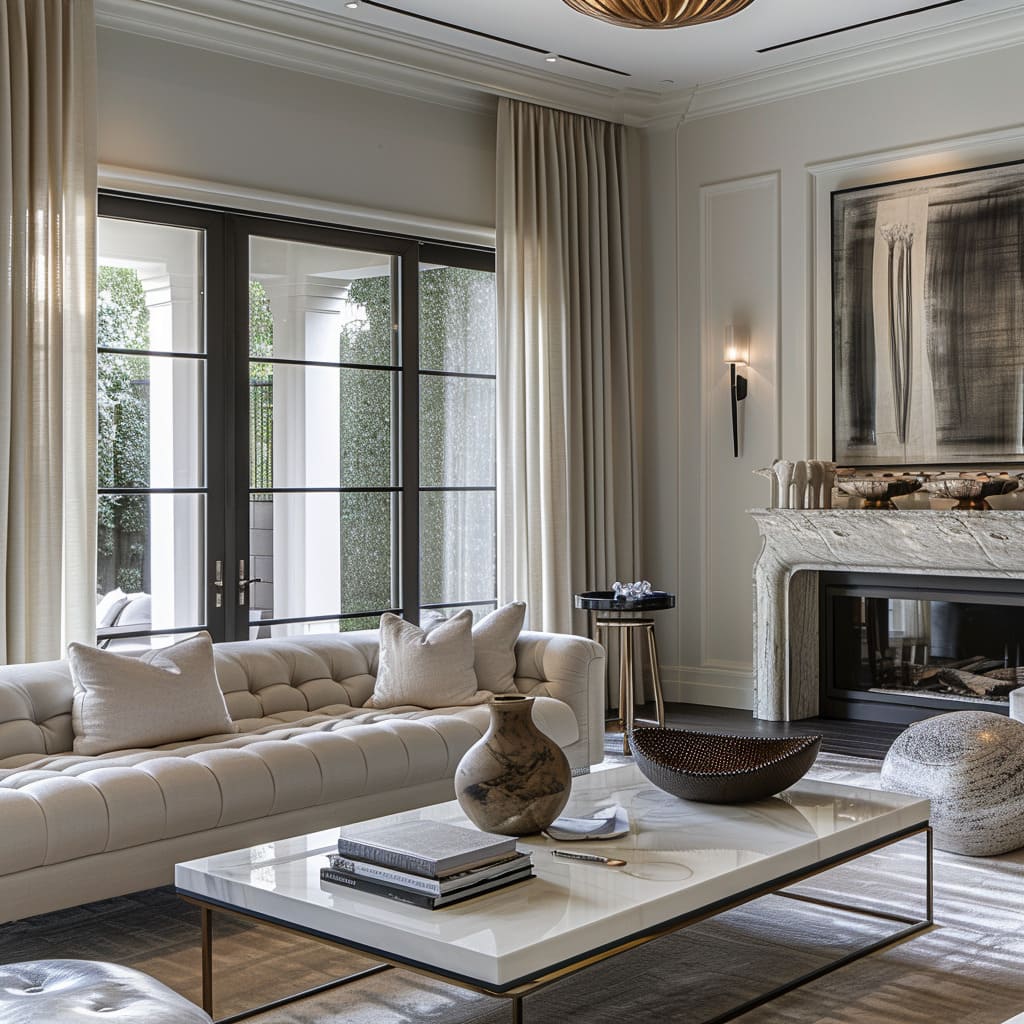
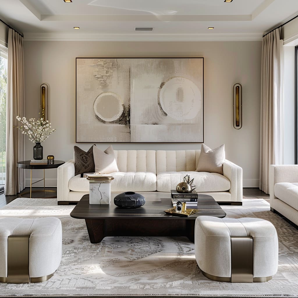
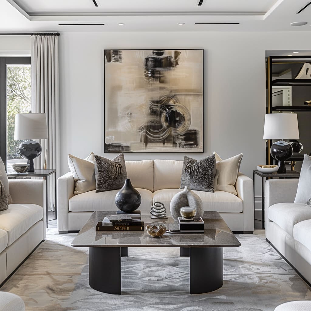
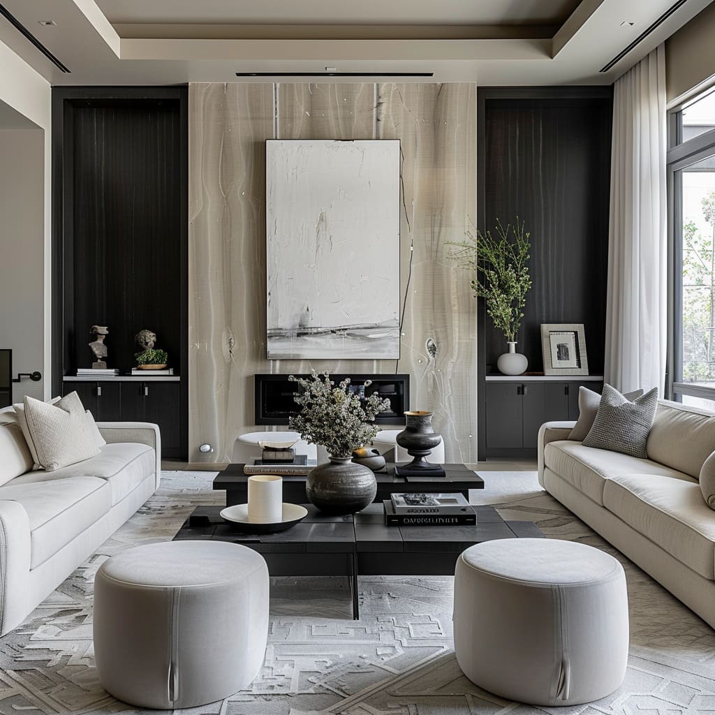
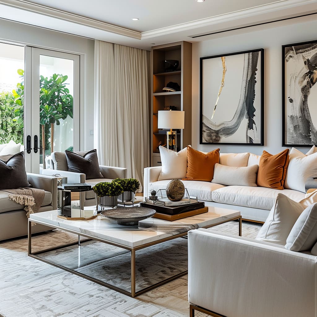
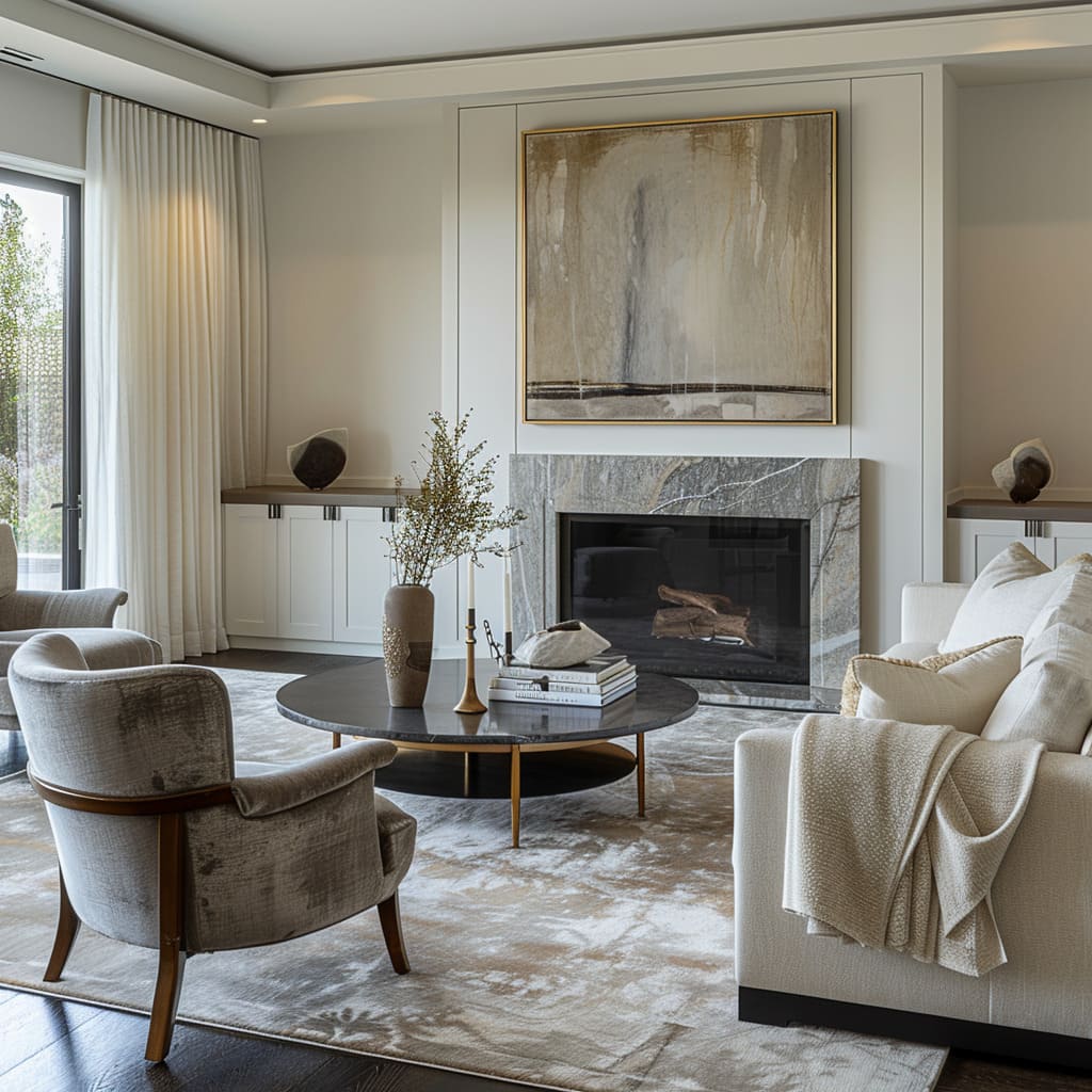
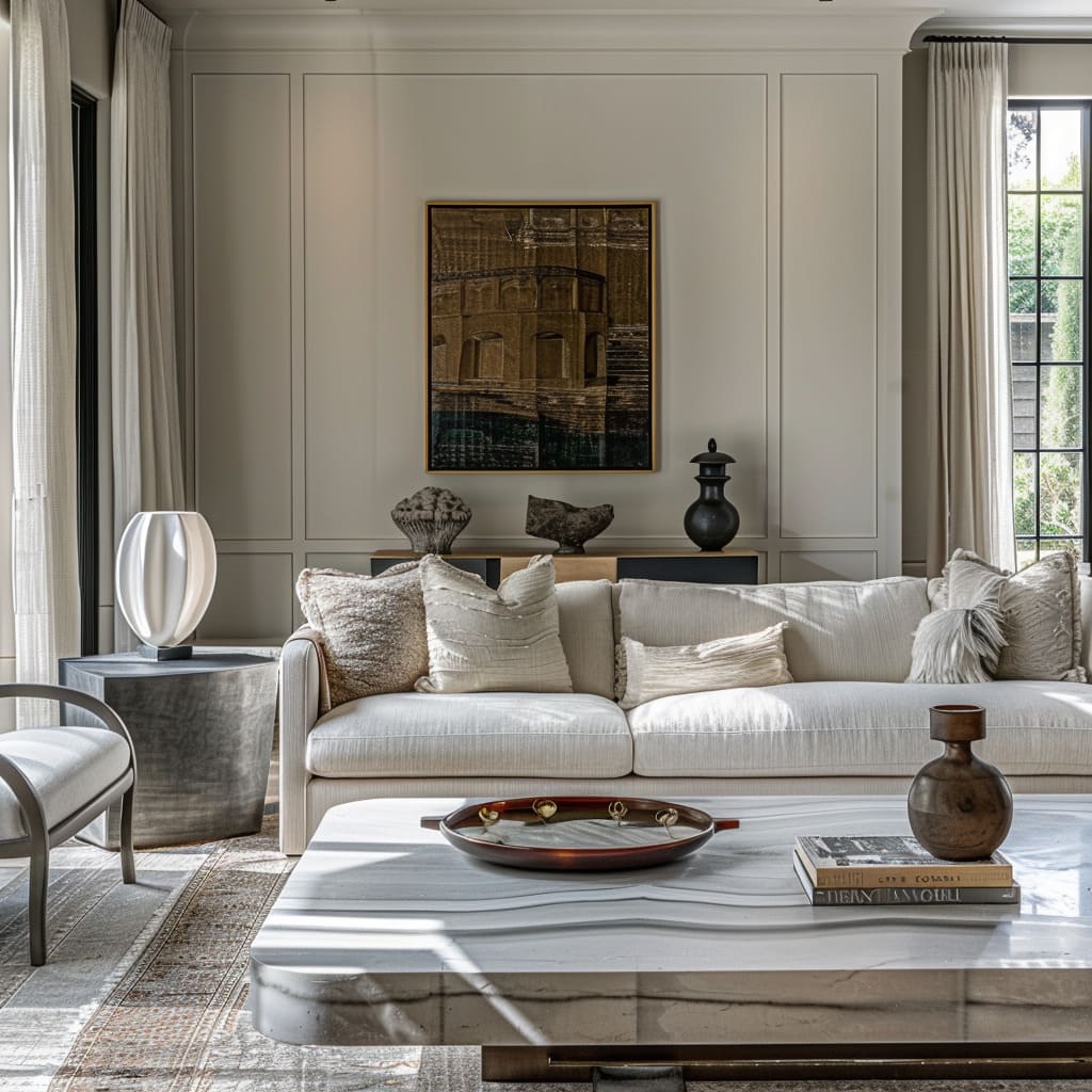
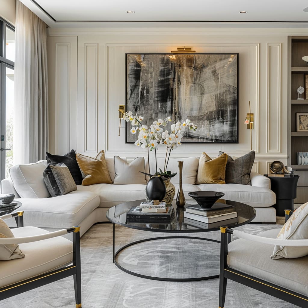
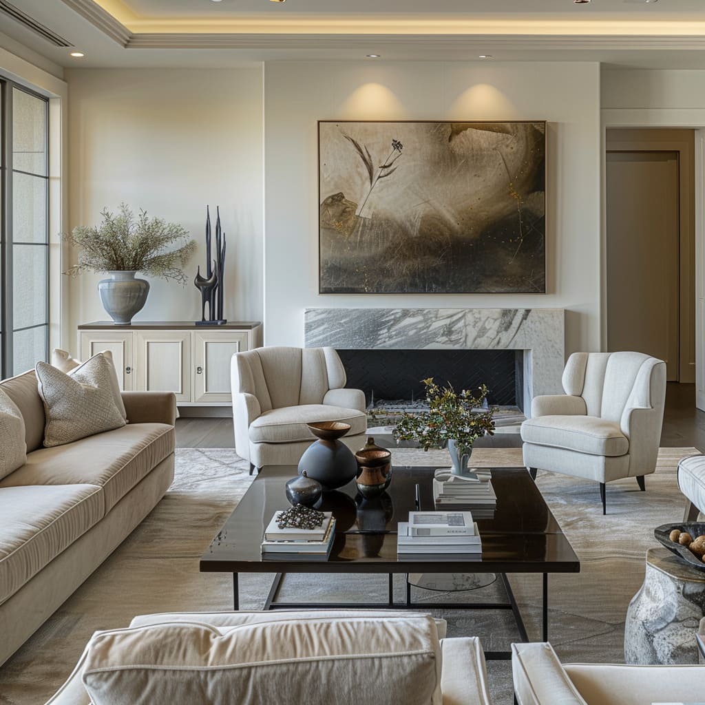
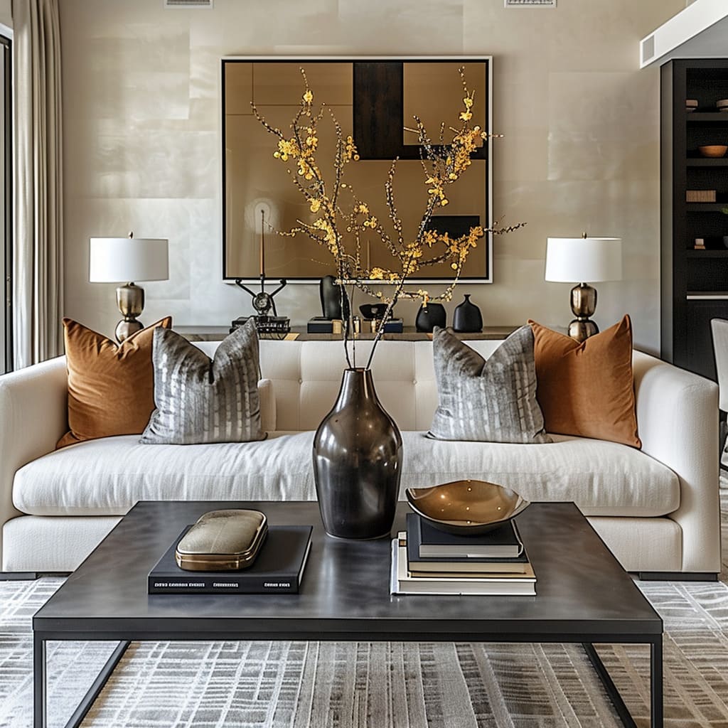
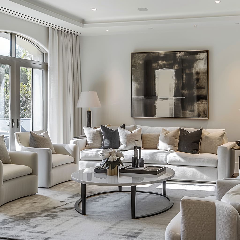
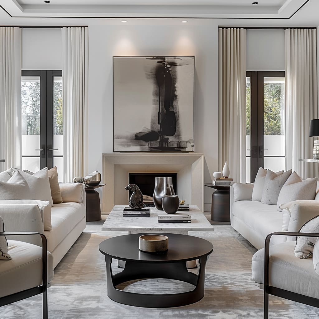
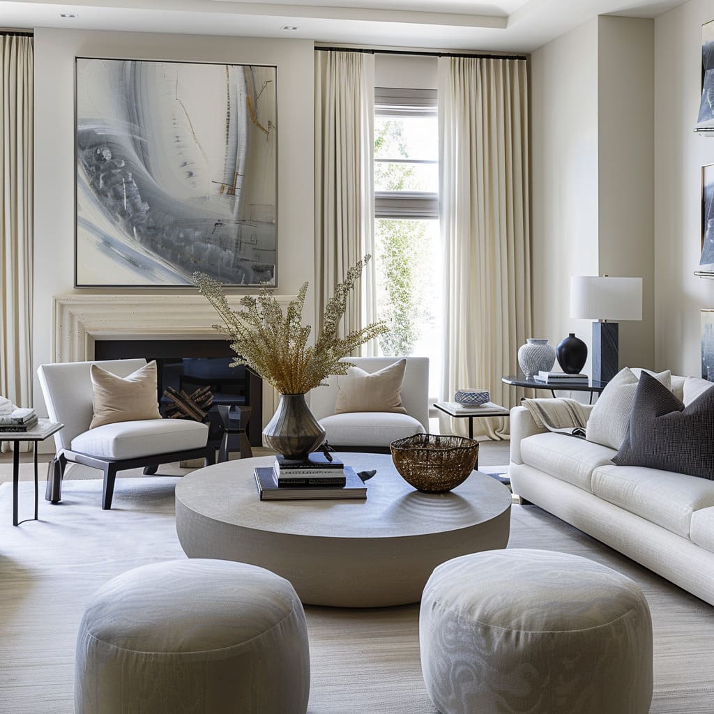
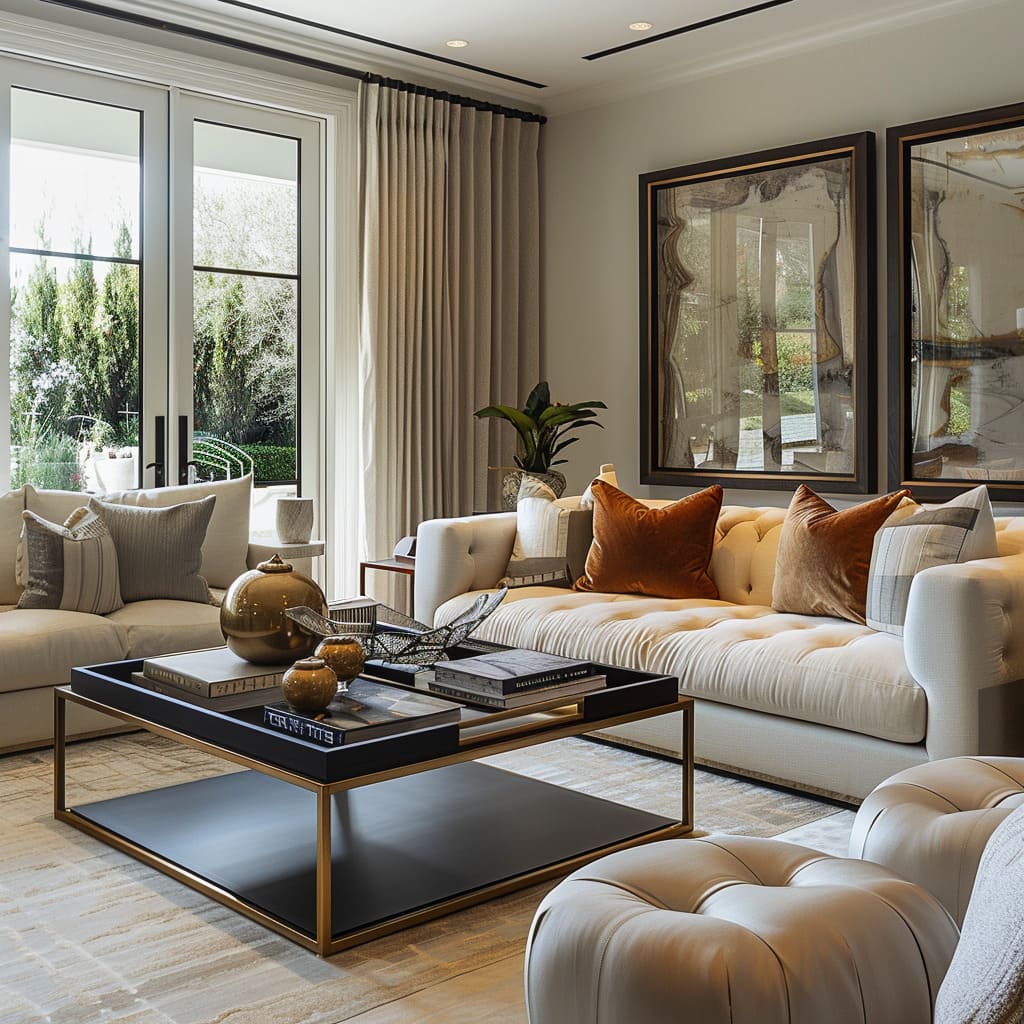
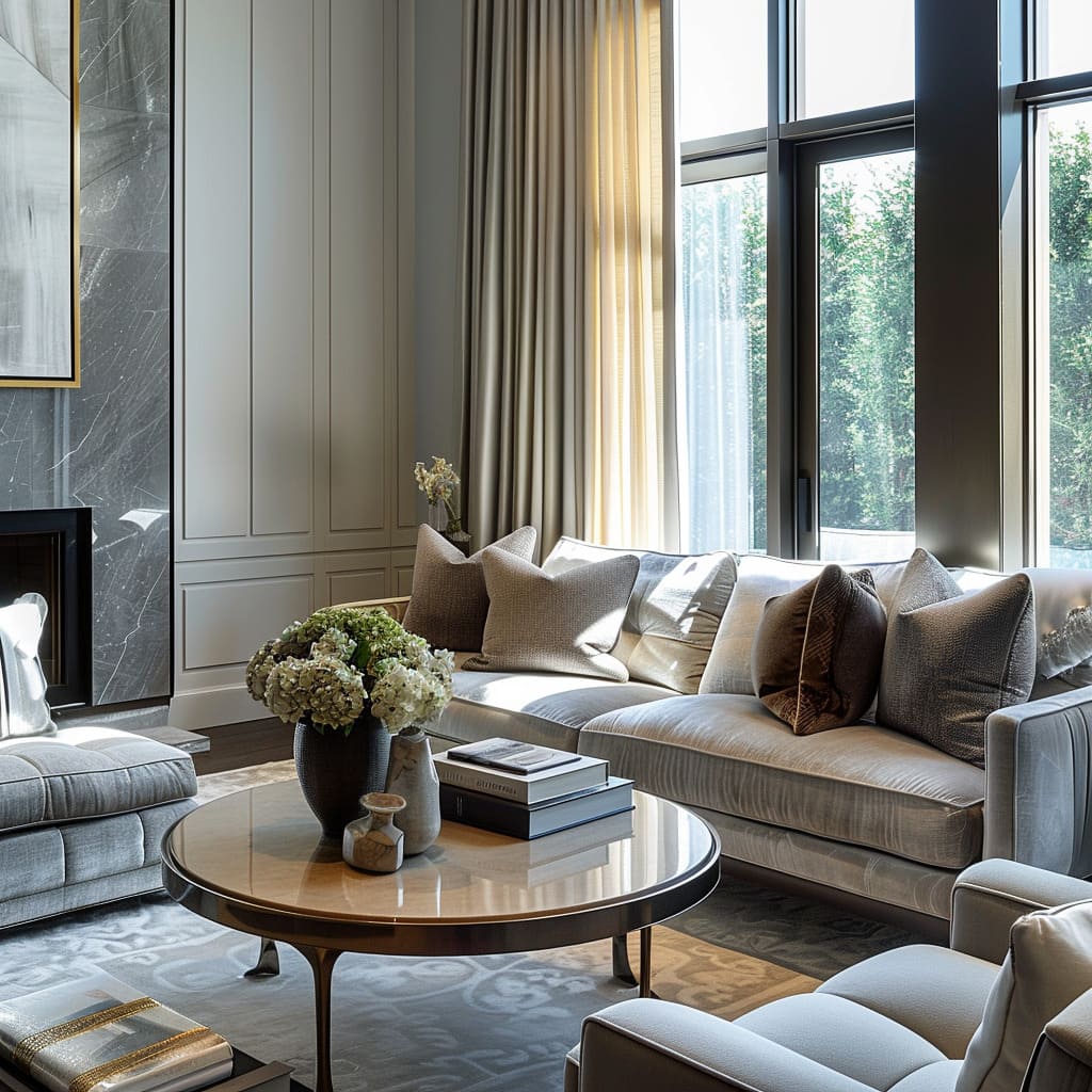
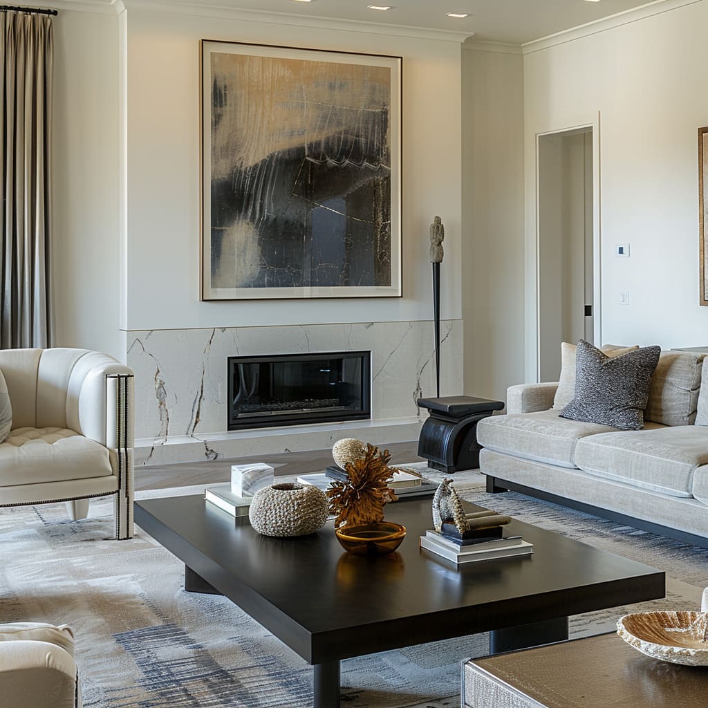
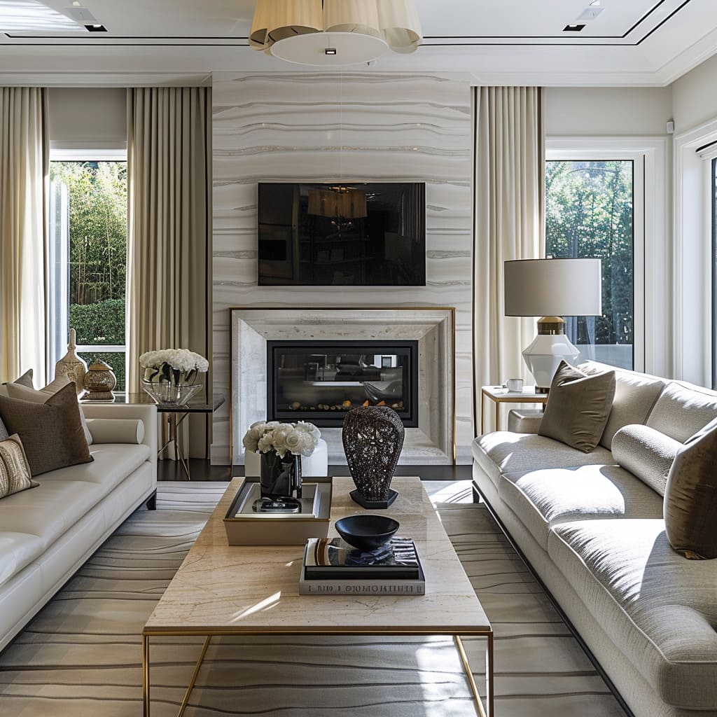
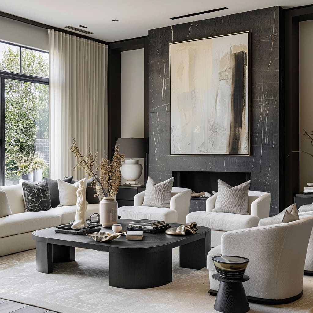
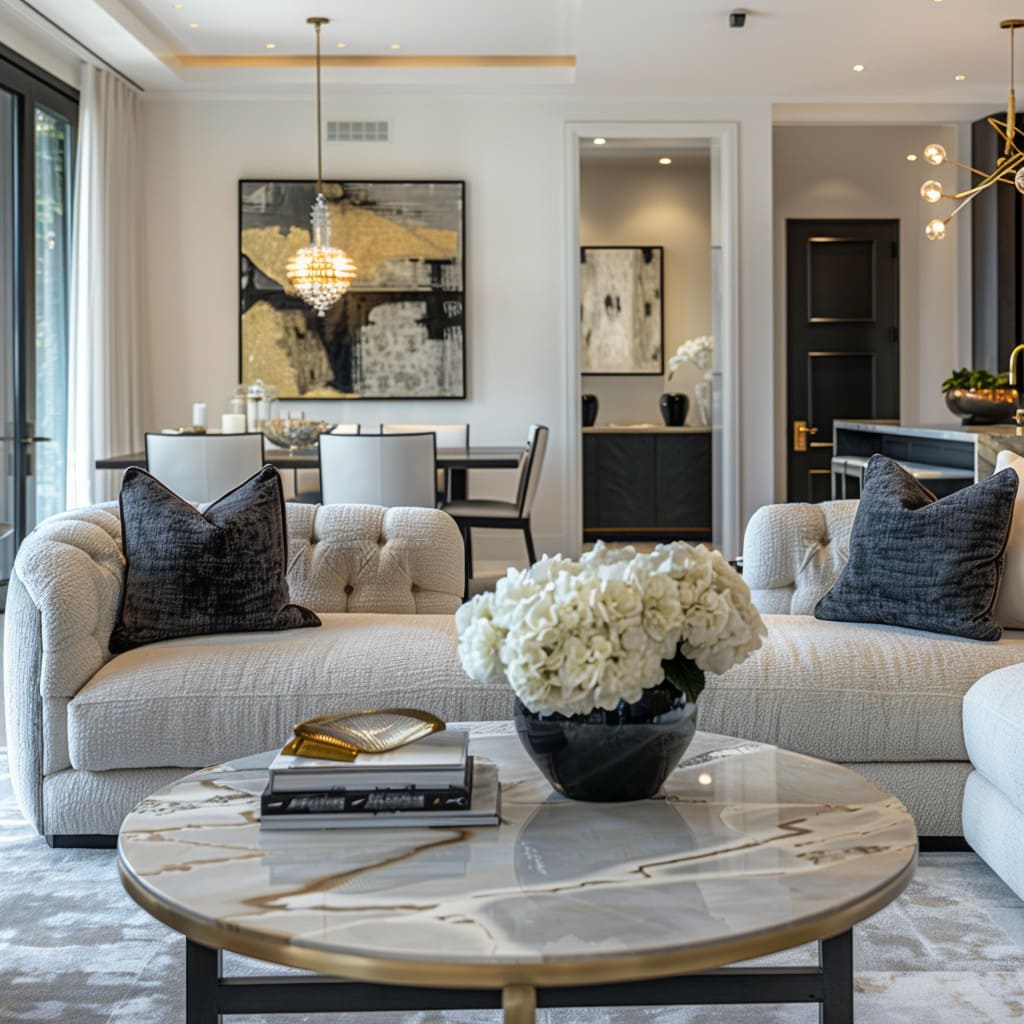
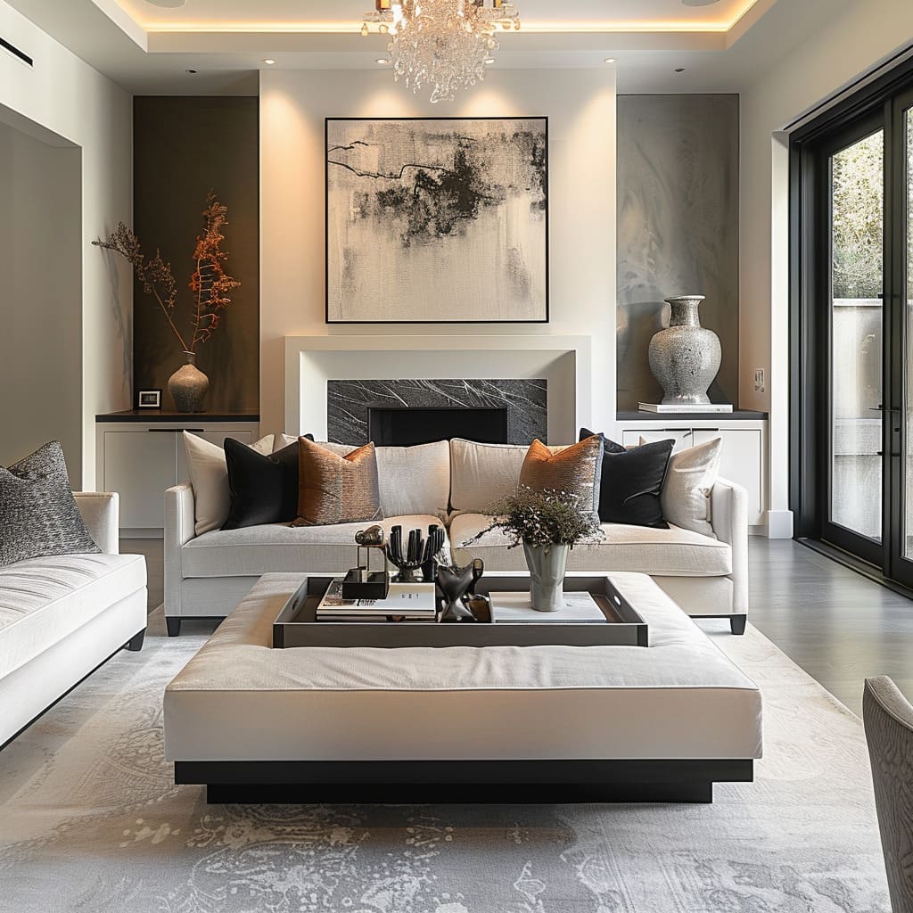
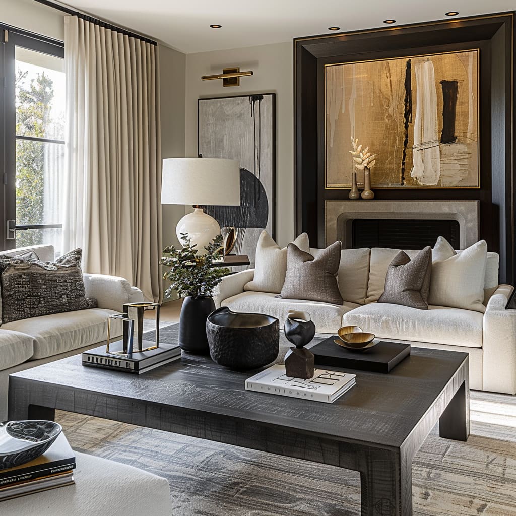
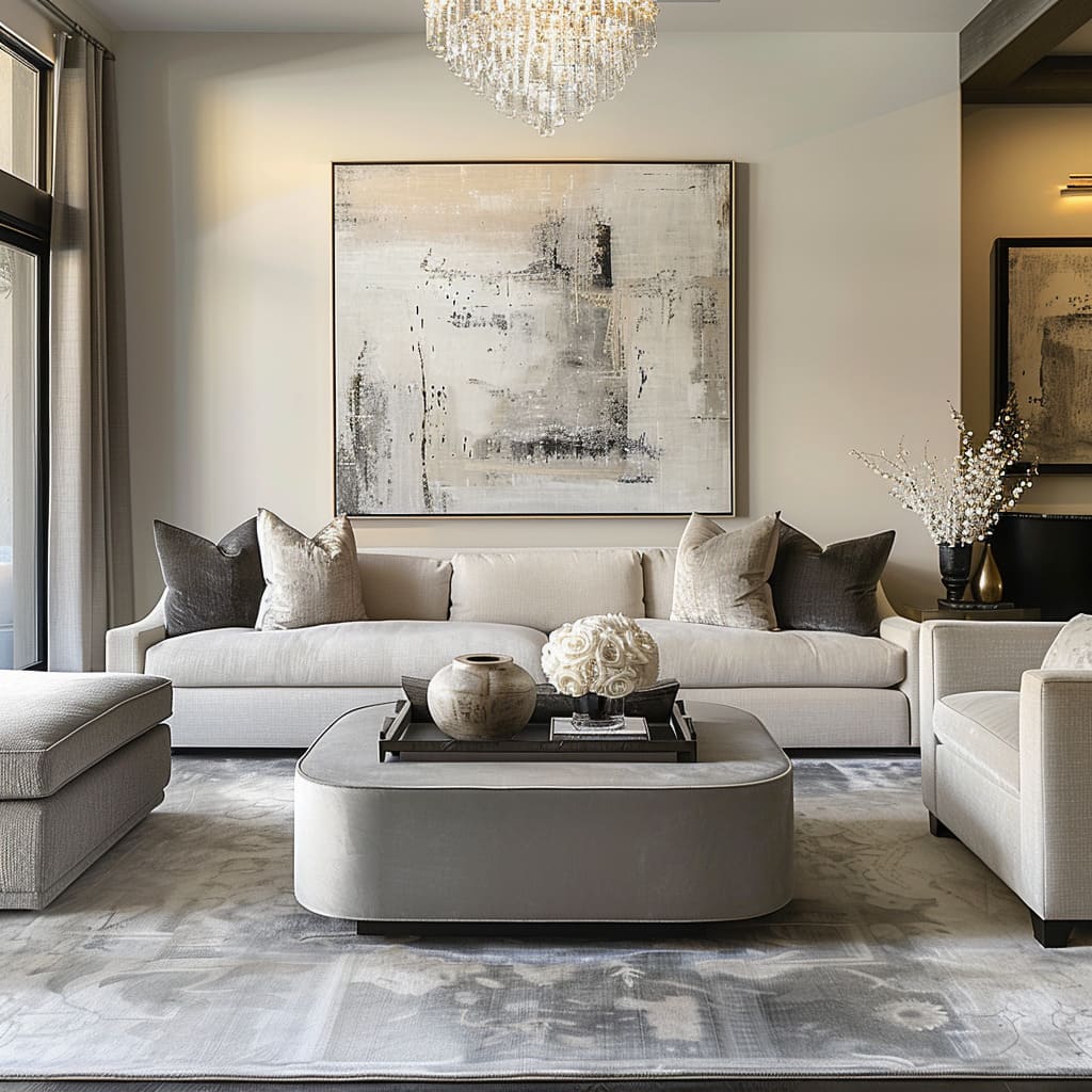
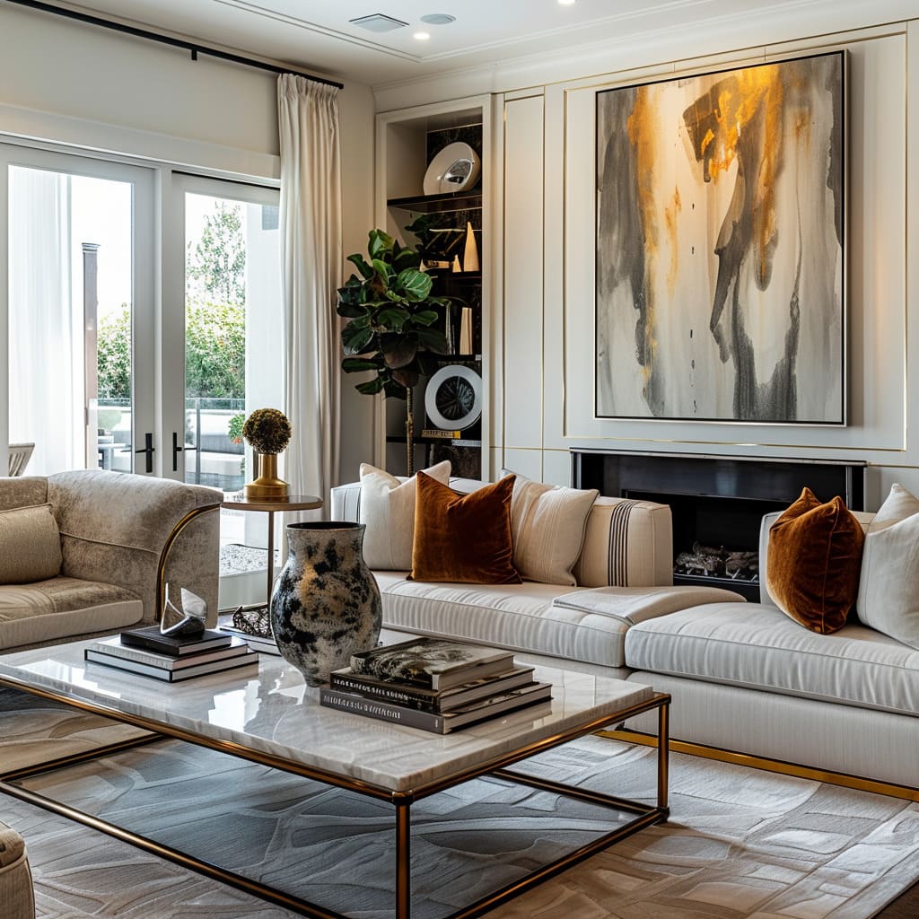
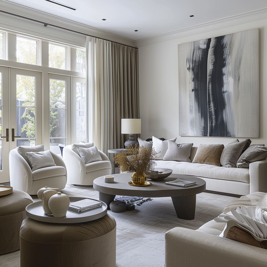
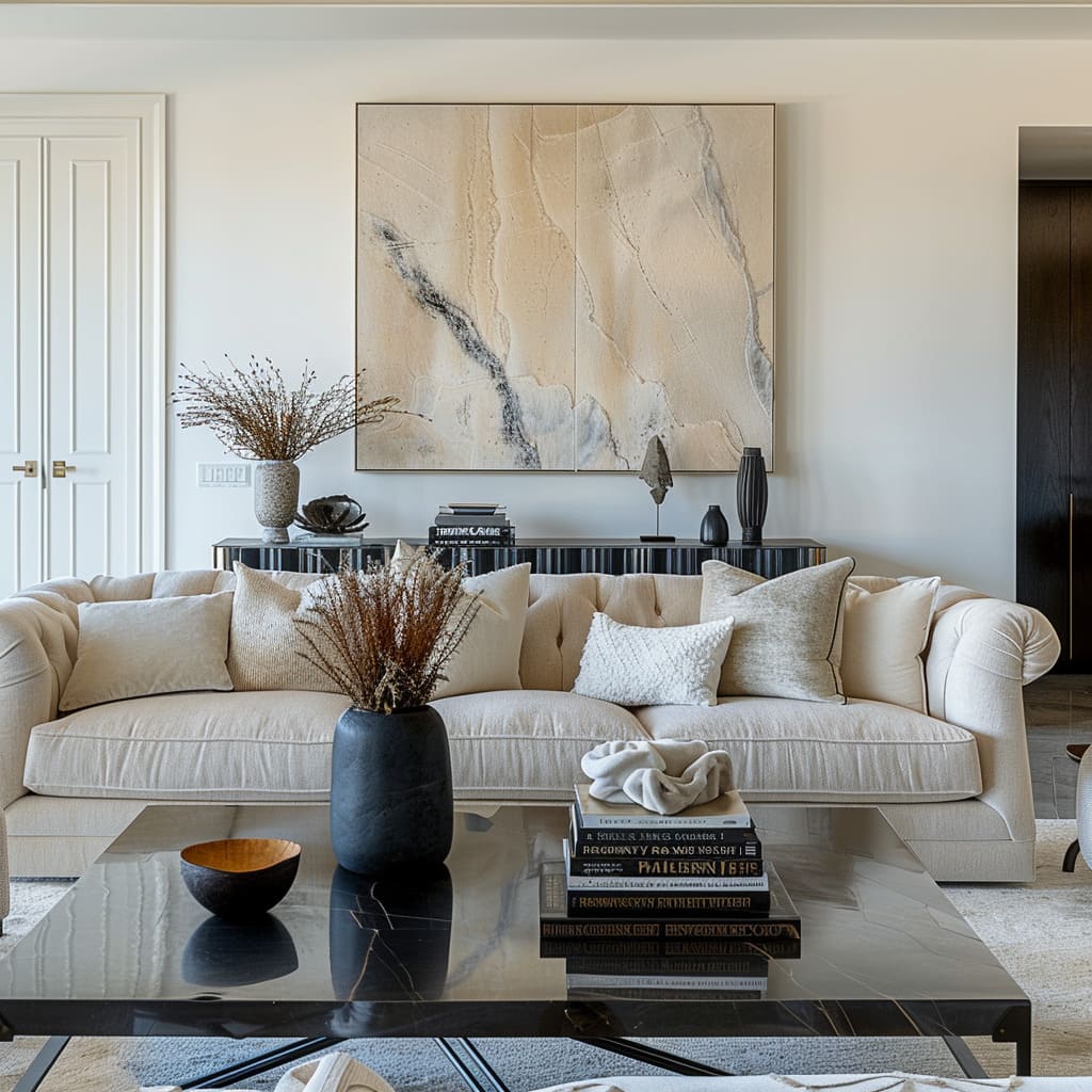
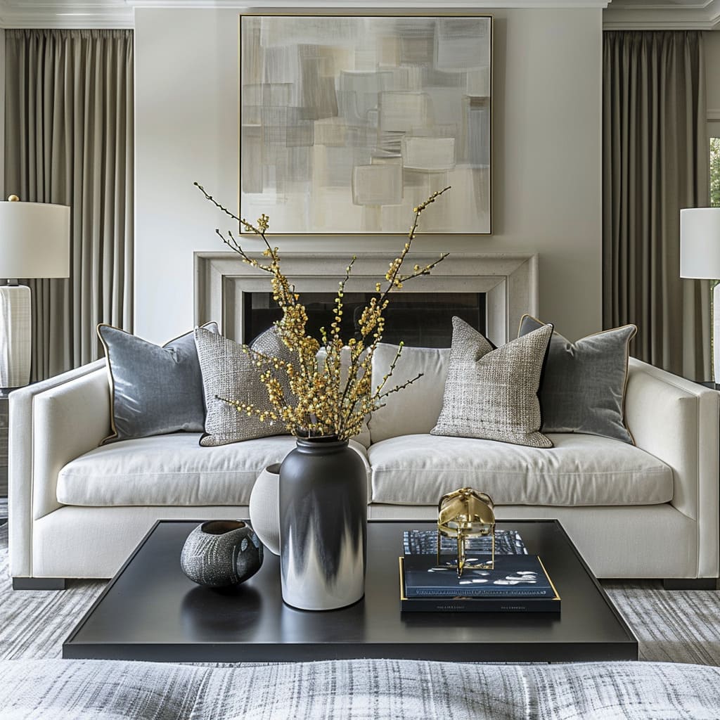
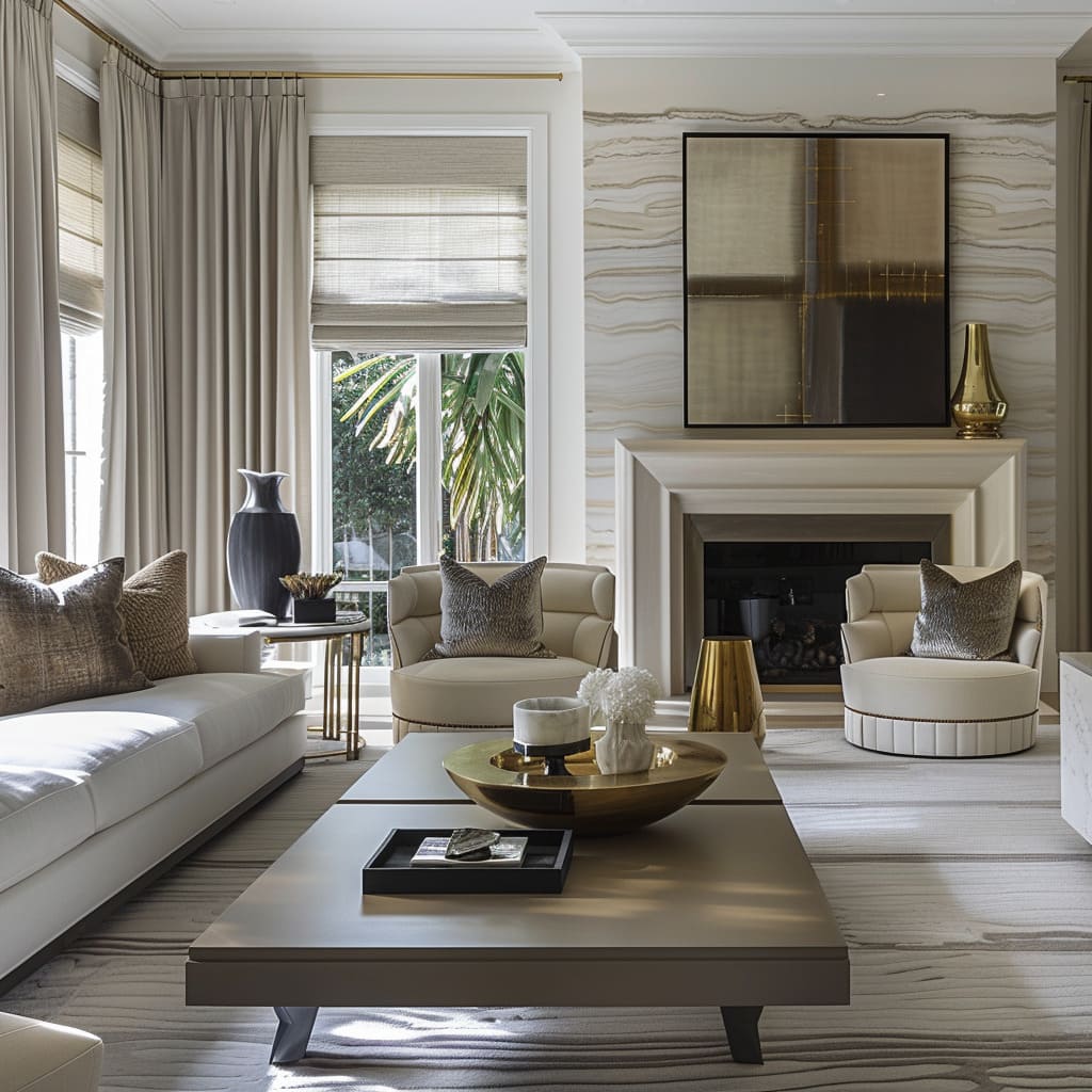
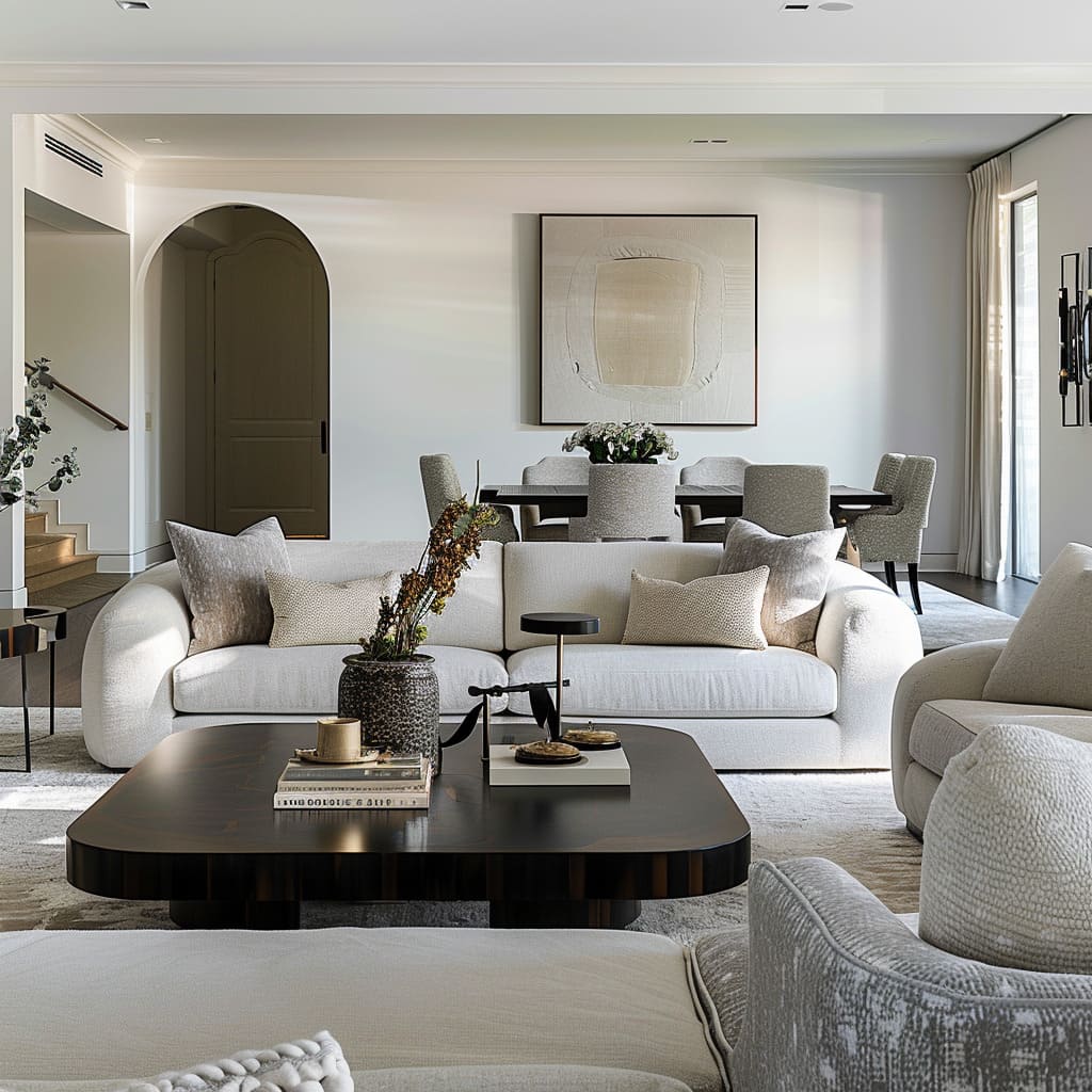
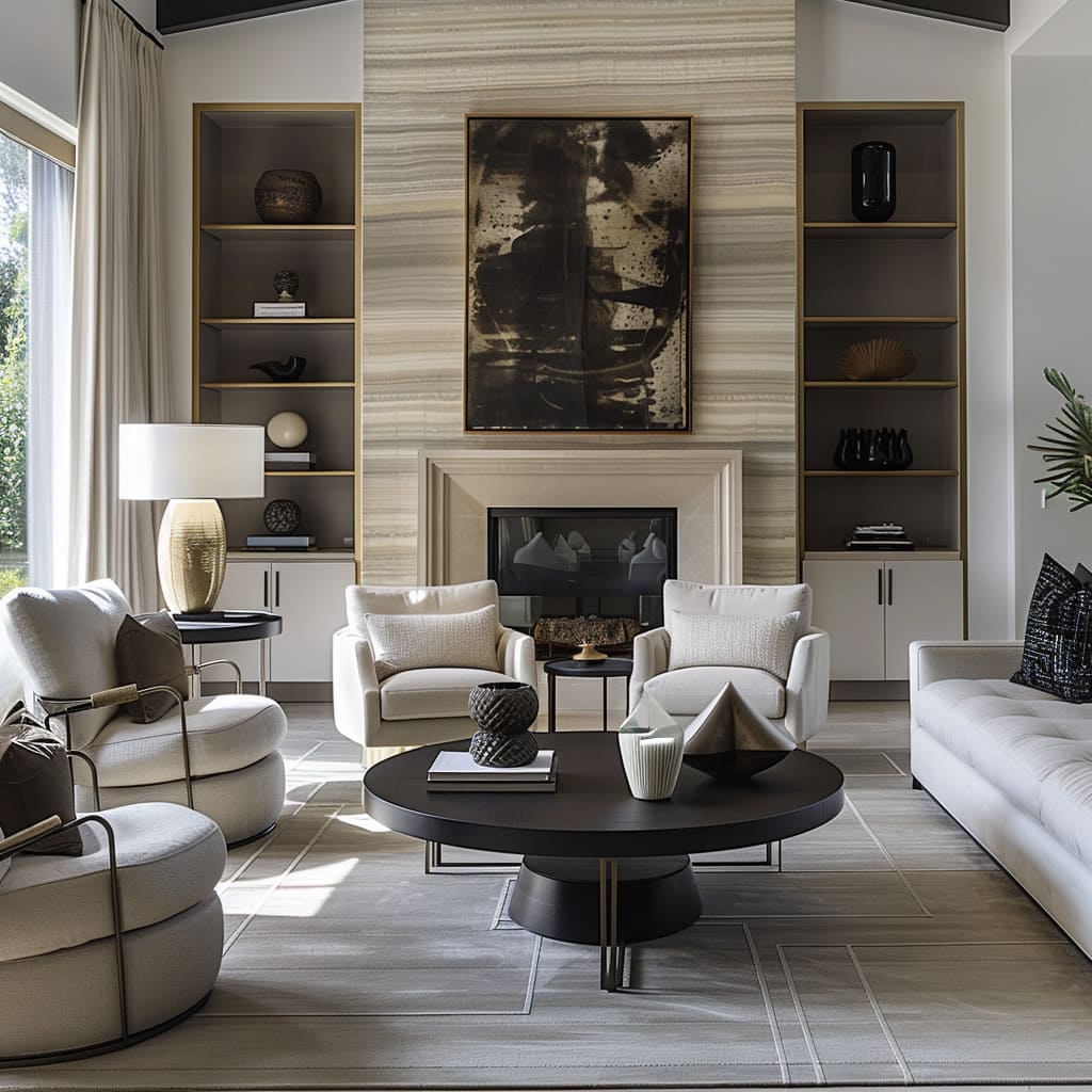
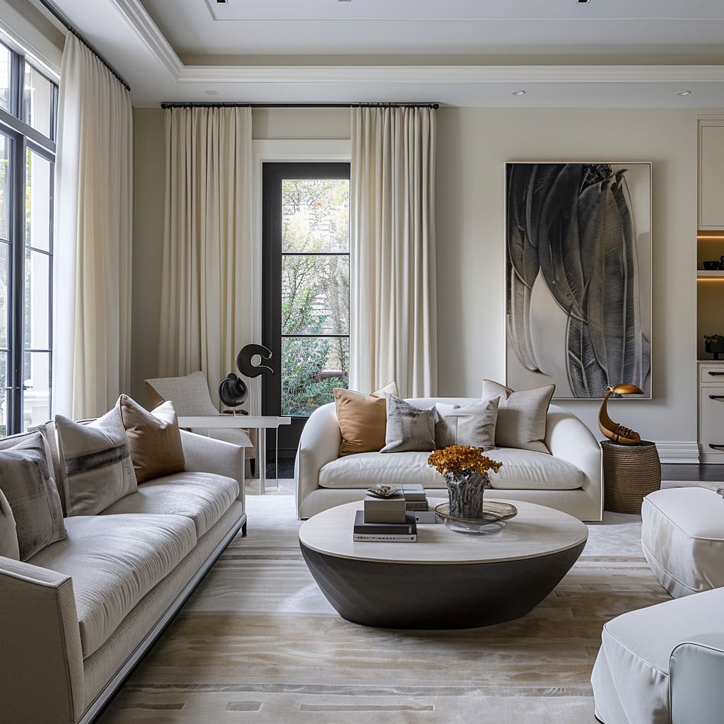
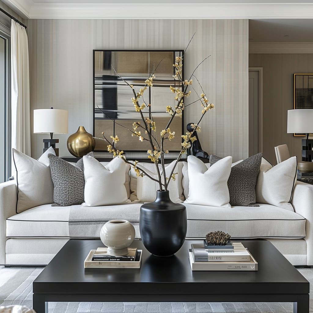
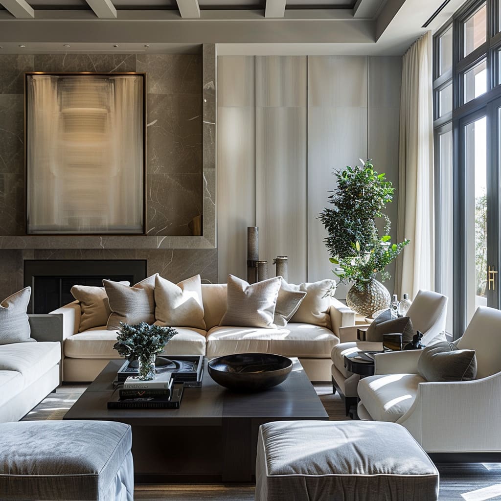
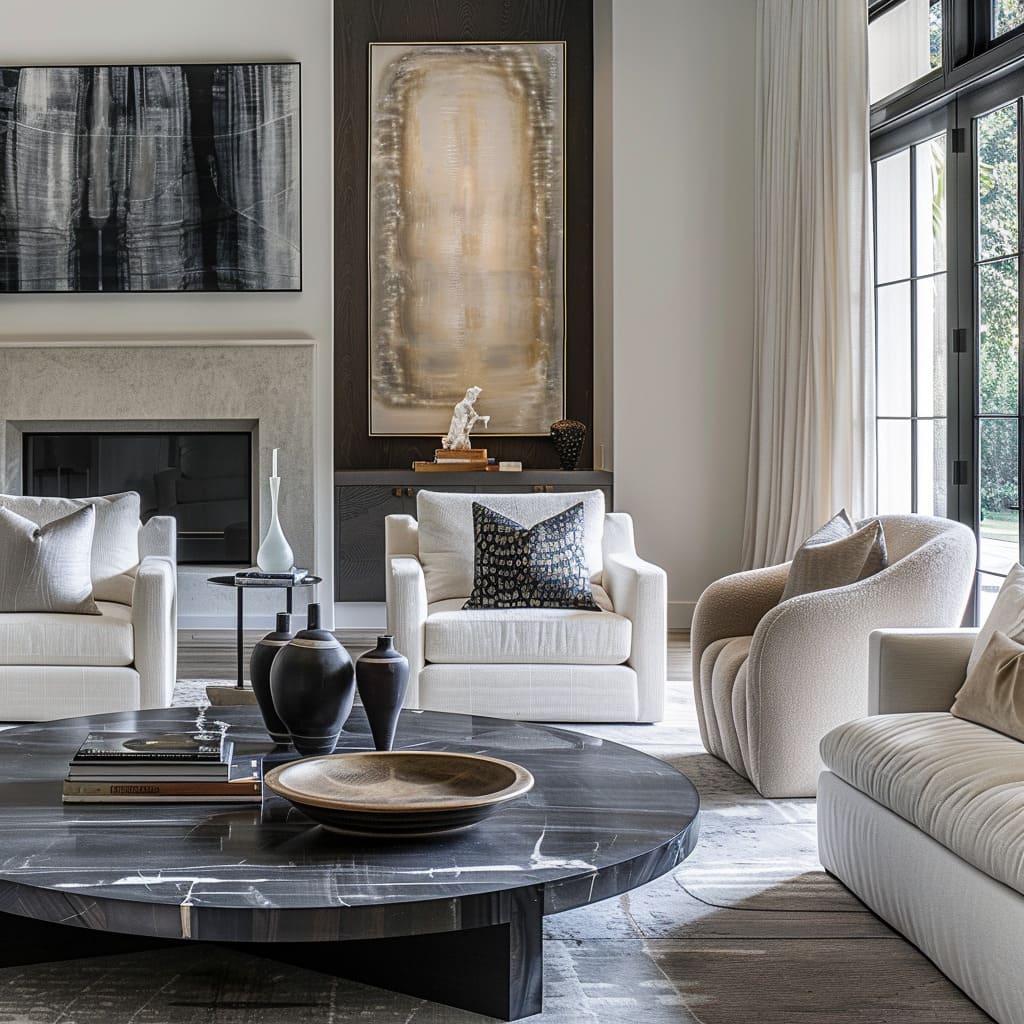
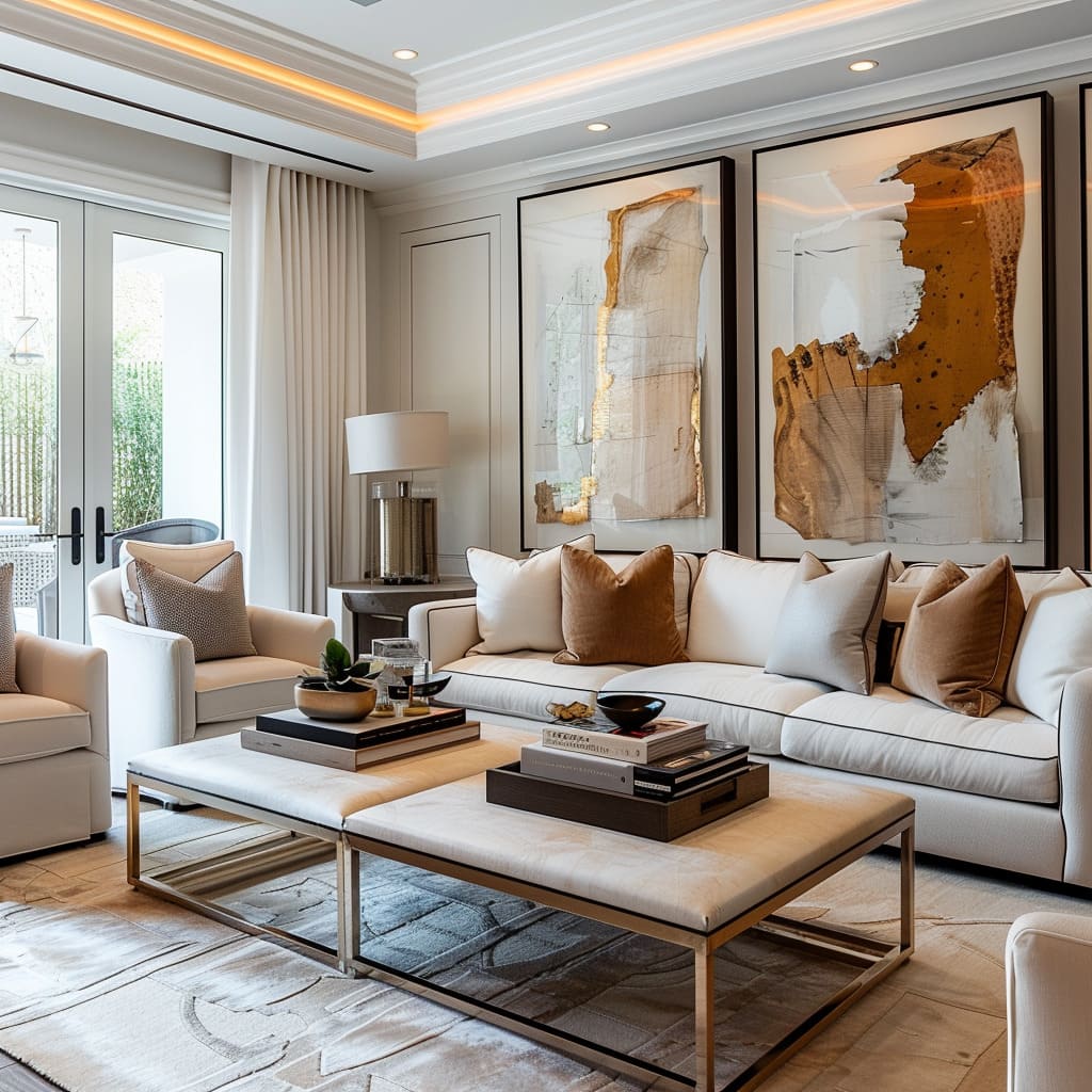
In the world of interior design, every line, texture, and color sings a part in the symphony of a home. It is the delicate interplay of these elements that turns mere spaces into havens of beauty and tranquility.
As we embark on this exploration of design, we dive into the subtleties that compose the harmonized spaces of a home, where structural elements set the stage, personal stories add depth, sensory experiences enrich interactions, and a timeless adaptability ensures that the home evolves along with its inhabitants.
The artistry of design lies not just in visual appeal but in creating environments that resonate with the lives lived within them.
Structural Harmony
Crafting Balance and Elevation
Interior spaces are not just about filling rooms with furniture and decor; they’re about creating an equilibrium that pleases the eye and soul. In this section, we explore the art of ‘Structural Harmony’—how strong horizontal lines provide stability, while visual balance is achieved without relying on perfect symmetry.
We will also delve into how strategic use of space and accentuating the height of rooms contribute to the impression of grandeur and open expanse, and how purposeful asymmetry introduces a dynamic yet grounded character to living spaces.
Use of Horizontal Lines
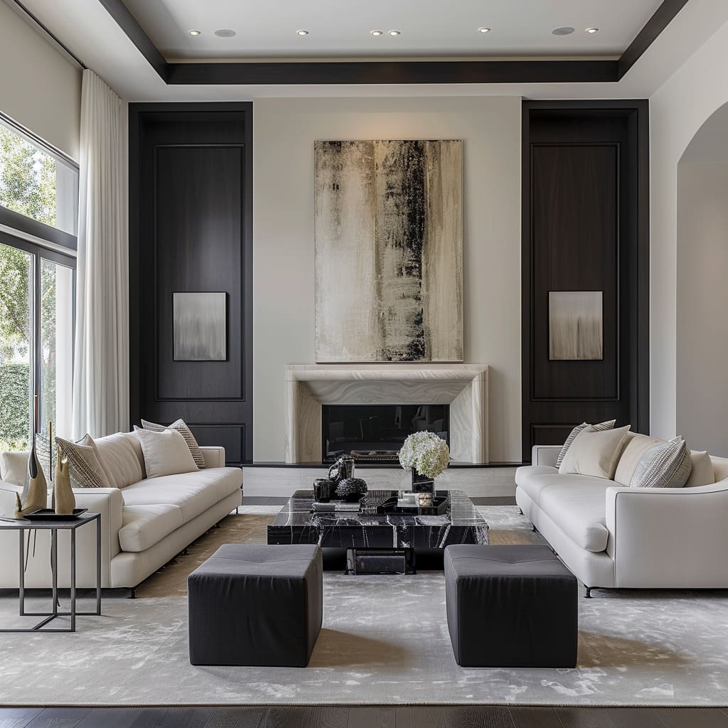
In these designs, strong horizontal lines not only serve a practical purpose in shelving and woodwork but also create a visual foundation that grounds the space. These lines extend across walls, often emphasized by elongated media units or continuous shelves that not only provide storage but also shape the room’s aesthetic.
In furniture, the horizontal orientation is echoed in long, sleek couches and coffee tables, reinforcing the overarching theme of stability and repose.
Visual Balance
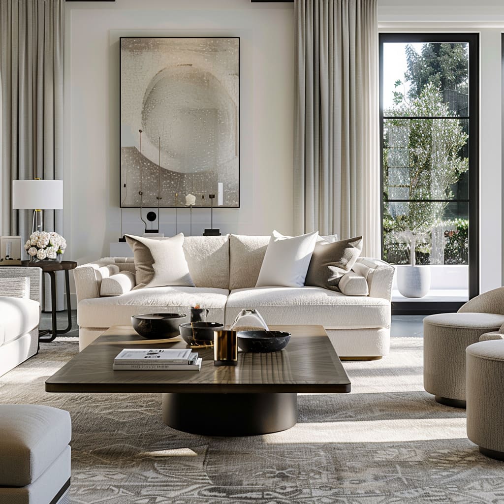
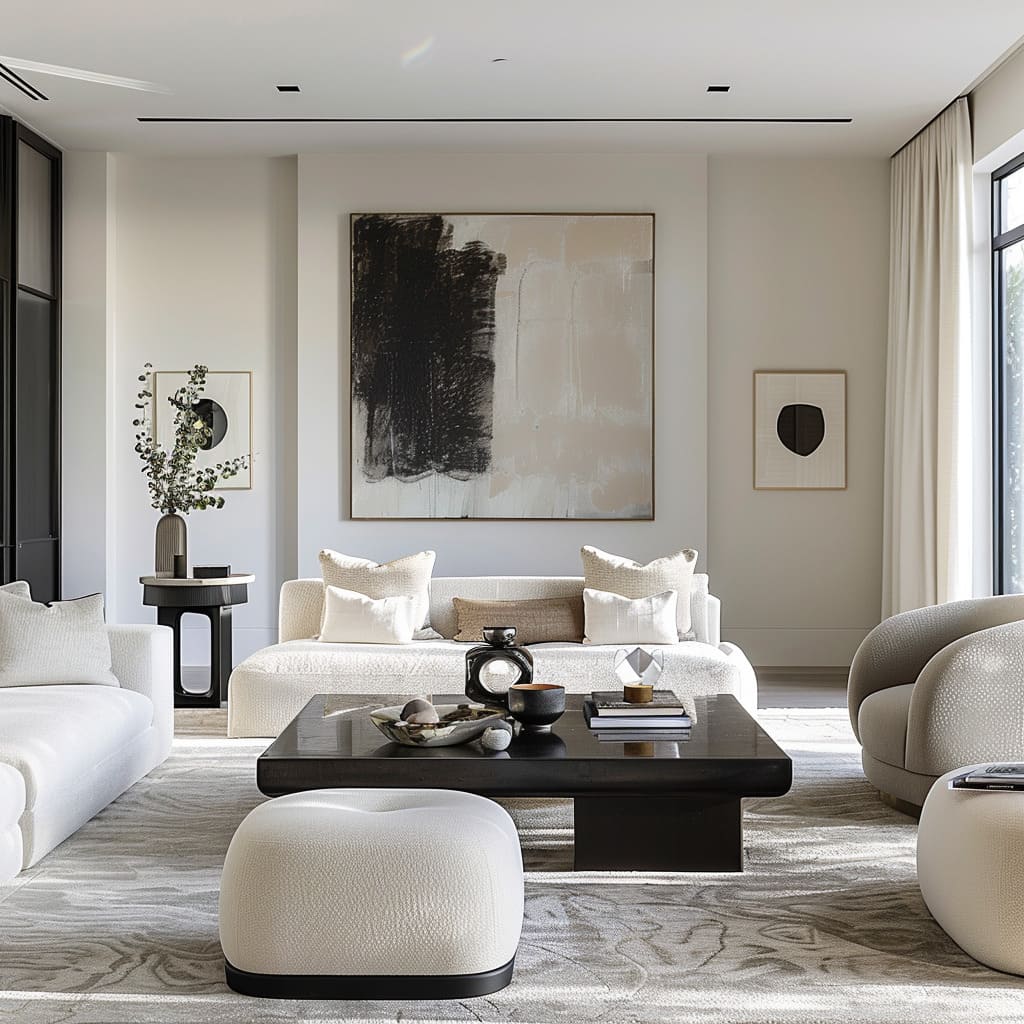
Achieving visual balance involves more than just symmetrical arrangement; it’s about creating equilibrium that is both pleasing and functional. In these spaces, furniture is strategically placed to balance the visual weight across the room, often using contrasting elements like a plush sofa against a streamlined coffee table.
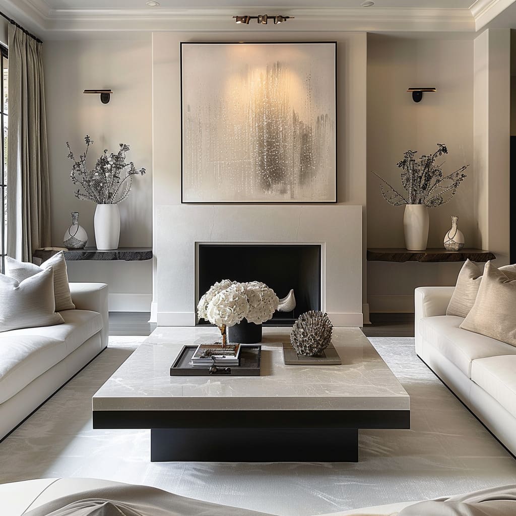
Decorative items are carefully selected, ensuring that each side of the room feels equally considered. This harmony is further emphasized by the thoughtful placement of artwork and accents that anchor the design without mirroring each other exactly.
Strategic Use of Space
The deliberate use of space turns areas of the home into multi-functional zones. Seating is arranged to foster conversation, with chairs and sofas facing each other to invite dialogue.
Nooks are transformed into areas for individual retreats, with comfortable reading chairs and well-placed lighting. Moreover, each functional area is designed to transition smoothly into the next, with a clear but subtle delineation of spaces achieved through the smart arrangement of furniture and rugs.
Accentuating Height
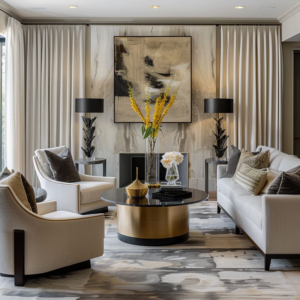
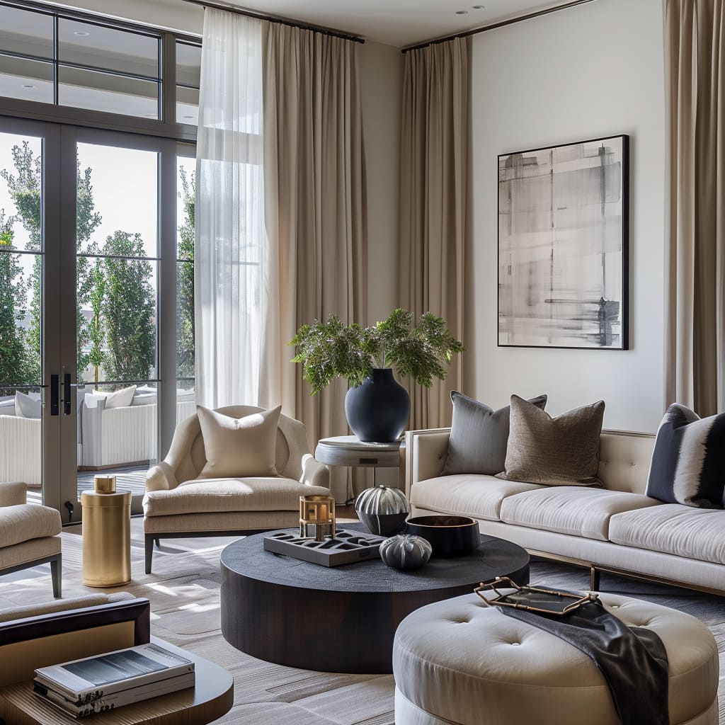
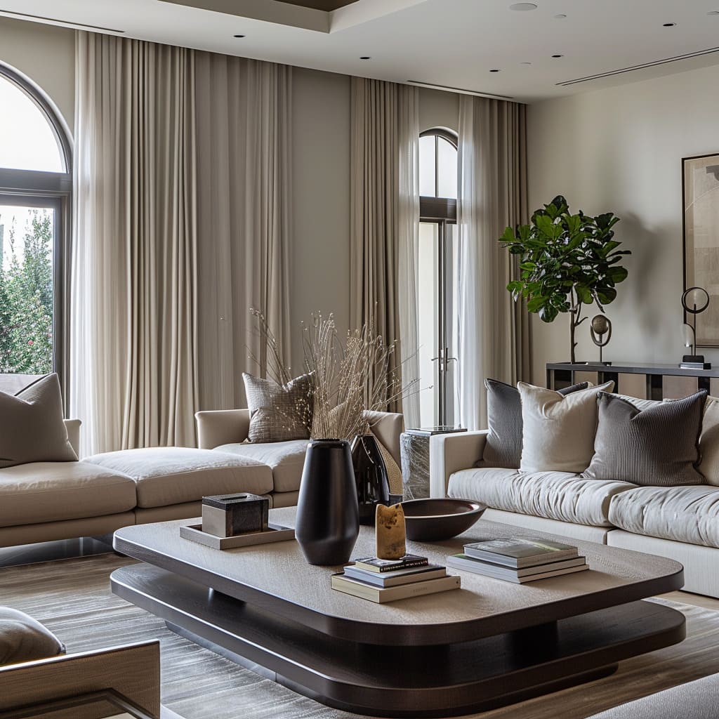
The height of the rooms is showcased by design choices that draw the eye upwards. Drapery hangs from the ceiling to the floor, emphasizing vertical lines and the expanse of the walls.
This is complemented by vertical elements in decor, such as tall vases and floor lamps that reach upward, filling the vertical space and enhancing the room’s dimensions. Even the artwork is selected and positioned to celebrate the lofty architecture, encouraging a visual journey from bottom to top.
Purposeful Asymmetry
Purposeful asymmetry is employed to lend a dynamic and contemporary feel to the space. This is seen in the playful yet sophisticated positioning of furniture which defies conventional expectations, creating an organic flow.
Elements like asymmetrical shelving units add visual interest and break up the linear conformity. Art pieces, too, are placed off-center, compelling the viewer to engage with the space in a more active way, while still maintaining an overall sense of balance and composure.
Design Storytelling
Narratives Woven into Spaces
The heart of a home is often in the stories it tells through its every corner. ‘Design Storytelling’ is where we peek into the curated spaces that reflect intention and personality.
We discuss how engaging accessories can narrate a tale, how selective use of color can speak volumes without a word, and how personalized spaces are subtly infused with the essence of those who dwell within. This is where design transcends aesthetics to become personal and meaningful.
Curated Spaces
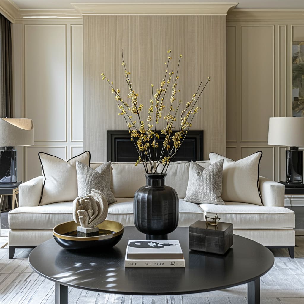
The thoughtful curation of spaces results in environments that are both aesthetically cohesive and deeply meaningful. Each item, from the elegant vases to the meticulously chosen coffee table books, contributes to a narrative that is both sophisticated and personal.
This narrative is further enhanced by the strategic placement of furniture which invites residents and guests to move through the space, experiencing the story as they go. Additionally, the careful selection of each decor piece ensures that there is no clutter, with every item serving a purpose within the story being told.
Engaging Accessories
Accessories are far more than mere embellishments in these spaces; they are conversation starters and memory holders. Each decorative object, whether a unique sculpture or a handcrafted bowl, is selected not only for its visual appeal but also for its ability to evoke emotion or recall a memory.
The arrangement of these pieces is intentional, creating points of interest that guide the observer’s eye and engage the imagination. Furthermore, these accessories often have a textural or material richness, adding a layer of depth and intrigue to the space.
Select Use of Color
In these designs, color is used with precision and intention. It punctuates the neutral backdrop in ways that can define the atmosphere of a room.
A singular, bold-colored cushion can invigorate a space, while subtle hues in artwork bring a serene quality. The use of color is strategic, ensuring that it supports the overall design narrative without overwhelming it.
This selective coloration not only creates visual landmarks within the space but also helps to underscore the intended mood and character of each area.
Personalized Spaces
Personalization is key in making a space not just stylish but also a reflection of its inhabitants. This is seen in the choice of books, the selection of art, and even the positioning of seating—each element contributes to telling the unique story of the residents’ tastes, interests, and experiences.
The inclusion of personal artifacts, whether displayed on shelving or as part of a gallery wall, adds a level of intimacy and warmth to the home. Each personal touch works in harmony with the design to create a space that is both individual and inviting.
Sensory and Aesthetic Engagement
Crafting an Immersive Experience
Interior design is a multisensory experience. Under ‘Sensory and Aesthetic Engagement’, we will look at how the texture interplay can be dynamic yet understated, creating a tactile narrative that begs to be touched.
This section will cover the art of engaging senses, creating ambiance, and the subtle brand integration that forms an essential undercurrent to the space’s identity. From the visual flow that guides one through the space to the understated artistry that complements, each design choice is a brushstroke in a larger masterpiece.
Dynamic Textures
The interplay of textures in these designs serves as a sensory journey, guiding the hand and eye across varied surfaces. Soft, plush fabrics on seating invite a sense of comfort and warmth, while smooth, glossy finishes on tabletops provide a sleek counterpoint.
The juxtaposition of grainy wood against polished metal frames not only adds interest but also creates a tactile diversity that encourages touch and exploration. The layering of these textures manifests a richness that is both seen and felt, imparting a depth that is integral to the design’s character.
Textile Layering
The layering of textiles contributes to a rich tapestry of comfort and style. Throws are casually draped over couches, adding a lived-in feel that invites relaxation.
Rugs with diverse patterns and weaves define seating areas, lending warmth and grounding the furniture.
This textile layering goes beyond mere functionality; it is a carefully composed element of the design narrative, with each layer building upon the last to create a cohesive and inviting whole. The textiles chosen speak to a dedication to comfort as much as to style, offering a harmonious blend of the two.
Visual Depth
Visual depth is crafted through the interplay of light and shadow, texture, and reflective surfaces. Strategic lighting highlights the intricate details of textured walls, creating a dance of light that changes with the time of day.
Mirrors and other reflective elements are placed to catch and spread light, adding a sense of spaciousness and brightness. This attention to visual depth ensures that the rooms have a dynamic quality, with different layers revealing themselves under varying conditions of light and perspective.
Engagement of Senses
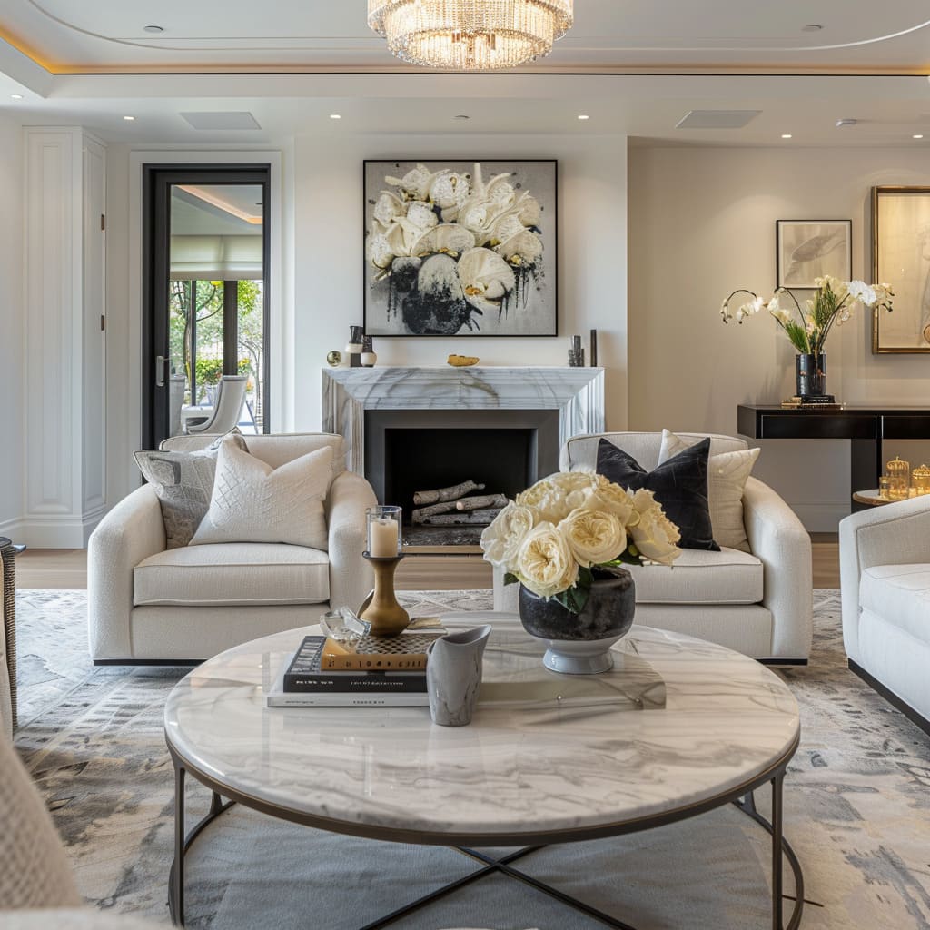
The design philosophy extends to a multisensory experience. The scent of fresh flowers subtly perfumes the air, enhancing the ambiance with a natural, refreshing aroma.
Textured surfaces not only add visual appeal but also beckon to be touched, from the roughness of a throw pillow’s embroidery to the cool smoothness of marble countertops. These elements are curated not just for their visual impact but also for the response they evoke when experienced with all senses.
Ambiance Creation
Each room is a canvas where ambiance is meticulously painted with design elements. The soft glow of ambient lighting sets a mood that can be both calming and inspiring.
The arrangement of furniture and accessories is purposeful, creating nooks that feel secluded and open spaces that are invigorating. The ambiance is a carefully tuned resonance of the design elements, tailored to elicit a specific emotional response, crafting an atmosphere that is as tangible as it is intangible.
Subtle Brand Integration
Where modern amenities and brands find their place, they do so with subtlety, becoming a seamless part of the space’s fabric. Technology is present yet unobtrusive, ensuring that it enhances the lifestyle without impinging on the aesthetic.
Brand elements, when visible, are chosen for their design as much as for their function, contributing to the overall narrative without breaking the visual story being told.
Selective Use of Pattern
Patterns, where they appear, do so with intention, adding rhythm and interest without overwhelming the senses. They may manifest in a bold statement wall that acts as a focal point or in discreet motifs on upholstery that only reveal themselves upon closer inspection.
This restrained use of pattern allows for complexity within the design that invites closer inspection and prolonged engagement with the space.
Understated Artistry
The artistry present in these designs is like a whisper rather than a shout. Art pieces are chosen for their ability to blend with the color palette and theme of the room, enhancing the space with their presence rather than taking center stage.
This understated approach to art selection allows for a harmonious integration with the rest of the design, ensuring that each piece adds to the serene and cohesive aesthetic.
Timeless Adaptability
Embracing Fluidity and Evolution
The essence of modern design lies in its ability to stand the test of time while remaining adaptable. In ‘Timeless Adaptability’, we will consider the elements that ensure spaces remain relevant and stylish over the years, from the timeless quality of design to the fluid transitions that allow for a seamless evolution of space.
We will explore how occasional bold statements serve as anchors to the otherwise tranquil design narrative, offering a refreshing counterpoint that ensures liveliness and adaptability.
A Sense of Timelessness
Timeless design creates a backdrop for life that feels both current and enduring. The spaces are crafted with a classic sensibility, utilizing elements that transcend trends.
The furniture selections, for instance, carry clean profiles with subtle details, ensuring their appeal lasts beyond seasonal styles.
The designs also incorporate traditional elements with a modern twist, like updated takes on classic chair designs or innovative materials used in conventional layouts. This blend of past and present ensures the spaces will feel relevant and cherished for years, if not generations.
Fluid Transitions
The fluidity of space transitions facilitates a sense of continuity and ease. There is a gentle unfolding from public to private areas, from indoors to outdoors, with each transition feeling as natural as the next.
This fluidity is achieved through consistent design language, with repeating materials and color palettes that guide one through the space without abrupt visual interruptions. Doors and walkways are designed to lead the eye and the feet, ensuring that moving through the home is an effortless and intuitive experience.
Occasional Bold Statements
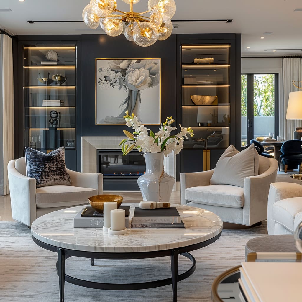
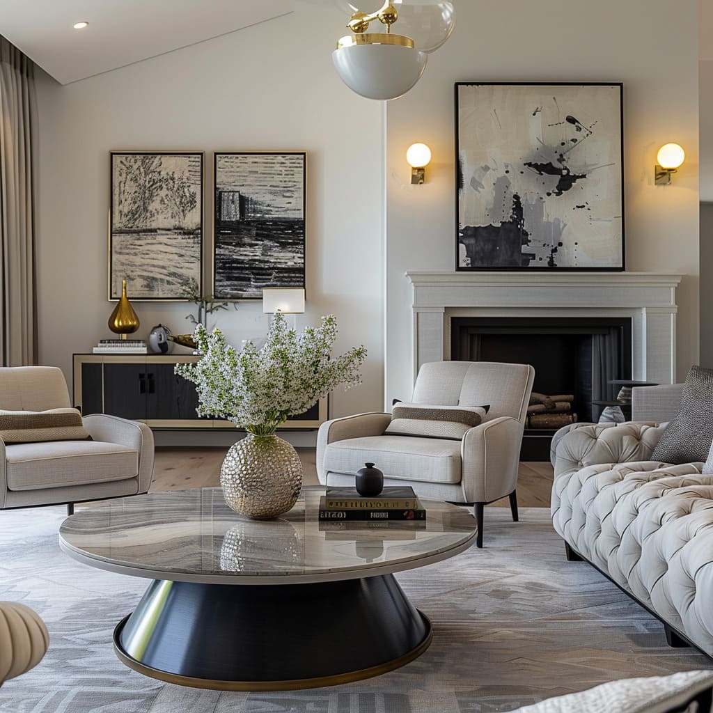
While the overall aesthetic remains neutral and timeless, there is room for expression through bold statements that serve as punctuation marks within the design. A striking light fixture or a piece of vibrant artwork can act as a centerpiece, drawing attention and providing a focal point around which the rest of the design organizes itself.
These bold elements are not just decorative; they are integral to the design, providing character and allowing for a dynamic interplay between the classic and the contemporary.
Precision and Detailing
The Art of Fine Tuning
Attention to detail can turn a house into a home, and ‘Precision and Detailing’ is where we explore this craftsmanship. This segment will reveal how balanced proportions and thoughtful focal points contribute to the overall harmony of the space.
We will discuss how intentional composition and selective use of patterns can transform a room, giving it character and depth without overwhelming the senses. Finally, we’ll touch upon the importance of cultural references and their contribution to the space’s authenticity and allure.
Intentional Composition The intentional composition of these spaces is like a carefully orchestrated symphony, where every element has a role to play. The placement of furniture is not left to chance; it is thoughtfully arranged to both facilitate movement and to create a visual impact.
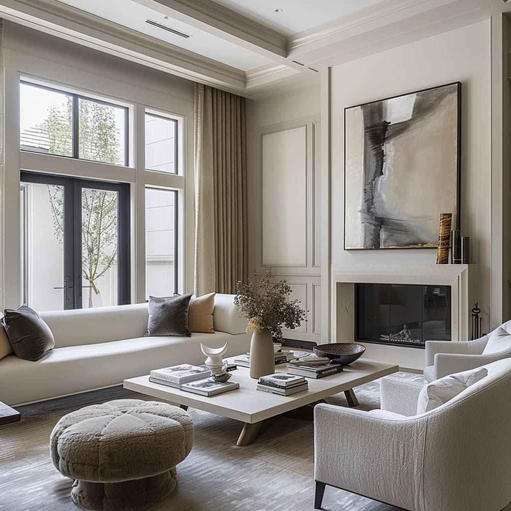
Decor is positioned to complement the architecture of the room, drawing attention to features such as fireplaces or expansive windows. This meticulous approach to composition ensures that each view, whether encountered from the entrance or from a seat in the corner, is harmonious and complete.
Balanced Proportions The harmony of a room often lies in the balance of its proportions, and these spaces are a testament to this principle. Furniture is scaled to the size of the room, ensuring that pieces are neither too large to overwhelm nor too small to be functional.
Decorative elements are proportioned to relate to each other and the space they occupy. This careful consideration of scale and proportion results in a sense of order and refinement, where every piece feels destined for its place.
Varied Lighting Sources Lighting is approached as a vital component of design, capable of transforming the mood and functionality of a space. A medley of light sources is employed, from the soft wash of natural daylight to the focused glow of task lighting.
Ambient lighting adds warmth and depth, while accent lighting highlights architectural details or prized artworks. The result is a layered lighting scheme that can be adapted to the time of day or the desired ambiance, enhancing both the beauty and the utility of the space.
Visual Flow The visual flow within these spaces is designed to be seamless, guiding occupants through a narrative of design. There is a rhythm to the arrangement of furniture and a logic to the progression from one area to the next.
Pathways are clear and inviting, with eye-catching elements positioned to lead naturally from one space into another. The flow is intuitive, encouraging exploration while also providing clear delineation between areas of different function or mood.
Cultural References Cultural references, when woven into design, enrich a space with layers of meaning and context. Artworks may reflect the heritage of the occupants or pay homage to specific artistic movements, while decorative items may incorporate traditional motifs or materials.
These references are subtle, never overwhelming, and are integrated in a manner that respects and enhances the contemporary setting. The result is a space that resonates with a sense of place and history, imbuing it with a depth that transcends the visual.
Focal Points Creating focal points is a deliberate exercise in drawing the eye and lending structure to a room. These focal points may be dramatic, such as a bold piece of art or a unique furniture item, or they may be more nuanced, like the delicate arrangement of a tabletop display.
The strategic use of focal points provides a pause in the visual narrative of the space, offering a moment of reflection or appreciation. They serve not just as aesthetic anchors but as the defining features that give each room its distinct character.
Concluding our exploration of the harmonized spaces, we reflect on the silent yet potent language of design. It’s an art form that speaks in hushed tones about balance, proportion, and intent.
Through precision and detailing, we understand that a home is more than a shelter; it is a curated collection of stories, a canvas of our sensory experiences, and a testament to the adaptability of design through time.


