A kitchen with visual depth doesn’t always start with the obvious things. It’s rarely about one bold material or a showy layout.
Instead, the strongest rooms rely on quiet moves—how panels line up, how light is shaped, how stone and wood relate to each other without pulling focus. Such kitchens hold together because they’re built on control, not excess.
Across different styles—from contemporary to warm minimalism—certain patterns begin to stand out. Flat-front cabinets act like continuous walls.
Veining in marble isn’t left to chance—it’s placed to flow or mirror with intention. Lighting is tucked away in edges or seams, not dropped in as a fixture.
Even texture is handled with restraint: one carved surface set beside a smooth one to avoid visual overload. These choices are quiet on their own, but layered together, they build something striking.

In both compact homes and large open layouts, the goal is the same—find a way to anchor the space without cluttering it. A fancy kitchen isn’t about collecting the flashiest elements.
It’s about knowing how each detail supports the next, and when to stop. This article breaks down those ideas—not through trends or decoration, but by focusing on how strong visual structure is built piece by piece.
Every section looks closer at the design decisions that make these kitchens stand out—not loudly, but with lasting clarity.

Discipline First: How Precision Becomes a Visual Signature
In high-end kitchens, the quiet strength isn’t always in materials like marble or brass—it’s in the way everything lines up with absolute precision. Visual order becomes a kind of luxury.
Gaps are barely wider than a thread. Drawer edges land in exactly the same place from one unit to the next.
The result is not flatness, but rhythm. A sequence of panels begins to feel architectural because every edge, seam, and surface has been placed with purpose.

Tall cabinets often run from floor to ceiling without interruption, and each reveal—the small negative space where two panels meet—acts like a pencil line sketching the structure. Even when there are appliances, they vanish into the composition.
Refrigerators, ovens, and dishwashers wear the same veneer as the adjacent doors, so the wall reads as a single piece rather than a collection of parts. This kind of visual camouflage doesn’t hide the function—it integrates it.
Handles, if used at all, are typically thin, linear, and placed with geometric consistency. One horizontal bar might stretch across an entire wall of drawers, forming a continuous reference line that anchors the whole space.
This strip of metal becomes more than a pull—it becomes a marker of calm.

In smaller rooms, this approach holds particular value. Rather than clutter the space with visual stops and starts, tight alignment creates a steady surface.
The eye doesn’t have to pause to process breaks or differences in shape. This leads to a feeling of openness without actually increasing the square footage.
It’s one of those quiet fancy kitchen design details that reshapes how space is read, not how it’s built.

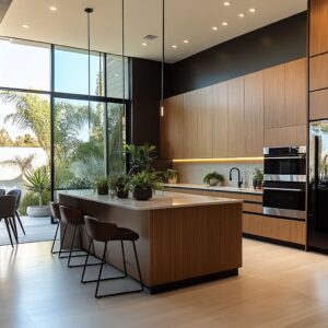
Mass-and-Carve: Treating Islands, Hoods, and Walls Like Carved Forms
In many refined kitchens, the standout features don’t look added. They feel sculpted—like they’ve been carved from a solid mass.
This idea plays out most clearly in the island, where a thick slab of stone wraps over the top and folds down the sides with no visible seam. Veins in the marble or quartz aren’t randomly placed—they’re aligned so the pattern folds around the corners like the pages of a closed book.
It doesn’t look like parts joined together. It reads as a single object.

This same strategy appears on the cooking wall. A large hood, which might otherwise break the flow, is often wrapped in matching stone or the same wood as the cabinets, forming a simple box that rises with quiet strength.
By removing extra trim or ornamental shapes, it takes on the presence of a column or an architectural beam—something built in, not tacked on. Where cooktops and ovens are involved, the goal is visual stillness.
Many are fully integrated, barely rising above the surface or tucked below the counter. The working edge disappears.
What’s left is a slab with function embedded inside, rather than sitting on top.

There’s also an interesting shift happening in how islands are faced. Some feature ribbed or fluted patterns—not across the whole unit, but only on the guest-facing side.
This groove detail plays with light, casting shadows that bring depth and movement. It’s subtle from a distance, but as someone approaches, it catches the light differently depending on the time of day.

These design moves speak to a broader language of sculptural form. Instead of decoration, there’s carving.
Instead of excess, there’s control. This is where many fancy kitchen ideas find their strength—not in adding more, but in subtracting the unnecessary until only structure remains.

Texture Used as Whisper, Not Shout
In kitchens where refinement is the goal, texture doesn’t compete for attention—it settles into the background and works with shadow, not contrast. The impact isn’t loud.
Instead, it arrives through surface variation that feels natural and quietly deliberate. You’ll often see materials like soft-cut limestone, hand-grooved travertine, or fine-striated brick—each one sitting only a few shades off from the cabinetry beside it.
The restraint is what makes them powerful. These textures don’t fight for the spotlight; they catch and bend light, adding depth without pulling the eye away from the room as a whole.

There’s a subtle rule at play: only one texture leads at a time. If the wood is fluted, the stone next to it stays calm.
If the stone carries a pattern or relief, then the nearby wood is left smooth. That contrast—soft-on-flat, flat-on-grooved—is what lets these surfaces breathe together.
It avoids visual overload and builds a kind of steady rhythm, especially important in kitchens where long sightlines connect cabinetry, counters, and wall planes.

In a smaller layout, this principle becomes even more noticeable. A softly ridged backsplash tucked just above the counter brings in dimensional interest where it matters most—right at eye level—without loading the full wall with texture.
This touch is often what separates a space that simply looks finished from one that feels thoughtfully layered. It’s this kind of quiet surface control that often defines a fancy kitchen.

Grain Direction Equals Motion Control
Wood grain might seem like a subtle detail, but in high-end kitchens, it’s used almost like a drawing tool. It directs movement, shifts proportions, and holds large areas together in ways most people never notice—until they step back and see the difference it makes.
A horizontal grain across drawer fronts stretches a kitchen visually. It makes a galley layout feel longer, as if the room were drawn out to both sides.
On tall cabinetry, the grain flips. Vertical movement helps pull the ceiling higher, especially in rooms with low or flat rooflines.
It’s not decoration—it’s a compositional tactic.

In some layouts, grain direction is used to break function zones apart without changing material. The base of the island might run horizontally, while a slightly raised bar top turns the grain vertical or diagonal.
It’s a move that shifts the reading of space—one part is for work, the other for gathering—but it does so without a single color shift.

There’s also a kind of craftsmanship in how the grain wraps. Around refrigerator doors, ceiling drops, or edge panels, the wood pattern often continues seamlessly, turning corners as though drawn from the same sheet.
This wrapping holds the surfaces together as one continuous unit and avoids the visual chop of unmatched panels. This level of grain control is a clear mark of refinement in a fancy modern kitchen—not because it shows off, but because it brings order to the room in a way that feels fully intentional.

Bookmatching as Wall Art
Some kitchens approach marble as more than a countertop choice—it becomes a surface to compose with. Bookmatched slabs, where the natural veining mirrors itself across a seam, take on a new role in this context.
Rather than isolating that mirror effect to the backsplash alone, many designs carry it across the entire composition: island, backsplash, and hood, all cut from the same material and laid out to fold into one another like pages in a continuous drawing.

The result is a room that reads as a single canvas. Veins stretch from horizontal to vertical without disruption, and in many layouts, the lines are allowed to flow without symmetry.
In fact, breaking the mirror axis—shifting it slightly to one side—can make the movement of the stone feel more organic. This off-center placement can steer the gaze across the room, often toward a window or focal point, guiding how space is experienced.

This approach to stone selection turns veining into a compositional element. It’s not just texture—it’s motion.
And when used with precision, it can become one of the strongest fancy kitchen backsplash ideas, offering both visual drama and architectural clarity in one gesture.

Light Treated as an Architectural Layer
Light in fancy kitchens isn’t about show—it’s about shape. Rather than hanging down as decoration, most lighting is integrated directly into the surfaces themselves.
This makes the glow part of the composition. It defines edges, softens transitions, and allows textures to unfold gently over time, depending on how the light strikes them.
One of the most effective moves is the use of toe-kick lighting. A low amber or warm white LED, hidden beneath the base cabinets, casts a faint glow across the floor and subtly lifts the cabinetry, making it feel lighter without changing a single material.
Floating shelves are another common zone for embedded light. A thin line under each shelf gives ceramic vessels, glassware, or small bowls the same kind of framing you’d find in a gallery.

Where stone is used—especially with veining—backlighting shifts the mood entirely. It brings the layers of the material forward, illuminating details that would stay flat under overhead light.
In large kitchens with tall ceilings, this concept is pushed further. Cove lighting, tucked along the upper edge of the walls, creates a ceiling line that feels drawn in by hand.
It pulls the gaze lower, wrapping the space in warmth instead of letting the ceiling feel distant. This layered lighting approach is especially useful in a fancy small kitchen, where floor space is tight, but volume and texture need to be felt.
Here, light becomes the tool that defines structure, not by spotlighting, but by building quiet contrast.

Warm-Cool Pairing for Controlled Drama
Nearly every “wow” palette relies on one rich wood or brass accent set against cooler stone or lacquer.
| Warm Element | Counter-balancing Cool Surface | Resulting Effect |
|---|---|---|
| Walnut ceiling canopy | Honed limestone island | Cozy vault without heaviness |
| Brass tube pendants | Gray quartzite block | Spark points on a calm canvas |
| Cognac leather stools | Pale concrete worktop | Grounded seating zone |
In small rooms the warm accent is often movable (stools, pottery), allowing seasonal changes without major renovation.

Negative Space as Active Design
Silence in design can be louder than decoration. In many refined kitchens, what’s not there becomes just as meaningful as what is.
Open shelves that end short of a full wall, display niches left partly empty, or vertical gaps between cabinetry runs aren’t signs of incompletion—they’re calculated decisions. These intervals break the rhythm deliberately, letting the eye rest.
Instead of constant cabinetry or tile coverage, there’s a moment to pause.

Some layouts include tall windows or narrow clerestory strips placed high on the wall. These aren’t just for daylight—they act like cutouts, framing the outside like a living canvas.
A cluster of leaves moving outside, a shifting sky tone, even distant branches—these natural fragments replace the need for interior artwork or added decoration. The wall becomes a quiet scene, changed by season or time of day.

In wide kitchens, this kind of open space prevents the room from reading like a showroom. It breaks that uniform retail feel.
And in smaller kitchens, it’s a relief. A narrow ledge with three handmade bowls tells more than a row of twelve matching jars.
Negative space, used with this kind of restraint, plays an important role in kitchen fancy design thinking. It edits the visual weight, clears the noise, and gives each element room to be noticed.

Curves Used Sparingly for Soft Contrast
Most kitchens rely on straight lines and sharp corners, but even a single curved detail can shift the entire atmosphere. Rounded corners on an island, an arched window niche, or a softly bulged hood give the room a different kind of presence—more sculpted, less mechanical.
These elements stand out precisely because they don’t match everything else.

What’s key is the finish. The materials used for curves are rarely reflective.
Honed stone, brushed plaster, or matte composite finishes are common—surfaces that absorb light instead of bouncing it. This lets the shape carry the focus instead of glare.
A curved form draws attention through shadow and outline, not through shine.

Often, the curve follows something outside the room. A soft arch might echo the shape of a nearby tree canopy or align with the frame of a distant view.
Instead of making the eye circle inside the room, it pulls the gaze outward. This move is subtle, but it expands the sense of space—especially in kitchens that sit on smaller lots or within enclosed layouts.
In the context of a modern fancy kitchen, curves are used like punctuation. Just one or two can break the grid enough to soften the whole room, making the design feel hand-shaped, not factory-drawn.
Strategies by Scale
Size doesn’t dictate style, but it changes how certain visual choices land. What feels balanced in a compact kitchen might feel lost in an expansive layout.
This is where visual proportion and placement come into play. In smaller kitchens, scale is managed through alignment and continuity.
Horizontal grain on drawer faces, extended pulls that run across an entire bank, and even floating shelves positioned only where natural light touches—all of these stretch the space without changing the floorplan. Materials are often wrapped—same stone on backsplash and countertop—to eliminate visual breaks.
This creates the illusion of uninterrupted volume, especially effective when working with light tones. Even lighting plays a role: a cove light near the ceiling or a soft glow from a toe-kick adds vertical layers without taking up space.
These quiet tricks can bring structure to a layout that might otherwise feel boxed in.

In larger kitchens, the challenge shifts. Instead of trying to extend space, the focus becomes anchoring it.
Large islands read as sculptural blocks, often wrapped in thick stone with full waterfall edges. Full-height stone walls or extended cabinetry runs are treated like vertical anchors—strong enough to organize the entire room.
Lighting gets layered here: ambient washes from coves, directional pin-spots over work zones, and narrow strips under shelves give dimension. Small changes in texture—like fluting on a single surface or a live-edge counter overhang—offer contrast that makes the space feel human in scale.
Some kitchens also include framed library-style walls or recessed niches with art objects. These personal touches soften the volume and make the space feel collected, not sterile.
Each approach—whether for a small fancy kitchen design or an open-plan home with high ceilings—follows the same goal: keep the space visually coherent while letting the materials and light define how it’s experienced.

Conclusion: Take-Home Visual Principles
Every one of the kitchens studied operates on a simple idea: control the lines, carve the forms, and let the light do its work. It starts with drawing—imagining a cabinet wall not as a stack of boxes, but as one mass.
Then, pieces are removed only where necessary. This approach gives surfaces their calm strength.
It’s a subtraction-based way of designing that keeps everything focused.

Color doesn’t always come from paint or finish. In many kitchen rooms, it arrives through daylight.
Neutral tones—soft stone, pale oak, chalky plaster—make space for outside light to reflect in. A blue sky, the green of nearby trees, even the golden cast of late afternoon—all these shift the mood of the room without changing a thing inside it.

Each view carries one focus. If the marble on the island is bold, everything around it quiets down.
If the wood grain is strong, the counters go soft. This idea of contrast isn’t about drama—it’s about clarity.
Letting one surface speak at a time avoids visual noise and gives each material room to breathe.

Lighting is never centered for effect. It grazes.
A shelf lit from beneath casts a glow over ceramic edges. A base cabinet lifted by toe-kick LEDs seems lighter than it is.
These edges of light, not central spots, give the room atmosphere instead of glare. And most importantly, the strongest designs know when to stop.
A slight pause—a shelf that ends early, a backsplash with an offset seam, a niche that holds just two bowls—pulls the viewer in. It makes them look closer.
That’s where the sense of richness lives.
These are the real tools behind a kitchen that holds attention: alignment that doesn’t flinch, stone that reads as carved, texture that whispers, and light that shapes rather than points. Whether in a tight city apartment or a long, open layout, the same principles apply.
Fancy-looking doesn’t mean crowded—it means composed.