2-tone kitchen cabinets have taken a strong position in current design trends, but their popularity isn’t based on color contrast alone. The most impressive kitchens show that the success of this style depends on subtle decisions that go far beyond just choosing two shades.
It’s how those shades interact with texture, finish, layout, and even lighting that makes them stand out. Whether the mix involves soft matte paint with brushed metal, or natural wood grain paired with rich color, it’s the small details—like shadow gaps, handle placement, and finish direction—that hold the whole design together.
This article breaks down those quiet moves that often go unnoticed at first glance but completely change how the kitchen feels and functions. From refined modern homes to cozy layouts influenced by farmhouse or coastal looks, the best two-tone kitchens prove that thoughtful contrast can feel effortless—if each element is working in sync.
Subtle Uses of Undertones to Shift Ambiance
Choosing colors for two-tone kitchen cabinets is rarely as simple as picking light for the top and dark for the bottom. The undertones hiding in each shade quietly shape how a space feels throughout the day.
Take greens, for example—what seems like a deep forest green in the morning might show a moody blue edge by late afternoon, especially in homes with big west-facing windows. Add a warm bulb overhead and the same green leans toward brown, grounding the room in a softer tone.
That slight shift? It’s not an accident—it’s built into the paint.

Blues behave similarly. Driftwood blue, slate, and even dusty navy can walk the line between bold and neutral.
In some kitchens, they don’t immediately scream color until paired with crisp whites or clean oak finishes. Then, suddenly, that gray-blue contrast pops out and gives the kitchen a sense of quiet motion.
Off-white cabinetry has its own layers. A cool-toned white leans slightly gray, and plays well with sharp blacks, steel, or gloss surfaces.
But go a few degrees warmer—closer to ivory or even blush—and now you’re in cozy territory, where brass fixtures and natural wood floors feel more at home. The base tone hasn’t changed; the mood has.

Some kitchens play a long game with color. They place two cabinet tones so close together in value that at first glance, it all reads as one.
Then, with a bit of sunlight or under-cabinet lighting, a whisper of clay or soft blush sneaks through, revealing that the single-color cabinet setup was actually a very subtle two-tone composition. That kind of detail doesn’t shout—it hums.

The Power of Finish: Gloss, Matte, and Brushed Effects
Color does plenty of heavy lifting, but finish is the silent partner that really brings two-tone kitchen cabinets ideas to life. One of the boldest moves designers make is going full gloss on either the uppers or lowers.
Think charcoal-black cabinets with a mirrored polish—not just shiny, but almost reflective enough to capture the greenery outside or the pendant lights above. These glossy finishes can give a smaller space more visual energy, but they’re unforgiving—every line, every edge, every alignment has to be spot on.

On the other end of the spectrum, matte finishes offer a calm contrast. In brushed steel or chalkboard-style paint, matte cabinetry absorbs light instead of bouncing it.
These surfaces create a soft backdrop, letting wood grains and stone textures take the lead. The brushed effect, especially on metals, can feel sleek without tipping into harsh.
It’s what often keeps industrial-inspired kitchens from feeling cold. The best designs often use both finishes intentionally—glossy on one half, matte on the other.
The contrast isn’t just visual—it’s tactile. A smooth upper cabinet paired with a brushed or sanded base brings variety without needing wild color combinations.
In fact, that tension between sheen and softness can be more impactful than any bold paint job.

Layered Geometry: Horizontal vs. Vertical
The shape of a kitchen isn’t only defined by layout—it’s also shaped by how cabinetry lines move across the room. Some of the most refined kitchen cabinets with different colors top bottom go a step further by playing with direction and flow.
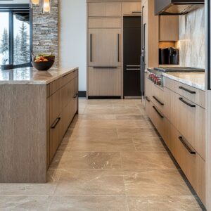
Cabinets built with continuous grain—especially in walnut or light oak—treat the wood like a visual map. Drawer fronts carry the same vertical or horizontal grain from one side to the next, giving the impression that the cabinets weren’t assembled, but carved from a single section of wood.
This grain continuity creates a fluid, grounded look that feels expensive and thoughtful, especially when the pattern matches around corners or under counters.

Other kitchens build contrast through direction. Vertical wood on upper cabinets naturally draws the eye upward, giving the illusion of more height.
In contrast, horizontal panels on the base create width and calm. Used together, they give shape to the room’s geometry without needing bold colors or complex hardware.
You’ll often see this approach in contemporary kitchens inspired by coastal or west coast minimalism, where space feels open even when the footprint is modest.

Then there are the shadows—the quiet heroes of cabinetry. Inset drawers with thick framing, stepped edges, and small recessed kicks add depth without shouting.
These micro-shifts in depth turn flat cabinet fronts into sculptural surfaces. You’ll see it most in kitchens that feel quietly layered, where every panel feels like it belongs in a sequence.

Hardware as a Secondary Color and Texture
It’s easy to overlook the role of hardware, but it often acts like punctuation in a kitchen—small, deliberate, and able to shift the tone dramatically. Some designs lean on integrated pulls, grooves, or push-latch closures.
These keep the surfaces smooth and let the cabinet finish or wood tone be the focus. No breaks, no distractions—just clean lines.
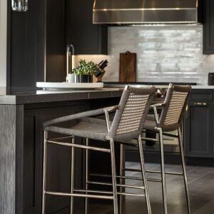
Others go in the opposite direction, treating hardware as detail work. Think of it as adding accessories to a clean outfit: square knobs, long linear bars, or patinaed finishes that sparkle just enough to break up the flatness.

Placement makes a bigger difference than many notice. Repeating a horizontal pull across every lower drawer keeps the eye moving and brings order.
In contrast, tall vertical pulls on deeper drawers or pantry doors create height. The most satisfying layouts use both, but always with intention—spacing and orientation that quietly mirror the cabinet layout beneath.

And then there’s coordination. A brushed brass faucet that matches drawer pulls, a pendant that picks up the tone of nearby knobs—these small links tighten the whole design without being obvious.
Brass, pewter, matte black, and even soft nickel finishes are favorites in current two-tone kitchen ideas. The key is matching tone, not necessarily color—warm metals with warm woods, cooler metals with soft grays or whites.
When it all clicks, you feel it, even if you can’t point to why. The cabinets, fixtures, and hardware speak the same visual language—and that’s what makes the kitchen feel complete without trying too hard.

Integration with Architecture and Adjacent Materials
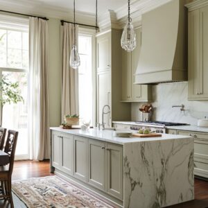
One of the strongest ways to ground a kitchen visually is by building the cabinetry into the room’s structure. In some of the most thoughtful 2 tone kitchen ideas, cabinets don’t stop at a fixed height—they reach all the way to the ceiling, flush with beams or side walls.
This approach removes visual breaks and makes the cabinetry feel like part of the room’s frame, not a separate element placed inside it.

Vent hoods also carry more weight than they get credit for. Whether they’re wrapped in plaster, finished in the same tone as the upper cabinets, or trimmed in natural wood, they create either quiet continuity or a strong visual break.
A simple shift in hood shape or finish can echo the tones of the cabinetry and change how the whole color story reads. These elements often act like a visual bridge between the upper and lower halves of the kitchen.
Backsplashes fall into the same category. A full slab of stone without seams gives the kitchen a clean surface that expands visually, especially when its tone matches the counters.
On the other hand, tile—especially handmade or subtly reflective—adds a bit of depth and texture, breaking up flat color zones and making even small walls feel layered. Both routes work—it’s about matching the backsplash’s character to the cabinetry, rather than letting it compete.

Subtle Color or Finish Transitions
There’s a quiet skill in working with more than two colors without creating chaos. Some of the smartest two-color kitchen cabinet ideas introduce a third element that adds depth without stealing attention.
A cabinet side panel in natural wood grain, beadboard on the island, or even a third finish on the bar stools can become the missing piece that ties the palette together. This added texture or tone works like a soft visual break between the main color blocks.

Then there are kitchens that look monochrome from a distance—but shift as you get closer. Beige next to blush, cream next to bone—the changes are so slight they almost read as one, but with better warmth and movement than a single flat color could offer.
These transitions only work if the rest of the materials support them. That’s where soft metal finishes—like aged brass or darkened nickel—help bring everything into sync, carrying a shared undertone that keeps the room feeling grounded.
In both cases, it’s the small tone shifts that carry the most weight. They create balance without drawing attention to themselves—and that’s what gives a kitchen its quiet confidence.

Small Yet Impactful Details
Some kitchens stand out not because of dramatic colors or oversized features, but because of how small details have been shaped with purpose. A great example?
Rounded corners on an island. Instead of hard edges, a softened curve at the end of a countertop or base cabinet changes the mood instantly.
It makes the island feel more like a piece of furniture, and more inviting too—especially in open-concept spaces where family or guests tend to gather.

Then there’s intentional asymmetry. A kitchen doesn’t have to be perfectly mirrored to feel balanced.
Placing a window slightly off-center, or floating a shelf only on one side of the hood, brings life to a layout that might otherwise feel too formal. Designers use these subtle shifts to allow light to hit differently across cabinets, especially in layouts using different color upper and lower kitchen cabinets.
It’s a way to create rhythm without strict repetition.

Even the smallest items—cutting boards leaning against the backsplash, a copper kettle near the stove, or a row of stacked ceramic bowls—can echo the tones used in the cabinetry or flooring. These aren’t props.
They’re part of the visual story, helping tie the room together through texture or tone rather than just color matching. Thoughtful placement turns these everyday objects into quiet anchors in the space.

Refined Lighting Choices That Enhance Contrast
Lighting isn’t just a functional layer—it shapes how the entire kitchen is read. In kitchens with a large island, pendant lights can act as design anchors.
When their size matches the width of the island or when spacing mirrors the cabinetry lines below, the effect is clear: everything feels proportioned and intentional. It’s not about using oversized fixtures—it’s about scale and rhythm.

Glossy cabinets, often found in modern two-tone kitchen cabinets, play a completely different game with light. A strip of LEDs under the upper cabinets or a pendant with a brushed metal dome can bounce reflections across the lower fronts, adding movement without needing any extra decor.
The finish becomes interactive—mirroring changes in natural light and the glow of nearby fixtures as the day shifts.

Then there are kitchens that choose subtlety. Recessed lighting, soft directional spots, or nearly invisible LEDs give just enough glow to bring out the veining in a stone backsplash or highlight the edge of a matte black drawer front.
These lights don’t draw attention to themselves—instead, they highlight the craftsmanship of the cabinetry or the quiet beauty of a neutral color palette. In every case, it’s not about the number of fixtures—it’s about knowing where the light should fall.

Final Thoughts on Two-Tone Kitchen Design
There’s a reason some kitchens feel instantly cohesive, even if their cabinet colors are bold or unexpected. It comes down to the way finishes, textures, and subtle shifts in tone are layered.
A two-tone setup can look completely different depending on how the wood grain flows, where the light hits, or how the hardware lines up. These aren’t big moves, but they carry a lot of weight in how the kitchen is experienced.
What ties standout kitchens together is consistency—not in color, but in thought. The best spaces don’t rely only on contrast between top and bottom cabinets.
They weave in small decisions: soft matte against polished surfaces, brushed metal tones repeated across fixtures, or just the right gap between stacked drawers. These details may not jump out at first, but they’re what keep a design feeling calm and complete over time.
So whether you’re after something sharp and graphic or more muted and layered, the smartest two-tone painted kitchen cabinet ideas focus on how each part supports the whole. It’s that quiet balance that makes the entire space feel intentional—and timeless.