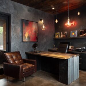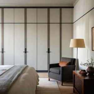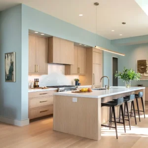
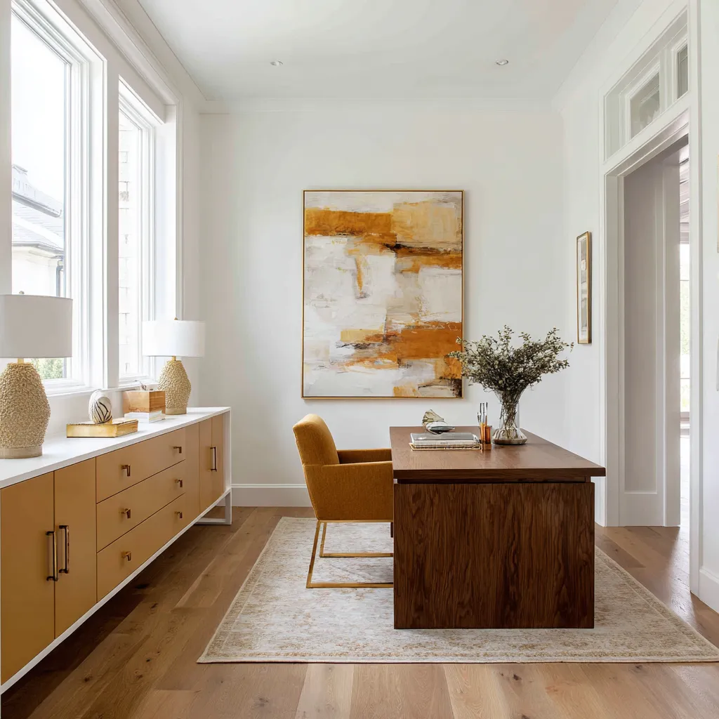
Most home office color advice begins with paint names.
Sage green.
Navy blue. Warm beige.
Terracotta. Greige.
Soft blue. Burgundy.
These names are useful, but they are not enough. A home office interior design does not succeed because one shade is fashionable.
It succeeds because the color is placed in the right layer of the room, supported by the right materials, and repeated with enough intelligence that the space feels personal, useful, and visually complete.
A home office is also different from a bedroom, dining room, or living room. It has to hold concentration, store visible things, tolerate screens, look pleasant in daylight and artificial light, and often share space with another function.
It may be a guest room, a landing, a closet, a basement corner, a library, a family work zone, or a small alcove beside a window. Because of that, color has a practical job.
It can define the work area, soften storage, warm a cool desk wall, make a small nook feel finished, or give a serious office more residential character.
The question is not simply: What color should I paint my home office?
A better question is: Which part of the room should carry the color?
That one shift changes everything.
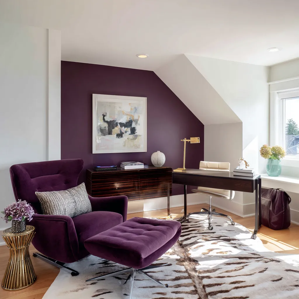
Color can live in the architectural shell, the built-ins, the desktop, the chair, the rug, the curtain, the artwork, the shelf backs, the plants, the metal finishes, or the materials themselves. The same sage green will feel completely different on a full wall, on lower drawers, on a velvet chair, inside bookcase backs, or repeated through pillows and greenery.
The same terracotta can feel heavy as a whole-room wall color, but very refined as a low desk band, a chair, a rug accent, and a ceramic vase. A home office color scheme works when color has a clear role, not when it is scattered without structure.
The first decision: give color a job
Before choosing the shade, decide what the color is meant to do. In a home office, color usually performs one of several roles.
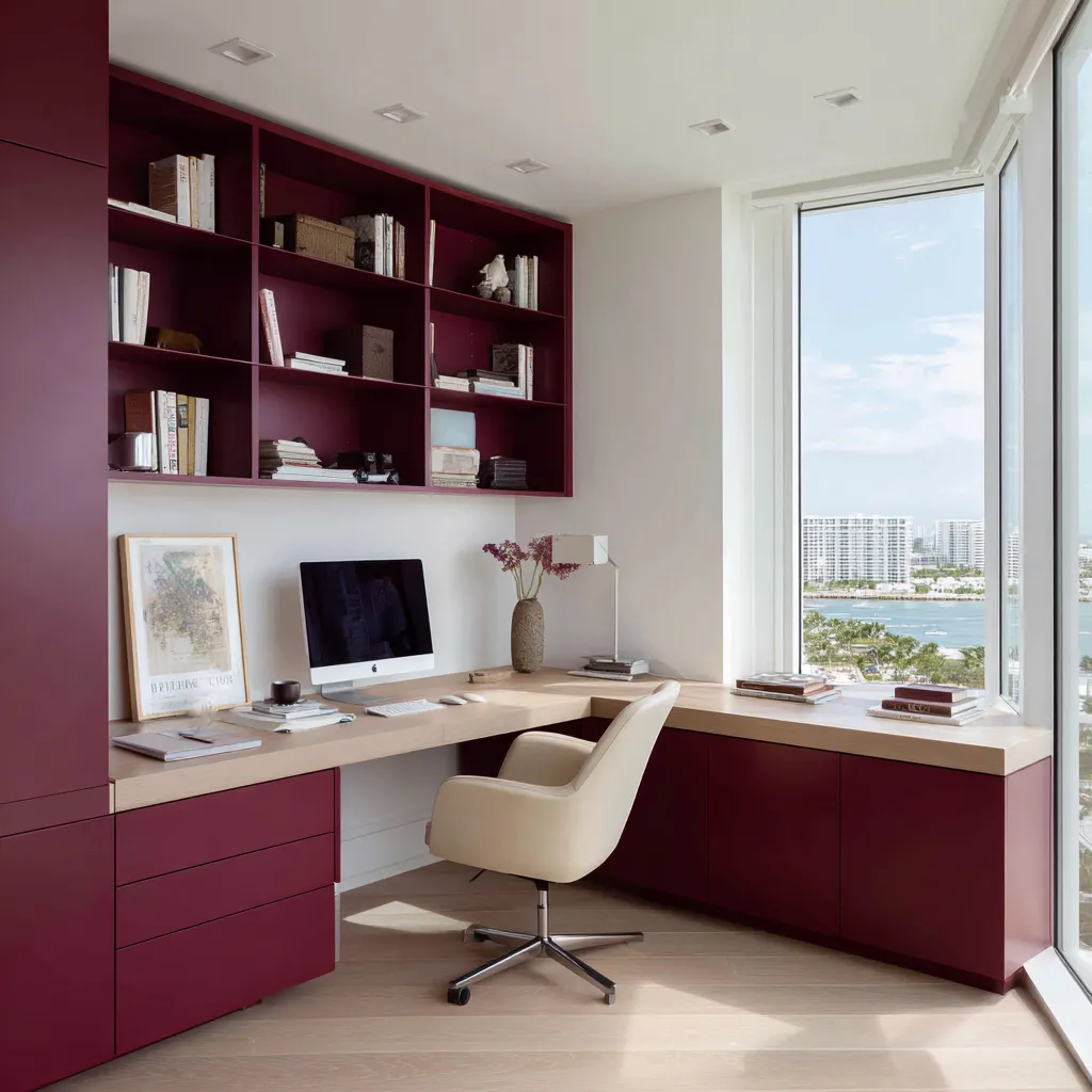
It can create focus, especially when used on a built-in wall, shelving unit, or desk niche. A deep aubergine, oxblood, teal-grey, or olive can make the work area feel intentional and enclosed enough for concentration.
It can create freshness, especially when used in pale sage, seafoam, celery green, fog grey, or misty blue-green. These shades work well when the office has daylight, white trim, garden views, or coastal-toned artwork.
It can create warmth, especially through butter yellow, saffron, clay, apricot, papaya, rust, or blush. These colors are very effective in nooks, landings, guest-office rooms, and spaces that might otherwise feel leftover.
It can create visual order, especially when color is applied to built-in storage. A painted cabinet wall turns files, books, drawers, baskets, and display objects into one composition.
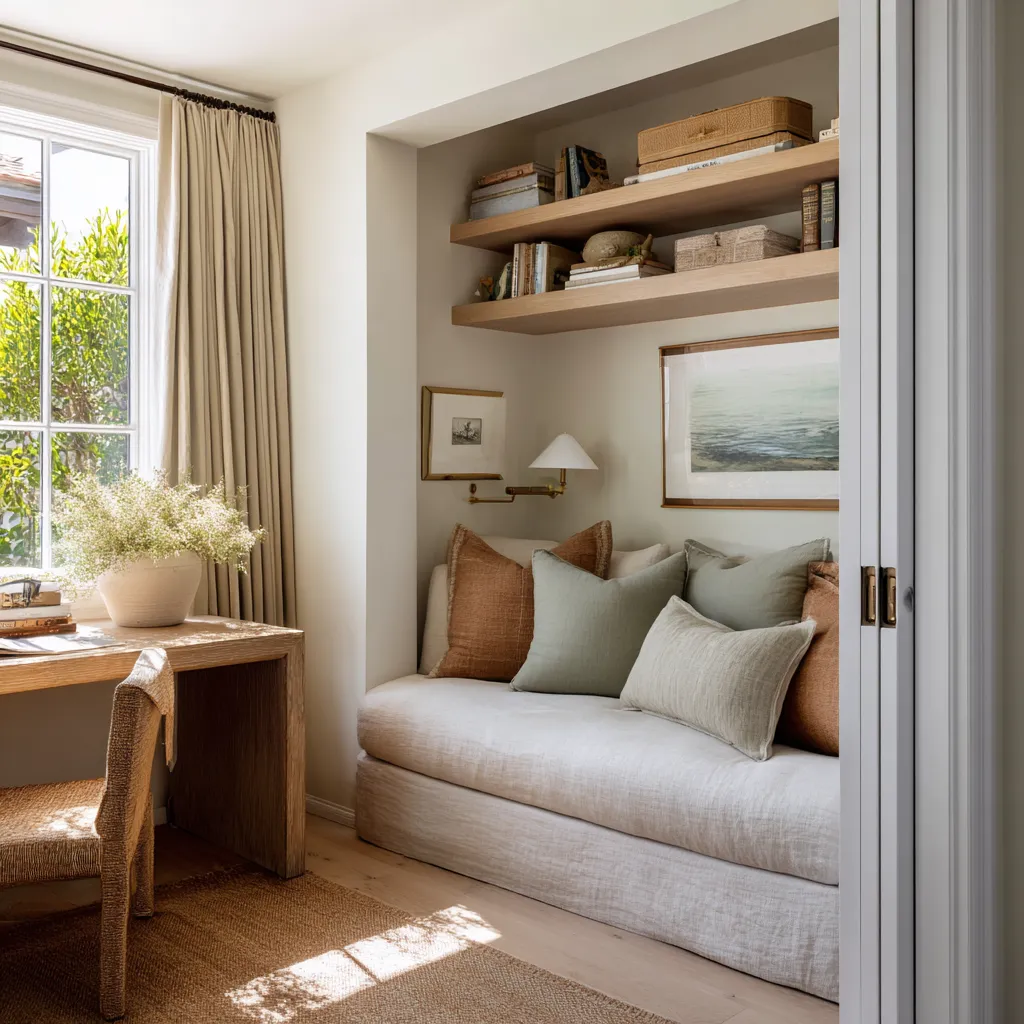
It can create softness, especially when the room has a desk and guest function together. Cream upholstery, linen drapery, plaster beige walls, woven baskets, and warm wood can make office furniture feel less technical.
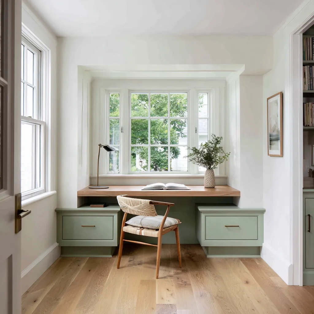
It can create identity in a room that has very little architecture. A compact alcove can feel designed if the base drawers are pale sage, the desktop is oak, the lamp is black, and the window view supplies natural green.
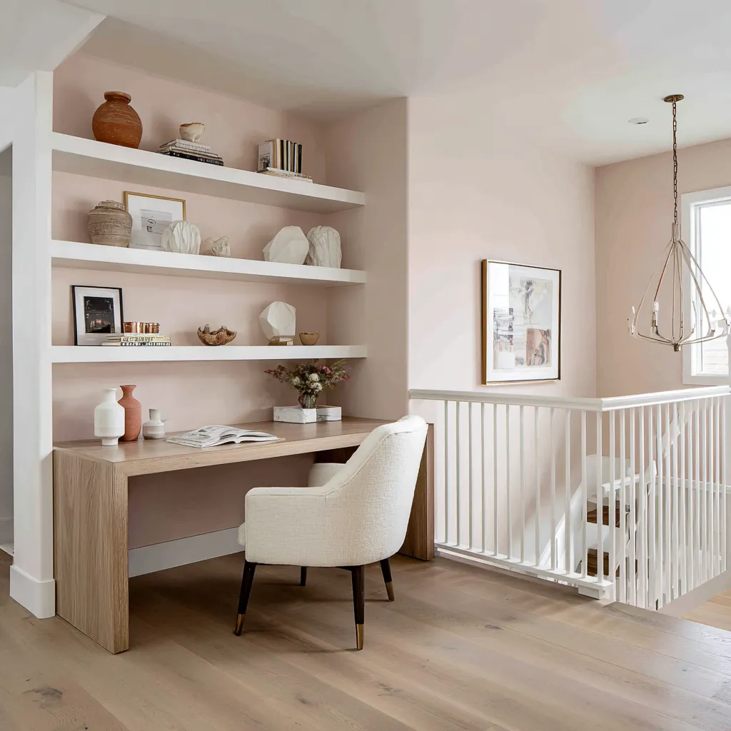
A small landing can feel purposeful if blush-clay wall color is framed by white shelves and pale oak furniture.
This is why choosing a color before choosing its role often leads to weak results.
A beautiful paint color can still fail if it covers the wrong surface. A risky color can work beautifully if it is placed in the right layer.
The architectural shell: why warm white does so much work
Many beautiful home offices keep the ceiling, trim, window casing, and much of the wall area warm white or soft white. This is not a lack of imagination.
It is one of the important color decisions in the room. Warm white gives color room to breathe.
In a home office, there are usually many visual interruptions: screens, lamps, papers, cords, books, frames, baskets, hardware, drawer lines, chair bases, keyboards, samples, and accessories. A pale shell keeps all these objects from feeling chaotic.
It also protects daylight. A white ceiling makes sloped attic spaces feel taller.
White trim frames garden views. White shelf fronts sharpen a blush wall.
White side walls make a colored office alcove feel crisp rather than heavy.
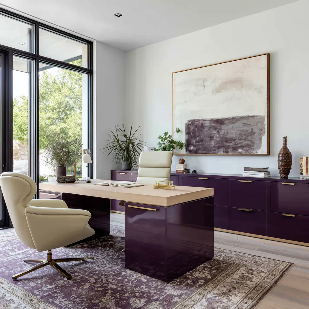
White is especially important beside deep colors. A burgundy cabinet wall, oxblood bookcase, aubergine wall, or teal-grey built-in needs pale relief.
Without it, the color can close around the user and make the office feel visually dense. With warm white trim, pale wall breaks, cream upholstery, and a wood desktop, deep color becomes architectural.
Warm white also changes how yellow and green behave. Yellow becomes fresher and less sugary.
Sage becomes brighter and less muddy. Seafoam becomes cleaner.
Fog grey becomes airy. Neutral rooms gain contrast between cream built-ins, sand walls, walnut desks, and linen textures.
For home office planning, warm white should be treated as an active color. It is the frame, the light reflector, the separator, and the visual reset between stronger materials.
Good places to keep warm white:
- ceiling
- sloped attic planes
- window trim
- door casing
- upper walls in small rooms
- shelf fronts when shelf backs are colored
- side walls around a colored built-in
- lower cabinets if upper shelves carry color
- surrounding walls around a desk niche
An interior design can have rich color and still feel bright when the shell remains light.
The desktop matters because color meets the body there
The desktop is one of the most underestimated color decisions in a home office. It is not only a surface for the computer.
It is the material closest to the hands, arms, papers, books, coffee cup, lamp, and keyboard. It shapes how the workspace feels during daily use.
This is why natural wood appears so often in successful home office color schemes. A pale oak desktop can warm blue-green cabinetry.
Honey wood can keep pale aqua from feeling cold. Walnut can make powder-lilac walls feel grounded.
A natural oak work surface can soften terracotta, olive, sage, yellow, and cream. Even in rooms with dramatic cabinetry, the wood worktop prevents the office from becoming too hard or too painted.
Wood also solves a common problem with colored built-ins. If the cabinet, drawer base, shelf back, and desk surface are all painted the same color, the work area can feel flat.
A wood desktop introduces a clear horizontal pause. It separates the storage layer from the work layer.
It gives the room a tactile center. Think of the desktop as the warm line running through the office.
In a burgundy built-in office, a pale oak surface keeps the dark cabinet mass usable. In a pale sage window alcove, oak creates a natural bridge between white casing and green drawer bases.
In a seafoam office, pale wood and marble can make the blue-green feel polished. In a neutral office, walnut gives weight to cream built-ins and sand walls.
In a terracotta loft office, pale oak flooring and shelves stop the red-orange work band from feeling isolated. A practical rule: if the main office color is cool, dark, pale, or complex, a wood desktop almost always helps.
Different wood tones create different effects:
Pale oak: fresh, light, adaptable, useful with sage, seafoam, pale blue-green, yellow, terracotta, and warm white.
Honey oak: warmer and sunnier, very good with butter yellow, citrus, apricot, pale green, and coastal artwork.
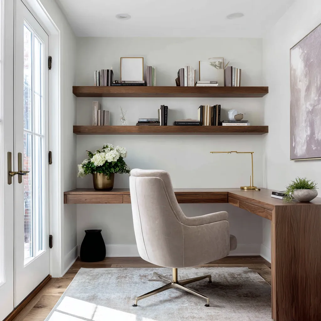
Walnut: serious, deep, refined, excellent with greige, moss-taupe, powder lilac, cream, sand, and olive.
Weathered or pale washed wood: good for attic offices, coastal cool palettes, fog grey, and soft neutral rooms.
Wood is the material that makes color feel touchable.
Built-in storage can carry color better than a flat accent wall
One of the most useful home office color ideas is to put color on built-ins instead of only on a flat wall. A painted wall changes the mood.
Colored storage changes the mood and gives the room function. This matters in a home office because storage is usually necessary: shelves, files, books, printers, baskets, stationery, samples, documents, and display objects all need a place.
When the storage carries the main color, the room feels custom and practical at the same time. Built-ins also make color deeper.
A flat wall is one plane. A bookcase has sides, backs, shelf thicknesses, shadow pockets, cabinet doors, drawer fronts, handles, recesses, and objects.
Color behaves differently on every small surface. A burgundy shelf makes white books brighter.
A teal-grey shelf back turns stone accessories into sculptural objects. A moss-taupe cabinet wall makes baskets and cream ceramics feel richer.
Pale blue-green shelving can make a wall full of storage feel lighter than it actually is.
Colored built-ins work well in many shade families:
- beetroot-burgundy for a compact but confident office
- aubergine for a formal executive wall
- pale blue-green for a fresh storage-heavy room
- celery-lime for a garden-facing study
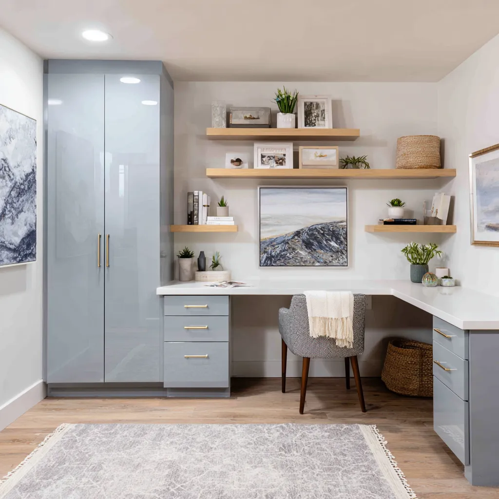
- misty blue-grey for basement cabinetry
- oxblood for a library feeling
- oxidized teal-grey for a compact desk niche
- olive-beige for serious filing and office supplies
- seafoam for airy display shelving
- tobacco olive for a mature green study
- soft sage for paired bookcases
- moss-taupe for a serious built-in wall
A good colored built-in usually needs one or more of these balancing moves:
- pale or warm white surrounding walls
- natural wood desktop
- brass, bronze, or dark hardware
- cream chair or pale upholstery
- baskets, ceramics, or books in a limited tonal range
- one piece of artwork that repeats the cabinet color softly
- a rug that brings the color down to the floor in a faded way
Colored storage should feel like architecture, not like furniture painted after the fact. The easiest way to achieve that is to repeat the color on several connected parts: lower drawers, shelf backs, side panels, a tall cabinet, or desk base.
Then add a wood surface to keep the work layer comfortable.
Deep home office colors: aubergine, burgundy, oxblood, and teal-grey
Deep colors can make a home office feel serious, cocooned, and expensive. But they need discipline.
They become difficult when they cover too many layers at once. A deep office should usually separate its layers:
- dark vertical layer: wall, built-ins, bookcases, cabinet backs
- warm horizontal layer: oak or walnut desktop
- pale human layer: cream chair, ivory rug, light cushion, soft upholstery
- living layer: plant, flowers, garden view, landscape art
- reflective layer: brass, lacquer, glass, glossy cabinet finish, framed art
This is why deep colors can feel rich without feeling oppressive. They are powerful in one or two main zones, then supported by light, texture, and wood.
Burgundy and oxblood
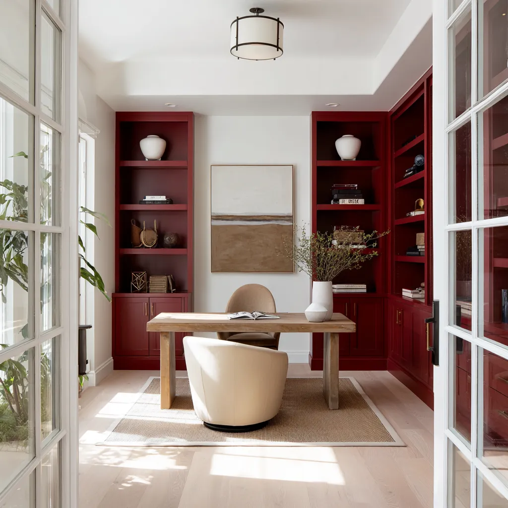
Burgundy and oxblood work especially well on built-ins. A beetroot-burgundy office with pale oak and white walls can feel warm, individual, and highly designed.
Oxblood bookcases can create a study mood while still feeling residential if the central wall stays white, the desk is natural wood, the seating is cream or camel, and the rug is beige. The trick is to let the red family become cabinetry, not simply paint.
Red-based colors have a lot of emotional weight. On a cabinet wall, they feel grounded and useful.
On random wall paint, they can feel too theatrical unless carefully supported. Good partners for burgundy and oxblood:
- pale oak
- cream upholstery
- warm white walls
- brass hardware
- beige or tan rug
- landscape art with brown, cream, or muted blue
- greenery in small but visible doses
Aubergine and blackened plum
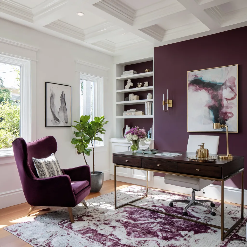
Aubergine can replace black, espresso, or navy in a formal home office. It has depth, but it brings more warmth than black and more individuality than navy.
It works beautifully in glossy cabinetry, matte walls, velvet chairs, faded rugs, and abstract art. Aubergine should rarely stand alone.
Repeat it in different textures: wall paint, velvet seating, rug pattern, shelf backs, artwork, or flowers. This makes the palette feel layered rather than flat.
Good partners for aubergine:
- cream leather or boucle
- dark wood
- brass
- white trim
- pale abstract art
- faded purple-taupe rug
- plants or outdoor green
Deep teal-grey
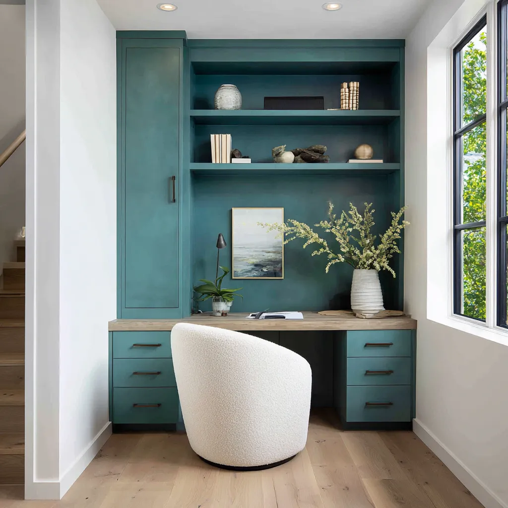
Oxidized teal-grey is a refined alternative to navy and charcoal. It works very well in compact built-in offices because it has depth but still connects to water, foliage, stone, and grey-blue art.
The key is warmth. Teal-grey needs wood, cream upholstery, stone objects, baskets, and dark hardware.
Without warmth, it can feel cold. With pale oak and cream boucle, it becomes mature and atmospheric.
Good partners for teal-grey:
- pale oak desktop
- cream chair
- blackened metal handles
- stone vessels
- off-white books
- muted green foliage
- white side walls
Deep colors are not risky when they are given structure. The problem is not depth.
The problem is depth without relief.
Warm colors: use them as rhythm rather than full coverage
Yellow, saffron, apricot, papaya, terracotta, clay, rust, and blush can make a home office feel energetic, creative, and sunlit. But these colors are sensitive.
Too much yellow can feel childish. Too much orange can feel hot.
Too much blush can feel sweet. Too much terracotta can shrink a small room.
The most refined way to use warm color is to let it move through the room in intervals.
For example: art → chair → rug → vase → shelf object
or: curtains → chair → lower cabinets → pillow → pottery
This repeated rhythm makes the color feel planned while keeping the office usable for long work hours.
Butter yellow and citrus yellow
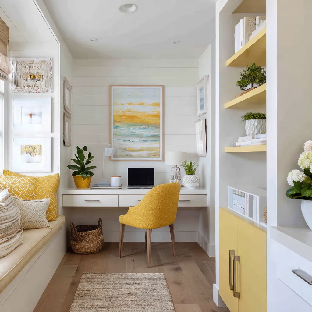
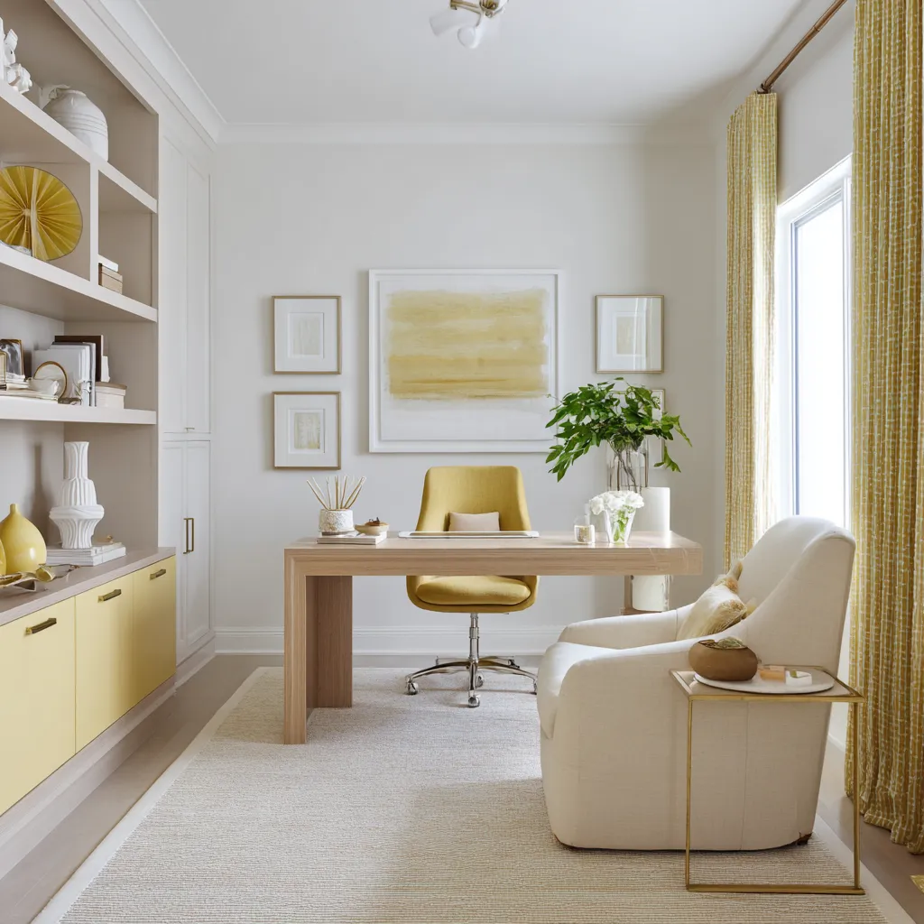
Yellow works beautifully in a study nook when softened toward butter, pale marigold, citrus cream, or ochre. It is especially good for a compact desk area near a kitchen, mudroom, hallway, or family room.
The most successful yellow offices usually keep walls warm white and use yellow in selected places:
- upholstered chair
- lower cabinets
- curtain pattern
- bench pillows
- open shelf planes
- rug block
- art
- pottery
- small planter
Yellow needs natural texture nearby. Woven shades, baskets, pale oak, linen, cream cushions, and plants keep it from feeling synthetic.
A butter-yellow office can be very sophisticated if the color is muted and repeated in several small-to-medium doses. The chair can carry the emotional brightness.
The cabinetry can provide a low band. The art can explain the palette.
The woven texture can warm the whole scene.
Saffron and ochre
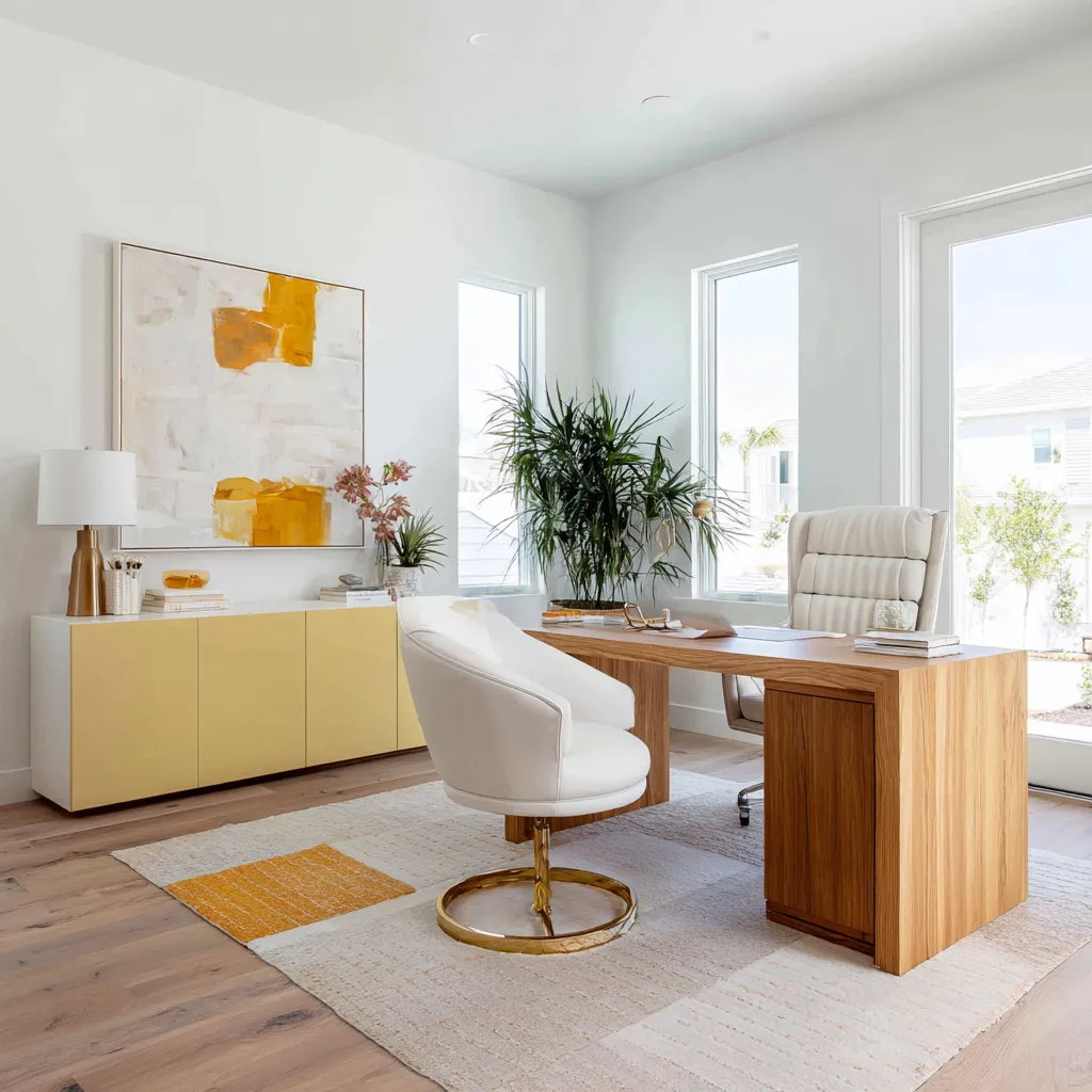
Saffron and ochre are deeper than butter yellow. They work well in traditional offices with white walls, walnut desks, brass lamps, and large abstract art.
A mustard or ochre credenza under a window can bring warmth without darkening the whole room. An ochre chair can energize a desk area without requiring colored walls.
Saffron needs grounding. Walnut, aged rugs, warm white walls, and muted greenery help it feel adult.
Useful saffron combinations:
- warm white walls
- walnut desk
- mustard storage
- ochre abstract art
- brass lamp
- beige rug
- dusty green branches
Apricot, papaya, and coral
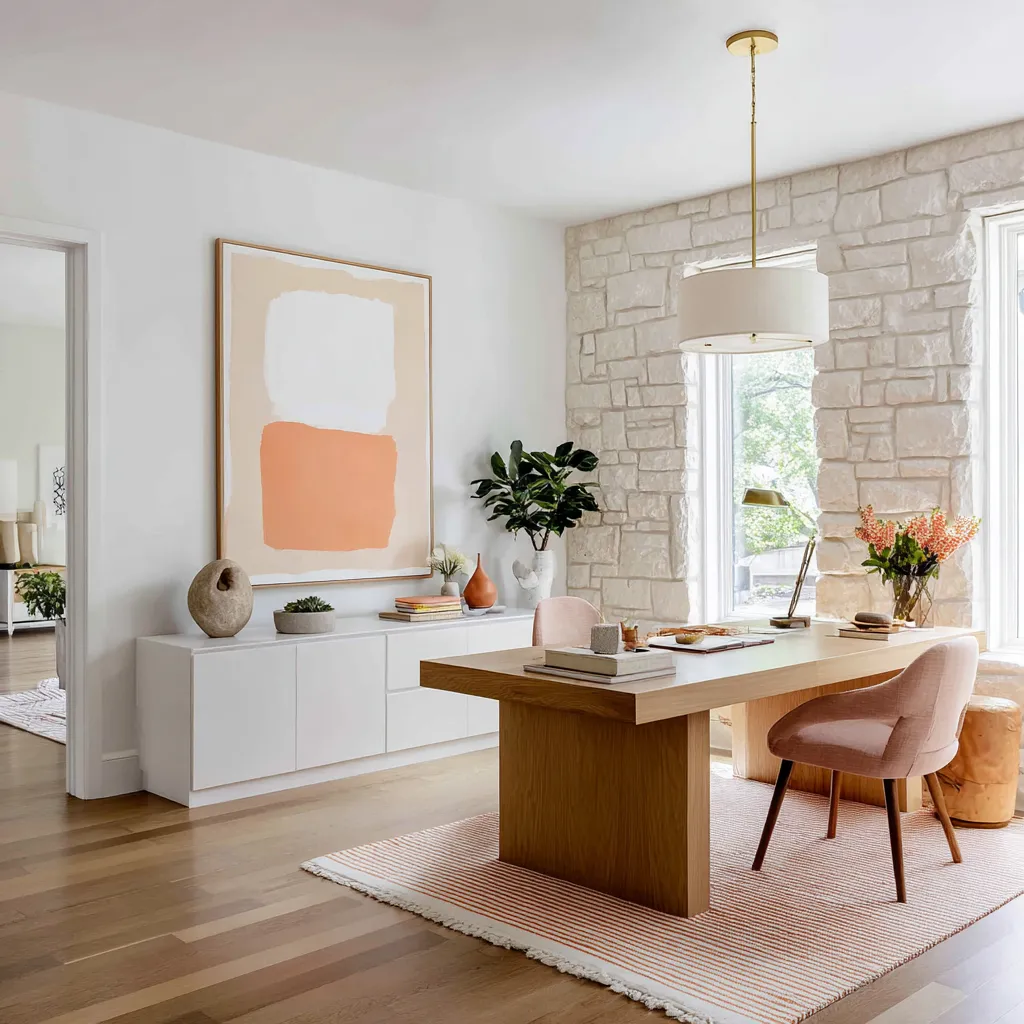
Apricot and papaya are softer than terracotta but warmer than blush. They work particularly well when introduced through artwork, chairs, flowers, pottery, and striped rugs.
A cream room with pale oak furniture can become much warmer with one coral lounge chair, a large apricot block-color artwork, a clay vase, and a few warm-toned books. These shades need material grounding.
Stone, oak, plaster, ceramic, brass, and greenery prevent them from feeling too decorative. A good apricot office does not make everything peach.
It uses several related strengths:
- pale apricot in art
- dusty peach on chairs
- coral in flowers
- clay-orange in a vase
- tan-orange in leather or hide
- thin peach stripe in a rug
This range makes the palette feel developed.

Terracotta and rust
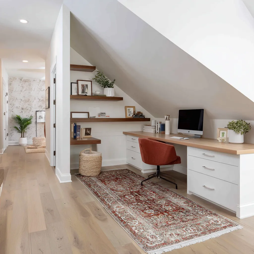
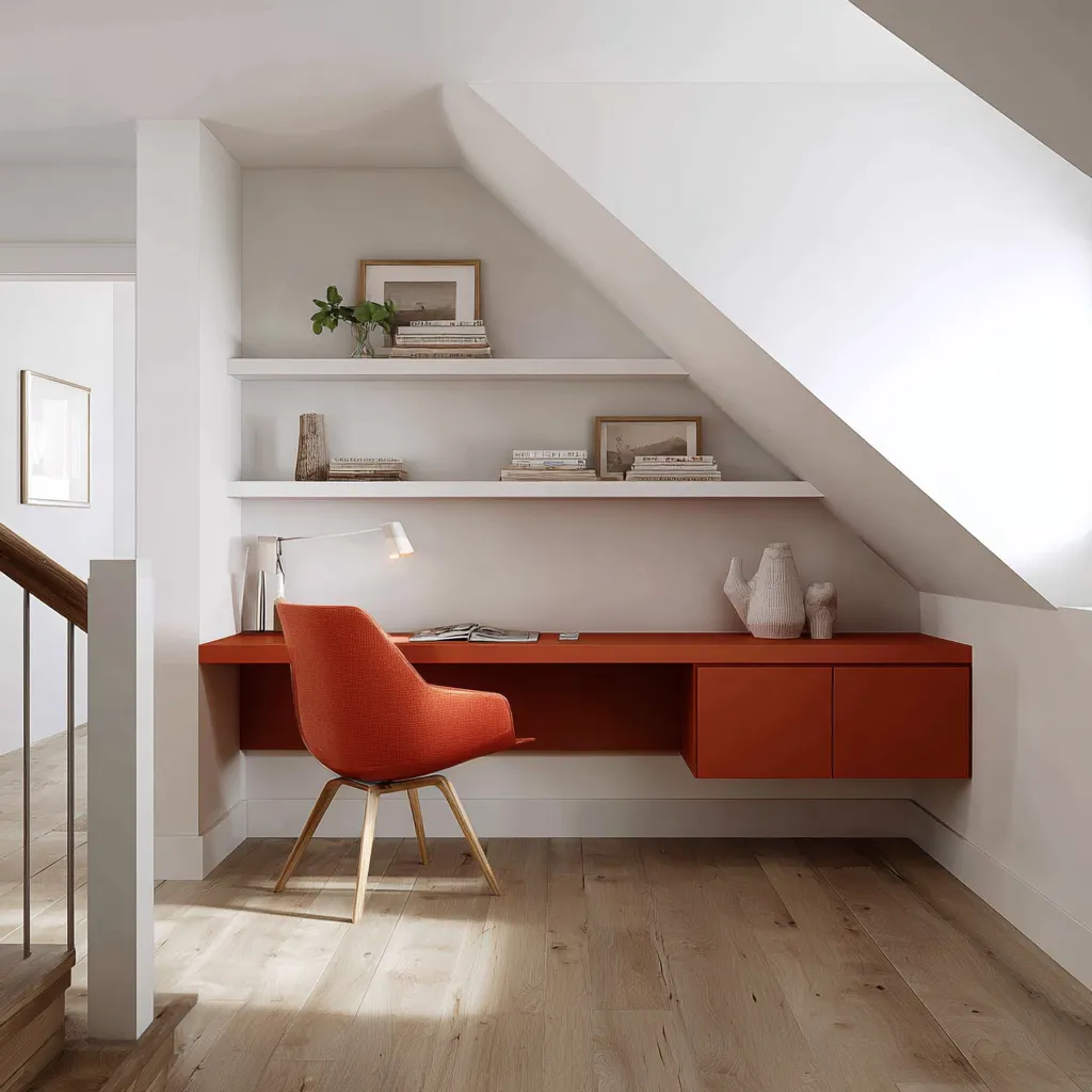
Terracotta and rust are excellent for loft offices, attic offices, and rooms with a lot of white architecture. They work well when color is kept low: desk band, chair, rug, ottoman, pillows, ceramics, or lower cabinetry.
In a sloped-ceiling room, terracotta should usually sit below eye level. Keep the ceiling and angled walls white, then let the desk, chair, and rug carry the warmth.
This gives identity to an awkward wall without making the ceiling feel lower. Terracotta becomes especially refined with:
- pale oak flooring
- white shelving
- cream walls
- small green plants
- pale ceramics
- aged rust rug
- black accents in very small amounts
Warm colors should feel like sunlight, clay, fabric, pottery, leather, or art. They should not feel like flat paint chosen from a trend list.
Green home office ideas: garden green versus library green
Green is one of the most flexible home office color families, but it changes character dramatically depending on its support materials. There are two main green directions.
Fresh garden green
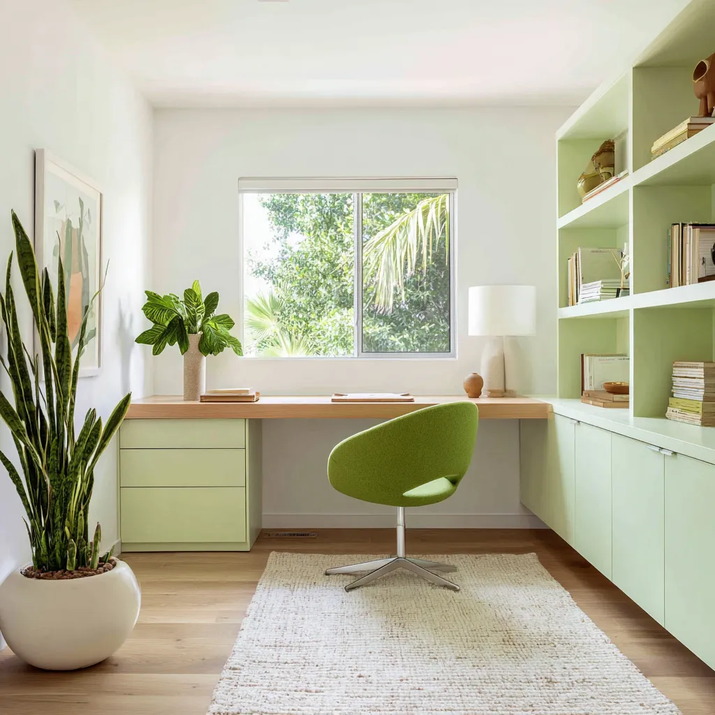
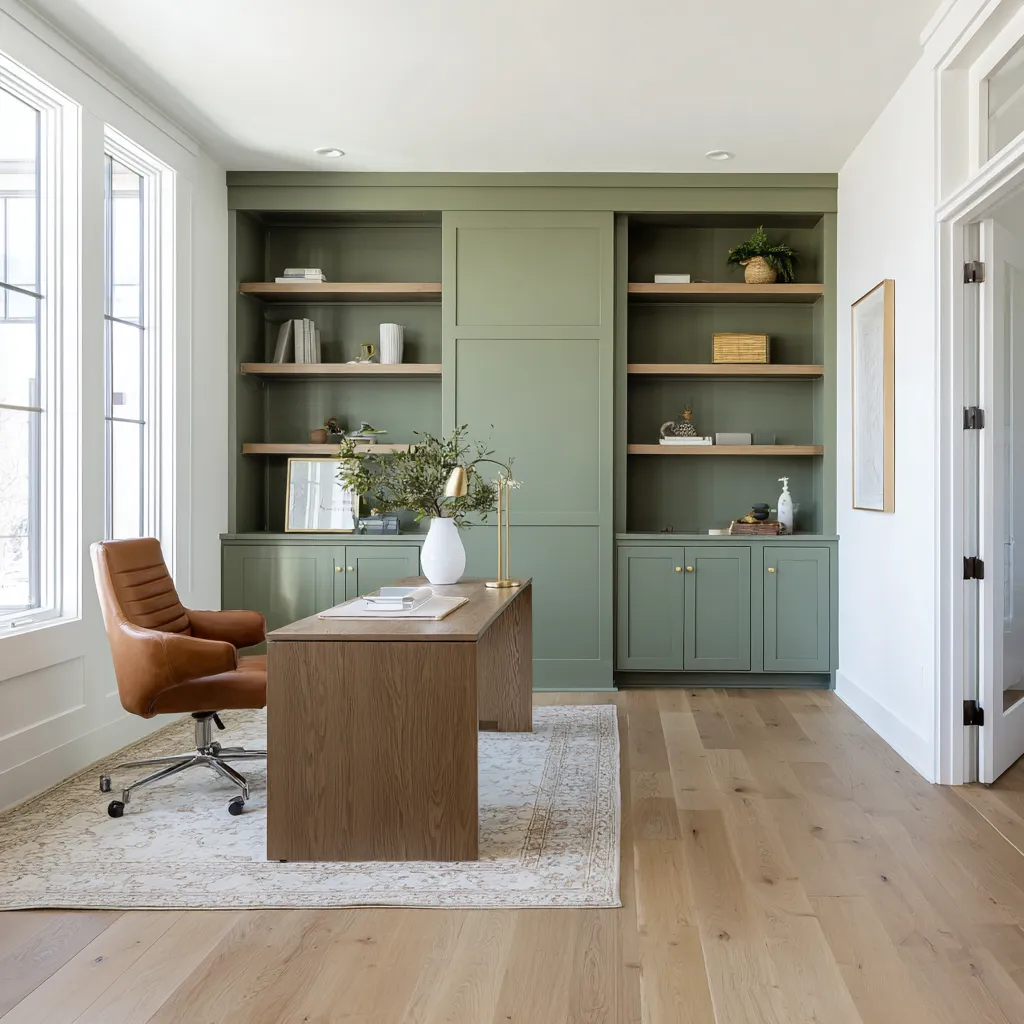
This includes pale sage, celery, pistachio, soft lime, and light green-grey. It works beautifully in offices with windows, garden views, plants, oak desktops, warm white walls, and woven rugs.
Fresh green is especially effective on:
- lower drawers
- base cabinets
- open shelving
- desk backs
- paired bookcases
- window-alcove cabinetry
The goal is not to match the plant color exactly. It is better when the painted green is softer than the living green.
The cabinetry can be celery or pale sage, while the plants and view bring deeper, more varied green. This keeps the office natural rather than overly coordinated.
Good elements for fresh green offices:
- white walls and ceiling
- oak desktop
- cream or pale rug
- brass pulls
- leafy plants
- garden view
- woven basket
- pale upholstery
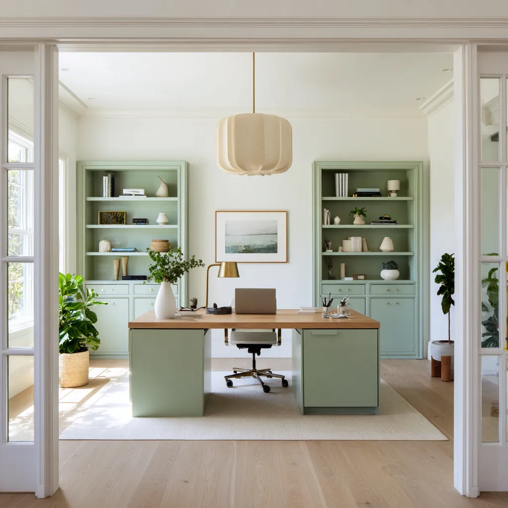
A soft sage office with paired bookcases and an oak worktop can feel fresh and organized. A pale sage alcove below a window can connect to the garden without making the whole room green.
A celery-lime built-in office can feel cheerful if a deeper green chair, plants, and pale wood support it.
Mature library green
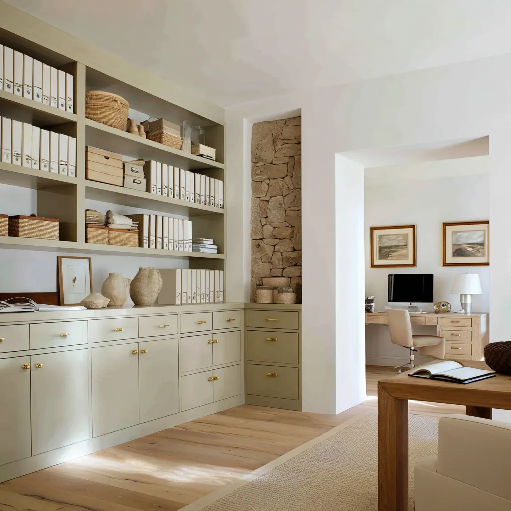
This includes olive-beige, tobacco olive, moss-taupe, khaki-green, and grey-green. These colors are deeper, more serious, and more suitable for storage-heavy offices or library-style rooms.
Mature green works well on:
- full built-in walls
- file storage
- cabinet frames
- shelf backs
- tall doors
- desk bases
It needs richer materials than fresh green:
- walnut desk
- brass knobs
- cream boucle seating
- woven baskets
- linen-like shelf backs
- stone inserts
- natural flooring
- dark lamp or blackened metal detail
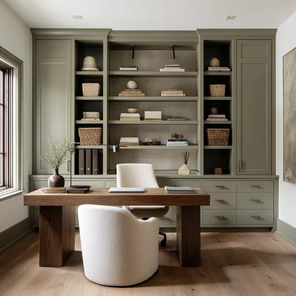
Olive and moss shades can make office storage feel less utilitarian. A wall of files and binders can look warm and orderly if the cabinetry is olive-beige, the hardware is brass, the binders are cream, and baskets bring straw texture.
A moss-taupe library wall can feel serious if the shelf backing has linen texture and the desk is walnut. The lesson: green is not one mood.
Pale green belongs to daylight and plants. Olive and moss belong to storage, wood, brass, and library atmosphere.
Cool office colors need warmth close to the hands
Seafoam, misty blue-grey, pale aqua, fog grey, grey-lilac, and blue-green can create a fresh and clear home office. They are especially useful in compact rooms, basement offices, coastal-inspired workspaces, attic rooms, and white-trimmed studies.
But cool colors need warmth nearby. If blue-grey cabinetry is paired only with white walls, white desk surfaces, chrome, and cool lighting, the room can feel thin.
The solution is to place warm materials where the user works and sits. Good warming elements:
- honey wood desktop
- oak shelves
- walnut wraparound desk
- woven baskets
- brass pulls
- cream chair
- wood chair frame
- beige rug
- pale flooring
- plants
Pale blue-green and seafoam
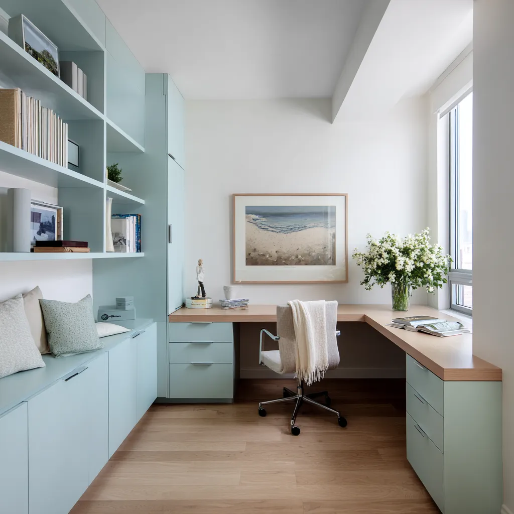
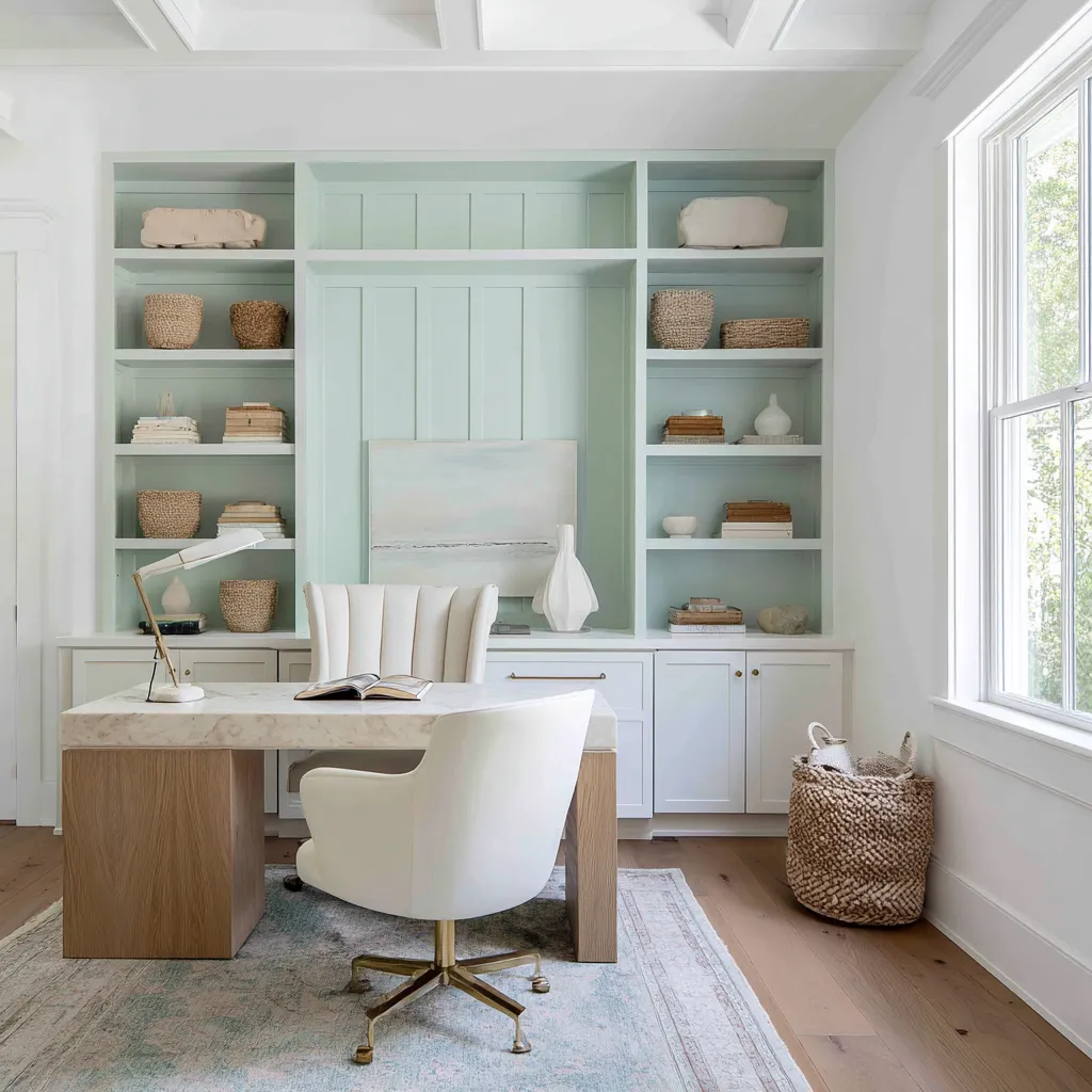
Pale blue-green cabinetry works well when the desktop is warm wood and the walls stay white. This prevents the room from feeling like a pastel box.
Add coastal-toned art with muted water, sand, and grey-blue tones, then keep accessories neutral. Seafoam is especially effective in shelf backs and recessed panels.
It gives a storage wall identity without making the entire room feel heavily painted. White lower cabinets, marble or stone desktop, pale oak, brass bases, and woven baskets can make seafoam feel polished.
Misty blue-grey
Misty blue-grey is very useful for basement offices or lower-level workrooms. It adds color to cabinetry, but it stays soft enough for limited daylight.
A white work surface is helpful in this setting because it keeps the actual desk area bright. Oak shelves, brass handles, plants, woven baskets, and a pale rug warm the cabinet color.
Fog grey and attic offices
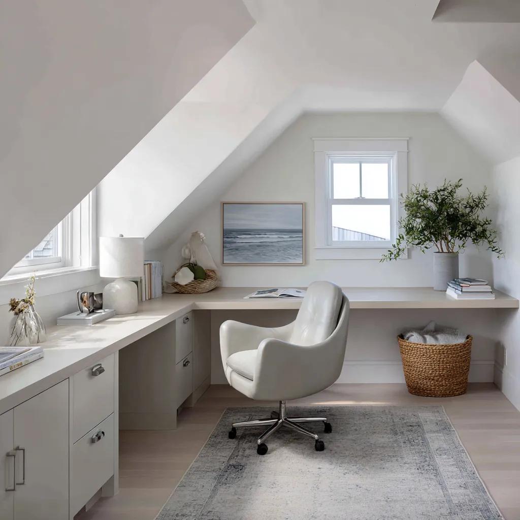
Fog grey works beautifully in attic rooms when used on lower cabinetry while sloped walls and ceilings remain white. Add a pale blue-grey rug, water-toned art, wicker basket, white chair, and plants.
The color gives the built-ins definition without weighing down the angled ceiling.
Powder lilac and grey-lilac
Grey-lilac and powder lilac are refined alternatives to plain grey. They can appear in art, upholstery, or storage blocks rather than full walls.
Walnut and brass are excellent partners. A walnut wraparound desk can make pale lilac undertones feel warmer and more mature.
Cool office colors should not be left alone with white. They need touchable warmth: wood, basketry, cream fabric, brass, or natural flooring.
Neutral home offices: depth without obvious color
Neutral home offices can be very rich, but only when the neutral palette is layered. A room made from one beige tone can feel flat.
A room made from plaster beige, flax linen, walnut, oak, stone, boucle, leather, brass, baskets, and aged rugs can feel full of depth without a bright hue. The key is material variety.
Think of the neutral palette as a family of surfaces:
- matte plaster wall
- linen curtain
- walnut desk
- pale oak shelf
- stone wall
- woven shade
- boucle chair
- camel leather
- aged rug
- ceramic lamp
- brass handle
- landscape art
Each surface handles light differently. Plaster absorbs.
Brass reflects. Walnut deepens.
Boucle softens. Woven shades create tiny shadows.
Stone varies from cream to grey to beige. Aged rugs add low-contrast pattern.
This is how neutral offices avoid feeling plain.
Warm vanilla office
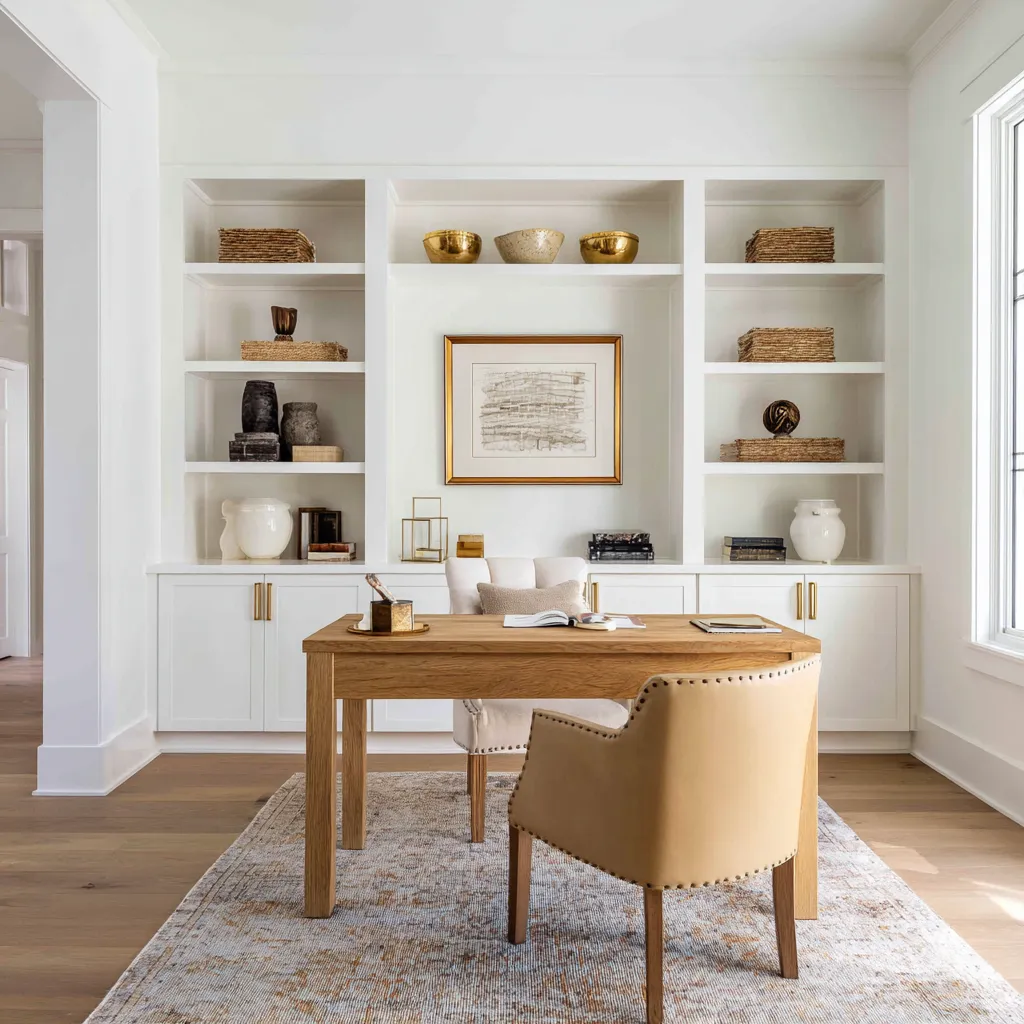
A warm vanilla office with white built-ins can gain depth through a honey oak desk, tan leather chair, brass handles, woven baskets, gold bowls, ceramic vessels, and a faded rug. The white built-ins become the background for material color, not the whole story.
Sand and cream traditional office
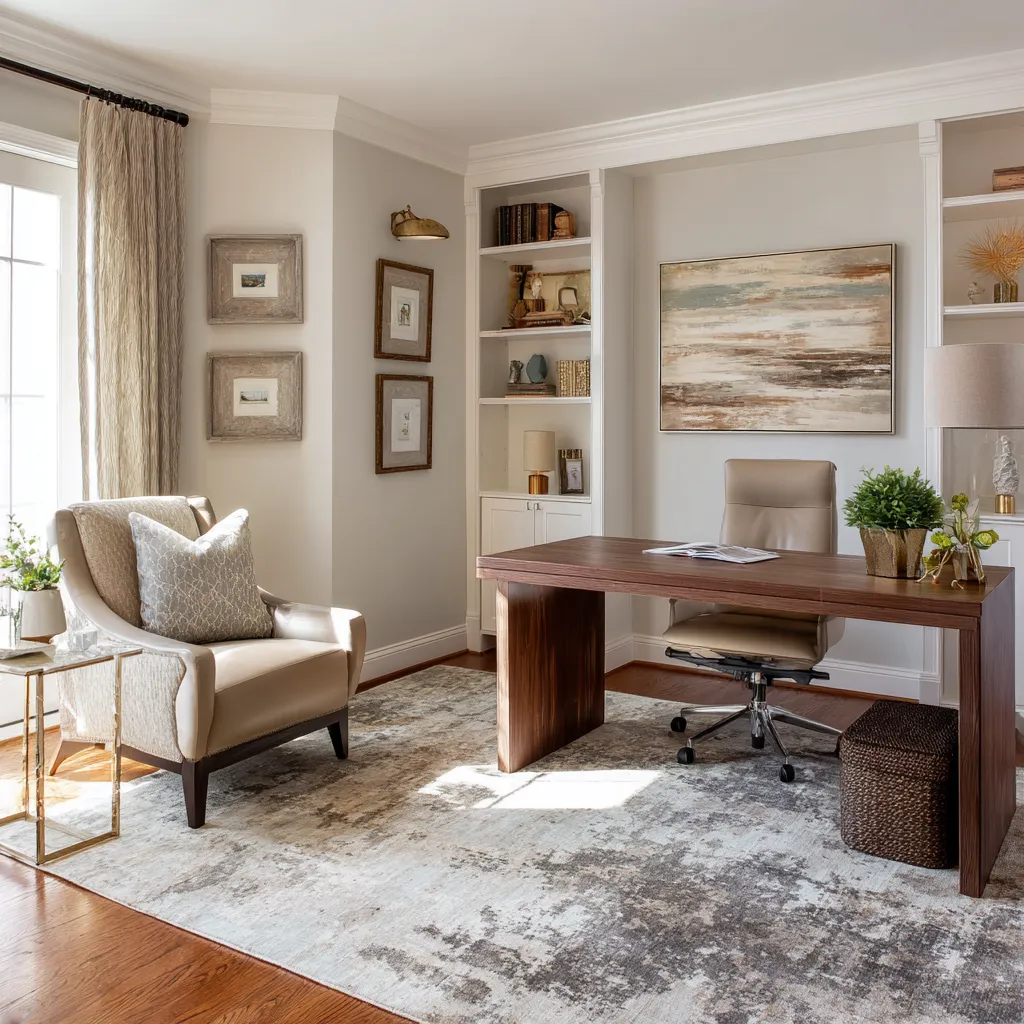
A sand-colored office can feel layered with cream built-ins, walnut desk, ivory lounge chair, linen drapery, aged landscape art, brass side table, and a taupe-patterned rug. The room remains light but has enough contrast to feel finished.
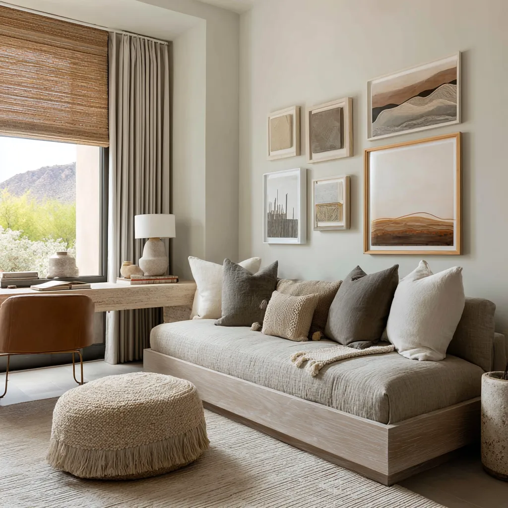
Desert-neutral office lounge
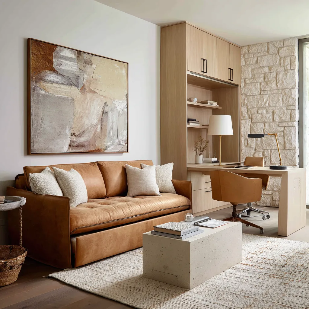
A desert-inspired office lounge can use stone-beige walls, flax drapery, woven shades, camel chair, warm wood, layered landscape art, taupe pillows, and a nubby ottoman. The desk, lounge, window treatment, art, and textiles all share a natural color family while still offering different textures.
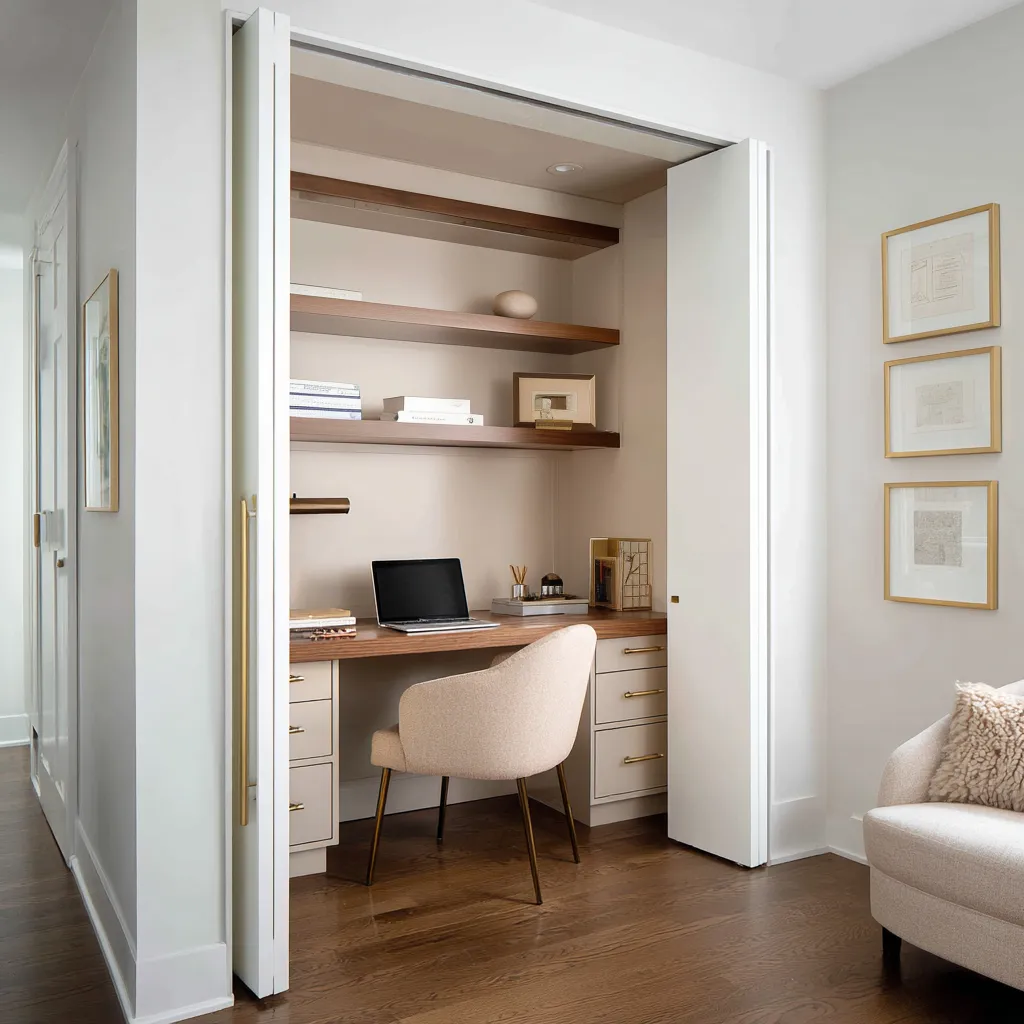
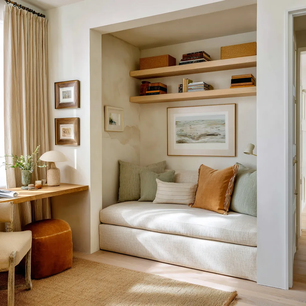
Closet office in warm neutrals
A closet office can feel refined with warm white pocket doors, greige niche walls, walnut shelves, brass handles, cream upholstery, and dark wood flooring. The contrast between the pale exterior and warmer interior makes the small workspace feel intentional.
Neutral color works when it is built from materials, not from one paint chip.
Artwork can be the color plan
In many refined home offices, artwork does not simply fill an empty wall. It explains the palette.
A large abstract artwork can contain the room’s color logic: apricot, cream, beige, and white. Then the office repeats those tones through peach chairs, coral flowers, oak desk, stone wall, and clay vase.
An ochre artwork can connect saffron storage, mustard chair, walnut desk, and warm white walls. A sea-toned artwork can make pale blue-green cabinetry feel connected to air and water rather than random pastel color.
This method is useful because art can contain several colors in unequal amounts. A room can then borrow from that internal balance.
For example:
- the lightest color in the art can become wall color or chair color
- the deepest color can become cabinet, chair, or rug accent
- the middle tone can become wood, pottery, cushion, or curtain
- one muted cool note can appear through plants, water-toned art, or grey-blue textile
- one warm note can appear through brass, clay, or leather
This prevents color matching from becoming too literal. The room does not need the exact same blue, exact same peach, or exact same yellow everywhere.
It needs related tones with different strengths. Art is especially helpful when using:
- apricot
- saffron
- seafoam
- aubergine
- sand
- pale blue-green
- fog grey
- terracotta
- rust
A good home office artwork often has muted colors, broad shapes, and enough pale space to keep the work wall open. Very busy art can compete with shelves and screens.
Art with large fields of color usually supports an office better.
Rugs translate color to the floor
A rug often repeats the main color in a softer, older, faded, or broken version. This is a subtle but important home office idea.
Aubergine does not need a solid purple rug. A washed plum-taupe rug is more refined.
Terracotta does not need a bright orange rug. An aged rust pattern works better.
Fog grey can become a faded blue-grey rug. Yellow can become one ochre block or a small pattern.
Sand can become a taupe and beige distressed rug. Blue-grey cabinetry can connect to a pale grey patterned rug.
The rug’s job is not to match. Its job is to translate.
A good office rug can:
- define the work zone
- soften chair movement
- bring cabinet color down to the floor
- add pattern without busy wallpaper
- connect the chair and desk
- lighten a dark furniture piece
- warm cool cabinetry
- add age to glossy or very new surfaces
In a home office, the rug should also consider chair movement. A heavily textured rug may look beautiful but make rolling chairs difficult.
A lower pile rug or a large rug that extends fully under the chair area is usually easier to live with. If the room uses a fixed upholstered chair rather than a rolling task chair, more texture can work.
The chair often carries the emotional color
The office chair is close to the body, so its color has a special effect. It can soften, energize, mature, or personalize the whole room.
A cream chair can soften burgundy or teal cabinetry. A yellow chair can energize a small study nook.
A deeper green chair can give celery built-ins a focal point. A coral lounge chair can warm a cream and oak office.
A cognac leather chair can make olive cabinetry feel richer. A terracotta chair can give a white loft office identity.
A boucle chair can soften moss-taupe built-ins and walnut furniture. The chair is also one of the easiest places to use color because it can be changed later.
This makes it ideal for stronger tones such as butter yellow, terracotta, coral, sage, oxblood, plum, or cognac. For a refined office, the chair should relate to at least one other item:
- chair color repeats art tone
- chair color repeats rug accent
- chair color repeats cabinet color in a softer texture
- chair leather relates to wood and brass
- chair cream relates to trim and rug
- chair green relates to plants and view
The chair should not feel like a random accent dropped into the room. It should complete a small color circuit.
Plants and views are color correctors
Plants do more than add decoration. In a home office, they often correct the palette.
Greenery can cool warm yellow, saffron, terracotta, and apricot. It can make pale sage feel connected to life rather than paint.
It can add depth to blue-grey and seafoam. It can soften aubergine, burgundy, and oxblood.
It also adds organic shape against the straight lines of desks and storage. A garden view can function like a large living artwork.
If the office has a window with palms, shrubs, trees, or lawn, the interior color can borrow from the view. Pale sage drawers, celery cabinetry, blue-green shelves, or warm wood desktops can all feel more natural when the window supplies moving color and daylight.
Plants are especially valuable in home offices with:
- deep built-ins
- yellow accents
- orange or clay palettes
- sage cabinetry
- blue-grey storage
- neutral rooms that need life
- basement offices
- window alcoves
Good placement ideas:
- tall plant beside a bookcase
- vase greenery on the desk
- small plant inside open shelving
- white flowers near yellow or blue-green cabinetry
- branches in a clay or stone vase
- plant near window to connect interior and exterior color
A plant should be treated as part of the palette, not as an afterthought.
Small rooms, attics, and nooks: keep color low
Small home offices can handle color, but the placement matters. In narrow rooms, closet offices, window alcoves, attic rooms, and sloped-ceiling spaces, color often works better below eye level.
Good lower color placements:
- base drawers
- desk band
- chair
- rug
- lower cabinet fronts
- bench pillows
- under-desk back panel
- side drawer units
Keep these upper areas light:
- ceiling
- sloped planes
- window casing
- upper walls
- side trim
- deep alcove returns
This keeps the architecture open while still giving the work area personality. A sloped ceiling already has visual weight because it angles downward.
If it is painted in a deep color, it can feel heavy. But if the ceiling stays white and color appears in the desk band, chair, rug, or low cabinetry, the room feels organized and bright.
A window alcove can use pale sage or blue-grey drawers below the desktop while keeping the deep window frame white. The view remains the main upper feature, while color defines the work base.
A landing office can use blush-clay walls if white shelving, pale oak, railing, and cream upholstery give the color structure. A closet office can stay neutral outside and warmer inside, with walnut shelves and brass hardware creating focus within a very small volume.
Small rooms need color with restraint, not fear.
Shared offices need soft division
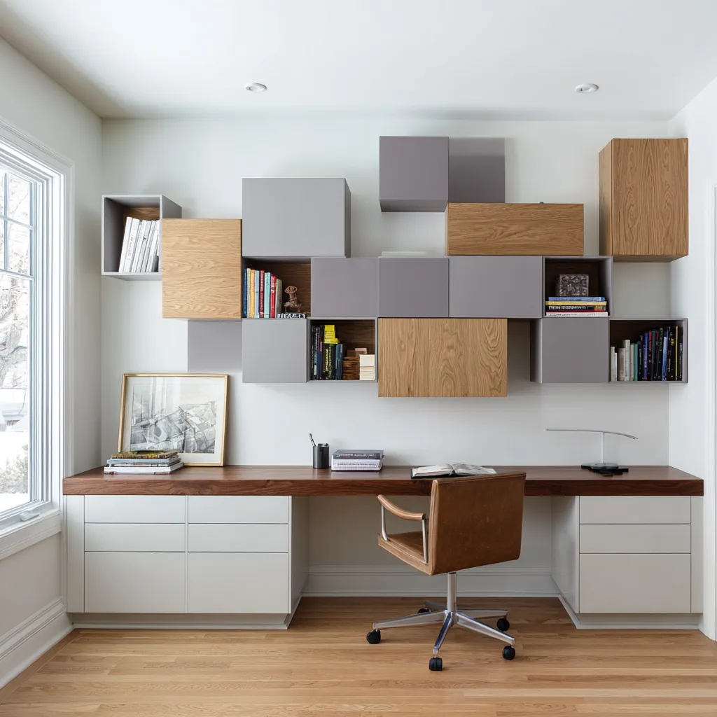
A two-person home office has a different color problem. It needs to support two users without becoming visually divided into two unrelated stations.
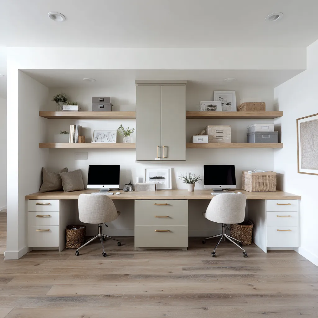
The most successful shared office palettes use gentle materials:
- warm white cabinetry
- pale greige center storage
- long oak desktop
- matching oak shelves
- brass pulls
- cream chairs
- woven baskets
- coordinated boxes
- soft grey or beige storage pieces
Color can create separation without a wall. A slightly darker greige cabinet in the center can divide two work zones.
Matching shelves can give each side storage. A continuous desktop can keep the whole composition unified.
This is very useful for family offices, homework walls, couple workstations, or long spare-room desks. A shared office should avoid too many competing accent colors.
It benefits from tonal organization and repeated material details. The goal is not visual excitement in every corner.
The goal is a clear, warm, organized work wall that can handle daily use.
How to build a home office palette by layer
A practical way to design the color scheme is to assign each layer before buying anything.
Layer 1: Architectural shell
Choose wall, ceiling, trim, and window casing.
Safe direction: warm white, soft white, cream, pale greige, plaster beige, light sand.
Ask: Should the shell reflect light, frame color, or become the main color field?
Layer 2: Storage
Choose whether cabinetry carries the main color.
Good colors: sage, olive, burgundy, seafoam, blue-grey, moss-taupe, pale yellow, greige, warm white.
Ask: Is storage the visual identity of the office or should it recede?
Layer 3: Work surface
Choose wood, stone, white, or painted surface. Wood is usually the most forgiving.
Pale oak works with fresh colors. Walnut works with serious and neutral rooms.
White surfaces are useful in basement offices or very compact zones.
Ask: What material will the hands touch every day?
Layer 4: Seating
Choose whether the chair is a soft neutral, the main accent, or a deeper echo of the cabinet color.
Good accent chair colors: yellow, sage, cognac, terracotta, coral, plum, cream boucle, camel leather.
Ask: Should the chair calm the room, warm it, or give it personality?
Layer 5: Soft materials
Rug, curtain, throw, cushion, daybed, bench, or lounge chair.
Ask: Can the rug translate the main color in a softer way?
Can the curtains add height without adding visual noise?
Layer 6: Objects
Books, baskets, ceramics, trays, frames, lamps, boxes, and art.
Ask: Are shelf objects adding too many colors, or are they supporting the cabinet and wall color?
Layer 7: Living and reflective details
Plants, views, flowers, brass, bronze, black accents, glass, glossy finishes.
Ask: Does the palette need freshness, warmth, contrast, or light reflection?
This layered method prevents one shade from doing too much work.
Specific color formulas for home office ideas
Dramatic built-in study
Use deep aubergine, burgundy, oxblood, teal-grey, or mossy dark color on built-ins or one major wall. Keep the ceiling and trim warm white.
Use a pale or medium wood desktop. Add a cream chair, brass or dark bronze hardware, large art with pale zones, a rug with broken pattern, and a plant or outdoor view.
This works well for front studies, library rooms, executive offices, and offices with good daylight.
Fresh garden office
Use pale sage, celery, pistachio, or soft olive on base drawers, built-ins, or paired bookcases. Add white walls, oak desktop, cream rug, brass hardware, plants, garden view, and a pale chair.
This works well for window alcoves, sunroom offices, main-floor studies, and rooms facing greenery.
Warm yellow study nook
Use butter yellow or citrus cream on the chair, lower cabinets, pillows, art, or curtain pattern. Keep walls warm white.
Add pale oak, woven shade, basket, cream cushion, and a plant. This works well for compact nooks, kitchen-adjacent desks, family workstations, and hallway offices.
Soft clay and apricot office
Use apricot, blush clay, papaya, terracotta, or rust through artwork, chair, ceramics, rug accents, or a low desk band. Add cream walls, pale oak desk, plaster or stone texture, brass lighting, and muted greenery.
This works well for creative offices, lofts, guest-office rooms, and spaces that need warmth without heavy built-ins.
Coastal cool office without obvious coastal symbols
Use seafoam, blue-green, fog grey, misty blue-grey, or grey-lilac on cabinetry, shelf backs, base drawers, or storage blocks. Add white trim, honey wood or oak desktop, cream chair, pale blue-grey rug, baskets, water-toned art, and plants.
This works well for daylight rooms, compact offices, attic offices, and soft modern workspaces.
Material-neutral office lounge
Use sand, vanilla, greige, flax, stone, plaster beige, or cream as the base. Add walnut or oak desk, linen drapery, woven shade, leather or boucle seating, aged rug, landscape art, baskets, brass, and ceramics.
This works well for guest offices, office-lounge combinations, main-floor studies, and rooms visible from living areas.
Common color mistakes in home offices
Mistake 1: Choosing a color without choosing its surface
A beautiful shade can fail on the wrong surface. Before painting walls, consider whether the color would work better on built-ins, lower drawers, chair upholstery, art, rug, or curtains.
Mistake 2: Using deep color without pale relief
Deep cabinetry or walls need light nearby. Add warm white, cream upholstery, pale rug, wood surface, art with light areas, and plants.
Mistake 3: Making cool colors too cold
Blue-grey, seafoam, fog grey, and pale aqua need wood, baskets, brass, cream textile, or greenery. Otherwise the space can feel clean but emotionally thin.
Mistake 4: Treating yellow as one big statement
Yellow is easier to live with when repeated in smaller doses: chair, cabinet, art, pillow, curtain, pottery, or rug detail.
Mistake 5: Making neutral rooms too uniform
Do not rely on one beige. Use plaster, linen, stone, walnut, oak, leather, boucle, brass, baskets, and aged rugs to create depth.
Mistake 6: Ignoring the chair
The chair is visually and physically central. Its color, shape, and texture can change the entire office.
Mistake 7: Forgetting the floor
The rug can soften the color story, translate cabinet color, and define the work zone. A blank floor can make colored walls feel disconnected.
The final principle: color should belong to the room’s function
A home office color scheme feels convincing when color has a reason to exist. Burgundy belongs on built-ins because the storage wall becomes the office identity.
Pale sage belongs below a window because it connects to garden color while keeping the view bright. Terracotta belongs in a loft desk band because it gives a difficult wall a purpose.
Seafoam belongs inside shelving because it turns storage into a fresh backdrop. Yellow belongs in a small nook because it makes a compact work zone visible and happy.
Moss-taupe belongs on a library wall because it gives books, baskets, and walnut furniture depth. Neutral plaster belongs in an office-lounge because it lets texture, rest, and work share one language.
The useful home office color ideas are not built from color names alone. They are built from relationships:
- dark color with pale relief
- cool color with warm touchpoints
- warm color with natural texture
- green with plants or walnut
- neutral with varied materials
- art with repeated tones
- rug with softened echoes
- chair with emotional presence
- white shell with wood center
A home office does not need to be bright to feel creative. It does not need to be beige to feel practical.
It does not need to be dark to feel serious. It needs color placed with purpose, supported by materials, and balanced by light.
That is the deeper secret of home office color: the shade matters, but the layer matters first.