Bathroom tile color has changed in a very clear way. The freshest ideas no longer depend on loud color, one small accent wall, or a sharp contrast between white tile and a dark vanity.
The newer approach uses softer, undertone-rich tile colors that help build the mood of the entire bathroom.
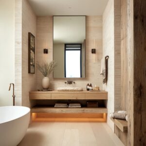
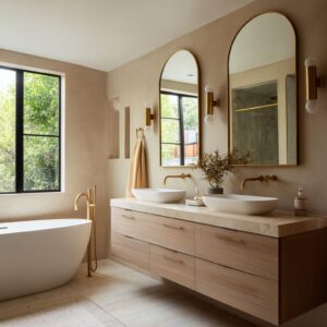
Modern bathroom interior design concepts lean into neutral-stone families such as taupe, greige, mushroom, cream, champagne, sand, warm white, and cocoa. And also, green-to-olive tones are popular, as well as pink-rose, clay or terracotta, and blue-gray.
Most modern bathroom tile ideas are based on light to light-mid values. In other words, the main direction is not bold saturation.
It is softened color, diluted color, and layered undertones. Modern bathroom tile color ideas today feel polished, easy to live with, and still full of character.

The new shift starts with undertone
Bathroom tile color is now chosen for its undertone before its main hue. Instead of a plain green, designers are using green softened with gray, beige, stone, or sage dust.
Instead of a plain pink, they are using blush mixed with clay, peach, mauve, or beige. Even the neutrals are no longer simple.
The better ones carry a second note inside them: olive in taupe, pearl in greige, blush in champagne cream, or a faint lilac cast in mushroom-toned tile.

This matters because it gives the room identity without making the color feel demanding. A bathroom can look neutral from the doorway, then show more personality in daylight, under warm mirror lighting, or where the tile catches a soft sheen.
That kind of layered color feels current because it adds depth without turning the room into a theme.

So, this is the first thing to keep in mind: if you want a tile color that feels fresh for a long time, do not start by asking whether you want blue, green, pink, or beige. Start by asking what hidden undertone you want the room to carry.

The best tile color ideas treat color as the room shell
Usually, the same tile family is carried through most of the wet zone: shower walls, tub surround, ledges, niches, benches, or built-in surfaces. The reason is simple.
Color feels far better in a bathroom when it behaves like architecture instead of decoration. A celadon tile that wraps the shower wall, bench, and bath ledge feels settled and intentional.
The same celadon used only in one narrow strip would feel like an afterthought. A dusty blush tile covering both the main wall and shower enclosure feels soft and integrated.
The same tone used only behind a mirror can feel too small to support the room.

This is one of the rules in the current wave of bathroom tile color design: the more visible the hue, the more continuous the surface should be. Once the tile color stretches over connected planes, it stops feeling like a little accent and starts defining the room itself.
That is why modern bathrooms with green, blush, clay, or blue-gray tile often feel complete. The color is not fighting for attention in one corner.
It is building the entire backdrop.

Finish changes how the color behaves
Finish is doing far more work than many realize. Reflective finishes can be glossed, satin-gloss, low polish, or soft sheen.
And the opposite ones are more mineral, matte, or stone-like surfaces. The more chromatic bathrooms, especially in pale green, blush, clay, and blue-gray, lean toward reflective finishes more often.
The neutral bathrooms lean more often toward matte or stone-like finishes.

This is not accidental. A reflective finish helps a muted color in three key ways.
First, it keeps pale chromatic hues from looking flat. A soft celadon or pale blush can lose life quickly if the surface is too dry.
Second, it creates small shifts in tone without needing a second color. One tile can look lighter, deeper, warmer, or cooler depending on the angle.
Third, it makes a softened hue feel fresh instead of dull.

That is why gloss in today’s bathrooms often feels refined instead of flashy. It is not there to make the room sparkle for its own sake.
It is there to keep a muted hue active and light-responsive. Neutral tile works differently.
A greige, mushroom, taupe, or warm sand tile can stay matte because it often gets its depth from stone clouding, soft surface movement, or larger tile scale. Those rooms do not need as much sheen to stay interesting.

Tile size is now a color tool
Tile format is not a secondary styling choice. It directly changes how color lands in the room.
Narrow vertical tile is especially helpful with softened green and blush tones. The vertical rhythm gives those colors more structure and makes them feel neater and more architectural.
It also adds a sense of height, which helps soft hues feel more deliberate.

Small square grids are very effective with greener tile families. The grid breaks the color into many units, so the hue feels segmented rather than like one broad block.
This keeps a visible green field from becoming visually heavy and adds many little shifts in reflection. Large-format stone-like tile works for pale mineral greens, taupes, warm grays, olive-taupes, and sand-based neutrals.
Fewer grout lines mean less visual interruption, so the color feels broader, smoother, and more settled. This is why large-format muted tile often gives a bathroom that spa-like, built-from-stone feeling.

Very fine mosaic formats work especially well with pale creams, buttercream tones, pearl whites, and other light tile families. Those tiny units create a luminous surface full of subtle variation, which keeps light colors from feeling empty.

Ribbed or lined tile has become one of the smartest ways to make beige work harder. The fine grooves create small bands of shadow, which add a second layer of tone without needing a stronger color.
That is why warm beige, linen, sand, and chalk-white bathrooms can look rich and layered even when the palette is very restrained.

In short, tile size and surface pattern are now part of color design. Small-scale tile brings energy and light play.
Large-scale tile brings stillness and breadth. Ribbing gives pale neutrals a more shaped look.

Bathroom designs use three support elements
A tile color can be beautiful on its own, but in a full bathroom it still needs support. There are different forms of white relief, such as a white tub interior, sink, countertop, or sanitary fixture in bathrooms.
They can include wood as a warmth stabilizer, and a dark anchor such as a black window frame, darker trim, dark hardware, a deep basin, or shadowed shelving. These three support elements work for tile palettes to feel balanced.

White relief gives the eye a reset. It adds hygiene clarity and keeps the room feeling crisp.
This is especially useful around colored tile, because the white makes the hue look cleaner and more intentional. Wood brings warmth in a softer, more natural way than strong brown tile would.
It helps green, blue-gray, taupe, and blush bathrooms feel grounded and livable rather than cold or powdery. Dark contour sharpens the edges.
A dark faucet, black frame, or deeper shelf line can define the room and stop everything from blending together.

So, the lesson is that color needs a relief structure. Without that structure, the room can blur.
With it, the same tile color feels richer and better composed.

The new neutral is not plain beige or plain gray
Some modern bathroom tile color ideas are technically neutral, yet they do not feel generic at all. That is because the strongest neutrals now carry a second undertone.

For example, tiles are not simple beige, simple gray, or simple white. They are greige with pearl warmth, mushroom beige with a gray-ivory drift, taupe with a faint mauve haze, olive-taupe with a khaki cast, smoky cocoa with an ash-stone coolness, or champagne cream with a soft blush-beige layer.

These dual-register neutrals are useful in bathroom design because they stay easy to pair with wood, white sanitary fixtures, pale stone counters, chrome, brushed metal, or dark trim. They also shift gently through the day.
A warm dove gray can seem more stone-like in daylight, then turn softer and slightly warmer under mirror lighting. That subtle shift gives the room life without needing a stronger color statement.
This is a safe route: choose a neutral tile that is not flat. The hidden undertone is what keeps it from feeling ordinary.

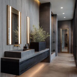
Darker tile can work, but it needs room to breathe
In darker or mid-dark ideas, more popular tones are like moss, smoky cocoa, and deeper terracotta. They worked well, but only under stricter conditions.
The darker bathroom designs tended to include a larger source of daylight, visible tonal variation in the tile, white or pale relief surfaces, warm wood or warm lighting, and very restrained decor. These features create release points so the room does not become visually dense.

This is an important distinction. Darker tile is not a bad idea.
It simply needs decompression zones: a pale floor, a white tub interior, a brighter counter, a clear glass partition, or stronger daylight. Without those pauses, the bathroom can start to feel compressed too quickly.
So if you love deep green, smoky brown, or richer clay tile, the answer is not to avoid it. The answer is to give it contrast in a softer, smarter way.

What bathroom tile color ideas feel current right now
The freshest directions are easy to spot.

Soft green families remain one of the most useful choices, especially when the hue is muted with gray, sage, beige, or stone undertones. They feel fresh, natural, and easy to pair with pale wood and white surfaces.

Coded neutrals are perhaps the most flexible option for a wide range of homes. Greige with pearl warmth, mushroom-beige, olive-taupe, and warm dove gray all offer depth without pushing the room too far in one direction.

Warm pale palettes are also growing stronger. Buttercream, shell, almond, champagne cream, warm pearl, and chalk-white tile can make a bathroom feel bright and welcoming without the sharper edge of stark white.

Soft clay and pale blush are still more niche, but they are working in a more mature way now. The key is to keep the tone dusty, not sugary, and to use clear structure in the tile layout.

The likely next step in this direction includes large-format matte rose-taupe, olive-greige ribbed tile, darker moss satin slabs, pale pistachio mineral tile, warm pearl vertical tile, and smoky mauve-greige in finer formats. All of these follow the same formula: muted hue, layered undertone, careful format choice, and a support system of white, wood, and sometimes dark contour.

The lesson behind today’s bathroom tile color ideas
The bathroom tile color ideas now are built on atmosphere, not volume. The tile does not need to shout.
It needs to hold the room together.

That is the shift behind bathroom designs. The color is softened.
The undertone carries the personality. The finish keeps the surface alive.
The tile size regulates how much movement the room has. White, wood, and dark accents keep the palette legible.
Once those parts work together, tile color starts doing what good bathroom design should do: it gives the whole room a stable mood, a clear identity, and a finished sense of balance.