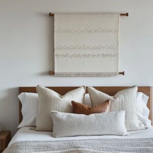
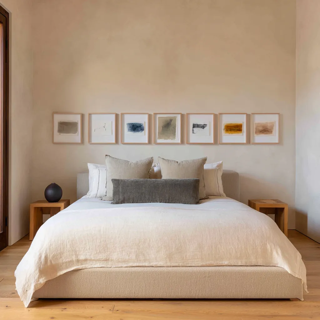
The bed is in place, the headboard has scale, the nightstands balance the sides, and artwork appears above the bed as the expected final step. But that last layer often gets handled too literally.
Frames are added to occupy the wall, and the room gains decoration without gaining structure. Everything is technically where it should be, yet the composition still feels thin.
The reason is that the wall above the headboard is not a simple backdrop. It sits directly over the largest soft element in the room, so anything placed there changes how the whole bedroom is read.
The bed brings weight, comfort, and visual depth. The above-the-bed decorating should bring something different: alignment, lift, surface tension, contour, or a more precise sense of order.
When both parts do their own job well, the room feels composed rather than merely furnished.
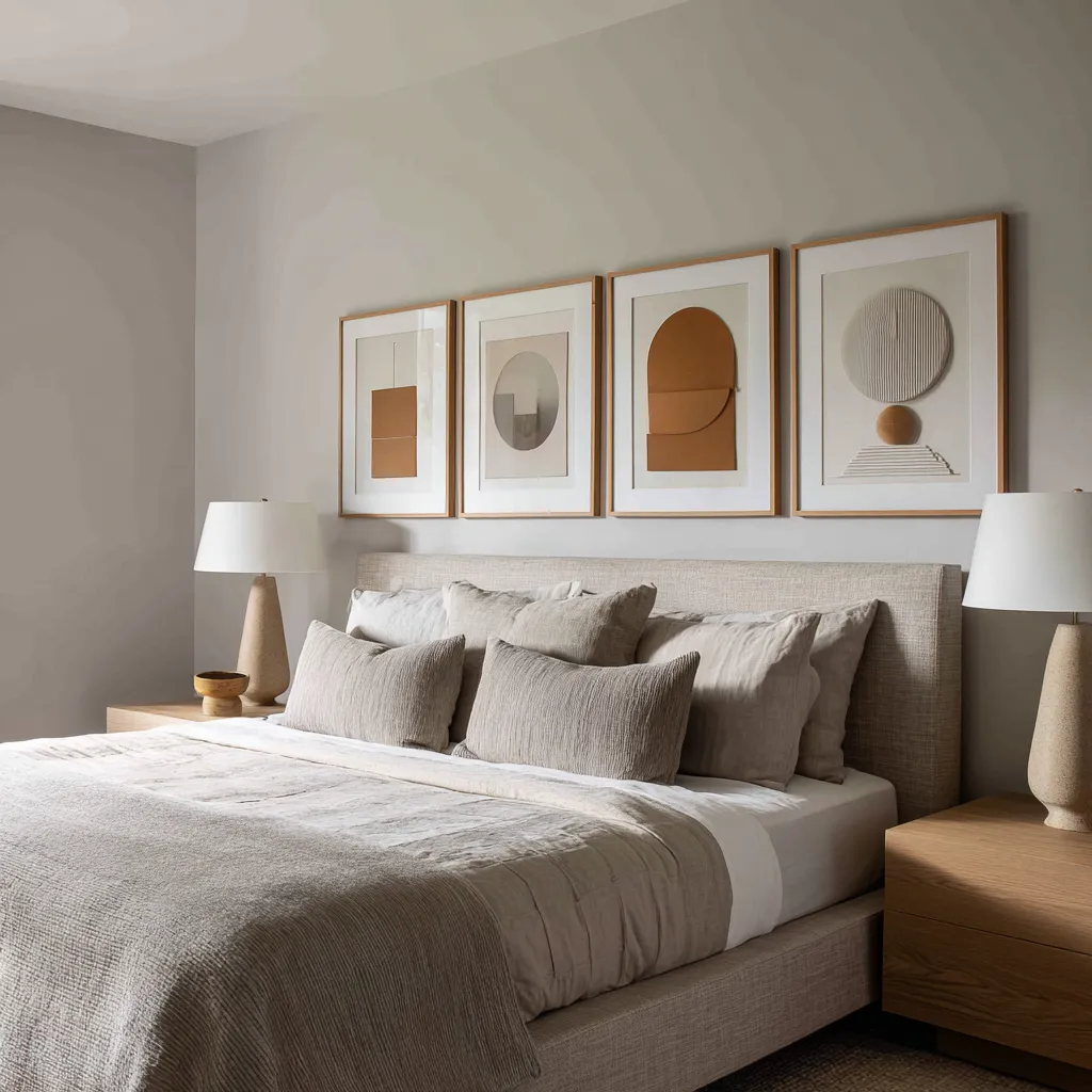
This is why above-bed arrangements should avoid obvious formulas. They do not need to rely on scale alone, quantity alone, or boldness alone.
Their success comes from balance. The upper wall gains enough definition to sharpen the room, but not so much that it steals attention from the bed.
The bed remains soft and welcoming, but not so visually inactive that the wall has to carry the entire composition by itself. That is the balance this part of the room has to solve.
Above the headboard, the design needs clarity and control. At bed level, it still needs softness and ease.
A strong bed wall comes from making those two conditions work together instead of letting one overpower the other.
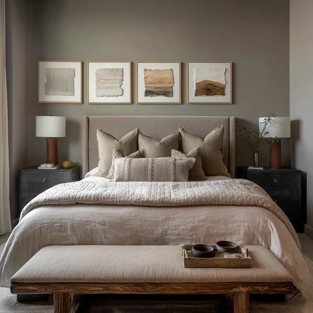
The bed wall works when the art behaves like upper architecture
One of the differences between a generic bedroom design and a highly resolved one lies in the role the art is asked to play. In a weaker compositions, framed works are used as decorative additions.
They are chosen for color, taste, or trend, then centered above the headboard because that seems like the proper place to hang them. The result can be attractive, but it often feels separate from the room shell.
The art belongs to itself. The bed belongs to itself.
The wall simply holds both.
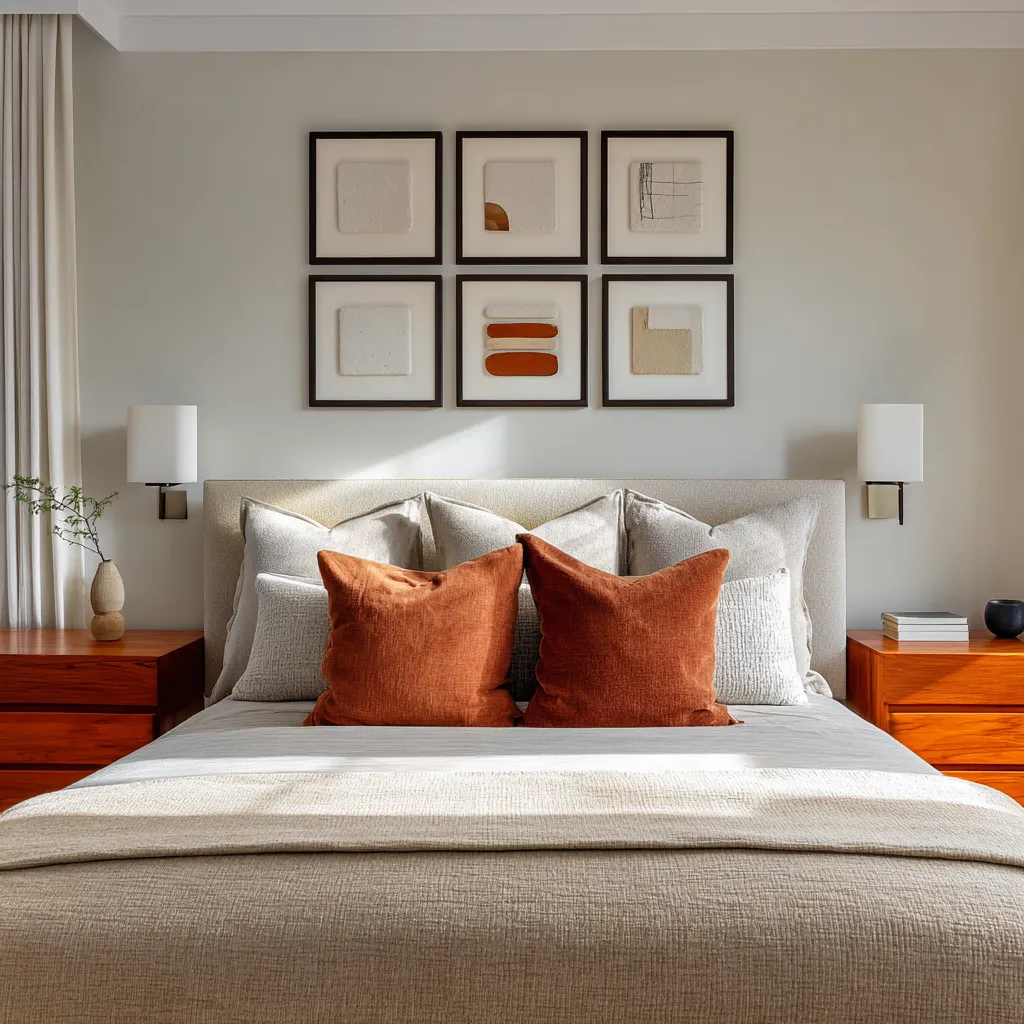
In stronger designs, the art takes on a structural role. It helps determine how wide the bed wall feels.
It influences whether the eye moves outward or upward. It helps regulate how much contrast is allowed in the room.
It can connect darker furniture to pale bedding, echo a pendant placement, answer a tray ceiling, extend a stone base, or turn a recessed niche into a composed wall field. In those bedrooms, the art is not solving emptiness.
It is organizing the elevation.
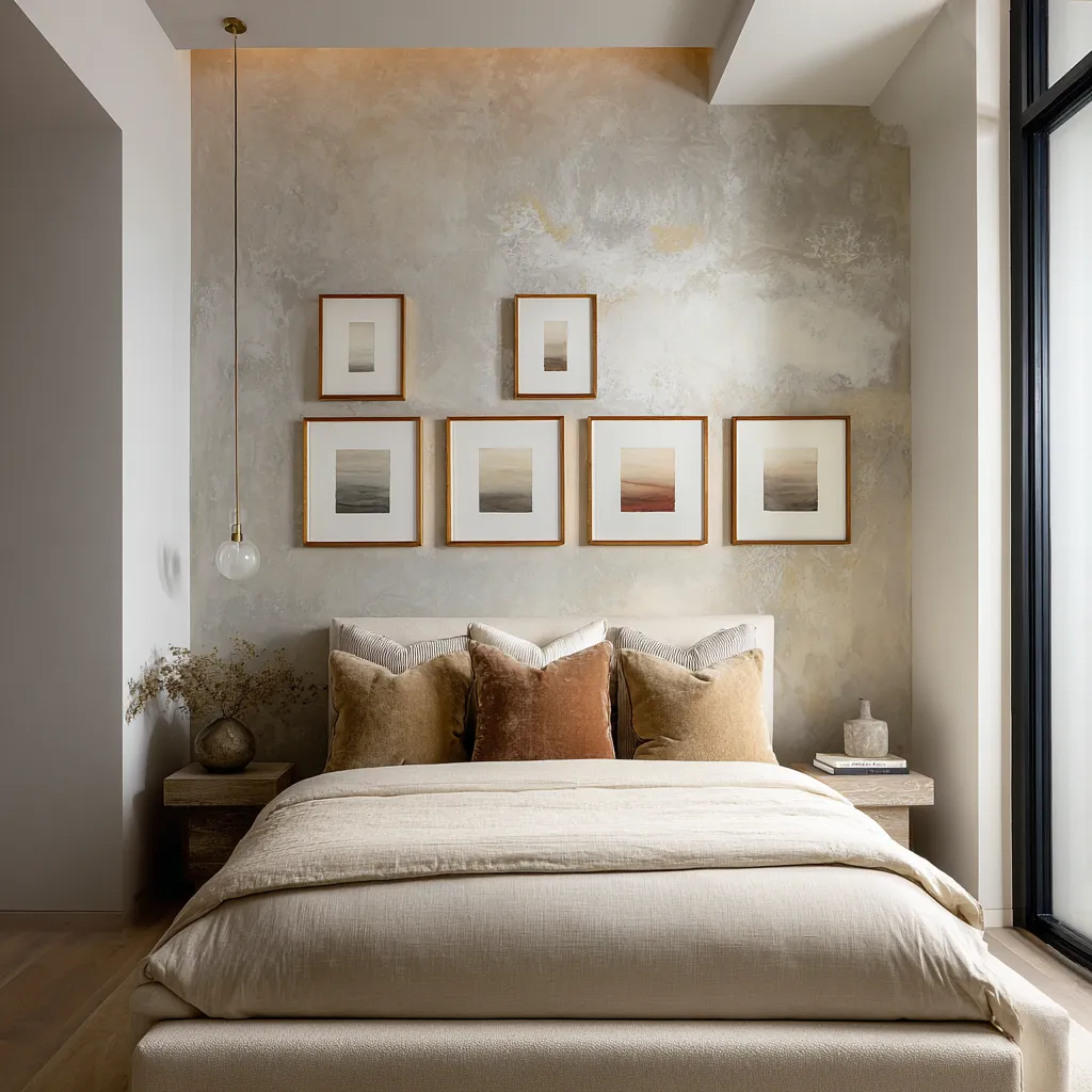
That shift changes everything. Once the wall art begins behaving like an upper architectural layer, the arrangement gains depth even before anyone notices the subject matter of the individual works.
This is why modern bed wall ideas often feel highly thought through even when the palette is narrow and the individual pieces are understated. Their intelligence sits in spacing, proportion, repetition, materiality, frame line, and relation to the furnishings below.
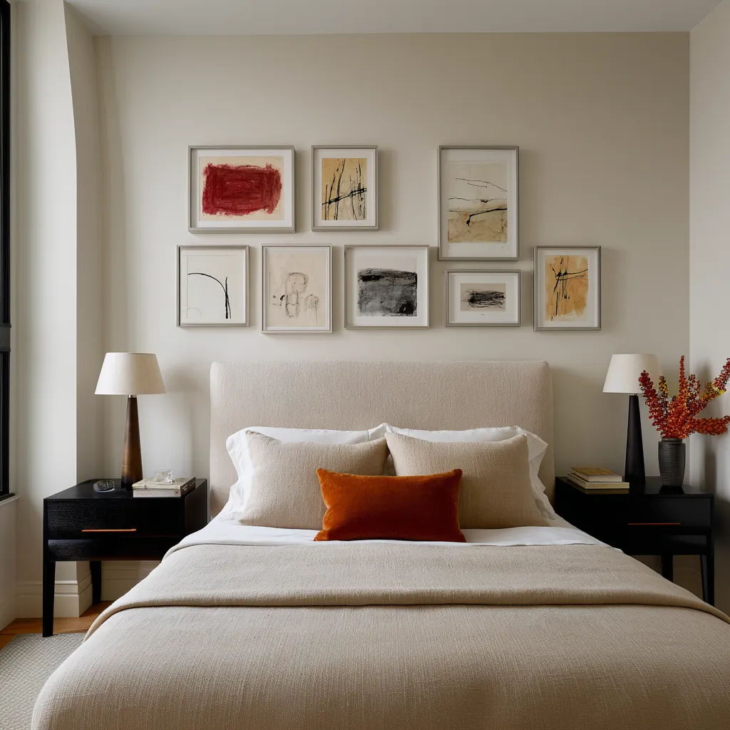
The lower half and the upper half should not do the same job
A common mistake in bedrooms is trying to make both the bed and the wall equally active. A heavily layered bed with pronounced pattern, many accent colors, and strong texture is then paired with an energetic grouping of artwork above.
The room becomes visually overcommitted. Nothing has enough silence around it.
A more refined approach lets the two halves of the composition carry different burdens. The lower zone usually benefits from breadth and softness.
The headboard can be wide, the pillows generous, the duvet ample, the textile contrast low to moderate. That lower mass needs to feel stable and settled.
It forms the visual base of the room.
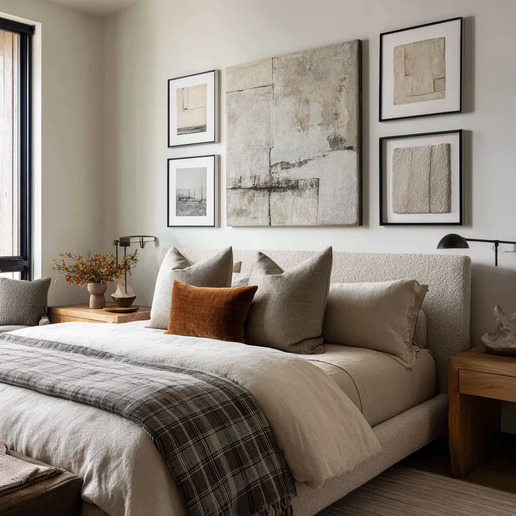
The upper zone can then carry what the bed does not. It can bring frame edges, interval, rhythm, asymmetry, tonal punctuation, relief, shadow, or a lighter register of structure.
This does not mean the wall should always be hard and the bed always soft. It means each zone should contribute something the other lacks.
That relationship explains why so many successful contemporary bedrooms use combinations such as these:
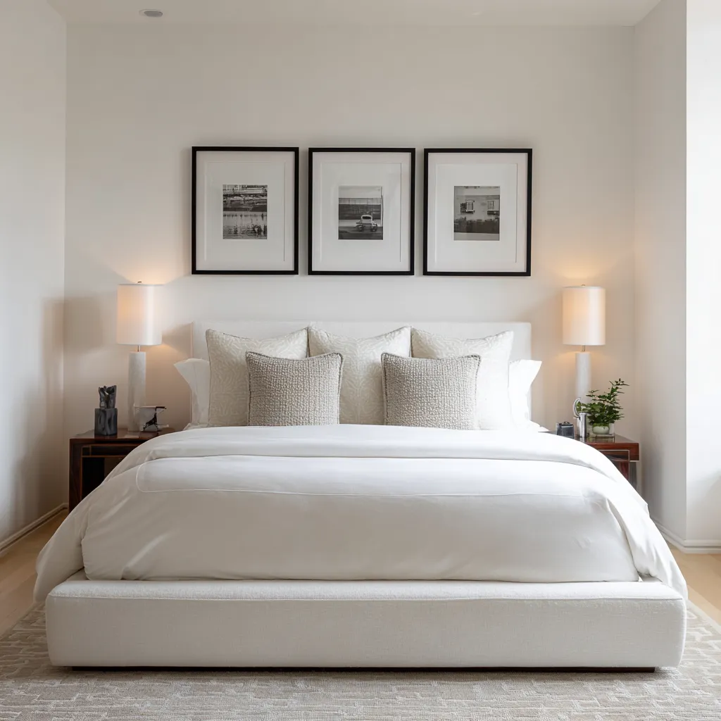
- a plain upholstered bed with a tight black-framed grid above it
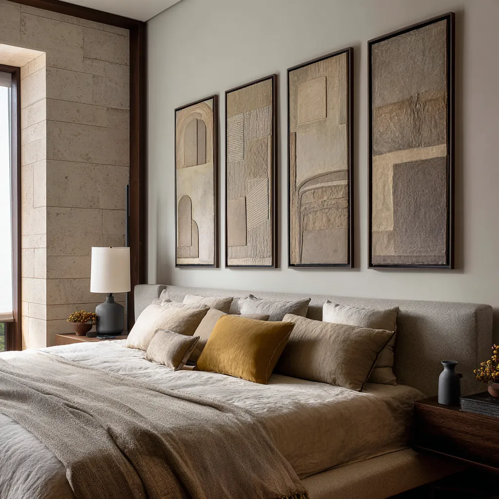
- a broad neutral headboard with tall vertical panels overhead
- monochrome bedding below sculptural relief works
- a quiet bed supporting a more collected, offset art grouping
- a wide pillow field answered by a long horizontal row of smaller framed works
The point is not literal matching. It is negotiated contrast.
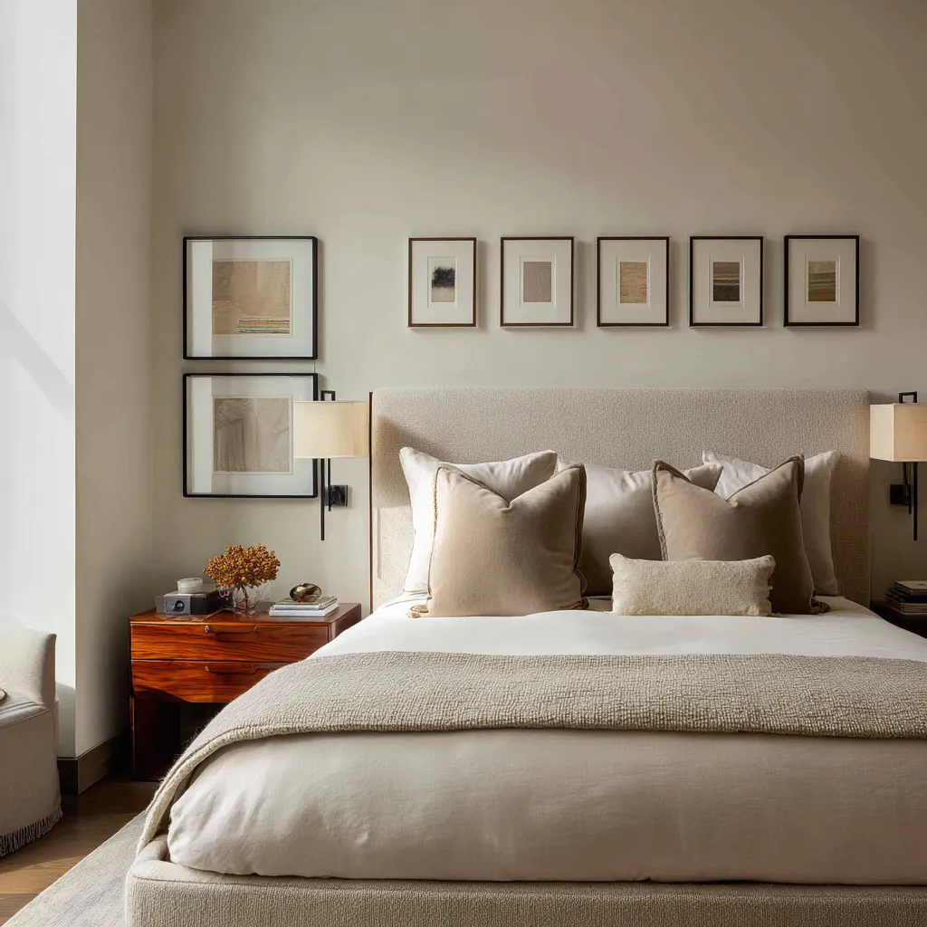
More frames do not automatically make the wall feel busy
There is a persistent assumption that a bedroom remains restful only if the decor above the bed is reduced to one, two, or three pieces. That assumption sounds sensible, but in practice it often oversimplifies the issue.
A bed wall can hold six, eight, ten, or even twelve framed works and still remain composed if the grouping has enough air. What usually creates visual fatigue is not quantity alone.
The more decisive problems are density, hard contrast, and poor internal spacing.
A multi-piece arrangement stays livable when three conditions are present.
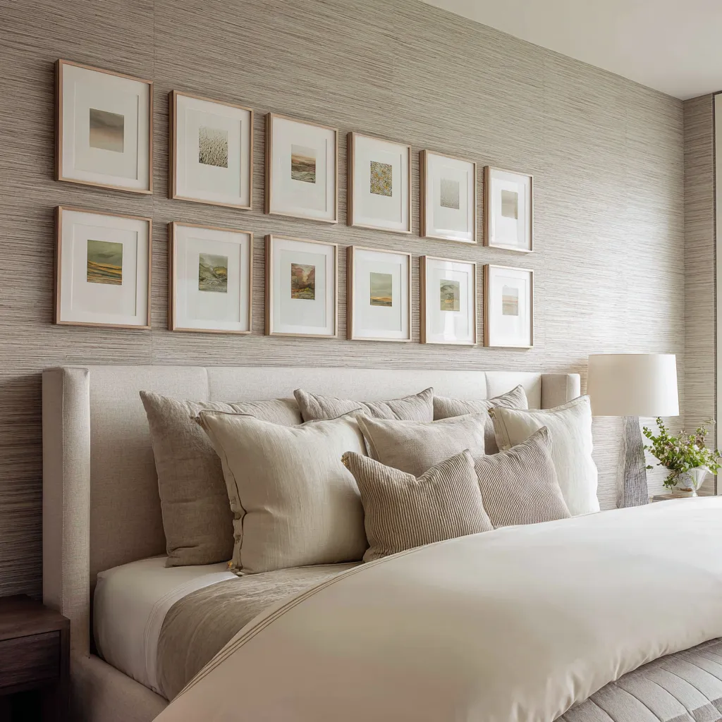
- First, the palette stays compressed. The works may vary, but they live inside a narrow family of chalk, sand, warm grey, stone, muted olive, pale blue-grey, rust, or ochre used in measured doses. A compressed palette keeps the grouping from fragmenting the room.
- Second, the framing language repeats with discipline. Similar frame finish, similar mat depth, similar internal proportion, or a consistent interval between works gives the eye a stable system to read. Repetition creates restfulness even when the number of pieces increases.
- Third, the grouping has breathing room. This breathing room may exist between the works, inside the frames through generous matting, or around the whole composition as preserved blank wall. Without that air, a many-piece wall hardens into chatter. With it, the same number of works can feel expansive and highly edited.
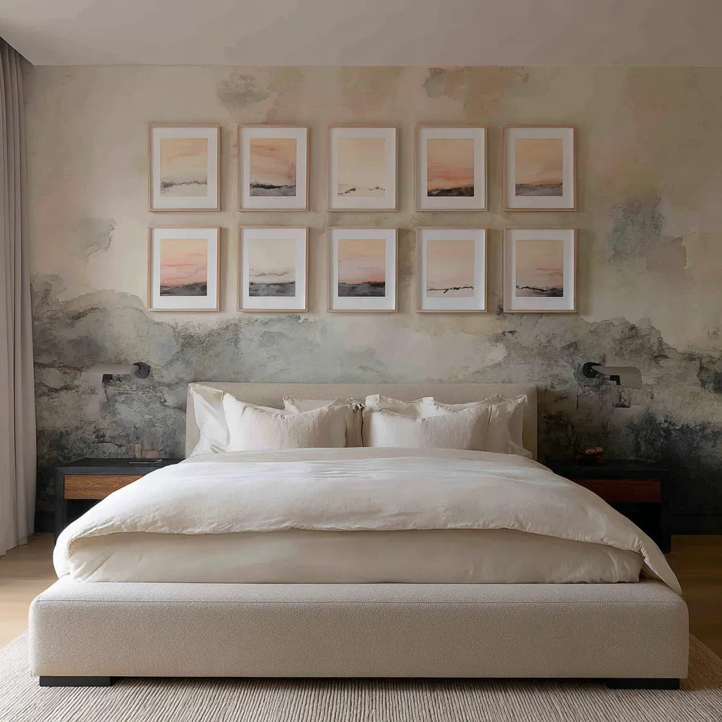
This is why some refined bedroom ideas use repeated small or medium works instead of one dominant artwork. A field of smaller pieces can spread attention laterally, making the bed wall feel wider and more articulated.
The eye moves across the wall in a measured way instead of striking one oversized focal object and stopping there.
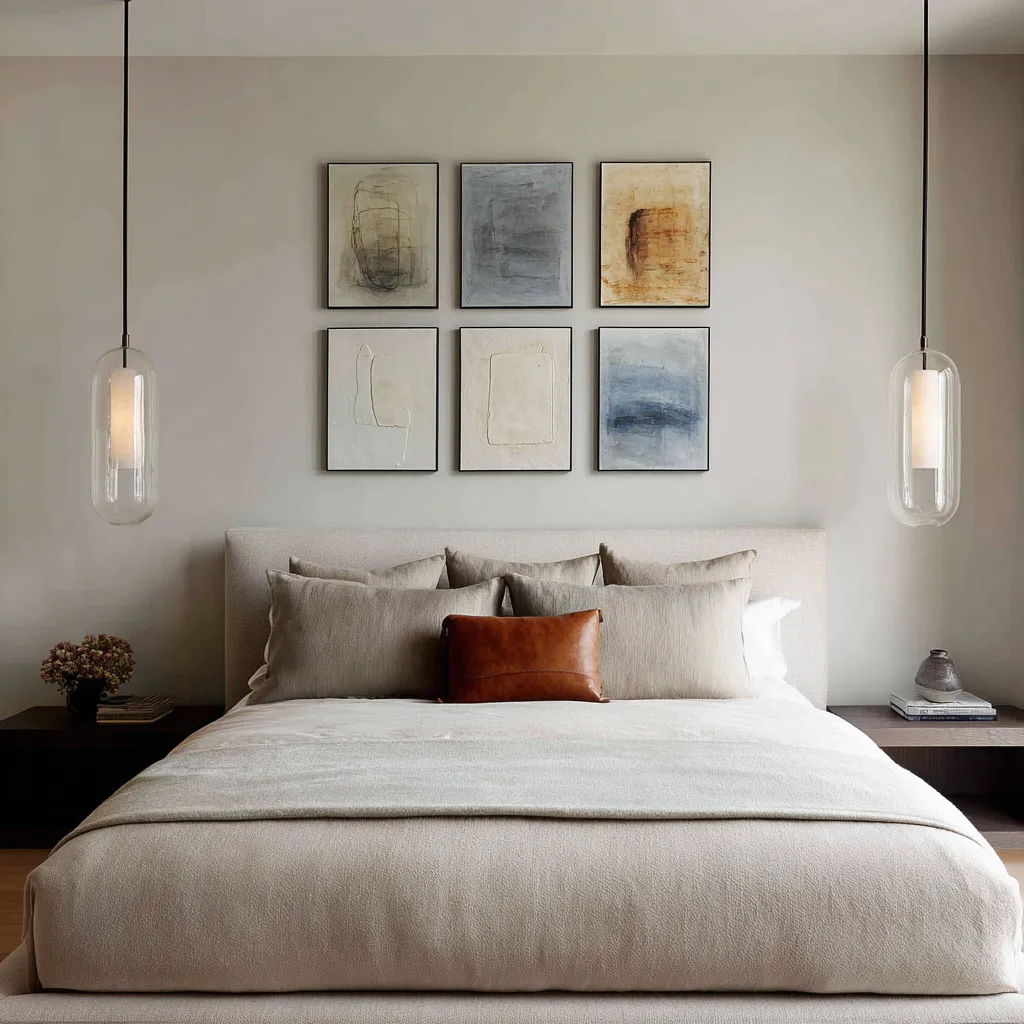
Matting is a tool on the wall
Matting is often discussed as a technical framing choice, but on a bed wall it does something much more substantial. It acts like visual cushioning.
A wide pale mat enlarges the apparent scale of a piece without increasing the intensity of the image itself. It gives the artwork room to sit inside its frame.
It also creates a layer of softness between the image and the room. This is especially valuable when the art is grouped in multiples or when the frames are dark.
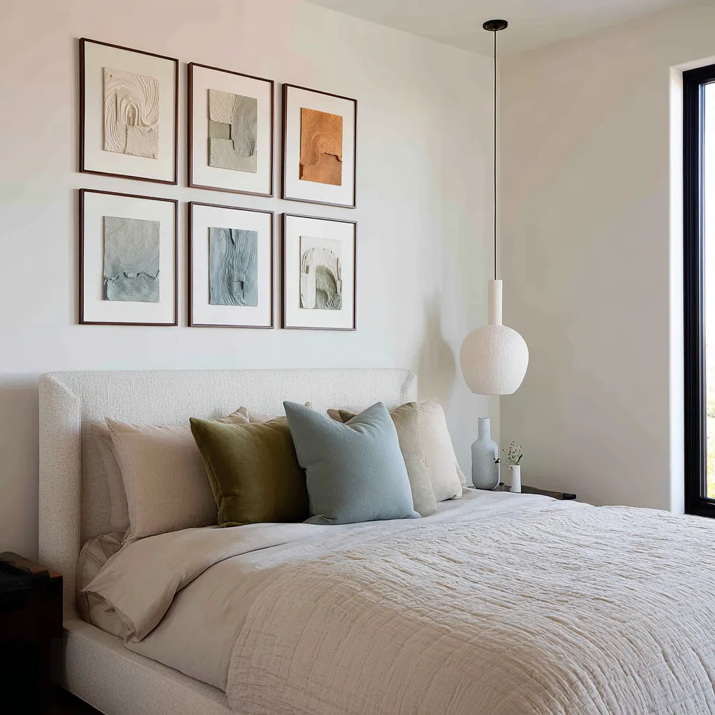
In bedrooms, matting serves several purposes at once. It softens the force of hard outlines.
It prevents neighboring works from crowding one another. It keeps pale wall colors from swallowing pale artworks.
It allows smaller works to participate in a larger composition without feeling timid. It can also separate delicate imagery from textured wallcoverings or mural-like backgrounds.
In practical terms, matting often makes the difference between a grid that feels sharp in a good way and a grid that feels overly insistent. A bedroom can tolerate a crisp black frame much more easily when that dark edge contains a broad pale field before the artwork begins.
The mat becomes a pause, and that pause matters.
Frame color changes the social character of the room
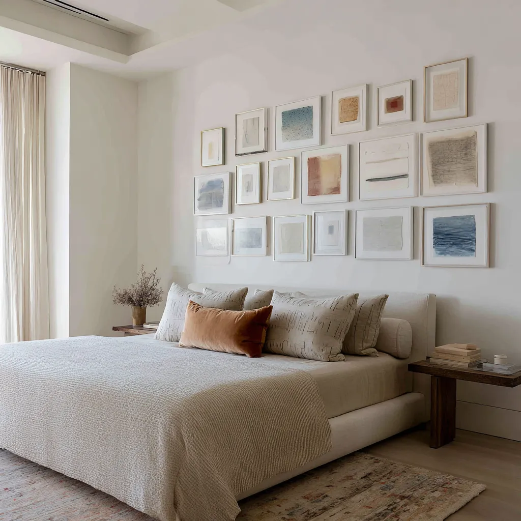
Frame line is one of the quickest mood shifters available on the bed wall. A pale wood frame, washed oak frame, or other lower-contrast border usually keeps the grouping airy and open.
It allows the art to merge more gently with the wall and tends to support rooms built from lighter woods, linen upholstery, pale plaster, and quiet tonal layering. This kind of frame often suits bedrooms where softness is the first priority and the goal is an upper wall with fine texture rather than assertive contour.
A dark frame changes the atmosphere immediately. It brings outline, sharper separation, and a more gallery-like sense of intent.
In pale bedrooms, it prevents artwork from dissolving into the wall. It also links the upper wall to window trim, black metal, darker nightstands, sconces, or other grounded notes around the room.
A dark frame can make an arrangement feel more current and more collected, but it also raises the level of edge. The room gains authority and loses some hush.
Neither option is automatically better. The right choice depends on what the room already has.
If the bedroom is built from low-contrast materials and needs a firmer skeleton, darker frames can provide that structure. If the room already has several strong outlines or darker architectural notes, pale frames may keep the wall from becoming too severe.
The important thing is recognizing that frame finish is not a minor detail. It changes the tone of the entire bed wall.
Texture often matters more than imagery
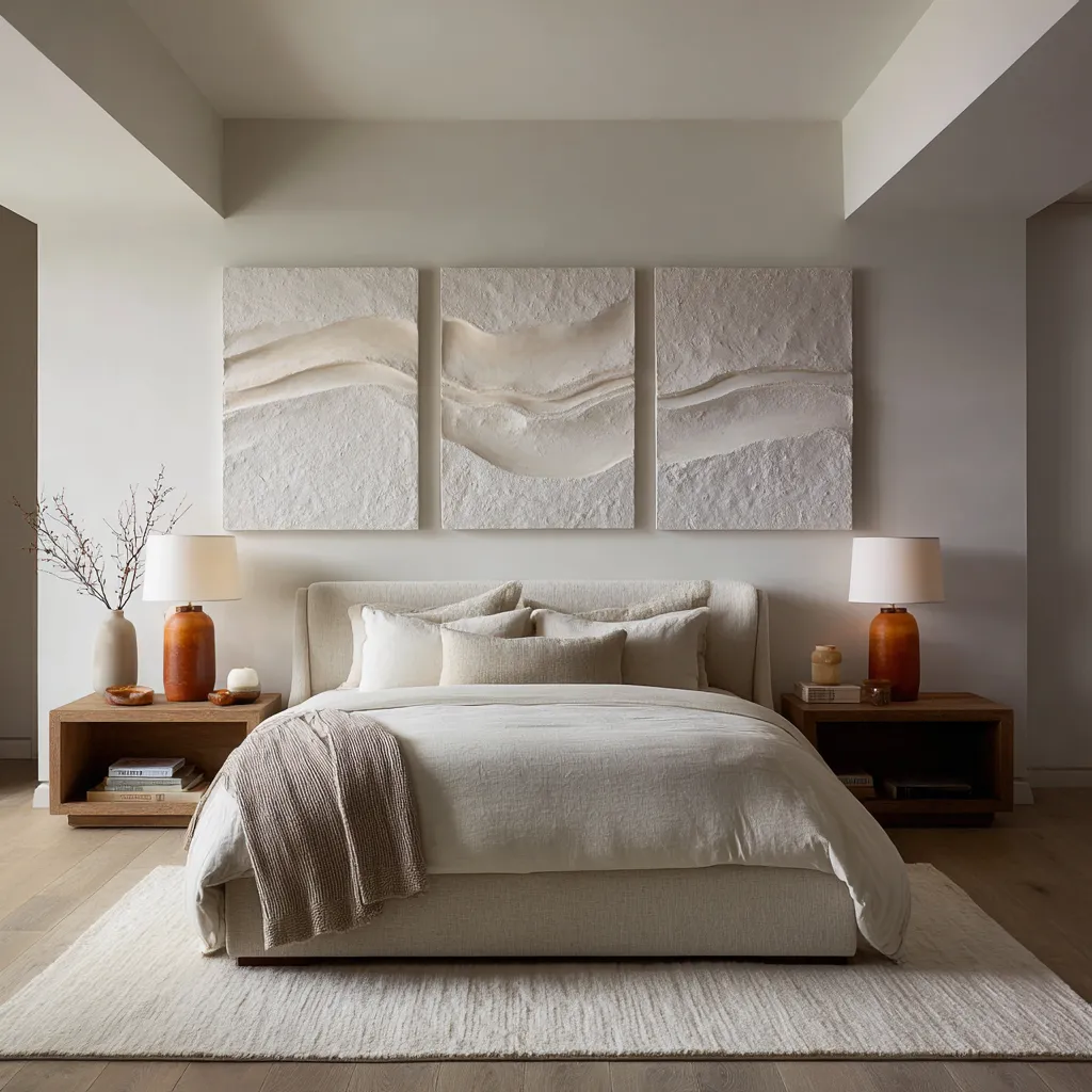
One of the directions in contemporary above-the-bed decor ideas is the move away from picture-led emphasis and toward material-led emphasis. Relief panels, plaster-like surfaces, scraped grounds, incised lines, ribbed compositions, thick matte abstraction, and low-relief geometric fields all do something very useful in bedrooms.
They create richness without turning the wall into a narrative scene. They give the eye surface, light change, and shallow shadow rather than descriptive content demanding attention.
That makes them unusually suited to the area above a bed. Bedrooms do not always benefit from art that insists on being read as subject matter.
The wall above the headboard often works better when it contributes depth, shape, and tactile tension instead of storyline. Relief-based pieces are especially strong because they operate almost like a second skin over the wall.
They borrow some of the authority of architecture while remaining framed works.
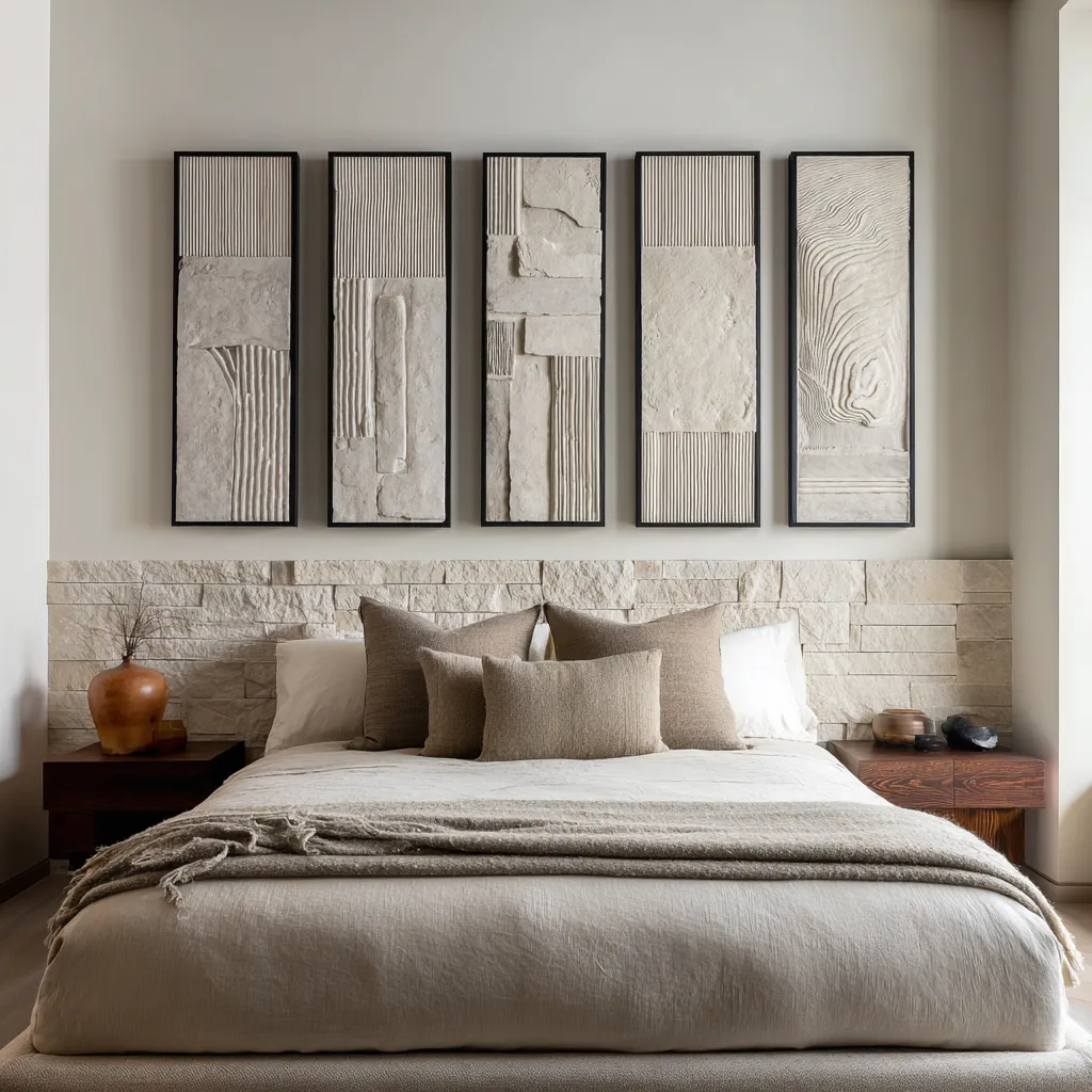
This is also why monochrome or near-monochrome compositions can feel deeply resolved rather than empty. If the surface has enough variation in ridges, scraped planes, or carved line, and if the room catches light well, the wall remains active without relying on color intensity.
The eye notices subtle movement across the surface. The art stays present because of shadow and form.
This type of work often pairs especially well with upholstered beds, boucle headboards, matte linens, and other soft tactile materials below. The room gains a dialogue between two texture families: one soft and fabric-based, one mineral and shaped.
Warm accents work as a vertical link, not as an all-over theme
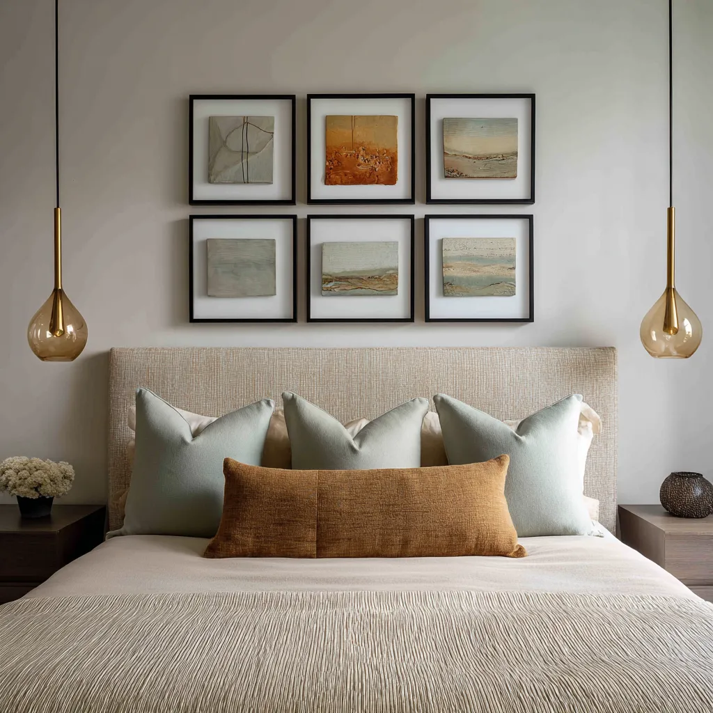
Many contemporary bed walls use a restrained neutral base with a small warm accent somewhere in the art. Rust, cognac, ochre, clay, amber, burnt umber, or terracotta often appear in this role.
What makes these warm notes effective is not their size. It is their placement.
Strong ideas rarely flood the entire bed wall with warmth. Instead, they place a warm accent in one artwork or one part of the grouping, then repeat it once at bed level and sometimes again near the floor or bedside furniture.
That repetition creates a vertical connection from upper wall to pillow field to wood or metal below.
This kind of warm note behaves like a stitch. It ties zones together.
It prevents cool-neutral rooms from feeling sterile, yet it does not repaint the whole palette. A single cognac lumbar pillow can suddenly make a restrained art grouping feel connected to the bed.
A clay note in a painting can speak to a walnut nightstand. A warm brown frame can relate to brass details and a single tawny textile accent.
Because the note is concentrated rather than spread everywhere, it feels deliberate. That concentration is one reason these bedrooms hold their balance so well.
Warmth enters with purpose, not as decoration piled on.
Asymmetry can look highly sophisticated, but only with strong stabilizers below
A symmetrical arrangement above a centered bed is the obvious move because it aligns naturally with the architecture of the furniture. Symmetry offers order quickly.
Yet many of the modern bed wall ideas use some degree of offset: one large anchor with smaller companions, a stepped cluster, a stacked pair beside a horizontal run, or a grouping that is centered in a loose rather than perfectly mirrored way. Asymmetry brings individuality.
It can make the room feel collected rather than formulaic. It can also prevent the bed wall from becoming ceremonially rigid.
But asymmetry is only persuasive when the room gives it a stable base.
The bed below usually needs to be broad, calm, and tonally reduced. The bedding cannot fight for equal attention.
The palette must stay edited. And the wall still needs an anchor, even if the full grouping is not formally symmetrical.
That anchor may be a large central work, a strong horizontal row, one dense zone of stacked pieces, or simply the sheer steadiness of the upholstered headboard beneath. Without those stabilizers, asymmetry above a bed can look accidental.
With them, it can look deeply considered. The eye accepts the offset because the lower half of the room holds the composition in place.
In that sense, asymmetry on a bed wall is not casual freedom. It is controlled imbalance resting on upholstered stability.
Architecture should participate
Some of the persuasive above-the-bed arrangement ideas feel as though the room expected them. This happens when the art is tied to the architecture instead of floating independently against a generic painted wall.
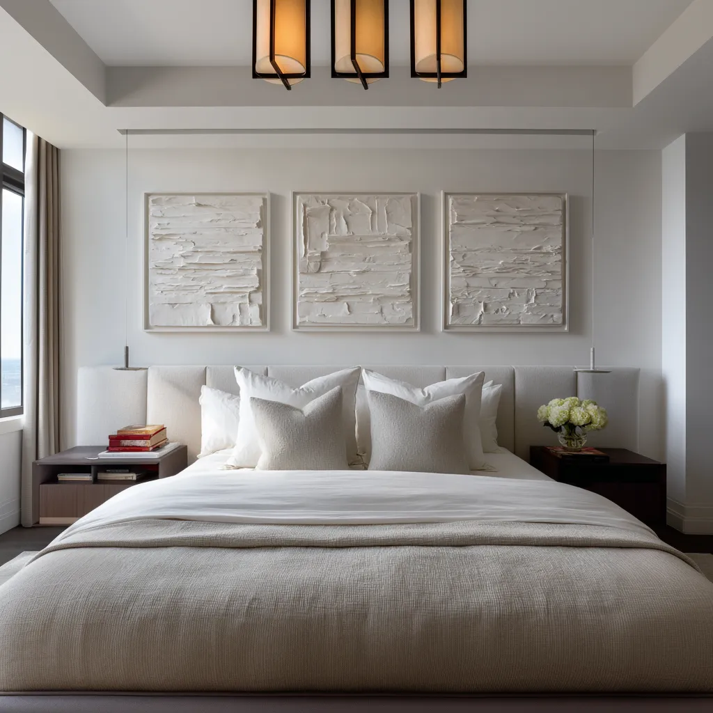
A recessed niche may set the width of the grouping. Pendants can flank a framed block and turn the whole wall into a three-part elevation.
A tray ceiling can establish the central field the art occupies. A mural-like surface can become the atmospheric ground behind a row of smaller pieces.
Stone cladding can continue upward through relief panels that echo its material logic. A vaulted ceiling can be steadied by a crisp grid beneath its peak.
When art participates in these conditions, the room gains a sense of inevitability. The arrangement stops feeling like furnishing and begins to feel composed with the shell.
That is often what separates a high-level bed wall from one that looks merely decorated. The art should not ignore architecture.
It should either answer it, extend it, or stabilize it.
Four strong contemporary directions for above-the-bed framed art
Although every room has its own nuances, contemporary above-the-bed framed art often falls into four broad design directions. Understanding these families makes it easier to choose an approach that suits the room instead of copying a formula that belongs elsewhere.
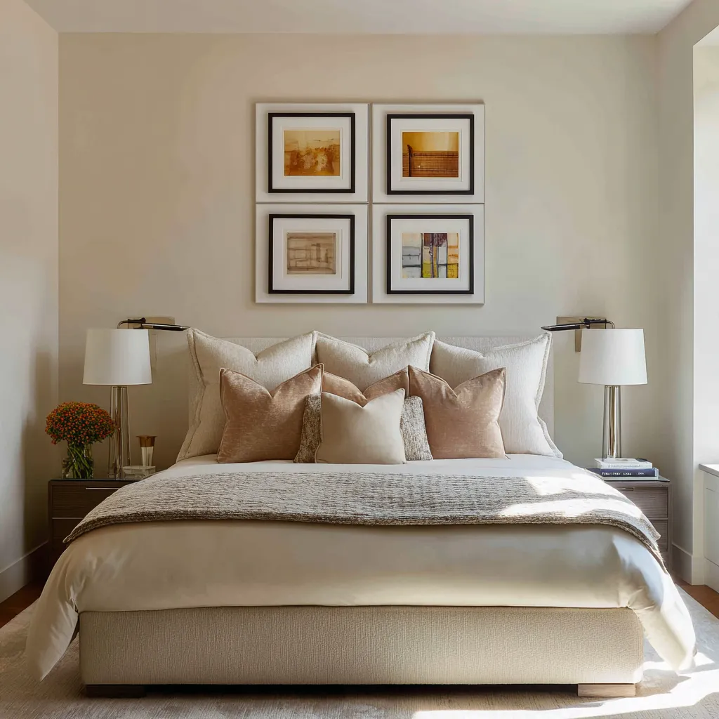
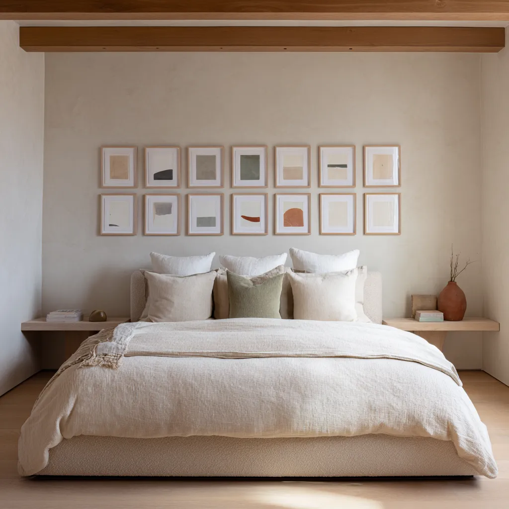
1) Pale matted spread
This direction uses many smaller or medium works, often in disciplined rows or grids, with light frames, generous mats, and a compressed palette. The result is soft, airy, and collected.
The wall gains fine visual grain without turning hard. This approach works well in bedrooms with pale upholstered headboards, lower-contrast materials, and a desire for breadth rather than sharpness.
It is especially good when the goal is to make the bed wall feel wider and more finished while keeping the atmosphere gentle. The danger is making the grouping too small or too contrast-heavy.
The success of this type depends on interval, white space, and tonal editing.
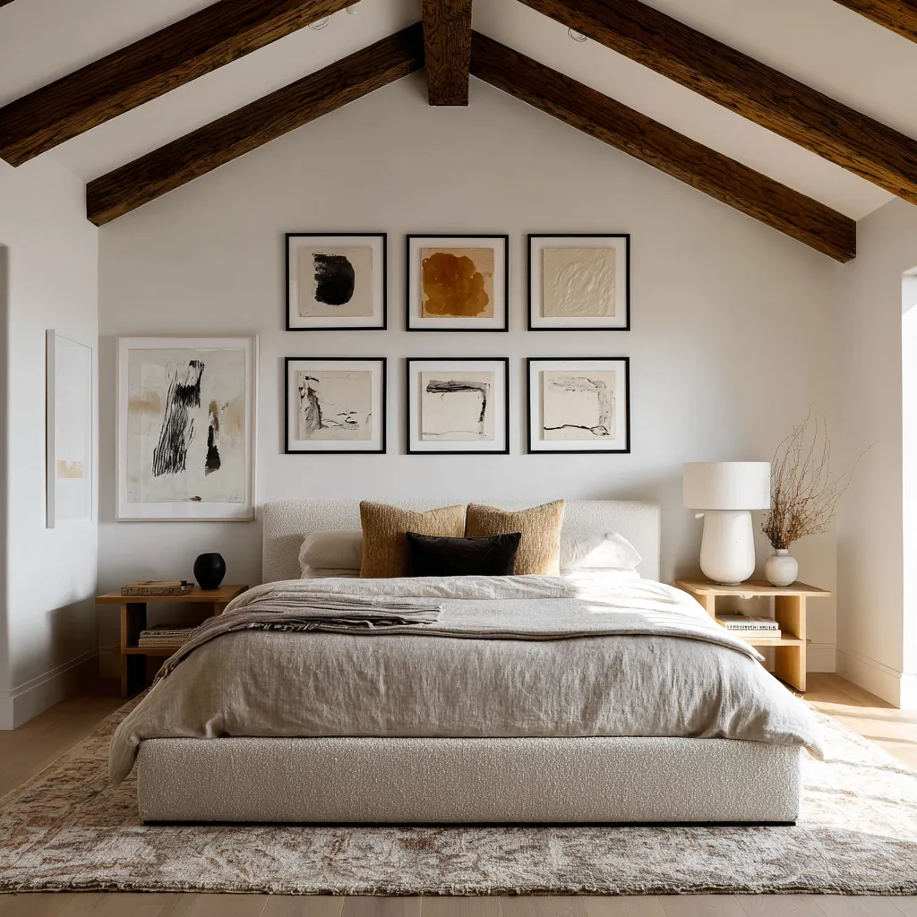
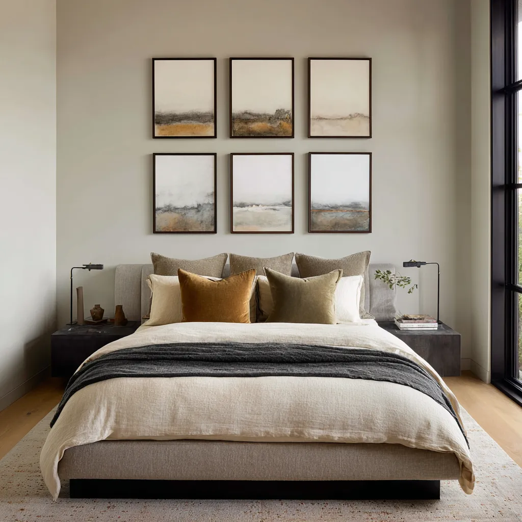
2) Dark-edged gallery block
Here the room remains mostly neutral, but the art introduces stronger outline through black or very dark frames. The works may be arranged as a strict grid, a disciplined row, or a tall panel sequence.
This direction gives the bedroom a more urban, gallery-minded upper edge. It suits rooms with cleaner architecture, darker furniture notes, black trim, pendants, or a desire for a firmer skeletal line above the bed.
One repeated warm note often helps keep the arrangement from feeling cold. The key is restraint below.
If the bed is already busy, dark-framed wall art may push the whole room too far.
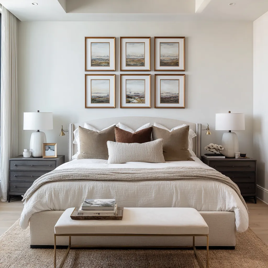
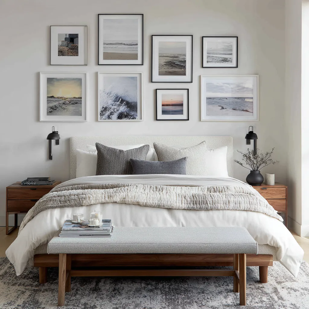
3) Asymmetrical collected cluster
This direction brings the individuality. Instead of a standard centered trio or strict grid, the wall uses a larger anchor and smaller companions, or a stepped arrangement with distributed visual weight.
It often feels more personal and less template-driven. It works when the bed is broad and quiet, the palette is tightly held, and one major compositional anchor keeps the grouping legible.
This route can produce a very rich wall with strong character, but it has the least tolerance for extra noise. Overstyled bedding, too many accessories, or uncontrolled color can quickly weaken it.
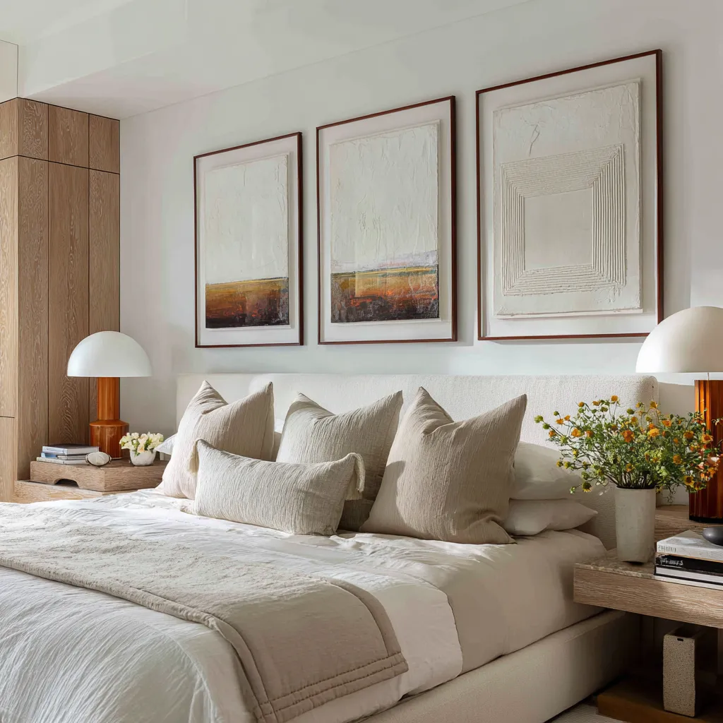
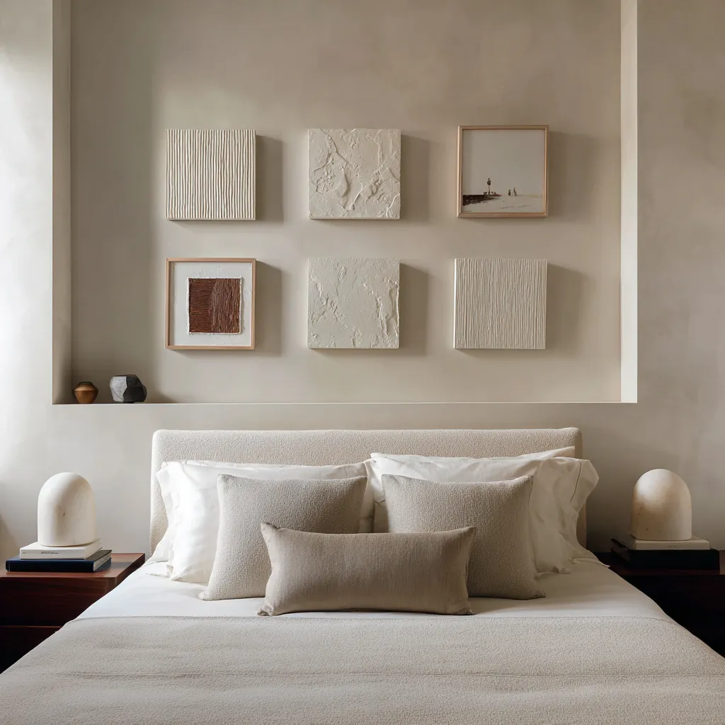
4) Monochrome sculptural field
This is one of the choices for a bedroom that wants serenity without flatness. The wall uses relief works, carved surfaces, or monochrome panels where texture, shadow, and shape carry the composition.
The palette may remain within white, cream, stone, and pale sand, yet the room still feels resolved because surface depth replaces color drama. This direction suits bedrooms aiming for a highly composed, architecture-led atmosphere.
It pairs especially well with textured upholstery, matte textiles, plaster walls, and restrained lighting. Its success depends on light, material quality, and proportion.
If the relief is weak or the surfaces too flat, the wall may lose force. When done well, it can be one of the persuasive routes available.
The bed walls rarely imitate the bed directly
A refined above-the-bed arrangement usually echoes the bed by analogy rather than duplication. The artwork may repeat the bedding’s horizon logic without copying its colors exactly.
A dark frame may answer a dark nightstand or slim metal sconce instead of repeating the duvet tone. A pale relief surface may relate to boucle or nubby upholstery through texture family rather than image subject.
A long horizontal row may answer the width of the headboard while the actual artworks remain quite different from the textiles below. This is an important distinction.
Literal matching often flattens a room. It makes the relationship too obvious and too thin.
Analogy gives the room depth. It allows the wall and the bed to belong together while still contributing different kinds of visual information.
That is often what gives contemporary rooms their sense of refinement. The connection is present, but it is carried through proportion, material, line, tonal weight, and measured repetition rather than by simple color copying.
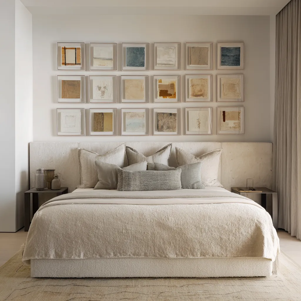
What makes a bed wall feel premium rather than decorated
The difference often lies in whether the arrangement seems to have been added to the room or absorbed into it. A premium-looking wall usually has these qualities:
- the grouping feels scaled to the headboard and wall field
- the spacing is precise enough to create rhythm
- the frames belong to the room’s material language
- the art repeats at least one note from below, whether tone, edge, texture, or warmth
- the bed styling stays edited enough to let the wall breathe
- blank wall is preserved where it helps the composition
- the art answers architecture or at least respects it
A weaker wall often fails in one of the opposite ways:
- the grouping is too small for the bed width
- the pieces are individually attractive but collectively unrelated
- the frame finish fights the room materials
- the wall is crowded, yet the bed is also overlayered
- the arrangement uses color more aggressively than the room can support
- the wall art floats without speaking to lamps, nightstands, trim, or ceiling geometry
In other words, the premium effect usually comes from relation, not from art price or trend.
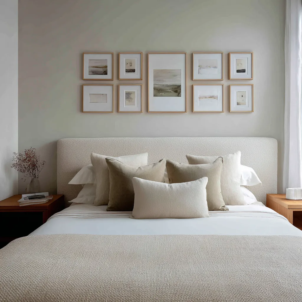
Final thought
The wall above a bed should not be treated as a leftover rectangle waiting to be filled. It is one of the sensitive compositional areas in the bedroom because it sits directly over the room’s softest and most important mass.
Whatever happens there changes how the whole room settles. Contemporary framed-art arrangements understand this.
They give the wall structure without making the bed feel secondary. They add curation without nervousness, shape without heaviness, and currentness without visual strain.
Whether they use a pale matted spread, a dark-edged gallery block, an offset collected cluster, or a monochrome relief field, they all share one deeper discipline.
They make the upper wall do what the bed cannot do on its own. And they make the bed steady enough to support that added articulation.
That is why some bedrooms look accessorized, while others look complete.