

A refined coastal bedroom should not begin with the ocean as an image. It begins with exposure.
Not exposure in the decorative sense of shells, boats, stripes, glass floats, or obvious blue-and-white coding. Exposure in the material sense.
Wood that looks dried by salt air. Plaster that feels slightly hazed rather than freshly painted.
Linen that appears sun-softened instead of crisply staged. A room that seems to have been touched by light, wind, dryness, and time before any accessory was added.
That shift in thinking changes everything.
Bedroom Decorating Ideas that call themselves coastal fail because they try to communicate the shoreline through accumulation. A little rope, a little driftwood, a little nautical art, a few pale blues, a few woven baskets, perhaps a paddle or surfboard above the bed, then more sand tones for safety.
The styling becomes legible very quickly, but it also becomes shallow very quickly. It announces the theme before it builds atmosphere.
It explains the coast before it creates a room.

The richer version of coastal decorating works the other way around. It reduces the number of signals and increases the quality of each one.
It allows one object, one surface treatment, one horizontal artwork, one weathered timber piece, one alcove, or one widened headboard wall to hold the shoreline reference while everything else supports it. The room does not keep repeating coast.
It lets one well-judged move carry the memory of coast, then lets material, light, spacing, and proportion deepen that memory. That is where sculptural restraint enters.
A coastal bedroom with sculptural restraint is not sparse for its own sake. It is selective so the room can hold tension between softness and age, between air and shelter, between polished composition and material roughness.
It lets the wall breathe. It gives a single gesture enough space to matter.
It avoids over-explaining. And because it avoids over-explaining, the room feels more adult, more settled, and much more design-led.

The coastal move is compression
One of the decorating ideas behind elevated coastal bedrooms is that the shoreline reference should be compressed rather than scattered. This is not a style that gains force from repetition.
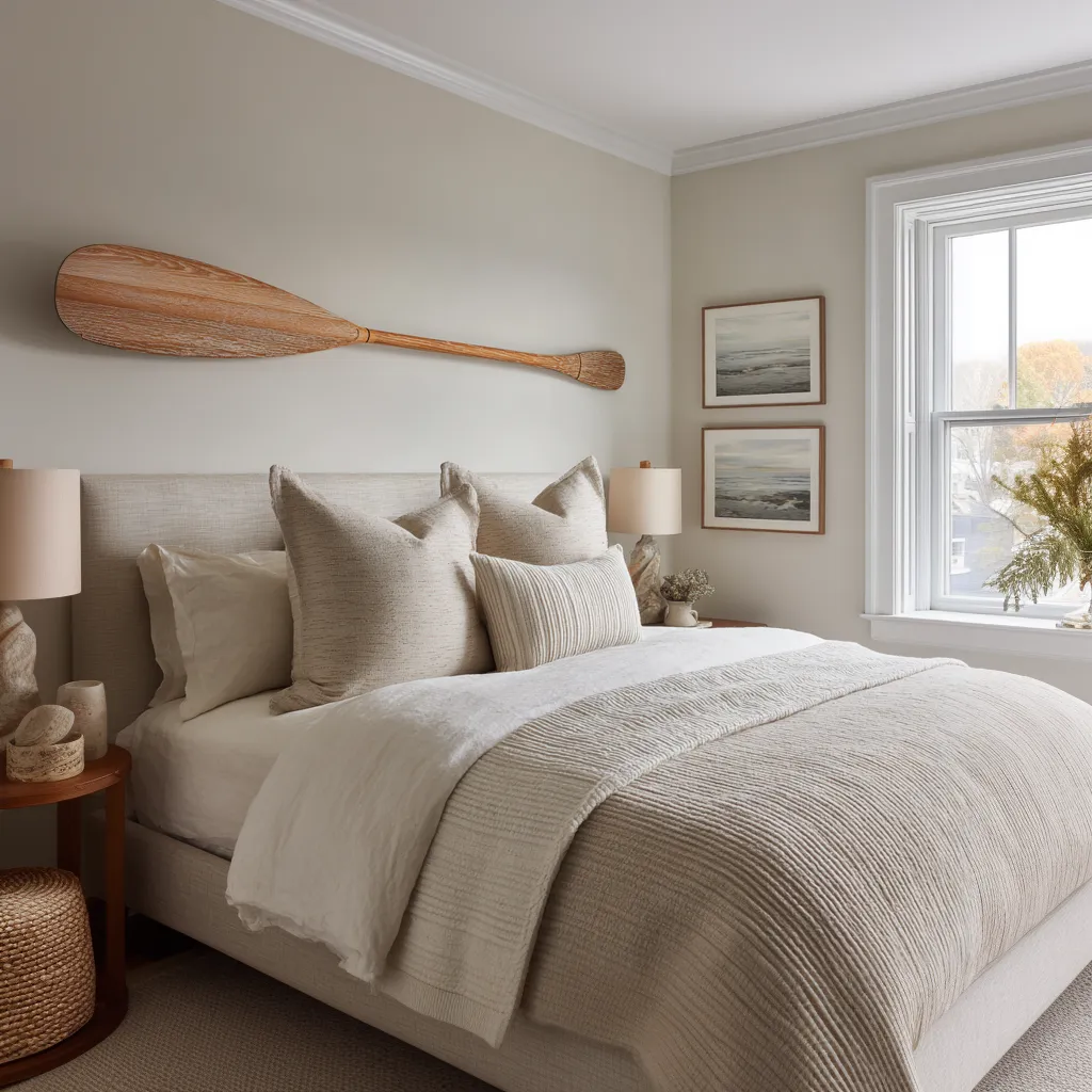
It gains force from concentration. A paddle mounted over a bed can work beautifully, but only if it is treated as the main sentence on the wall rather than one line in a longer paragraph of coastal objects.
A weathered pole can work. A suspended textile panel with horizon-like bands can work.
A long floating shelf with two vessels and one pale atmospheric artwork can work. A surfboard-like form can work too, though it asks more of the rest of the room.
In each case, the reference becomes stronger when it stands nearly alone.

Refined coastal bedrooms appear simpler than they really are. Their simplicity is not emptiness.
It is compression. The room takes a large idea and narrows it into one focused carrier.
That carrier may hold different kinds of memory. It may hold object memory, like an oar, paddle, or rope fragment.
It may hold material memory, like weathered timber or chalky plaster. It may hold landscape memory, like a fog-softened horizon artwork or a washed panel that suggests sea and sky without naming them.
It may hold structural memory, like an alcove that houses the bed the way a berth-like recess houses a place to rest. It may even hold time memory, where softened edges, small mismatches, and patina suggest years of use rather than recent decoration.
The room does not need all of these at once. In fact, it becomes better when it does not try to activate every kind of memory equally.
One should lead. One or two may support.
The rest should fall back.

The wall above the bed should act like composition, not storage
The bed wall is where many coastal bedrooms lose authority. It is easy to treat that wall as a place to pin the theme.
But the rooms with greater polish treat it as a compositional field. That means the object or artwork above the bed has to do more than communicate an idea.
It has to shape the wall.
- A mounted oar is not only an oar. It is a long horizontal line.
- A shelf is not only a shelf. It is a band of visual weight cutting across a pale field.
- A washed panel is not only art. It is atmosphere placed into architectural proportion.
- An alcove is not only a built feature. It is a large enclosing shape that changes how the bed sits in the room.
This way of thinking moves coastal decorating away from motif and closer to form. That matters because shoreline references are easier to live with when they perform a formal job first.
A paddle becomes easier to accept when it widens the room visually and anchors the wall composition. A surfboard becomes easier to accept when it reads more like a long curved plane than a sports relic.
A timber fragment becomes more compelling when it crosses a blank wall like a measured line rather than sitting there as found-object nostalgia.

The refined room translates the coastal cue into one of three formal roles.
- It may act as a line. A line can be a pole, paddle, shelf, timber member, or narrow artwork.
- It may act as a band. A band can be a headboard extension, long marsh painting, widened panel, or dark wood datum behind the bed.
- It may act as a field. A field can be a plaster haze, grasscloth backdrop, oak surround, alcove, or broad rectangular relief piece.
This is what makes coastal bedroom designs feel highly finished while others feel themed. The room that understands line, band, and field turns its references into structure.
The room that ignores these roles often ends up with decorative signs of coast floating on top of an otherwise generic interior.

Empty wall is not leftover space
Open wall around the main gesture is often mistaken for minimalism in the thin sense, as though the room stopped before it was finished. In better coastal bedrooms, that open wall is doing architectural work.
It gives the object authority. It isolates the gesture so it can be read clearly.
It stops the bed wall from turning illustrative. It allows light to move across plaster, paint, or wallcovering without interruption.
It turns the object into an event rather than background clutter. This is especially important with marine artifacts.
A paddle on a crowded wall often feels like decoration. A paddle on a broad, still field of pale plaster can feel severe, atmospheric, and surprisingly sophisticated.
The difference is not the object itself. The difference is the amount of breathing room around it.
This is why a coastal bedroom with restraint often feels larger than its square footage would suggest. It is not simply pale in color.
It is spacious in attention. The eye is not constantly being asked to decode many signals.
It is allowed to rest on one major note and then absorb the rest of the room through surface and light. There is also a psychological effect here.
Open wall creates distance, and distance is part of shoreline feeling. A coast is not only a collection of objects.
It is openness, horizon, spread, and the sense that one thing sits against a much larger field. A bedroom can borrow that sensation even if the room itself is not large, simply by refusing to overfill the wall.

Weathering carries coastal identity better than color
A great deal of dated coastal design still leans too hard on color to communicate location. Soft blue, pale aqua, white trim, maybe some navy striping.
Those combinations are familiar, but they often flatten the style because they communicate seaside life too quickly and too literally.
- The more refined route is usually weathering.
- Wood that looks sun-dried rather than stained to look dramatic.
- Fabric that looks bleached rather than pristine.
- Walls that feel chalky, lime-washed, fogged, or slightly powdery rather than bright and glossy.
- Artwork that suggests haze, low horizon, wet sand, distant water, clay shoreline, or weathered sky rather than postcard imagery.
In such bedroom decorating ideas, coastal feeling comes from exposure rather than palette coding. The coast is remembered through erosion, patina, softened contrast, and surfaces that seem touched by air and time.

This makes the room richer because weathering is materially believable. Blue can be applied anywhere.
Weathering suggests an environment. It suggests the room belongs to a place with light, salt, dryness, wind, or use-history.
That sense of belonging is far more convincing than decorative color signals alone. It also allows the palette to become more nuanced.
Sand, oat, fog, pale clay, flax, chalk, taupe, weathered brown, drifted gray-beige, warm plaster, dry cream, stone, faded amber—these tones are far more useful than many people realize. They allow the room to feel coastal without feeling sugary or resort-like.
One of the more interesting developments in coastal bedrooms is the movement away from obvious beach brightness and toward drier, moodier, more mineral color relationships. Smoky plaster, aged timber, pale bedding, one dark accent, and a washed atmospheric artwork often communicate the shoreline with much more depth than a bright white room with obvious nautical accessories.

The bed should remain the soft field, not a second storyline
Once the wall carries the main coastal gesture, the bed should usually step back from narrative duty. That does not mean the bed should be visually weak.
Quite the opposite. The bed should feel full, tactile, and substantial.
It should carry the room’s softness. But it should do so through hand, layering, and density rather than through overt coastal motifs.
This distinction is crucial. The refined coastal bed is rarely covered in obvious stripes, shell prints, coral motifs, or seaside embroidery.
It is more likely to rely on layered linen, brushed cotton, dry woven coverlets, pale nubby upholstery, a few pillows in oat, cream, flax, fog, or warm sand, and perhaps one subtle stripe or artisanal weave to prevent the whole field from becoming too smooth.

The lower half of the room therefore becomes a textile landscape. It is broad, matte, pale, and absorbent.
It catches daylight softly. It gives the eye a place to rest after the leaner, firmer gesture above.
This creates one of the central exchanges in elevated coastal bedrooms: the upper wall often carries an aged, linear, weathered, or sculptural note, while the bed below carries a thickened field of softness. Hard above, soft below.
Tension above, ease below. One elongated gesture over one deep tactile mass.
That exchange keeps the room from drifting into blandness. If both upper and lower zones are equally soft, the whole bedroom can become too vague.
If both are equally hard, the room can feel severe. The depth comes from contrast in hand and density, while keeping the palette restrained.
Thin dark accents save pale rooms from dissolving
Pale coastal bedrooms often run into one visual problem: blur. When the wall is pale, the bedding is pale, the rug is pale, the curtains are pale, and the wood is lightly finished, the room can lose definition.
Everything becomes pleasant, but not memorable. Soft, but not shaped.
This is where thin dark accents become useful. They do not need to dominate.
In fact, they should not. A slim black pendant, a narrow dark sconce, dark metal rings holding a timber pole, a bronzed wall light, a black-framed window, a narrow shelf line, a compact dark vessel on a bedside table—small elements like these provide compression and edge.
They are valuable because they mark the room without weighing it down. They sharpen the composition while allowing the larger field of pale materials to remain intact.

A coastal bedroom with no sharp accents at all can become visually sleepy. A coastal bedroom with too many dark accents becomes urban and loses its softness.
The useful middle ground is often very small: just enough dark punctuation to keep the room from evaporating. Thin pendants and compact sconces work well here, because they occupy very little visual volume, but they give the wall definition, height, and tension.
They can stand beside a weathered timber object or atmospheric artwork without crowding it, and they keep the bed wall from feeling too washed out.

Architectural shelter is one of the hidden tools in the style
A coastal bedroom design does not need a marine artifact at all to feel tied to shoreline life. Sometimes structure does the work.
- An alcove can create the sense of protected rest inside a bright world.
- A widened oak surround behind the bed can produce a berth-like enclosure.
- A long headboard extension can form a low horizon band.
- A plastered recess can make the bed feel housed rather than simply placed.
- A broad relief panel can give the wall a tide-like rhythm without showing any seaside object.
These moves matter because coastal living is not only about what is seen outdoors. It is also about the interior response to exposure outdoors.
Shoreline houses often need thickness, recess, filtering, enclosure, and a sense of protected interior depth against brightness and openness beyond. A bedroom can borrow that condition.
Once it does, it often needs far fewer decorative references. The structure itself begins to carry the coastal feeling.
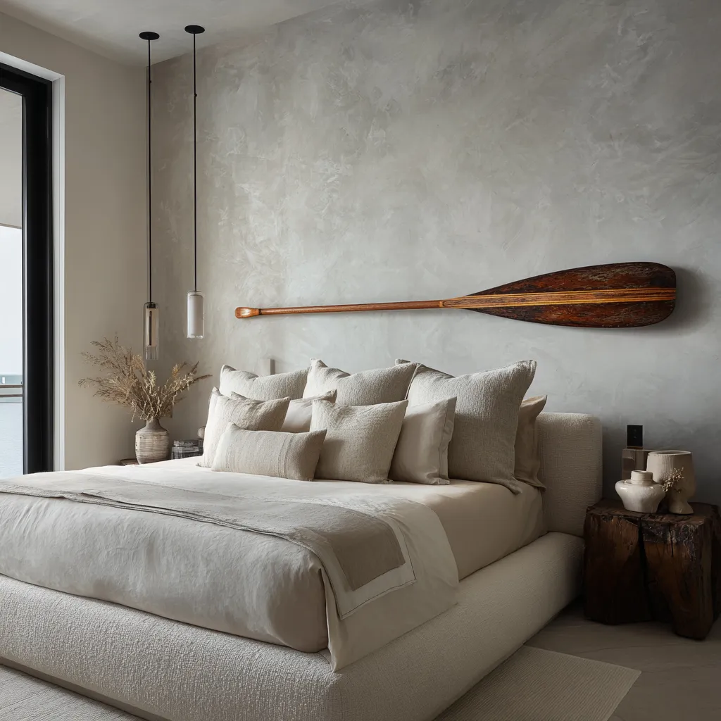
Refined coastal bedroom decorating ideas can feel almost abstract. There is little or no overt nautical sign, yet the room still carries shoreline memory through shelter, spread, softened light, and dry material contrast.
That route is especially useful for readers who want the room to feel coastal without ever being identified as a themed coastal room. It creates a stronger connection to place because it works through architecture and light, not through symbol.

Not every coastal object is equally easy to refine
This is an important distinction because many people assume any shoreline object can be elevated if the room is edited enough. Editing helps, but some objects arrive with heavier narrative baggage than others.
A weathered timber pole or irregular wood fragment is relatively easy to refine because it is ambiguous. It can be read as sculptural material before it is read as maritime evidence.
That ambiguity gives the room freedom. A paddle or oar sits in the middle.
It is recognizable, but still geometric enough to be translated into a long line. It can be disciplined by scale, wall openness, moody plaster, architectural framing, or atmospheric support.
A surfboard is more difficult. Its silhouette is culturally louder.
It carries sport, lifestyle, and memory in a much more specific way. That does not make it unusable.
It simply means the room around it has to become stricter. Fewer additional cues.
More open wall. More severe palette editing.
More attention to how the board relates to architecture rather than memorabilia.

This is why a surfboard above a bed often needs the rest of the room to become nearly silent. If the room adds woven hanging pieces, beach prints, baskets, and nautical fabrics around it, the whole thing becomes too readable too quickly.
If the surfboard is isolated, weathered, tonally muted, and treated as one curved wall form inside a highly restrained room, it can still feel polished. The object itself does not decide the outcome.
The room’s response to the object decides it.

Atmospheric art may be the safest route to a refined result
For those who want shoreline feeling without any risk of cottage-like theme, atmospheric art is one of the reliable paths.
- A horizon painting in reduced tones.
- A suspended textile panel with blurred bands of clay, fog, sand, and pale mineral color.
- A long rectangular artwork that suggests marsh, surf line, low cloud, or wet shore without ever turning illustrative.
- A relief piece with ribbed forms that hint at shell interiors, tide marks, dunes, or boardwalk rhythm without identifying any one of them directly.
These pieces work well because they hold coastal memory as atmosphere rather than object. They speak through width, drift, soft transition, and landscape structure.
The room feels shoreline-adjacent without becoming tied to recognizable equipment or memorabilia.

Atmospheric art also sits more naturally inside contemporary interiors because it already belongs to the language of abstraction. It can pair with pale bedding, wood tones, sculptural lamps, and minimal bedside styling without asking the rest of the room to join a theme.
That does not mean the art should be oversized or dramatic. In fact, the more refined examples often use broad low formats, quiet values, and generous wall around the piece.
The aim is not to turn the bed wall into a gallery statement. The aim is to borrow the visual grammar of coast—horizontal breadth, softened transition, distance, air.

Shelf compositions work when the shelf becomes a horizon
A floating shelf above the bed can easily become cluttered, and once it becomes cluttered the coastal mood weakens immediately. But a shelf can also be one of the subtle tools in the style if it is treated as a horizon line rather than a storage strip.
The long shelf itself becomes the main horizontal. The objects on it should be few enough that the line remains dominant.
One artwork, two vessels, maybe a bowl or one short stack of books. That is often enough.

What matters is not the number of objects but the ratio between object and emptiness. More empty shelf than occupied shelf usually produces the richer result.
The open stretches between the pieces keep the shelf from turning domestic in the ordinary sense. The shelf starts to read like a datum, a line in space.
This is especially effective in rooms that already rely on pale bedding and dark wood bedside tables. The shelf can become a crisp upper band that holds the wall without needing any marine artifact at all.
Add a hazy landscape artwork or a pair of matte vessels, and the room can communicate shoreline atmosphere through composition alone. The mistake is to treat the shelf as a place to add many beach-adjacent things.
The useful version treats the shelf itself as the main gesture and the objects as light interruptions along it.

Warm-earth coastal has a different emotional climate
There is a common assumption that refined coastal style must be pale, chalky, and cool. That version is certainly one important branch of the style.
But another branch exists, and it is warmer, denser, and more sun-soaked. This second branch may use walnut, amber-toned art, clay lamps, grasscloth-like wall surfaces, terracotta undertones, richer woven textures, and stronger wood mass.
It can still feel coastal, but the feeling shifts. Instead of saline air, one gets sun-heated shelter.
Instead of fog-softened brightness, one gets late-day glow. Instead of spare dune-pale neutrality, one gets a room more closely tied to dry earth near water.

This branch can be deeply beautiful, but it needs more discipline because warmth adds visual body quickly. Richer wood, clay lamps, and textured wall finishes can make a room feel house-rooted and substantial, which is good, but also heavier, which means the room can lose shoreline air if too many warm notes stack up.
The answer is not to avoid warmth. It is to edit warmth.
- Let one wall finish carry the woven heat.
- Let one lamp color carry the clay note.
- Let the artwork suggest horizon without becoming saturated.
- Keep bedding restrained.
- Reduce decorative objects even further.
- Preserve openness around the major gesture.
A warm-earth coastal bedroom should not copy the pale branch with warmer colors substituted in. It should recognize that warmth changes the room’s pace and density, then subtract accordingly.

Small asymmetries keep the room human
A bedroom this pared back can become overly arranged if every side mirrors the other perfectly. Yet too much asymmetry can make the room feel unresolved.
The useful middle ground is slight mismatch.
- One nightstand a little heavier than the other.
- One side with a vase, the other with a small stack of books.
- One throw draped toward one corner instead of spread evenly.
- One pendant visible more strongly from the camera angle.
- One bedside object rougher, one smoother.
These small deviations matter because they suggest selection rather than package styling. They introduce life without changing the room’s larger order.
In a style built on reduction, even minor difference becomes meaningful. The goal is not obvious imbalance.
The goal is relief from mechanical sameness. This is important in coastal interior designs because weathering, exposure, and use-history are already part of the visual language.
A room that wants those qualities should not feel factory-perfect. Slight variation helps the space feel inhabited and softened by time rather than assembled all at once.

Shoreline life should appear as memory
The phrase quiet references to shoreline life becomes useful only when it is understood correctly. It does not mean adding small seaside props and hoping they remain subtle.
It means allowing the room to carry echoes of coastal living without theatrical explanation.
- A rope detail can suggest mooring or rigging without becoming decorative rope décor.
- A weathered pole can suggest use, labor, and exposure without being labeled as driftwood styling.
- A long low artwork can suggest marsh horizon, fog, or shoreline distance without any literal marine scene.
- A dry woven lumbar can suggest utility cloth or hand-loomed fiber rather than themed pattern.
- A dark wood band can suggest jetty, dock, beam, or boardwalk memory through material association alone.
- A black-framed window and chalky plaster can suggest weather, brightness, and shelter rather than any direct ocean image.
This is how shoreline life enters refined interiors. Not through collection, but through residue.
Not through performance, but through trace. The room feels as though it belongs near water because its materials and formal moves make sense in relation to light, air, wear, and enclosure.
That is a much deeper achievement than simply naming the location through decor.

How to build the look without flattening it
If you are shaping a coastal bedroom and want depth rather than formula, begin by choosing the room’s main carrier. Will the coast enter through an object, a surface, a horizon artwork, an architectural surround, or a weathered timber line?
Once that choice is made, keep the rest of the room in support mode.
- Let the bed become a tactile neutral field.
- Leave air around the major gesture.
- Prefer aged and dry materials to obvious marine color.
- Use just enough dark contrast to sharpen the room.
- Keep supporting art atmospheric rather than illustrative.
- Treat shelves as horizons, not storage.
- Let architecture do some of the work if possible.
- Be especially strict if the main cue is highly legible, such as a surfboard.
- Allow slight irregularity, but not visual drift.
Most importantly, decide what kind of memory you want the interior design to hold. Is it remembering weather?
Horizon? Shelter?
Material exposure? Utility objects?
Time? Once the room has one clear memory, it becomes far easier to edit everything else.

The deeper lesson of elevated coastal bedrooms
The coastal bedroom is not a room full of seaside references. It is a room that understands what shoreline life does to material, light, and proportion.
- It understands that coast is often dry rather than colorful.
- That weathering can carry more truth than palette.
- That one line across a wall can say more than a gallery of themed objects.
- That plaster haze, oak surround, dark metal ring, washed textile, and open wall can produce stronger atmosphere than decorative storytelling.
- That softness below and aged tension above make a bed wall feel complete.
- That shelter matters as much as openness.
- That air around objects matters as much as the objects themselves.
A room shaped by these ideas does not beg to be recognized as coastal. It simply feels as though it belongs to a life near shore.
It has been edited enough to stay poised, but not stripped so far that it loses warmth. It carries the memory of exposure without becoming rustic.
It borrows from shoreline life without turning into performance.
That is what makes this version of coastal decorating so enduring. It does not rely on novelty.
It relies on form, material history, and restraint strong enough to let one well-chosen gesture carry the room.