A bay window breakfast nook can look soft, bright, and inviting in almost any house. They shape how the room holds you.
Some feel like sheltered alcoves that draw people inward for coffee, reading, or a slow breakfast. Others behave like compact dining zones that can handle family meals, homework, serving dishes, and daily traffic without strain.
The difference comes from enclosure, table presence, seating shape, light control, and how firmly the nook is tied to the architecture around it.
That is why bay nooks do not begin with a style label. They begin with a spatial decision.
Should the bay feel held and inward, almost like a small room nested inside the larger room? Or should it stay open, connected, and ready for active everyday use?
Once that decision is made, nearly everything else becomes clearer: the curve of the bench, the scale of the table, the role of movable chairs, the amount of framing around the bay, and even the way shades or drapery should be used.

Start with the question: refuge or daily use
Bay window breakfast nooks can fail because they try to do every job at once. They want the softness of a cocooning corner and the capacity of a hard-working family dining spot, yet those goals often pull in opposite directions.

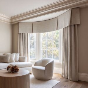
A refuge-oriented nook tends to feel more enclosed. The bay may be framed by deeper trim, a recessed opening, side millwork, or a clear alcove effect that gives the seating area a protected boundary.
The bench often curves more, wrapping the perimeter in a way that makes the table feel gathered inward. Loose chairs are limited, sometimes reduced to one extra seat or a pair of low stools, so the open edge stays clear and the built-in remains the main visual form.
In these nooks, the room feels centered and settled. The table is present, but it does not take over the bay.
The mood is often soft, low-contrast, and tactile.

A daily-use nook moves in another direction. It usually has a larger table with more real visual mass and more practical surface area.
One or two movable chairs or stools help the breakfast zone expand beyond the built-in. The bay keeps a stronger relationship to the room and to the view outside.
The bench may still curve, but less aggressively. The whole setting feels more like a compact dining platform than a tucked-away booth.
These nooks can still be warm and beautiful, but their beauty comes from use, movement, and grounded materials rather than from enclosure alone. The strongest results appear when the design team decides early which role matters more.
If that part stays vague, the nook often ends up neither fully sheltering nor fully practical.

Geometry matters more than strong color
One of the things about current bay window breakfast nook design is that color has lost its old role as the main source of character. The nooks today often stay within a compressed range of pale creams, warm whites, oat tones, light stone, natural oak, sand, camel, or muted earth notes.
Rather than relying on bold contrast, they build depth through shape, surface, and mass.

Geometry matters so much. A curved banquette changes the emotional reading of the bay immediately.
A centered round or oval table creates a different social feel than a square or rectangular one. A sculpted pedestal base can give a nook gravity even when the palette remains light and restrained.
A framed alcove opening can make the breakfast zone feel claimed by the architecture before a single accessory is added.

This shift has changed how a nook should be styled. If the room is already based on tonal closeness, then the eye starts reading other things with much greater intensity: the softness of a boucle or brushed fabric, the density of woven shades, the depth of a wood base, the smoothness of stone, the shadow line under a built-in seat, the scale of a pendant, the crispness of trim around the windows.
These become the design language.

Why enclosure changes everything
If a bay breakfast nook feels especially good to sit in, it is often because it feels held. This can happen in several ways.
Sometimes the architecture itself creates that feeling through a recessed opening, an arched transition, thicker side walls, or a built-in envelope that makes the nook feel slightly separate from the room. Sometimes it comes from the bench wrapping the bay closely enough that the seating forms its own perimeter.
In older homes, deep window casings, historic trim, or paneled side walls can heighten the same effect. In newer homes, a cleaner alcove with crisp surfaces can do it just as well.

This sense of holding is often more powerful than decorative softness. Cushions alone do not create refuge.
A room can be full of plush fabric and still feel exposed if the bay is visually loose. By contrast, a nook with stronger framing and clearer centering can feel deeply inviting even with restrained upholstery and very little styling.
If you want the bay to feel special, think first about how the architecture can claim it. That may mean thickening the trim, extending millwork, shaping the opening, or designing the built-in so it feels inseparable from the window zone.

Curved seating is powerful, but not always the right answer
Curved banquettes have become one of the defining forms of the modern bay breakfast nook. They soften faceted bays, reduce the severity of angular window lines, and give the seating a more bodily, welcoming feel.
In the right setting, a curved bench can turn a simple window recess into a real retreat.

Yet curvature has limits. The more enveloping the seat becomes, the more the nook tends to shift away from broad daily utility and toward intimacy.
That is excellent for a breakfast corner meant for two to four people, for a reading-and-coffee area, or for a house that wants the bay to feel like a small refuge inside the kitchen or family room. It is less ideal if the nook must support larger meals, laptops, serving pieces, and active circulation.

That does not mean straight or faceted benches are better. It means they solve a different problem.
A more structured U-shaped or L-shaped built-in often handles daily use more easily. It supports larger tables, clearer seating positions, and stronger front-edge access.
It also ties more naturally to cabinetry and millwork when the breakfast area needs to feel like part of a working kitchen rather than a separate alcove. The decision should come from how the bay will be used.
If the room needs cocooning, curve helps. If it needs capacity, a more controlled geometry often performs better.

The table decides whether the nook is a perch or a room
A substantial table gives the bay center gravity. It turns the nook into a room that can truly operate.
This does not necessarily mean a visually heavy or oversized table. It means a table with enough width, enough top presence, and enough base confidence to keep the breakfast corner from feeling decorative only.
A larger oval can make a bay feel communal. A square or rounded-square top can give a more architectural nook discipline.
A solid round pedestal can create a centered, inward mood that works beautifully in smaller or more sculptural settings.

The base matters just as much as the top. A single cylinder gives calm centrality.
Twin cylinders can introduce more structure. A fluted pedestal adds fine detail without clutter.
A faceted wood support gives a more crafted and grounded character. A thin top on a strong base can be especially effective because it keeps the table refined while still letting it hold the room.

This is where many bay nooks either deepen or weaken. A table that is too small can make the nook look like a styled window seat rather than a true breakfast zone.
A table that is too large can crush circulation and erase the pleasure of sitting in a bay at all. The scale has to suit the behavioral goal of the space.
If the nook is meant to carry daily meals, the table should look ready for them.

Loose chairs and stools
Movable seating is one of the signals that a bay window breakfast nook is meant for active use. One or two extra chairs, or a pair of compact stools, instantly make the room more flexible.
People can pull up for breakfast, work from the table, or join a larger conversation more easily. The nook stops being a built-in-only corner and starts behaving like a compact dining area.

At the same time, extra seating changes the emotional structure of the bay. It opens the front edge, adds more object presence, and weakens the booth-like quality that makes many nooks feel comforting in the first place.
That is why the number and type of loose seats should be chosen carefully.

Low stools are often the least disruptive option. They preserve openness, tuck away easily, and do not interrupt the visual line of the built-in.
One single side chair can also work beautifully, especially when the goal is to keep the nook relaxed and flexible without crowding the center. Full dining chairs, especially in pairs, are best when the bay is expected to behave more like a true dining node.
In other words, extra seating is not only a practical addition. It changes the social and spatial reading of the room.

Window treatments are not what make the nook feel sheltered
Many people assume that shades or drapery create the feeling of enclosure in a breakfast nook. In practice, they usually do something else.
They moderate brightness, soften the glass, add tactile variation, and tune the relationship between the room and the outside. The sheltering effect usually comes more from framing, bench shape, and centering than from fabric alone.

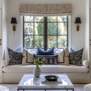
Woven roman shades are especially effective because they add dry texture and a slight tonal warmth against painted trim and glass. They can shorten the perceived height of tall bays, soften the top half of the window field, and make the lower seating zone feel more intimate without closing the room.
Roman shades in fabric bring a different softness. Their folds help reduce stiffness in a very geometric bay and can make a pale room feel more relaxed and domestic.

Drapery works best when it helps frame the outer edge of the bay or soften one side of a more angular window composition. It is often less about cocooning the nook and more about giving the windows enough surface depth to feel complete.

This distinction matters. If the bay feels exposed, changing the shades may not solve the real issue.
The deeper fix may be to strengthen the architecture around the nook or to reshape the seating so the room feels more held.

Pale sculptural nooks and wood-led grounded nooks
Many of today’s most appealing bay breakfast nooks fall into one of two broad material directions.

The first is the pale sculptural nook. These spaces rely on compressed tones, shaped banquettes, centered pendants, and smooth or softly textured surfaces.
They often feel airy, hushed, and highly composed. Their depth comes from form, shadow, and subtle surface changes rather than from strong material contrast.
A glowing globe pendant, a curved stone table, a pale upholstered bench, and filtered light can create a remarkable amount of atmosphere without much color.

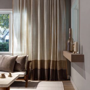
The second is the wood-led grounded nook. These designs use oak, walnut, stained millwork, leather, ribbed timber, deeper base cabinetry, or stronger earth-based material notes to give the bay more weight.
They often support heavier daily use because the materials themselves carry structure and durability. These nooks can still stay bright, but they tend to feel more anchored and more closely related to the house as a whole.

Neither direction is inherently superior. The pale sculptural version is often stronger when the goal is retreat, softness, and a highly centered focal composition.
The wood-rich version is often stronger when the goal is everyday endurance, warmth from below, and a more substantial room presence.

Historic architecture can improve a modern nook
There is often unnecessary fear around designing a modern breakfast nook inside an older bay. In many cases, the historic shell is exactly what makes the nook stronger.
Deep trim, faceted windows, arches, paneled walls, leaded glass, thick openings, and older ceiling profiles all intensify framing and depth. Those qualities can support a current insert beautifully.
A clean round table, a soft curved banquette, or a restrained pendant often looks better inside a strong historic envelope than a decorative furniture set that tries too hard to match the old details.

The key is to let the architecture carry the memory while the new furniture carries the use. If the room already has ornate or character-rich features, the built-in can stay cleaner.
If the shell is plain, the bench or table may need more shaping to give the nook identity. This is why a minimal white built-in can work well in an old bay, and why a more grounded wood-and-stone table can work so well under traditional trim.
The success comes from balance, not imitation.

Texture has replaced loud contrast
A modern bay window breakfast nook rarely feels complete if every surface is smooth. Usually they stay close in tone, they need texture to build hierarchy.
That texture can come from woven shades, boucle or brushed upholstery, ribbed wood bases, fluted table pedestals, stone grain, leather seating, ceramic lighting, linen drapery, or even the way daylight hits deep trim and creates shadow lines.

This is why the styling of a nook should usually remain restrained. Once the materials themselves are doing enough work, the room does not need many extra accessories.
A branch arrangement, a bowl of fruit, a stack of books, or one vase is often enough. Too much decorative layering can interrupt the shape of the built-in, clutter the table, and make the bay feel smaller.
In a successful nook, texture does the expressive work that color once did. It gives the room richness while allowing the palette to stay settled and coherent.

Four strong directions for current bay nooks
Here, bay window breakfast nook design ideas are divided in behavioral families instead of only stylistic labels.
- One direction is the open social nook. It has a moderate amount of framing, at least one or two movable seats, a table with enough presence for real use, and a strong relationship to the view and the surrounding room. This is the active breakfast corner that can carry daily family life.
- Another direction is the soft domestic hybrid. It often includes drawers or built-in storage, a painted or wood base, a pale cushion line, and a settled home-centered mood. These nooks feel integrated and easy to live with rather than highly formal or highly dramatic.
- A third direction is the pale sculptural cocoon. Here the bench curves more strongly, the composition is tightly centered, the palette is compressed, and the pendant and table behave almost like sculptural objects. These nooks are deeply inviting for quiet use, though less suited to high-capacity daily traffic.
- A fourth direction is the grounded architectural booth. These nooks use deeper framing, stronger material mass, and often some historic or crafted presence to create a breakfast zone that feels embedded in the house. They combine intimacy with a real sense of permanence.
All four can look current. The difference lies in what kind of life they support.

How to shape a hybrid nook that does both jobs reasonably well
Many do not want to choose between refuge and utility too sharply. They want a bay nook that can feel inviting during a quiet morning but still handle everyday use.
The compromise usually sits in the middle rather than at either extreme.

A good hybrid often includes moderate framing rather than a fully sealed alcove. The bench may curve gently, but not so much that the space loses practical seating logic.
The table should be substantial enough to feel useful, though not so large that it overwhelms circulation. One loose chair or a pair of low stools can add flexibility without crowding the front edge.
Filtered light from woven shades or soft roman shades can warm the room without turning the windows into a decorative event. Wood or earth-toned materials low in the composition help ground the nook, while pale upholstery and lighter upper surfaces keep it bright.

This kind of balance can produce a nice result because it accepts that a breakfast nook serves more than one mood. It can hold a quiet coffee, a weeknight meal, a laptop, a child’s homework, or a conversation that runs longer than expected.

Styling ideas that support the design
Once the architecture and furniture are right, styling should reinforce them rather than compete with them. Keep the table center low and open enough that the window wall still matters.
Use branches, loose greenery, or a generous bowl rather than a dense arrangement that blocks the view. Let pillows support the logic of the bench.
On a long built-in, use them to break the line into usable sitting zones. On a more sculptural banquette, use fewer so the bench shape remains legible.
Repeat one warm note with care, such as camel, olive, blush, or muted blue-green, instead of scattering many accent colors. Let the pendant do work overhead.
If the room is pale and compressed, a centered light can help hold the composition together. If the room already has strong timber or historical character, the fixture can stay simpler.
Most of all, preserve breathing room. A bay nook becomes memorable when you can still read the shape of the window, the sweep of the seating, the presence of the table, and the quality of the light.

The design decision
Modern bay window breakfast nook design and styling ideas do not start with coastal, Tudor, urban, desert, or cottage labels, even though any of those influences can appear beautifully. They start with a more practical and more spatial question: should this bay feel like an alcove, or should it work like a compact dining room?

Once that choice is clear, the room becomes easier to shape. Framing, curvature, table scale, loose seating, materials, shades, and styling all begin to line up behind a single purpose.
That is why some nooks feel deeply satisfying the moment you see them. Their parts are not merely attractive.
They agree with one another.
A great bay breakfast nook is never only a pretty seat at a window. It is a carefully tuned balance of shelter, use, light, texture, and center.
When those pieces are handled well, the bay stops feeling like an architectural leftover and becomes one of the most loved places in the house.