This article takes a close look at kitchens where the island is painted a different color than the rest of the cabinetry—a design move that’s become increasingly popular and far more thoughtful than just picking two nice-looking paint chips. A kitchen island with a different color isn’t simply about contrast; it’s a chance to shape how the space feels, flows, and even functions.
The main focus here is on subtle details that people often overlook: how one tone might quietly echo another, how textures in stone or hardware build quiet rhythm, and how changing the island color can affect the room’s center of gravity. We’ll explore real examples and break down what actually makes these kitchens work—not just visually, but emotionally and practically too.
Contrast That Grounds or Highlights
There’s a certain trick designers use when they want to make the center of a kitchen feel steady and grounded: paint the island darker than the cabinets. This move does more than make the island stand out—it visually anchors the entire room.
Deep navy, muted plum, or blackened green tones give the base a weighted feel, especially when paired with lighter cabinetry around the perimeter. The contrast makes the kitchen feel open around the edges, and the darker island takes on a role similar to a central piece of furniture, giving the space structure without needing walls.
But not all dark islands are simply dark. Some have unexpected undertones—like a green that almost looks black until sunlight hits it.
These quieter shifts in color are often designed to mirror things like black window frames, dark vent hoods, or even outdoor views. The result is harmony without obvious matching.

Finer Point
You might assume an island painted in charcoal is just that—charcoal. But take a closer look in daylight and you may notice green or blue undertones woven in.
That hidden note often ties back to other features in the room and helps make the contrast feel natural rather than bold. It’s a method that works especially well when cabinets and island are different colors but still part of the same overall tone family.
Example of How It’s Used:
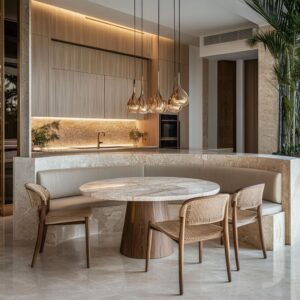
In one standout example, a blackened green kitchen island plays this role perfectly. At first glance, it reads as near-black—just a solid, grounding centerpiece.
But as natural light filters in through the windows, the island begins to show its green base, connecting visually with trees outside and picking up warmth from the surrounding wood floor. Paired with creamy bone-colored cabinets and brick-patterned tile, the color contrast feels smart, not forced.
This approach shows just how effective a kitchen island different color can be when it works in quiet partnership with its surroundings.

Muted Mid-Tones That Quietly Converse
Not every kitchen needs bold contrast to feel layered. Some of the most interesting combinations happen in that soft middle ground—where the colors shift in tone but not volume.
A two tone kitchen island different color from cabinets can bring in this kind of balance: think warm muted mustard, dusty rose, or pale clay paired with dove gray or soft cream cabinetry. The contrast here is delicate, and that’s what makes it intriguing.
There’s no visual shouting, yet the room feels considered. This approach works because the undertones are speaking to each other.
A slightly warm island next to a cooler cabinet tone creates an almost imperceptible visual tension—subtle, but it keeps the eye moving. The best results usually involve finishes with a matte or eggshell sheen and hardware that bridges both sides.
Brass, aged bronze, or muted black pulls are often used to echo tones from both surfaces.

Finer Point
The trick is in temperature. If the island leans warm and the surrounding cabinets feel cool, that temperature shift draws the eye without overwhelming the room.
Even the lighting—like aged brass pendants—can reinforce the warmth and build a quiet bridge between the different elements.
Illustrative Example
One standout kitchen uses a faded mustard yellow for the island. It’s softened enough to blend into the space but still distinct.
The perimeter cabinets are a cool, nearly silvery dove gray. Nothing clashes, but the contrast is real.
It feels calm, but not flat. You can feel the difference without having it spelled out—and that’s exactly the charm of using different color cabinets and island in this kind of soft contrast scheme.

Dual Tone Within the Island Itself
Some kitchens take things one step further by giving the island multiple tones on its own. This layered approach is easy to miss at first glance because people expect a kitchen island to be one color all the way around.
But when the drawers are one shade and the frame is another, it adds dimension without needing dramatic color contrast. In these cases, the island becomes more than just a functional block in the room—it starts to read like a furniture piece.
The frame can be painted in a warm tone while the drawers take on a cooler or more neutral finish. That shift can stretch the island visually, making it appear longer or more sculpted depending on the configuration.

Quiet Strategy
It’s often the hardware that ties the two tones together. Long brass pulls, for example, may echo warmth from one part of the island while standing out cleanly on a cooler drawer face.
That layering adds texture even when the color palette is soft.
Example You Could Try
A great example comes from the same kitchen with the faded mustard island. In that case, the frame is a warm ochre-mustard, but the drawers themselves are done in a subtle gray.
It’s an understated contrast, yet it adds depth to the island without complicating the room. This technique works especially well in kitchens that don’t want a high-contrast look but still want interest.
It’s a smart choice for anyone considering a more furniture-like island—especially in a space where clean lines and a quiet palette are the goal.

Role of Hardware in Bridging Contrasts
Small choices often carry more weight than they seem, and hardware is a perfect example of that. In kitchens with a different color island, the handles and knobs can act like quiet connectors—or intentional separators.
If the cabinetry around the room shifts from a neutral to a bold shade, using the same hardware across all of it can keep the design cohesive. On the other hand, switching up hardware finishes between the island and the perimeter adds a visual break, emphasizing the change in tone.
Another layer of subtlety comes from size. Islands sometimes use the same hardware style as the rest of the kitchen, but scaled up slightly—longer bar pulls or chunkier knobs.
This small change signals the island’s importance without announcing it loudly. Even if you don’t notice it at first, the proportions play a role in how balanced or anchored the space feels.

Design Examples
A kitchen with a dusty navy island and natural white oak cabinets might carry slim brass bar pulls across both areas. The repeated material and finish act like visual stitching between different surfaces, making the island feel like it belongs, even with a bold tone.
In contrast, a coral-toned island can be fitted with extra-wide brass pulls that stand apart from the rest of the cabinetry—offering a modern twist and reinforcing its distinct role. Both approaches work, depending on whether the goal is to blend or to highlight.

Repetition of Materials for Unity
While contrasting cabinetry and island colors bring energy to a space, it’s often the materials that help it feel whole. One of the most effective ways to do this is by repeating the same stone on both the island and the backsplash.
Whether it’s marble, quartz, or quartzite, using a continuous material across horizontal and vertical surfaces gives the kitchen a sense of flow. That kind of repetition can soften the impact of a bold paint choice and keep the room from feeling too split.
Designers sometimes go further by adjusting the stone finish between areas. For instance, a honed surface on the island can feel grounded and soft to the touch, while a polished version of the same stone on the wall introduces a bit of reflection.
It’s a small shift that brings texture and depth without adding clutter.

Illustrative Ideas
A kitchen with a navy island might carry the same marble slab up the wall behind the cooktop, tying the island and the perimeter into one clean line. It doesn’t matter that the island is a different colour kitchen island—the shared surface keeps the palette feeling balanced.
Another option might be a kitchen with a burnt sienna island that uses matte quartz both on the countertop and backsplash. The warm, low-sheen finish calms the richness of the island paint and creates a smooth connection to the lighter cabinetry around it.
Whether you’re planning a strong contrast or just a touch of difference, repeating materials is a subtle but effective way to bring clarity and structure to the room. It’s especially useful in kitchens where color and texture are both part of the design conversation.

Interplay with Lighting Choices
Lighting above the island is more than decoration—it directly shapes how the island’s color looks and feels in the space. Pendant lights, in particular, either highlight or soften the presence of a bold finish.
Clear glass pendants let the island tone show through freely, which works well with more saturated shades. On the flip side, solid shades like metal or fabric pull focus downward and can either spotlight or diffuse the island’s presence.
The inner finish of a pendant makes a surprising difference. A brass-lined shade, for example, casts a warm reflection that might make a cool island paint take on a slightly softer or more golden cast.
It’s a detail many overlook, but one that can subtly shift the whole atmosphere depending on time of day and how the light hits.

Example
A blackened green island can be paired with matte black dome pendants that throw a strong beam of light downward. This works especially well if you have black window trim or darker fixtures elsewhere in the room—it creates visual consistency without overpowering the room.
In contrast, a graphite island might benefit from something more textural—like woven cylinder pendants—that scatter soft shadows and add dimension to the flat matte finish. Lighting doesn’t just frame the island; it shapes how the color breathes in the space.

Furniture-Like Base Details
When the kitchen island is a different color than cabinets, its form becomes more pronounced. That’s why some designers take the opportunity to treat it like a furniture piece—adding carved legs, bracketed corners, or base moldings that might otherwise go unnoticed in a fully color-matched room.
These touches give the island its own identity without disrupting the kitchen’s overall unity. Shapes at the corners—like fluted columns or chamfered feet—often draw from older design languages, giving a nod to tradition even in a contemporary space.
These accents break up the mass of cabinetry and make the island feel intentional, not just functional.
Option to Consider
A soft pistachio island can be framed with beveled posts and chamfered details, echoing hand-built furniture. That same method works beautifully on a deeper, more dramatic dusty inky plum island, especially if the drawer fronts are thick and framed.
The contrast in shape and tone makes the island feel grounded and storied, even in a newer home. These furniture-inspired details often go unnoticed at first glance but become the thing that gives the kitchen its character.

How Open Shelving Affects the Island’s Look
Adding open shelving to a kitchen island instantly changes how it functions and how it feels. Instead of acting as a solid block in the center of the kitchen, the island becomes more open, approachable, and styled—especially when combined with a distinct paint color.
This works particularly well when the shelves are used for textured or natural pieces like woven baskets, ceramic serveware, or stacked cookbooks. These items introduce softness and break up the uniform lines of cabinetry.

There’s a trick to how the shelving is painted. If the interior matches the exterior, the color frames the objects and helps them stand out.
But if the shelf back is painted a few shades lighter or darker than the rest of the island, it can add quiet depth, almost like a shadow effect. This small move adds dimension, especially in softly lit kitchens.

Fresh Ideas
Take a stone blue island with linen white cabinets. If open compartments are built into the island’s seating side and finished in the same muted blue, the shelving becomes part of the island’s identity, not just an afterthought.
Baskets in natural tones or light wood can soften the color without blending in completely. This kind of open shelf design not only adds function—it also offers visual rhythm that makes the island feel connected to the rest of the space.

Multiple Materials on the Island
Not every island has to be one thing. Some of the most interesting ideas play with contrasting materials on the same island—one face in wood paneling, another in painted finish, and a bold stone top pulling it all together.
This approach adds character without adding clutter. It gives each side a purpose, and each material its own place.
A standout example is using a waterfall stone top. This type of countertop extends down the sides of the island, and when done right, it becomes a major visual feature.
The direction of the veining in the stone can draw the eye vertically, adding movement to what would otherwise be a flat horizontal surface. If the stone complements both the cabinetry and the island color, it quietly ties the palette together.

An Option
A mossy khaki island paired with whitewashed oak cabinets makes a strong case for this layered method. One face of the island might be painted in the earthy khaki tone, another finished in vertical rift-cut oak, and the whole structure topped with a waterfall slab in creamy taupe stone.
Each material supports the other without blending in completely. The wood adds warmth, the paint adds saturation, and the stone adds flow.
This type of combination works well in kitchens where texture and natural finishes are key design elements.

Handling of Texture in Paint
Paint isn’t only about color—it’s about finish, and finish changes everything. In kitchens where the island is used to add depth or contrast, the texture of the paint can quietly shift how that island is read.
A flat, matte finish will pull in the light and make a bold hue feel velvety and grounded. On the other hand, eggshell and satin finishes allow for a little glow, often helping cooler tones come to life.
Then there’s the option of semi-transparent stains, especially on woodgrain—these finishes don’t hide the material underneath but let its character show through. What makes this so impactful is that texture in paint is rarely noticed at first glance—but it shapes how the island feels in the space.
Glossy surfaces bounce light and lean more formal. Matte absorbs light and brings a sense of calm.
Semi-transparent stains sit in the middle, offering richness without heaviness.
Idea
A dusty lilac island paired with pale gray slab cabinets could be finished in a stain that lets the woodgrain subtly peek through. The result?
An island that feels both quiet and layered. It’s not a flat block of color—it has depth, it moves with the light, and it holds a presence that’s different from the uniform perimeter.
It feels like it belongs, but it still carries its own story.

Drawer Configuration and Visual Rhythm
Color gets all the attention, but layout plays just as big of a role in how an island comes across. A bold shade can bring focus, but how the drawers or doors are arranged defines the visual rhythm.
A grid of evenly sized drawers creates repetition and structure—it makes the color feel even more solid. In contrast, using larger panels with few seams allows the surface to read as one single mass, which can either simplify the look or make it feel sculptural.
These decisions are especially noticeable when the island tone stands apart from the rest of the kitchen. More drawer fronts mean more shadows, more handles, and more pattern.
Fewer fronts mean more stillness.

Example to Consider
Take a moss green island with white oak cabinets. If the island has twelve drawers arranged in a perfect grid, the effect is architectural.
Each panel repeats the color, line by line, creating texture through layout instead of changing materials. It’s organized without feeling stiff—and in a natural shade like moss, the structure feels grounded rather than mechanical.
This kind of drawer configuration can quietly reinforce the color’s strength and create a focal point that’s both useful and visually calm.

Range Hood Coordination
The range hood often plays a bigger visual role than most people expect. It sits high, right in the line of sight, and can either quietly support the color story or add a second focal point.
In kitchens where the island is a standout shade, the hood can be used to reinforce or balance that contrst. Matching the hood with the perimeter cabinets keeps the island in the spotlight.
But if the hood shares a tone or texture with the island, it creates a second anchor—visually bookending the kitchen. The design choice depends on how unified or segmented the layout should feel.
Two strong elements—hood and island—can give a space balance across height and depth. A single accent, on the other hand, gives the kitchen a more centralized focus.
Refined Touch
A hood painted or finished to echo the island can visually pull the room together without using the same tone. Even something as small as a wood trim or a shape echoing island details makes a quiet connection.
A Creative Idea
In a kitchen with soft olive cabinets and a clay pink island, the hood could be painted a creamy tone with a natural wood band—mirroring the floating shelves and creating a soft link without pulling attention away from the island. It ensures the island stands out while the hood feels like part of a thoughtful plan, not an afterthought.

The Role of Seating Textures and Upholstery
The stools or chairs around a kitchen island are easy to overlook, but they can pull the entire palette together—or shift the visual weight. When the island is a different color than cabinets, the right seating makes the contrast more fluid.
Using upholstery in a similar shade adds softness and makes the island feel like it’s part of a larger tone family. Choosing a contrasting seat fabric highlights the seating area and gives the eye something to land on besides cabinetry.
It’s not just about color either. Materials and structure matter too.
Black metal frames might reflect nearby window trim or hardware. Leather can echo floor tones.
Woven textures introduce a natural touch that softens saturated paint or stone finishes.

What’s Easy to Miss
The scale and finish of the stools matter more than most think. Heavy woven seats can balance a strong color; minimalist frames let a bold island speak on its own.
Insight
Imagine an indigo black island paired with soft putty cabinets. Now picture barstools with thick, pale linen seats and black wood frames.
The seating doesn’t match exactly—but it brings texture, shape, and soft neutrality that helps ease the difference between the dark island and the light cabinets. It’s that type of quiet connection that makes the whole kitchen feel complete without every detail matching on the nose.

Flooring Choices as a Bridge
Flooring has a quiet but powerful role in how kitchen colors relate to each other. It can act as the connector between contrasting elements, especially in kitchens where the island takes on a standout tone.
If the island leans warm—think ochre, clay, or terracotta—a floor with amber or honey undertones can build a seamless path from base to baseboard. In cooler kitchens with navy, graphite, or slate islands, a soft gray tile or cool-toned wood can ground the color while reinforcing its tone.
What really makes this connection feel natural is the way texture and grain interact with color. A herringbone or chevron pattern in wood flooring isn’t just decorative—it breaks up light and shadow across the floor and can reflect the island’s undertones in subtle ways.
That movement creates a sense of rhythm across horizontal space without needing extra accents.
Example Idea
Picture a muted ochre island with soft white cabinets, placed on top of a warm herringbone oak floor. The grain in the floor doesn’t match the island paint exactly, but the tones speak to each other.
The ochre leans into the floor’s natural warmth, while the cabinetry stays crisp. This combination makes the room feel thoughtfully pulled together—without having to rely on perfect color matches.

Trends Toward Earthy and Muted Tones
One of the clearest shifts in current kitchen design is the move away from saturated or overly bold colors, and toward toned-down, earthy hues. These include everything from sage and moss to faded coral, dusty pink, rust, and soft clay.
These tones carry weight without being overwhelming. They add depth, but stay relaxed.
The appeal lies in their versatility. These colors pair well with natural wood, white oak, creamy paints, and subtle brass or aged hardware.
And because many of them carry a gray or brown base, they feel stable—easy to live with over time. In regions inspired by natural surroundings, this palette has taken hold, especially in homes that want a sense of balance without going completely neutral.

Key Shift
Instead of going for sharp contrast, designers are leaning into muted layers. A clay pink island with cream cabinets.
A sage island paired with soft beige uppers. These combinations work because they don’t fight for attention.
They settle into the space, offering warmth and individuality without the risk of becoming trendy for a season and dated the next. This muted approach makes color feel easy, even in a kitchen where the island different color than cabinets is the standout feature.

Observing Emerging Directions
- Several clear preferences are shaping today’s kitchens, and they all lean toward comfort, balance, and understated complexity. Layered earth tones—like clay, terracotta, and soft pinks—have become key choices for those who want warmth without going overly rustic. These hues work naturally with finishes like aged bronze or brushed brass, which adds depth without needing extra color.
- For kitchens looking to ground the space visually, darker tones still dominate. Deep forest green, inky navy, and near-black shades with subtle color shifts remain popular, especially in sunlit spaces. These colors don’t just create contrast—they provide weight and presence without overwhelming the room.
- Meanwhile, pastels are taking a quieter turn. The bright mints and baby blues of past trends are being replaced with gray-leaning versions that feel more grown-up. Think dusty lilac, soft pistachio, and powdery blue-gray—tones that bring in color but with restraint.
- Another direction gaining momentum is the use of mixed materials on a single island. Designers are blending painted cabinetry with natural wood panels or pairing flat color with dramatic stone elements like waterfall edges. It’s not about showiness—it’s about thoughtful layering.
- Also worth noting: finishes are shifting. High-gloss cabinets are less common now. Instead, matte and low-sheen finishes are preferred because they show more texture and allow undertones to be seen. In kitchens where woodgrain is visible through the paint, this creates a sense of life and movement, even in muted color schemes.

Putting It All Together
A kitchen with an island that breaks from the perimeter color isn’t just doing it for flair—it’s often the design move that brings everything else into balance. What makes the most successful kitchens work isn’t just the use of a statement shade, but all the fine-tuned choices around it.
Small differences in hardware scale, finish texture, or even the way stone is repeated across surfaces play a major role. One overlooked connection is how the island relates to the flooring.
If the tones feel in conversation—whether through contrast or alignment—the kitchen feels tied together without effort. The same applies to hardware and lighting.
Repeating a metal finish or echoing a material in multiple places creates flow, even if the palette features strong contrast.
Planning a kitchen with two tones means looking well beyond paint chips. It means understanding how your space behaves throughout the day—how shadows fall, how surfaces reflect, and how elements like seating or shelving can either quiet or amplify the overall look.
In the end, the most memorable kitchens rarely shout. They’re the ones where the pieces talk quietly to each other—where a clay-toned island next to soft olive cabinets doesn’t need explaining, because the textures, tones, and light do all the work.
It’s in these subtle connections where the design really settles in.